
Pink and Green Preppy Room Shopping List & Styling Guide
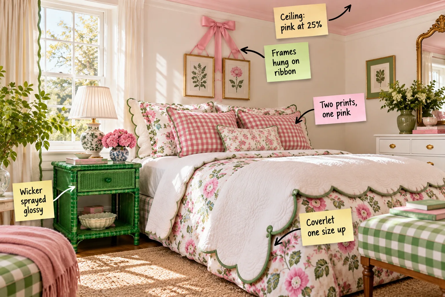
Create the ultimate preppy bedroom with our complete styling guide, and print your one-page shopping list featuring the exact blush ceiling and kelly-green paint pairings. You will be able to mix gingham and floral patterns confidently using our foolproof pattern-mixing chart without second-guessing your fabric choices.
The 25 Percent Pink Ceiling Trick
A fully saturated pink ceiling can quickly overwhelm a bedroom, but leaving the fifth wall stark white abruptly breaks the room’s cozy envelope. The elegant solution is having the paint counter mix your chosen wall or accent pink at exactly 25 percent strength.
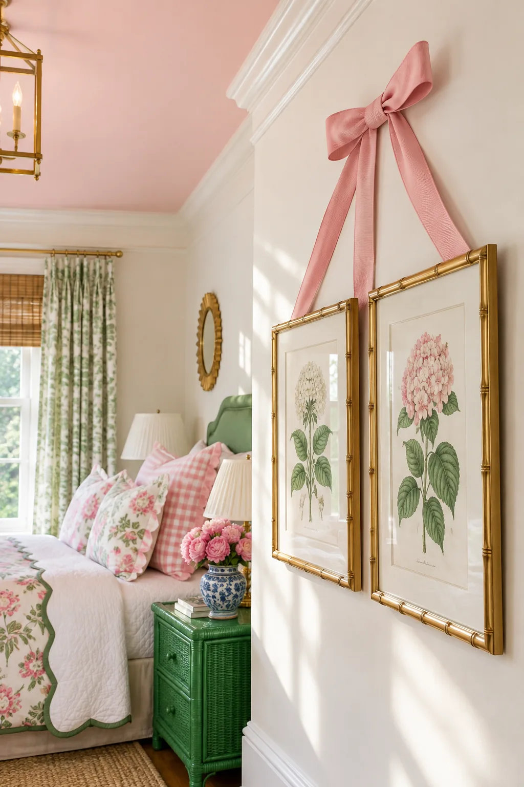
Before committing to a full gallon for the ceiling, it is crucial to test how the diluted color behaves in your specific room lighting. This creates a subtle blush tint that reflects a warm, flattering glow without competing with the bold textiles resting below.
Testing Paint Undertones in Natural Light
Because ceiling planes receive light differently than vertical walls, your newly mixed blush paint requires careful observation before you begin rolling. Evaluating the color throughout the day ensures the subtle pink remains crisp rather than turning muddy when the afternoon shadows stretch across the room.
- Paint a large two-foot square of foam board rather than applying the sample directly to the ceiling drywall.
- Secure the painted board overhead using gentle painter’s tape to mimic the exact angle of light reflection.
- Observe the color during bright morning sunlight to ensure the pink does not lean overly vibrant or neon.
- Check the swatch again in the late afternoon to confirm it resists turning gray or overly cool.
- Turn on your bedside lamps at night to verify the artificial light maintains a warm, inviting blush tone.
Selecting the Right Flat Ceiling Finish
Always request a true flat finish for your diluted pink ceiling paint to effectively hide inevitable drywall imperfections and roller marks. A flat sheen absorbs light beautifully, creating a velvety texture overhead that softens the room and contrasts nicely against glossy accent furniture.
Hanging Art With Grosgrain Ribbon
Elevate simple botanical prints by hanging them from wide grosgrain ribbon, which draws the eye upward toward the blush ceiling. The ribbon acts as a bold decorative statement, beautifully bridging the awkward visual gap that often exists between a standard headboard and the crown molding.
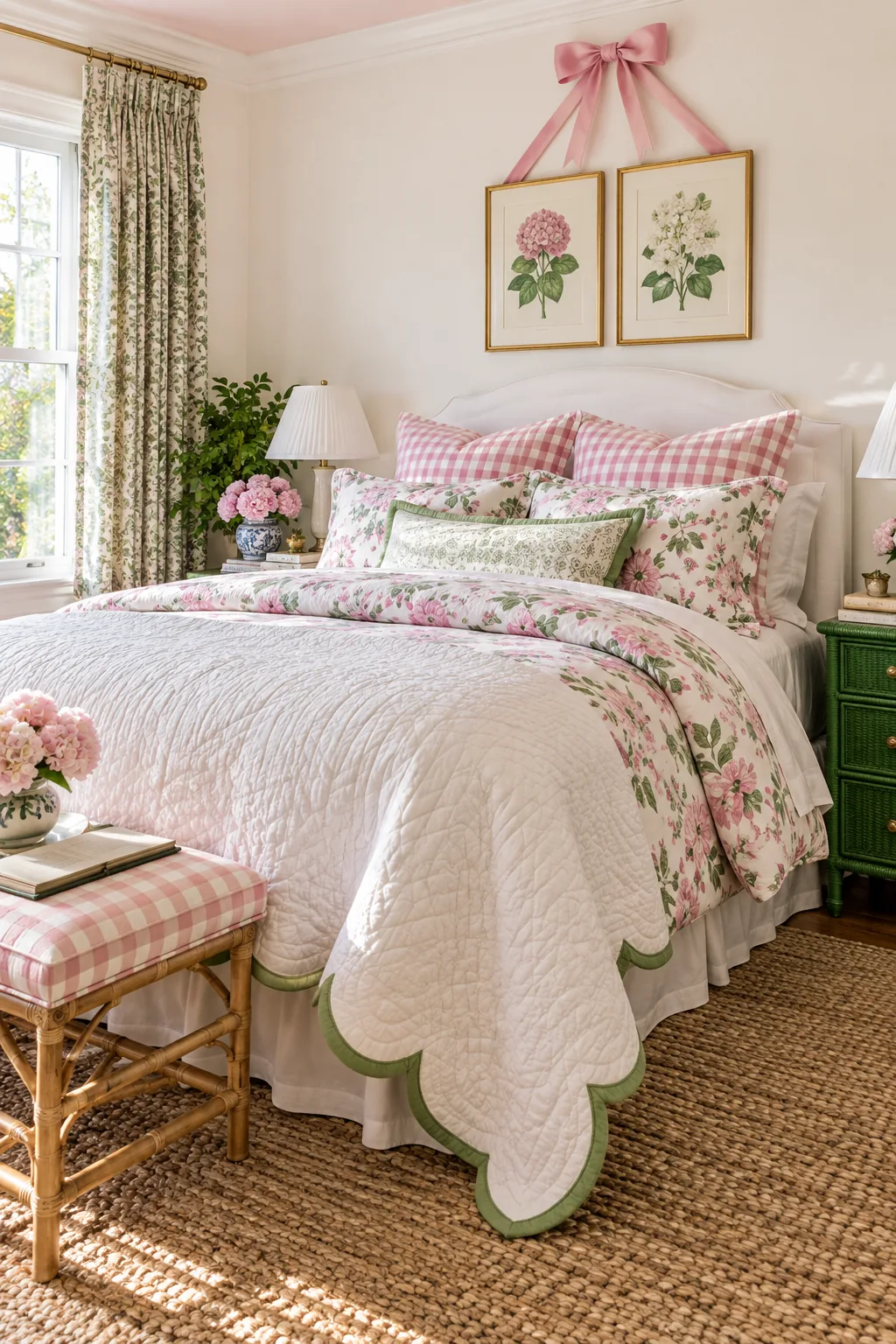
For a polished and intentional look, ensure the ribbon color exactly matches a dominant shade pulled from your bedding textiles. Selecting a high-quality ribbon with a pronounced ribbed texture adds an extra layer of classic preppy detail to your bedroom walls.
Choosing the Proper Ribbon Width
Selecting a ribbon that is too narrow will make your framed artwork look visually unanchored and flimsy against a large expanse of wall. Use this simple scaling guide to match your botanical frame dimensions with the ideal grosgrain width and structured bow size.
| Frame Dimensions | Ribbon Width | Finished Bow Span | Visual Impact |
|---|---|---|---|
| 5×7 inches | 1.5 inches | 4.5 inches | Delicate accent |
| 8×10 inches | 2.0 inches | 5.5 inches | Classic proportion |
| 11×14 inches | 2.5 inches | 6.5 inches | Bold statement |
| 16×20 inches | 3.0 inches | 8.0 inches | Dramatic focal point |
| Gallery wall mix | 1.5 inches | 4.0 inches | Cohesive grouping |
Securing the Ribbon to the Frames
Proper installation guarantees your botanical prints hang perfectly straight without putting undue stress on the decorative grosgrain fabric over time. Bypassing flimsy tape in favor of mechanical fasteners ensures the ribbon remains taut and secure against the back of the heavy wooden frames.
- Measure and cut a length of two-inch pink ribbon tailored exactly to your desired drop height.
- Fold the bottom raw edge of the ribbon under by one half-inch to prevent future fraying.
- Secure the folded ribbon directly to the top center of the wooden frame back using a heavy-duty staple gun.
- Install a standard brass picture hook on the wall to carry the actual weight of the framed artwork.
- Tie a separate, structured bow and tack it directly to the wall just above the hidden picture hook.
Sizing Up the Scalloped Coverlet
Achieve a lush, traditional layered bed without the fuss of a tailored bed skirt by purchasing a quilted coverlet one size larger than your mattress. This oversized approach provides a beautifully clean, tailored finish that completely hides the standard metal bed frame and hardware.
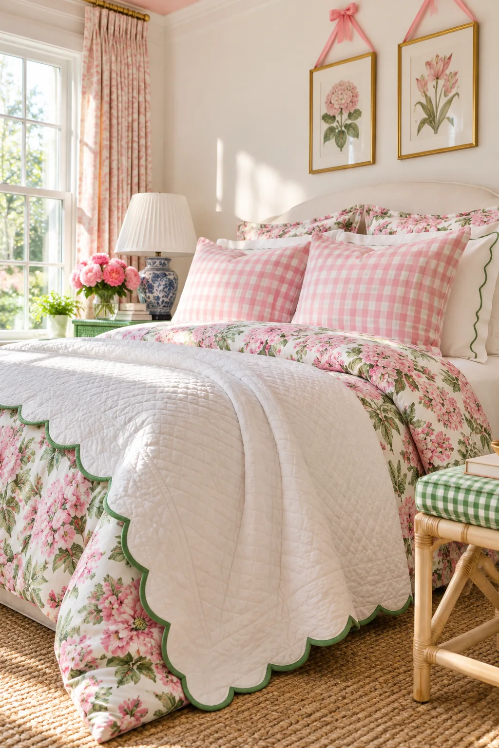
I used this exact trick in my own Boston guest room, throwing a king-size coverlet on a standard queen bed. The generous extra width allows the decorative scalloped edges to drape elegantly down both sides, nearly grazing the floor for a high-end custom look.
Selecting the Ideal Quilt Weight
A heavier quilt weight is absolutely essential for this sizing trick, as lightweight fabrics will simply pool on the floor rather than holding a crisp shape. The added structure of a densely quilted cotton coverlet ensures the scalloped borders remain perfectly flat and defined.
Hiding the Bed Frame Effectively
When skipping the traditional bed skirt, you must ensure the oversized coverlet falls evenly on all three exposed sides of the mattress. Pull the quilt slightly further down at the foot of the bed if your pillows and folded duvet naturally consume extra fabric near the headboard.
Mixing Two Prints in One Pink Tone
The true secret to preppy pattern mixing is varying the scale dramatically while strictly matching the underlying color palette. This tight color control allows the contrasting patterns to look highly intentional and polished rather than chaotic, visually exhausting, or accidentally mismatched.
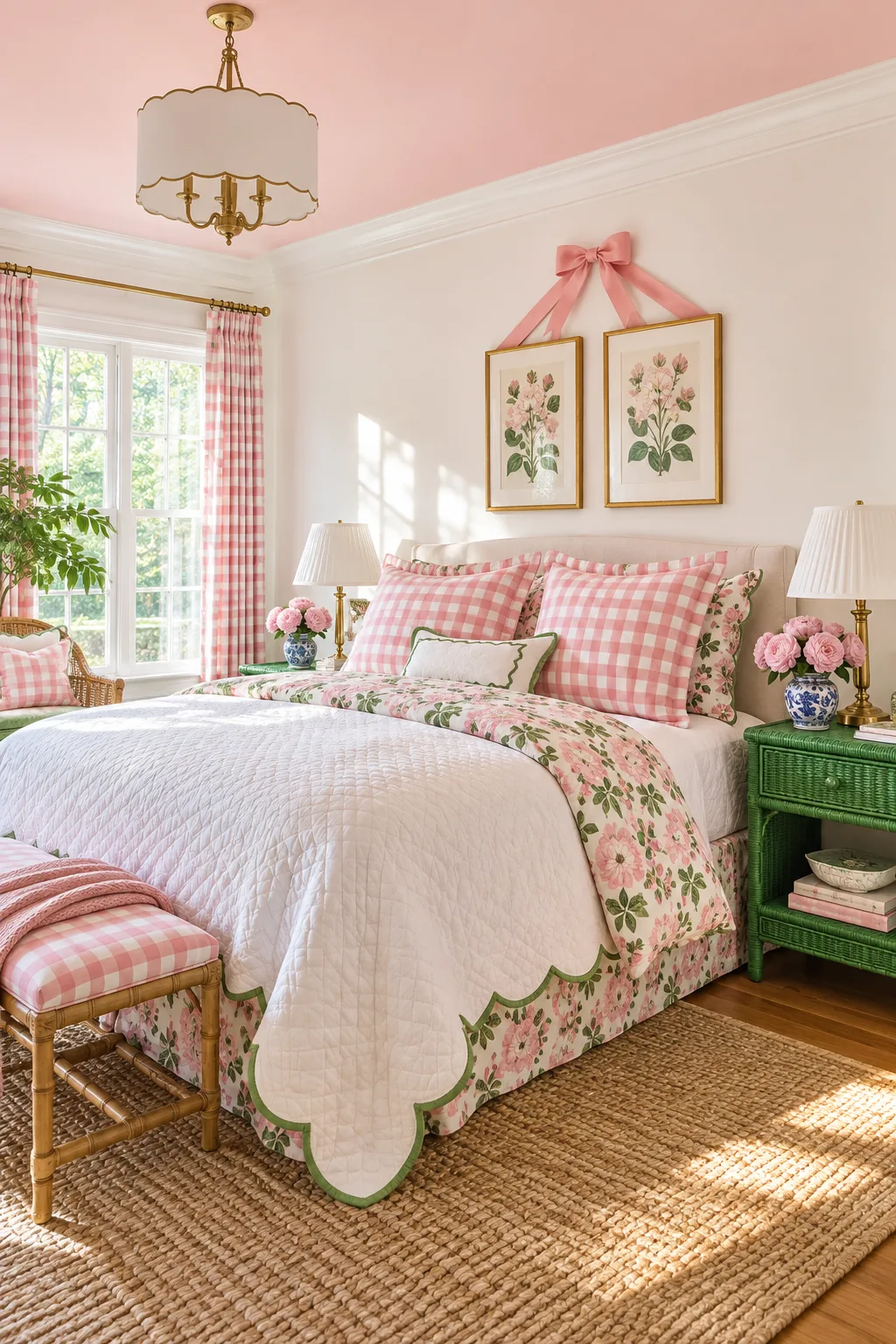
When I recently styled a client’s brownstone master bedroom, pairing a large-scale floral duvet with small-scale gingham shams proved incredibly effective. Ensuring both textiles featured the exact same shade of pink instantly unified the bed and created a cheerful, cohesive focal point.
Balancing Large Florals With Small Gingham
To master this classic combination, ensure the floral pattern features blooms that are at least three times larger than the gingham checks. This stark contrast in scale prevents the two distinct geometric and organic patterns from fighting for dominance across your layered pillows.
Grounding the Bedding With Crisp White
To keep the bold pink and green palette feeling crisp rather than juvenile, incorporate plenty of optic white across your secondary bedding layers. Crisp white sheets, a bright white bed frame, and white lampshades provide necessary visual breathing room between the saturated preppy patterns.
Glossy Green Wicker Accents
Anchor the soft, feminine pinks with a powerful punch of high-gloss kelly green applied to a heavily textured surface. This striking combination adds vibrant color saturation and essential tactile contrast to the smooth cotton bedding and flat painted walls.
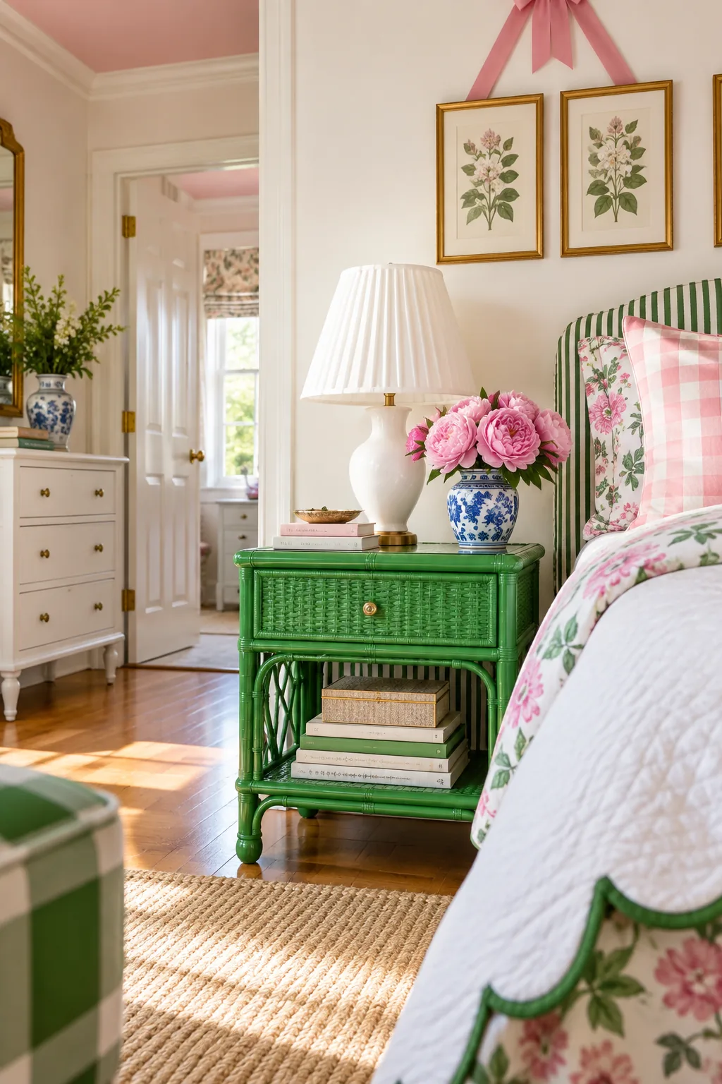
A thrifted wicker nightstand transformed with glossy spray paint beautifully highlights the intricate woven details while giving the vintage piece a fresh update. The brilliant, reflective finish catches the natural sunlight, bringing an unexpected modern edge to the deeply traditional room layout.
Prepping Wicker for High-Gloss Paint
Proper preparation is non-negotiable when updating vintage wicker, as decades of dust and flaking varnish will ruin your glossy finish. Use a stiff bristle brush and a vacuum attachment to thoroughly clean deep into the woven crevices before applying any primer or color.
Applying Thin Coats for a Smooth Finish
Achieving a factory-like gloss requires immense patience and multiple extremely thin applications of premium spray paint. Holding the can eight inches away and sweeping across the wicker prevents the heavy gloss paint from dripping or pooling inside the delicate woven joints.
5 More Preppy Bedroom Color Palettes
Explore these classic color variations to find the perfect preppy aesthetic for your own space.
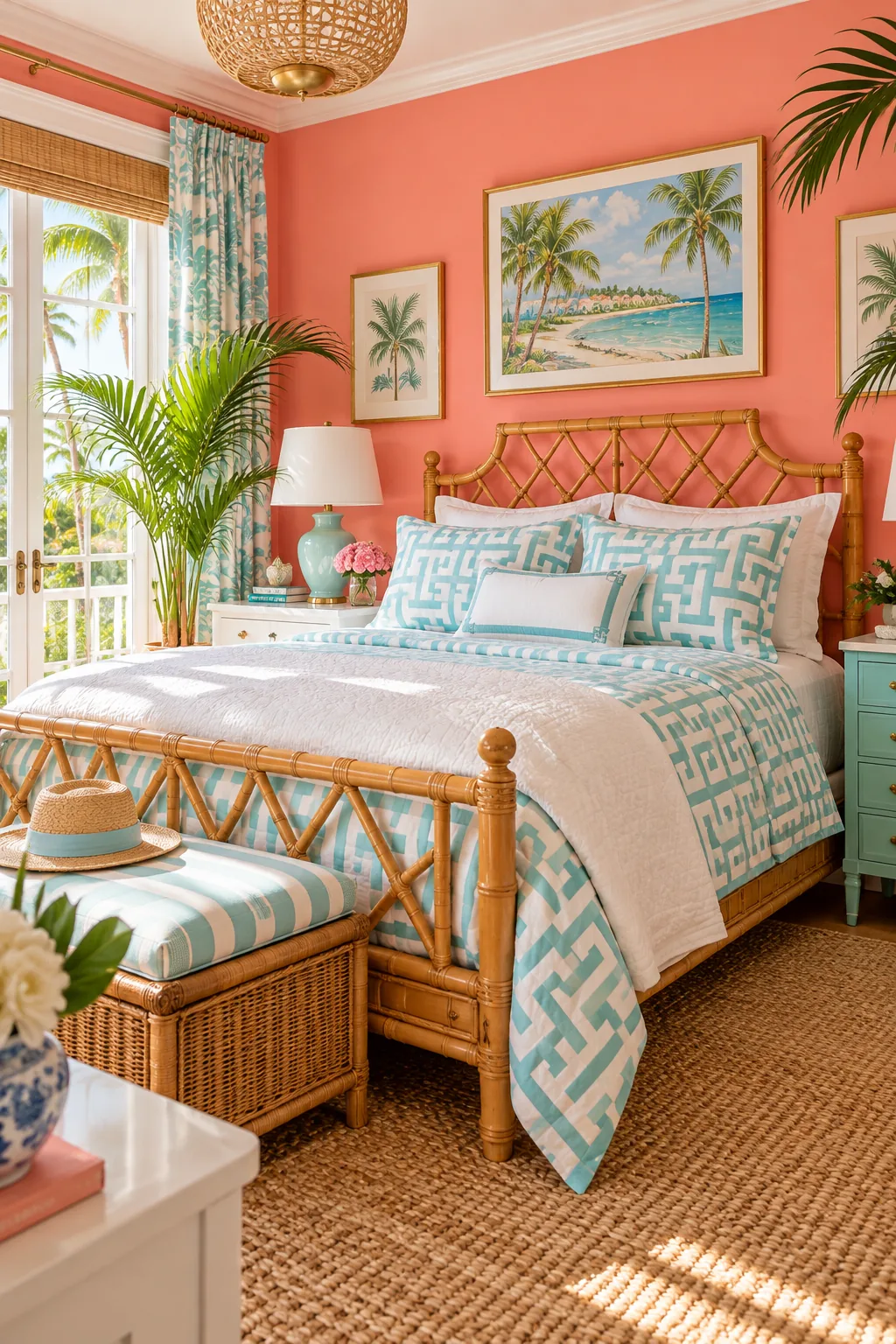
Palm Beach Coral and Aqua: Swap traditional florals for crisp geometric prints and faux-bamboo furniture to create a vibrant, resort-inspired atmosphere.
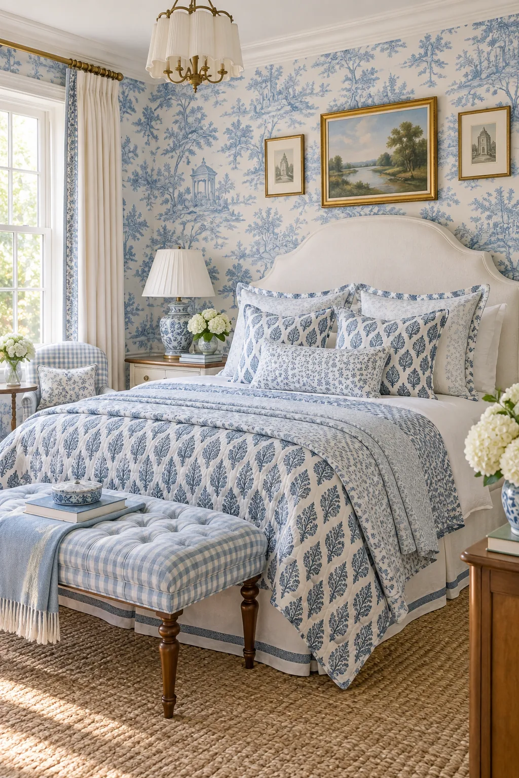
Grandmillennial Powder Blue: Layer classic toile wallpaper with block-print textiles in matching shades of powder blue for a nostalgic, heavily patterned look.
Classic Navy and Kelly Green: Ground the space with dark navy walls and rich green velvet to give classic preppy motifs a sophisticated, tailored edge.

Pastel Yellow and Lilac: Pair pale lemon walls with lilac gingham for a fresh, springtime palette that feels light, youthful, and incredibly inviting.
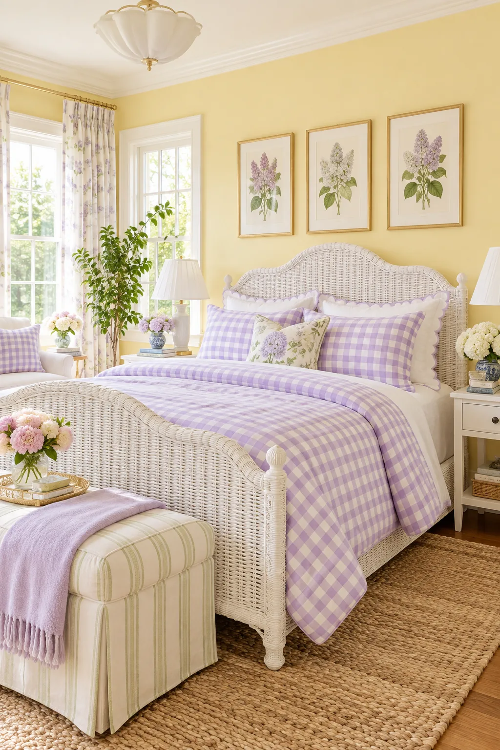
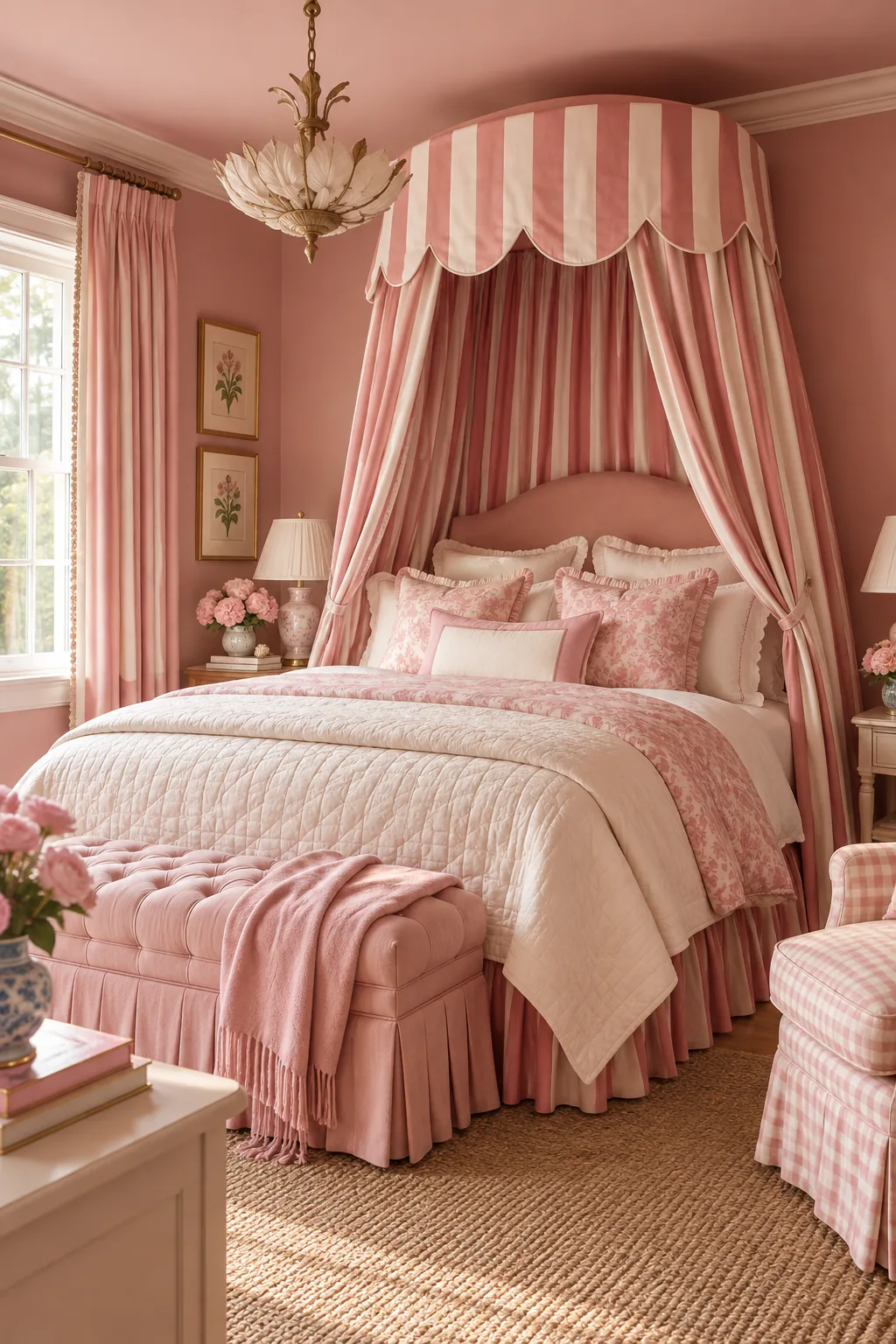
Monochromatic Rose Pink: Commit to a single color family by layering varied shades of rose pink across the walls, bedding, and a dramatic striped canopy.
Your Pink and Green Preppy Room List
Pulling this classic aesthetic together requires the exact right balance of paint formulas, textile scales, and glossy accent pieces. Navigating the paint counter and fabric store becomes completely stress-free when you have every specific detail and measurement clearly mapped out in advance.
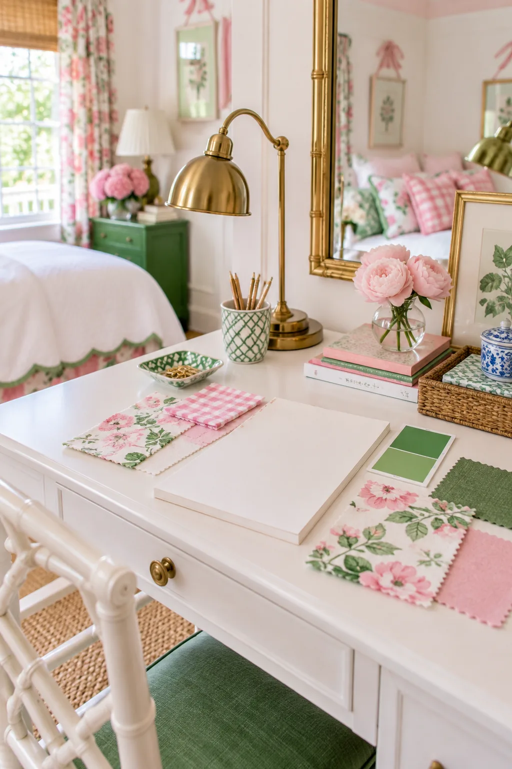
Use this comprehensive, one-page shopping list to instantly find the exact blush ceiling and kelly-green paint pairings needed for your space. It also includes our quick-reference pattern-mixing chart to help you confidently select the right gingham, floral, and stripe scales in perfectly matching pinks.