
Living Room Layout Rules: The Exact Spacing Guide You Need
Stop guessing where the sofa goes and start arranging your space with confidence using this highly specific layout guide. You will master your living room layout using precise measurements for walkways, coffee tables, and rugs to create a perfectly balanced, professionally designed space.
Identifying Your Focal Point Anchor
Every successful room arrangement begins by anchoring the space around a primary architectural feature, such as a prominent fireplace, a large picture window, or a substantial media console. Identifying this natural focal point eliminates the guesswork of deciding where your largest foundational furniture pieces truly belong.
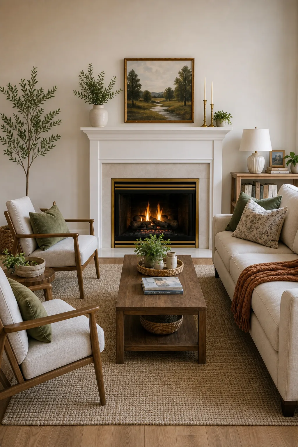
The main seating piece should face this focal point anchor directly to establish the room’s orientation and create clear, natural sightlines. Aligning your heaviest sofa squarely with this feature instantly provides the structural foundation required for the rest of your precise spatial measurements.
Orienting the Primary Seating
Once the central feature is established, you must position the foundational seating to maximize both comfort and visual impact without blocking essential room entrances. Following a strict sequence ensures the heaviest items are locked into place before you measure out the smaller peripheral gaps.
- Identify the strongest architectural feature to serve as your room’s uncompromising structural center.
- Float the primary sofa directly across from this anchor to establish the main viewing axis.
- Measure the remaining floor space behind the sofa to confirm adequate primary walkway clearance.
- Position secondary armchairs at a slight angle to enclose the seating arrangement naturally.
- Place supportive side tables within immediate reach of every dedicated seating position.
- Verify that no heavy furniture piece obstructs the natural traffic flow from adjacent doorways.
Locking in this foundational arrangement provides the exact coordinates needed to confidently roll out your area rug. The precise placement of these heavy pieces dictates the boundaries of your conversational grouping and determines the required dimensions for your floor coverings.
The Front-Legs Rug Placement Trick
A large area rug effectively defines the main seating zone, but you absolutely do not need every single furniture leg resting on the woven material. Purchasing an oversized rug that spans the entire room is an unnecessary expense that often makes the space feel smaller.
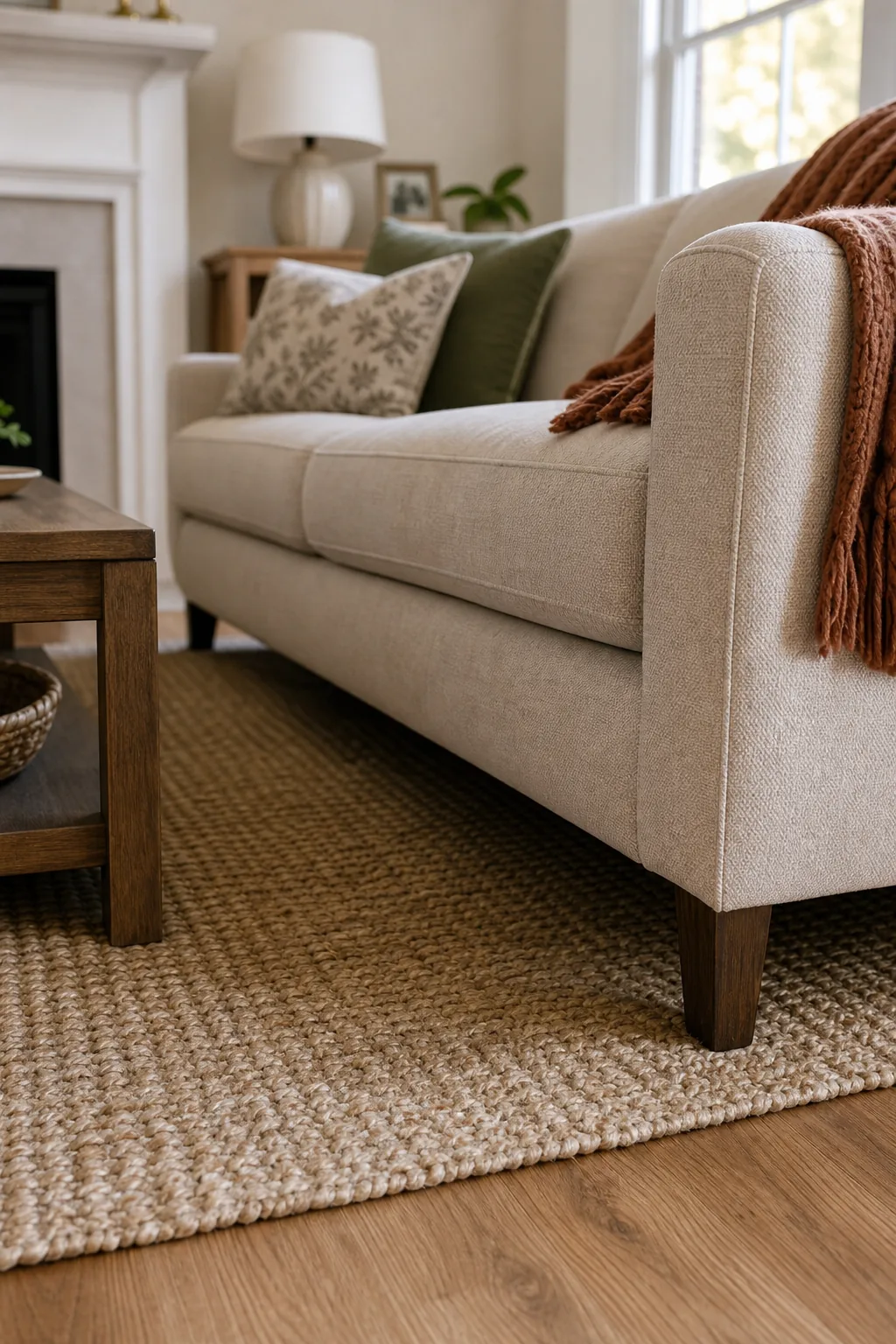
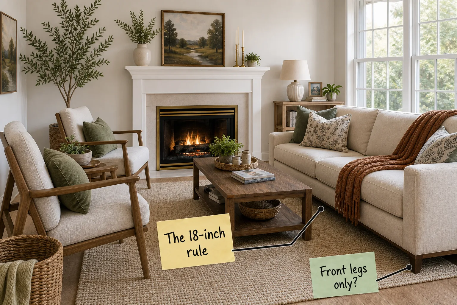
Placing just the front legs only of the sofa and accent chairs onto the rug anchors the entire grouping while saving you from purchasing a massive, expensive textile. If you are unsure which rug dimension will accommodate this specific seating arrangement, try this simple visualization method before purchasing.
Selecting the Right Rug Dimensions
Standardizing your textile choices ensures the foundational layer supports the heavy furniture without overwhelming the exposed hardwood or tile borders. Leaving at least eighteen inches of bare floor around the perimeter of the rug maintains a crisp, intentional border that highlights your home’s architecture.
Building the Core Conversation Zone
Furniture should be arranged to encourage intimate interaction without forcing guests to shout across a massive, empty floor plan during social gatherings. Pushing all your seating tightly against the perimeter walls creates an awkward, cavernous void in the center of your living space.
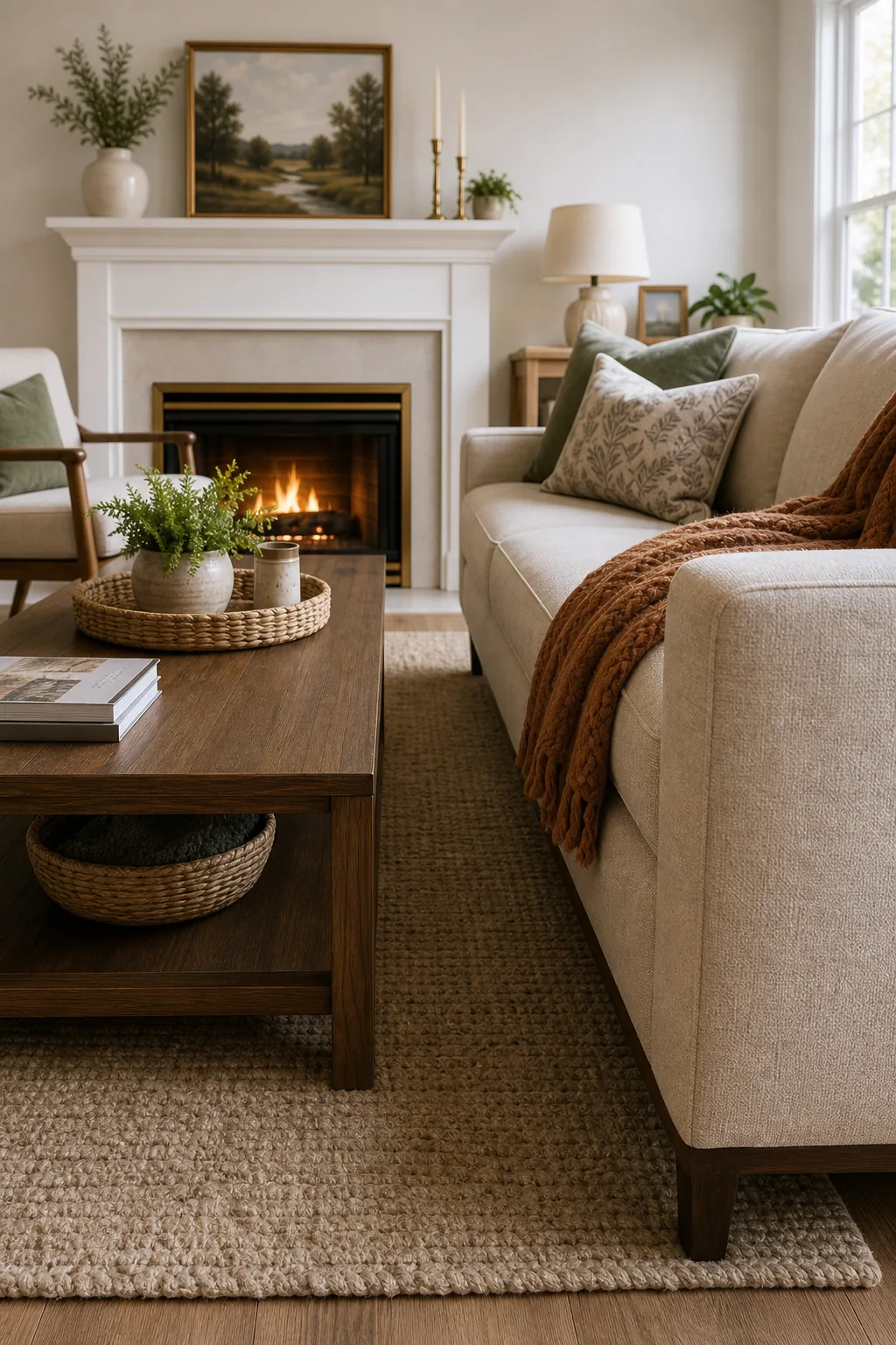
Keep the main seating pieces angled toward each other to establish the conversation arc for comfortable socializing and natural eye contact. This inward-facing geometry naturally draws people together and creates a cozy, purposeful atmosphere even within an open-concept architectural layout.
Establishing the Conversation Arc
Maintaining strict distance limits ensures that every guest feels included in the discussion without having to lean forward awkwardly. You must carefully calibrate the empty space between opposing chairs to foster a relaxed, welcoming environment for daily family use and weekend entertaining.
- Keep opposing seats within a maximum distance of eight to ten feet.
- Angle accent chairs slightly inward to enclose the grouping and direct focus.
- Ensure no single chair is isolated outside the primary conversational boundary.
- Provide a dedicated, reachable landing surface for drinks at every seat.
- Avoid placing high-backed chairs where they might block immediate eye contact.
Dialing In the Coffee Table Gap
The empty distance between your primary seating and the central surface is consistently the most frequently botched measurement in amateur home design. When this critical gap is too wide, guests must awkwardly perch on the edge of their cushions to set down a glass.
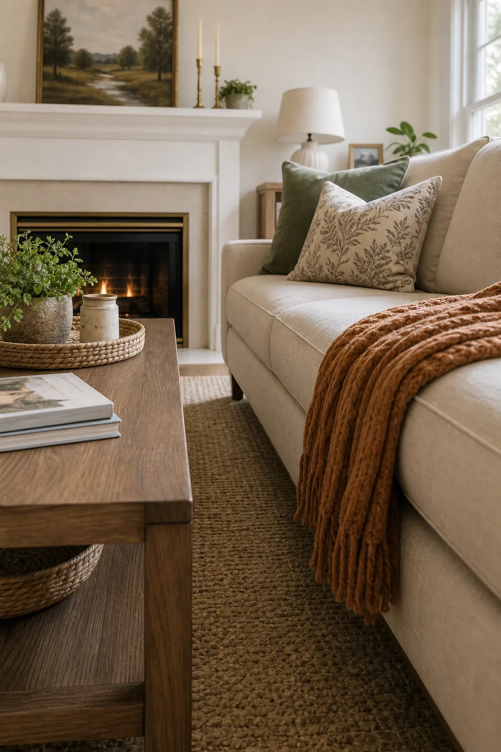
Maintain a strict 14 to 18 inches of clearance so drinks remain easily reachable but legs still have ample room to stretch comfortably. This specific measurement, often called the 18-inch rule, represents the perfect ergonomic balance between accessibility and unhindered physical relaxation.
Standard Surface Clearances
Memorizing the standard spatial requirements for every supportive surface prevents the chaotic, cluttered feeling that ruins otherwise beautiful interior styling. Applying these universal interior design metrics guarantees that your room functions just as beautifully as it photographs for a magazine spread.
| Furniture Piece | Ideal Gap | Measurement Point | Primary Purpose |
|---|---|---|---|
| Coffee Table | 14 to 18 inches | Sofa seat edge | Legroom and reach |
| Side Table | 2 to 3 inches | Armrest side | Elbow clearance |
| Media Console | 36 to 48 inches | Coffee table edge | Screen viewing |
| Sofa Back | 3 to 10 inches | Wall surface | Breathability |
| Accent Chair | 30 to 36 inches | Nearest wall | Traffic flow |
| Opposing Sofa | 8 to 10 feet | Front seat edge | Conversation |
Implementing these precise distances transforms a disjointed collection of expensive furniture into a highly functional, professionally calibrated living environment. Relying on hard numbers rather than visual guessing ensures that every family member can navigate the space safely and comfortably.
The Complete Living Room Spacing Guide
Pulling all these individual metrics together creates a comprehensive master plan that dictates exactly where every major piece should permanently reside. Use these exact measurements to confidently lock in your layout and ensure every piece sits in perfect, harmonious alignment.

Before finalizing your heavy furniture placement, walk through the room physically and verify these three critical clearances to prevent costly moving mistakes. Taking the time to measure twice guarantees that your final arrangement will easily accommodate the daily demands of a busy household.
Mapping the Traffic Flow
A beautifully styled room instantly fails if guests constantly bump their shins against sharp table corners while trying to reach the kitchen. Mapping out the invisible highways that cut through your space is just as important as selecting the perfect upholstery fabric.
Protecting Walkways and Clearance Zones
Traffic flow ultimately dictates how comfortable a room feels, especially when navigating around large, heavy seating arrangements during a crowded holiday gathering. Ignoring these essential paths forces people to squeeze awkwardly between delicate accent tables and bulky upholstered arms.
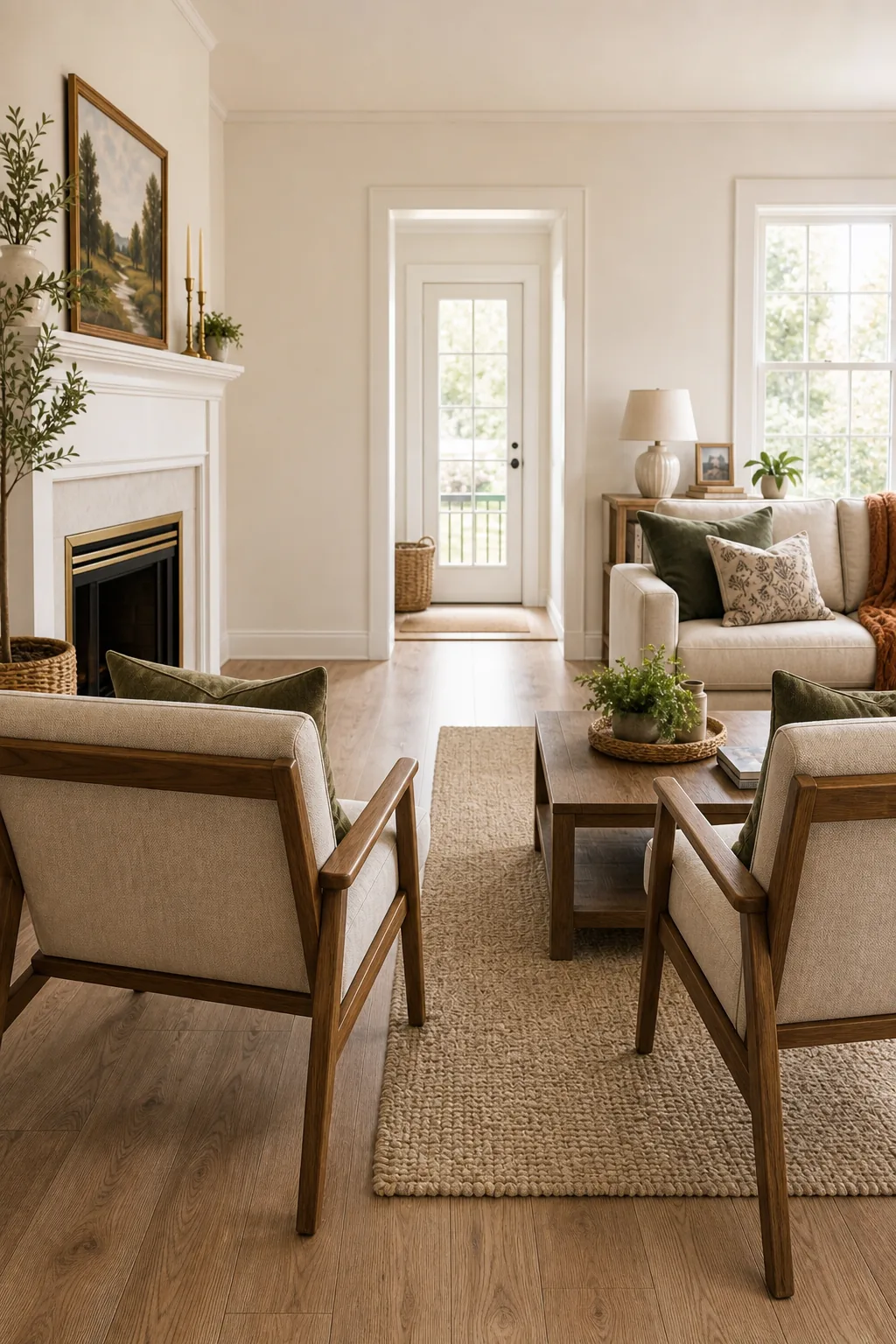
Always leave 30 to 36 inches of clear walkway space in the dedicated clearance zone behind accent chairs to prevent feeling cramped. Preserving this generous empty border guarantees that anyone can traverse the room effortlessly without interrupting the people seated in the core conversation area.
Maintaining Secondary Paths
While primary walkways require a full three feet of width, secondary paths between smaller furniture groupings can be slightly more compressed. However, you must never reduce any navigable path below twenty-four inches, or the space will immediately trigger a sense of claustrophobia.
Applying the 60/30/10 Color Rule
Once the rigid spatial layout is securely set, you must distribute your chosen palette cohesively to prevent visual chaos and sensory overload. Throwing too many bold hues into a single sightline destroys the calming symmetry you just built with your tape measure.
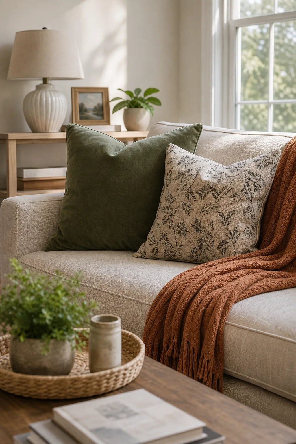
Use the 60/30/10 rule by assigning 60 percent of the room to a dominant neutral, 30 percent to secondary tones, and 10 percent to accents. This proven mathematical ratio ensures that your vibrant throw pillows and artwork pop beautifully without overwhelming the foundational upholstery.
Distributing Accent Tones
Scattering your boldest accent color evenly across the room creates a subconscious visual rhythm that encourages the eye to travel smoothly. Grouping all your vibrant accessories on a single sofa leaves the opposite side of the room looking barren, unbalanced, and structurally ignored.
Balancing Visual Weight Across the Room
A layout works best when heavy, grounded pieces and light, airy frames are distributed evenly to manage the room’s overall structural gravity. Placing all the massive, skirted furniture on one side of the rug creates a lopsided aesthetic that feels distinctly uncomfortable.
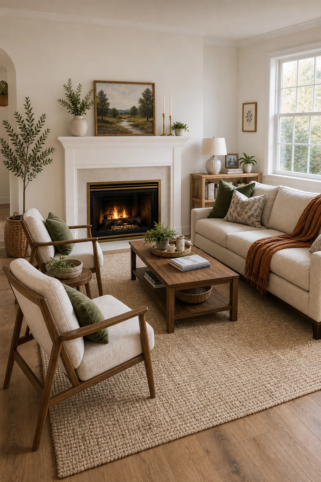
Offset a solid sofa with accent chairs that feature exposed wooden legs to manage visual weight and keep the room feeling balanced. Mixing these dense and transparent silhouettes guarantees that your meticulously measured living room remains a dynamic, breathable, and inviting sanctuary.