
How to Choose Gray Kitchen Cabinets: The Undertone Test
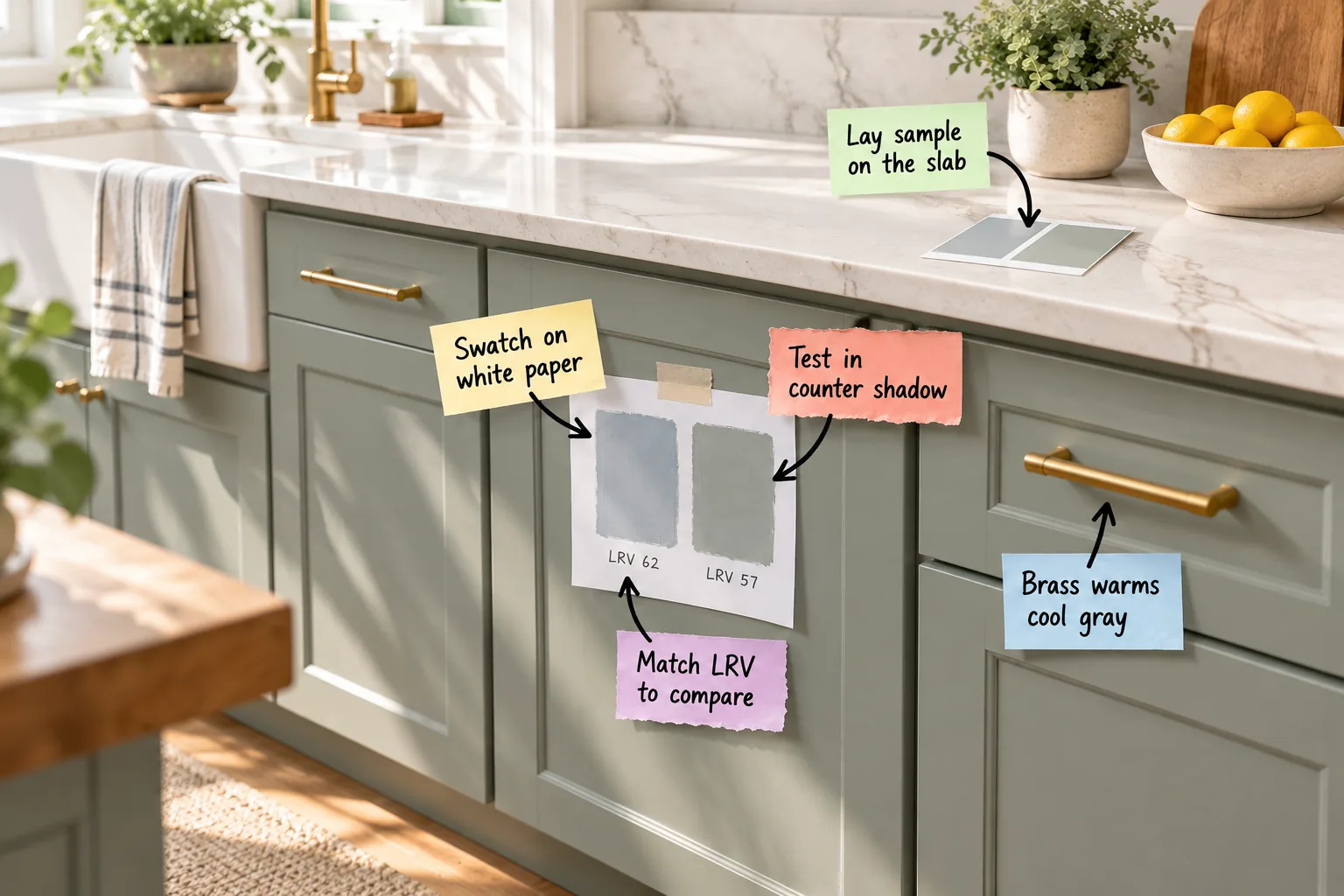
Finding the perfect neutral is a delicate balancing act, but downloading our Gray Cabinet Undertone Test Sheet gives you a printable step-by-step sequence to compare two grays accurately. You will confidently isolate paint undertones and select a shade that perfectly complements your unique lighting and countertops.
Isolating Undertones on Pure White
Taping your painted swatches directly to a piece of standard bright white printer paper forces your eye to register the true color. Without a stark white background, your vision automatically adjusts to the surrounding room, causing you to miss subtle biases.
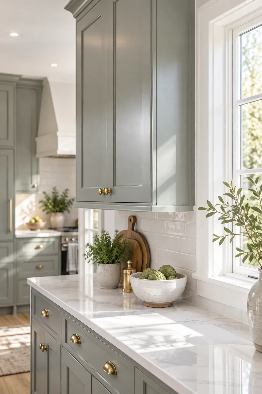
In my own Denver kitchen remodel, skipping this step initially blinded me to a strong blue bias that only became obvious after painting a whole door. To get the most accurate read from your paper test, completely isolate the new color from the old one.
Matching LRV for an Honest Comparison
Light Reflectance Value measures how much light a color bounces back on a scale of 0 to 100. When comparing two grays, ensure you select LRVs within 3 to 5 points of each other—like a 57 and 62—so brightness differences do not distract you from evaluating the actual undertone.
Evaluating the Final Cabinet Sheen
Flat paint absorbs light, while satin or semi-gloss finishes reflect it back into the room. Always paint your test swatches in the exact enamel sheen you plan to use on the cabinets to gauge the true final appearance.
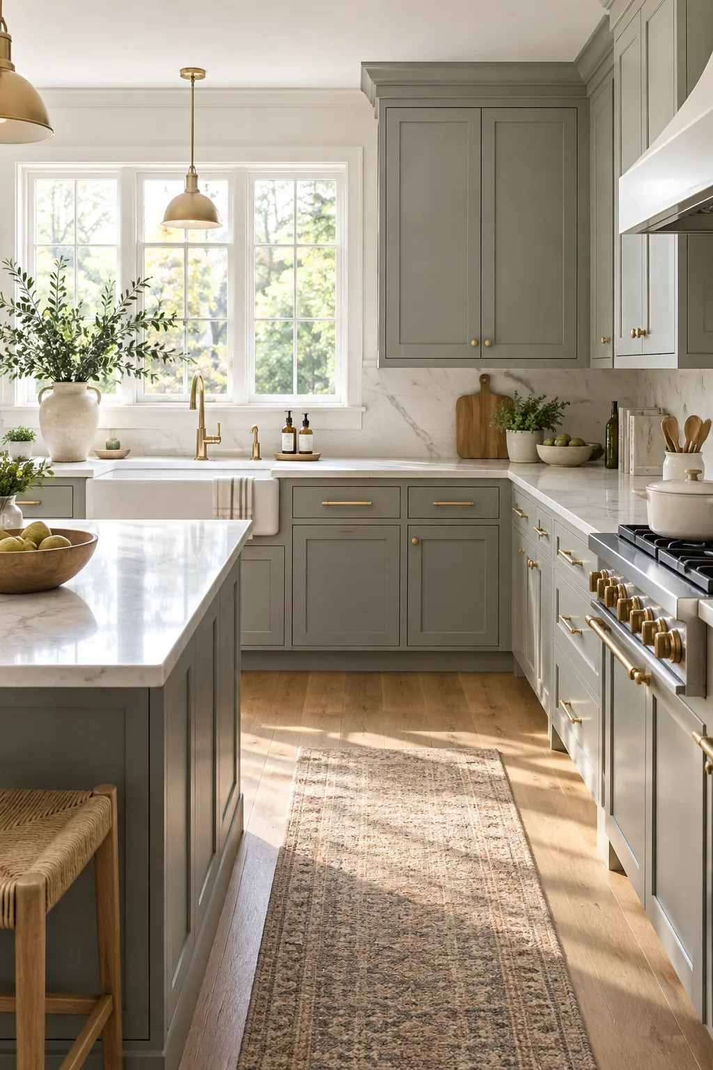
This added reflection will slightly lighten the perceived color and amplify the underlying green or blue tones, making your initial paper test even more crucial for final validation.
The Countertop Shadow Effect
Lower cabinets typically sit beneath a 1.5-inch countertop overhang, placing their top edge in a permanent soft shadow. Testing your sample directly in this darker zone reveals how the reduced light deepens the gray in its natural habitat.
- Locate the shadow band immediately beneath the counter overhang.
- Tape your painted sample board high on the base cabinet door.
- Observe how the shadow interacts with the paint’s undertone throughout the afternoon.
Pairing Grays With Slab Veining
The gray cabinet must share the exact visual temperature as the countertop veining to avoid a muddy transition. Lay the painted sample flat on the quartz or marble slab right next to a prominent vein to check this critical harmony.
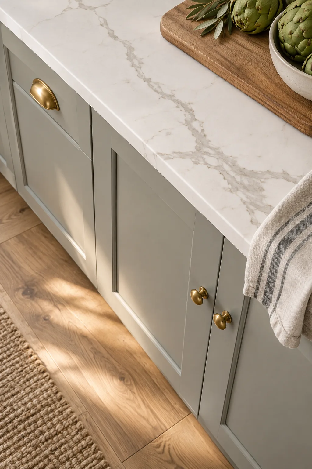
I once had a client fall in love with a cool slate gray, but placing it against her warm-veined Calacatta marble immediately revealed a clashing disconnect. Always verify that your cabinet undertone aligns perfectly with the stone’s dominant secondary color.
Warming Up Cool Grays With Brass
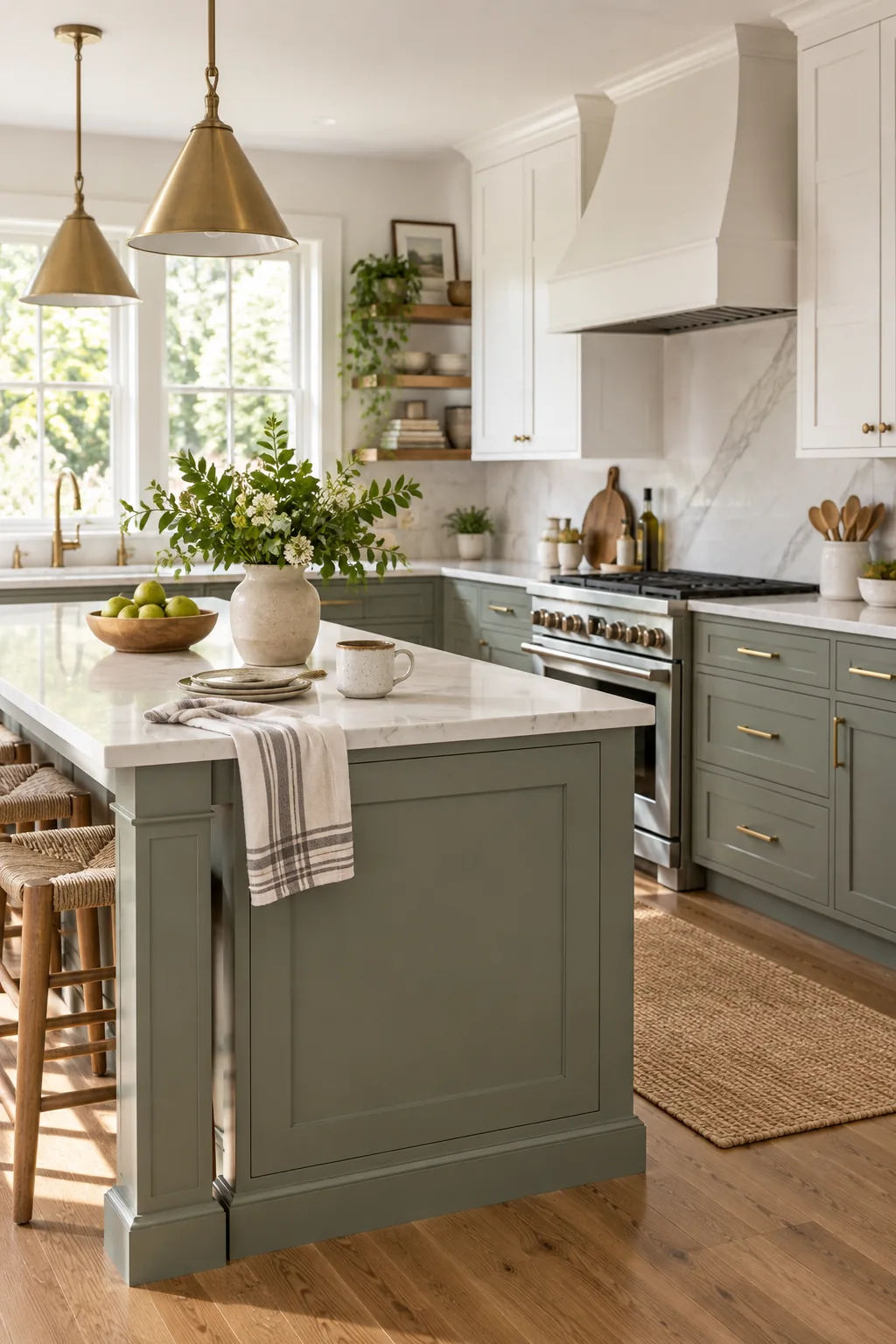
Hardware dramatically alters how a cabinet color reads in the physical space. Introducing satin brass pulls injects immediate warmth, balancing out stark blue-grays and enhancing the earthy, organic feel of subtle green-grays.
| Cabinet Undertone | Brass Finish Effect | Resulting Vibe |
|---|---|---|
| Cool Blue-Gray | High contrast warmth | Crisp and balanced |
| Warm Green-Gray | Harmonious blending | Earthy and organic |
| True Neutral Gray | Subtle color injection | Classic and inviting |
Coordinating Undertones With Floor Tones
Floors bounce colored light directly onto your lower cabinets, drastically altering their appearance. A warm oak floor will cast a yellow glow upward, potentially turning a perfectly neutral gray into a subtle, unintended green.
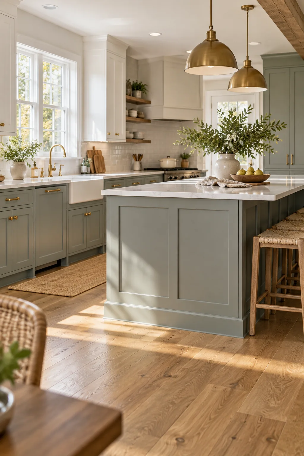
This reflective color shift makes floor coordination just as critical as the countertop match, requiring you to evaluate the painted swatch exactly where the wood tones hit the baseboards.
The Two-Gray Undertone Test Sheet
This printable one-page sequence guides you through the complete comparison process, bringing all these testing phases together. It covers the white-paper check, matching LRVs, and using the countertop-veining pairing grid to make an informed final decision.
Four Ways to Style Gray Kitchen Cabinets
Explore how different gray undertones and finishes can completely transform the mood of a kitchen.
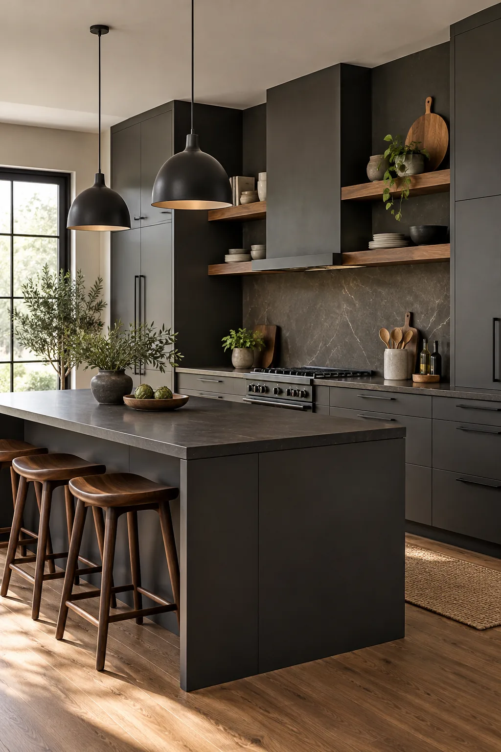
Modern Minimalist Charcoal: Deep charcoal gray provides a striking, high-contrast anchor when paired with sleek matte black hardware and warm walnut accents.
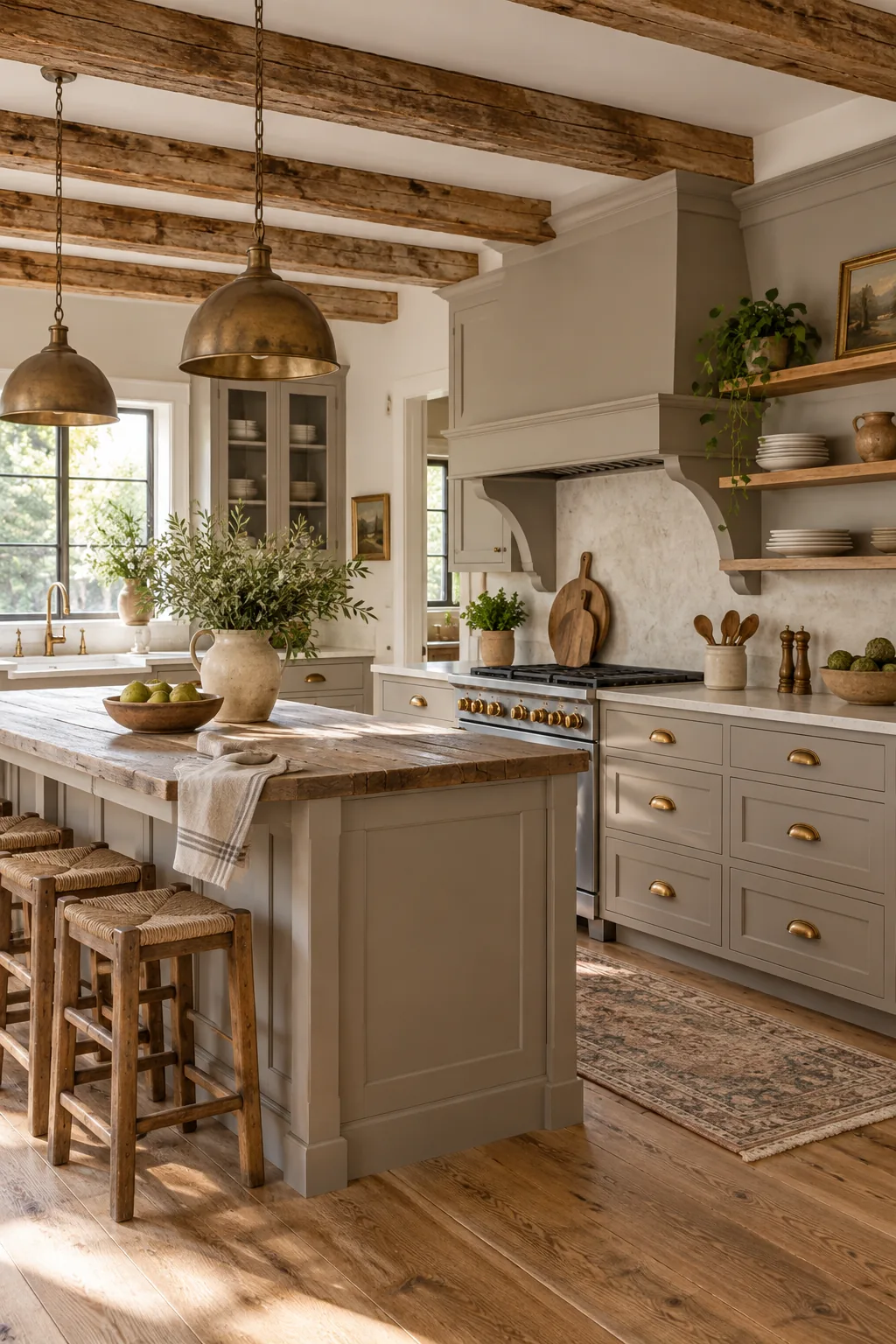
Rustic Farmhouse Greige: A warm mushroom gray bridges the gap between beige and gray, perfectly complementing aged brass and rustic reclaimed wood.
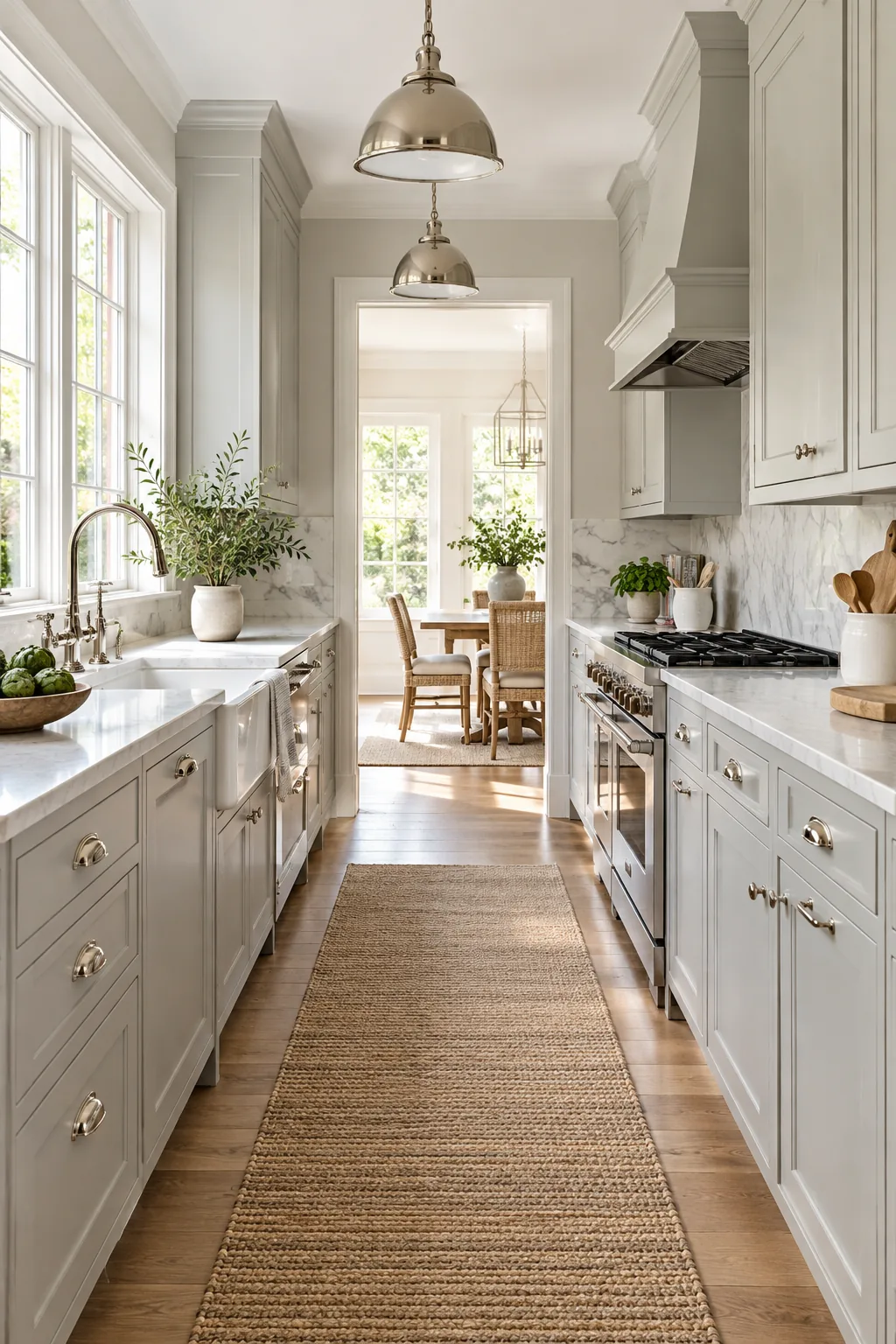
Classic Transitional Dove Gray: Pale dove gray offers a softer alternative to stark white, looking exceptionally elegant alongside polished nickel and classic marble.
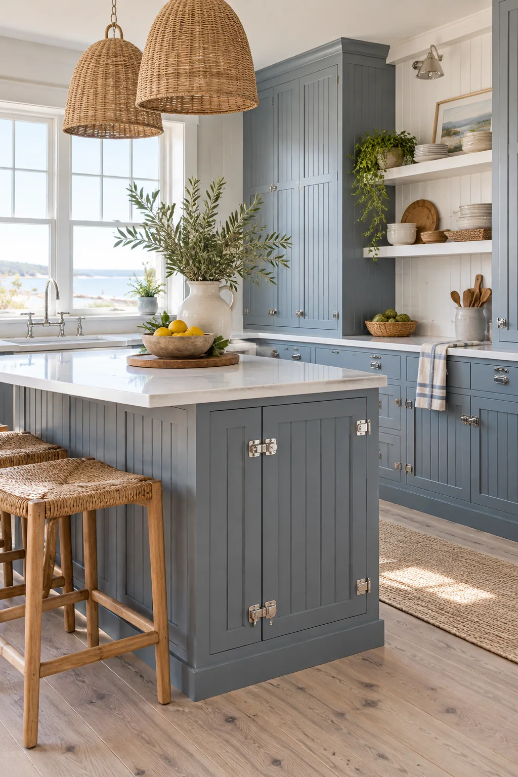
Coastal Cottage Blue-Gray: Leaning into cool blue undertones creates a breezy, relaxed coastal atmosphere that pops beautifully against whitewashed oak floors.
Finalizing Your Cabinet Color
Review your final samples at morning, noon, and night to ensure absolute stability. The right gray will maintain its intended character across all natural and artificial lighting conditions without turning unexpectedly icy after the sun goes down.
By methodically testing undertones against pure white, matching LRVs, and evaluating the physical environment, you guarantee a cabinet color that glows beautifully in your unique kitchen space.