
The Black & White Kitchen: Your 80/20 Palette Ratio Guide
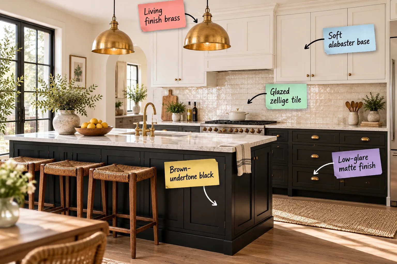
You can master the warmth balance in a high-contrast space by downloading our complete 80/20 palette ratio guide to mix matte finishes, zellige tile, and brass. This exact formula will help you balance stark monochrome contrast with inviting warmth in your own kitchen remodel.
Grounding the Room with Warm Black
Stark, blue-based black feels cold in large doses, which is why grounding the island in a brown-undertone black prevents the room from feeling top-heavy. Testing swatches in natural light ensures this deep base anchors the room while maintaining essential warmth.
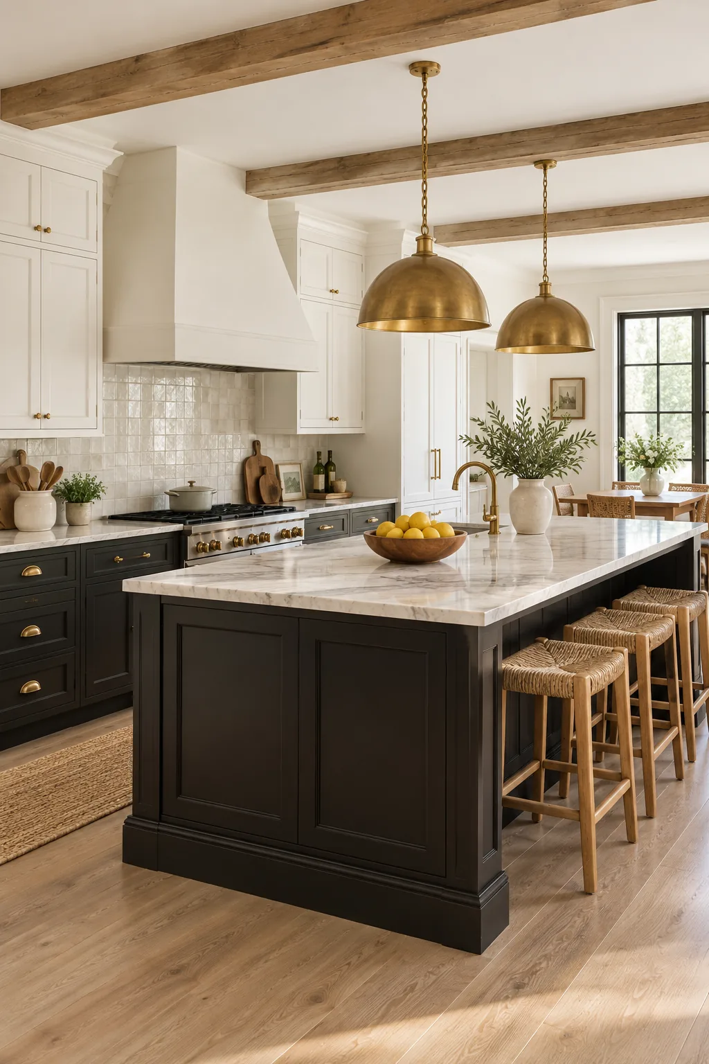
Testing Black Swatches in Natural Light
Evaluating your paint samples throughout the day is critical because changing sunlight dramatically shifts how we perceive dark undertones. You should observe the swatches on vertical surfaces during morning, noon, and late afternoon to verify the brown base remains visible.
| Time of Day | Light Quality | Undertone Effect | Action Required |
|---|---|---|---|
| Morning | Cool, blue-tinted | Mutes brown warmth | Check for starkness |
| Noon | Bright, direct | Highlights true color | Verify depth |
| Afternoon | Warm, golden | Enhances brown base | Confirm coziness |
Choosing a Low-Glare Finish
A low-glare matte finish absorbs light to soften the heavy footprint of dark cabinetry, and I always use a 10 to 15 percent gloss level in my Denver projects to balance light absorption with durability.
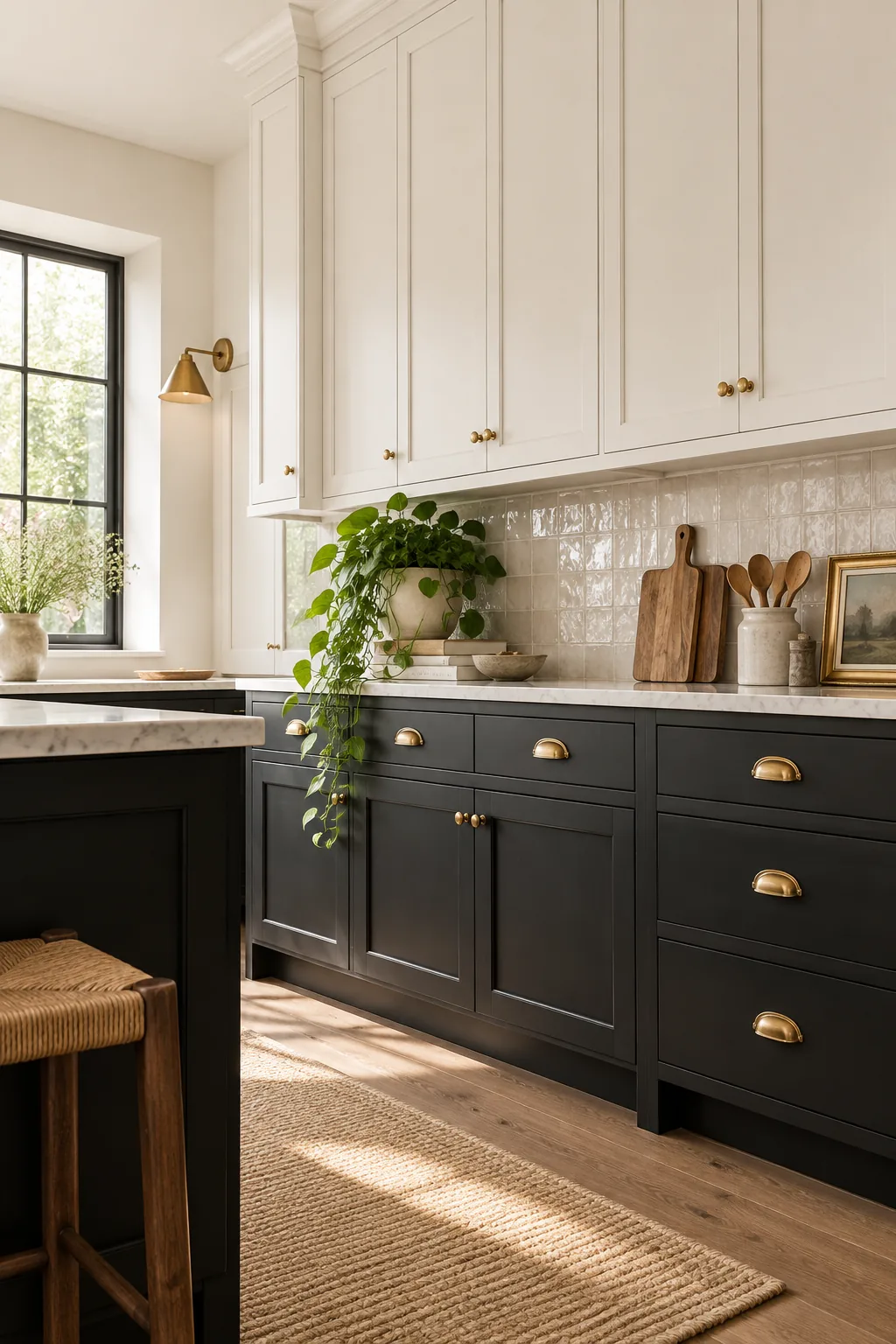
Getting the color right is only half the battle; selecting the wrong sheen can instantly ruin the cozy atmosphere you are trying to build.
Evaluating Sheen Durability Over Time
Matte surfaces often require specialized cleaning to prevent burnishing, which occurs when excessive rubbing creates unintended shiny spots. Using a microfiber cloth with a gentle, pH-neutral cleaner preserves the protective clear coat while easily lifting daily kitchen grease.
Lifting the Eye with Alabaster
Transitioning to upper cabinets using a soft alabaster base rather than hospital white creates a seamless visual lift that matches the ceiling color. This creamy tone softens the contrast line and makes ceilings feel taller without ever feeling sterile.
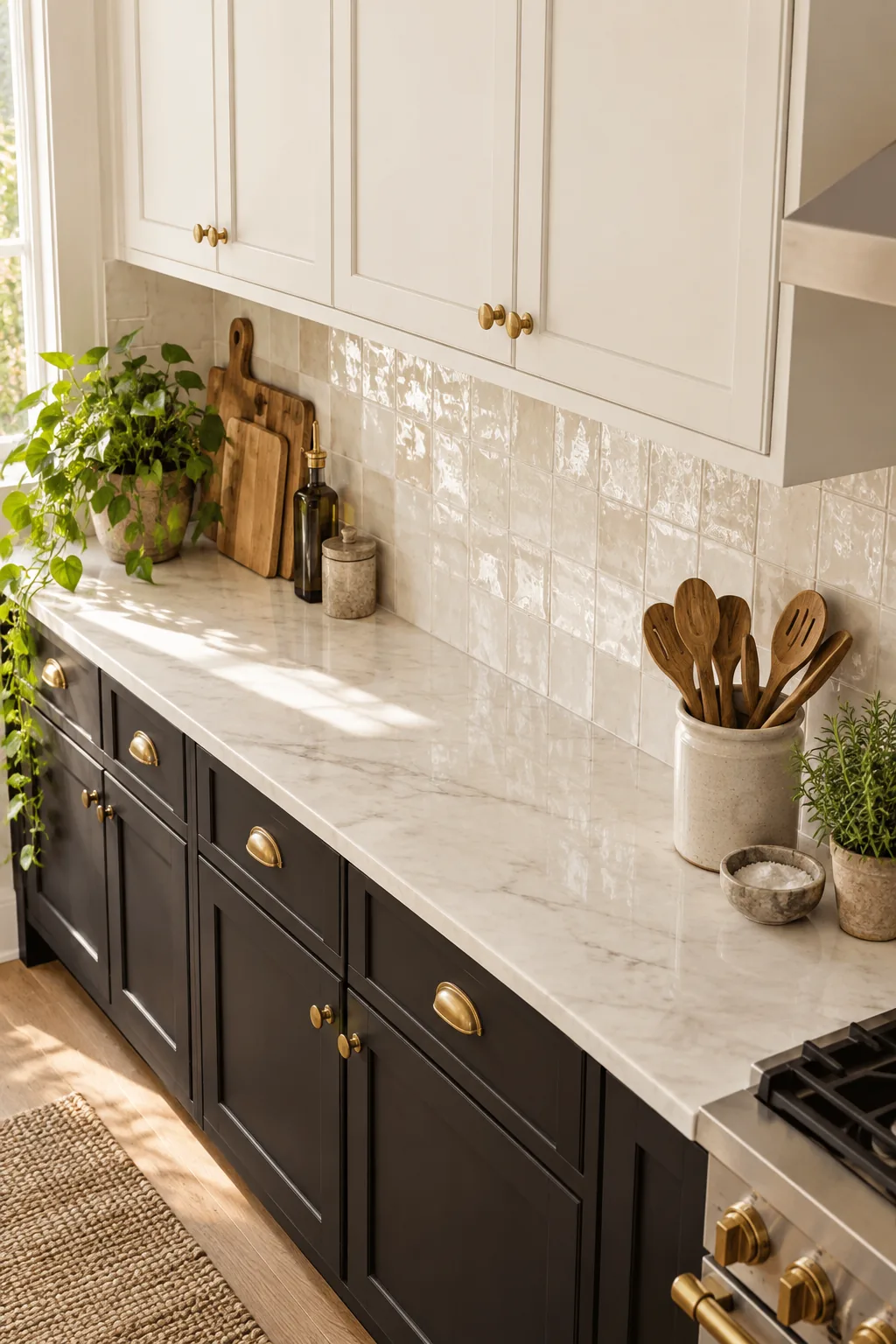
Matching Upper Cabinets to Ceiling Whites
Carrying the exact alabaster tone from the cabinet faces up across the ceiling plane eliminates harsh horizontal visual breaks. This continuous wrap of warm white reflects ambient light downward, amplifying the spaciousness of the upper visual zone.
Bridging the Gap with Texture
Using the uneven glaze of glazed zellige tile creates a transitional reflective zone between the matte lowers and soft uppers. Standard 4×4 square tiles with a tight 1/16-inch grout line act as a perfect reflective bridge.
Selecting the Right Grout for Zellige
Pairing your handmade tiles with a subtle, warm gray grout highlights the irregular edges without creating a busy grid pattern. A non-sanded grout is essential here to avoid scratching the delicate surface glaze during the installation process.
Warming the Palette with Brass
Breaking up a monochrome palette requires living finishes that patina over time to inject warmth, like the unlacquered brass hardware I chose for my own kitchen remodel. These raw metals age gracefully, building unique character that softens the stark black and white.
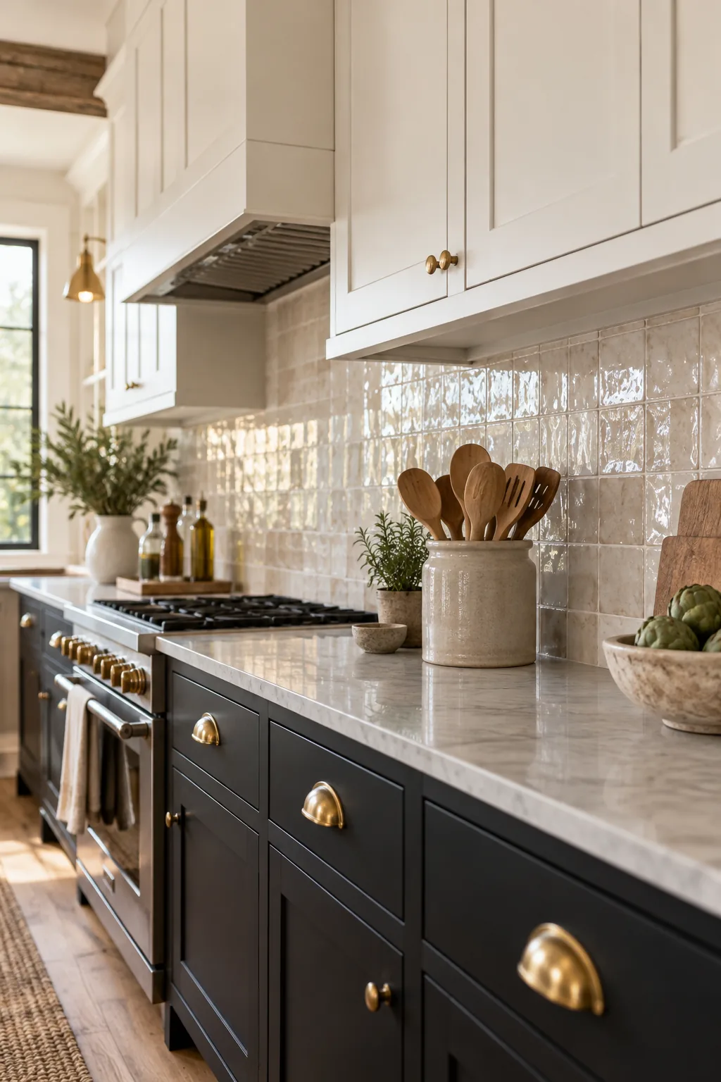
Caring for Unlacquered Brass Finishes
Allowing raw brass to oxidize naturally means embracing uneven darkening where hands frequently touch pulls and knobs. If the patina becomes too heavy, a gentle polish with a specialized brass cream will carefully restore the original bright golden highlights.
Incorporating Organic Wood Tones
Layering organic textures like woven seagrass softens high-contrast boundaries and prevents the room from feeling like a rigid showroom. Incorporating two to three distinct wood elements ensures the space remains grounded and approachable.
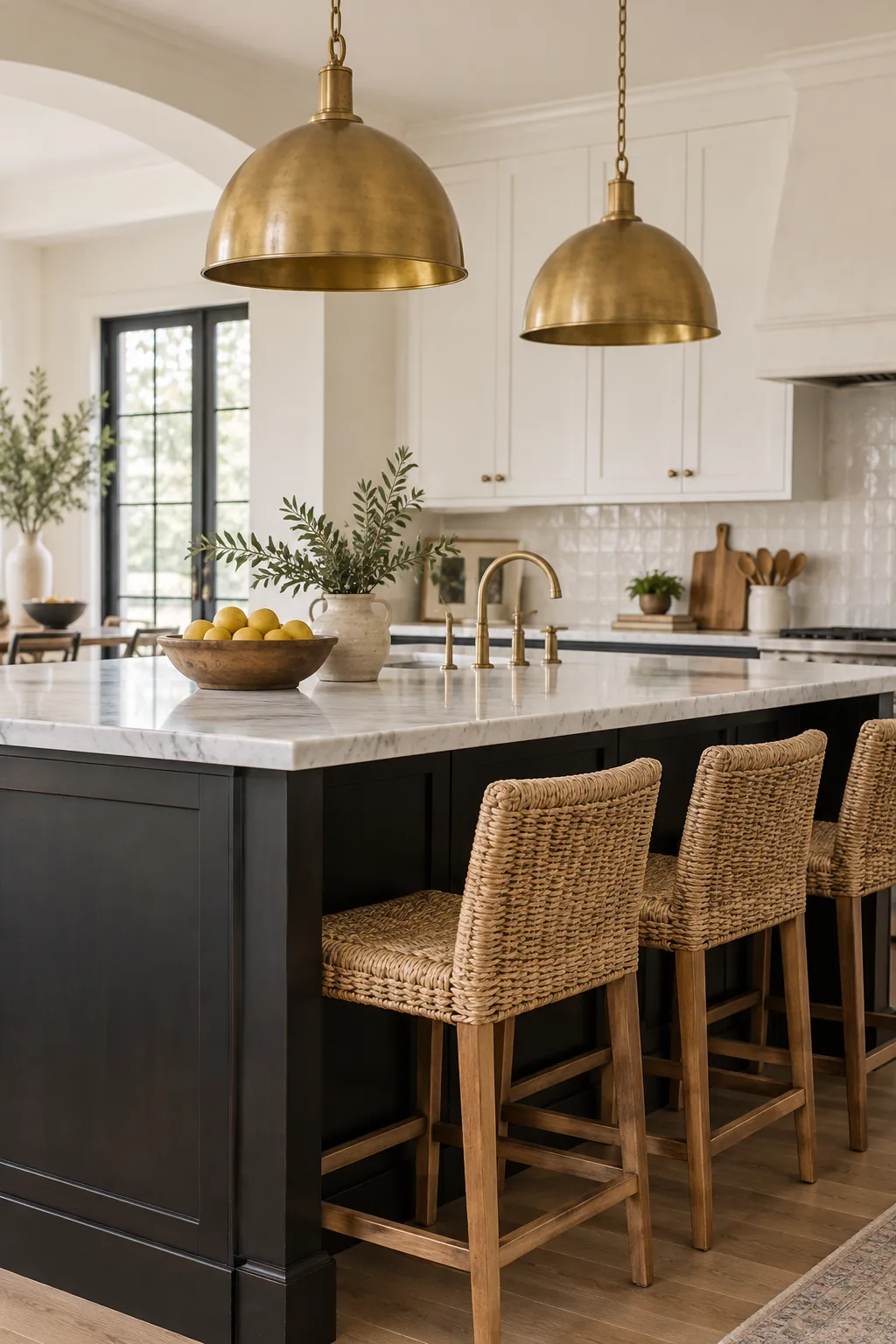
Balancing Wood Tones Across Zones
Distributing your wood accents evenly across the lower, middle, and upper sightlines prevents visual clustering in one area. Placing a white oak cutting board on the counter perfectly balances woven stools below and open wooden shelving above.
Framing the View with Contrast
Black window sashes frame natural light and echo the island’s grounding color, a trick I use to draw the eye outdoors seamlessly. This creates a cohesive sightline without adding new colors to our carefully balanced palette.
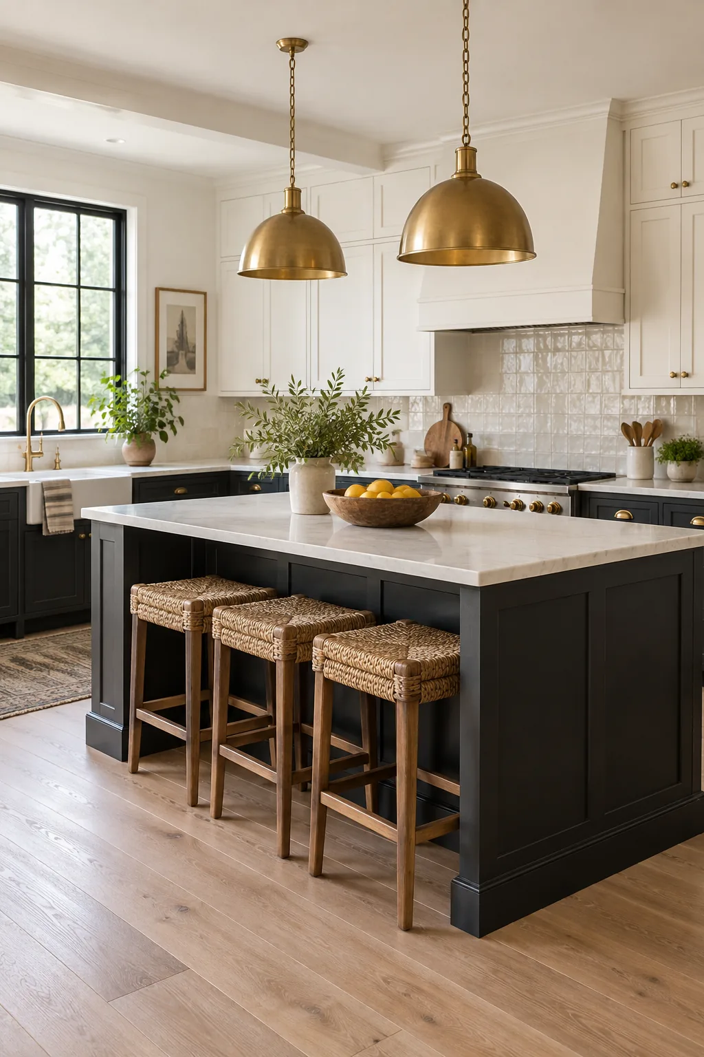
Aligning Window Sashes with Sightlines
Painting the interior mullions to match the lower cabinets establishes a deliberate rhythm that guides your gaze through the room. This high-contrast perimeter detailing defines the architectural boundaries while letting the vibrant outdoor landscape act as the focal point.
The 80/20 Palette Ratio Guide
Visualizing the final 80/20 balance across the completed kitchen design means dedicating 80 percent of the space to foundational black and white blocks. The remaining 20 percent is reserved strictly for warming elements, a rule that saved my own recent layout from feeling stark.
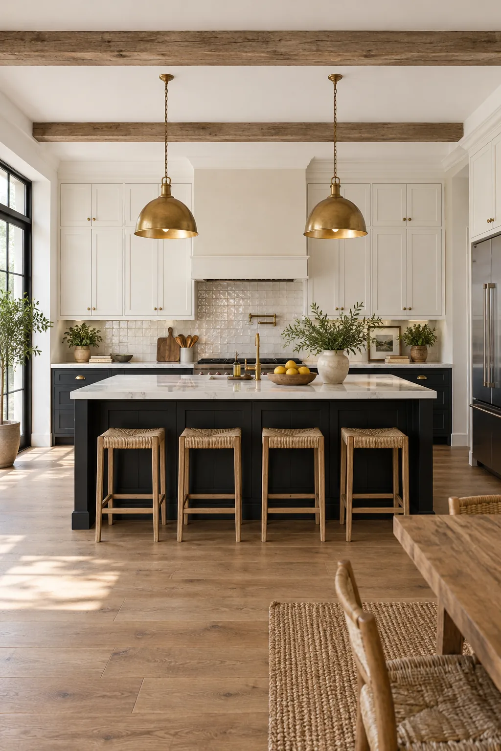
Before finalizing your material orders, run your design through this quick ratio check to ensure the warmth balance is perfectly dialed in.
5 Ways to Style a Black & White Kitchen
Explore how this high-contrast foundation adapts to completely different architectural styles and moods.
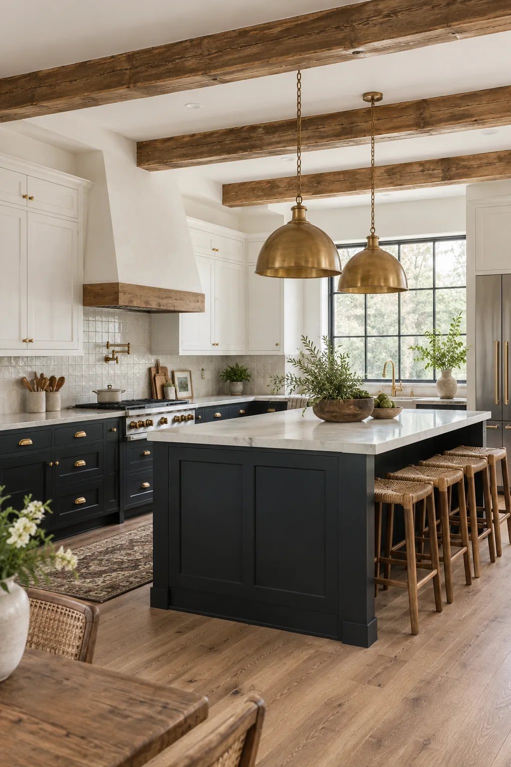
Modern Farmhouse: Charcoal and chalk tones blend beautifully with rustic reclaimed wood beams for a cozy, lived-in farmhouse aesthetic.
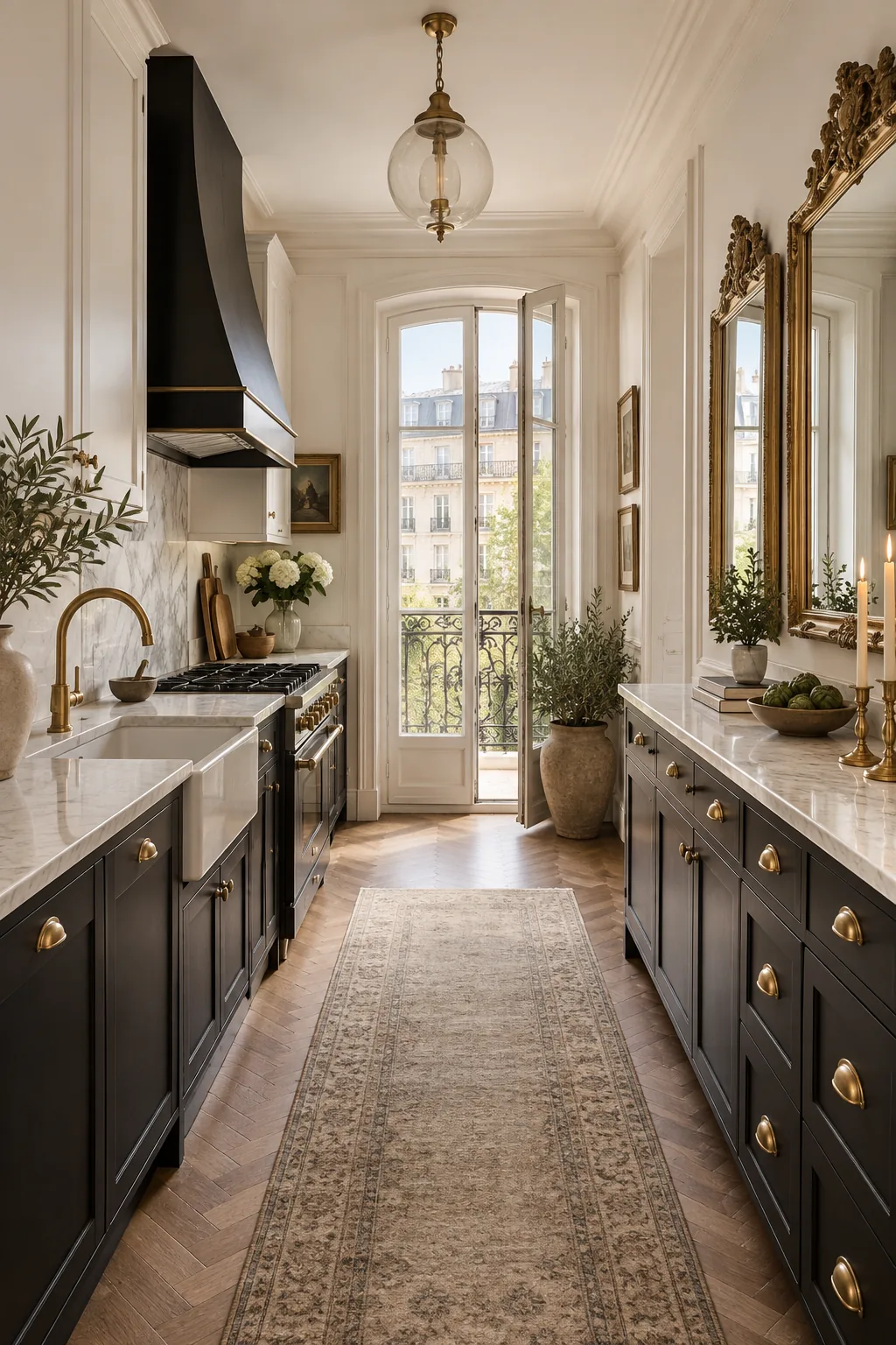
Parisian Apartment: Deep ink black bases ground this narrow galley, allowing ivory walls and ornate brass details to shine.
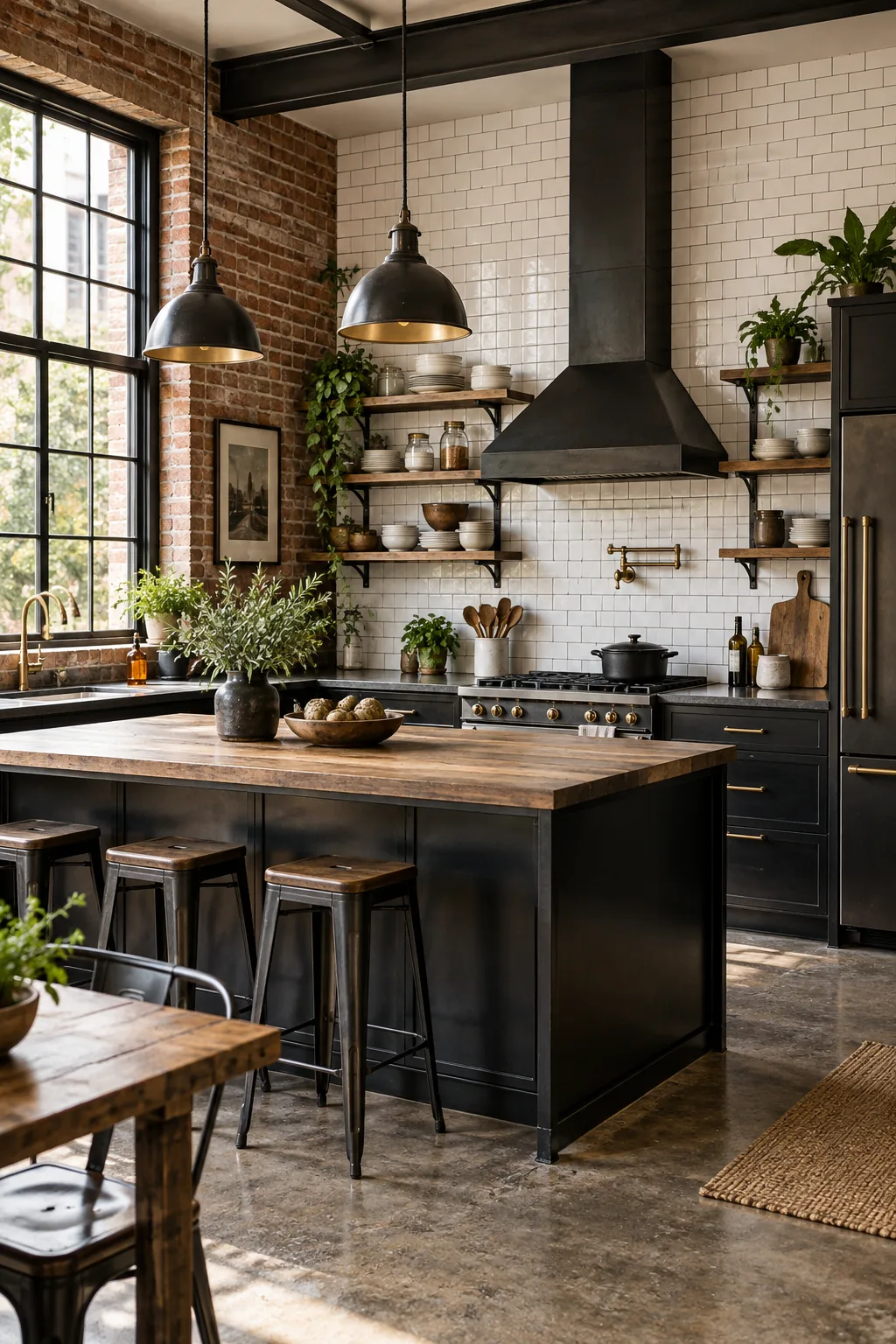
Industrial Loft: Pitch black metal cabinetry and bright white subway tile create a striking contrast against raw exposed brick.
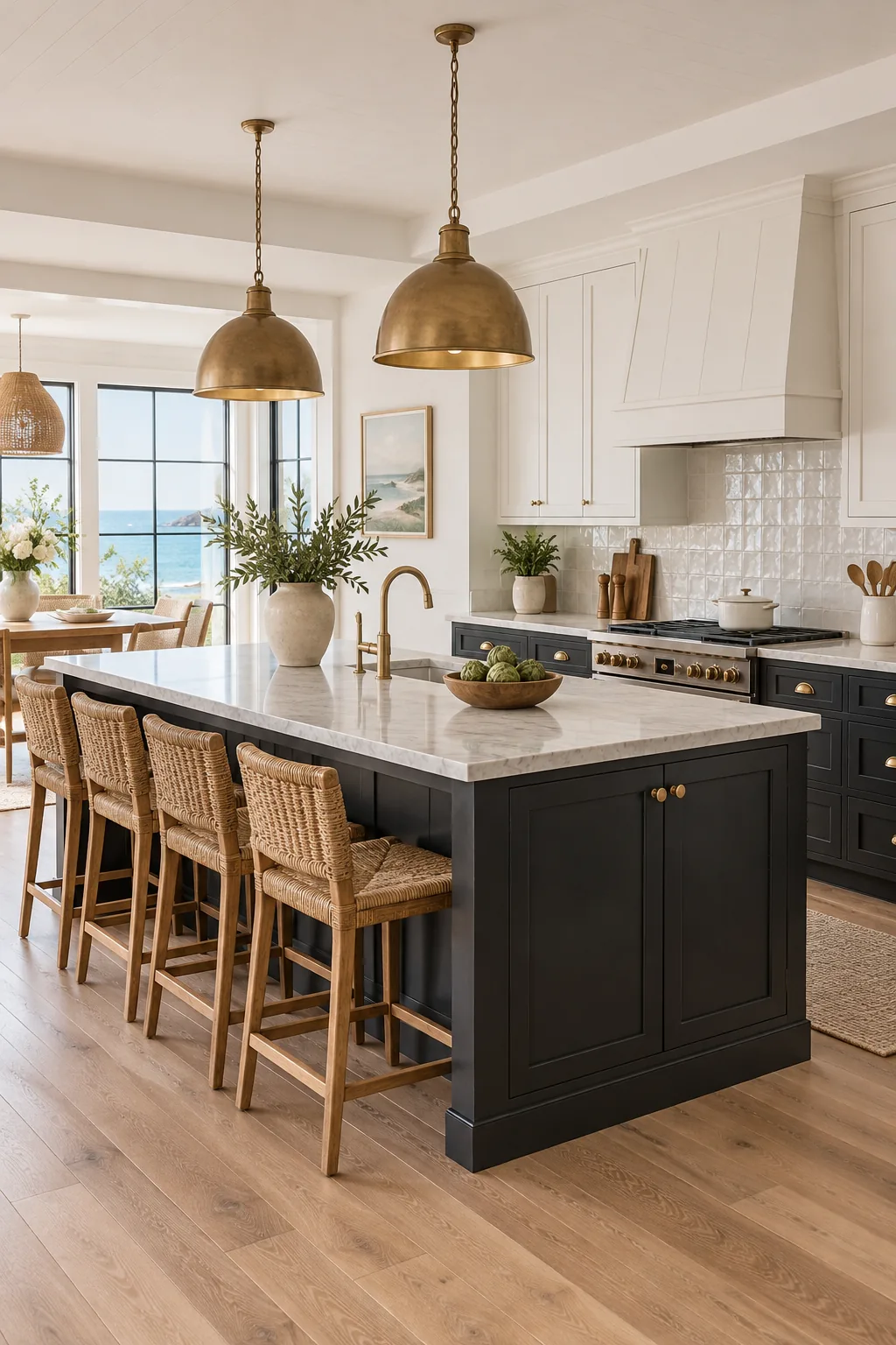
Coastal Transitional: A soft faded black island anchors the room while sea-salt white uppers and light oak floors keep it breezy.
Minimalist Scandi: Matte ebony flat-panel cabinets and stark white counters deliver clean lines, warmed gently by pale ash wood details.
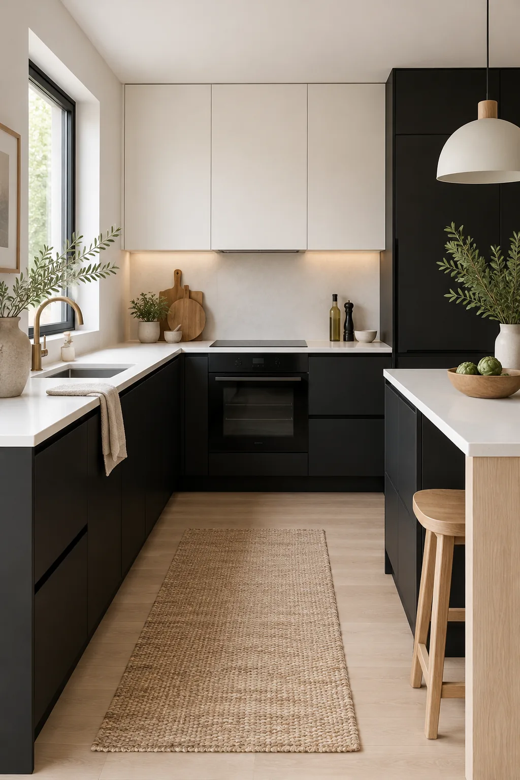
Measuring Visual Weight in the Kitchen
Calculating this ratio involves looking at the surface area of your primary materials rather than counting individual objects. When the large planes of your cabinets and walls dominate, the smaller tactile accents naturally provide exactly enough warmth to complete the room.