Letter Board Styling Secrets & Printable Layout Cheat Sheet
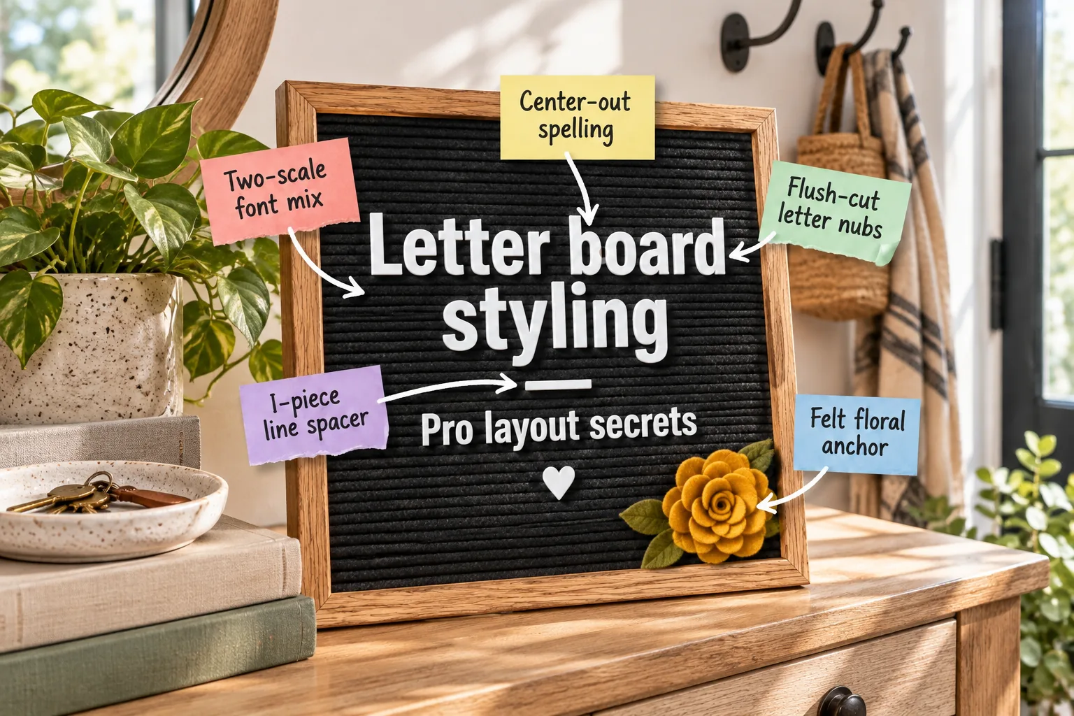
You can easily trim, space, and style a flawless letter board quote using professional layout techniques by grabbing our free printable layout cheat sheet. This simple guide helps you perfectly center your favorite text and mix fonts beautifully every time.
Trimming Letters for a Flush Fit
A perfectly flat, tight letter sitting flush against the felt is the absolute foundation of a polished board. When you achieve this snug fit, clean edges prevent those distracting, messy shadows from forming behind the text when overhead sunlight hits.
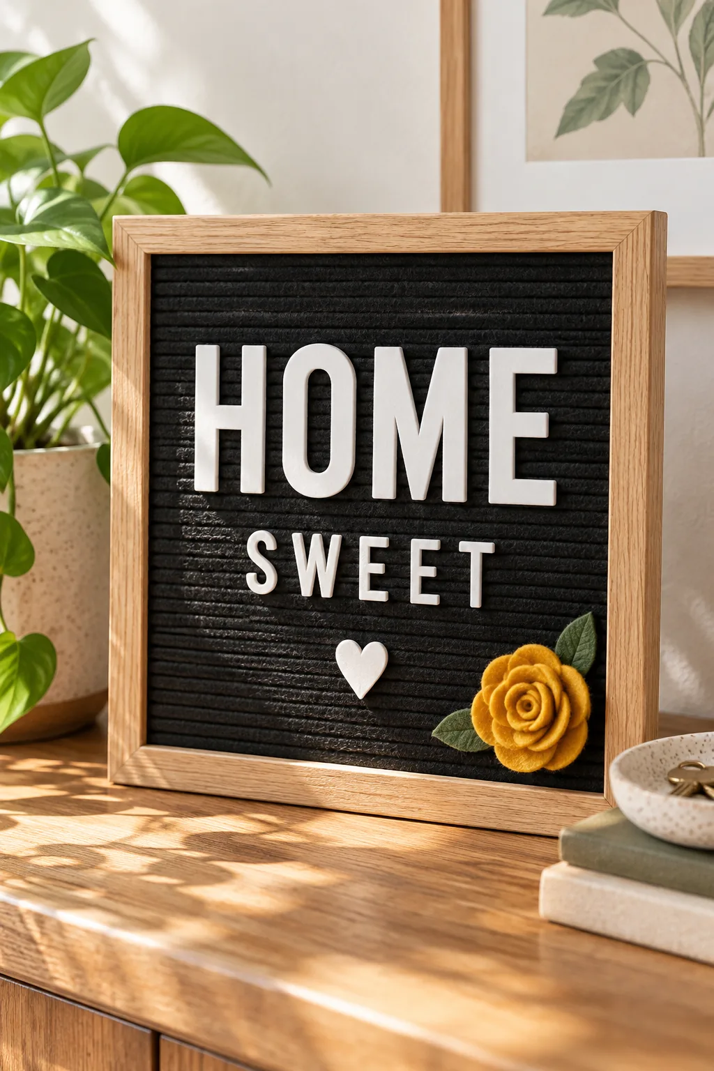
You must clip the plastic nubs off the back of every new letter completely flat using sharp flush cutters. Leaving a strict 0-millimeter gap ensures the characters sit tightly against the narrow grooves without tilting forward or falling out.
Selecting the Best Cutting Tool
Twisting letters off the plastic sprue leaves jagged edges that catch on the delicate felt background and push the character outward. Using the wrong tool damages the plastic stems and ruins the friction grip required to hold the quote.
| Tool Type | Cut Quality | Felt Safety |
|---|---|---|
| Standard Scissors | Leaves 2mm plastic tab | Low |
| Craft Knife | Uneven slicing risk | Medium |
| Jewelry Flush Cutters | 0-millimeter flat back | High |
Investing in a small pair of wire snips guarantees that every single letter presses deeply into the board for a secure, professional hold. This tiny tool upgrade makes the entire assembly process faster and infinitely more satisfying.
Sanding Stubborn Plastic Edges
If you accidentally leave a tiny burr on the back of a crucial vowel, gently buffing it with a fine-grit nail file smooths the surface. This quick sanding step prevents the sharp plastic from snagging and pulling the felt fibers.
Organizing Your Letter Inventory
Dumping hundreds of loose characters into a single bag guarantees immense frustration when you need one specific vowel to finish a long phrase. Sorting your pieces beforehand streamlines the styling process and keeps your creative momentum flowing smoothly.
- Separate all standard vowels into one dedicated, easily accessible storage compartment.
- Group common consonants like T, S, and R together in larger sections.
- Store punctuation and specialized symbols safely in the smallest corner bins.
A basic plastic tackle box with adjustable dividers keeps your entire character inventory neatly sorted and ready for your next styling session. You will never waste time digging for a missing letter when inspiration strikes.
Storing Fragile Punctuation Marks
Tiny commas, periods, and apostrophes are incredibly easy to lose in a deep storage bin. Keeping these microscopic pieces in a small, sealed pill organizer ensures you always have the right punctuation to complete your favorite grammatical jokes.
Planning with the Layout Cheat Sheet
In my Boston apartment, I guessed my spacing until I kept running out of room, so I created this printable layout cheat sheet you can download right here. Before touching the felt, run your chosen quote through these three quick planning checks.
Calculating Your Exact Center
Finding the true middle of a phrase requires counting every single letter, punctuation mark, and blank space between words as one complete unit. Dividing that total number in half reveals the exact character that belongs in the middle.
Marking the Starting Row
Counting the felt ridges from the top wooden frame down to the middle ensures your primary word anchors the exact vertical center of the display. Marking this specific groove prevents the entire quote from drifting too high.
Drafting on a Flat Surface
Laying your sorted letters out on a clean table before pressing them into the board lets you verify your spelling and character counts. This quick visual check prevents you from realizing you are missing an ‘E’ halfway through assembly.
Spacing Rows with the I-Piece Trick
Whenever I style displays for clients, I rely on a sideways ‘I’ letter temporarily placed between two rows of text to maintain perfect vertical rhythm. This physical spacer removes all the guesswork from aligning multiple lines of text.
Placing this standard letter piece temporarily ensures exactly two felt grooves of empty space between lines. Consistent vertical gaps make longer quotes significantly easier to read and prevent the cramped look of squished typography.
Managing Descending Tails
Lowercase letters with long descending tails require careful vertical placement so they do not overlap with the capital letters in the row beneath them. You may need to add a third spacer groove if your quote features multiple ‘Y’s.
Leaving Room for Ascenders
Tall letters like ‘H’ and ‘T’ demand just as much breathing room at the top of your layout. Keeping a generous border of empty felt between the wooden frame and your first row creates a sophisticated, gallery-like presentation.
Spelling from the Center Out
Finding the exact middle letter of the main centered word and placing it first establishes an unbreakable anchor for the rest of your quote. This single placement dictates the symmetry of the entire finished decorative board.
Securing the First Middle Letter
Pressing the center character firmly into the felt without stretching the fabric requires a gentle, straight-on pushing motion. Wiggling the plastic tabs side to side can permanently warp the delicate black ridges and ruin the tight friction grip.
Working Outward to the Edges
Spelling outward to the left and right from that single point naturally prevents lopsided, off-center quotes without requiring complex mathematical measurements. You simply add one letter to the right, then one to the left, until the word finishes.
Mixing Font Scales for Impact
I always tell my styling clients that a word using oversized letters directly above standard-sized text instantly grabs attention from across the room. This bold typographic contrast elevates a basic message into a striking piece of modern art.
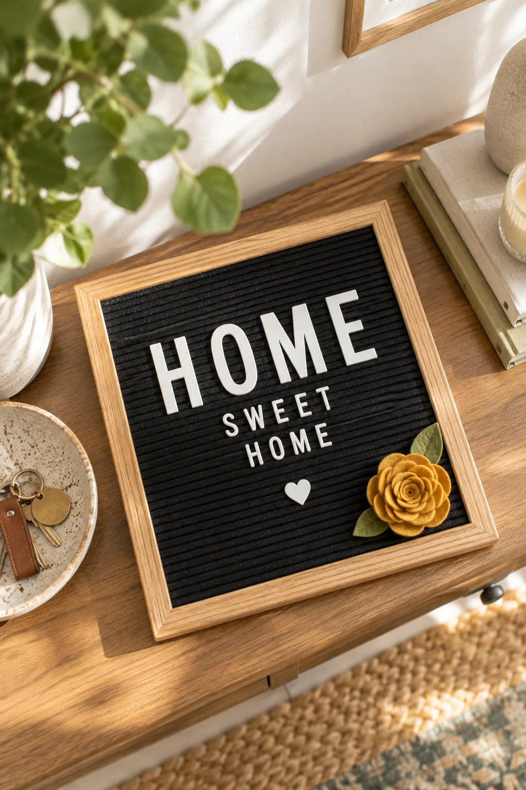
Combining 2-inch oversized letters for the main impact word with standard 1-inch letters for supporting text creates a clear, sophisticated visual hierarchy. Contrasting sizes guide the eye naturally through the sentence and emphasize the most important emotion.
Choosing the Hero Word
Selecting the most emotionally resonant word in your quote to feature in the larger scale dictates the entire mood of your framed display. Highlighting the wrong phrase confuses the reader and weakens the overall visual punch of the design.
Aligning Mixed Font Baselines
Pressing the bottom tabs of both large and small letters into the exact same horizontal felt ridge keeps the baseline sharp and professional. Staggering the bottom edges makes the mixed fonts look messy and completely unintentional.
Creating Negative Space Buffers
Leaving extra horizontal room around your oversized hero word ensures it truly stands out from the smaller supporting text. Crowding the large letters with too many tiny characters diminishes their visual power and clutters the overall composition.
Anchoring the Corner with Felt Florals
Tucking a mustard yellow felt flower into the bottom corner of the board introduces a necessary organic shape to the rigid layout. This pop of warm color instantly softens the stark contrast of the black and white typography.
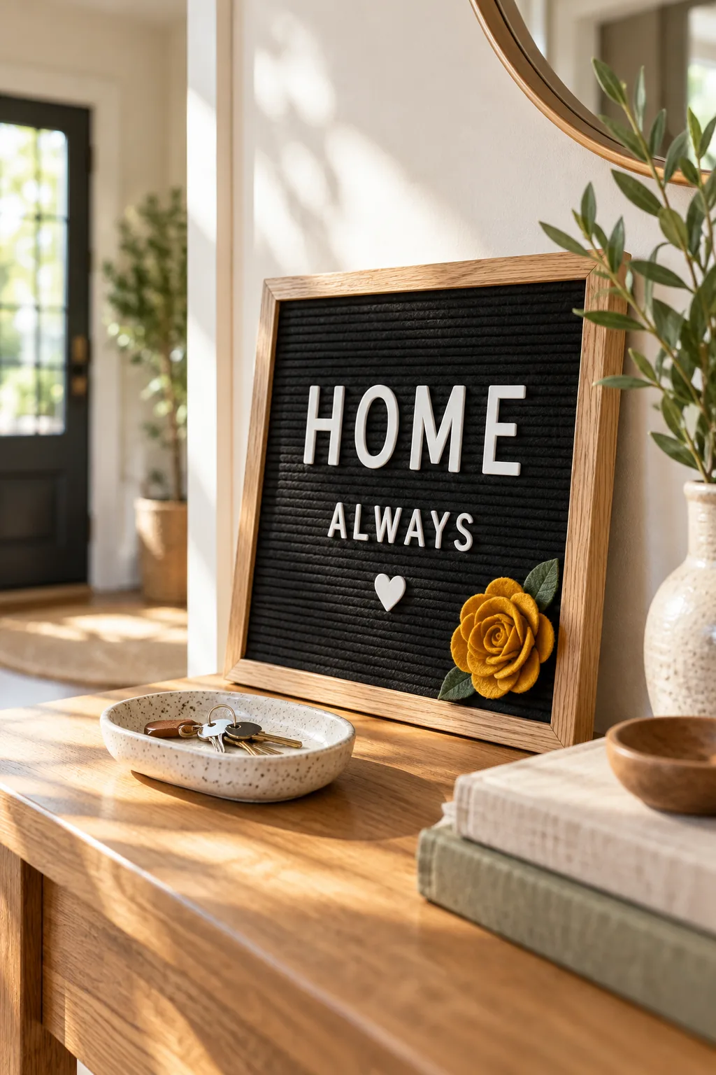
Adding a 3-inch felt flower breaks up the strict grid of the text and brings a soft, tactile element to the wooden frame. Soft textures beautifully balance the rigid lines and make the piece feel incredibly customized.
Selecting Complementary Textures
Matching the wool blend of your floral accents directly to the background material creates a cohesive, high-end finish that plastic decorations simply cannot achieve. Felt-on-felt layering looks incredibly intentional and mimics the aesthetic of expensive boutique signage.
Securing Heavy Corner Accents
Pushing the wire stem of a heavy floral piece deep into the corner seam between the felt and the oak frame keeps it stable. If the flower droops, a tiny piece of double-sided tape hidden behind the petals secures it.
Punctuating with Mini Icons
I keep a tiny white heart symbol permanently wedged in my entryway board to fill awkward blank spaces at the end of short, punchy quotes. While small icons add personality, it is easy to accidentally overwhelm your message with too many extras.
Balancing Asymmetrical Layouts
Placing a single minimalist icon on the lower right side beautifully counterbalances a heavy block of text anchored on the upper left. This strategic placement creates a dynamic diagonal tension that keeps the viewer engaged with the display.
Styling the Console Display
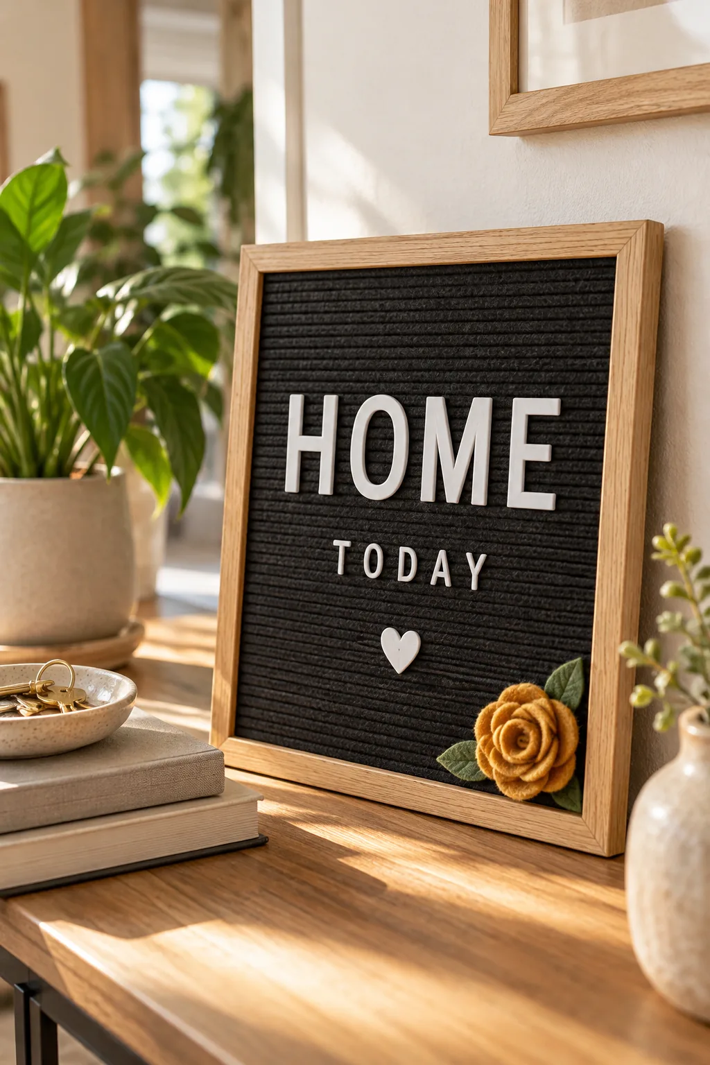
Leaning the finished oak board against a bright entryway wall transforms the piece from a simple craft project into intentional home decor. Integrating the frame into a larger vignette makes the bold typography feel like a natural part of the room.
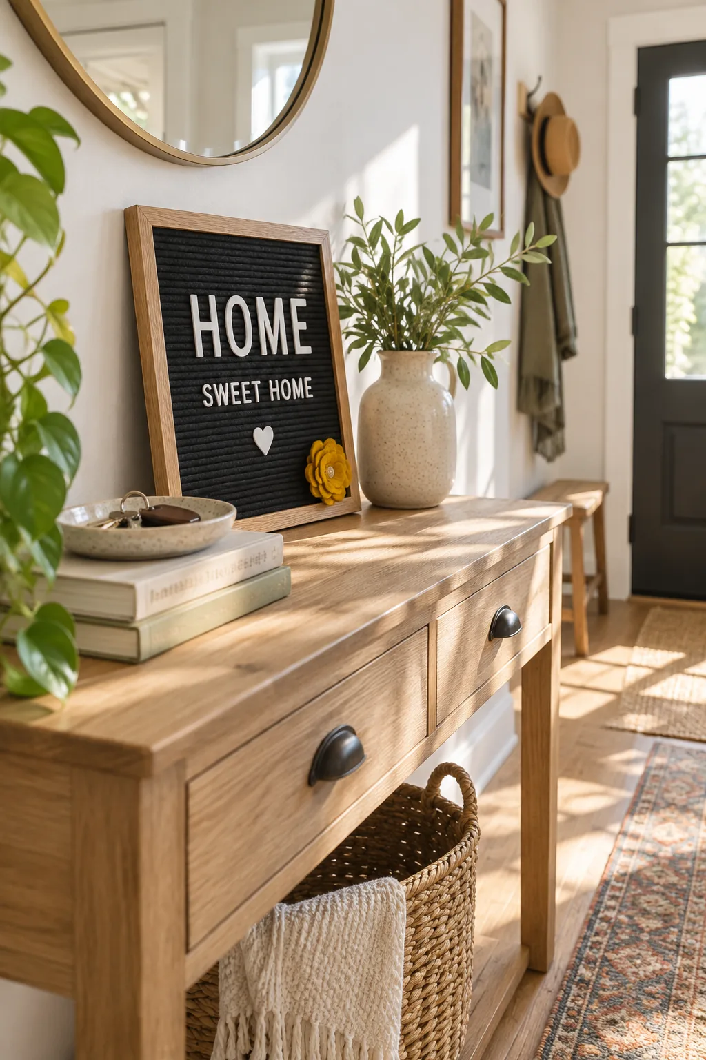
Layering the frame behind everyday functional objects like a ceramic key dish beautifully grounds the piece in your lived-in space. Everyday objects soften the graphic impact of the letters and tie the entire entryway arrangement together perfectly.
4 Letter Board Looks to Try
Explore these distinct styling variations to find the perfect mood for your own space.
Minimalist Scandinavian Workspace: Light grey felt and a raw oak frame keep the look bright and incredibly subtle.
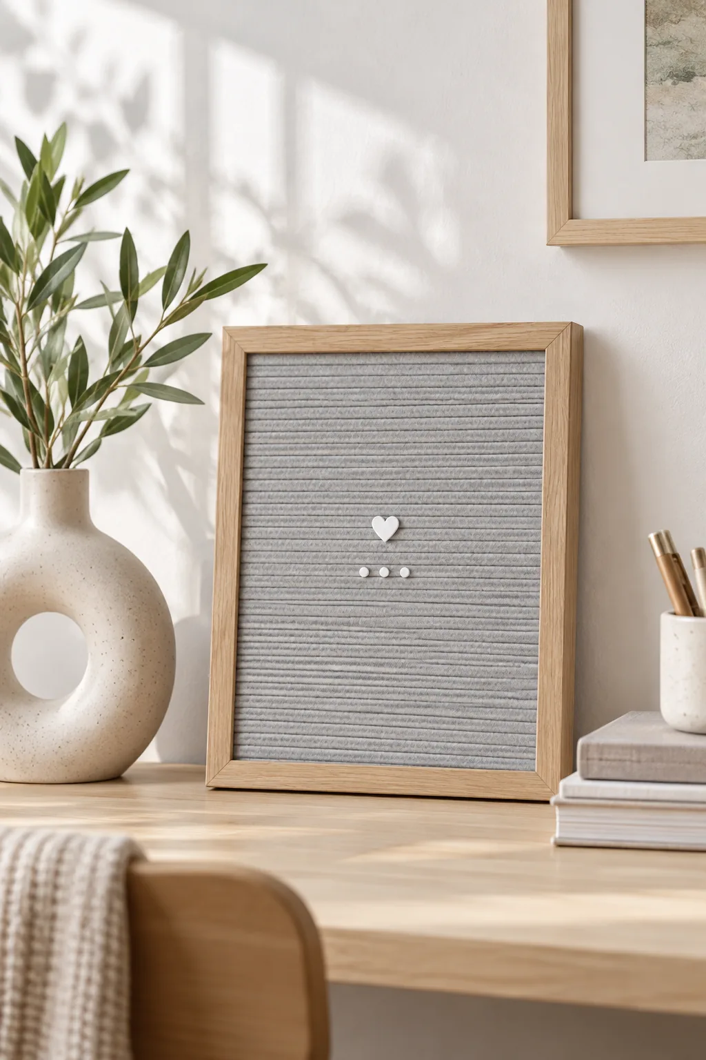
Moody Vintage Library: Deep emerald felt paired with metallic gold letters creates a rich, dramatic focal point.
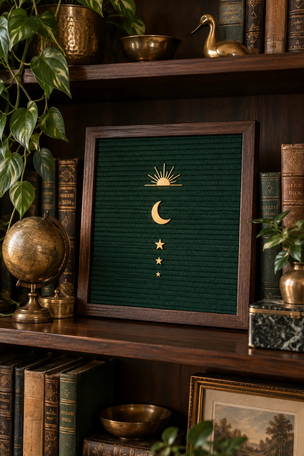
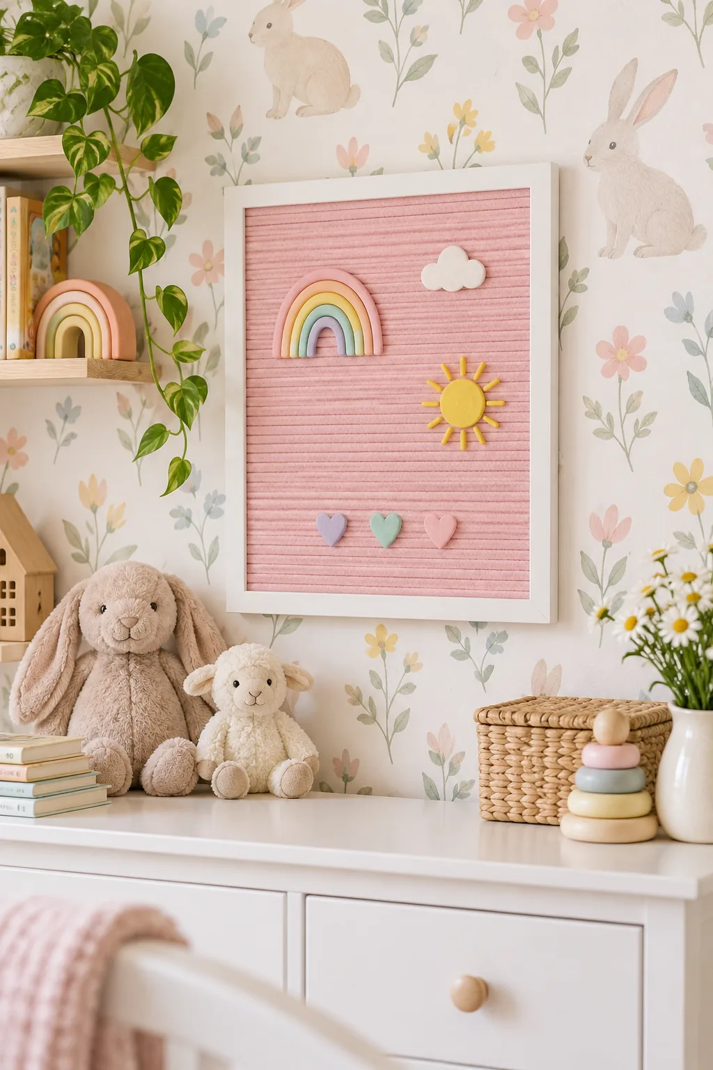
Playful Pastel Nursery: Blush pink felt and multicolored pastel letters add a cheerful, personalized touch to a child's room.
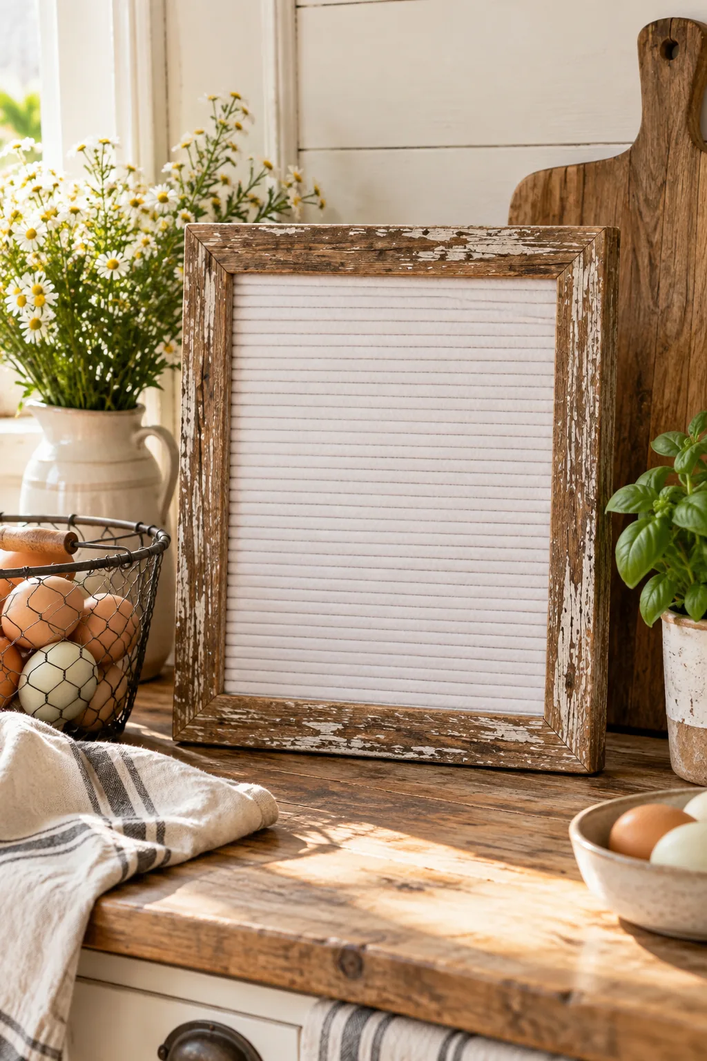
Rustic Farmhouse Kitchen: A distressed barn wood frame and crisp white felt perfectly complement a cozy, rustic kitchen counter.