
The Golden Rules of Interior Design: Your Proportion Cheat Sheet
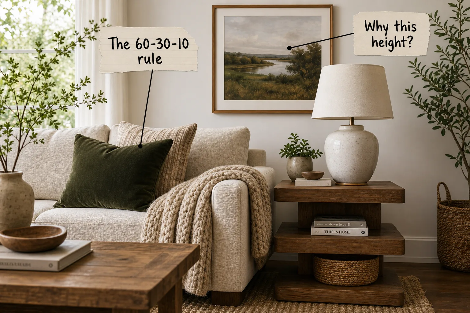
Master visual weight, precise color ratios, and exact hanging heights to style any room like a professional with our complete Designer’s Proportion Cheat Sheet. You will be able to measure, place, and perfectly balance your living room furniture and decor using exact designer proportions.
Establishing the Anchor Piece
Every well-designed room starts with a substantial anchor piece that physically and visually grounds the space. For a living room, this is typically a solid sofa with a standard depth of 38 to 40 inches, providing enough physical mass to build your remaining proportions around.
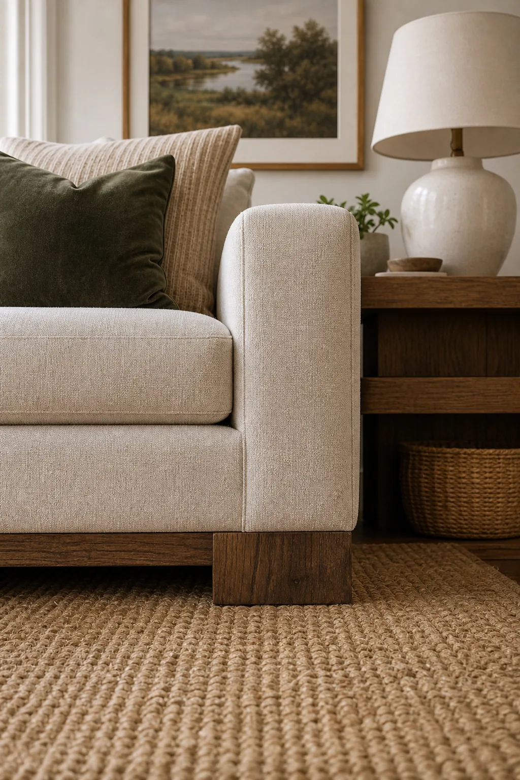
Even the most substantial anchor piece will look completely out of place and visually awkward if it isn’t positioned correctly within the room’s overall footprint before you begin layering your smaller decor.
Defining the Primary Seating Zone
Once your heavy anchor piece is fully established, you must clearly define the outer boundaries of your primary seating zone using a large area rug. A standard 8-by-10-foot or 9-by-12-foot rug perfectly frames a standard sofa, creating a distinct room within a room that dictates placement.
Applying the 60-30-10 Color Rule
Achieve perfect color balance by dividing your room’s entire palette into three uneven slices using the 60-30-10 rule. Dedicate exactly 60 percent of the room to a dominant neutral tone, 30 percent to a secondary color, and exactly 10 percent to a bold accent.
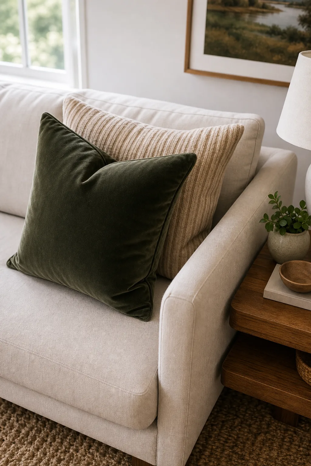
Distributing that final 10 percent through small, easily changeable textiles ensures your high-contrast accent color never overwhelms the foundational neutral tones that do the visual heavy lifting in your carefully planned space.
Selecting the Dominant Neutral Tone
Your 60 percent dominant color should ideally be a calm, flexible neutral like warm white, soft beige, or light gray. Applying this foundational shade to your largest surface areas, including the walls and the primary sofa, creates a quiet backdrop that allows smaller decor pieces to shine.
Layering Texture for Contrast
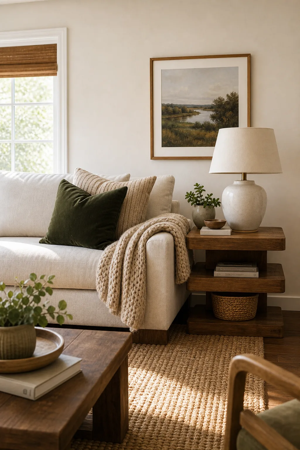
When working with a tight, disciplined color palette, texture contrast becomes your primary tool for adding necessary visual depth. Draping a chunky, heavy-knit throw over a smooth linen or cotton sofa creates immediate visual interest without requiring an additional accent color to draw the eye.
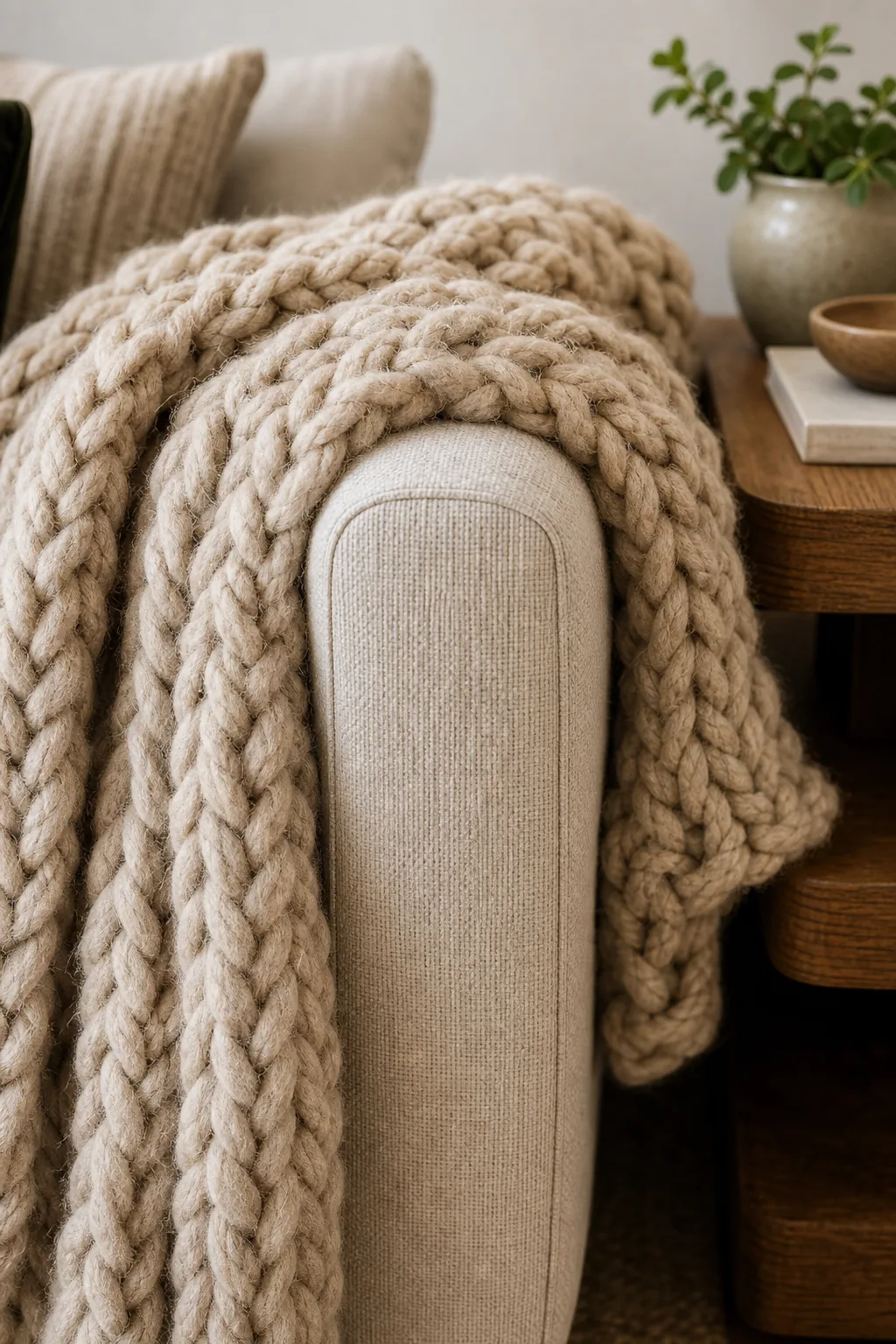
Pairing completely opposite materials against one another elevates a neutral space and prevents matching upholstery from looking flat or lifeless. Using heavily textured textiles allows you to build a cozy, layered environment that still feels remarkably clean, intentional, and perfectly balanced from every angle.
Mixing Woven and Smooth Materials
To maximize the impact of your textiles, ensure that every soft surface contrasts directly with the hard or smooth material sitting immediately beneath it. Placing a rough jute rug under a smooth leather sofa, or a sleek silk pillow on matte wool, creates sophisticated tactile tension.
Balancing Visual Weight
Every object in your room possesses visual weight, which dictates exactly how much attention it demands from the human eye. A solid, opaque ceramic table lamp carries heavy visual weight, making it the perfect dense counterweight to a large, visually heavy sofa base.
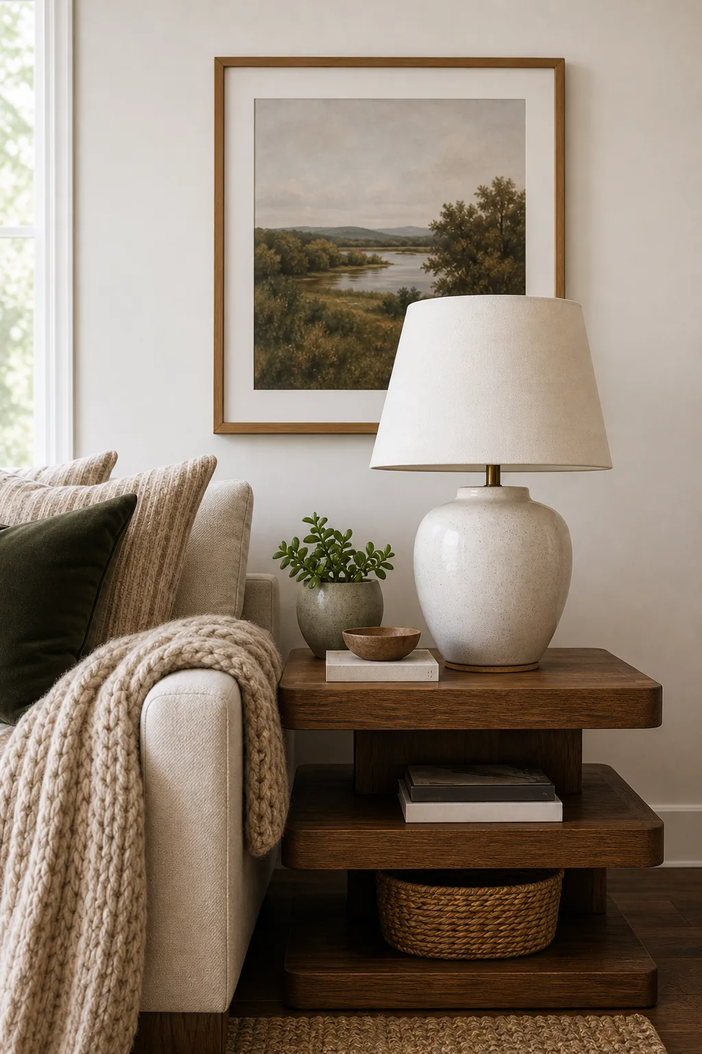
If you used a thin wire or clear glass lamp here, the massive sofa would visually overpower the delicate side table. Matching the visual density of your lighting to your primary seating ensures that neither side of the arrangement feels uncomfortably heavy or physically unsupported.
Matching Furniture Leg Styles
You can further manage visual weight by intentionally mixing the leg styles of your secondary furniture pieces. If your heavy anchor sofa extends entirely to the floor, pair it with side tables or accent chairs that feature exposed, slender legs to keep the room feeling airy.
Hanging Art at the Right Height
The most common design mistake is hanging artwork far too high, leaving it floating disconnected near the ceiling. To connect the art to the furniture below it, the center point of the framed piece should sit exactly 57 to 60 inches from the floor.
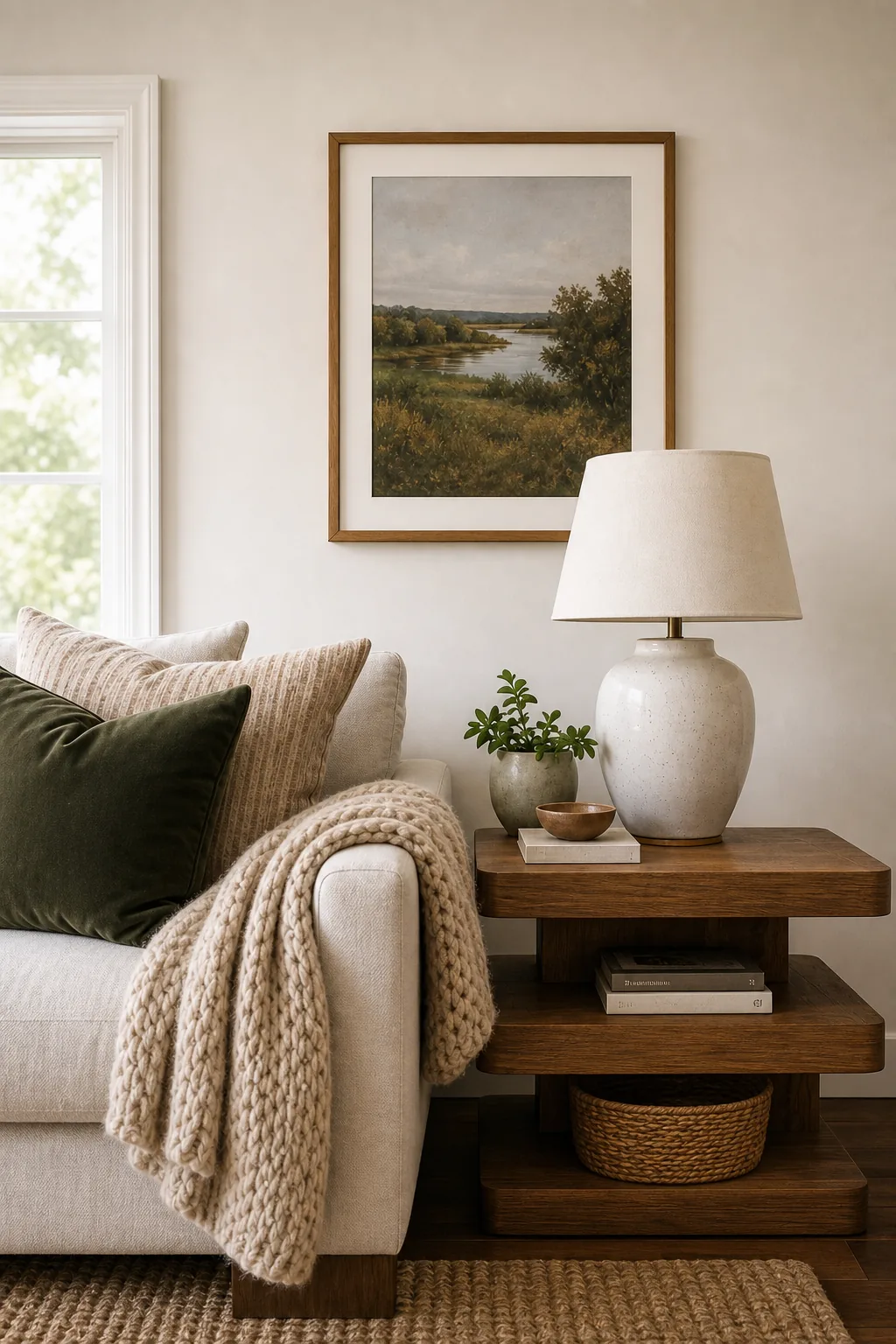
This precise measurement keeps the artwork at natural human eye level and creates a cohesive, intentional vertical stack with the table lamp and side table resting directly beneath it.
| Ceiling Height | Art Center Point | Distance Above Furniture |
|---|---|---|
| 8 feet | 57 inches | 6 to 8 inches |
| 9 feet | 58 inches | 6 to 8 inches |
| 10 feet | 60 inches | 8 to 10 inches |
| 12+ feet | 60 inches | 10 to 12 inches |
Sizing Wall Decor for the Space
Beyond the hanging height, the physical width of your artwork must relate directly to the furniture anchored beneath it. A framed print or gallery wall should span exactly two-thirds to three-quarters of the total width of the sofa or console table it hangs above.
Ideal Spacing for Side Tables
Proportion isn’t just about the physical size of your objects; it is equally about the negative space left between them. You must leave exactly 2 to 3 inches of clearance between the arm of your sofa and the inside edge of your side table.
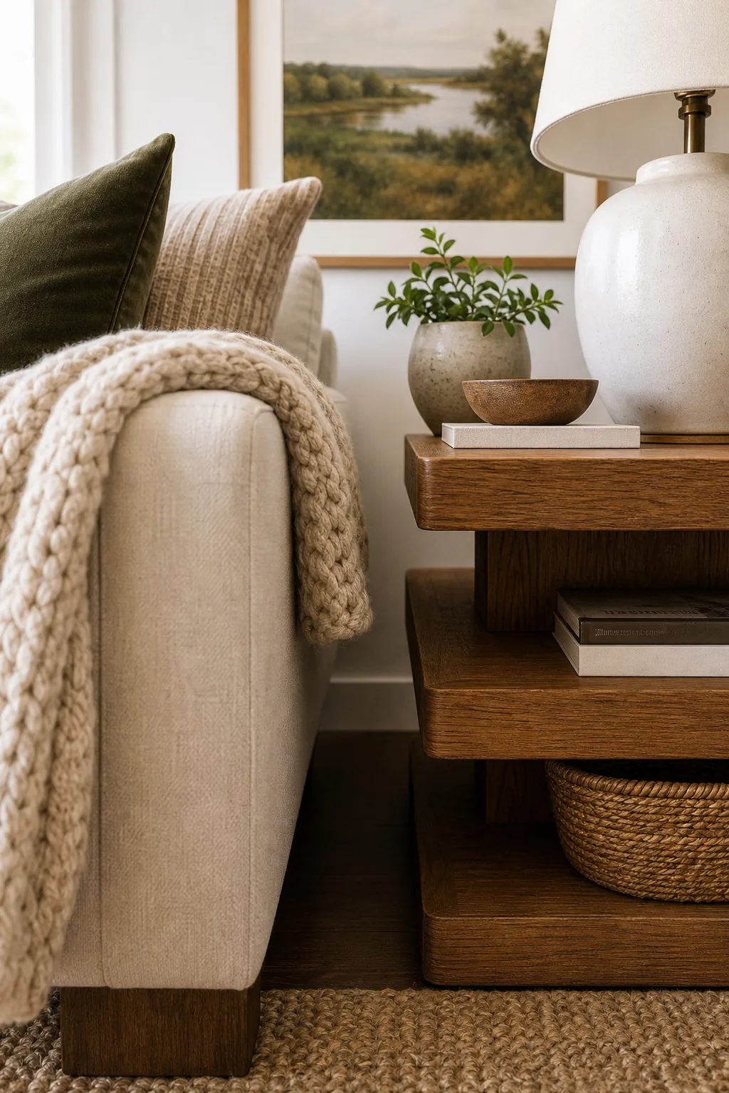
This precise gap allows upholstery fabrics to drape naturally and prevents the furniture arrangement from taking on a cramped, cluttered appearance. Maintaining this strict breathing room ensures that each piece can be appreciated individually while still functioning as a unified, comfortable seating zone.
Aligning Armrests and Table Heights
To ensure your side tables are both visually pleasing and practically useful, their top surface must align with the seating. Select a side table that sits exactly level with, or no more than two inches shorter than, the maximum height of your sofa’s upholstered armrest.
Styling the Tabletop Layers
A well-proportioned side table uses varying heights to keep the eye moving rather than letting it stall on a flat surface. You can prevent any tabletop from feeling stagnant by arranging your decorative objects in a classic, dynamic triangular composition.
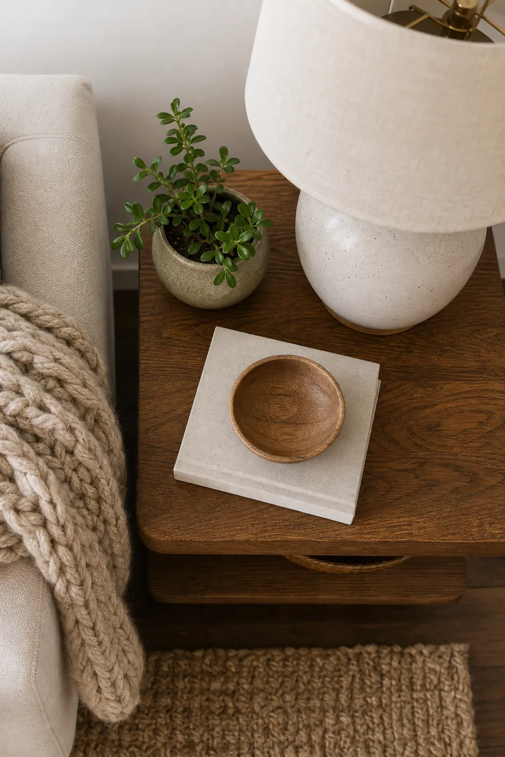
Build this layered arrangement by combining three specific functional and organic elements that step down gradually in height to create a visually pleasing slope toward the center of the room.
- The tall anchor: Place a substantial, heavy table lamp at the back corner to establish the maximum height of the vignette and provide essential reading light.
- The medium organic: Introduce a potted plant or a sculptural vase to soften the rigid, straight lines of the surrounding furniture and add a touch of life.
- The low catch-all: Finish the front edge with a shallow wooden or ceramic bowl for functional, everyday storage of coasters, remotes, or reading glasses.
Selecting the Right Table Lamp Shade
To maintain proper proportions on your side table, ensure the bottom edge of your lamp shade sits precisely at eye level when you are seated. The shade itself should never extend wider than the table’s surface, preventing it from encroaching on the seating area.
The Designer’s Proportion Cheat Sheet
Bring all these foundational rules together with a concrete set of measurements you can easily reference for any future room refresh. Standardizing your spacing ensures that every new piece of decor automatically harmonizes with your carefully planned furniture layout from the start.
Before you finalize your layout, move heavy furniture, or drill any new holes in the drywall, run through this quick measurement check to guarantee your proportions are perfectly dialed in.