
Front Porch Curb Appeal: The Complete Styling Guide
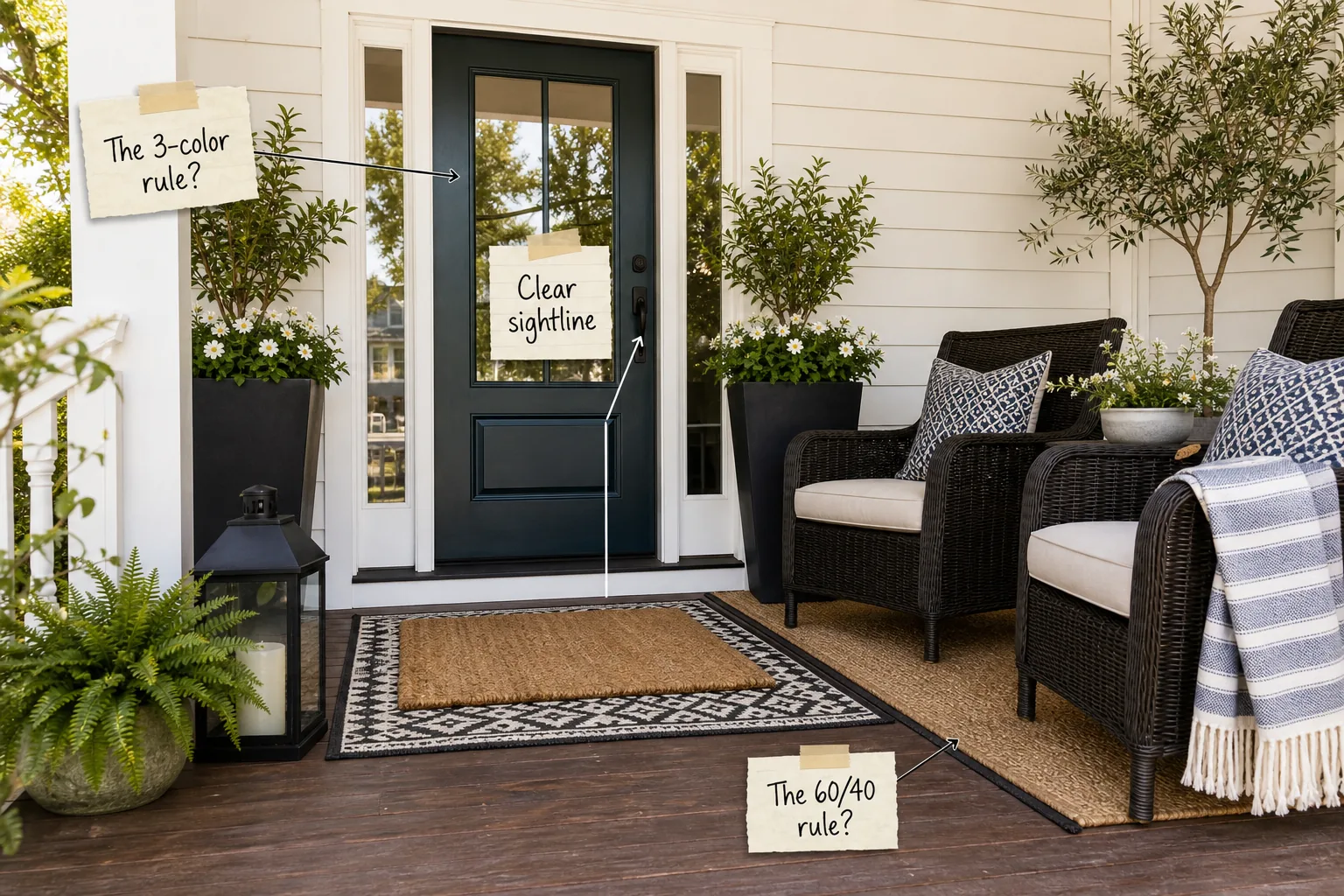
Master your home’s exterior with our complete curb appeal styling guide, detailing the essential 60/40 spatial layout and the 3-color palette. You will be able to measure your porch for the 60/40 layout, select a cohesive palette, and arrange planters for maximum impact.
The Curb Appeal Styling Guide Framework
A successful exterior transformation relies on a disciplined overarching framework to prevent visual clutter. This complete curb appeal styling guide utilizes a strict 60/40 spatial division and a cohesive color system to organize the entire approach.
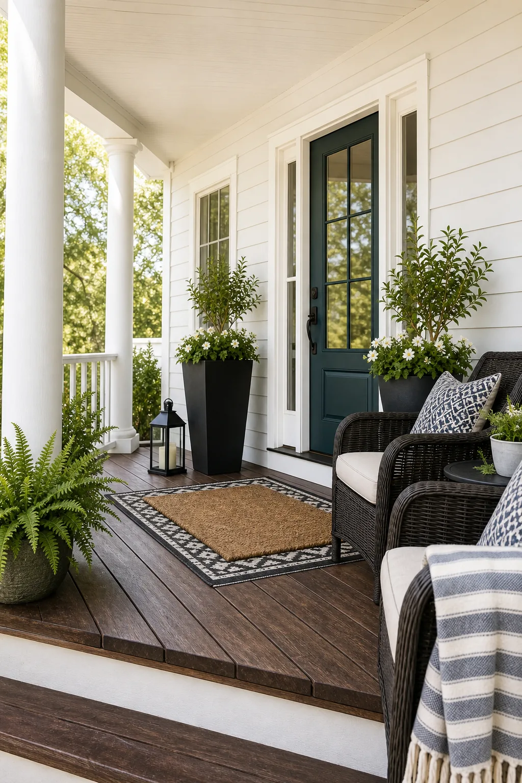
Before purchasing new planters or seating, verify these foundational styling elements to ensure a cohesive, well-planned exterior layout. Establishing these parameters first prevents costly mistakes when scaling furniture for the outdoor space.
Calculating Exterior Surface Proportions
To properly execute the styling guide, first measure the total visible facade to determine your base canvas. Accurate square footage calculations guarantee that your chosen paint colors map correctly to the required architectural ratios.
- Calculate the total square footage of the front siding to establish the primary base.
- Measure the combined surface area of the exterior trim, structural pillars, and roof fascia.
- Determine the exact square footage of the front door for the accent color.
These raw measurements dictate exactly how much paint you will need to accurately execute the required exterior proportions. Always purchase an extra quart of the accent color for future touch-ups around the high-traffic entryway.
Applying the 3-Color Rule
The 3-color rule dictates that the dominant siding takes roughly 60 percent of the visual space, secondary trim takes 30 percent, and the bold accent takes the final 10 percent. This strict division creates immediate architectural harmony.
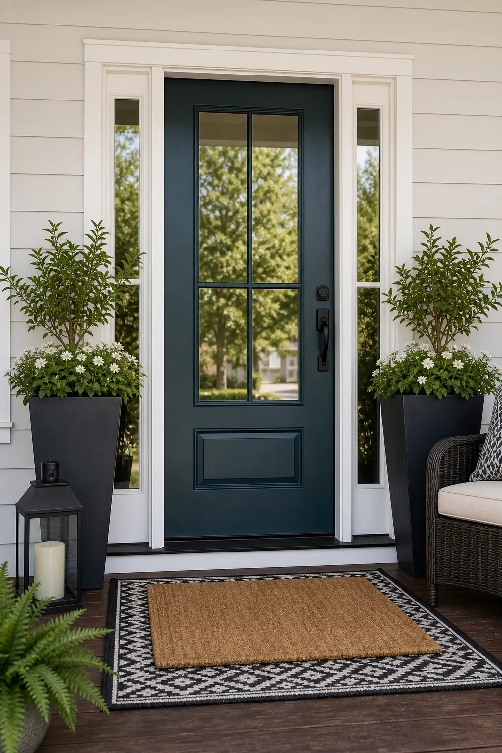
Reserving the strongest, most saturated color exclusively for the front door prevents the exterior architecture from feeling visually overwhelming. This highly focused application instantly directs arriving visitors toward the primary entry point without unnecessary signage.
Selecting the Optimal Paint Finishes
Beyond color allocation, matching the correct paint sheen to each architectural element ensures long-term durability against harsh weather conditions. Proper finishes protect the underlying materials while enhancing the visual depth of the 3-color palette.
| Exterior Surface | Visual Proportion | Recommended Finish | Primary Benefit |
|---|---|---|---|
| Main Siding | 60 Percent | Satin or Eggshell | Hides minor imperfections |
| Architectural Trim | 30 Percent | Semi-Gloss | Highlights structural lines |
| Front Door | 10 Percent | High-Gloss | Maximizes color depth |
Using a high-gloss finish on the 10 percent accent zone also makes the high-traffic entryway significantly easier to wipe clean. The reflective surface catches ambient light, further emphasizing the front door under covered porches.
Mapping the 60/40 Spatial Layout
The 60/40 rule requires dedicating exactly 60 percent of the total porch width to an open, unobstructed walkway. The remaining 40 percent is strictly reserved for the dedicated seating or decorative styling zone to maintain balance.
Taping off this exact boundary line before placing any furniture guarantees a comfortable, welcoming approach for multiple arriving guests. Maintaining this generous clearance prevents the porch from feeling cramped during busy seasonal gatherings.
Adapting Layouts for Shallow Porches
When working with a porch depth under 72 inches, standard lounge chairs often encroach dangerously on the critical walkway zone. Implementing space-saving alternatives keeps the primary circulation path completely clear while maintaining the required proportions.
- Swap deep lounge chairs for a narrow wooden bench placed flush against the siding.
- Use wall-mounted folding tables instead of freestanding side tables to save floor space.
- Install ceiling-mounted lighting rather than placing bulky floor lanterns in the seating zone.
Testing the door swing with these slimmer furniture pieces ensures the entry remains fully functional. The door must open to a full 90 degrees without striking any seating elements or decorative accessories.
Establishing Visual Anchors
Visual anchors frame the entryway using substantial exterior containers that reach at least 24 to 36 inches in height. These structural elements provide necessary symmetry and scale against tall architectural facades.
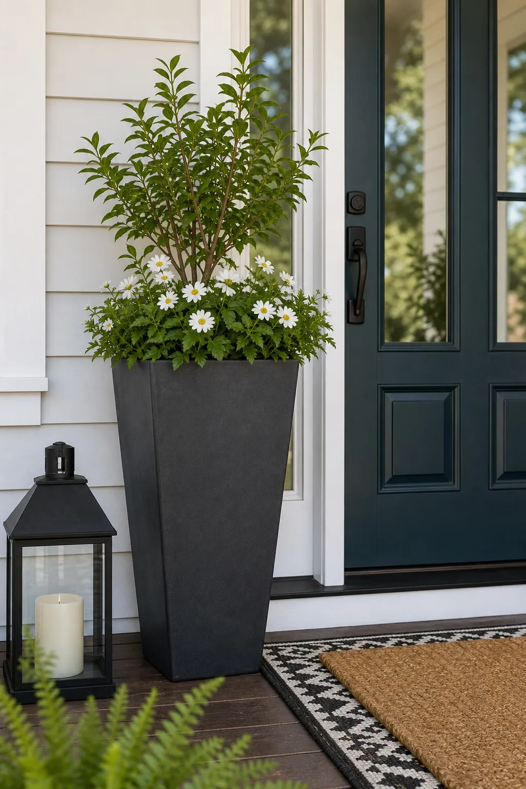
Positioning these tall planters directly against the door frame grounds the space and powerfully draws the eye inward toward the handle. Matching the planter color to the 30 percent trim ties the composition together.
Sizing Anchor Containers Correctly
A common error involves selecting pots that are too small, which look disproportionate next to standard 80-inch exterior doors. Upgrading to heavier materials like cast concrete or fiberglass ensures the containers provide adequate architectural weight.
Maintaining a Clear Sightline
A clear sightline requires an unobstructed 18-inch visual path stretching directly from the top porch step to the door handle. This invisible corridor guides visitors naturally from the driveway to the threshold.
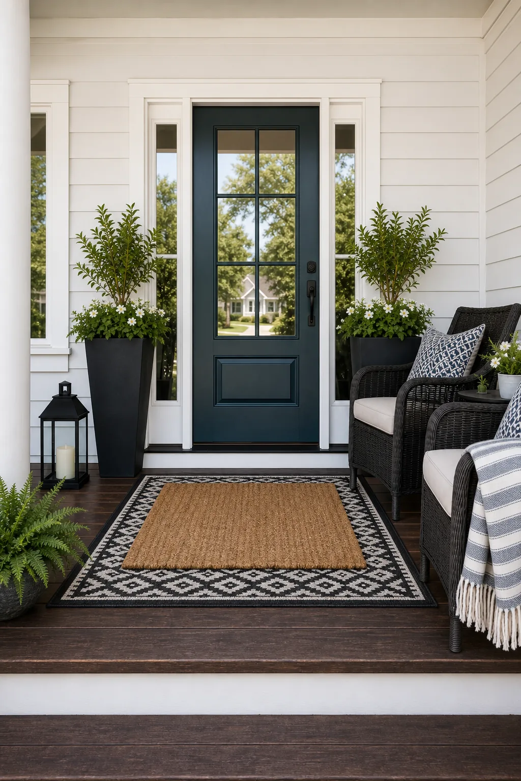
Relocating bulky hanging baskets or oversized wall lanterns at least 18 inches away from this central axis prevents frustrating visual interference. Keeping this zone pristine emphasizes the carefully selected 10 percent accent color.
Upgrading Entryway Hardware
Because the door handle serves as the final visual destination of the clear sightline, upgrading to a substantial 12-inch handleset maximizes impact. Solid brass or matte black hardware immediately stands out against the accent color.
Layering Textures Underfoot
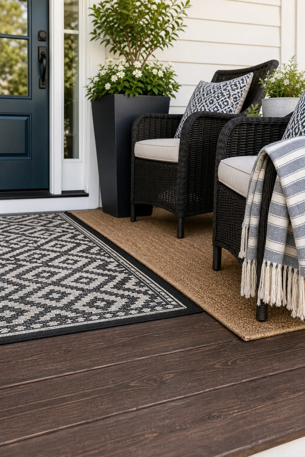
Layered textures start with a base patterned outdoor rug measuring 24 by 36 inches, topped with a standard 18 by 30-inch coir mat. This precise dimensional pairing exposes a crisp 3-inch border of pattern.
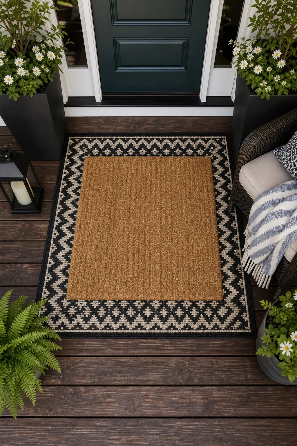
Proper sizing ensures the bottom pattern remains visible without posing a tripping hazard for arriving guests. Aligning the mats perfectly with the door frame maintains the strict geometry of the overall layout.
Coordinating Mat Patterns with the Palette
Selecting a geometric base rug that incorporates the 10 percent door color unifies the ground plane with the vertical architecture. A natural, unbleached coir top mat provides necessary neutral relief from the highly saturated accent.
Styling the Seating Zone
Furnish the designated 40 percent zone with weather-resistant wicker chairs, leaving a minimum of 12 inches between the seats. This arrangement transforms a transitional walkway into a functional outdoor room.
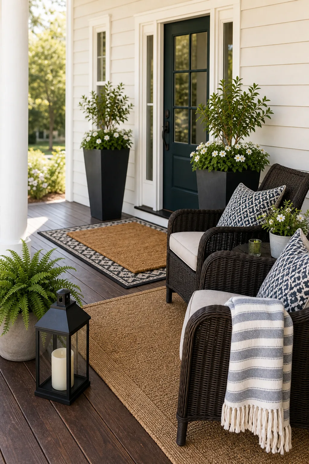
This deliberate spacing easily accommodates a small side table while preventing the heavy furniture arrangement from feeling cramped. Angling the chairs slightly inward encourages conversation while respecting the 60 percent walkway boundary.
Selecting Outdoor Performance Fabrics
Upholstering the seating zone cushions in solution-dyed acrylic fabrics ensures they resist fading under direct, harsh sunlight. This durable material choice prevents the carefully planned exterior palette from degrading over the long summer months.
Balancing Asymmetry with Accessories
Balance a visually heavy seating area on one side by placing lower-profile accessories on the opposite side of the walkway. This asymmetrical approach maintains equilibrium without mirroring the bulky furniture.
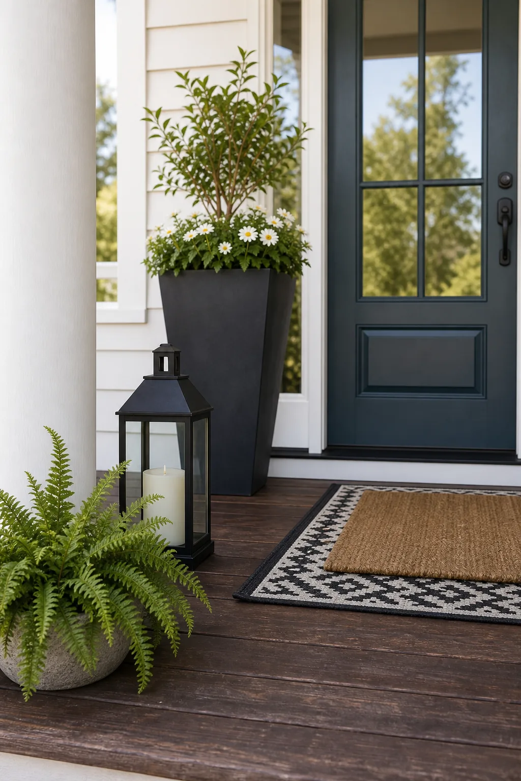
Grouping a 15-inch floor lantern and a low potted fern adds necessary visual weight without ever blocking the 60 percent circulation path. These grounded elements complete the styling guide while keeping sightlines completely clear.