
60-30-10 Bedroom Colors: Complete Paint & Styling Guide
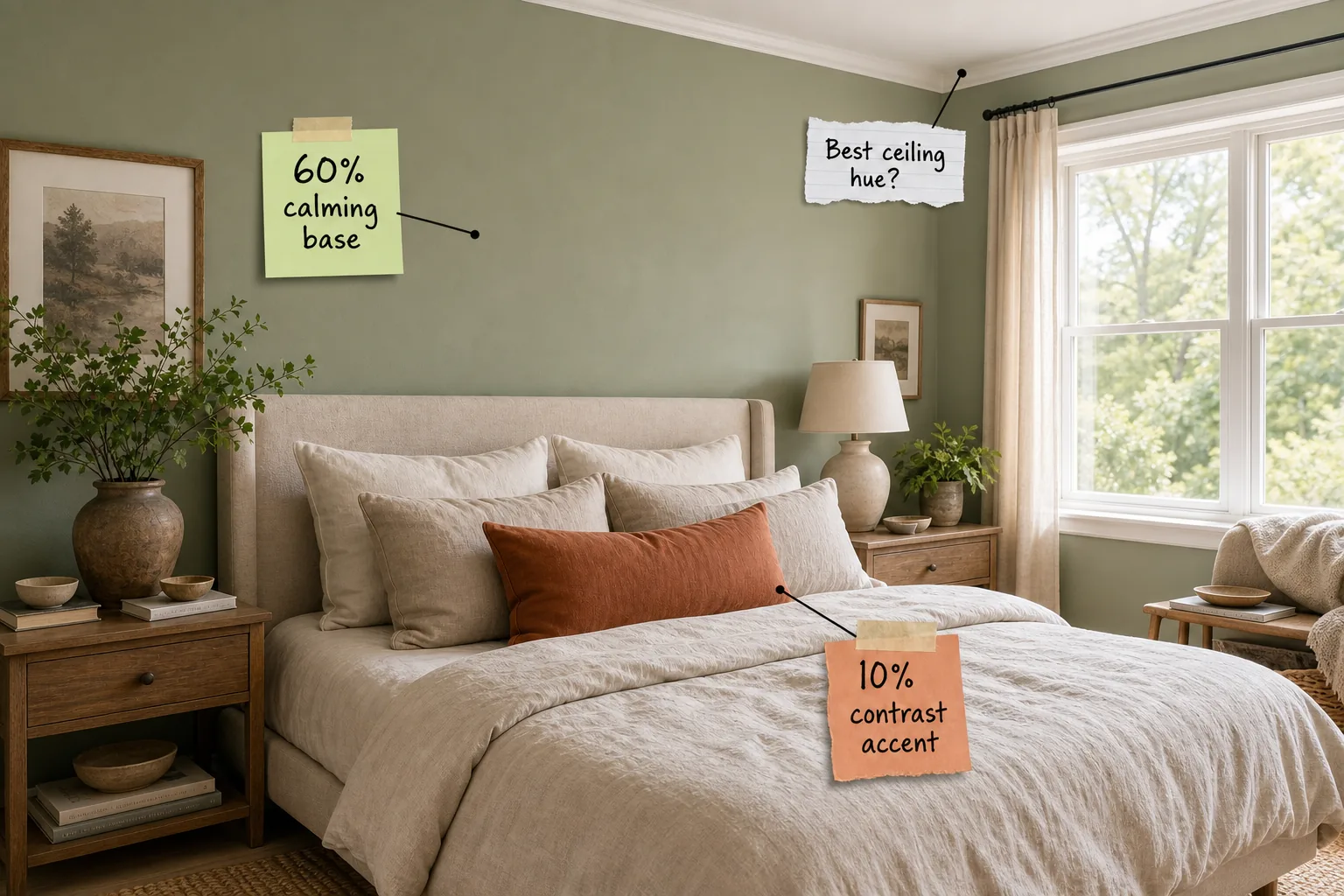
You will be able to successfully apply the 60-30-10 color ratio to your bedroom and confidently buy the exact paint shades and bedding tones shown. Master this simple design formula to get our complete color guide with exact brand matches for a perfectly serene retreat.
Understanding the 60-30-10 Bedroom Formula
Translating this mathematical design concept into a physical 3D space requires assigning strict visual percentages to your room’s surface area. The dominant 60 percent covers the four walls, the secondary 30 percent covers large textiles, and the final 10 percent highlights small accent pieces.
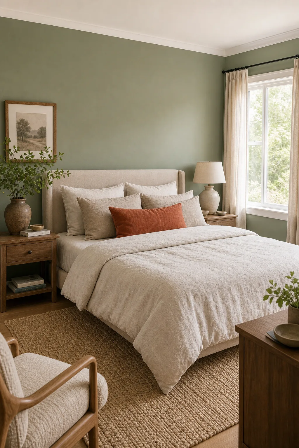
Breaking down the bedroom environment into these distinct mathematical zones prevents any single hue from overwhelming the resting space. This highly structured approach guarantees a balanced visual weight regardless of your specific furniture layout, ceiling height, or the amount of natural light available throughout the changing seasons.
Mapping Visual Weight in Small Spaces
Applying this exact formula in bedrooms under 120 square feet requires careful attention to how bulky furniture alters your visible wall space. When a massive wardrobe or oversized headboard obscures the primary wall color, you must strategically compensate to maintain the required ratio.
- Paint the entry door: Matching your interior bedroom door to the wall color immediately reclaims lost dominant square footage.
- Include the baseboards: Carrying the primary hue straight down to the floor expands the visual footprint of the 60 percent base.
- Count the window frames: Painting the interior window trim reinforces the dominant color without requiring any extra blank wall space.
- Coat the closet doors: Disguising large sliding closet doors in the primary wall color prevents them from acting as an unplanned secondary tone.
Adjusting these specific architectural details ensures the primary color retains its dominant presence even when large secondary textiles dominate the center of the floorplan.
Choosing Your 60% Calming Base
Applying the dominant color to your room’s largest surface area establishes the essential 60 percent baseline without requiring exact square-footage calculations. Painting all four walls instantly envelops the room in your primary calming hue and firmly sets the overall atmospheric mood.
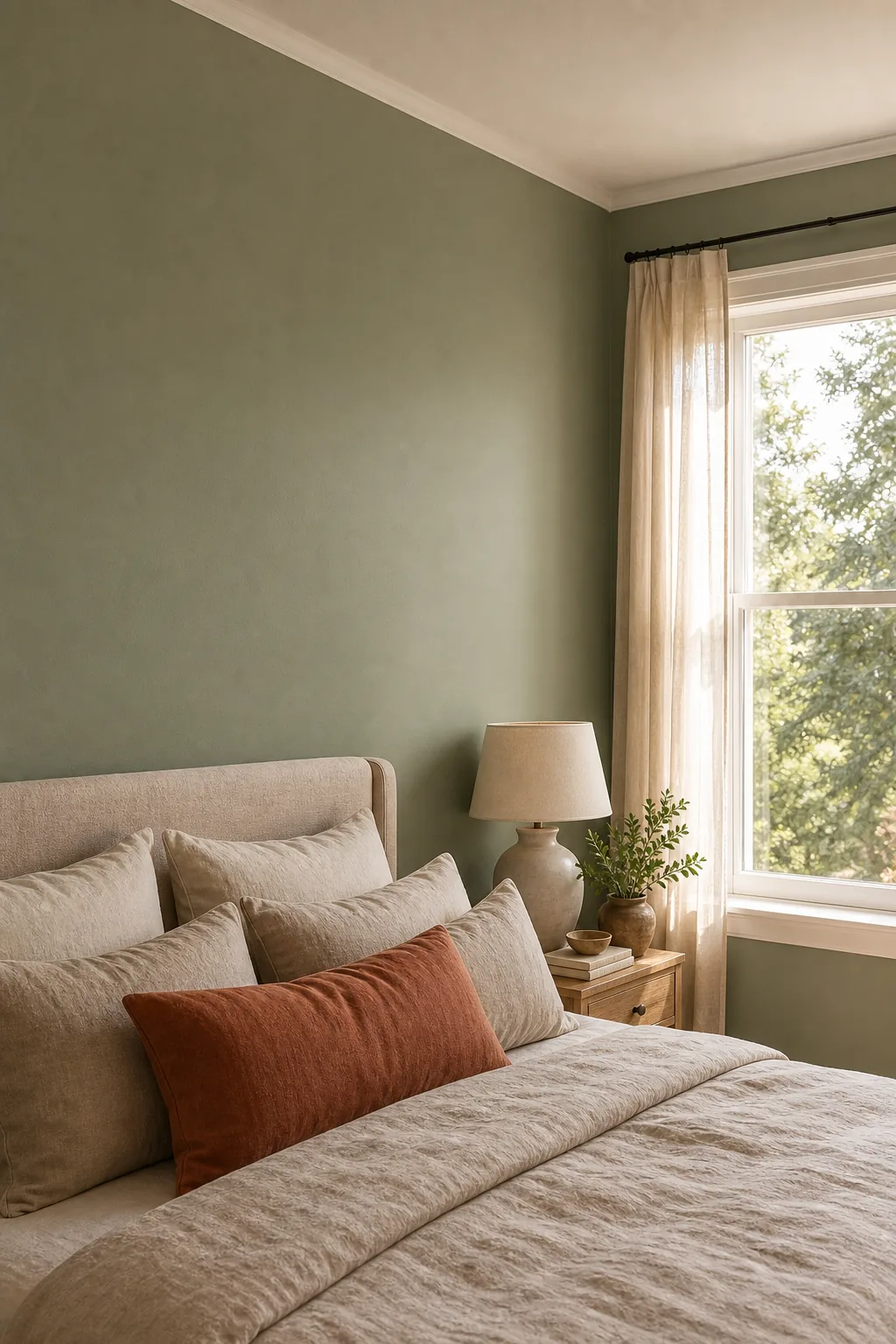
Selecting a muted, low-reflectance tone for this massive surface area prevents the walls from bouncing harsh morning light directly into your eyes. A deeply saturated but soft base color grounds the entire space and provides a highly reliable backdrop for lighter neutral textiles and natural wood furniture.
Selecting the Right Paint Finish
The specific sheen of your primary wall color drastically impacts how the 60 percent base absorbs or reflects natural window light. High-gloss finishes create distracting glare across the walls, while a true flat finish softens the dominant hue into a velvet-like visual texture.
Testing different paint finishes on your specific drywall texture is crucial because heavily textured walls will naturally cast microscopic shadows that slightly darken the perceived base color.
Layering the 30% Secondary Tone
Large furniture pieces and expansive textiles introduce the secondary color to bridge the visual gap between the dark walls and bright accents. A standard king or queen bed occupies roughly one-third of the visual floor space in most standard residential bedrooms.
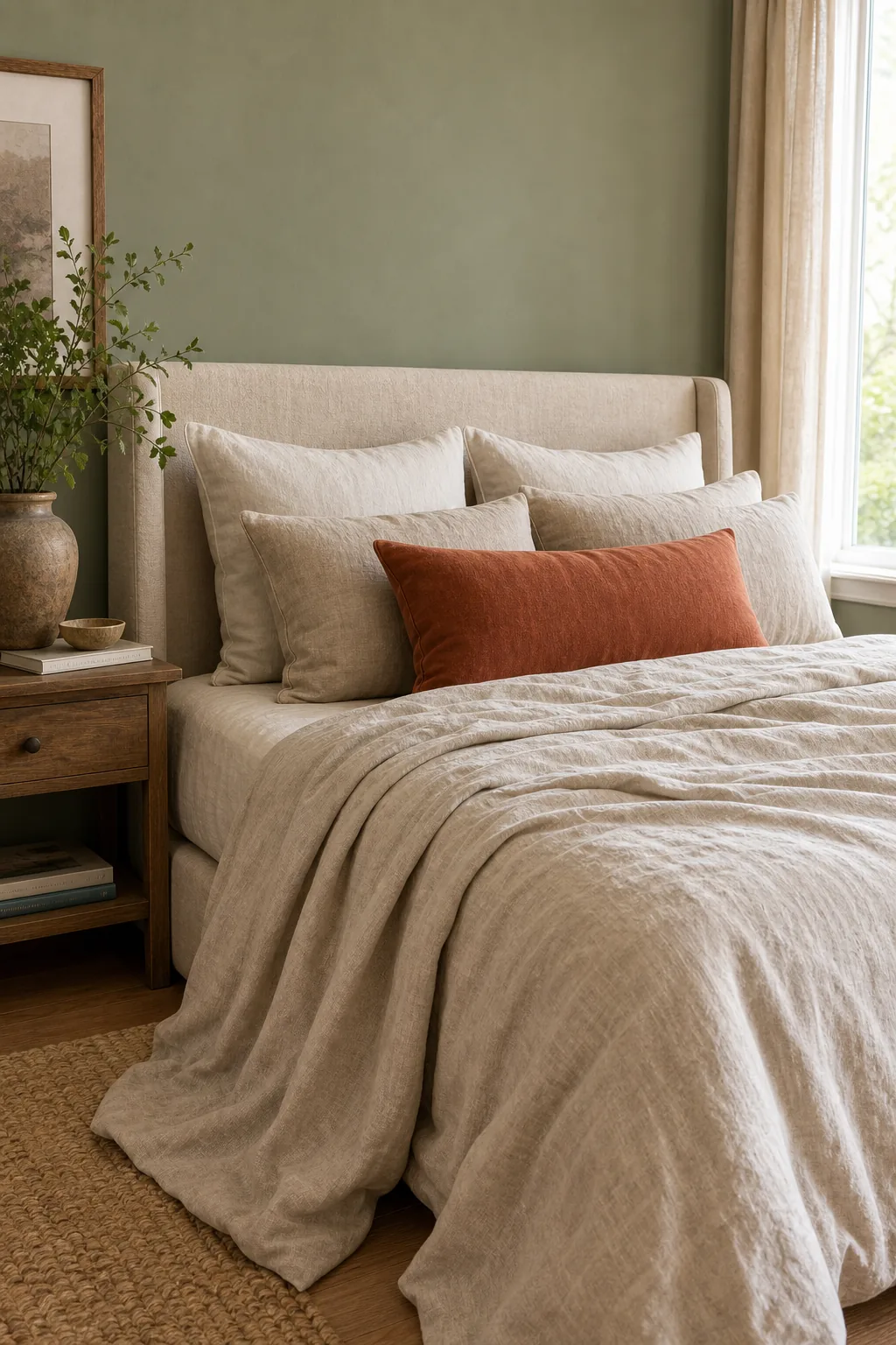
Utilizing an oatmeal linen duvet as this 30 percent vehicle introduces necessary visual warmth and effectively breaks up the solid wall color. The natural, varied texture of washed linen adds crucial physical dimension that prevents the secondary neutral tone from looking entirely flat.
Expanding the Secondary Footprint
If your bed frame is minimal or your mattress sits very low to the floor, the bedding alone might not fulfill the entire 30 percent requirement. You must strategically introduce additional large-scale decorative elements in the exact same neutral tone to compensate.
| Secondary Element | Visual Impact | Ideal Placement |
|---|---|---|
| Woven Area Rugs | High floor coverage | Under the lower two-thirds of the bed |
| Linen Curtain Panels | Vertical wall height | Hung floor-to-ceiling over main windows |
| Upholstered Bench | Medium grounding weight | Positioned directly at the foot of the bed |
| Oversized Lounge Chair | Corner anchoring mass | Angled near the primary natural light source |
| Woven Storage Baskets | Low scattered weight | Tucked neatly beneath the open nightstands |
Matching your heavy window treatments or a large textured area rug directly to your oatmeal bedding guarantees the secondary tone carries enough visual weight to balance the dark walls.
Adding the 10% Contrast Accent
Strategic placement of a high-impact accent color gives the eye a specific, intentional place to land upon entering the bedroom. You must strictly maintain the 10 percent ratio to prevent the brightest color from actively agitating the carefully planned restful environment.
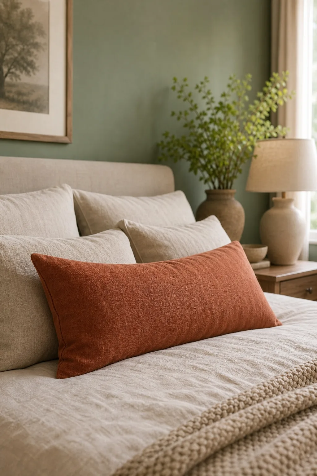
Limiting this bold terracotta tone to a single lumbar pillow or a small throw blanket ensures it remains a decorative accent rather than a distraction. These smaller textile pieces pack enough visual punch to activate the room without requiring a massive financial commitment or a complete room renovation.
What Is the Best Ceiling Hue?
Leaving the ceiling stark white creates a jarring visual boundary that abruptly stops the eye and makes the room feel significantly shorter than its actual architectural height. The absolute best approach for this transition is mixing your 60 percent wall color with flat white paint at a 1-to-4 ratio.
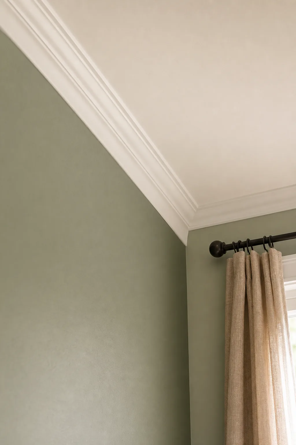
Applying this softly tinted ceiling hue effectively blurs the harsh contrast line where the vertical drywall meets the overhead horizontal surface. This subtle color continuation keeps the room feeling exceptionally tall while maintaining the enveloping, cozy atmosphere of the dominant sage green walls.
Balancing Warm and Cool Undertones
Mixing specific color temperatures within your formula is entirely essential for creating a dimensional environment rather than a flat, monochromatic box. Pairing a cool sage base with highly textured neutral oatmeal establishes a deeply inviting, complex resting space that feels professionally designed.
Evaluating your existing flooring material is the first critical step in diagnosing undertone clashes before you purchase any new paint gallons or expensive bedding sets.
Managing Accent Proximity and Texture
Grouping your 10 percent accent pieces too closely together creates a heavy, unbalanced focal point that throws off the room’s carefully planned proportions. Distributing these small pops of color across different vertical elevations forces the eye to travel comfortably around the entire space rather than getting stuck in one corner.
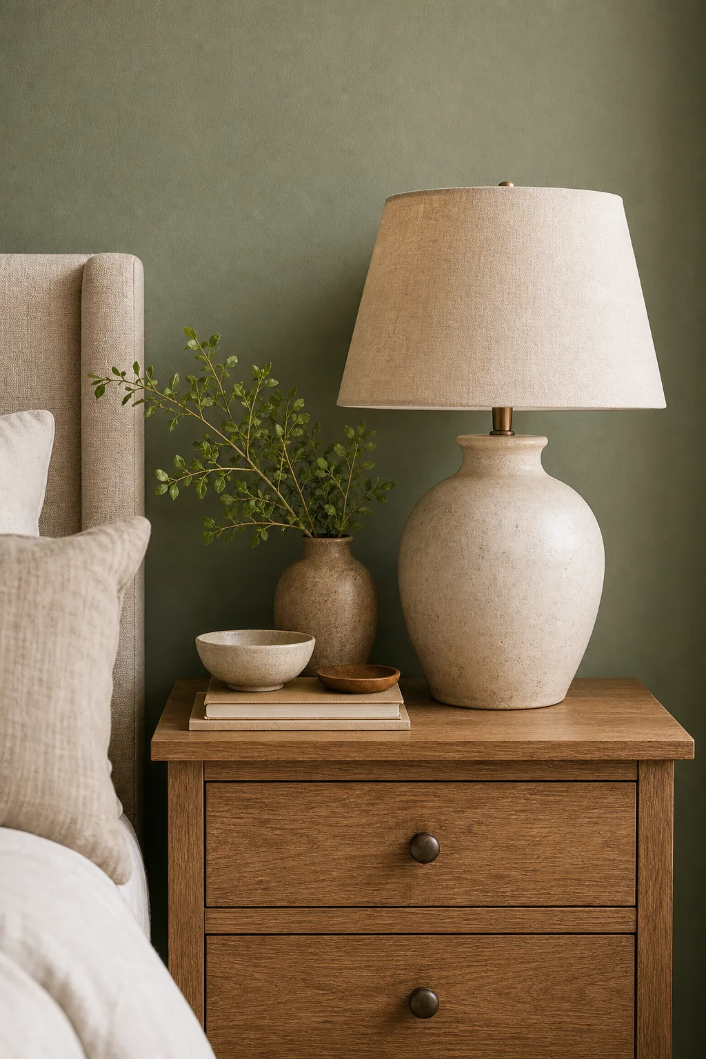
The physical material of your accent pieces drastically changes how the terracotta hue absorbs ambient bedroom light throughout the day. Choosing heavily textured materials like chunky woven cotton, thick wool bouclé, or matte velvet visibly deepens the color saturation and enhances the contrast.
The Complete 60-30-10 Color Guide & Exact Matches
Recreating this exact serene look requires specific paint colors and material pairings that perfectly execute the 60-30-10 formula without guesswork. Use these exact brand names and shade codes to accurately source your sage green walls, tinted ceiling, and critical textile matches.
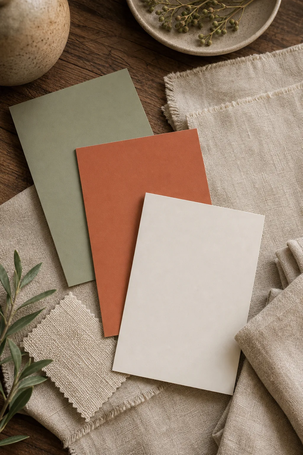
The primary 60 percent base is Sherwin-Williams Evergreen Fog in a matte finish, while the 30 percent secondary tone is Cultiver’s Oatmeal washed linen. The critical 10 percent accent is flawlessly achieved using Benjamin Moore Audubon Russet applied to woven cotton pillows.
Sourcing Authentic Linen Textures
Achieving the correct 30 percent visual weight relies heavily on the physical shadow play of genuine washed linen. Synthetic blends reflect too much light and will cause the secondary oatmeal tone to look cheap against the premium matte walls, instantly ruining the carefully balanced aesthetic.
Final Testing in Bedroom Lighting
Testing the palette under different lighting conditions ensures your sage and terracotta choices look perfectly accurate throughout the entire day. Check the physical swatches at 8 AM for natural daylight accuracy and at 8 PM under warm artificial bulbs before committing.
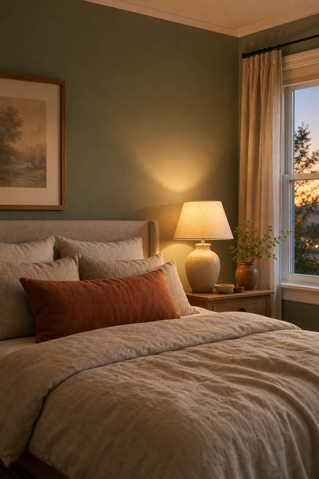
Artificial lighting will drastically alter how your sage walls and terracotta pillows read during the late evening hours when you actually use the space. Run through this quick testing sequence before heading to the paint store to buy your gallons.