
Living Room Paint Colors: The 60-30-10 Proportion Guide
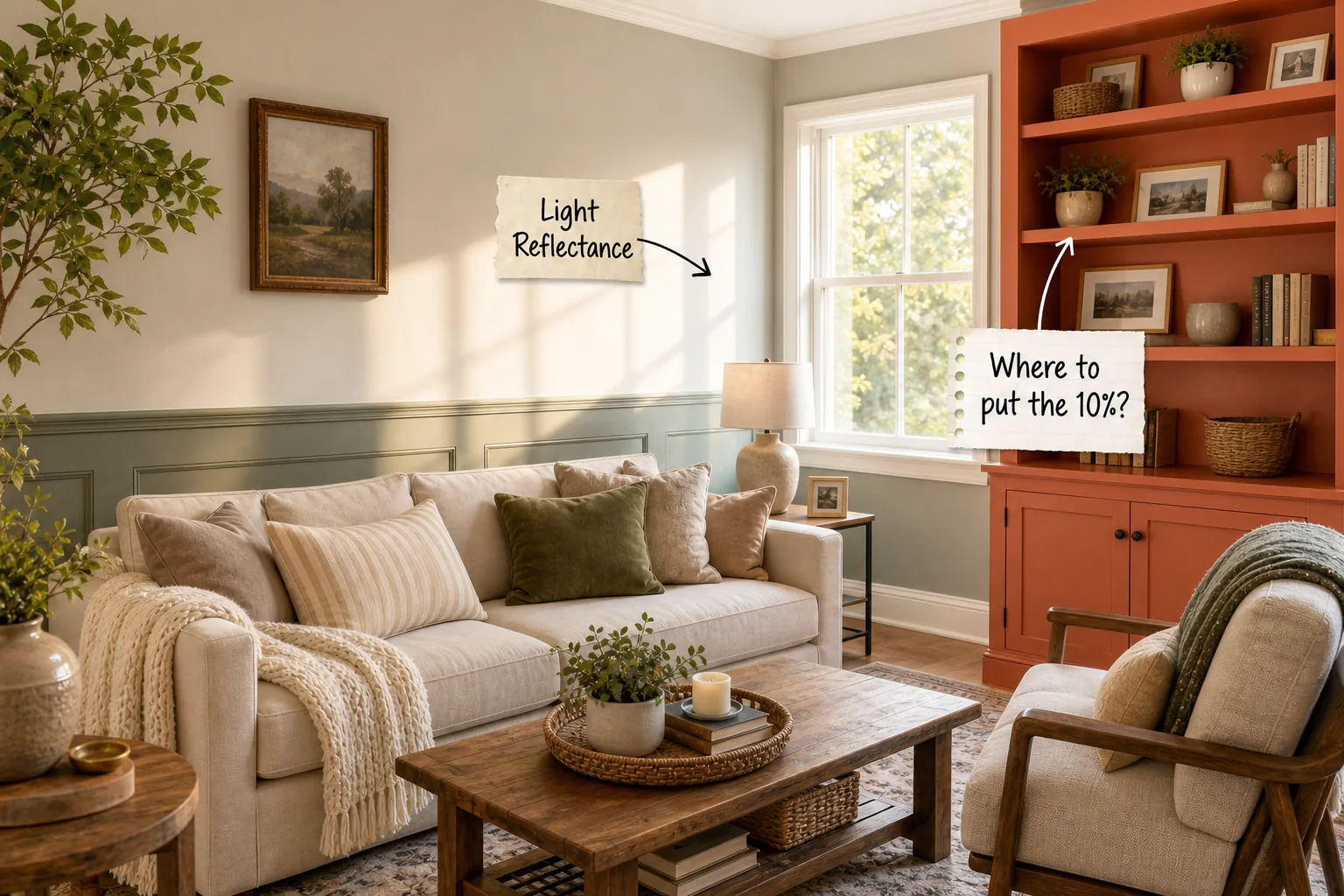
You will be able to confidently select and place three coordinating paint colors in your living room using proper proportions by following this complete 60-30-10 color proportion guide. We will break down the formula from the largest wall expanse down to the smallest accent details.
The 60-30-10 Color Proportion Guide
The classic interior design rule divides your living room palette into three distinct mathematical zones to guarantee visual balance. You will assign exactly 60 percent to your dominant walls, 30 percent to your secondary trim, and 10 percent to a bold accent feature.
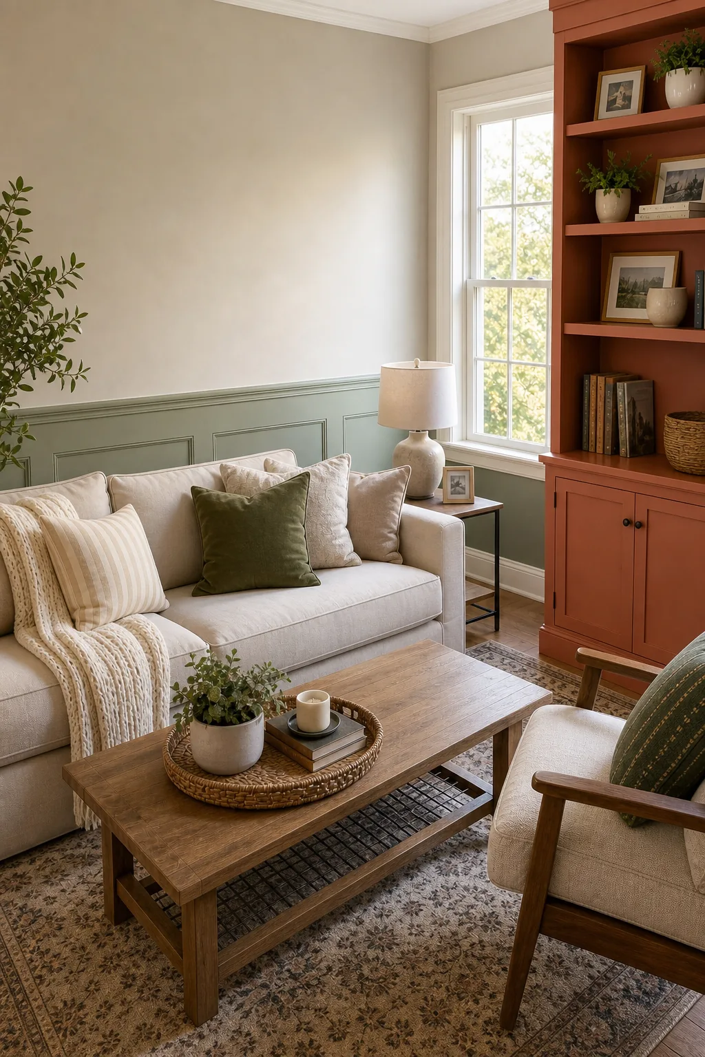
Proportions matter significantly more than the specific hues you select because this ratio prevents competing colors from overwhelming the space. Applying these percentages correctly creates a natural visual hierarchy that guides the eye comfortably around the entire room.
Selecting the Right Paint Finishes
The 60-30-10 rule relies heavily on contrasting paint finishes to create subtle visual boundaries between your three distinct color zones. Applying a flat or matte finish to your dominant walls ensures the massive surface area absorbs light rather than reflecting a distracting glare.
| Color Zone | Required Percentage | Primary Application Area | Recommended Paint Finish |
|---|---|---|---|
| Dominant Base | 60% | Main drywall expanses and large structural walls | Matte or eggshell |
| Secondary Trim | 30% | Wainscoting, baseboards, and interior window casings | Satin or semi-gloss |
| Accent Feature | 10% | Built-in shelving units and fireplace mantels | High-gloss or satin |
| Ceiling Surface | Variable | Overhead drywall tinted with the dominant color | Flat or ultra-matte |
| Transitional Doors | Variable | Interior room doors and adjoining hallway frames | Durable semi-gloss |
Choosing Your 60% Dominant Wall Color
The dominant wall color anchors the room and covers the most square footage, requiring a versatile shade that avoids visual fatigue. You should start with a reliable neutral base like warm sand, soft beige, or a muted greige to establish a calming foundation.
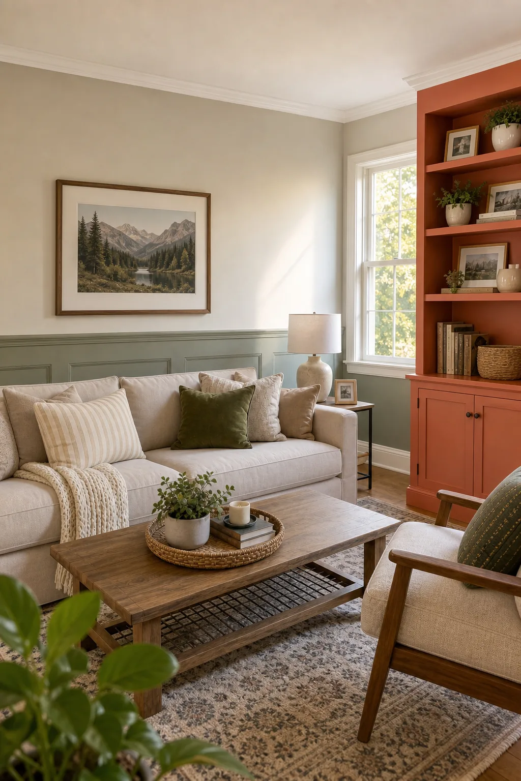
Neutral backdrops allow your architectural features and furniture to stand out naturally against the expansive matte painted wall. Selecting a highly saturated hue for this massive 60 percent allocation often makes the living room feel significantly smaller and much more chaotic.
Applying the 30% Secondary Trim
The 30 percent secondary trim adds necessary architectural depth and grounds the room by contrasting lightly with the main walls. You will apply this secondary shade directly to your wainscoting, baseboards, crown molding, and prominent interior window casings.
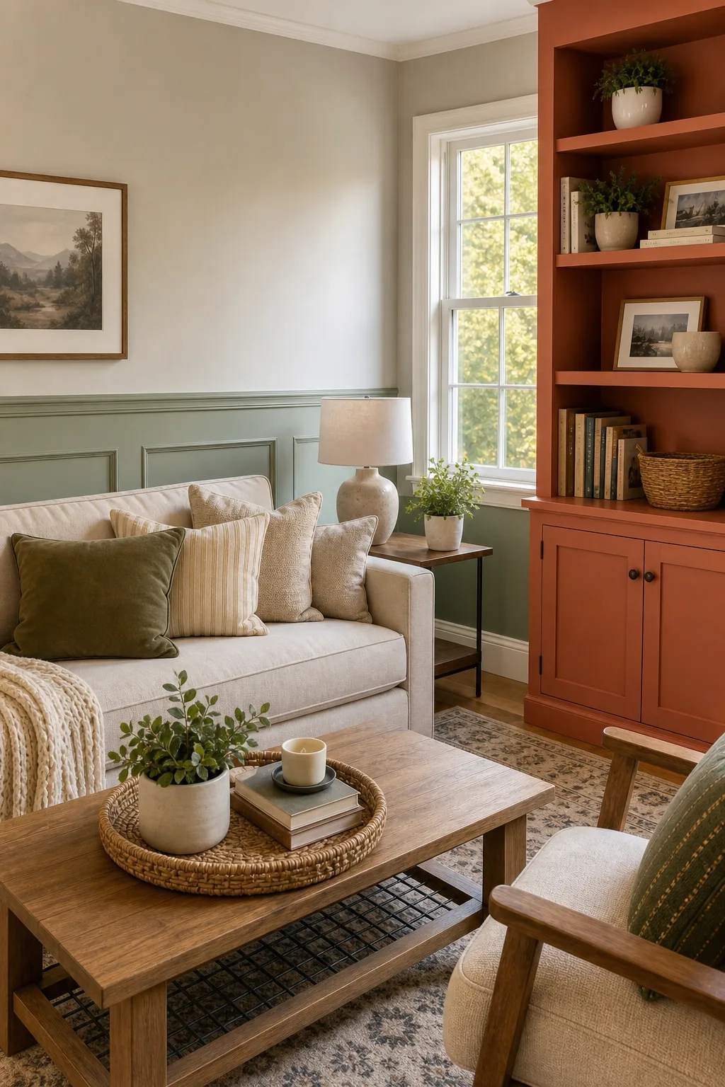
Calculating that 30 percent proportion can easily go wrong if you overlook the room’s transitional elements and strictly paint the baseboards. Continuous trim color elevates the perceived ceiling height while seamlessly connecting different functional zones throughout your living space.
Expanding the 30% to Architectural Details
When your living room lacks extensive wainscoting, you must creatively allocate the 30 percent secondary color to other structural elements. Expanding this mid-tone shade across larger architectural features in this ranked order of visual impact ensures the room maintains the correct mathematical balance.
- Paint the fireplace surround: Coat the entire wooden or masonry mantel structure in your secondary trim color to immediately boost the ratio.
- Include window mullions: Extend the trim paint onto the interior window sashes and mullions to maximize natural light reflection.
- Cover structural pillars: Treat any exposed load-bearing columns or prominent archways as secondary trim rather than blending them into dominant walls.
Where to Put the 10% Accent Color
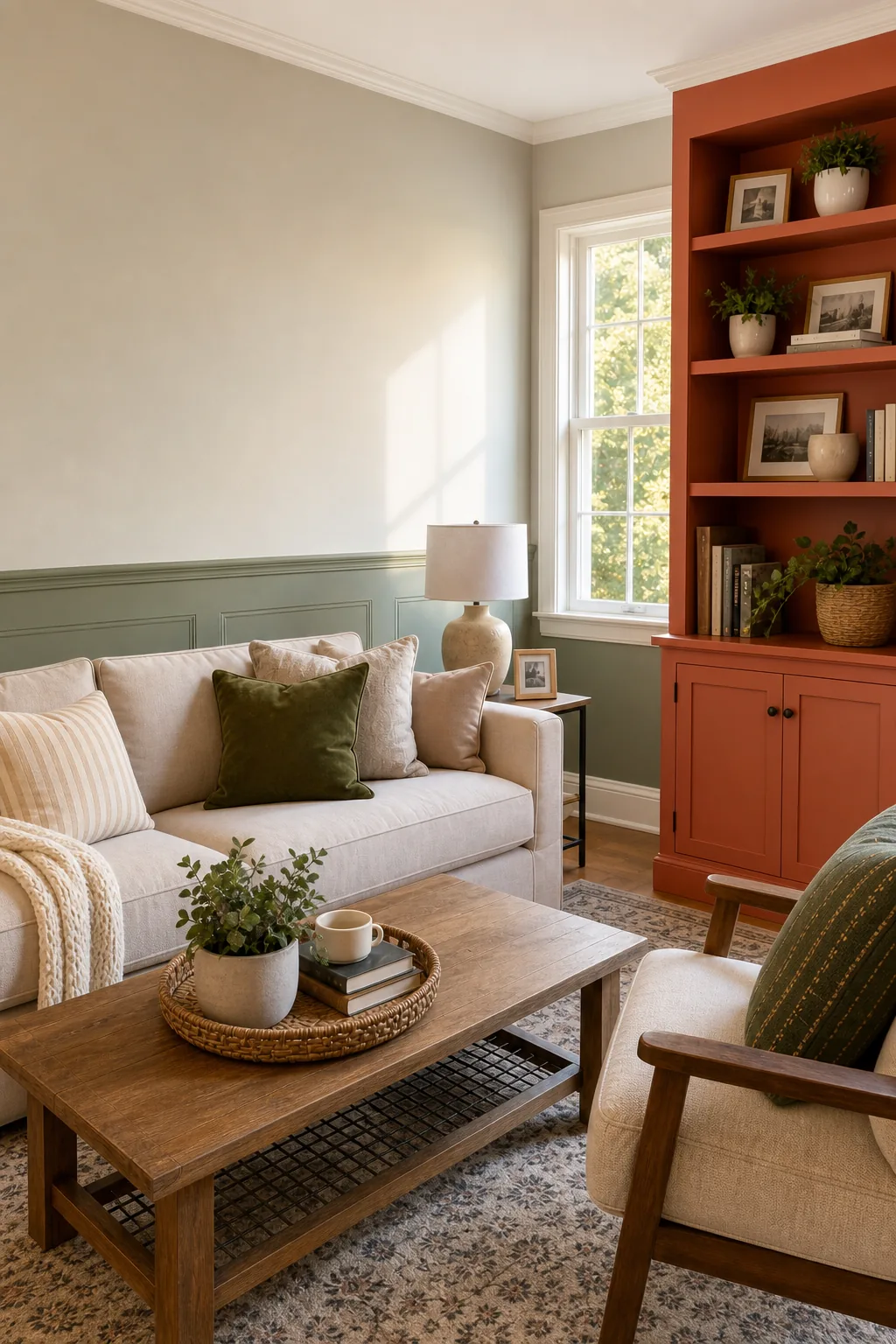
The final 10 percent accent color is strictly reserved for high-impact architectural features that deserve immediate visual attention. You should confidently paint a built-in bookcase, a central fireplace mantel, or a single structural alcove in your boldest chosen shade.
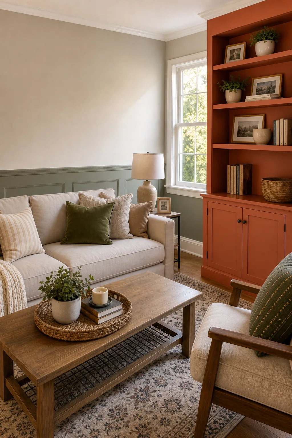
Concentrate these bold shades on functional focal points like shelving rather than randomly scattering small patches of bright color around the room. A rich terracotta or deep navy applied to a brightly painted accent built-in shelf delivers massive personality without overwhelming the neutral walls.
Factoring in Light Reflectance (LRV)
Paint colors are measured by their Light Reflectance Value (LRV) on a strict scale from zero to one hundred. Your dominant 60 percent wall usually requires an LRV between 50 and 70 to keep the living room feeling bright but not stark.
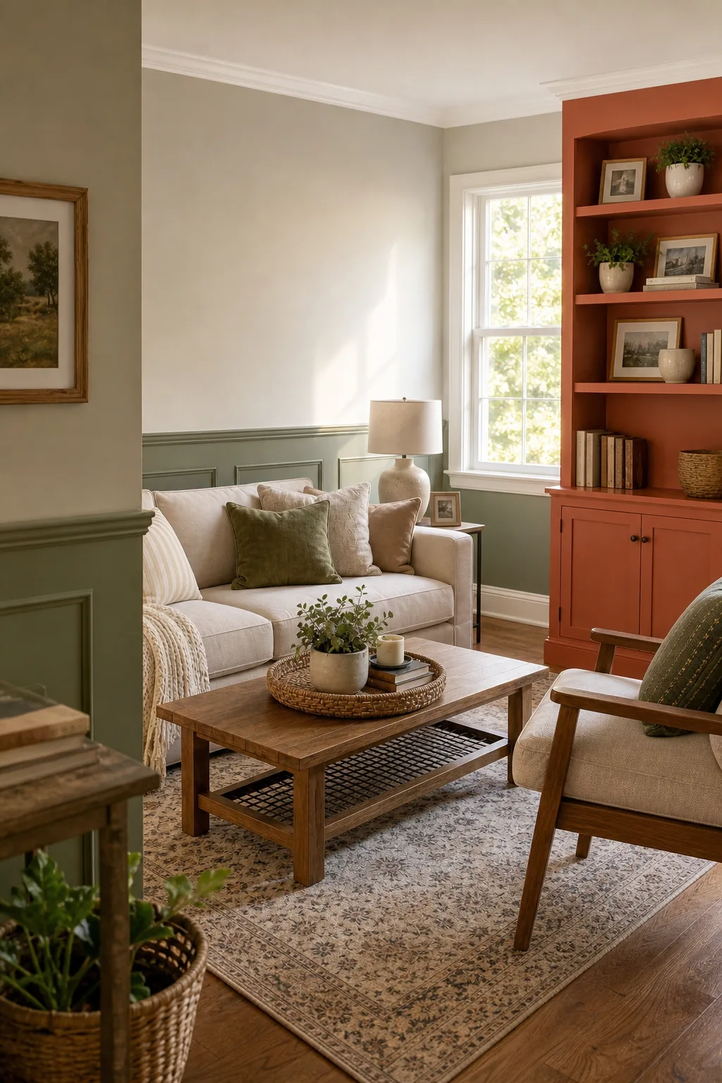
Understanding a color’s technical specifications will save you from a room that feels unexpectedly gloomy when the afternoon sun shifts. Always evaluate how morning and afternoon light alters the bright gradient where sunlight hits the wall paint before making your final decision.
Selecting the Right Ceiling Undertone
Applying a stark, untinted white straight from the can creates a harsh, unfinished transition above your carefully curated living room walls. You must tint your flat ceiling paint with a 10 percent mix of your dominant wall color to create a harmonious ceiling undertone.
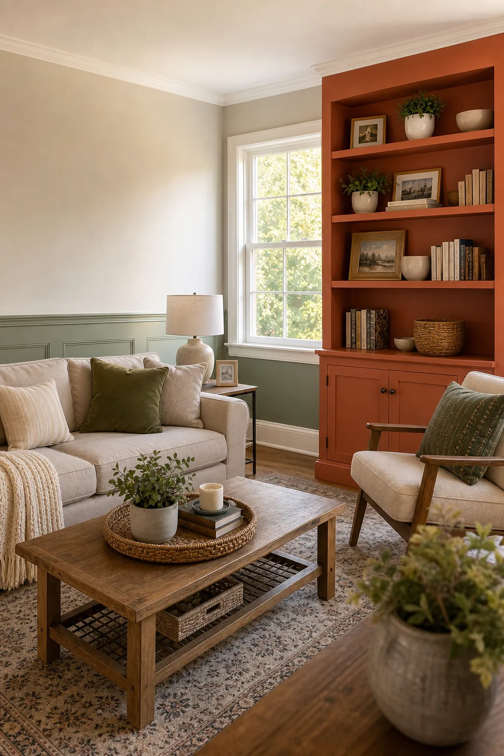
Tinting the overhead surface prevents a stark transition and draws the eye upward naturally toward the slightly tinted painted ceiling. This subtle blending technique guarantees the ceiling feels like an intentional part of the color palette rather than a forgotten builder-grade surface.
Balancing Warm and Cool Paint Tones
Your three chosen colors must deliberately contrast in temperature or share a strictly cohesive undertone to prevent the room from feeling flat. You can easily pair a warm sand dominant wall with a cool sage secondary trim to establish a dynamic, balanced foundation.
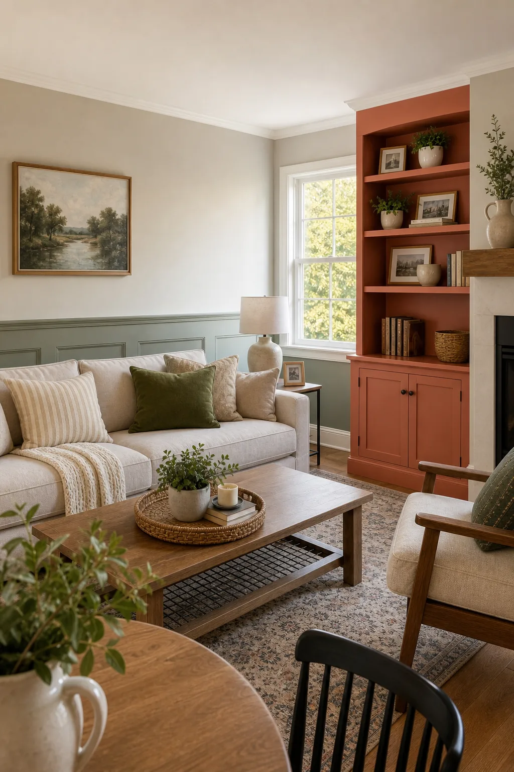
Mix warm and cool tones carefully to keep the palette dynamic at the intersection of the three paint colors. Warming the palette back up with a vibrant terracotta accent ensures the room remains inviting while maintaining clear boundaries between the three distinct zones.
Adjusting Proportions for Open Floor Plans
Open concept homes require you to carry the 60 percent dominant color continuously through the connected hallways and adjacent dining spaces. Maintaining this primary wall color across the entire open area preserves the mathematical ratio while allowing you to shift the secondary tones slightly in neighboring zones.
- Unify the main walls: Keep the largest shared walls painted in your primary neutral hue to establish a cohesive visual flow between the living and dining zones.
- Shift the accent color: Introduce a new 10 percent accent color in the adjoining kitchen to define the new functional space without breaking the overarching rule.
- Maintain trim consistency: Continue your 30 percent secondary trim color along all shared baseboards to ground the open floor plan seamlessly.
Testing Your Three Colors Together
You must implement a concrete testing method before purchasing expensive gallons of paint and committing to the full 60-30-10 application. Paint large 12×12-inch sample squares of all three colors and observe them together on different walls at morning, noon, and night.
Observe physical swatches vertically before purchasing your final gallons to accurately judge how shadows interact with the specific paint finishes. Completing a rigorous lighting test guarantees your chosen proportions will look spectacular and cohesive regardless of the weather or the time of day.