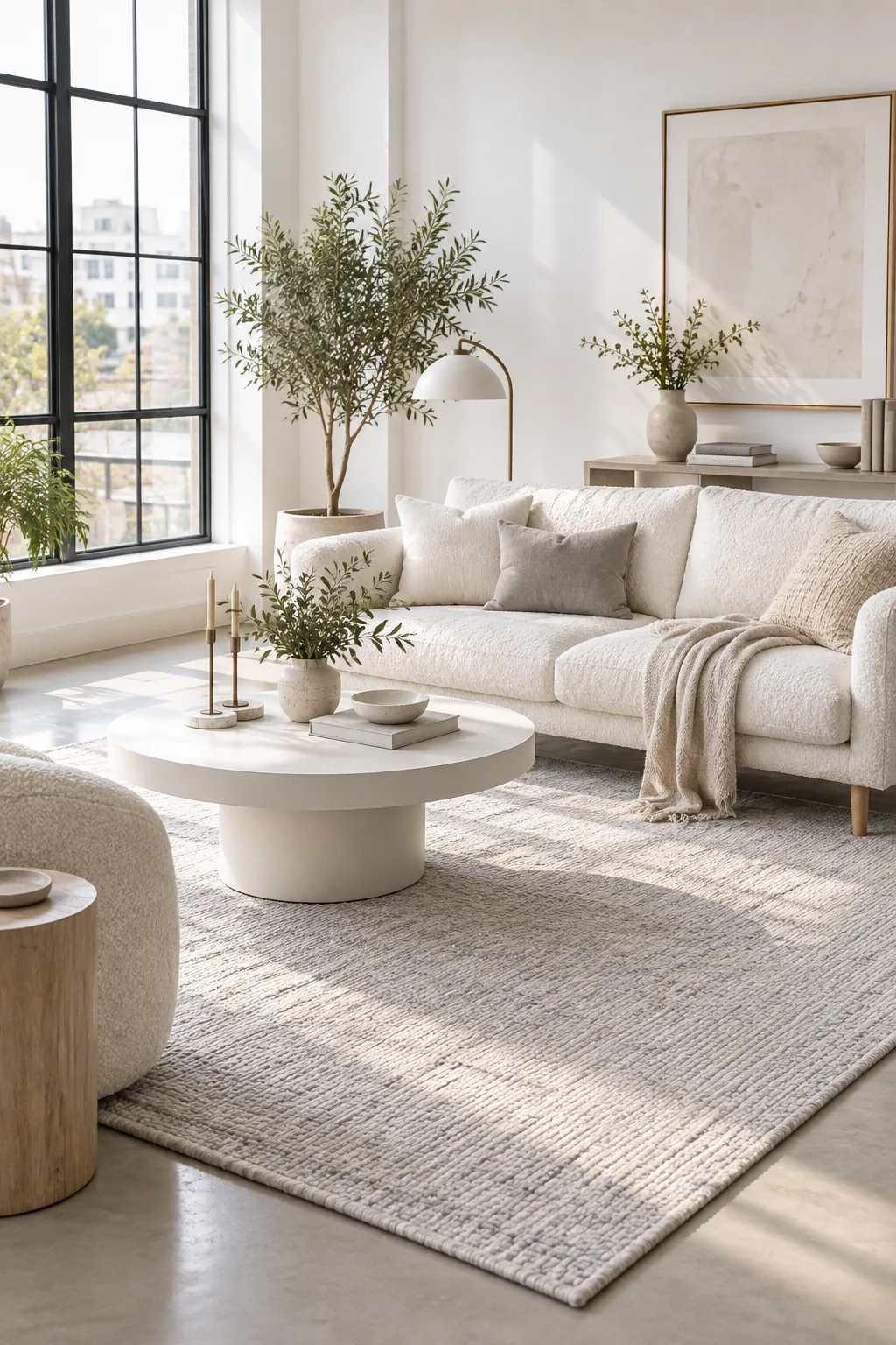
Small Living Room Layout: The Ultimate Spacing Cheat Sheet
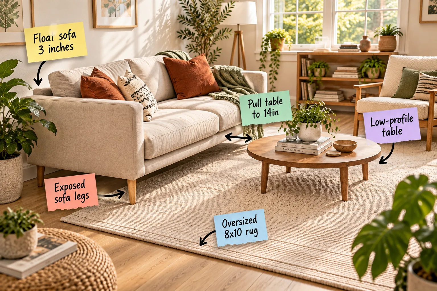
Mastering tight square footage requires exact measurements, which is exactly why I created this room clearance and spacing cheat sheet. You will be able to arrange your furniture using exact designer measurements to make any small room feel instantly larger.
Anchor the Room with an 8×10 Rug
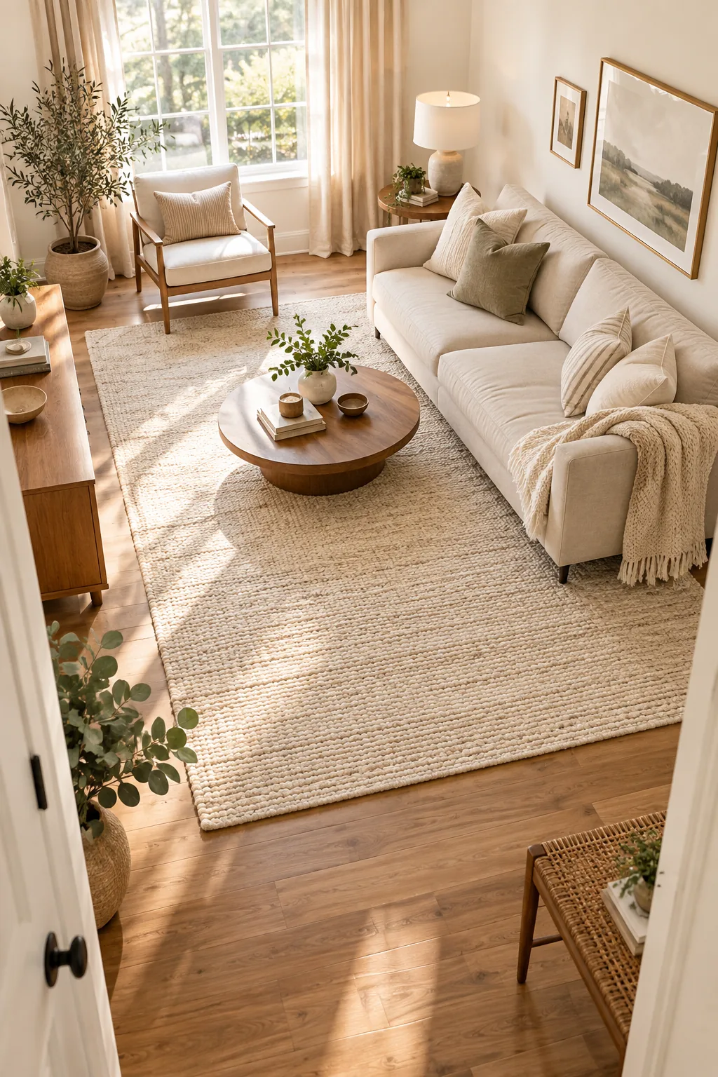
A common spatial error is using a rug that barely holds the coffee table, so upgrading to an oversized 8×10 rug visually expands the floor plan by pushing boundaries outward. Ensure the front legs of your main seating rest comfortably on the rug to tie the zone together.
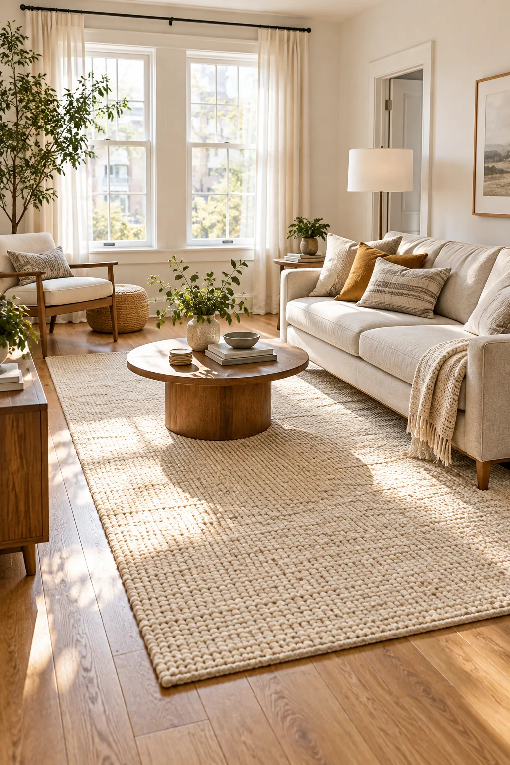
Before unrolling your new foundation, double-check that you aren’t making these common scale errors.
Define Zones with Subtle Color Shifts
A tonal shift in your textiles helps delineate spaces without requiring physical barriers. Using a slightly darker shade on the sofa grounds the seating area, while lighter throw pillows keep the overall visual weight feeling airy and intentionally curated.
Center the Layout on the Primary Focal Point
Whether it is a fireplace or a large window, aligning your primary seating with the room’s primary architectural feature creates immediate order. This symmetry anchors the eye, making the tightest square footage feel deliberate and completely balanced.
Float the Sofa 3 Inches from the Wall
Pushing seating flush against the drywall actually highlights a room’s cramped dimensions, so always float the sofa 3 inches forward. This strict gap introduces a shadow line that tricks the eye into perceiving essential depth behind the furniture.
Balance Visual Weight Across the Room
Placing all heavy furniture on one side of a narrow room causes the space to feel physically lopsided. Distribute mass evenly by placing a visually dense sofa opposite two lighter, open-framed chairs to maintain perfect spatial equilibrium.
Open the Floor with Exposed Sofa Legs
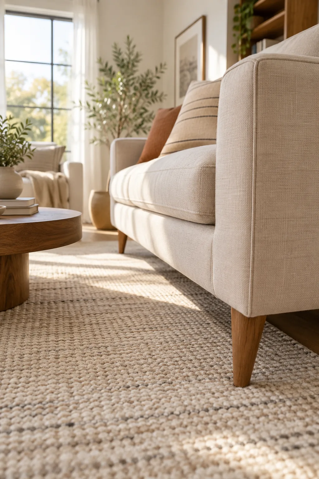
Heavy, skirted sofas block sightlines and consume visual volume, but swapping to a sofa with exposed, tapered wooden legs allows light to flow continuously underneath. This uninterrupted sightline lightens the furniture’s footprint, making it feel perfectly scaled for tight square footage.
In my own Denver bungalow, removing a heavy skirted sofa and replacing it with an elevated wooden frame immediately made the narrow living room feel twice as wide.
Select Narrow-Track Arms for Seating
Overstuffed rolled arms can steal up to a foot of usable seating space while adding unnecessary bulk. Specifying narrow-track arms maximizes the interior cushion width, giving you a full-sized seating experience within a much smaller overall footprint.
Set a 14-Inch Coffee Table Gap
Standard living rooms often use an 18-inch gap, but tight spaces require you to pull the table to 14 inches from the sofa edge. This keeps drinks reachable while maximizing the main walkway behind or beside the seating area.
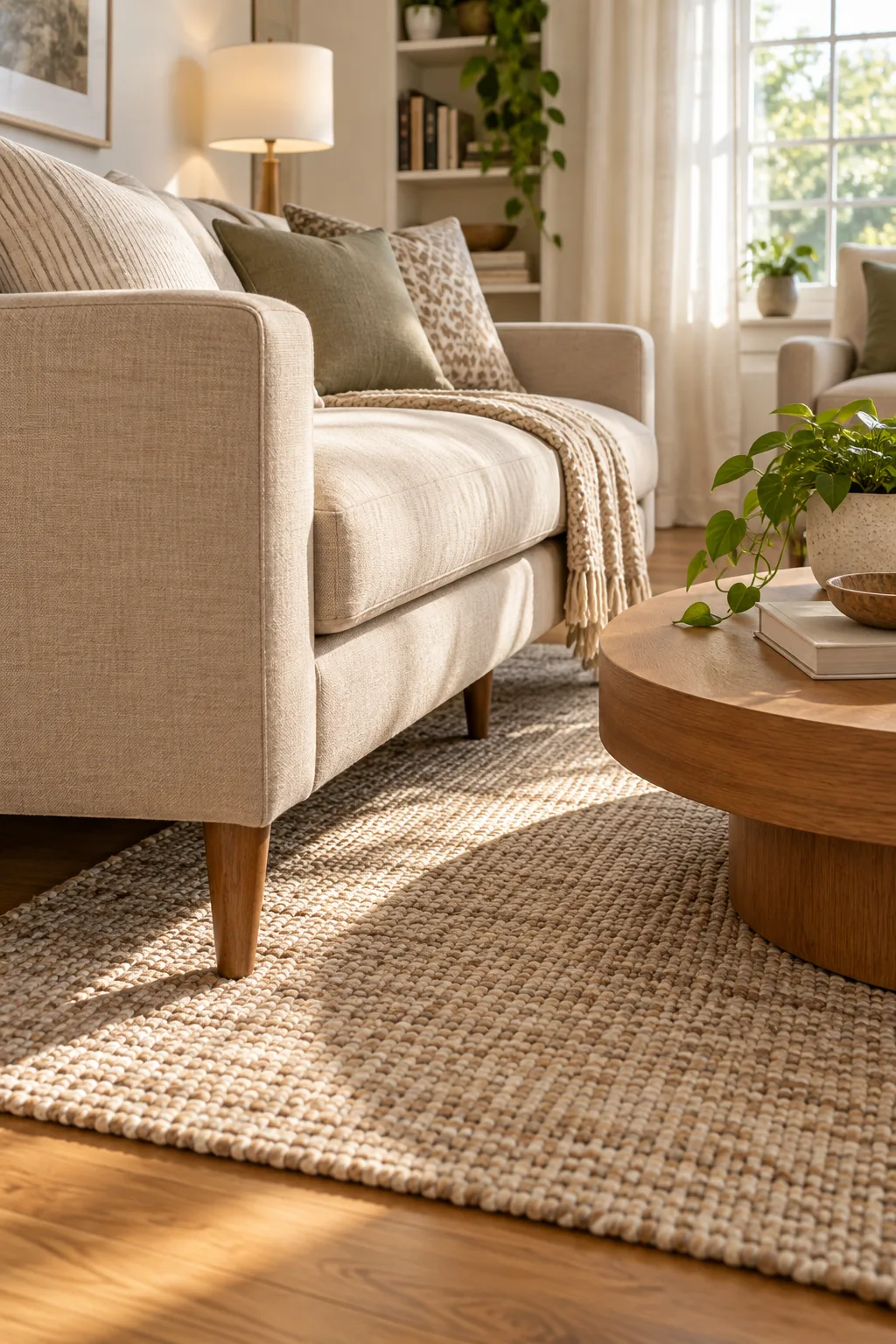
I always use this exact 14-inch clearance in my clients’ tightest floor plans to ensure traffic flows effortlessly behind the primary seating area without sacrificing comfort.
Choose Round Tables to Improve Circulation
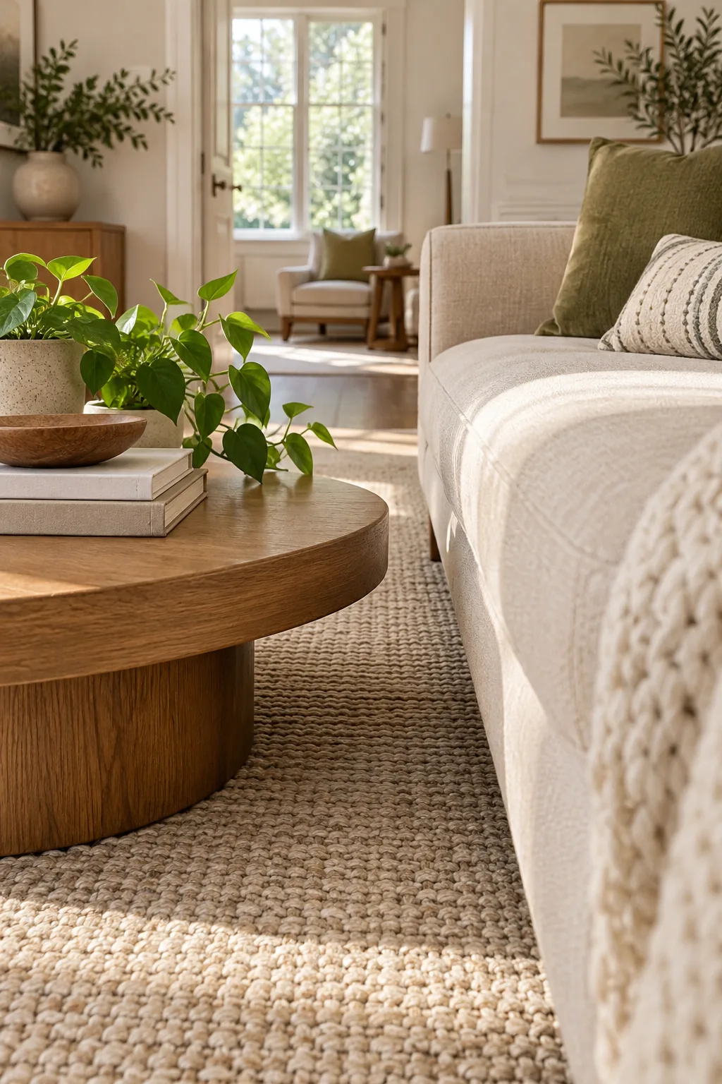
Sharp corners on square tables create pinch points in narrow walkways and disrupt the natural flow of traffic. Swapping to a round coffee table softens the room’s geometry and allows guests to navigate the space without awkward maneuvering.
Protect Sightlines with a Low-Profile Table
Tall, bulky coffee tables act as visual roadblocks in the center of a small space, so choose a sleek, low-profile table that sits an inch or two below the sofa seat height. This subtle drop in elevation keeps the room feeling airy and unobstructed.
Utilize Multipurpose Nesting Tables
When floor space is at an absolute premium, static side tables often waste valuable square footage. Nesting tables provide flexible surface area that expands when entertaining and tucks away seamlessly when you need to reclaim your walkways.
Scale Secondary Seating for Flow
Accent chairs must never choke the room’s entry points, so always maintain a minimum 24-inch clearance behind any secondary seating to ensure a comfortable walking path. If that measurement isn’t possible, follow this simple hierarchy to preserve your floor plan.
- Measure the primary entry path to confirm your available footprint.
- Swap bulky armchairs for open-weave frames that let light pass through.
- Use backless ottomans to provide seating without demanding dedicated walkway clearance.
Opt for Armless Accent Chairs
If your secondary seating still feels cramped after measuring, armless slipper chairs offer a brilliant solution. They provide comfortable, dedicated seating but allow the eye to glide right over their profile, keeping the room’s sightlines wide open.
Maximize Vertical Space with Lighting
Floor space is a premium currency in tight layouts, so replace wide-base floor lamps with wall-mounted plug-in sconces. Tucking these ultra-slim fixtures exactly 12 inches from the corners draws the eye upward while keeping the functional floor plan completely clear.
Layer Ambient and Task Lighting
Relying solely on a single overhead fixture casts harsh shadows that make small rooms feel like caves. Layering soft ambient sconces with targeted reading lamps creates overlapping pools of light that visually push the walls outward.
Mount Window Treatments Near the Ceiling
Hanging curtain rods directly above the window frame visually compresses the room’s height. Installing the rod just two inches below the ceiling line draws the eye upward, tricking the brain into perceiving significantly taller architectural proportions.
Keep Window Sills Completely Bare
Cluttering window ledges with small plants or decor blocks natural light and makes the perimeter feel chaotic. Leaving these surfaces entirely bare maximizes solar gain and emphasizes the clean architectural lines of your small living space.
Incorporate Strategic Wall Mirrors
Placing a large mirror directly opposite your primary window doubles the room’s natural light and reflects the outdoor view. This classic designer technique creates a virtual window that immediately dissolves the feeling of being boxed in.
Harmonize Wood Tones for Cohesion
Mixing too many different wood finishes in a compact layout creates visual noise and fragmentation. Stick to two complementary wood tones throughout the space to ensure your furniture pieces feel like a unified, intentional collection.
Introduce Texture Instead of Clutter
Small rooms cannot handle excessive decorative objects, so rely on varied textiles to add necessary interest. Layering a chunky knit throw over a smooth leather chair provides rich visual depth without consuming a single inch of tabletop space.
Hang Artwork at Proper Eye Level
Mounting art too high disconnects it from the furniture below, making the ceiling feel oppressively low. Always center your primary art pieces exactly 57 to 60 inches from the floor to maintain a grounded, human-scale perspective.
Select Multi-Functional Storage Pieces
Every item in a tight layout must earn its keep by performing double duty. A tailored storage ottoman serves as a comfortable footrest, a secondary seat for guests, and a hidden compartment to stash unsightly media cables.
Standard Clearances for Small Layouts
Memorizing these essential measurements ensures you never purchase furniture that overwhelms your available square footage. Use this reference matrix to verify your floor plan before making any final design decisions.
| Design Element | Target Clearance | Spatial Purpose |
|---|---|---|
| Sofa to Wall | 3 inches | Creates shadow lines for depth |
| Sofa to Coffee Table | 14 inches | Maximizes the main walkway |
| Primary Walkways | 30 to 36 inches | Ensures comfortable passage |
| Between Accent Chairs | 24 inches minimum | Prevents visual crowding |
| Rug Front Overlap | 8 inches minimum | Anchors the seating zone |
| Primary Art Height | 57 to 60 inches | Maintains human scale |
Angle Furniture to Break Up the Box
When dealing with a perfectly square, rigid room, placing every piece parallel to the walls emphasizes the boxy dimensions. Angling a single accent chair toward the sofa breaks the grid and introduces a dynamic, welcoming energy.
Edit Accessories Down to Odd Numbers
Clustered decor easily overwhelms a small coffee table, so always group your accessories in odd numbers. A simple trio of a tray, a small plant, and a sculptural object feels balanced and curated rather than messy.
Keep Walkways Clear of Trailing Cords
Nothing ruins a carefully planned layout faster than visible extension cords snaking across the floor. Route all wiring behind baseboards or under the edges of your oversized rug to maintain the pristine, uncluttered aesthetic you worked for.
The Room Clearance and Spacing Cheat Sheet
To execute this layout flawlessly, rely on these hard numbers for major traffic paths and furniture clearances. Maintain at least 30 to 36 inches for major traffic paths, keep 24 inches between accent chairs, and ensure your 8×10 rug slips at least 8 inches under the front sofa legs.
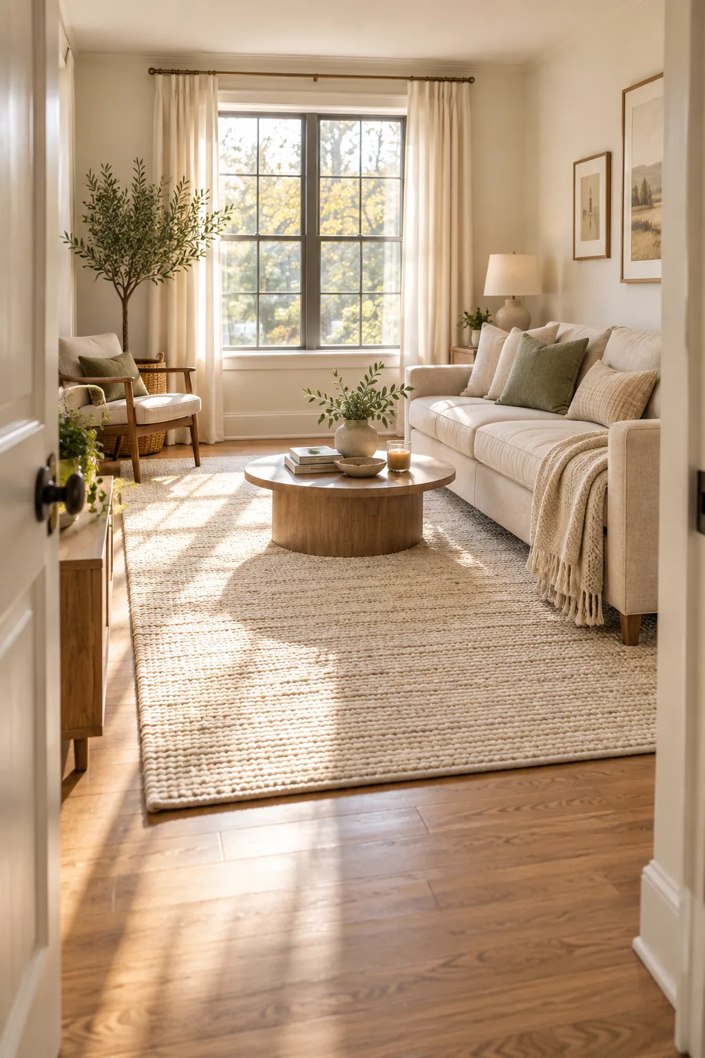
I keep this final spacing checklist handy on my phone when rearranging my own pieces, and you should use it whenever you shop for new furniture.
Small Space Layouts in 4 Different Styles
See how these strict spacing rules adapt beautifully to completely different aesthetics.
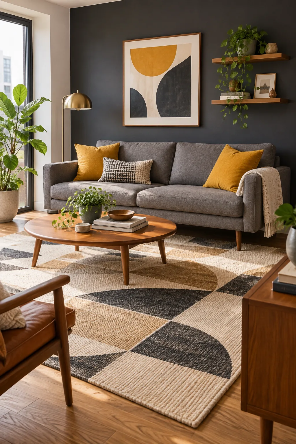
Mid-Century Modern Apartment: Warm teak woods and sharp geometric rug patterns give this tight layout a retro edge while maintaining perfect clearances.
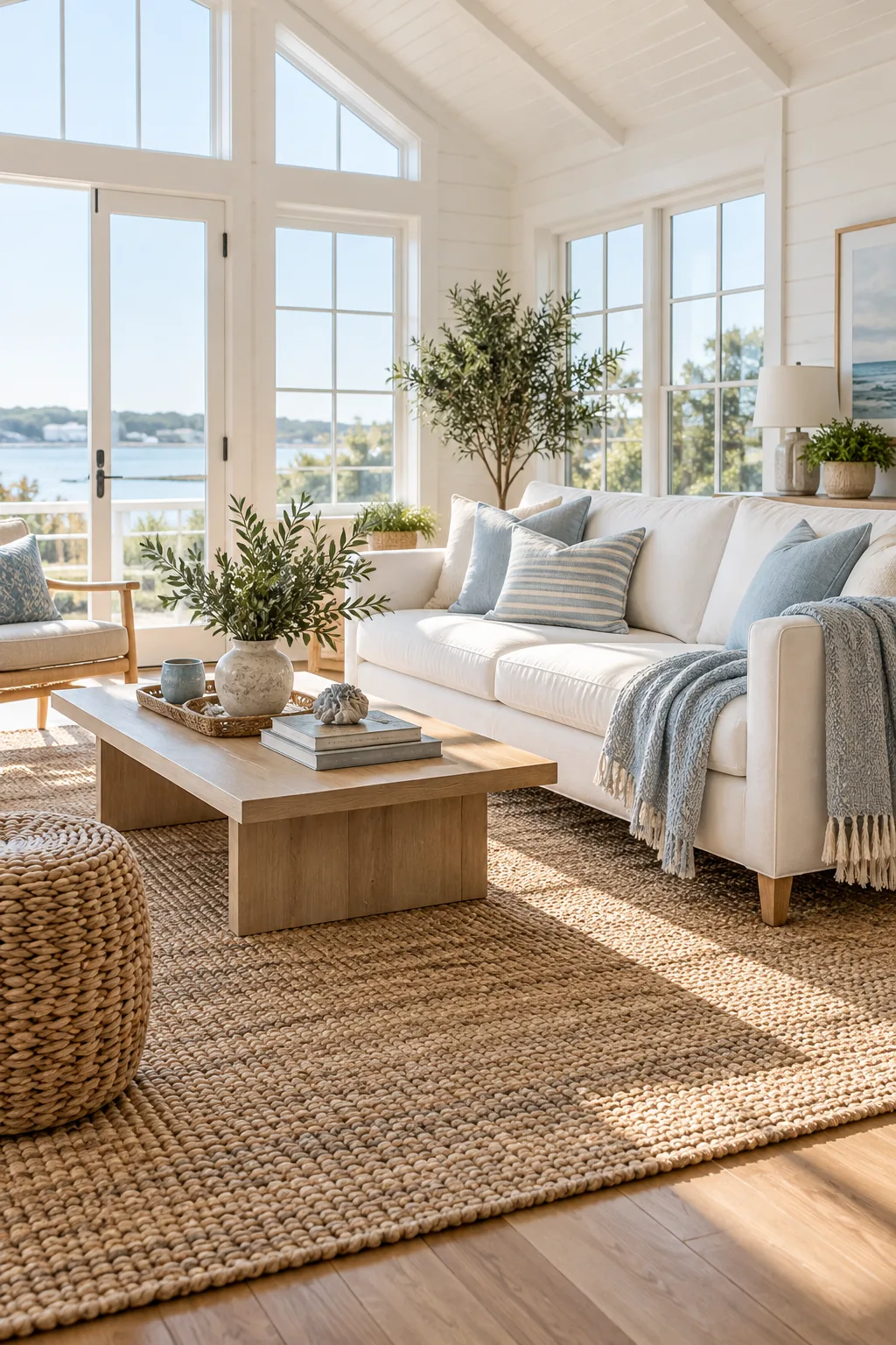
Coastal Minimalist Sunroom: Bleached woods and a massive textured jute rug keep this airy coastal layout feeling grounded yet incredibly spacious.
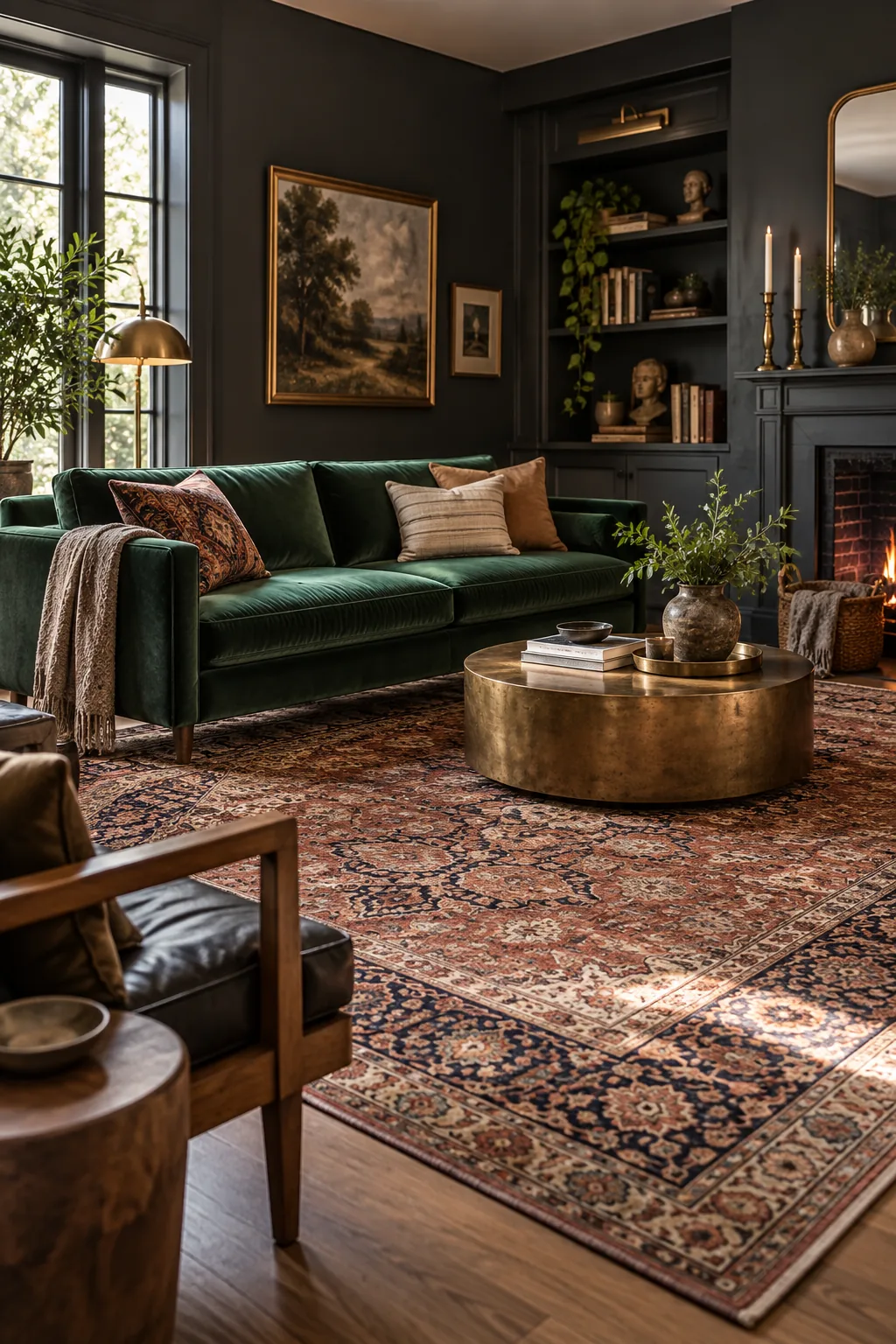
Moody Eclectic Den: Dark walls recede visually when you float a vibrant velvet sofa just a few inches forward to create deep shadow lines.
Scandinavian Neutral Loft: High exposed legs and a low-profile center table ensure nothing interrupts the clean, minimalist sightlines of this Scandinavian space.