
Small Room Layout Guide: Exact Spacing Rules to Make It Feel Huge
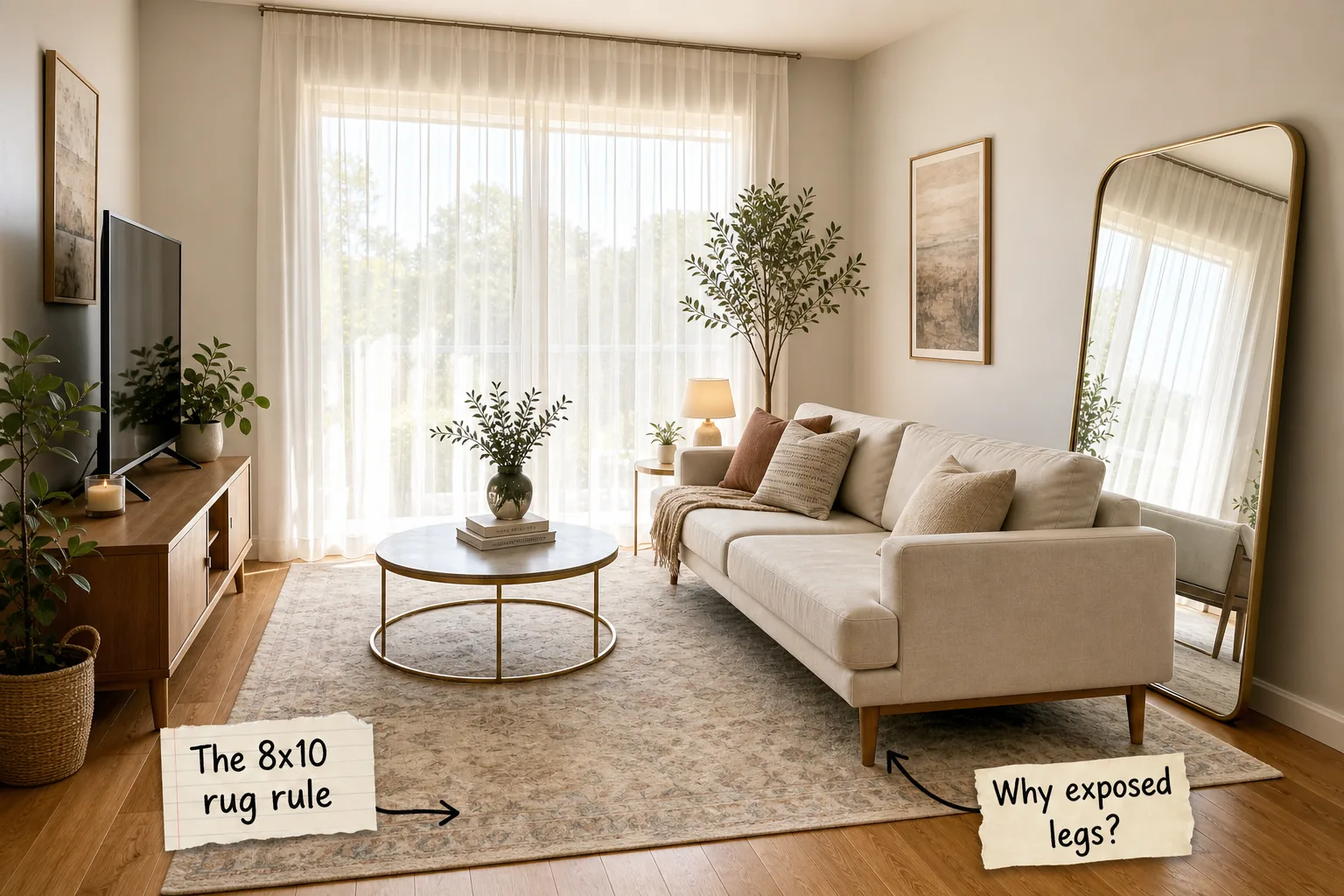
Mastering your compact living space requires our complete small room layout guide with exact spacing rules and rug sizing charts. You will finally be able to arrange your furniture using precise measurements to make any tight floor plan feel spacious and entirely intentional.
The 8×10 Rug Rule
A large area rug expands the visual floor plan rather than shrinking it, establishing a generous foundational boundary for your seating arrangement. Positioning the sofa so its front legs rest 8 to 12 inches inside the rug edge anchors the entire space.
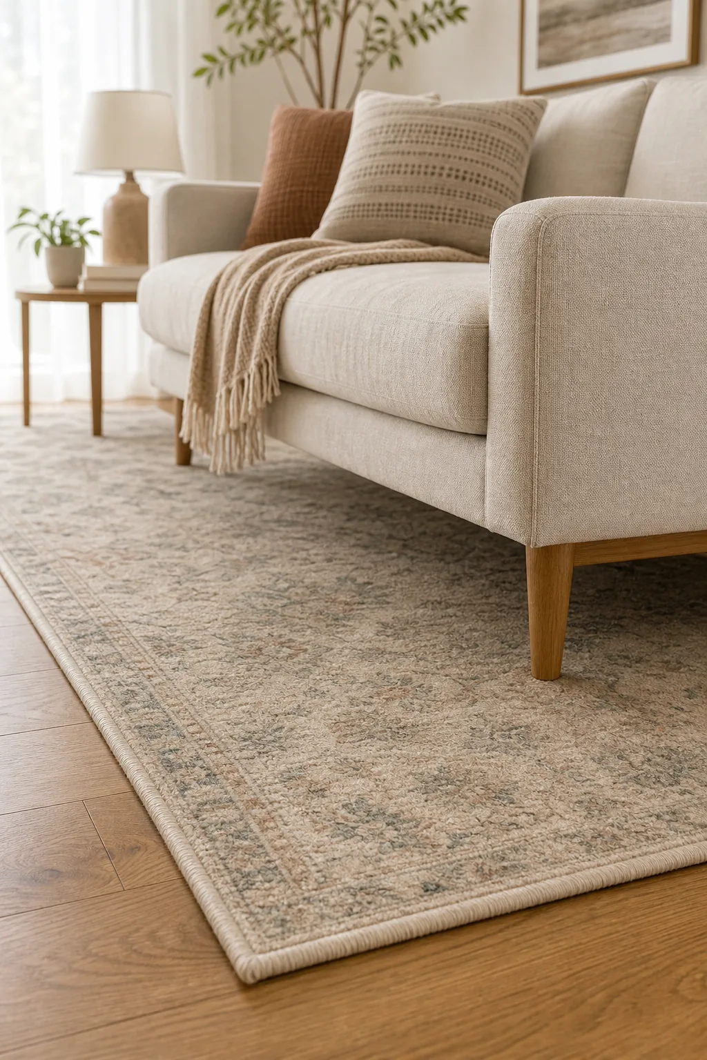
Selecting an 8×10 rug is ideal for most small living rooms because it stretches the perceived boundaries of the conversation zone toward the walls. This generous border prevents the furniture from looking awkwardly clustered in the center of the room.
Rug Placement Mechanics
To maximize the illusion of square footage, you must align the rug precisely with your primary architectural features rather than floating it arbitrarily. Follow these specific orientation checks to keep the room feeling balanced and visually expansive from every angle.
- Leave a minimum of 12 to 18 inches of bare floor between the rug edges and the baseboards.
- Center the longest side of the rug parallel to the longest wall in the room.
- Ensure all primary seating pieces touch the perimeter of the rug.
Maintaining this exposed perimeter of hard flooring creates a framing effect that highlights the room’s true dimensions. This border prevents the rug from looking like poorly fitted wall-to-wall carpeting, which often makes tight spaces feel claustrophobic.
Why Exposed Legs Matter
Seeing the floor underneath your furniture tricks the eye into perceiving more square footage because the visible ground plane continues uninterrupted. Opting for a sofa with a minimum 6-inch floor clearance immediately lifts the visual weight off the ground.
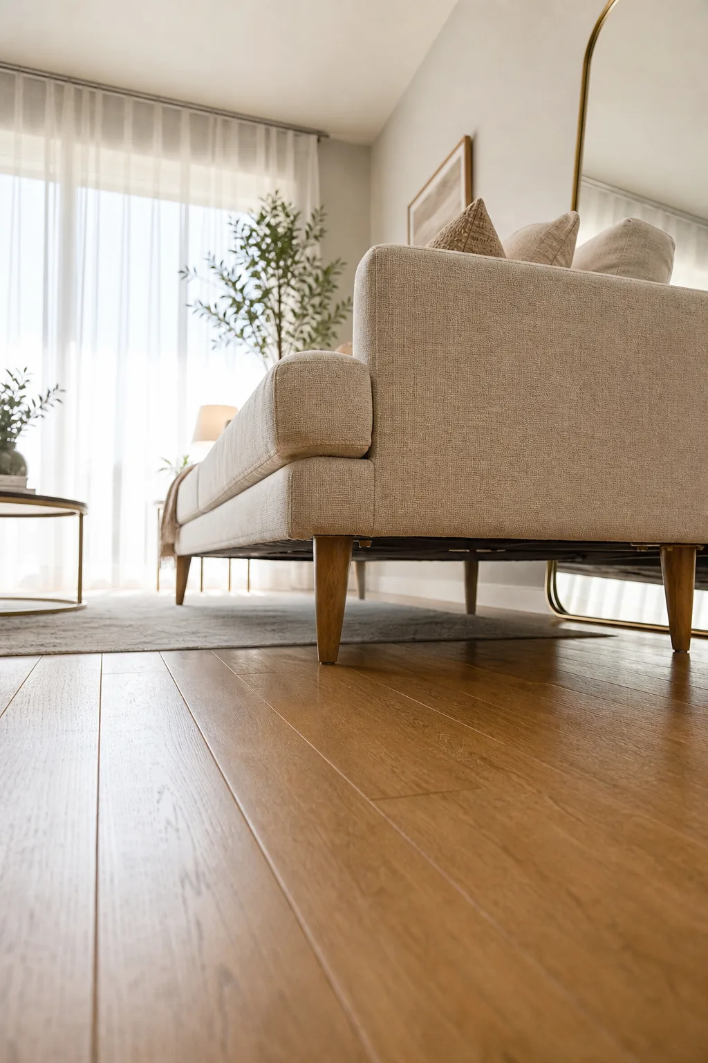
This elevated stance allows shadows to dissipate and light to pass freely beneath the frame, creating a powerful illusion of depth. Skirted sofas or block-base designs completely block this sightline, making the room feel noticeably heavier and more cramped.
Avoiding the Block-Base Trap
Skimping on rug size or choosing overly grounded furniture are the most common layout errors that visually chop a compact floor plan into smaller pieces. You must actively protect the visible floor area to maintain a continuous, airy atmosphere.
Correcting these grounding errors immediately restores the room’s visual flow and allows the eye to sweep smoothly across the space. Every inch of exposed floor beneath your seating directly contributes to the perception of a wider, deeper room.
Low-Profile Seating
Maintaining clear sightlines across the room is critical for making the ceiling feel higher and the walls wider. Selecting a sofa with a back height under 32 inches prevents the furniture from dominating the room’s total volume.
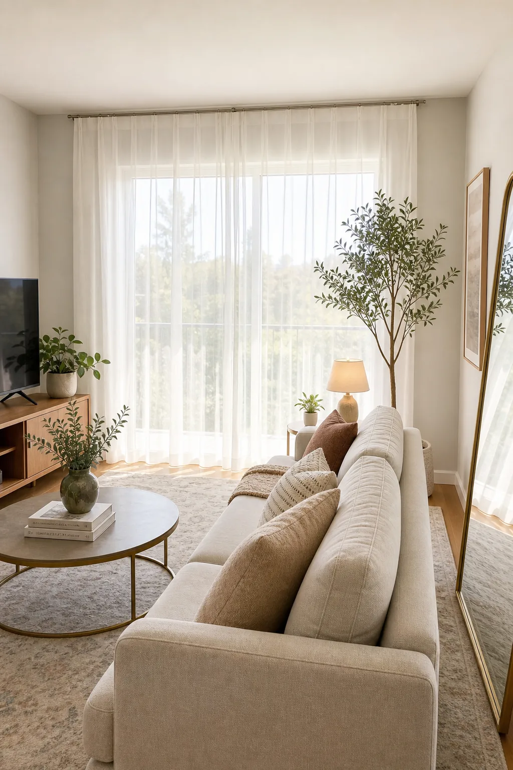
Lower furniture backs allow your gaze to travel smoothly over the seating area toward the windows without hitting a solid upholstered wall. This simple height restriction ensures natural light easily reaches the center of the room.
Sightlines and Visual Volume
When outfitting a tight space, you must strictly control the vertical height of every piece that sits in the middle of the floor plan. Follow this prioritized sequence to protect your crucial horizontal sightlines and maximize natural light penetration.
- Cap the primary sofa back height at 32 inches to ensure the room feels open upon entry.
- Select accent chairs with open arms and backs lower than the main sofa.
- Keep media consoles below 24 inches tall to maximize the exposed wall space above them.
Adhering to this tiered height strategy prevents heavy furniture from acting as visual barricades in the center of the room. By keeping the tallest elements pushed against the perimeter walls, the core seating area remains delightfully unobstructed.
The Light-Bounce Zone
You can instantly double the perceived natural light by establishing a dedicated reflective surface opposite or adjacent to your primary window. Positioning a floor mirror at least 65 inches tall maximizes this crucial light-bounce effect.
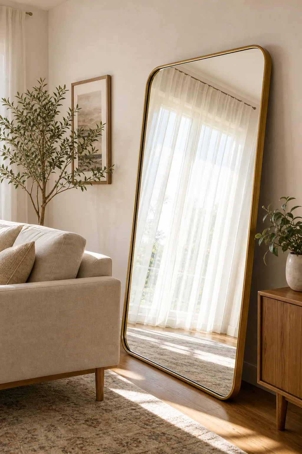
This massive reflective plane acts as a secondary window, catching the incoming sunlight and scattering it deeply into the shadowed corners. The sheer scale of the glass surface creates a convincing architectural illusion of a much deeper room.
Angling for Maximum Illumination
Leaning the tall mirror at a slight upward angle pushes the reflected light toward the ceiling, further exaggerating the height of the room. Always secure heavy leaning mirrors with a discreet wall anchor to ensure complete safety in high-traffic compact zones.
High-Mount Curtains
Drawing the eye upward is a fundamental trick to exaggerate ceiling height and make the walls feel grander than their actual dimensions. Mounting the curtain rod 1 to 2 inches below the ceiling line forces the gaze to travel the full vertical span.
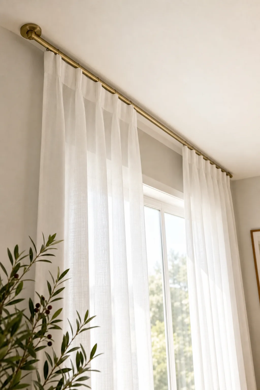
To avoid blocking the actual glass, you must also extend the rod 10 to 12 inches beyond the window frame on each side. This allows the curtain panels to stack entirely over the drywall, making the window itself appear significantly wider.
Choosing the Right Drapery Fabric
Heavy drapes can easily make a small room feel boxed in, so your fabric choice matters just as much as the strategic mounting placement. You want materials that filter light gracefully without adding dense visual weight to the perimeter walls.
Selecting these translucent fabrics ensures the window remains a brilliant focal point rather than a dark, heavy void. Lighter textiles also catch the ambient breeze, adding a subtle sense of movement that makes the entire room feel exceptionally fresh.
Smart Coffee Table Proportions
A visually light or round coffee table dramatically improves daily navigation in tight quarters by eliminating sharp, restrictive corners. You must maintain a strict 14 to 18-inch gap between the sofa seat and the table edge for comfortable reach without crowding.
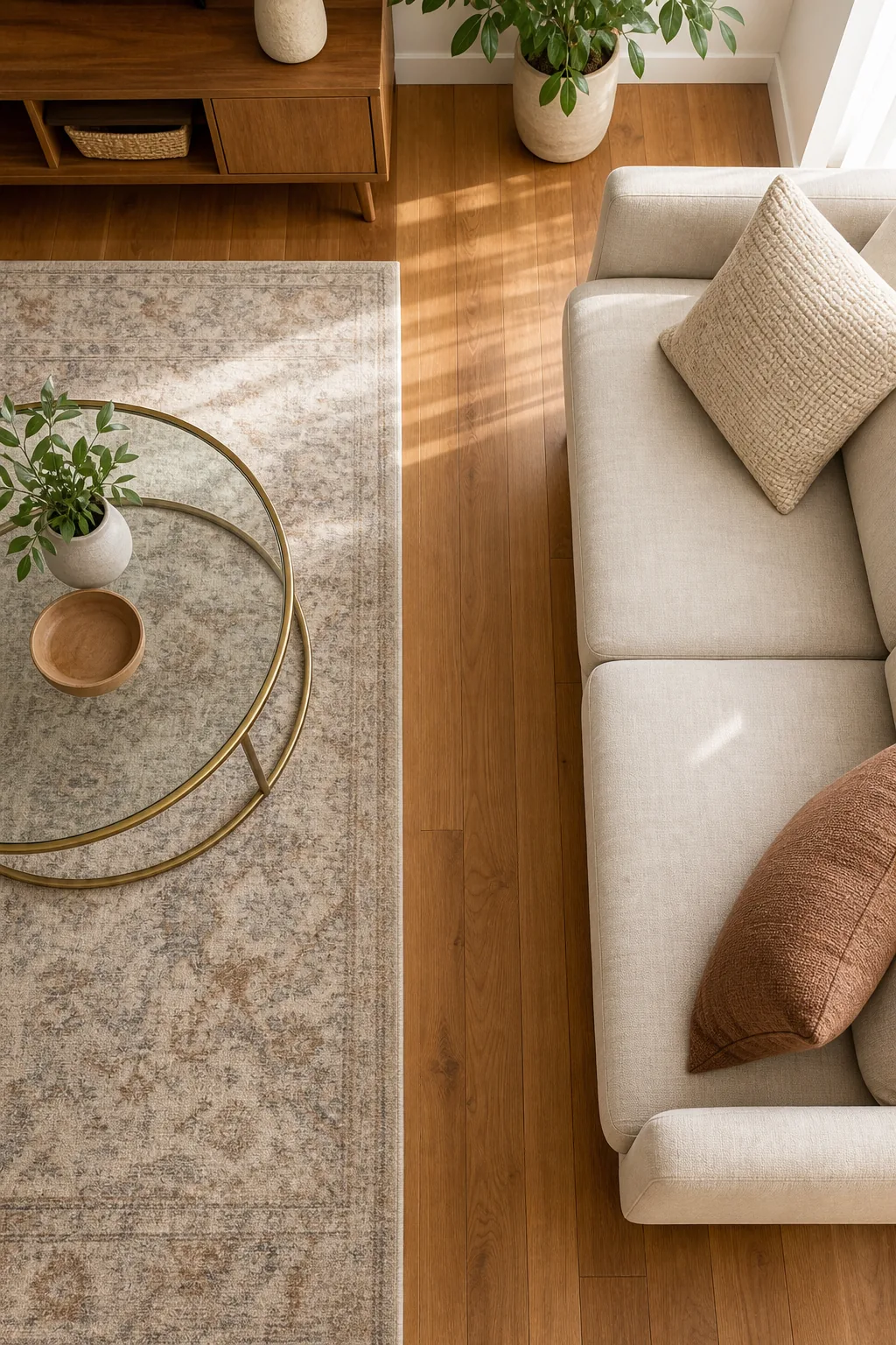
This precise spacing guarantees that anyone sitting down has ample legroom while still being able to set down a drink effortlessly. Round shapes naturally guide foot traffic around the seating arrangement, softening the rigid lines of the surrounding layout.
Material Choices for Tight Quarters
Selecting a coffee table with a transparent glass top and a slender metal frame allows the rug pattern to remain fully visible beneath it. This transparency completely removes the table’s visual bulk, keeping the center of the room feeling delightfully unobstructed.
Traffic Flow and Walkways
Preserving dedicated, clear paths through the room is an absolute necessity to avoid a cluttered, chaotic feel. Your main walkways must measure 30 to 36 inches wide to ensure comfortable, unobstructed movement around the primary seating zone.
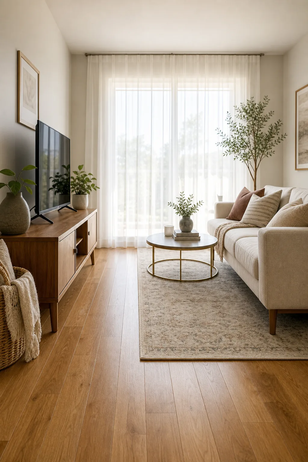
Pinching these vital arteries forces residents to squeeze past furniture, instantly reminding them of the room’s limited footprint. Protecting these generous clearances guarantees the space functions smoothly and feels intentionally designed rather than overstuffed.
Preserving Secondary Paths
While primary routes require generous width, you must also measure and protect the secondary paths between accent chairs and side tables. Maintain a minimum clearance of 24 inches for these minor walkways to prevent the corners of the room from becoming inaccessible dead zones.
The Small Room Layout Guide
When you combine precise vertical sightlines, elevated furniture frames, and generous floor clearances, the entire room transforms into an airy retreat. Applying these consistent spacing rules ensures that every piece of furniture supports the illusion of a much larger space.
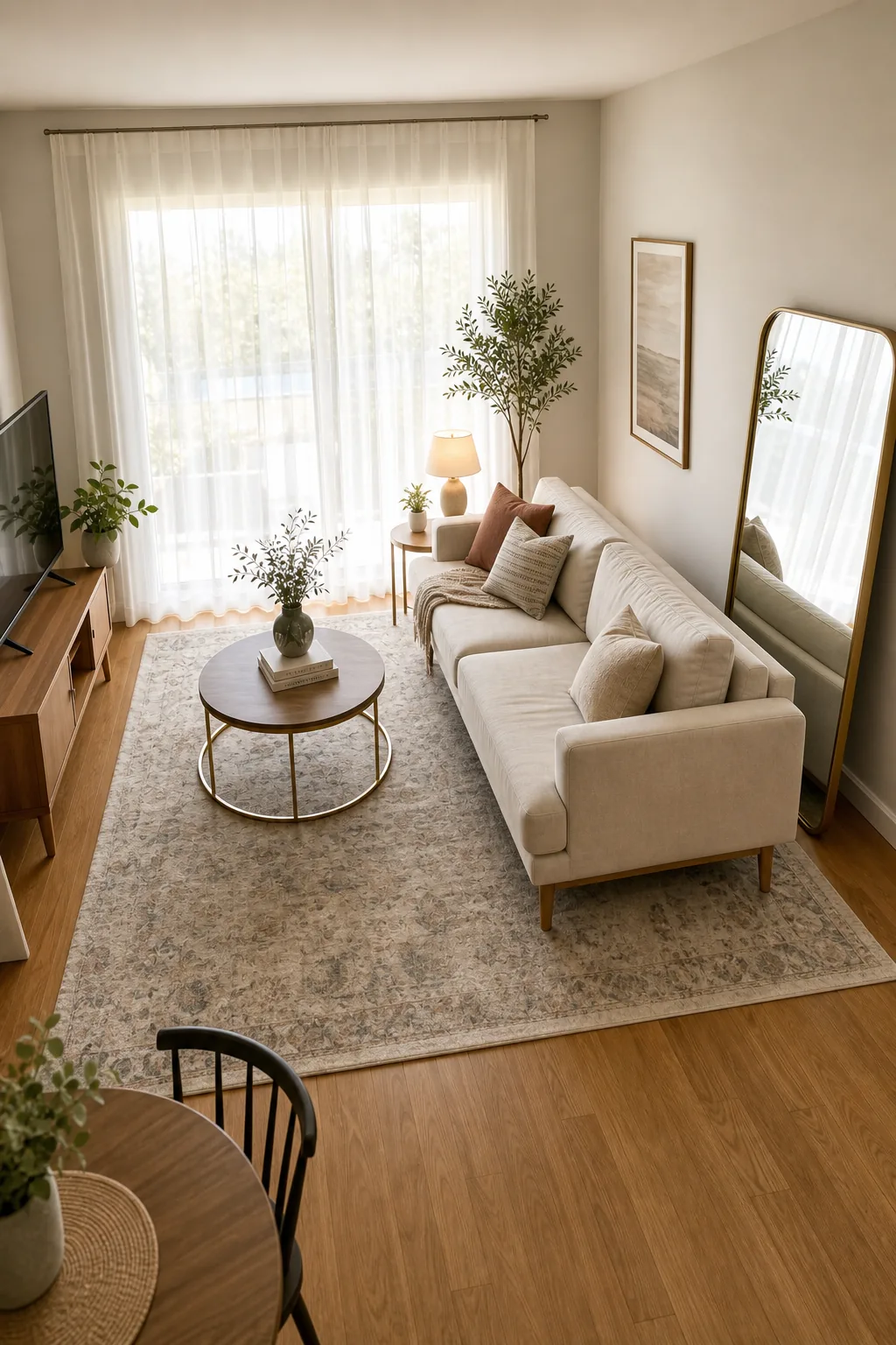
This cohesive arrangement relies entirely on strict adherence to the foundational measurements that dictate traffic flow and visual balance. Use the spacing chart below to verify your final layout and secure the exact clearances promised by this small room layout guide.
| Layout Element | Exact Measurement | Visual Benefit |
|---|---|---|
| Area Rug Size | 8×10 feet | Expands floor plan boundaries |
| Sofa Floor Clearance | 6 inches minimum | Creates deep floor shadows |
| Coffee Table Gap | 14 to 18 inches | Balances reach and legroom |
| Main Walkways | 30 to 36 inches | Prevents cramped navigation |
| Curtain Rod Height | 1 to 2 inches below ceiling | Exaggerates wall height |