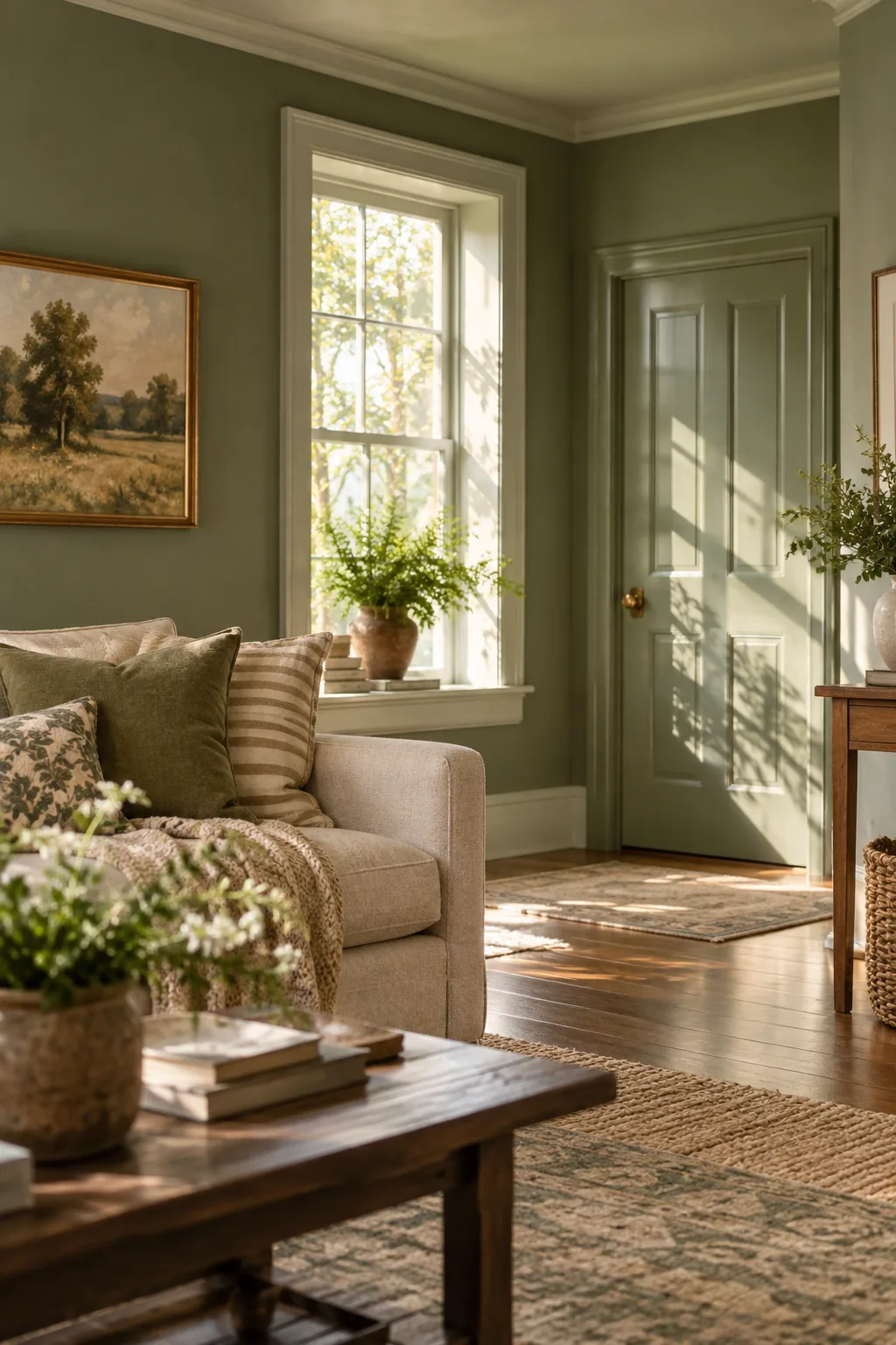
Wall and Trim Color Combinations for a Pricier Custom Look
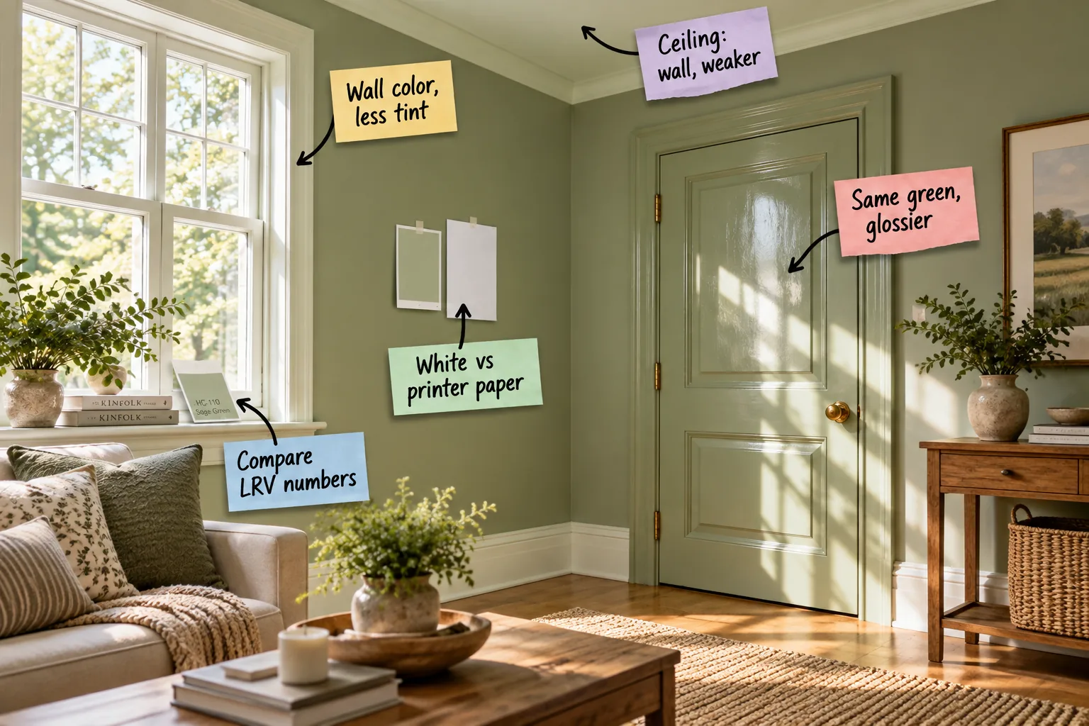
You will confidently order custom tint strengths and match perfect sheens for your walls, trim, and ceiling with our printable two-page Wall-to-Trim Pairing Sheet. I designed this guide to help you mix paints like a pro and achieve a cohesive, high-end room without the guesswork.
Choosing Your Primary Wall Color
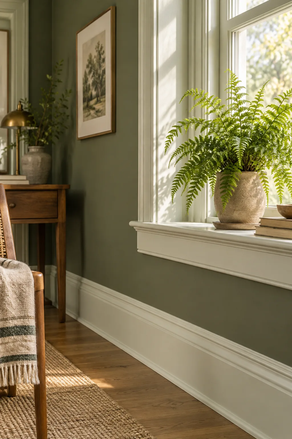
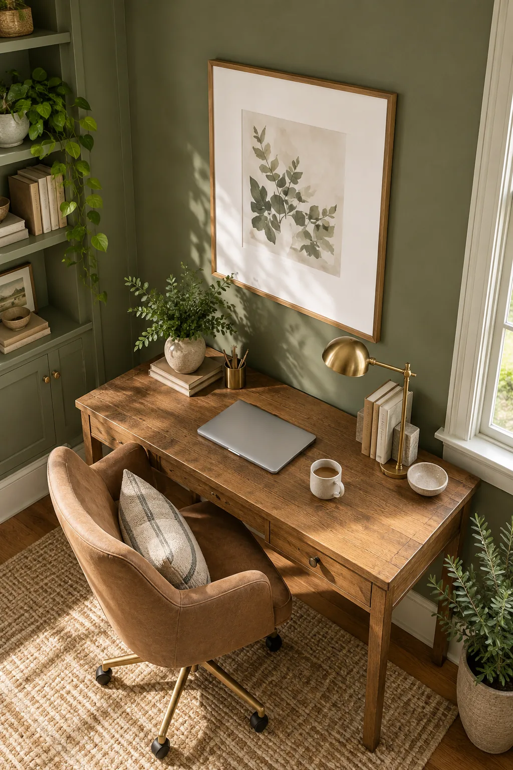
Establishing the main sage green in an eggshell finish anchors the room with a rich, velvety backdrop. Standard two-coat coverage provides better durability than flat paint in high-traffic living spaces while maintaining a soft, sophisticated look.
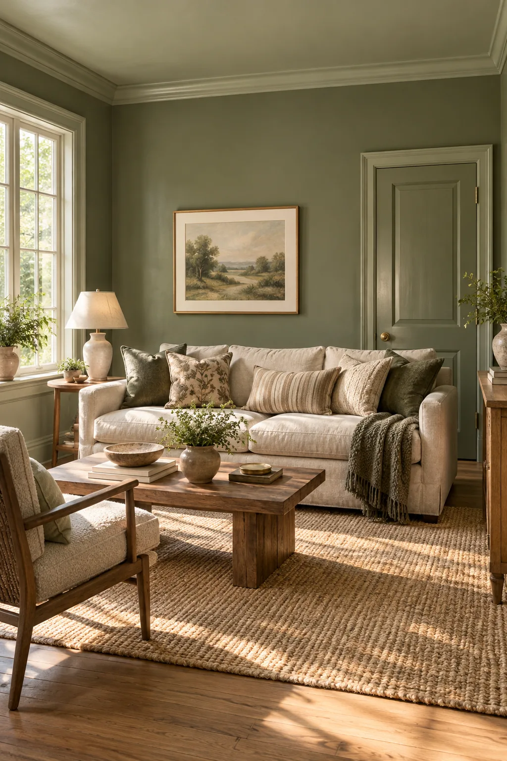
Interior Doors in a Glossier Sheen
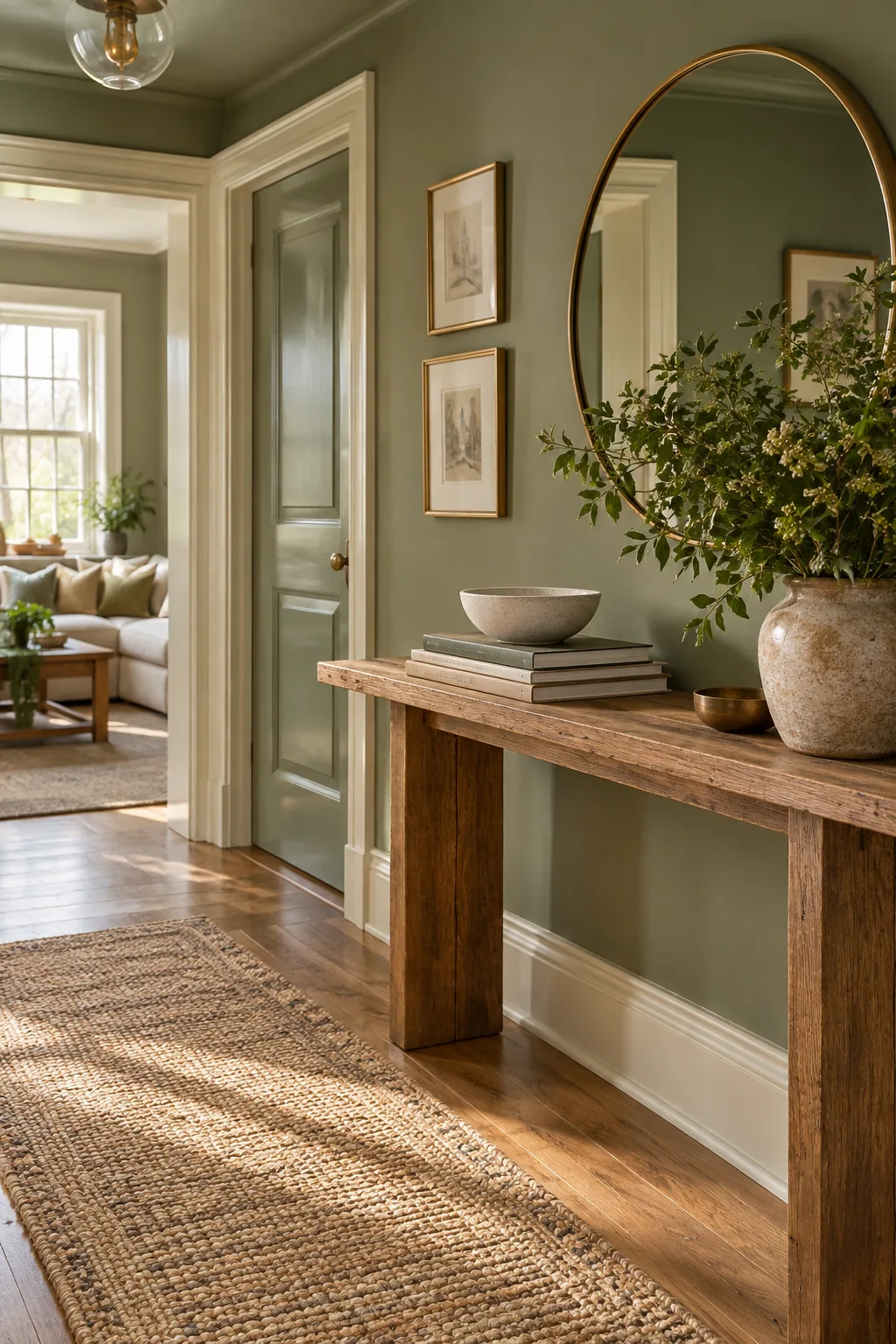
I always paint interior doors the exact same sage green but step up to a semi-gloss or satin finish. In my own Denver home, this simple sheen shift reflects more light and highlights the raised door panels beautifully without introducing a clashing hue.
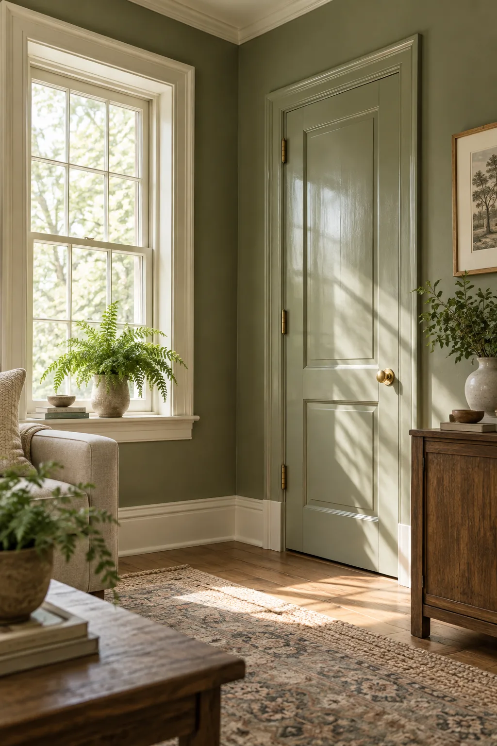
Transitioning to a higher sheen requires a perfectly smooth foundation to prevent visible brush strokes and peeling over time.
Custom Trim With Reduced Tint
Request your primary wall color mixed at 50% or 75% tint strength for the baseboards and window casings. On a recent historic renovation, this technique created a soft, green-tinted white that harmonized perfectly with the walls while providing crisp architectural definition.
- Ask the paint counter to start with your exact wall color formula.
- Request a custom reduction to 50 percent strength.
- Verify the mix by testing a small sample before leaving the store.
Washing the Ceiling in a Weaker Hue
Avoid stark white ceilings by asking the paint counter for a 10% to 25% strength mix of the wall color. This faint wash draws the eye upward and makes the crown molding pop without making the room feel enclosed or heavy.
The Printer Paper Undertone Test
Tape a standard sheet of bright white printer paper next to your painted sample board on the wall. The pure white background instantly reveals hidden yellow, blue, or gray undertones in the paint that might otherwise go unnoticed.
Comparing LRV Numbers for Contrast
Look up the Light Reflectance Value (LRV) on the manufacturer’s website. I always space the wall and trim LRV numbers by at least 15 to 20 points for crisp contrast, or keep them within 10 points for a softer, tonal look.
| Design Goal | LRV Spacing | Visual Effect |
|---|---|---|
| Crisp Contrast | 15 to 20 points | Sharp architectural definition |
| Soft Tonal | 5 to 10 points | Subtle, blended transitions |
| Monochromatic | 0 to 4 points | Seamless, modern envelope |
Get the Wall-to-Trim Pairing Sheet
Download the printable two-page guide to take the guesswork out of your next project. It lists the exact sheens to buy for every surface and provides a script for ordering custom tint strengths at the paint counter.
Before you head to the hardware store, make sure you have everything needed to order your custom mixes smoothly.
More Tonal Color Drenching Ideas
Explore how different hues and palettes transform when applied across walls, trim, and doors.
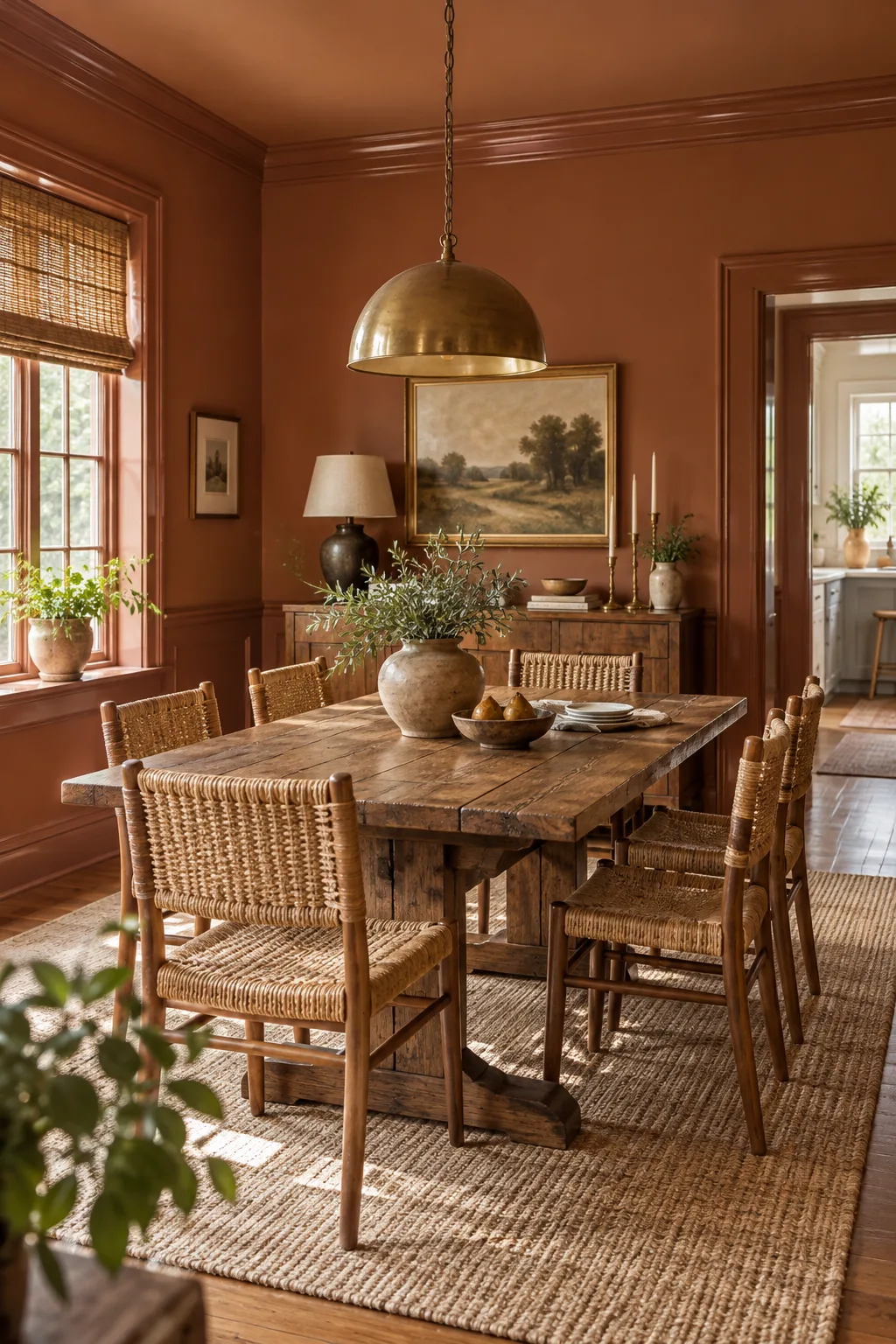
Warm Clay Dining Room: High-gloss trim elevates earthy clay tones, adding a touch of formal elegance to an otherwise rustic and cozy dining space.
Slate Blue Home Library: Painting the built-in bookshelves in a satin finish matching the matte walls creates a seamless, enveloping atmosphere perfect for a library.
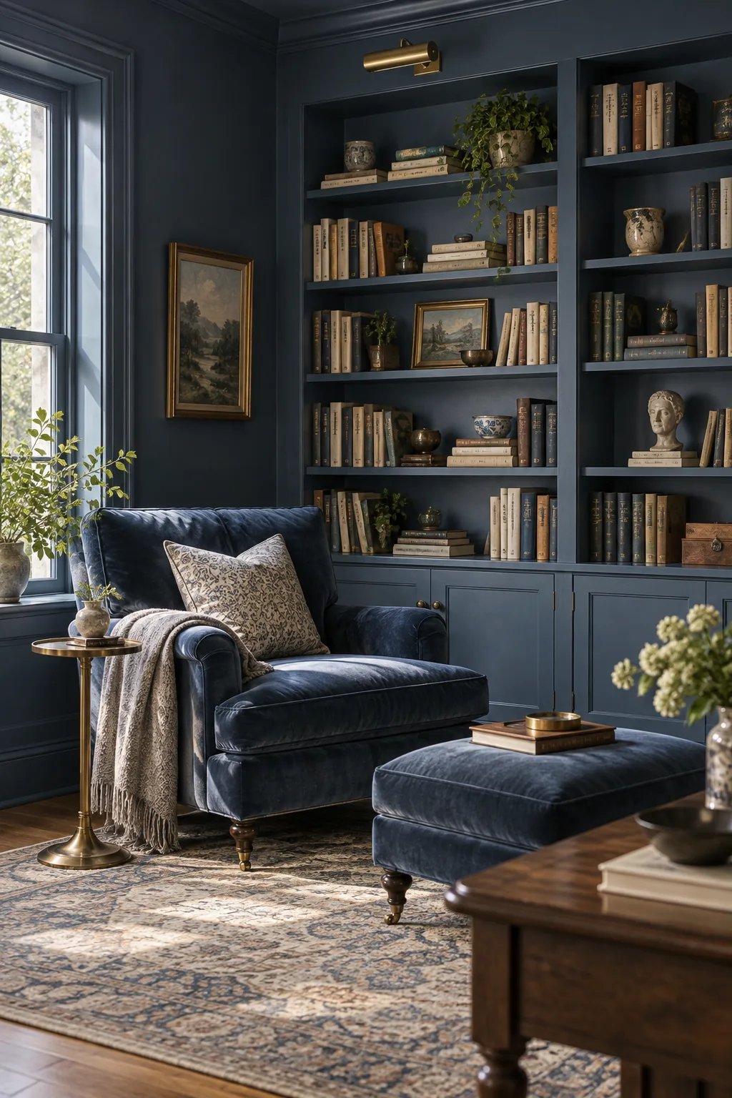
Soft Sand Coastal Bedroom: Reducing the wall tint by half for the trim keeps the coastal palette light and airy without relying on harsh, stark whites.
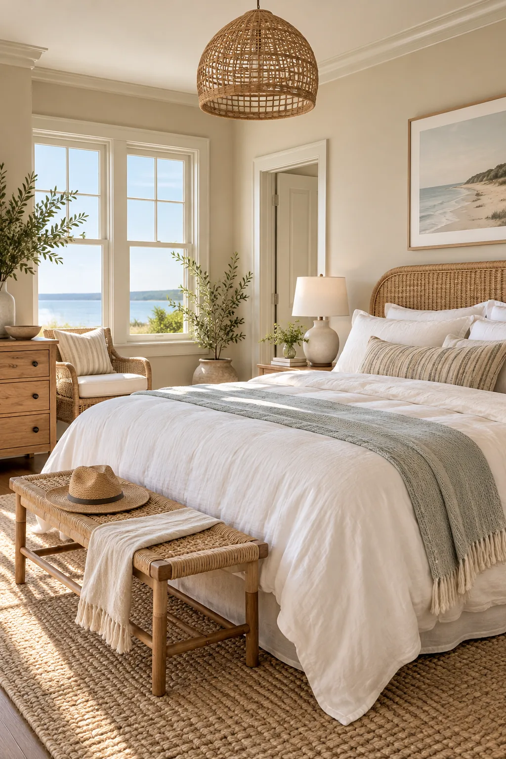
Deep Plum Powder Room: Pairing a dark, dramatic hue on the upper walls with a lighter tint on the wainscoting grounds the small space beautifully.
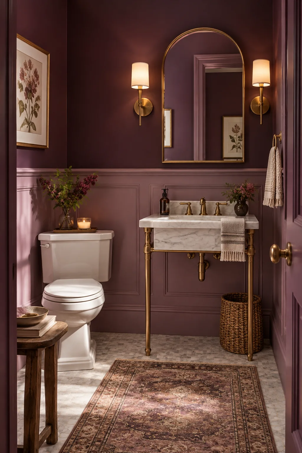
Testing Samples in Your Own Light
Roll your custom mixes onto large sample boards and move them around the room. In my west-facing living room, checking the colors at three distinct times of day ensured the reduced tints performed beautifully under shifting natural and artificial lighting.