
Choose the Perfect Green Living Room Paint by Window Direction
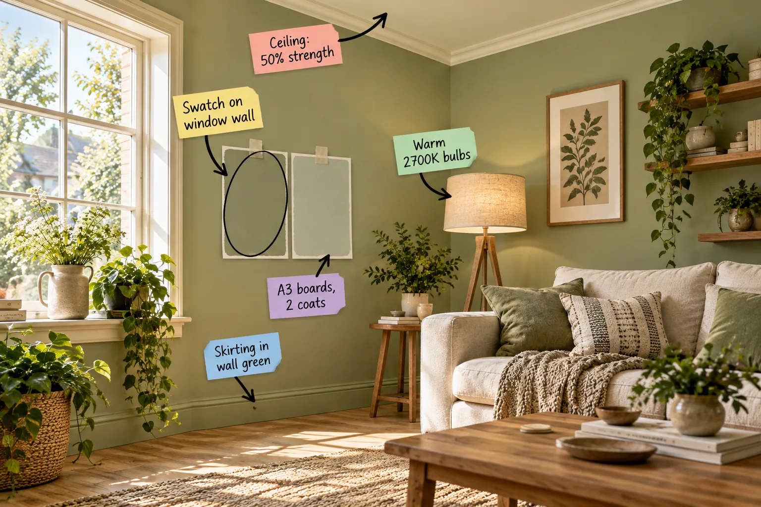
Stop guessing how your paint will look and download our printable Window-Direction Green Chart to match your room’s natural light to the exact right undertone, LRV, and ceiling tint. You will finally be able to test and choose the perfect green for your living room’s unique exposure.
The Window-Direction Green Chart
Natural light dictates how green paint behaves, which I learned the hard way when my Denver living room turned a sickly yellow in south-facing sun. Matching the paint’s undertone to the specific compass direction of your window prevents the color from feeling flat.
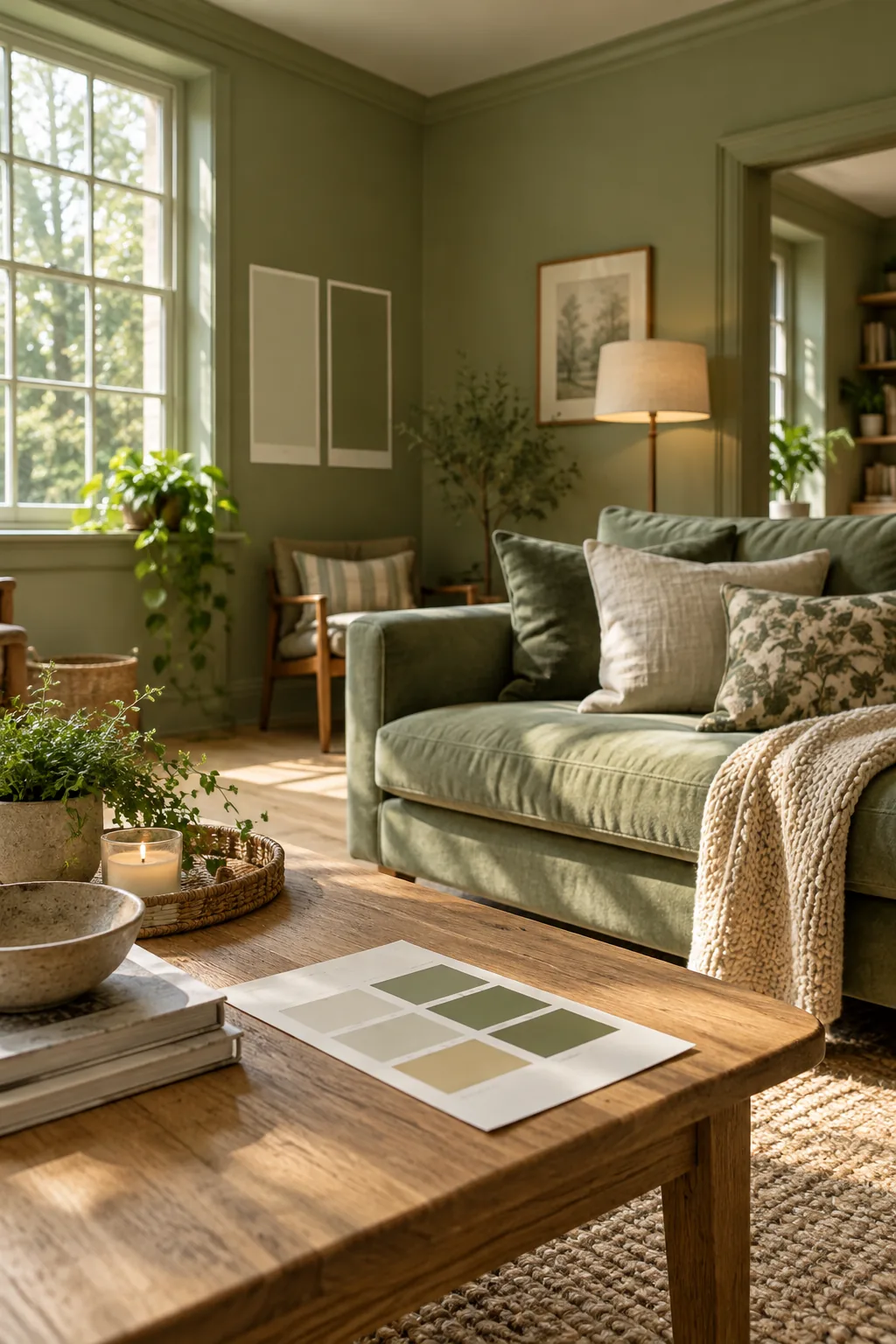
Our printable chart pairs north, east, south, and west light exposures with the correct green undertone and LRV range for perfect balance.
Decoding Light Reflectance Value
Light Reflectance Value measures how much light a color reflects on a scale from zero to one hundred. You should aim for an LRV between 40 and 60 to ensure your green living room feels grounded without absorbing all the natural daylight.
Why North Light Needs Warm Undertones
Northern exposure casts a cool, bluish light that can make standard greens look chilly and uninviting. Selecting a green with strong yellow or olive undertones counteracts this cool light, ensuring the room maintains a welcoming warmth throughout the day.
Understanding East-Facing Window Light
East-facing rooms enjoy bright, clear morning light that gradually turns shadowy and cool by late afternoon. Choose a green with a balanced neutral base so the color remains grounded when the direct sunlight disappears after midday.
Managing Intense South-Facing Sun
Rooms with south-facing windows receive intense, warm sunlight that amplifies yellow tones in your paint. You must choose a green with gray or blue undertones to prevent the color from appearing overwhelmingly neon or overly bright during peak afternoon sun.
Compensating for West-Facing Sunsets
West-facing living rooms sit in soft shadows all morning before receiving a blast of rich, golden light at sunset. A muted sage or olive works beautifully here, as the warm evening sun enhances the earthy tones without making them overly aggressive.
Assessing the Window Wall
The wall that houses your window is the most critical place to test paint because the backlit wall immediately next to the window is the truest test of how dark the paint will look.
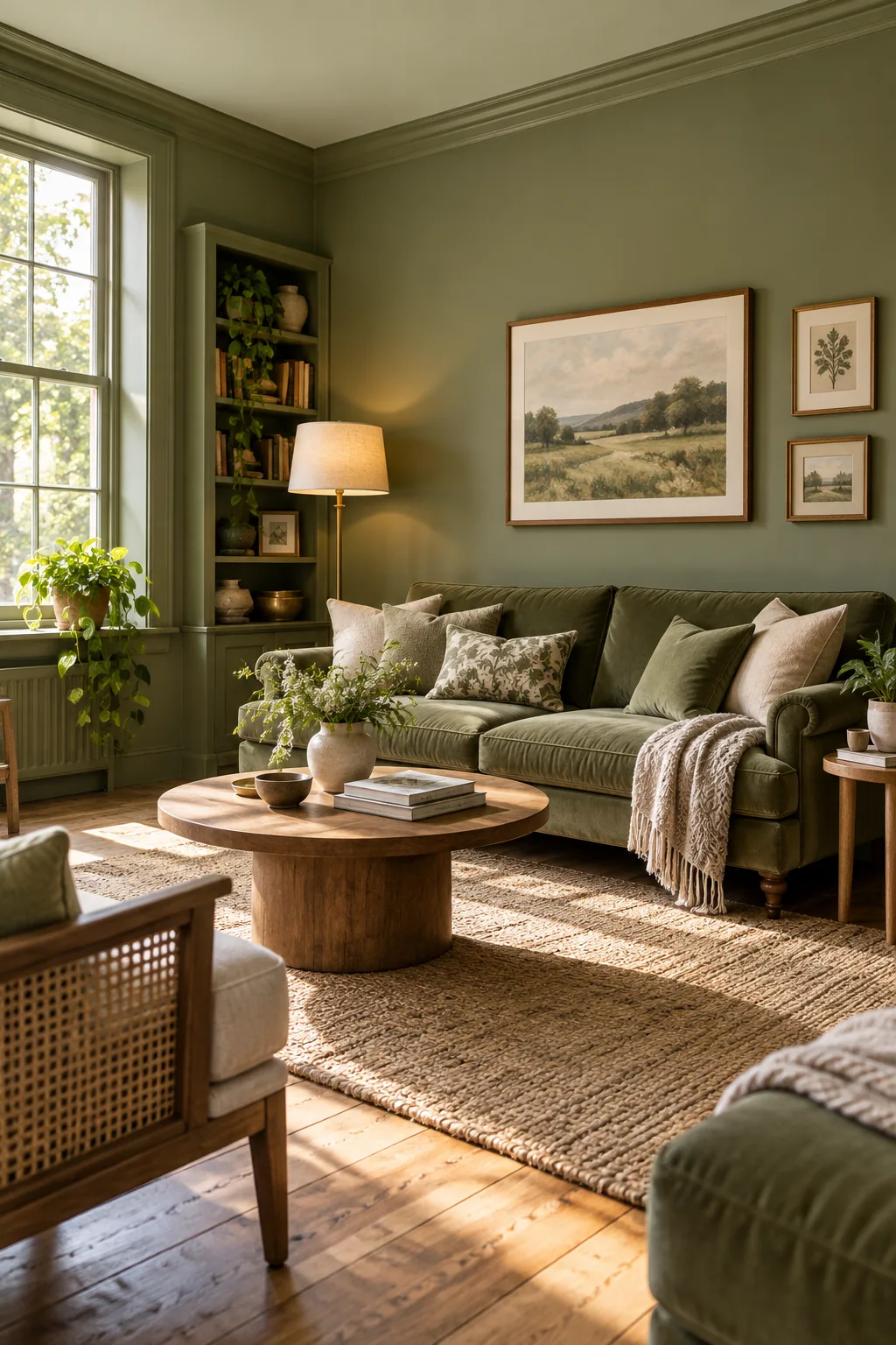
Because this surface sits in its own shadow and receives no direct illumination, it reveals the green at its absolute darkest.
Preparing Your Sample Boards
Always purchase thick, warp-resistant watercolor paper or dedicated A3 sample boards for your paint testing phase. Applying paint to a bright white board ensures that the underlying surface does not distort the delicate green undertones you are trying to evaluate.
The Two-Coat A3 Swatch Rule
When testing your paint, prop your boards low to observe the visual benefit of painting the skirting boards the same color as the walls to create a seamless look.
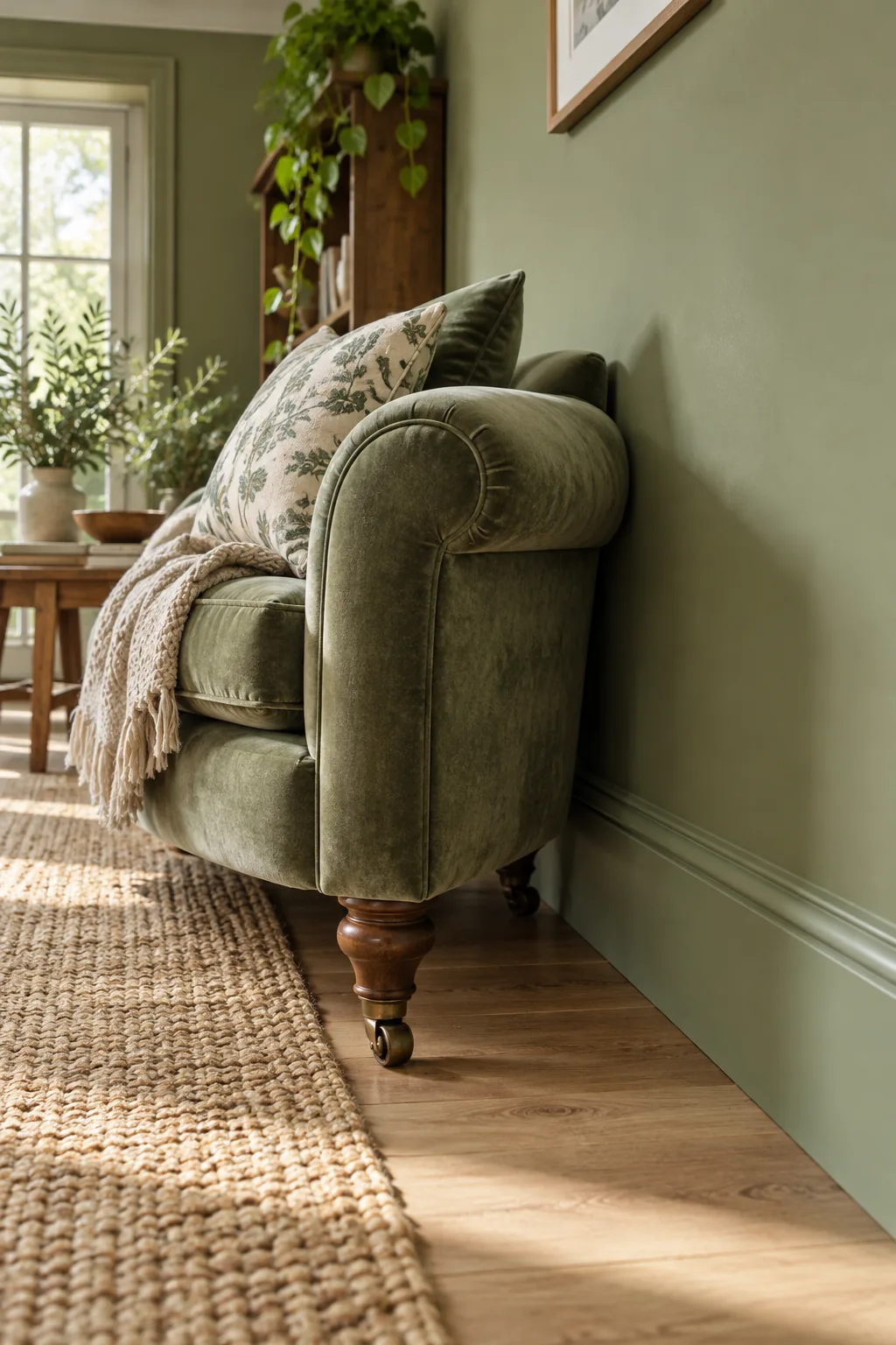
Testing your paint correctly is just as important as the color itself, yet many homeowners rush this step and get skewed results.
Tracking Color Shifts Throughout the Day
Move your painted A3 boards to different walls every few hours to observe how the changing angle of the sun alters the color. A sage green that looks perfectly muted at breakfast might turn surprisingly vibrant by three o’clock in the afternoon.
Evaluating Evening Paint Appearance
Once the sun sets, your room relies entirely on artificial fixtures, which drastically changes how your paint reads. You must check your sample boards under your actual living room lamps to ensure the green does not shift into a muddy brown.
Color-Drenching the Skirting Boards
For a modern, cohesive look, paint the skirting boards the exact same green as the walls. This color-drenching technique eliminates harsh horizontal lines, making standard ceiling heights feel significantly taller and creating an enveloping, custom atmosphere.
Selecting the Right Paint Finish for Walls
Before addressing your trim, you must select the correct sheen for your primary wall surfaces. A flat or matte finish is ideal for green living rooms because it absorbs light evenly, hiding drywall imperfections and creating a velvety, luxurious backdrop.
Selecting the Ideal Trim Finish
While the color remains the same, shifting the sheen provides necessary architectural definition. Use a soft satin or eggshell finish on the trim to provide subtle contrast against matte walls without breaking the visual height.
| Finish Type | Ideal Application | Visual Effect |
|---|---|---|
| Flat / Matte | Main Walls | Absorbs light, hides imperfections |
| Eggshell | Low-Traffic Trim | Very subtle glow, soft depth |
| Satin | Skirting Boards | Durable, reflects light, defines edges |
Painting the Architraves and Doors
Extend your chosen green onto the door frames and the doors themselves to complete the immersive color-drenched effect. Matching these elements to the walls prevents white doors from acting as distracting visual interruptions in your carefully curated green living room.
Lightening the Ceiling Tint
Ceilings naturally look darker than walls, so using a 50% strength tint of the wall color on the ceiling is essential to counteract the natural shadow effect.
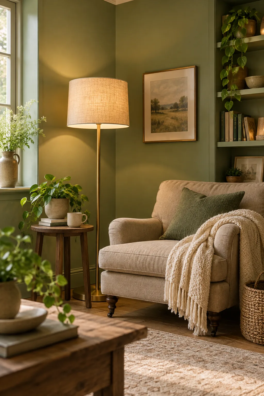
Ask the paint mixer to half-tint your chosen wall green to keep the ceiling feeling continuous but airy.
Cutting in the Ceiling Line
When applying your half-strength ceiling tint, use a high-quality angled brush to cut in a perfectly crisp line where the wall meets the ceiling. A sharp transition is crucial when working with tonal color shifts to maintain a professional, architectural finish.
Choosing Your Artificial Lighting
The color temperature of your light bulbs dictates the nighttime mood of your green living room. Avoid daylight bulbs above 4000K, as their blue bias will clash with your carefully chosen green and create a stark, commercial feeling.
Layering Ambient and Task Lighting
Relying solely on overhead lighting creates harsh shadows that flatten green walls. Distribute table lamps, floor lamps, and wall sconces evenly around the room to wash the green paint in soft, multidirectional warmth.
Finalizing Your Green Paint Choice
Once you have tested your swatches against the skirting boards and viewed them under 2700K evening light, you are ready to commit. Trust the rigorous testing process, order your full gallons, and transform your living room with confidence.
Green Living Room Styles
Explore how different shades of green can completely transform the mood of a living space.
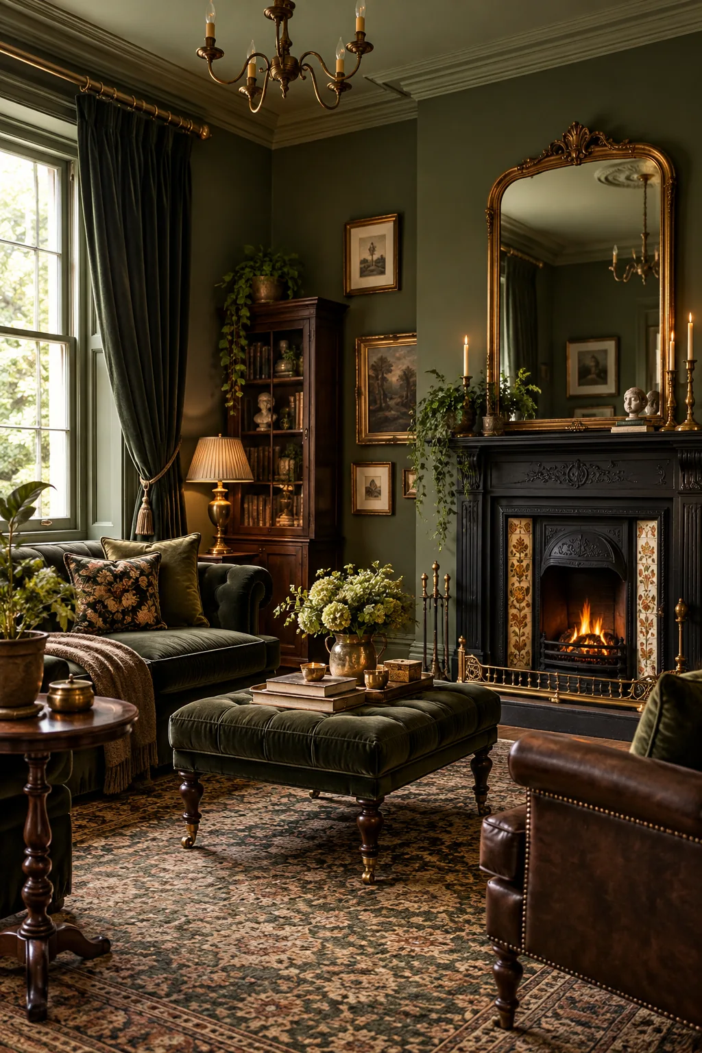
Dark Victorian Olive: Deep olive green absorbs light beautifully in cozy evening rooms, contrasting perfectly with polished brass hardware and dark walnut furniture.
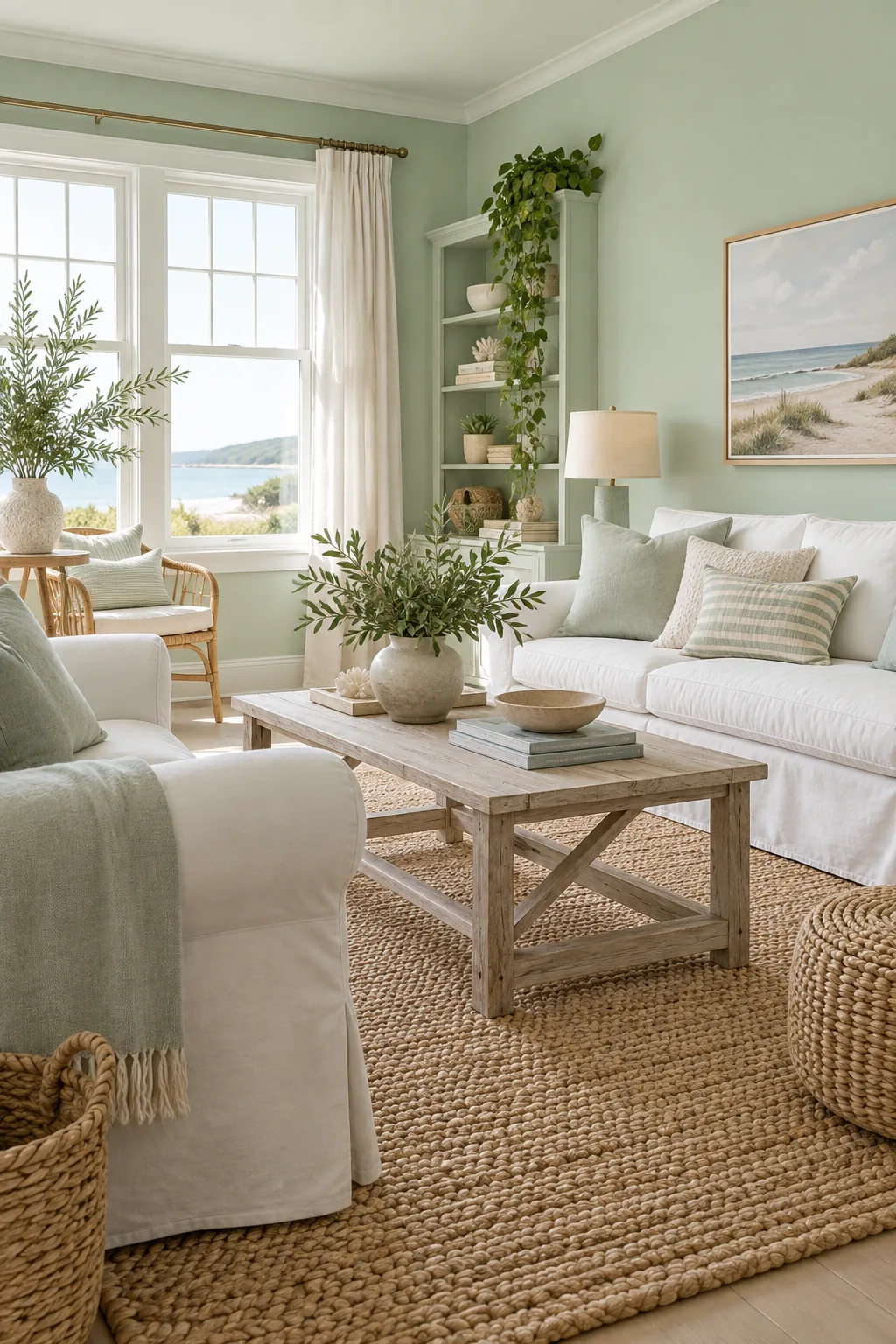
Coastal Pale Mint: Light mint green brings an airy freshness to south-facing spaces when layered with white linen slipcovers and a chunky jute rug.
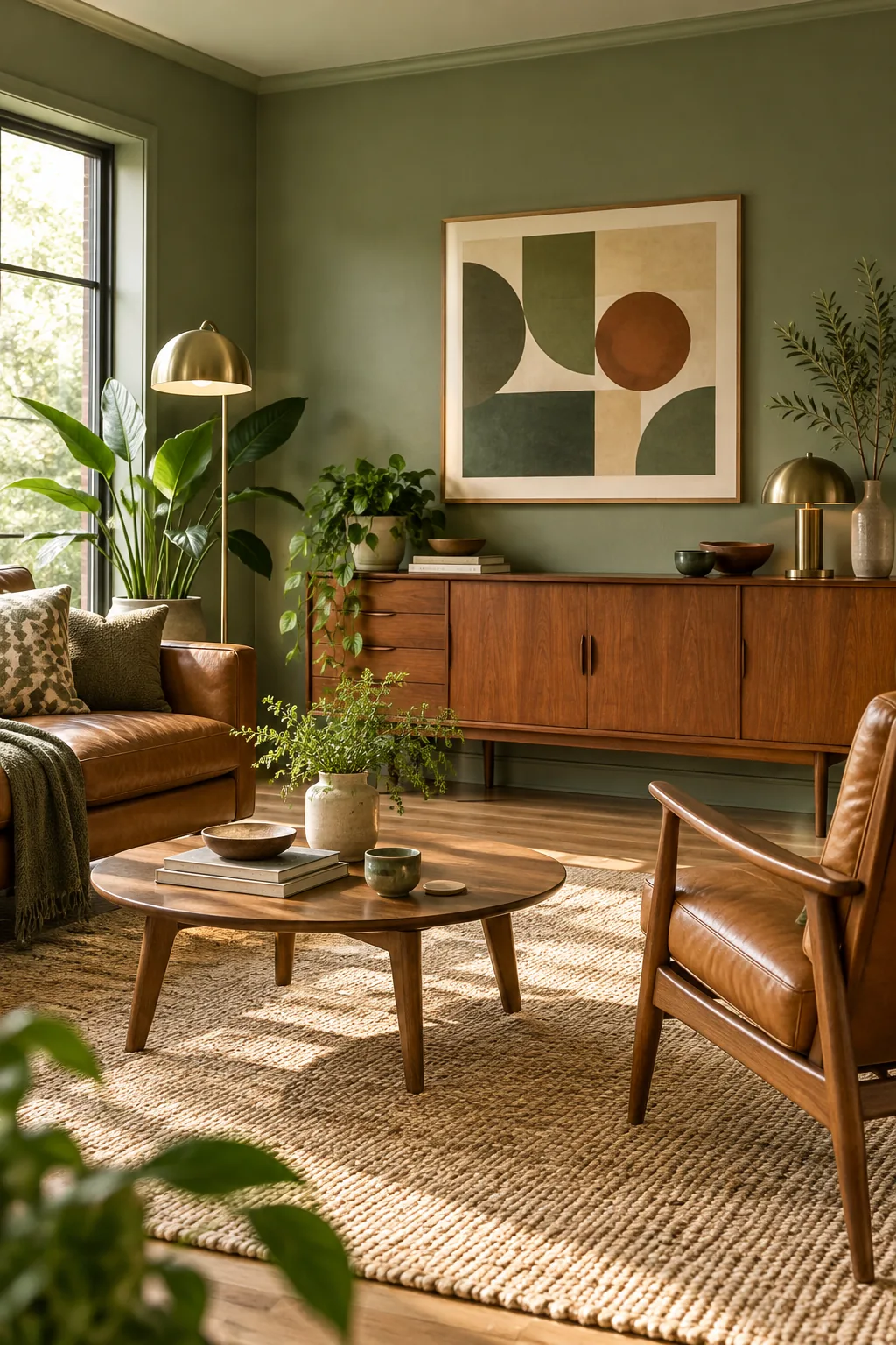
Mid-Century Earthy Sage: A muted sage acts as a warm neutral in mid-century layouts, pairing seamlessly with warm teak wood credenzas and caramel leather seating.
Warming Up the Evening Light
Green paint can turn sterile under the wrong artificial light, which I noticed when my own cozy sage den suddenly looked like a hospital waiting room at night. You must use warm 2700K bulbs to maintain the cozy feel of green paint after dark.
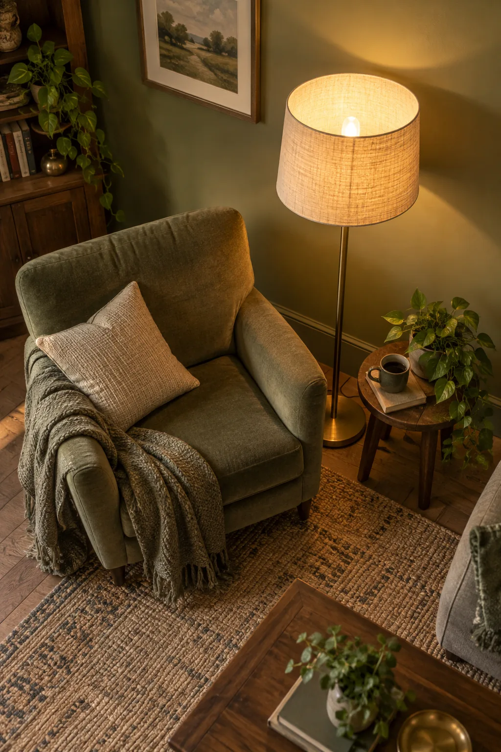
Install these warm bulbs in all your floor and table lamps to keep sage and olive tones feeling inviting.