
Calm Bedroom Paint Colors: Pick the Sleepier Twin Swatch
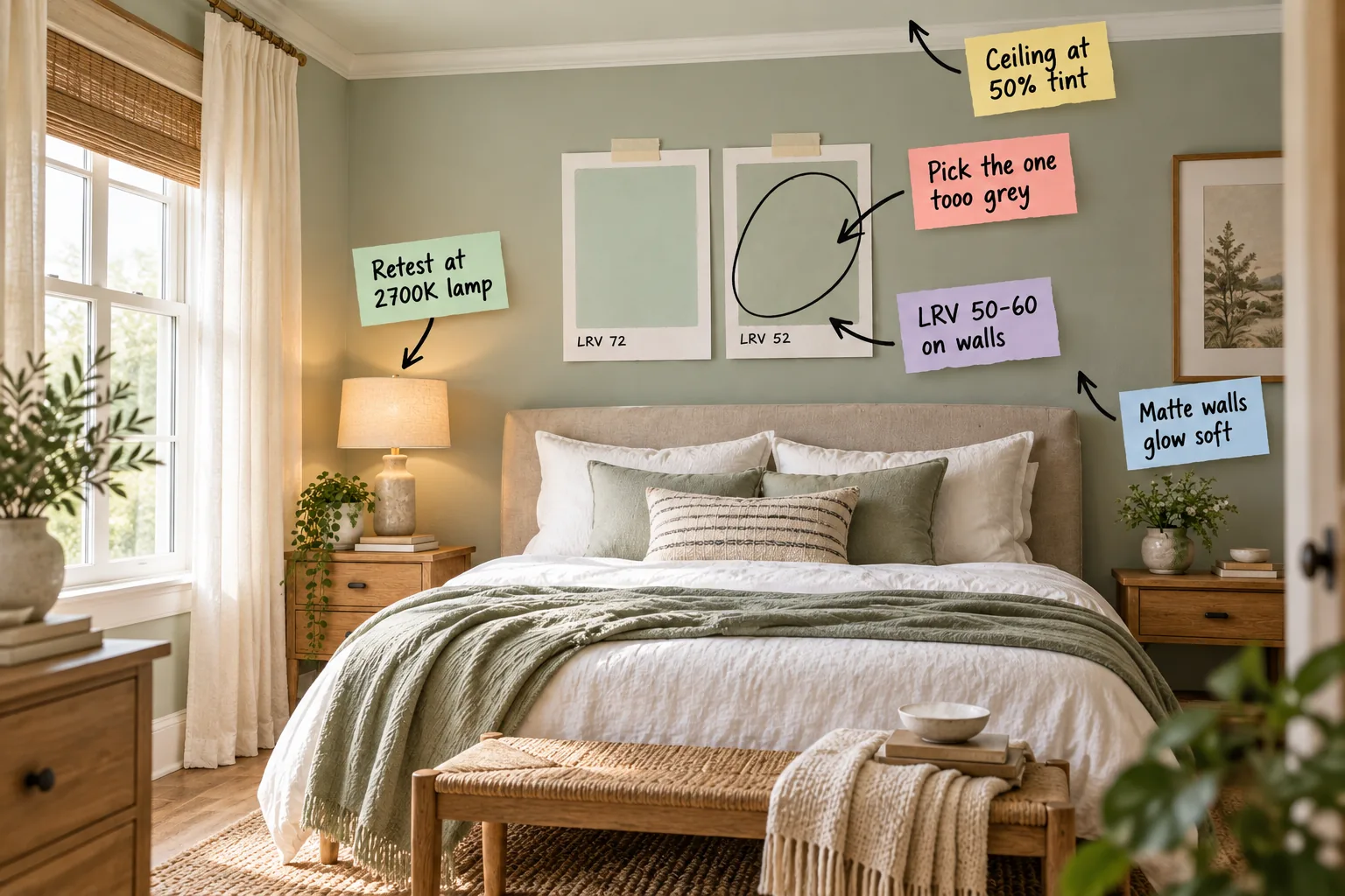
You will be able to confidently test, score, and select a restful bedroom wall color using our printable side-by-side swatch evaluation sheet. Download our free Calm Bedroom Swatch Test Sheet to find the perfect low-chroma shade for a truly sleep-friendly space.
The Sleepier Twin Strategy
Choosing a color with more grey ensures the room feels restful rather than visually overwhelming. Bright, clear colors look magnificent on a tiny paint chip, but they vibrate with too much energy when painted across four large bedroom walls.
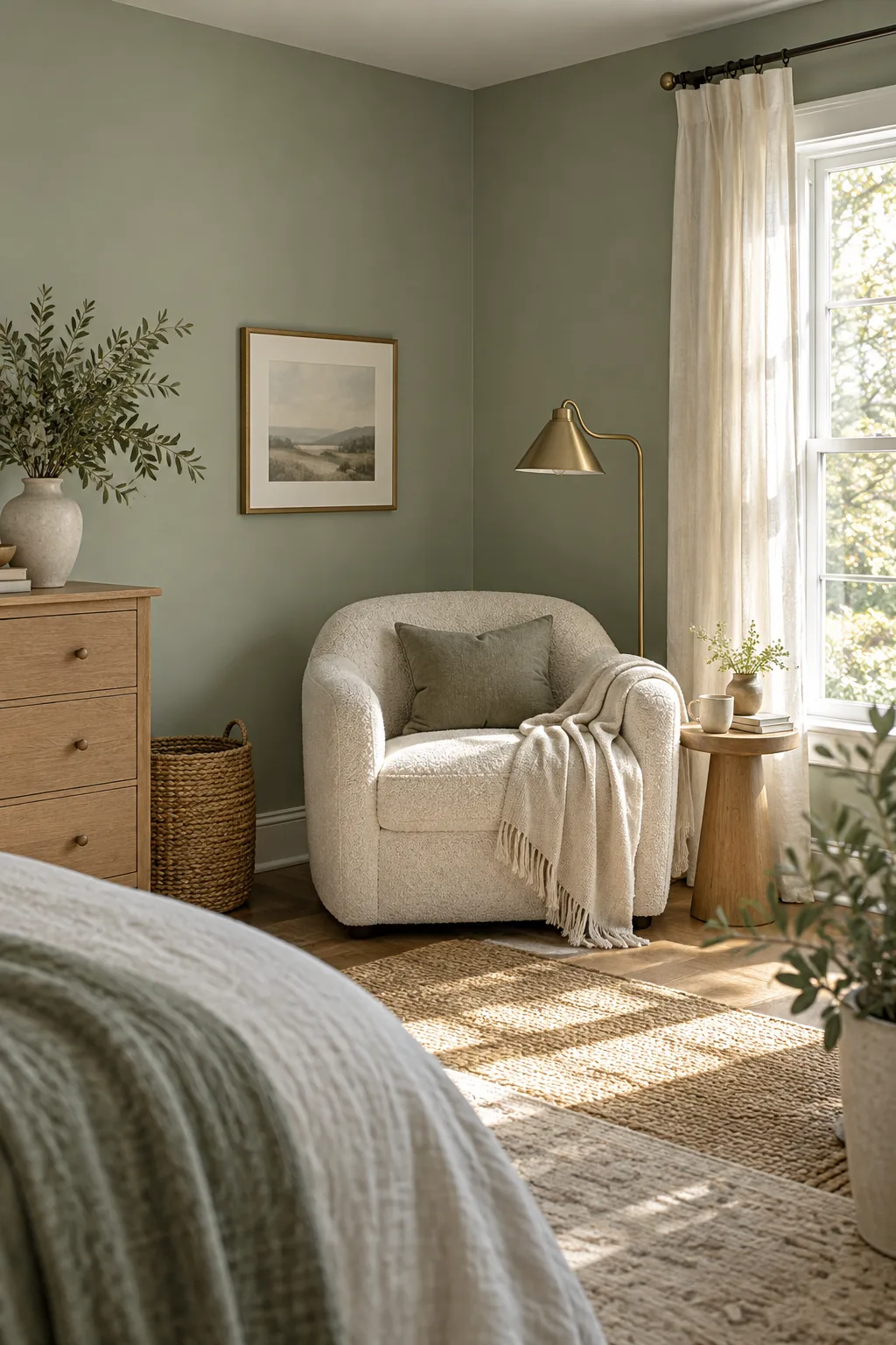
Always start by picking your absolute favorite initial swatch, and then immediately pick the one too grey sitting next to it on the display. This slightly duller twin will always read stronger and much more beautifully across a full wall.
Why High Chroma Fails in Bedrooms
Western design often pushes us toward highly saturated statement walls, but Eastern principles remind us that sleeping spaces require absolute visual quiet. High chroma colors demand constant attention from your eyes, which actively disrupts your body’s natural transition into evening rest.
| Chroma Level | Visual Energy | Ideal Room | Sleep Quality |
|---|---|---|---|
| High (Clear) | Stimulating | Dining Room | Poor |
| Medium | Engaging | Living Room | Fair |
| Low (Muted) | Restful | Bedroom | Excellent |
| Very Low (Greyed) | Recessive | Den | Good |
By intentionally selecting a muted shade, you allow the walls to recede softly into the background. This creates a deeply grounded environment where your mind can finally stop processing bright visual stimuli and begin winding down for the night.
Selecting the Perfect Base Family
Before you even pick up a paintbrush, you must determine which foundational color family will anchor your personal sanctuary. I always evaluate three specific emotional responses when guiding my Denver clients through their initial palette selection.
- Assess your morning mood: Determine if you wake up better surrounded by warm earth tones or cool, receding watery hues.
- Check your existing textiles: Pull the dominant subtle thread from your favorite linen duvet or vintage rug to anchor the walls.
- Evaluate the landscape: Look out your primary bedroom window and borrow a desaturated tone from the surrounding natural environment.
Establishing this core family narrows your focus immediately, preventing the common mistake of bringing home thirty conflicting paint chips. You can then confidently apply the sleepier twin rule to just three or four highly curated options.
Preparing Your Sample Boards
Never paint your small test swatches directly onto the existing bedroom drywall, as the old color will aggressively bleed through. Apply two thick coats of your chosen low-chroma paint onto large, standalone poster boards to create an isolated, movable testing surface.
Targeting the Ideal LRV
An LRV between 50 and 60 provides the perfect balance of coziness and necessary light reflection. In my own Denver bedroom, I initially painted the walls a moody LRV 30, but it felt like a dark, light-absorbing cave every morning.
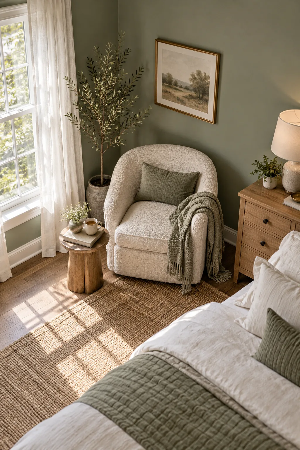
Locating this exact light reflectance value is easier than you might think when browsing the hardware store aisles.
Navigating the LRV Scale
The Light Reflectance Value scale measures how much light a color reflects, running from absolute black at zero to pure white at one hundred. Staying strictly within the fifties ensures your bedroom retains enough structural depth without ever feeling heavy.
Eliminating Current Wall Distractions
When evaluating your new painted boards, leave a wide border of pure white primer completely surrounding the fresh color. This stark border effectively neutralizes the old wall color, allowing your eyes to judge the new muted tones with perfect, unbiased accuracy.
Checking Undertones by Window Direction
Testing the color in different corners reveals exactly how changing natural light shifts its underlying tones. I once watched a beautiful warm sage turn completely icy in my guest room because I forgot to check the afternoon shadows.
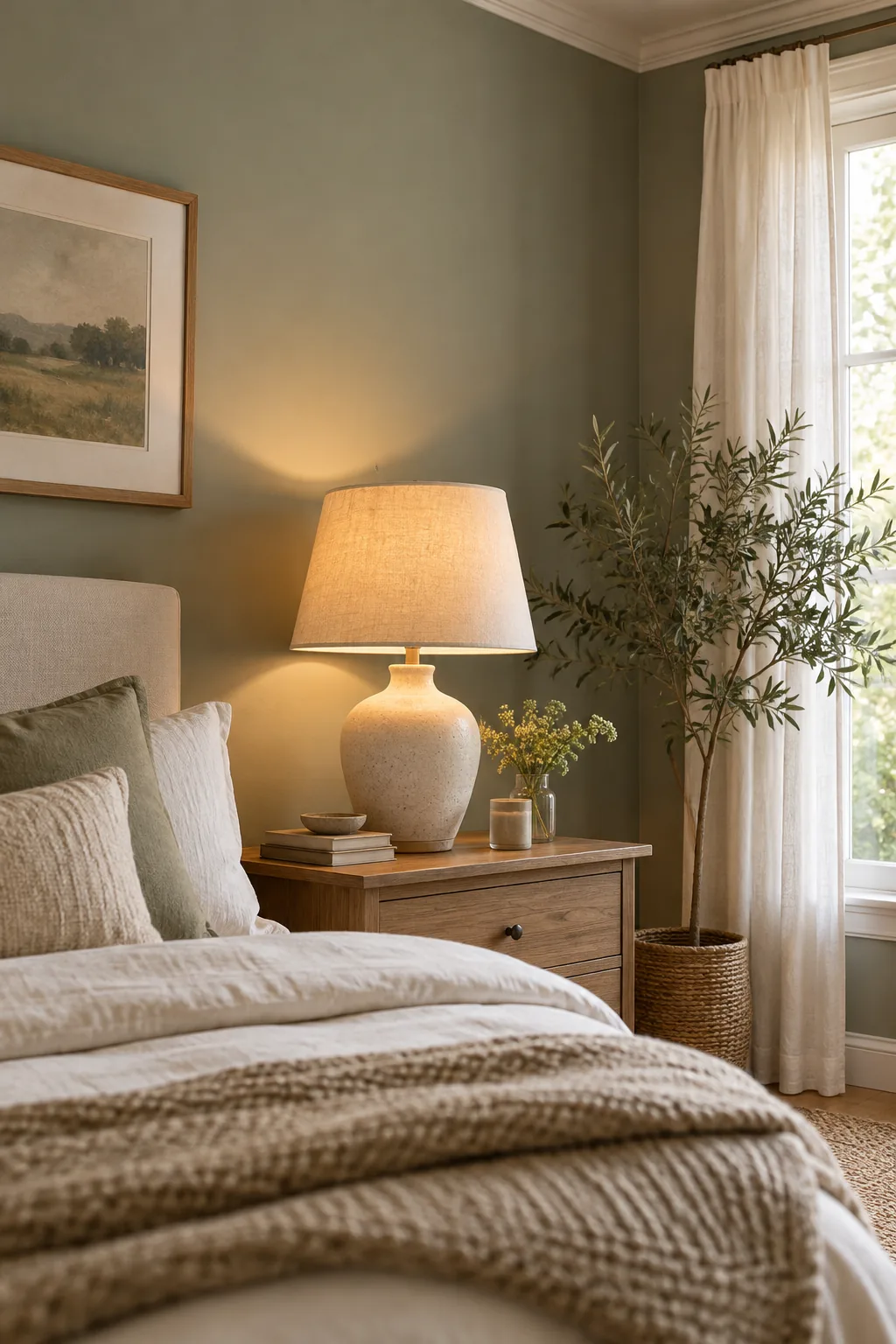
You must physically move your painted sample board from the bright window wall directly into the darkest opposite corner. This simple diagnostic sweep exposes whether hidden blue or yellow undertones will dominate the room during your quiet morning routine.
Managing South-Facing Light
Rooms with southern exposure receive intense, warm sunlight that dramatically amplifies any yellow or red undertones present in your paint. You will need to select a slightly cooler, greyer base to prevent the afternoon glow from turning your calm walls muddy.
Balancing Cool Northern Exposures
Northern light introduces a persistent blue cast that can make low-chroma colors feel incredibly sterile and unwelcoming. Counteract this chill by choosing a sleepier twin that leans heavily into warm green or soft taupe undertones to restore visual warmth.
The 2700K Evening Lamp Test
Evaluating the swatch under a warm bedside lamp ensures it looks deeply soothing when you actually use the room at night. Natural daylight testing is crucial, but your bedroom primarily functions as an evening retreat under artificial glow.
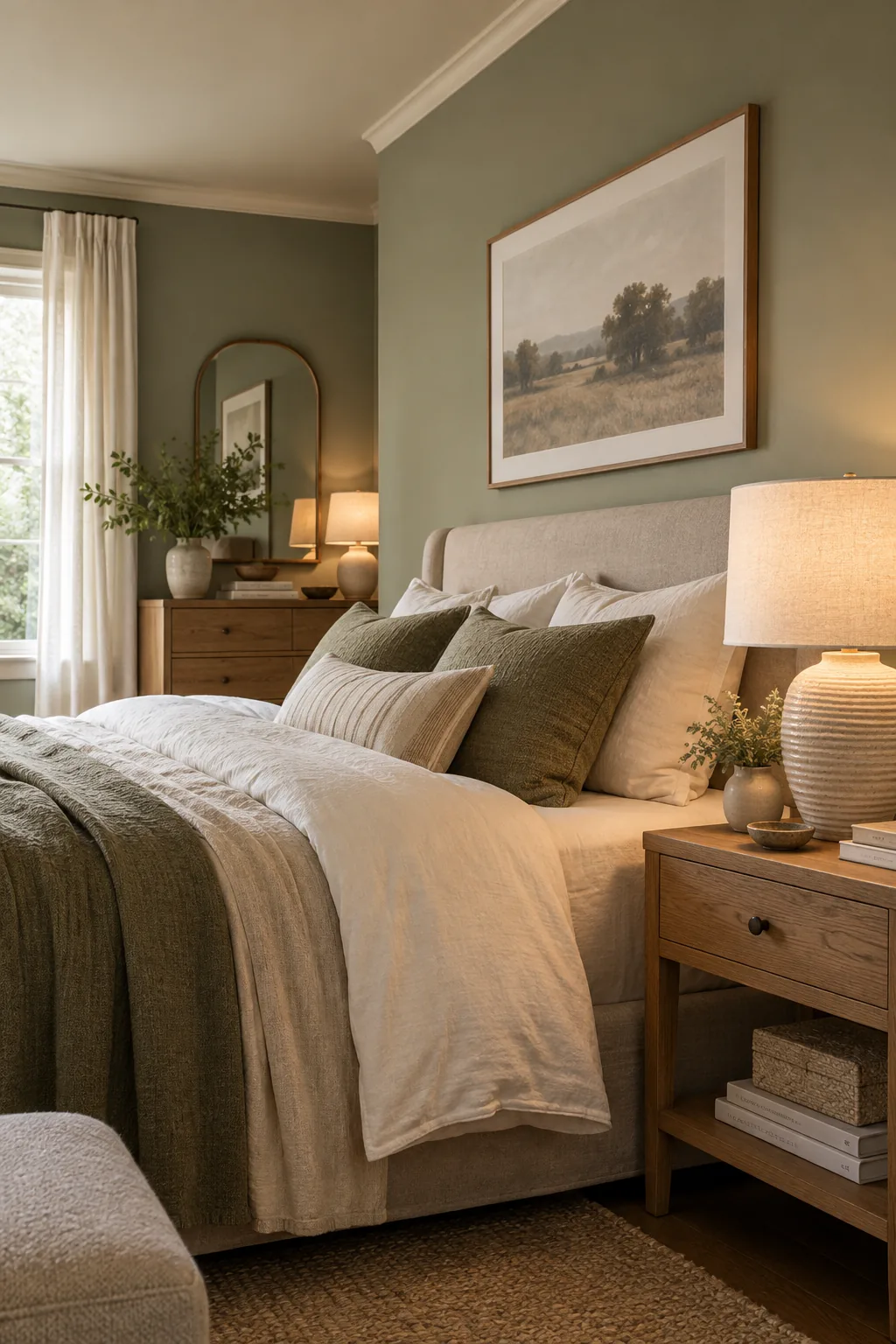
Turn off the overhead fixtures and retest at 2700K lamp temperatures to see how the color responds to a softer spectrum. This crucial step guarantees your chosen greyed hue will not shift into an unappealing, sickly green when you read in bed.
Evaluating Shadows and Corners
Artificial light creates distinct pools of illumination that cast deep, shifting shadows across your bedroom walls. Observing your sample board at the edge of these shadows confirms the color maintains its elegant, restful character even in the dimmest conditions.
Why Matte Walls Work Best
A matte finish diffuses light beautifully and eliminates harsh glare, instantly enhancing the room’s overall tranquil feel. When I switched my own primary bedroom from a shiny eggshell to a dead flat finish, the walls suddenly felt like soft, enveloping velvet.
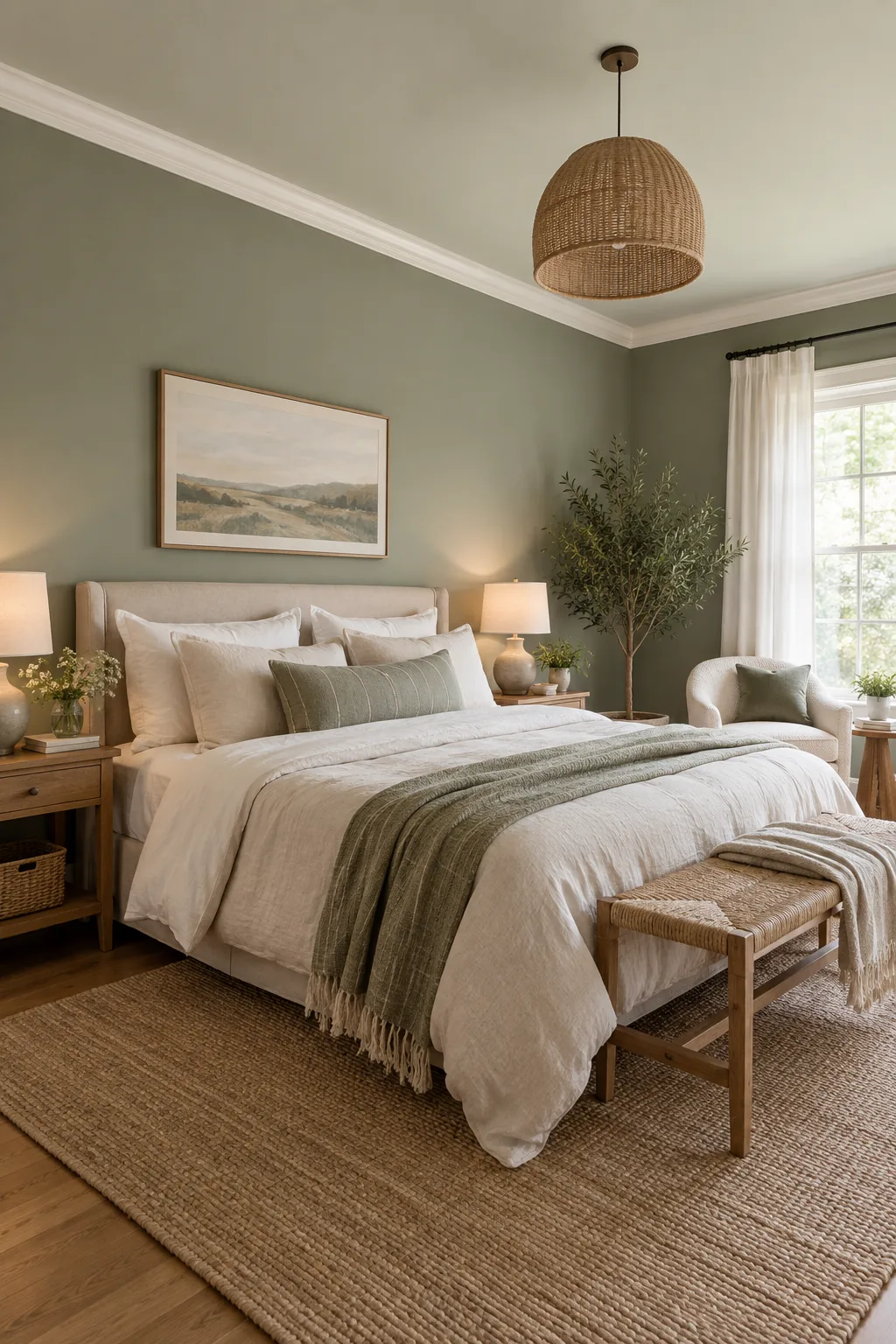
Because Matte walls glow soft, they absorb reflections rather than bouncing sharp light directly into your tired eyes. This low-sheen option is absolutely essential for cultivating the quiet, sensory-friendly atmosphere required for deep, uninterrupted sleep.
Eggshell versus Flat Finishes
While eggshell finishes offer superior scrubbability for high-traffic hallways, they introduce an active, restless sheen that works against bedroom calmness. Committing to a premium flat paint formula provides enough durability for adult sleeping spaces while maintaining that crucial, glare-free aesthetic.
The 50 Percent Ceiling Tint Rule
Tinting the ceiling with 50 percent of the wall color creates a cohesive, enveloping space that feels incredibly secure. I used to paint every ceiling bright white until I realized that stark contrast completely breaks the visual softness of a restful room.
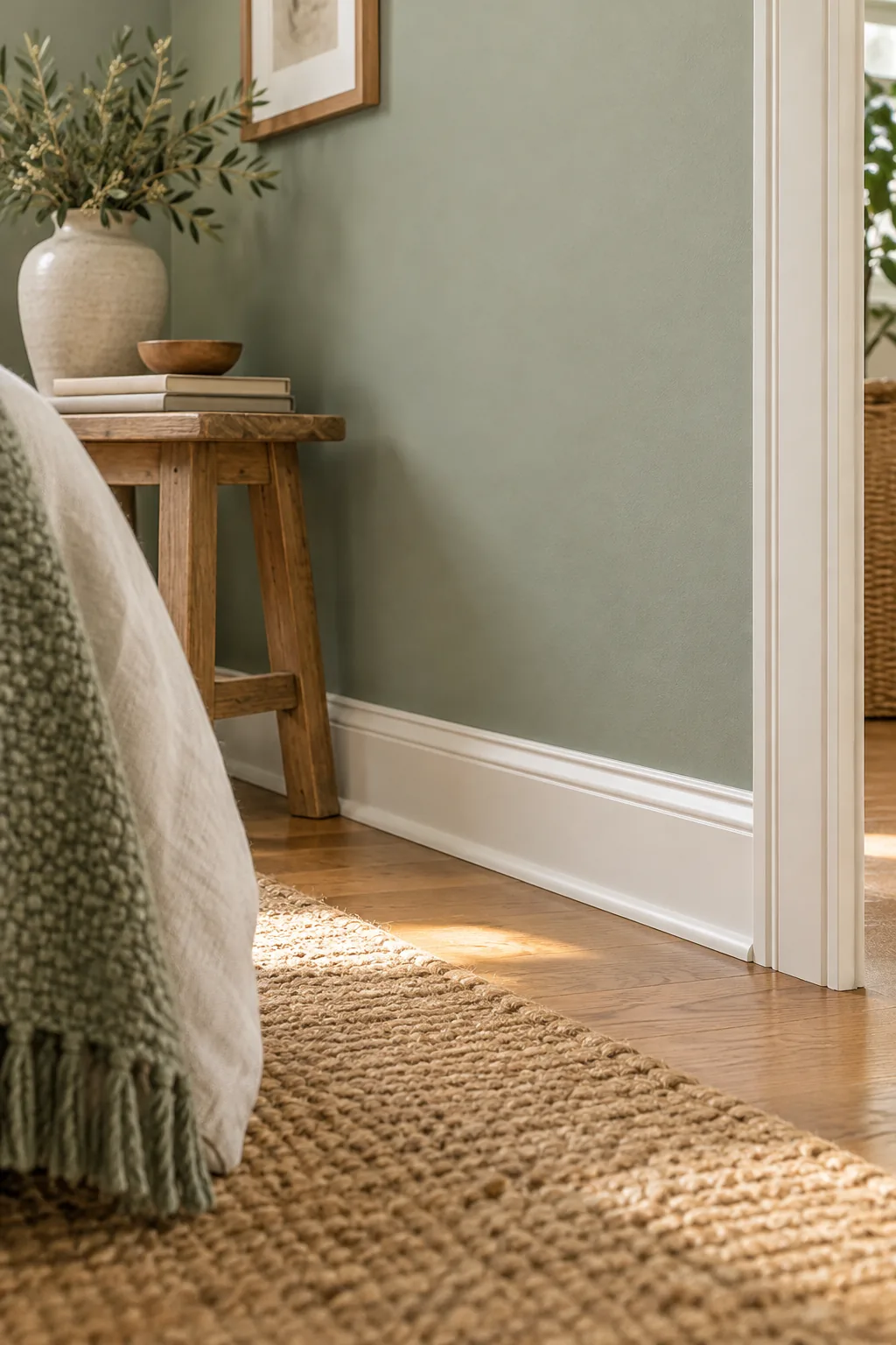
Ask your local paint counter to mix your chosen wall color at half strength to keep the ceiling at 50% tint. This subtle shift eliminates the jarring white boundary overhead, creating a gentle canopy that visually lowers the ceiling for better sleep.
Creating a Continuous Canopy
A tinted ceiling draws the eye smoothly upward without interruption, mimicking the natural gradient of a soft evening sky. This seamless transition between the walls and the ceiling fosters a deep sense of psychological safety, which is vital for restorative rest.
Pairing with Soft Trim
Warm white trim in a satin finish frames your newly muted walls beautifully without introducing any harsh, high-gloss contrast. You want the architectural elements to provide subtle definition that supports the room’s calm energy rather than fighting it.
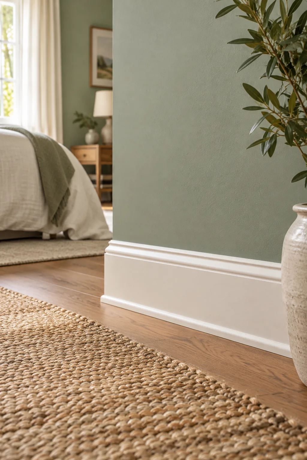
Select a creamy, un-tinted white for your baseboards, crown molding, and interior doors to ground the space. The slight satin sheen offers necessary durability against scuffs while remaining soft enough to harmonize seamlessly with your flat, sleep-friendly walls.
The Role of Warm White Doors
Interior bedroom doors occupy a significant amount of visual real estate, making their color just as important as the walls. Painting them a soft, creamy white ensures they blend quietly into the background rather than standing out as stark, demanding rectangles.
The Importance of Visual Weight
Darker trim can anchor a room, but in a bedroom, heavy contrast near the floor pulls your eye downward unnecessarily. Soft, un-tinted white baseboards keep the visual weight perfectly balanced, allowing the muted walls to float effortlessly above the floorboards.
Trusting Your Morning Instincts
After living with your movable sample boards for three full days, pay close attention to your very first reaction upon waking. The color that feels instantly soothing before you have even had your morning coffee is definitively the correct choice for your space.
More Restful Bedroom Color Palettes
Explore how the sleepier twin strategy works beautifully across different color families and interior styles.
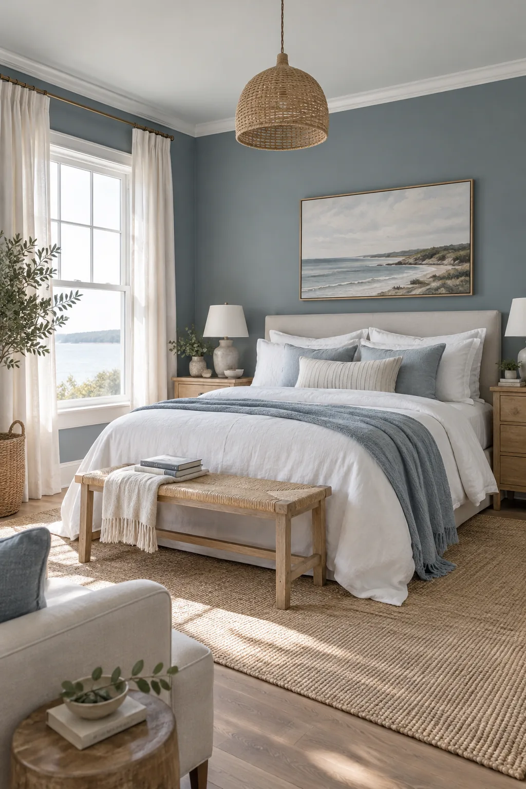
Coastal Slate Blue: Greyed blues bring a breezy, coastal calm to the space, especially when paired with crisp white linens.
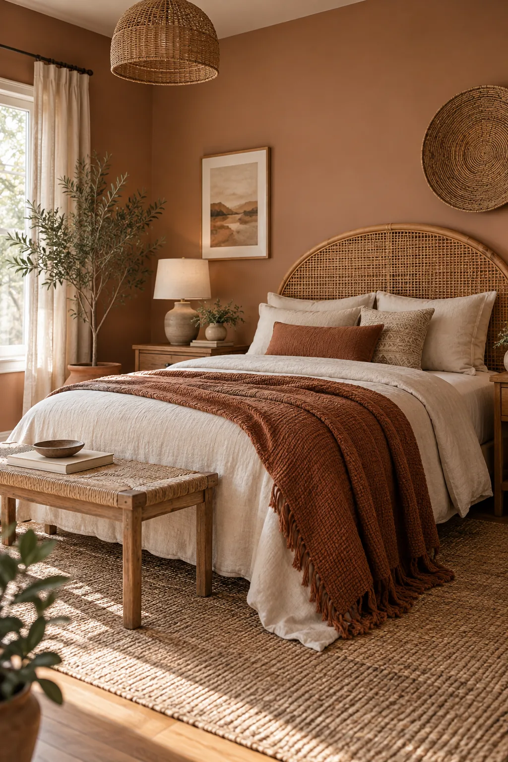
Desert Modern Clay: Muted terracotta and clay shades create a grounded, earthy warmth that feels incredibly soothing at night.
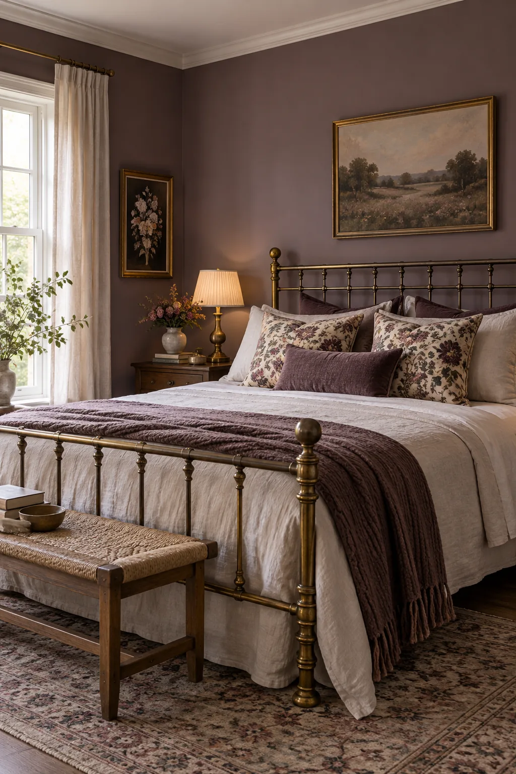
Romantic Vintage Plum: A heavily greyed plum offers a sophisticated, romantic backdrop that changes beautifully as the evening light fades.
Your Calm Bedroom Swatch Test Sheet
The printable scoring grid helps you finalize your decision by systematically logging natural light shifts, ideal LRV numbers, and nighttime sheen performance. Having a structured side-by-side framework removes the emotional guesswork so you can confidently commit to your final shade.
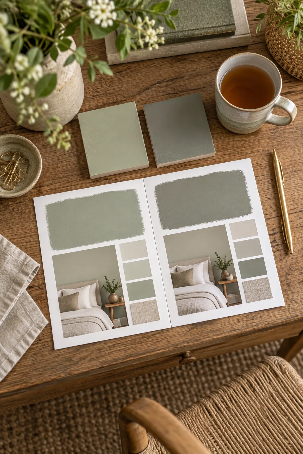
Before printing your scoring grid, gather a few basic supplies to ensure a highly accurate side-by-side test.