
Veterans Day Poster: The Designer's Complete Layout Guide
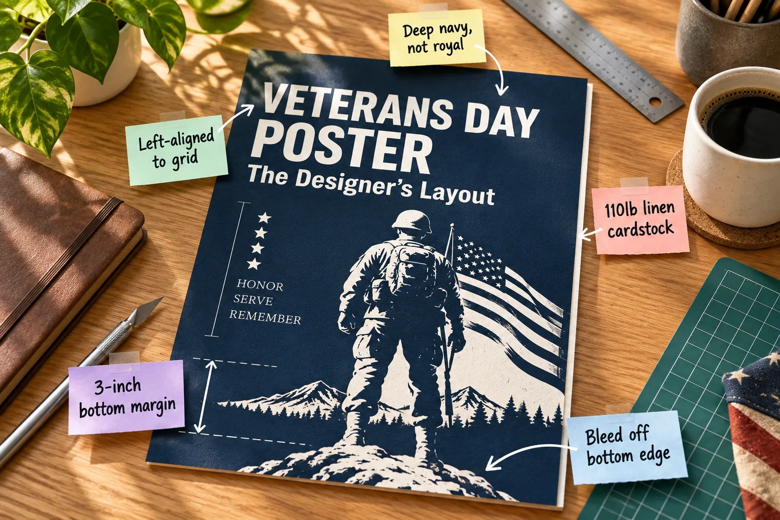
You will easily be able to recreate this stunning professional poster design using precise grid measurements, specific color codes, and proven font pairings. Download our printable layout and typography guide to immediately start building your own respectful, gallery-ready tribute.
Choosing 110lb Linen Cardstock
I always recommend 110lb linen cardstock because it stops the heavy ink from soaking through and provides a beautifully tactile, professional finish. When I printed my first batch of workshop flyers on cheap paper, the ink warped them instantly, so I never skip the good stuff now.
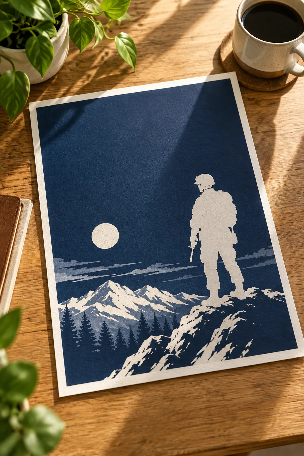
Before sending your high-resolution file to the printer, ensure your equipment is properly configured to handle the upgraded paper weight without jamming. Taking a few moments to adjust your feed settings saves time and protects your expensive materials.
Upgrading your base material is the absolute easiest way to elevate a standard print into a truly memorable keepsake. The subtle woven texture catches the light beautifully, giving the flat digital colors a rich, organic depth that standard copy paper simply cannot replicate.
Setting a Deep Navy Background
We are using a deep navy color instead of a bright royal blue to create a quiet, formal mood appropriate for Veterans Day. This darker tone allows the crisp white text to pop out with maximum contrast and readability.
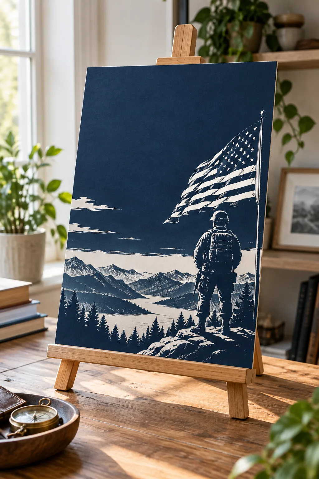
A highly saturated royal blue can easily feel far too energetic or commercial for a serious commemorative piece. By pulling the background hue closer to midnight, the entire poster instantly feels grounded, serious, and ready for any formal memorial event.
- Sample a navy tone that leans slightly warm to avoid looking like a harsh black.
- Verify the CMYK values for print so the dark blue does not muddy on the press.
- Test the contrast ratio to ensure the finest serif details remain fully legible.
Getting this foundational color right sets the emotional tone for everything that follows in your project. I love how a deeply saturated background makes the negative space feel purposeful, turning the empty areas of the poster into active parts of the design.
Anchoring the Left-Aligned Grid
Keeping the typography strictly left-aligned to grid creates a strong, organized visual hierarchy that makes the bold header instantly readable. A flush left edge gives the viewer’s eye a reliable, predictable starting point for every single line of critical information.
- Set a primary vertical guide exactly two inches from the paper’s left edge.
- Snap the very first letter of your main title directly to this invisible line.
- Align all subsequent secondary text blocks to match this exact same starting point.
Establishing this strict boundary early in your drafting process prevents the entire layout from feeling messy or chaotic. I love how a rigid grid quietly does all the heavy lifting to make the final composition look effortlessly polished and intentional.
Structuring the Header Hierarchy
Your massive primary title needs to be large enough to completely dominate the poster’s visual hierarchy. Establishing the main subject immediately ensures the viewer’s eye naturally moves down the page to absorb the secondary event details and location information.
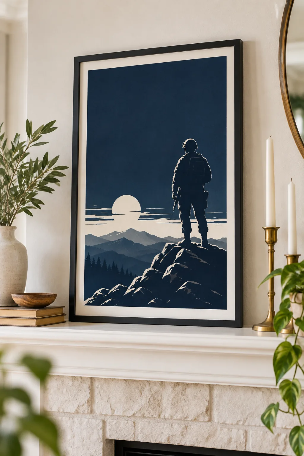
When the headline is undeniably the heaviest element on the page, it acts like a powerful visual anchor for the lighter information. Pushing the font size to its absolute maximum within the grid limits creates an unmissable, commanding typographic presence.
Pairing Impactful Typography
The secret to this layout lies in the specific font pairings that balance modern strength with traditional respect. We use a heavy, condensed sans-serif for the main title alongside a classic, highly readable serif for the secondary text.
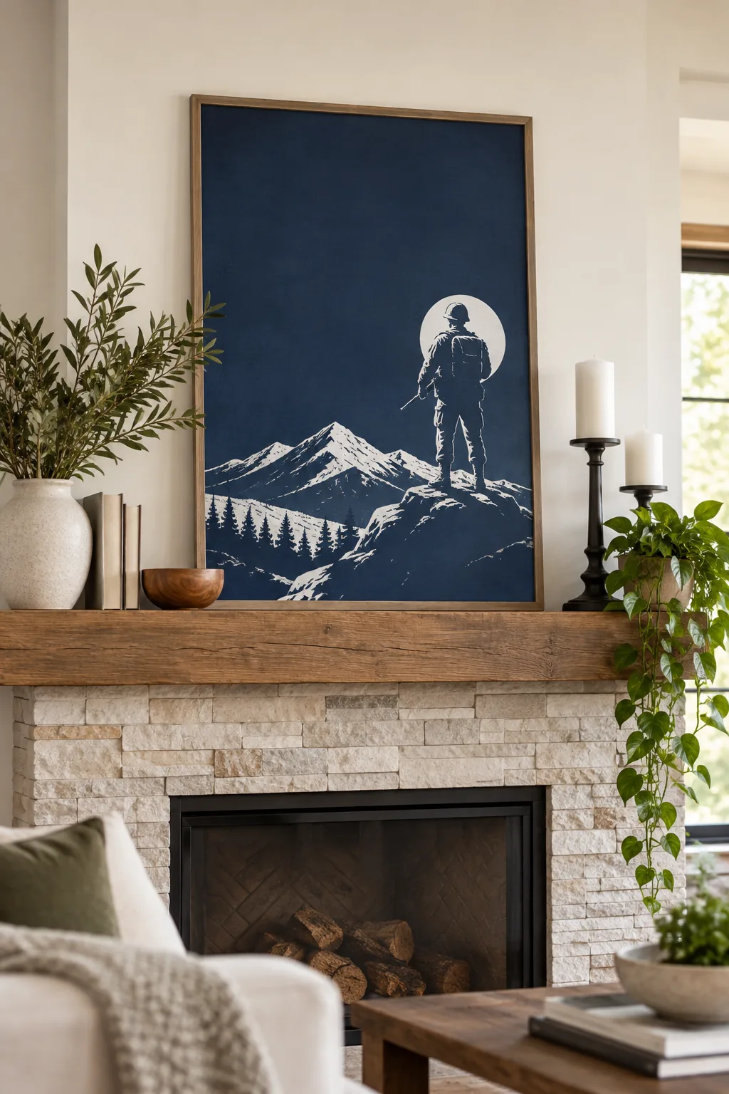
Mixing these two distinct typographic families prevents the design from feeling emotionally flat or overly corporate. The stark contrast between the thick, blocky headline and the elegant, sweeping serif details gives the poster its unique architectural character.
| Element | Font Style | Weight | Purpose |
|---|---|---|---|
| Main Header | Condensed Sans | Black / 900 | Immediate impact |
| Subheading | Traditional Serif | Regular / 400 | Classic readability |
| Date & Time | Sans-Serif | Bold / 700 | Quick scanning |
| Location | Traditional Serif | Italic / 400 | Elegant contrast |
Sticking to just these two font families keeps the typography incredibly disciplined and cohesive. Introducing a third typeface usually clutters the message, so trust the contrast between your chosen sans-serif and serif to provide all the necessary visual interest.
Measuring the 3-Inch Bottom Margin
Always maintain a precise 3-inch bottom margin located directly below the secondary text block. This specific measurement provides necessary breathing room so the typography never crowds the graphic elements at the base of your commemorative design.
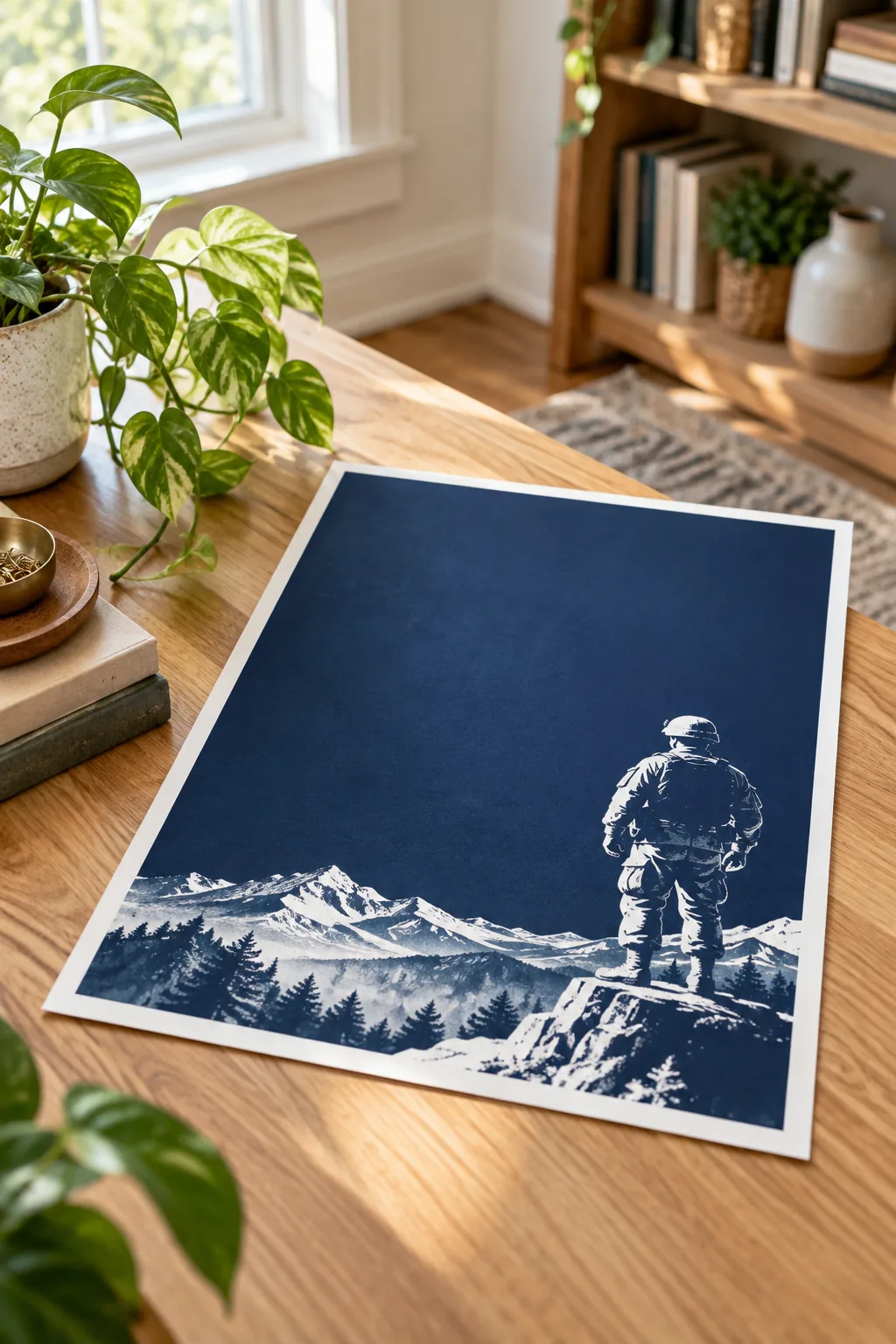
Without this generous pocket of negative space, the layout will quickly feel claustrophobic and overwhelming to the reader. Protecting this empty gap ensures that both the text and the illustration have enough room to speak clearly on the page.
Negative space is an active, powerful design element, not just leftover blank paper. By rigorously defending that three-inch buffer zone, you give the viewer’s eyes a place to rest before they take in the grounded imagery at the bottom.
Incorporating the Star Motifs
The four vertical stars act as a crucial visual bridge, connecting the heavy main header to the delicate secondary text block below it. I actually used a similar star alignment on my Fourth of July garden party invites, and it totally anchored the whole design.
These tiny decorative elements do more than just fill space; they gently guide the viewer’s eye downward along the established path. Keeping them small and perfectly spaced ensures they support the message without distracting from the main event details.
Bleeding the Graphic Off the Edge
We anchor the entire composition by allowing the soldier and mountain graphic to completely bleed off bottom edge. I learned the hard way with my Austin studio posters that leaving a white border around a grounded graphic makes it look like it’s floating away.
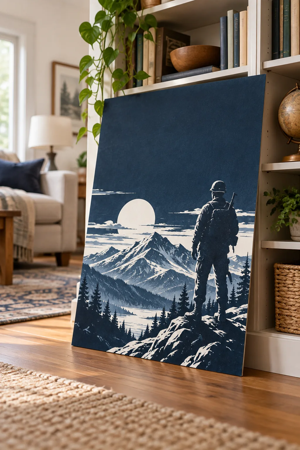
Extending the base of the white illustration past the printable margin creates a beautifully immersive silhouette that feels heavy and permanent. This technique visually locks the artwork to the physical paper, giving the tribute the weight it deserves.
- Ensure the graphic extends at least an eighth of an inch beyond the crop marks.
- Check that important mountain details remain safely inside the final trim line.
- Use a sharp craft knife and metal ruler for a clean, borderless cut.
If you are printing at home, mastering this borderless technique makes your work look professionally published. Trimming away those default white printer margins is a small extra step that completely transforms the final presentation of the poster.
3 Ways to Display Your Poster
See how this versatile layout adapts to different frames and settings.
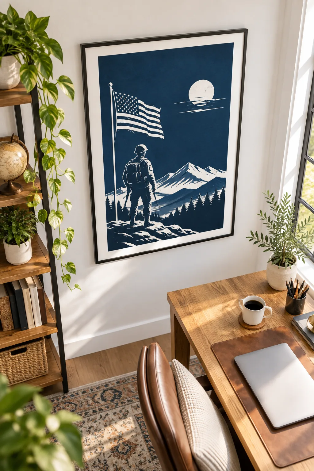
Minimalist Charcoal Frame: A sleek monochrome setup using a thin charcoal frame against a crisp white gallery wall.
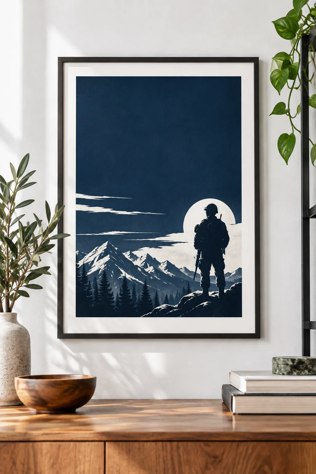
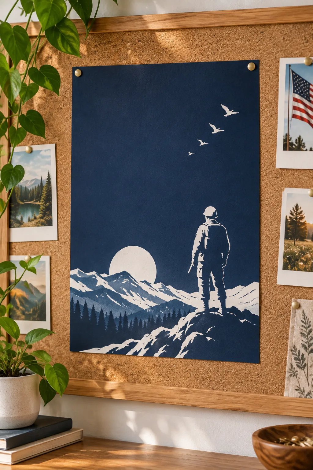
Rustic Community Board: An unframed print pinned to a warm cork and wood bulletin board for local events.
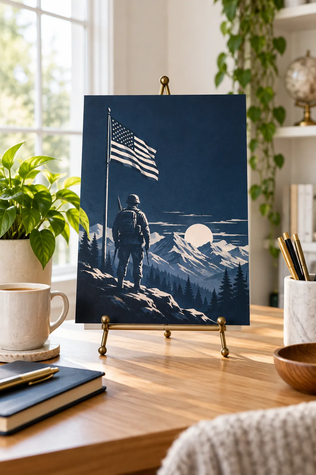
Modern Office Easel: Displayed casually on a brass tabletop easel surrounded by modern desk accessories.
Downloading the Layout and Font Guide
You are now ready to pull all these structural elements together into one cohesive, professional print. Grab the complete, printable layout and typography guide to get the exact spacing measurements, color codes, and font pairings needed for your own drafting table.
Having these precise specifications on hand takes all the guesswork out of formatting your commemorative project. Print the guide at full scale, tape it near your workspace, and enjoy the process of bringing this respectful tribute to life.