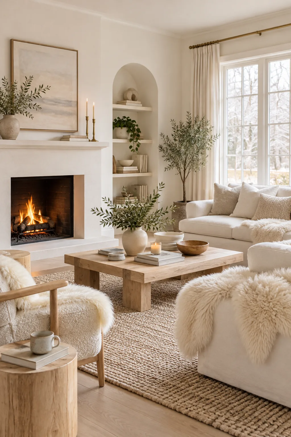
The Ultimate White Living Room Designer Spec Sheet
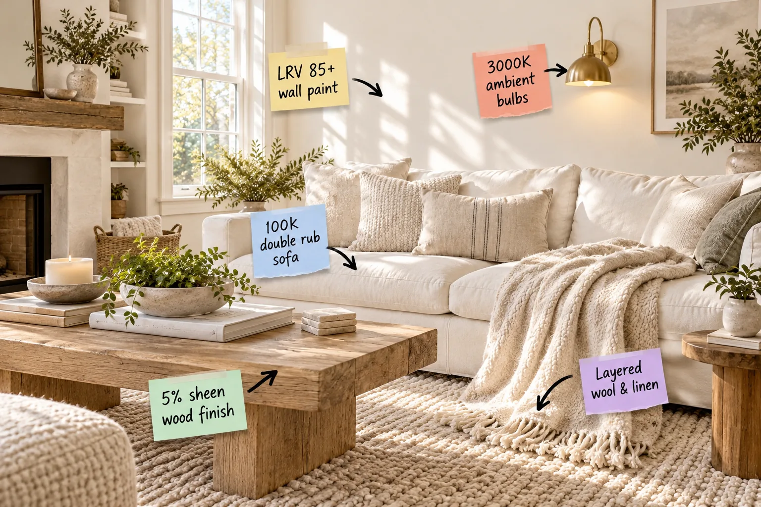
You will be able to shop for paint, furniture, and lighting using exact designer specifications to create a cohesive white living room. I built this White Room Spec Sheet to give you the exact paint LRVs, fabric durability ratings, and lighting pairings required for a bright, livable space.
Choosing LRV 85+ Wall Paint
When I painted my own Denver living room, I learned quickly that stark white feels clinical, so I always rely on Light Reflectance Value (LRV). You should aim for a warm white with an LRV between 85 and 90 to ensure the walls glow softly.
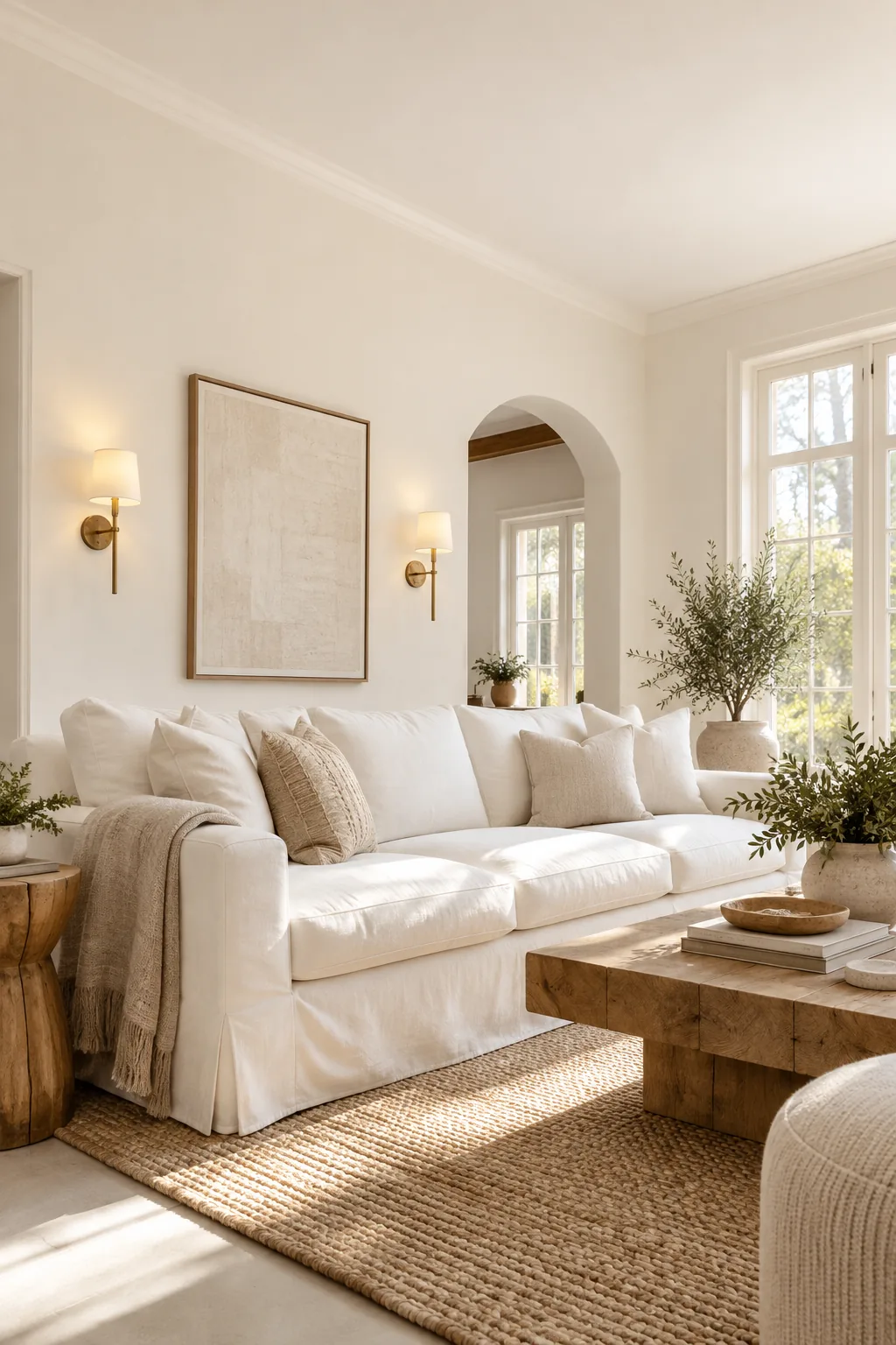
This specific mathematical range reflects enough natural daylight to feel bright without ever causing a harsh, blinding glare. Moving slightly beyond the paint chip requires evaluating how that specific color performs across different walls throughout the changing daylight hours.
Testing Paint Swatches in Natural Light
You must paint large test squares on both north-facing and south-facing walls to observe how the sun alters the pigment. A shade that looks perfectly creamy at noon might shift toward a muddy beige by late afternoon if the natural light lacks intensity.
Setting the Mood with 3000K Bulbs
Color temperature dictates how your paint behaves at night, making 3000K ambient bulbs the non-negotiable standard for a white room. This specific temperature casts a warm, inviting glow that perfectly mimics late afternoon sunlight while keeping the space highly functional.
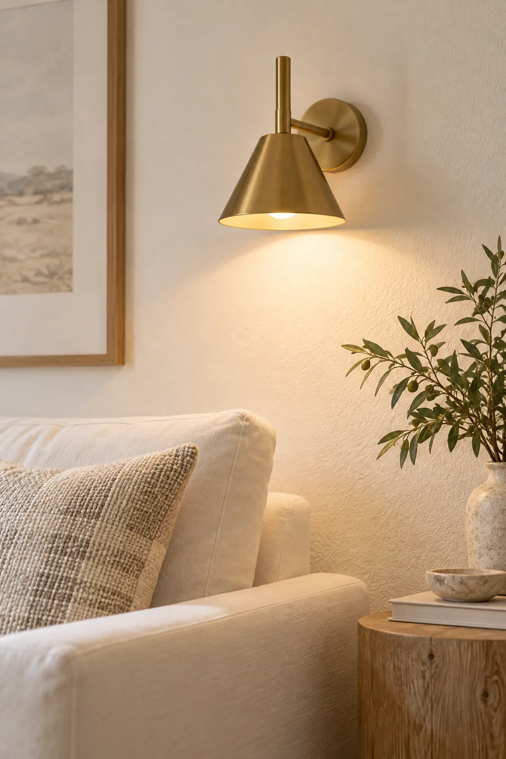
By standardizing all your fixtures to 3000K, you prevent your carefully chosen white walls from feeling clinical or blue-tinged in the evening. With the architectural shell illuminated correctly, we must position those fixtures to eliminate harsh overhead shadows.
Positioning Your Ambient Sconces
Mounting brass wall sconces roughly 60 inches above the finished floor ensures the light washes across the white paint at eye level. This horizontal illumination flatters the room’s architecture far better than aggressive recessed ceiling lights that cast downward shadows.
Sourcing a 100k Double Rub Sofa
White upholstery requires serious resilience, which is why I always specify a 100,000 double rub rating measured by the Wyzenbeek durability test. This commercial-grade threshold ensures your primary seating withstands heavy daily use without pilling or wearing thin over time.
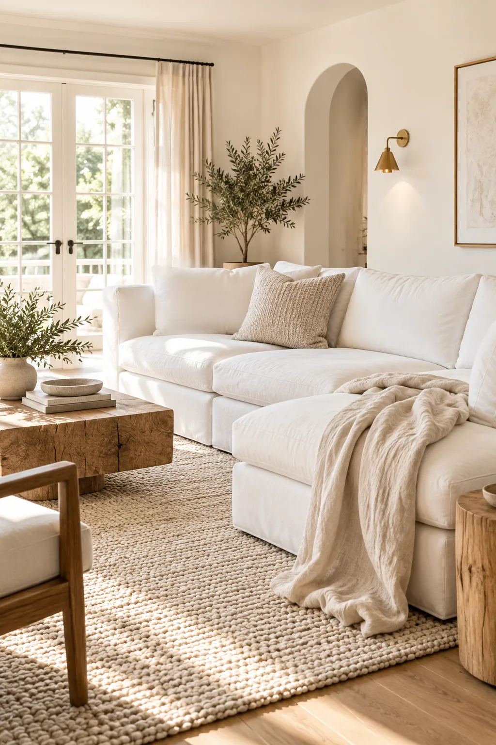
Even the most beautiful white sofa will quickly become an eyesore if the fabric cannot handle your household’s daily reality.
Selecting Performance Fabric Weaves
Beyond the numerical rub count, you must select a tight, flat weave like a performance basketweave to prevent pet claws or denim rivets from snagging the threads. A tightly woven surface naturally repels surface dust better than a loose, open boucle.
Layering Wool and Linen Textures
A monochromatic palette succeeds through tactile contrast rather than color, so I always combine a heavy-weight wool rug with relaxed, lightweight linen throws. This strategic pairing builds incredible visual interest and warms up the space without breaking the strict color rules.
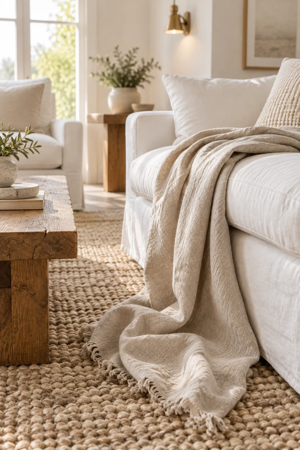
Contrasting these opposing fabric weights adds essential architectural depth to a room that might otherwise feel entirely flat. Once you establish this heavy foundation, you can manipulate the lighter textiles to create a relaxed, lived-in atmosphere.
Draping and Styling Throw Blankets
Pinching a linen throw at its center and letting it fall naturally over the sofa arm creates an organic, cascading drape. This effortless styling technique breaks up the rigid, boxy lines of modern white upholstery with a soft, welcoming layer.
Grounding the Room with 5% Sheen Wood
Natural wood elements provide necessary visual relief, but they require a 5% matte sheen finish to maintain their raw, organic appearance. This nearly invisible topcoat protects your coffee tables and accent chairs from moisture while preventing a distracting, glossy glare.
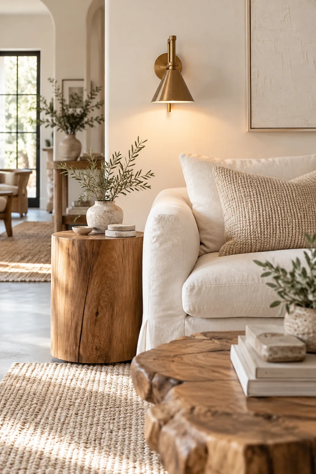
Specifying this exact matte finish grounds the airy room with a solid, earthy foundation that hides daily dust beautifully. Before finalizing your furniture order, you must select a wood species that complements your carefully chosen paint undertones.
Selecting the Right Wood Species
White oak and lighter ash woods naturally harmonize with a bright, airy aesthetic without weighing down the visual balance. Darker woods like walnut can work beautifully, but they create a high-contrast, graphic look that fundamentally shifts the room’s gentle, ethereal mood.
Balancing Warm and Cool Tones
Managing undertones across different materials is like a chess move; you must pair warm whites featuring subtle yellow or red undertones with complementary brass metals and warm oak. This careful alignment keeps the entire palette feeling highly intentional and unified.
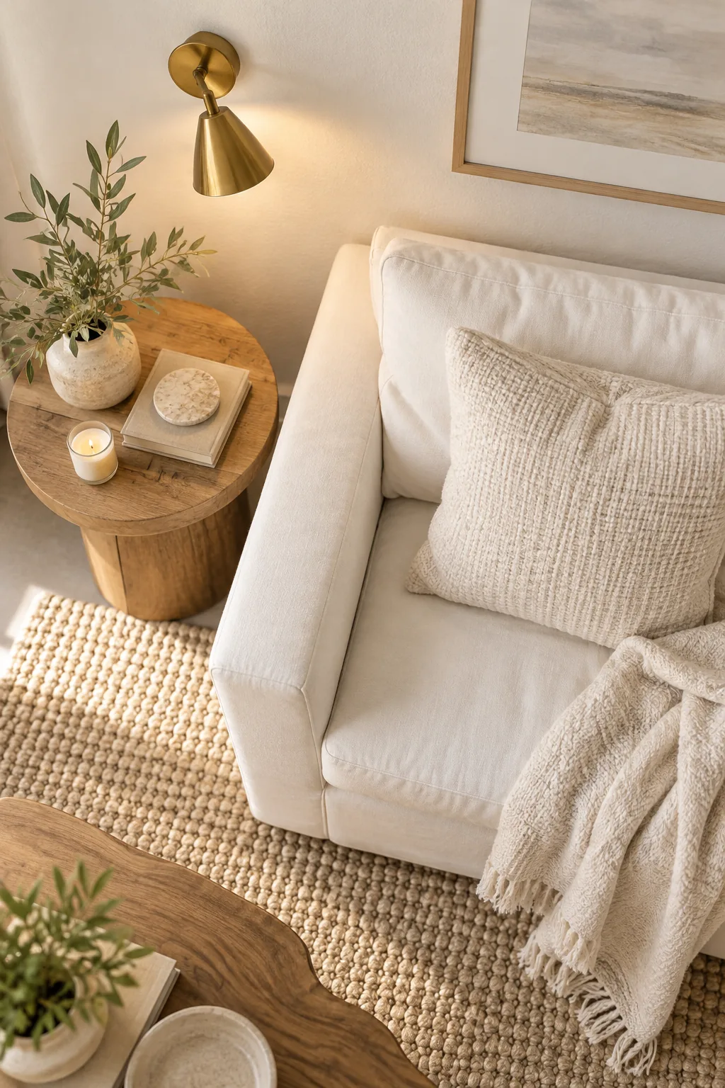
If you accidentally introduce a cool, blue-toned gray alongside these warm elements, the room will immediately feel disjointed and visually confusing. To prevent these costly matching errors, I use a simple trick to reveal the hidden colors in any sample.
Using Printer Paper to Check Undertones
Placing your fabric or paint sample directly against a sheet of standard, bright white printer paper instantly exposes its true undertone. Against the stark paper, a supposedly pure white fabric will quickly reveal whether it leans toward pink, yellow, or blue.
- Hold the paper and sample together near a sunlit window.
- Compare the pairing under your 3000K interior lighting.
- Discard any fabrics that suddenly look dingy or gray against the paper.
This simple diagnostic test prevents you from accidentally purchasing conflicting materials that look identical in the showroom but clash terribly in your home.
Identifying Hidden Green Casts
You must watch closely for green casts bouncing off exterior landscaping, which can tint your pristine white walls during the spring and summer. Filtering your windows with sheer, warm-white linen curtains helps neutralize this unwanted green light before it enters the room.
The Complete White Room Spec Sheet
You can confidently evaluate materials in the store by keeping your physical samples bundled with these finalized spec sheet numbers. Having this concrete data prevents impulse buys that might disrupt your carefully balanced architectural aesthetic.
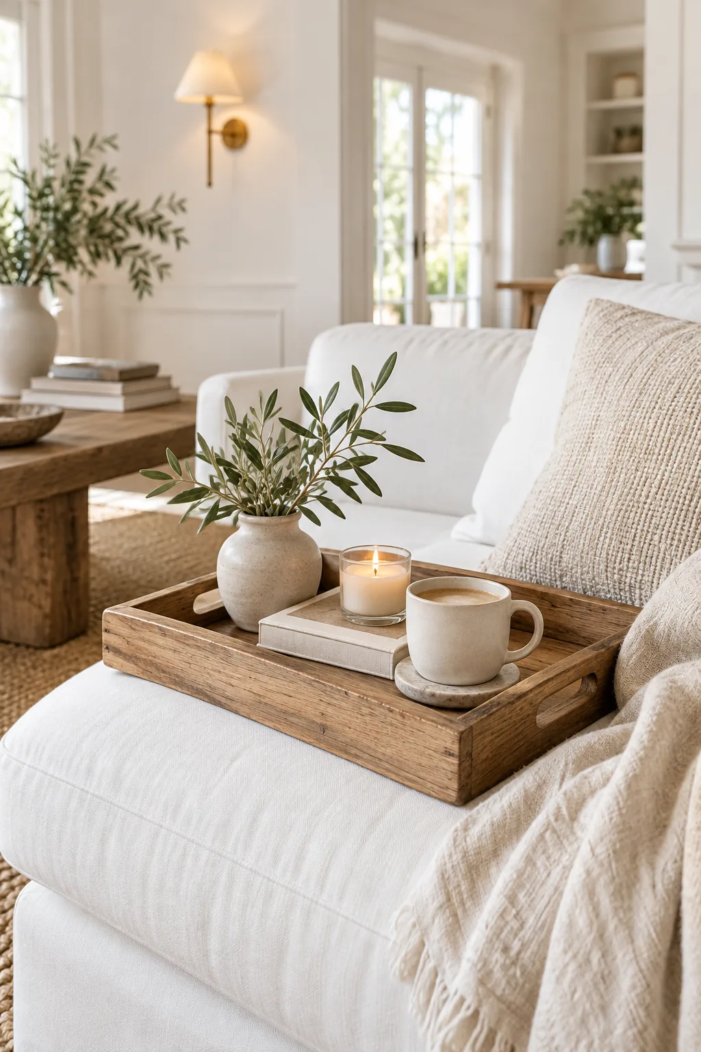
Use this compact reference chart to verify every major purchase against our established designer specifications before swiping your card.
| Design Element | Testing Metric | Exact Target Value | Primary Design Purpose |
|---|---|---|---|
| Wall Paint | Light Reflectance | LRV 85 to 90 | Bright but soft glow |
| Ambient Lighting | Color Temperature | 3000K Bulbs | Warm evening ambiance |
| Primary Upholstery | Wyzenbeek Test | 100,000 Rubs | Commercial durability |
| Wood Accents | Clear Topcoat | 5% Matte Sheen | Raw organic finish |
Mapping Your Budget for Key Pieces
Allocating your budget correctly means investing heavily in the performance upholstery, as a cheap white sofa will fail within a single year. You can save money on side tables and decorative throws, but the foundational seating dictates the room’s long-term success.
Prioritizing Your Lighting Investments
Hardwired brass wall sconces provide the most sophisticated ambient layer, making them worth a larger portion of your lighting budget. If hardwiring is impossible, high-quality plug-in sconces with cord covers offer the exact same warm glow without the steep electrician fees.
Handling Seasonal Textile Swaps
Rotating your secondary textiles keeps the white room feeling fresh, swapping heavy wool throws for breathable cotton weaves as summer approaches. This simple seasonal adjustment shifts the entire room’s thermal comfort while strictly maintaining the established monochromatic color palette.
Keeping Your White Room Pristine
When my own white linen sofa faced muddy paw prints during a Denver spring, I realized that choosing washable, removable slipcovers is the only way to survive. You should commit to regular vacuuming for textured wool rugs and using dry microfiber cloths on matte wood.
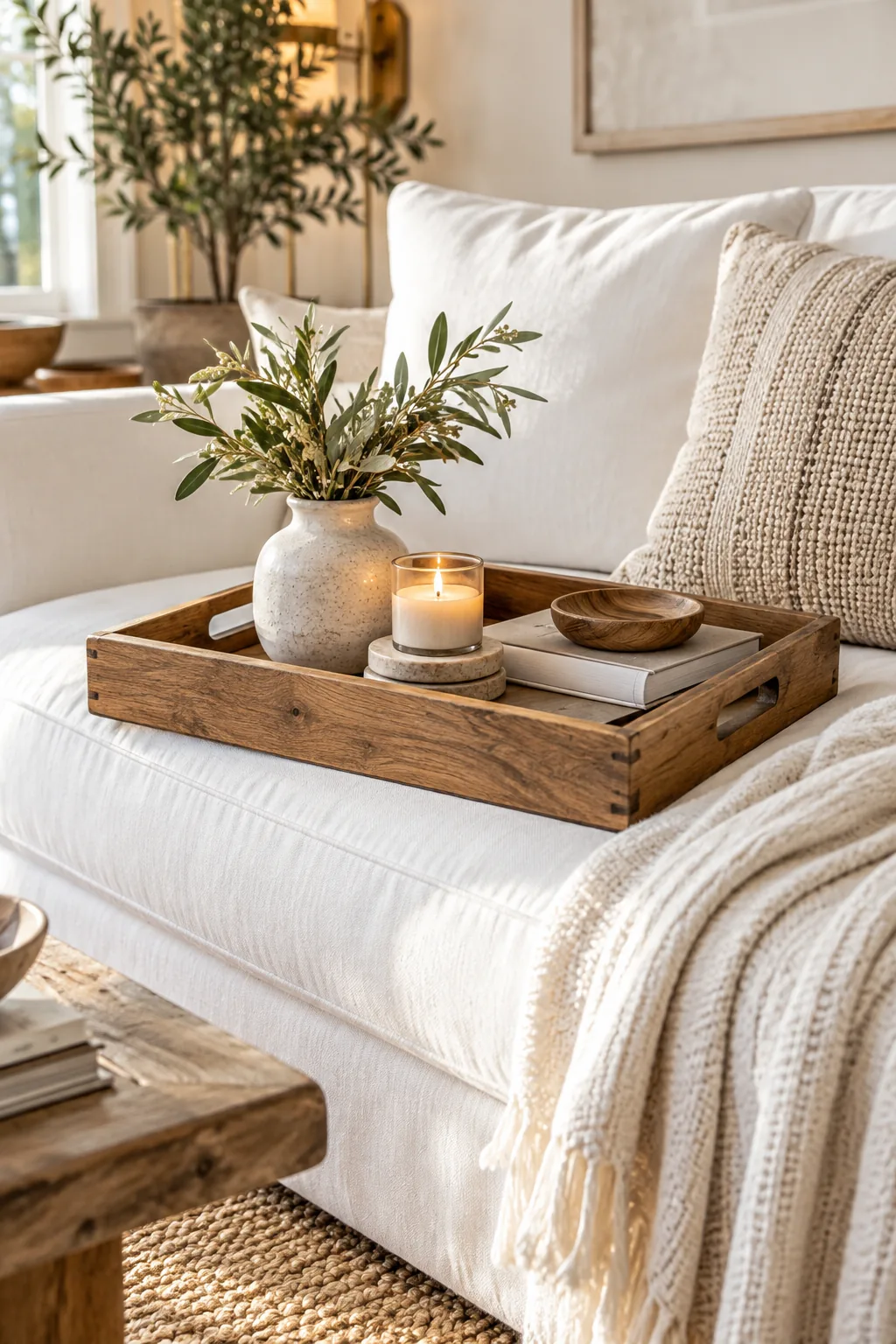
Maintaining a bright, airy aesthetic requires a proactive approach to cleaning and fabric care.
5 Ways to Style a White Living Room
Explore how these exact designer specifications adapt to completely different architectural styles and personal aesthetics.
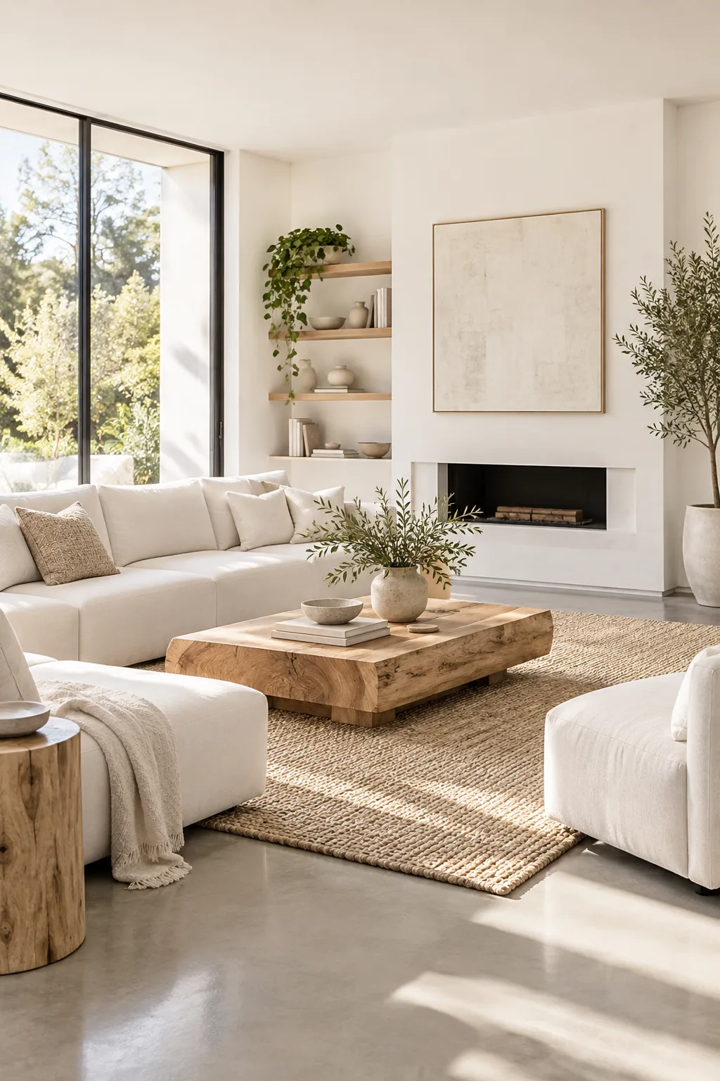
Modern Minimalist Gallery White: Crisp gallery-white walls and polished concrete floors create a striking, architectural foundation for low-profile contemporary seating.
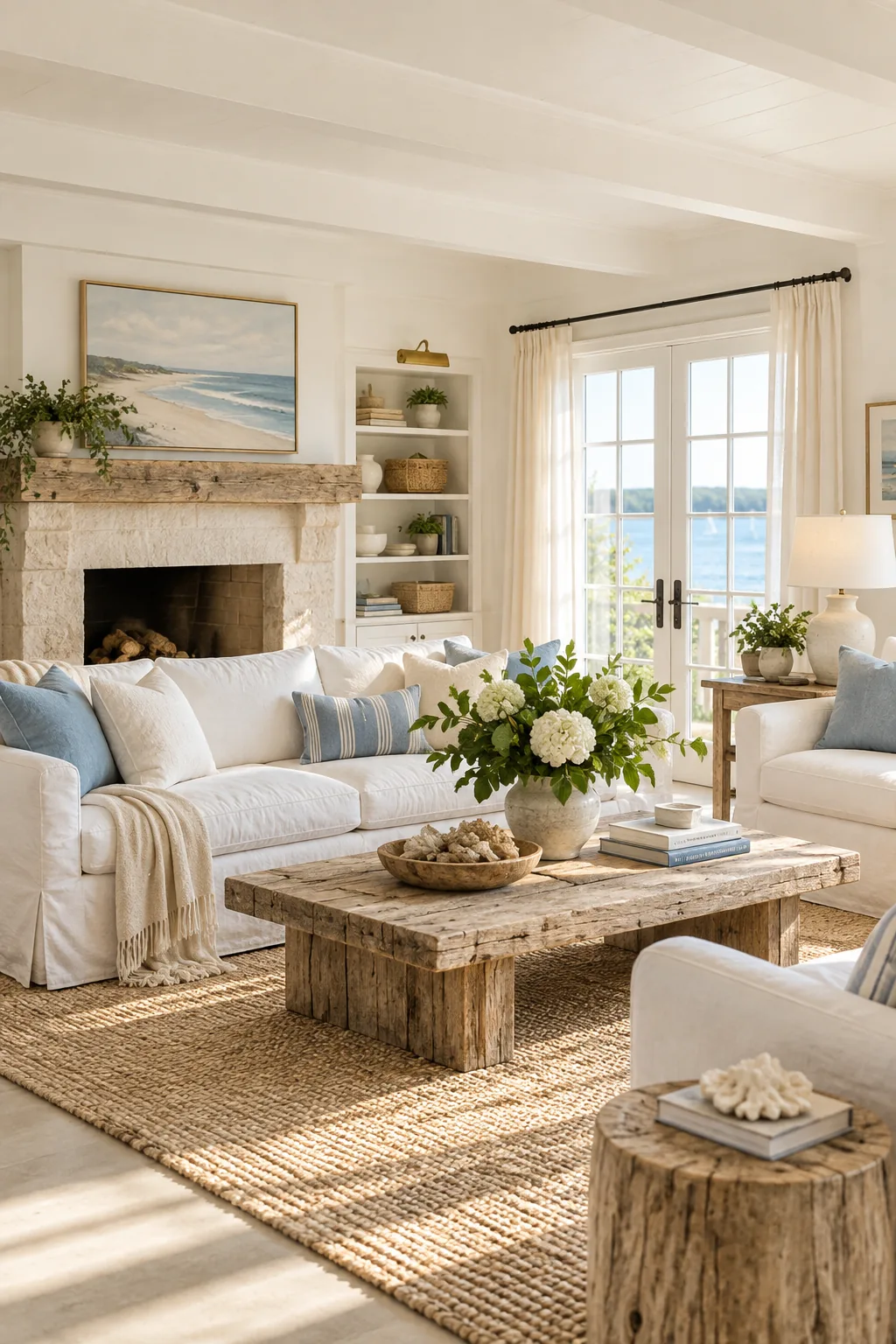
Relaxed Coastal Cottage White: Washable white slipcovers and weathered driftwood accents bring a breezy, relaxed coastal atmosphere to the space.
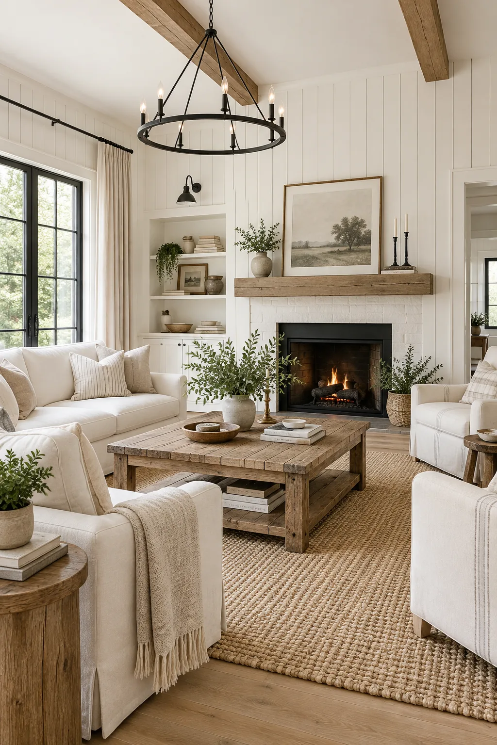
Textured Modern Farmhouse White: Vertical white shiplap adds instant architectural texture, contrasting beautifully with sharp black iron fixtures and distressed oak.
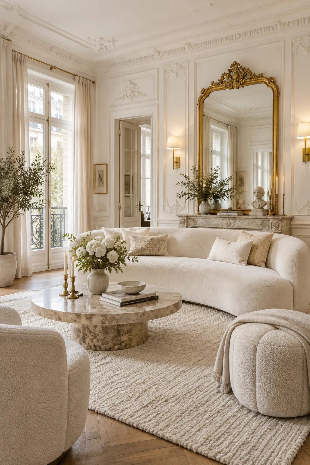
Elegant Parisian Chic White: Ornate wall molding painted in a warm white provides an elegant backdrop for luxurious cream velvet and antique gold.
Cozy Scandinavian Ash White: Creamy white walls paired with pale ash wood and fluffy sheepskin throws maximize warmth during dark winter months.