
This Recipe Book Became a Galley Kitchen
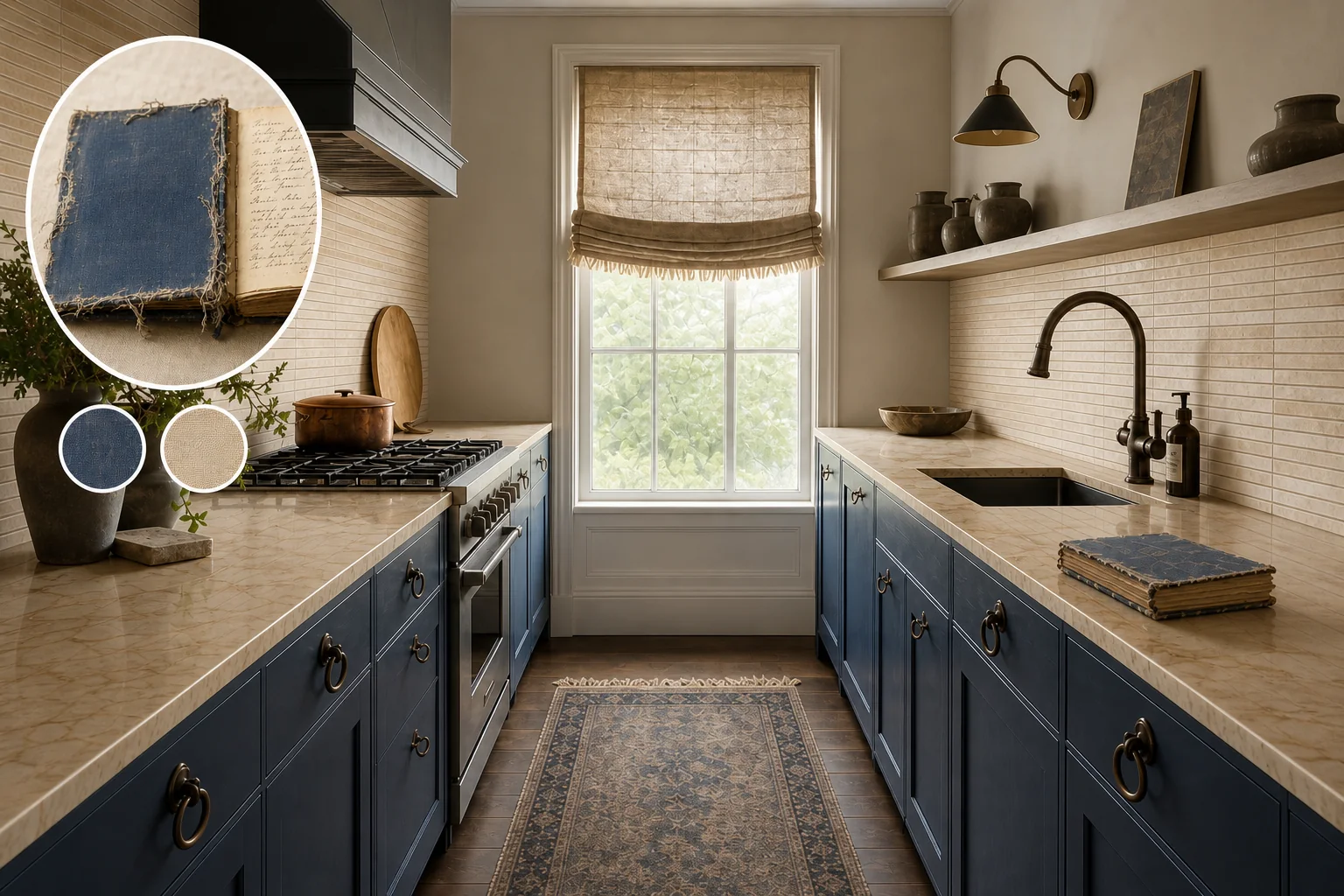
By mapping the frayed indigo binding and sepia ink of a vintage cookbook, this galley kitchen balances hardworking surfaces with soulful, tactile warmth. The design relies on the tension between rigid, stacked geometry and fluid, organic softness, keeping the architectural shell strictly linear while introducing sweeping curves through carefully selected hardware.
Stacking the parchment pages
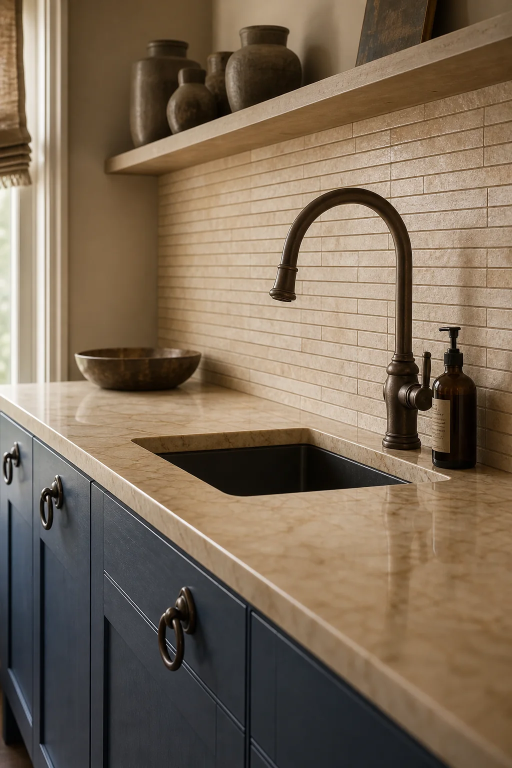
The rigid geometry of a narrow galley kitchen finds its essential rhythm in the dense, horizontal stacking of porous, parchment-toned tiles, directly mimicking the thick, layered pages of an old heirloom book viewed from the side. Running these tactile tiles continuously from the warm amber-veined counter all the way to the high ceiling emphasizes the room’s impressive architectural height while maintaining a visually quiet, highly durable foundation for a high-traffic cooking zone. To successfully achieve this stacked parchment effect without overwhelming the eye, follow these precise installation steps to ensure the architectural shell remains perfectly linear, matte, and structurally sound.
- Measure and prep the continuous backsplash wall so the surface is smooth, primed, and ready for a heavy tile application.
- Install parchment zellige tiles in a stacked bond to ensure horizontal lines run unbroken across the entire galley length.
- Apply a color-matched, matte sanded grout so the grout lines recede, emphasizing the stacked page effect.
- Seal the porous tile and grout thoroughly so the backsplash resists cooking splatters while maintaining a matte finish.
Grounding the space in faded indigo
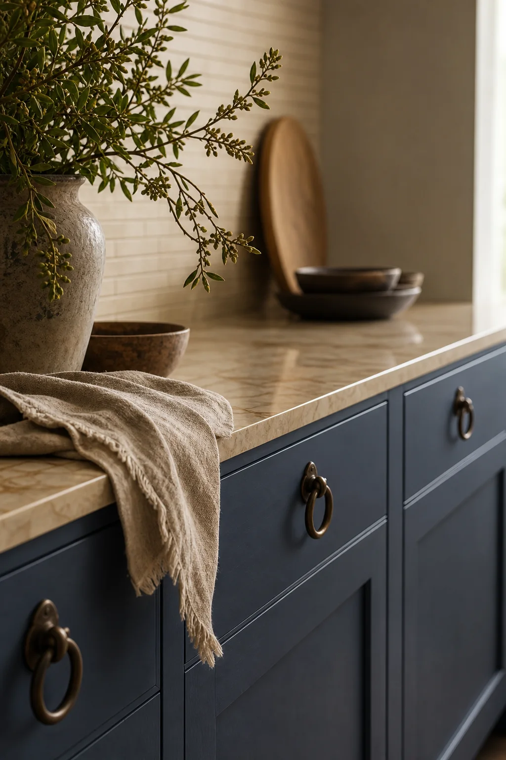
Translating the book’s worn fabric cover into matte indigo lower cabinets anchors the narrow room, providing a deep, grounding weight that beautifully contrasts the lighter upper walls. Choosing a flat-panel door style with a low-sheen finish mimics the light-absorbing quality of old, naturally dyed fabric, keeping the visual focus purely on the rich color rather than distracting ornate millwork. This careful balance ensures the parallel runs of cabinetry maintain a clean, unbroken visual rhythm. The following visual-DNA mapping table illustrates exactly how these tactile heirloom traits translate seamlessly into a highly functional, beautifully balanced cooking space.
| Source trait | Visible evidence | Room move |
|---|---|---|
| Stacked pages | The dense, horizontal layering of the book’s parchment pages viewed from the side | Horizontal, tightly stacked parchment-colored zellige tiles running the full length of the backsplash to mimic the page edges |
| Faded fabric cover | The muted, worn indigo blue of the book’s fabric binding | Matte, muted indigo-blue flat-panel lower cabinets grounding the parallel runs of the space |
| Frayed binding | Loose, tactile threads escaping from the worn edges of the fabric cover | A heavy, raw-edge linen roman blind at the far window and a fringed vintage runner rug on the floor |
| Handwritten script | The sweeping, organic loops of sepia ink across the rigid grid of the pages | Fluid, looping dark bronze cabinet pulls and a sweeping gooseneck faucet contrasting against the linear tile |
The transition from cover to page
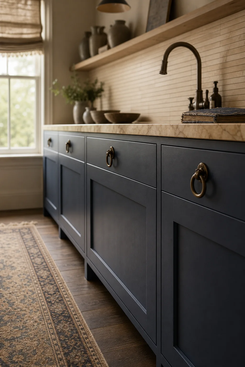
A close-up view reveals exactly how the warm, amber-veined marble countertop elegantly bridges the visual gap between the dark indigo cabinetry and the light parchment zellige backsplash. This durable natural stone surface acts as the ultimate binding agent for the design, seamlessly connecting the deep, light-absorbing base with the textured, porous walls to complete the faded indigo palette. By allowing the countertop to echo the subtle butter stains of the original recipe pages, the kitchen achieves a cohesive, organic warmth that softens the otherwise strict linear geometry of the parallel galley runs.
Embracing the frayed edges
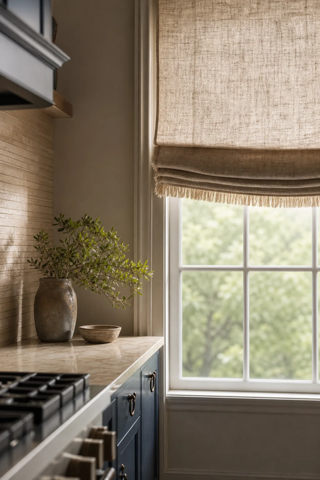
Introducing raw, unhemmed textiles breaks up the kitchen’s hard, durable surfaces, directly echoing the unraveling threads of a well-loved, time-worn binding. A heavy raw-edge linen roman blind softens the diffused daylight pouring through the tall sash window at the far end, while keeping these delicate fabrics safely away from direct, messy cooking zones ensures long-term practicality. This careful layering of textiles prevents the highly functional space from feeling sterile or overly utilitarian. To accurately recreate this tactile heirloom warmth in your own home, source the following specific material finishes for your complete room recipe.
Softening the hard floor
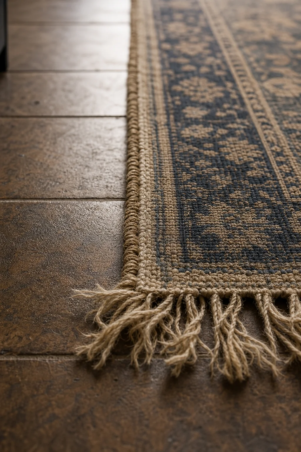
Looking straight down the long galley aisle, the fringed edges of a faded vintage runner rug rest gently against the durable, high-traffic flooring. This simple, easily replaceable textile addition adds essential softness underfoot for long cooking sessions, providing a practical yet deeply textural nod to the frayed fabric binding of the original source object. The rug’s muted tones tie the entire color palette together, drawing the eye toward the natural light of the far window while reinforcing the delicate balance between hardworking architectural materials and soulful, organic human marks.
Writing in sepia ink
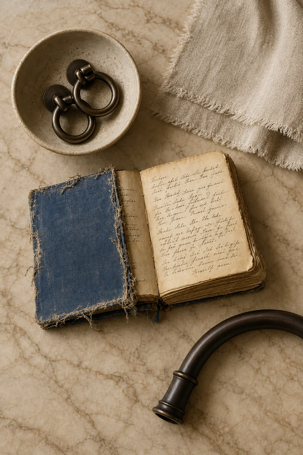
The fluid, looping shapes of handwritten script are translated into sweeping bronze hardware and a graceful gooseneck faucet, providing a necessary organic contrast to the room’s rigid grid. For a subtle execution, focus purely on the parchment and indigo palette using standard matte subway tile and simple brass pulls. A balanced approach introduces the stacked zellige and a single frayed linen window treatment, while a bold design extends the parchment tile completely to the ceiling alongside heavily distressed wood cabinets. Whichever intensity you choose, the hardware remains the defining organic signature.
Select unlacquered or oil-rubbed bronze for your hardware. It will naturally wear and change color with use, perfectly mimicking the organic aging of sepia ink.