Bookshelf Styling Sequence for a Pretty Mid-Novel Display
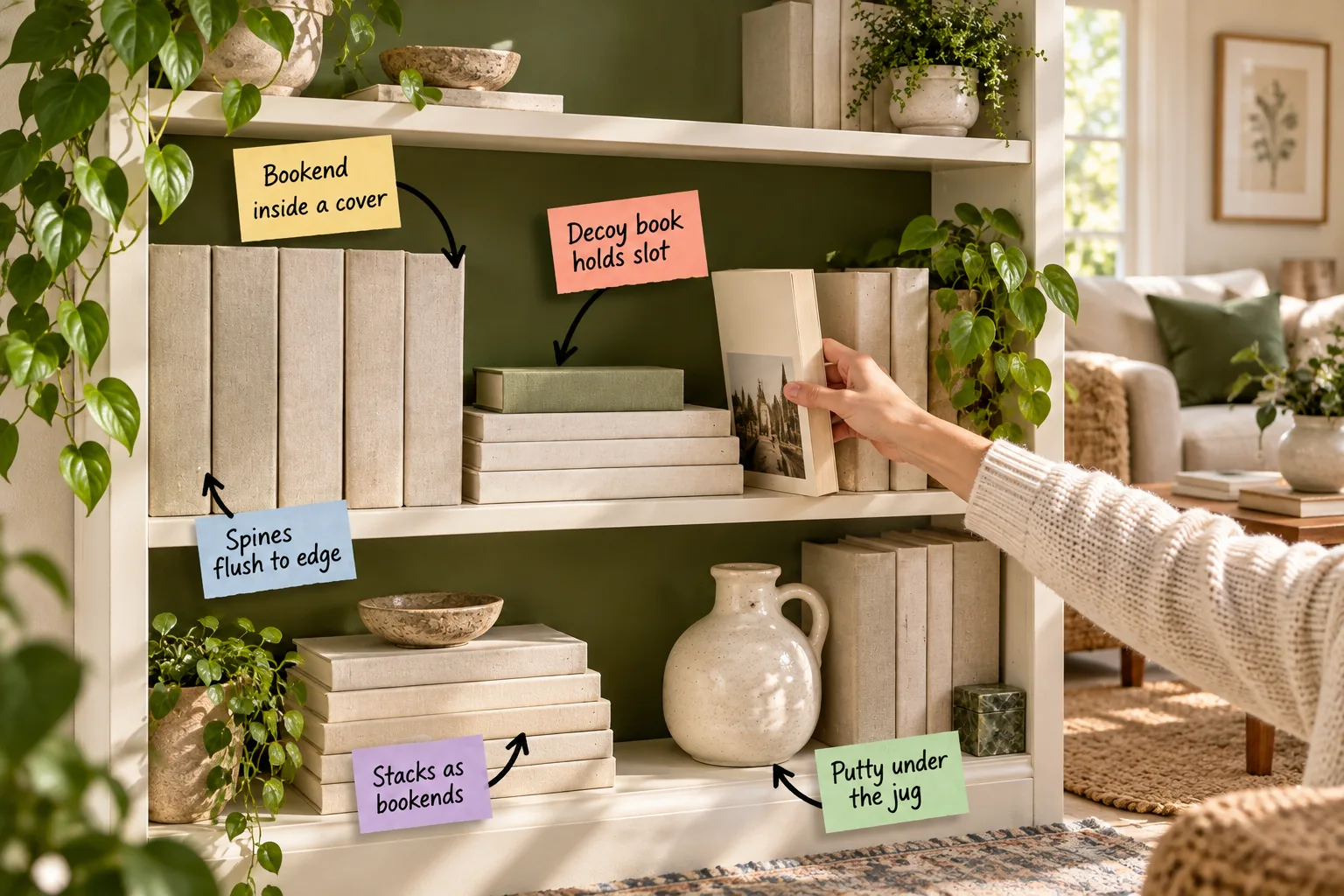
You can maintain a perfectly balanced bookcase even when you pull out your current read by following our printable shelf-by-shelf styling sequence. I will show you exactly how to arrange anchor stacks, vertical rows, and objects so the display stays flawless.
The Foundation of Anchor Stacks
In my own Boston living room, I always start shelf styling by placing horizontal stacks of four to six books at the outer edges. These structural anchors act as natural, heavy bookends that keep your vertical rows from tipping over.
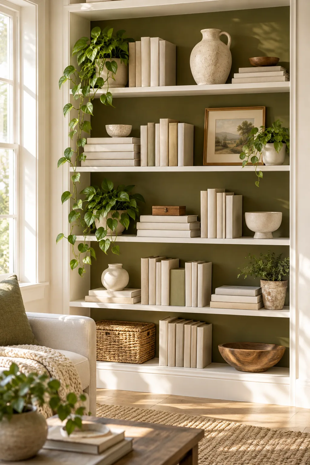
Establishing these heavy corners immediately grounds the entire bookcase and provides a sturdy framework for the lighter elements. You want to select your thickest, most substantial volumes for these foundational positions to ensure they can bear the weight of leaning rows.
Selecting Volumes for Horizontal Bases
Not every book works well in a flat stack, so you must evaluate your collection for size and stability. Hardcovers with textured cloth bindings grip each other far better than glossy paperbacks, preventing the stack from sliding when bumped.
| Book Material | Surface Grip | Stacking Stability |
|---|---|---|
| Textured Cloth Hardcover | High | Excellent |
| Matte Trade Paperback | Medium | Good |
| Glossy Photography Book | Low | Poor |
Once you gather your textured hardcovers, arrange them with the largest volume on the bottom to create a stable pyramid effect. This tapering shape naturally draws the eye upward while maintaining a low center of gravity for maximum structural support.
Determining the Ideal Stack Height
A successful horizontal anchor requires a specific height to look intentional rather than haphazard. Stack your volumes until they reach roughly one-third of the total shelf height, which usually requires four to six standard hardcovers depending on their page counts.
Pulling Spines Flush to the Edge
Instead of pushing titles against the back panel, align every spine exactly with the front edge of the shelf. This creates a clean, architectural line and casts uniform shadows, making mixed sizes look intentionally curated rather than messy.
When you pull everything forward, the dark void left behind the books actually adds a sense of depth to the room. This negative space behind the row makes the shelving unit feel custom-built and substantial rather than shallow and crowded.
Managing Mixed Book Depths
You will inevitably encounter varying book depths within a single curated row, which can complicate your alignment strategy. The trick is to ignore the back covers entirely and focus solely on keeping the front spines in a perfectly straight line.
This alignment technique immediately elevates the look of inexpensive paperbacks by giving them the same visual importance as your premium art books. The uniform front plane catches the room’s ambient light evenly, eliminating chaotic, distracting shadows from your display.
Dealing with Oversized Art Books
When styling oversized art books or deep photography portfolios, pulling them completely flush might push their back edges against the wall. In these specific cases, use these massive volumes exclusively in your horizontal anchor stacks where depth variations are far less noticeable.
Concealing the Support Bookend
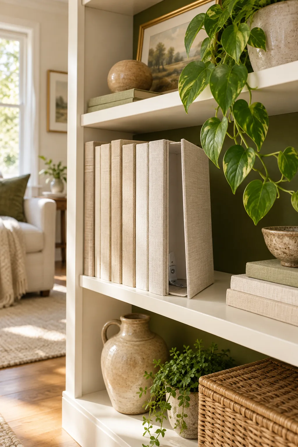
For rows that end mid-shelf, I use a trick from my visual merchandising days: slip a slim metal bookend inside the front cover of the final hardcover. The book stands perfectly straight with invisible support, keeping the row crisp.

Hiding the hardware inside the book jacket eliminates visual clutter and allows the beautiful bindings to remain the focal point. This invisible support system is especially crucial on upper shelves where traditional bulky bookends would look heavy and disproportionate.
Selecting the Ideal Metal Bracket
You must choose the right type of bracket to ensure it fits seamlessly behind the title page without damaging the delicate binding. Look for industrial L-brackets that feature a completely flat base and a thin, unpadded vertical profile.
- Base length: Choose a bracket with a base of at least four inches to sit securely under the adjacent books.
- Vertical height: Ensure the vertical arm is shorter than your book so it remains entirely hidden.
- Material thickness: Opt for stamped steel under two millimeters thick so the cover closes perfectly flat.
Sliding this specific type of bracket behind the flyleaf guarantees your row will never collapse, even if the shelf is forcefully bumped. The weight of the neighboring books anchors the flat base, transforming the final book into an immovable pillar.
Holding the Slot with a Decoy
Keep your arrangement looking complete while you read by sliding a linen-wrapped decoy block into the empty space. This slim wooden placeholder sits in the elbow-height slot, holding the adjacent books upright until your paperback returns.
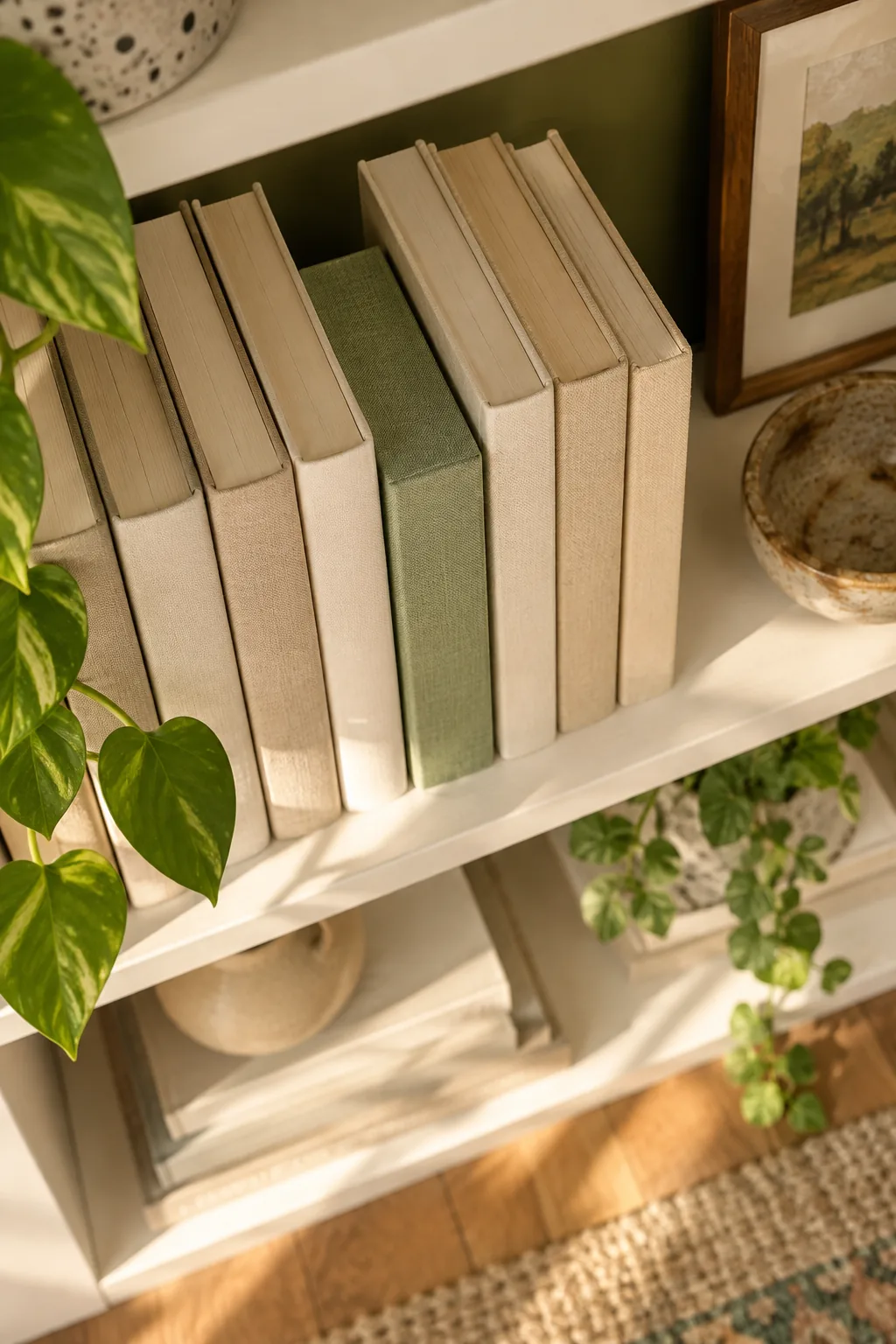
Placing the decoy at an ergonomic height means you can easily grab your current novel without disrupting the entire carefully styled display. The wrapped block maintains the necessary physical pressure against the row, preventing the surrounding titles from slumping sideways.
Customizing Your Placeholder Block
Creating your own decoy allows you to perfectly match the aesthetic of your room and the dimensions of your favorite reading material. You can easily cut a simple piece of scrap wood to match the exact height and depth of a standard trade paperback.
Using a high-quality bookcloth or leftover upholstery linen ensures the block blends seamlessly with the authentic book covers around it. This small attention to texture keeps the shelf looking sophisticated rather than feeling like a temporary, unfinished storage solution.
Anchoring Decor with Museum Putty
I learned the hard way after a favorite vase shattered to always place a dab of clear museum putty under the base of any ceramics. Pressing a stoneware jug firmly into place prevents disastrous shifts when you use the shelf.

Securing your fragile pieces is absolutely essential when they sit directly next to vertical rows that you access frequently. The putty acts as an invisible insurance policy, holding the object fast even if a neighboring book accidentally knocks into it.
Applying the Adhesive Correctly
You only need a pea-sized dot of putty to achieve a secure hold without damaging your painted surfaces. If you apply too much adhesive, it will ooze out from under the base and attract highly visible dust over time.
Removing Putty Safely
When it is time to rearrange your shelves or clean the unit, never pull the ceramic piece straight up. Gently twist the object back and forth to break the putty’s seal, ensuring you do not strip the paint off your shelving board.
Balancing Book Counts and Empty Space
Alternate the placement of your vertical rows and horizontal stacks on each tier so the visual weight zigzags down the bookcase. This structural rhythm prevents the unit from feeling lopsided or overwhelmingly heavy on one particular side.

Once the main stacks and rows are placed, step back to evaluate the negative space before adding smaller objects. You must intentionally leave room for the arrangement to breathe, treating the empty air as a crucial design element.
By leaving roughly one-third of every shelf width completely empty, you highlight the objects that are present rather than drowning them in clutter. This disciplined approach to negative space is the secret to achieving a high-end, professionally styled appearance.
Establishing the Zigzag Rhythm
To create that perfect zigzag effect, start by placing a heavy horizontal stack on the far left of your top shelf, then place the next stack on the far right below it. This alternating pattern keeps the styling dynamic and engaging.
Incorporating Organic Elements
While books and ceramics form the rigid structure of your display, adding a trailing plant softens the rigid grid. Position a small pothos near your heavy horizontal stacks to drape naturally over the sharp corners of the bindings.
Your Printable Styling Sequence
Download our two-page styling sequence to recreate this exact order at home, ensuring your shelves look professionally balanced. It includes the exact spacing ratios for standard 36-inch shelves and a checklist for placing anchors, rows, gaps, and objects.
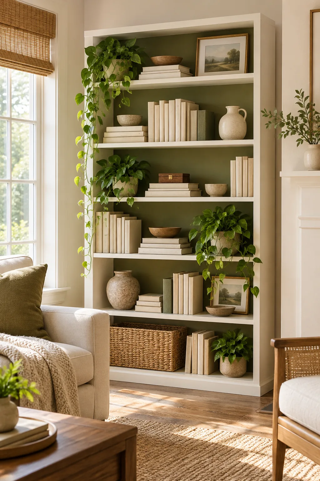
Following a strict sequence prevents you from getting overwhelmed by too many decisions at once and guarantees a cohesive final result. Stick to this proven placement order to build your display logically from the heaviest structural pieces to the final delicate accents.
- Place horizontal anchor stacks of four to six books at alternating outer corners of each tier.
- Arrange your vertical rows, pulling all spines completely flush with the front edge of the shelf.
- Insert your linen-wrapped decoy blocks into the designated mid-shelf reading gaps.
- Secure all decorative ceramics and fragile objects using clear museum putty.
Print this sequence out and keep it handy the next time you decide to refresh your living room display. Having a concrete plan transforms shelf styling from a frustrating trial-and-error process into an enjoyable, highly satisfying weekend project.
Three Ways to Style the Decoy Method
Choose a color palette and material finish that matches your room's unique architecture.
Moody Walnut Library: Deep walnut shelves paired with vintage leather spines and brass accents create a rich, traditional atmosphere. Use dark bookcloth for your decoy block to match.

Breezy Coastal Built-Ins: Whitewashed oak shelves styled with pale blue covers and coral objects bring light into the space. Keep vertical rows shorter to maximize airy negative space.

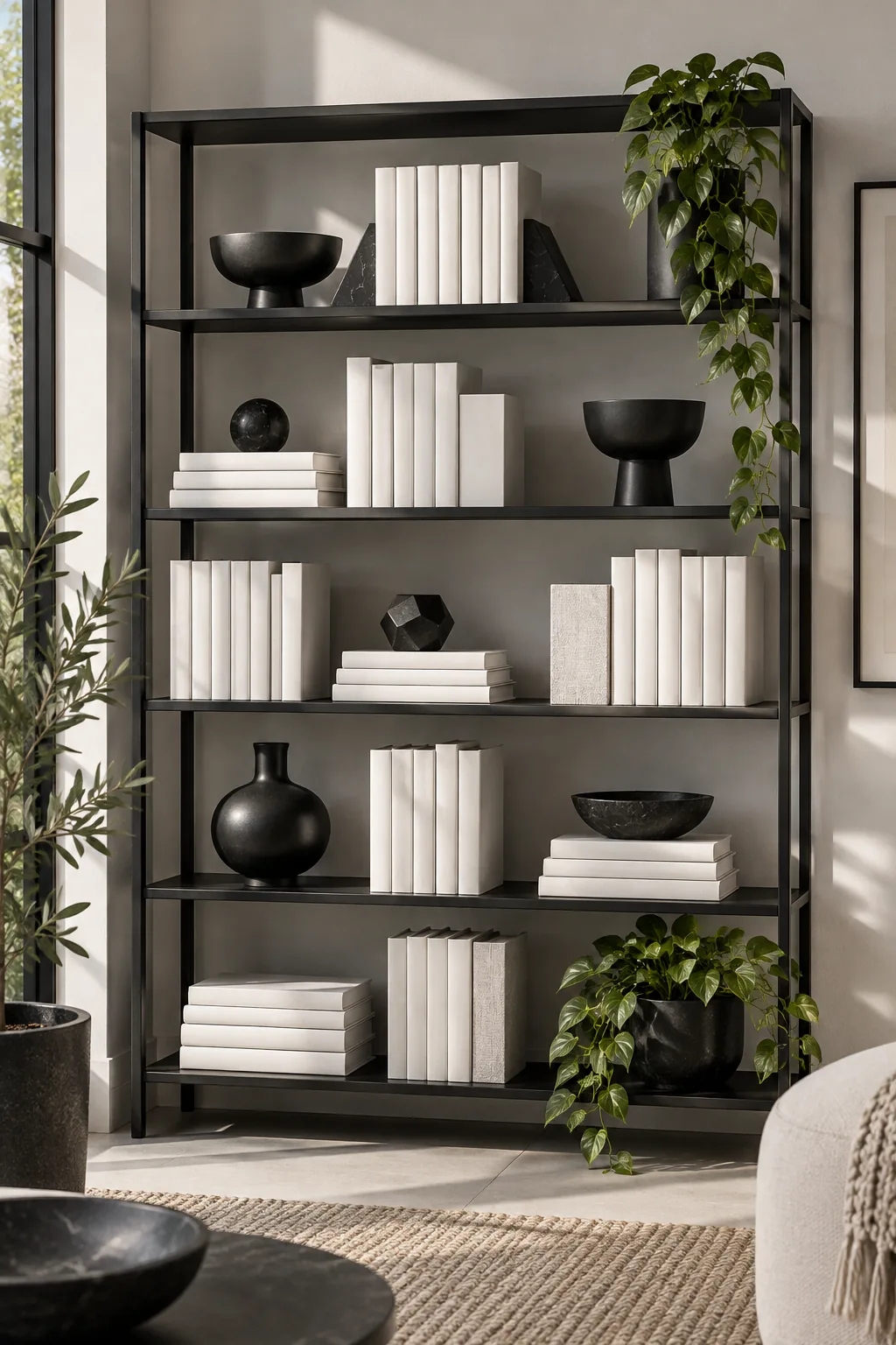
Minimalist Monochromatic Display: A matte black metal shelving unit featuring exclusively white-spined books and geometric ceramics offers stark contrast. Align everything strictly for a highly disciplined aesthetic.