
10+ Beautiful Best Dining Room Colors for Your Home
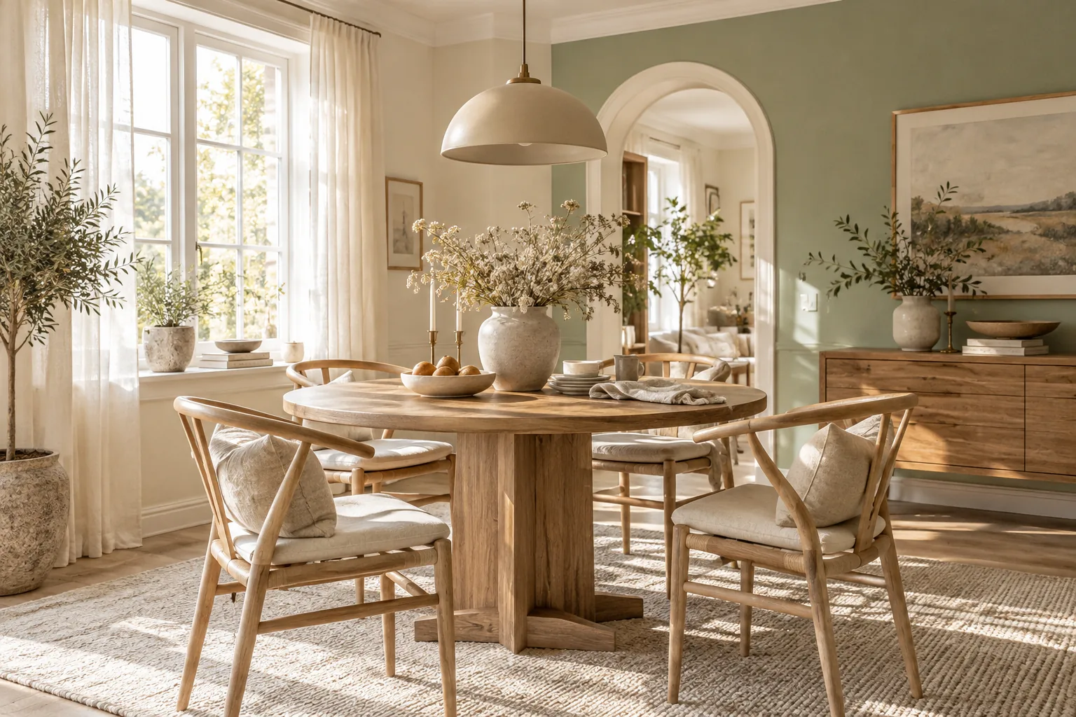
Picking the right paint completely changes how your dining space feels during meals. Here are my favorite shades that look incredible in real homes.
1. Moody Navy Blue
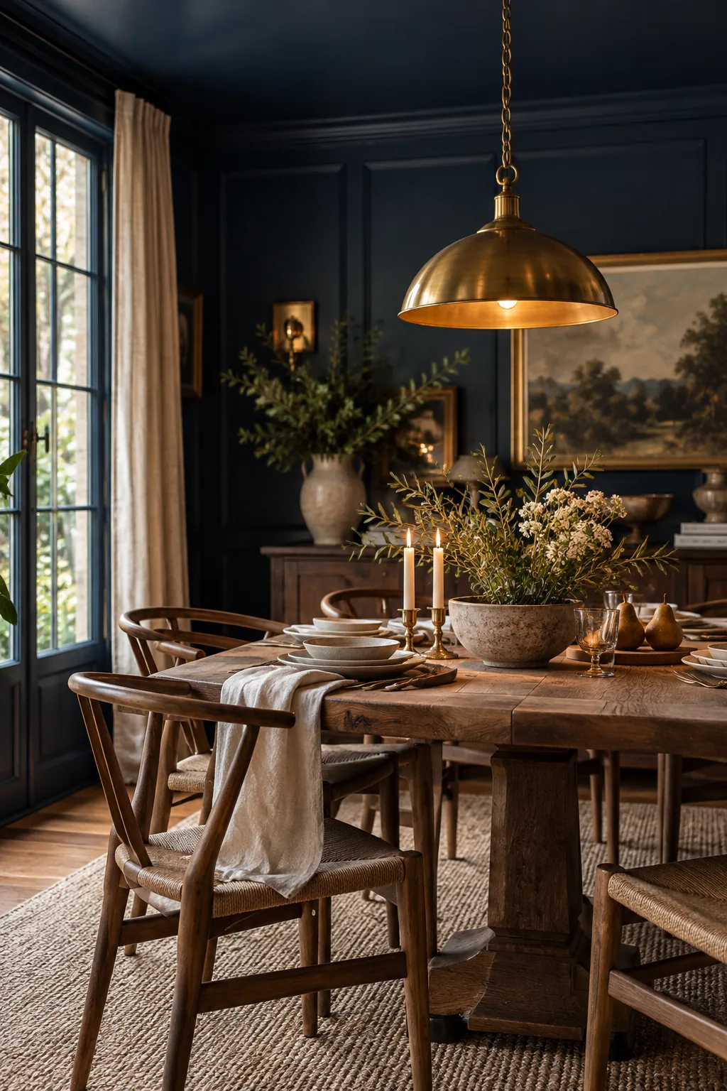
Dining rooms with large windows handle dark paint beautifully.
Navy blue walls instantly anchor a space and make basic wooden furniture look expensive. You can paint the ceiling the same color to create a cozy, intimate atmosphere for dinner parties. It pairs flawlessly with warm brass light fixtures.
2. Earthy Warm Terracotta
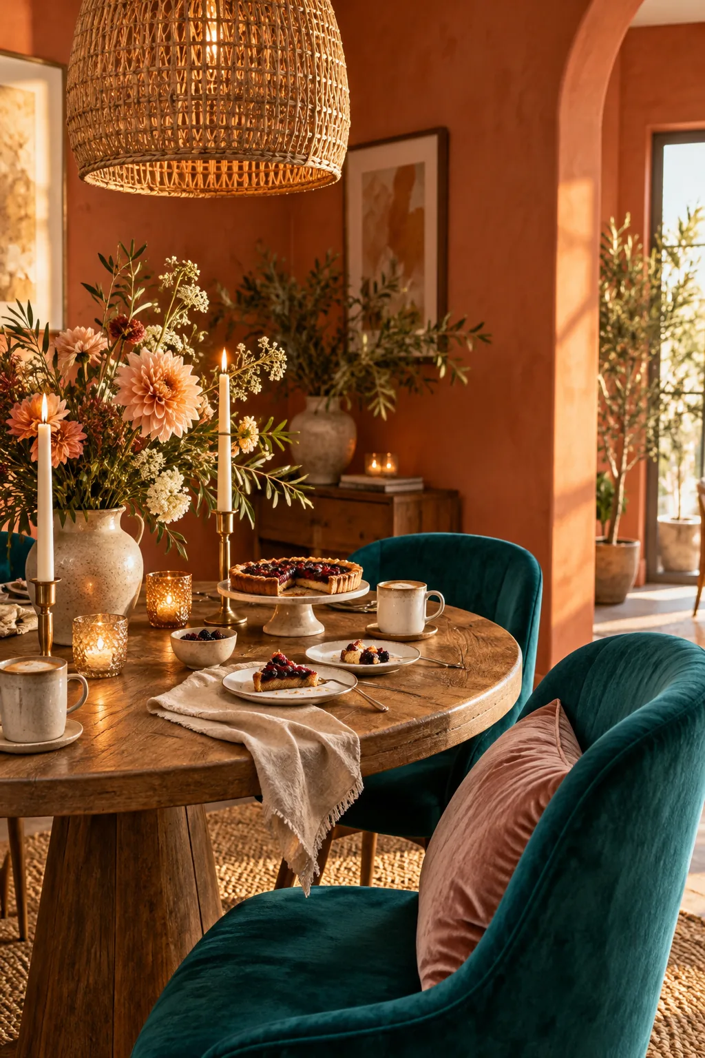
A standard dining room needs about two gallons of paint for full coverage. Warm terracotta brings an earthy, welcoming energy that makes guests want to linger over dessert.
3. Crisp Matte Black
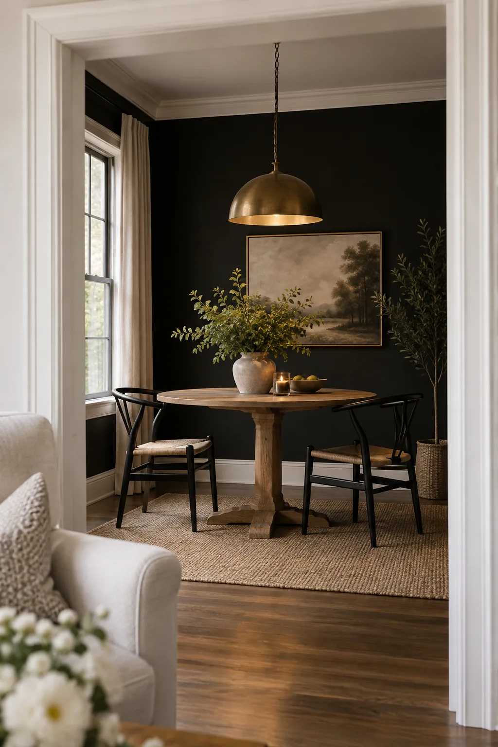
High contrast works because it creates immediate visual drama.
Painting your walls a crisp matte black blurs the corners of the room. This optical illusion actually makes a small dining area feel much larger than it is. Just keep your trim bright white for a clean finish.
Why it works: Black blurs room corners to create an optical illusion of more space.
4. Soothing Sage Green
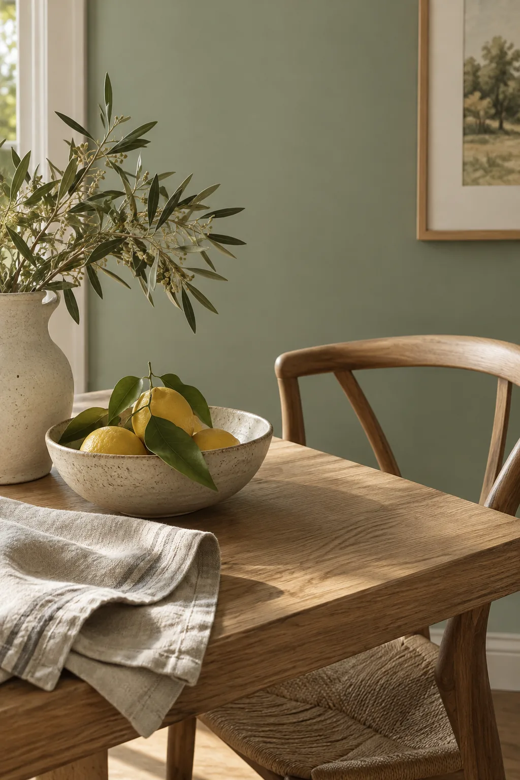
I always recommend sage green to clients who feel nervous about using color. It acts like a neutral backdrop while bringing a fresh, natural vibe to your daily meals.
5. Classic Burgundy Red
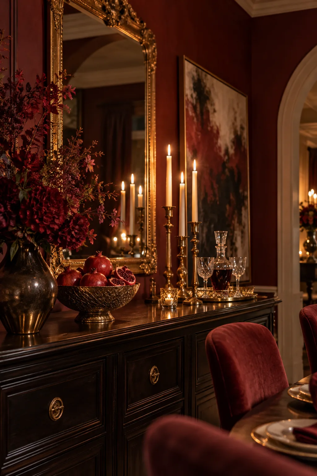
A rich burgundy red delivers a classic, traditional aesthetic that feels incredibly luxurious. This deep shade reflects candlelight beautifully during evening gatherings. You can balance the heavy color by hanging large mirrors or oversized artwork. It is the perfect choice for a formal dining setup.
6. Soft Blush Pink
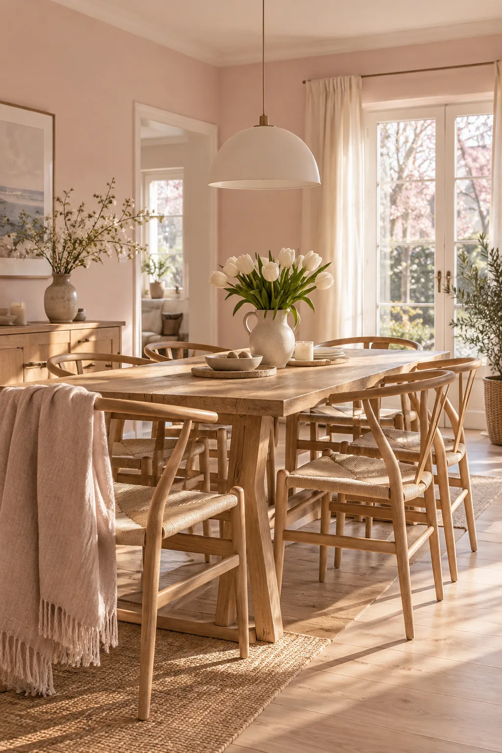
Light bounces differently off walls with a flat finish. Choosing a soft blush pink adds warmth without overpowering your existing decor. The subtle rosy undertones make everyone's skin look glowing and healthy around the table. Pair it with natural oak chairs for a modern Scandinavian feel.
7. Versatile Warm Greige
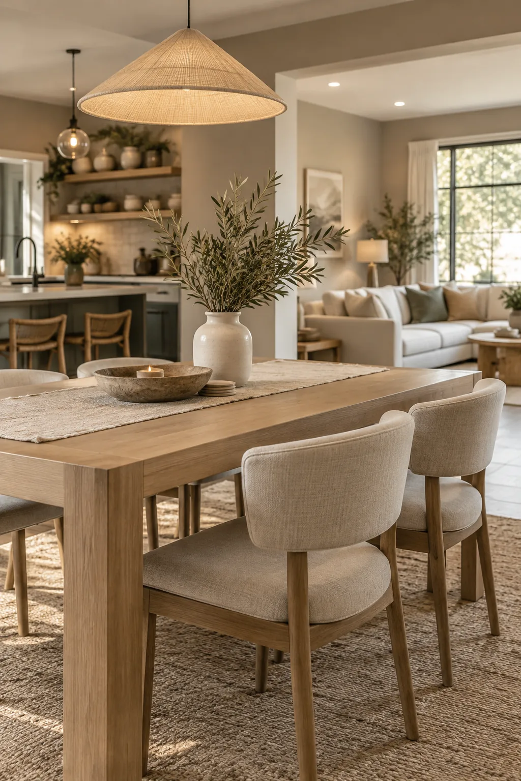
Nearly 80 percent of modern homes feature open floor plans that require cohesive color transitions. A warm greige bridges the gap between your kitchen and living space while giving the dining zone its own subtle identity.
8. Cheerful Mustard Yellow
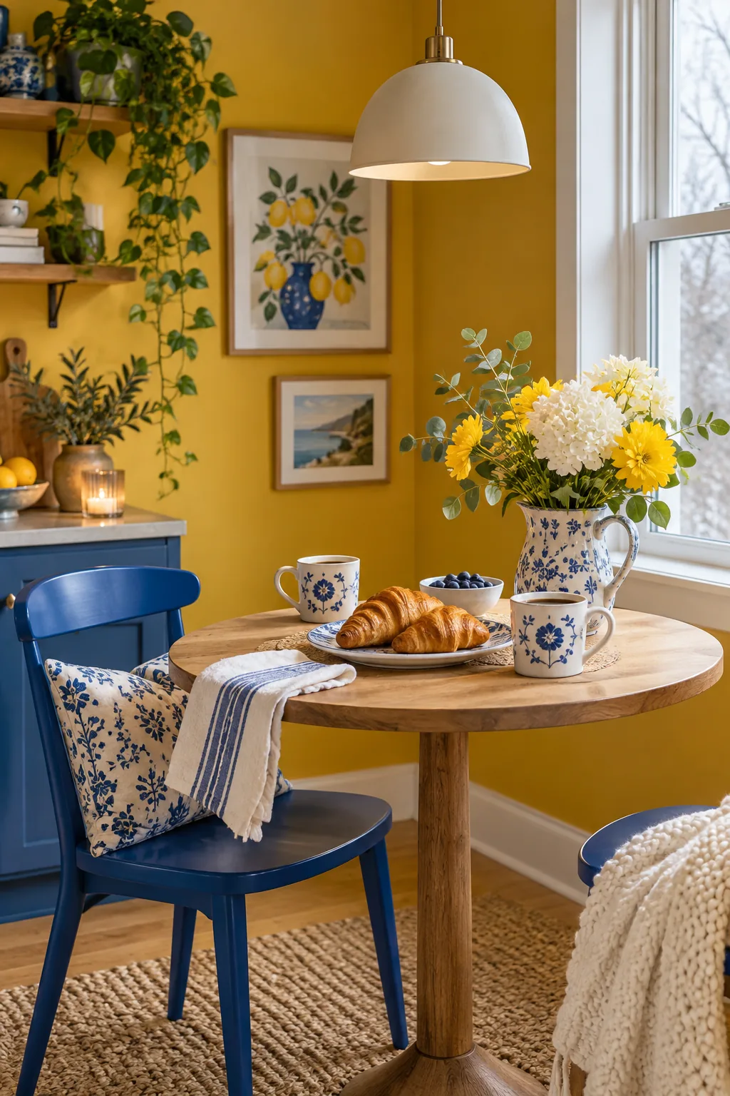
Rooms that face north get very cool, bluish natural light throughout the day. Brushing on a mustard yellow warms up those chilly shadows and brings instant cheer to your morning coffee routine.
9. Drenched Charcoal Gray
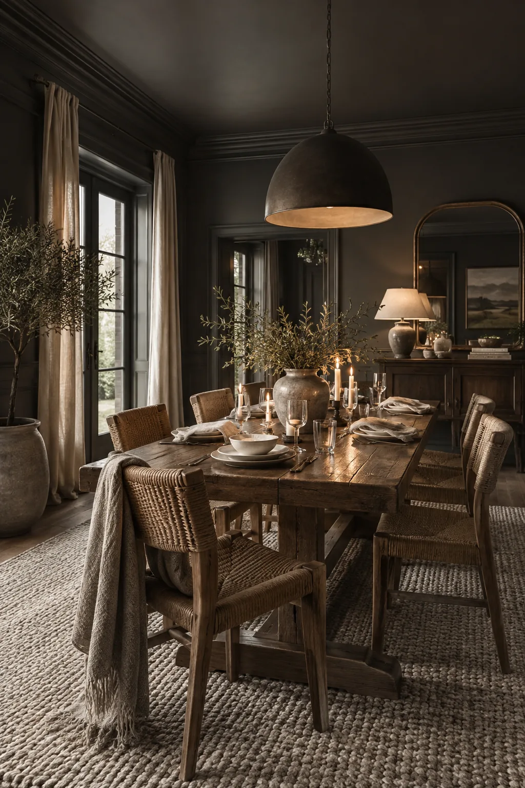
Monochromatic styling works because it eliminates visual clutter.
Drenching the room in charcoal gray creates a seamless envelope. It allows your table setting to take center stage.
To pull this off, you just need a few textural elements.
- Velvet dining chairs
- A chunky jute rug
- Matte ceramic plates
Why it works: Color drenching hides awkward transitions and highlights your furniture.
10. Classic Two-Tone Walls
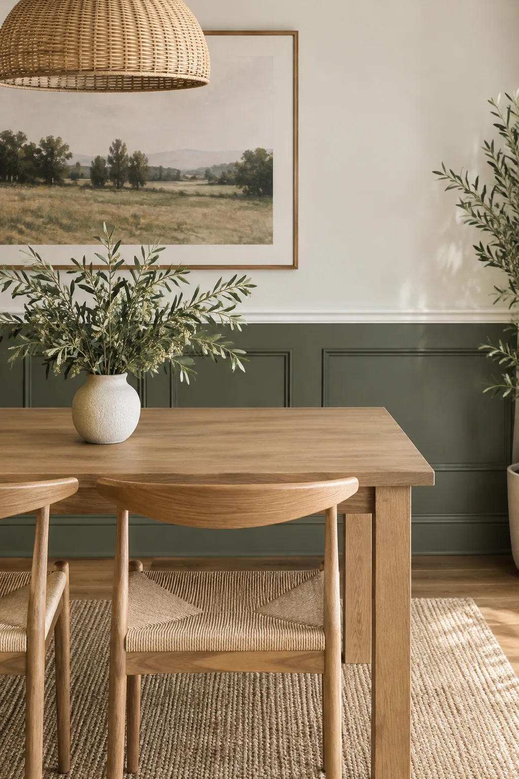
Dining chairs typically sit 18 inches off the floor.
Installing a chair rail at this height lets you experiment with two-tone walls easily. You can paint the bottom half dark and leave the top light.
This classic trick protects your drywall from scraping chairs. It also breaks up a large, boring wall.
11. Deep Olive Green
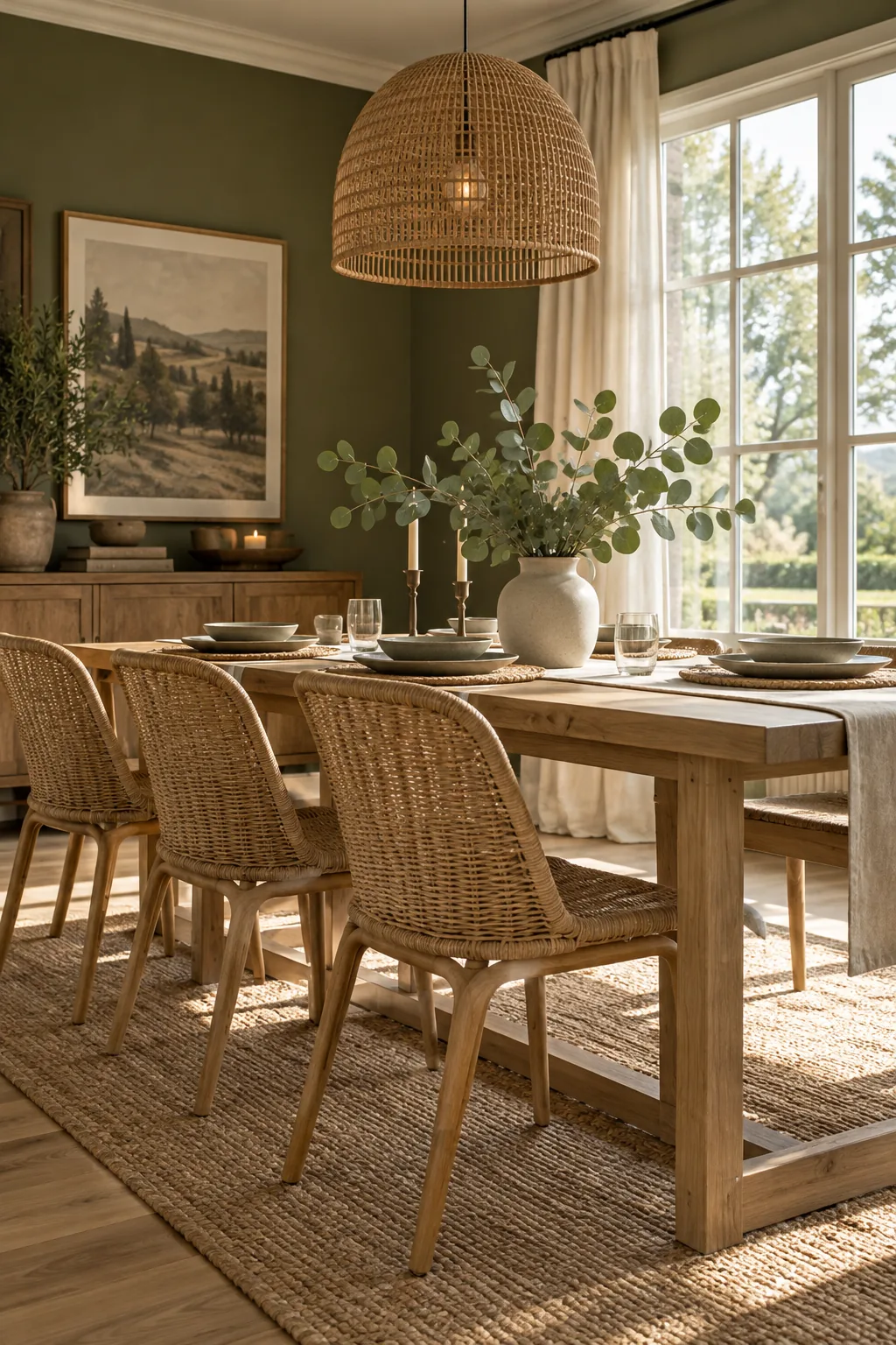
Earth tones work beautifully because they mimic nature.
A deep olive green brings the outdoors inside and feels incredibly calming. It serves as a gorgeous backdrop for natural materials and woven textures.
- Rattan light pendants
- Linen table runners
- Live indoor plants
Why it works: Earthy greens mimic nature to create a calming, grounded environment.