
17+ Clever August Bulletin Board Ideas for Your Home
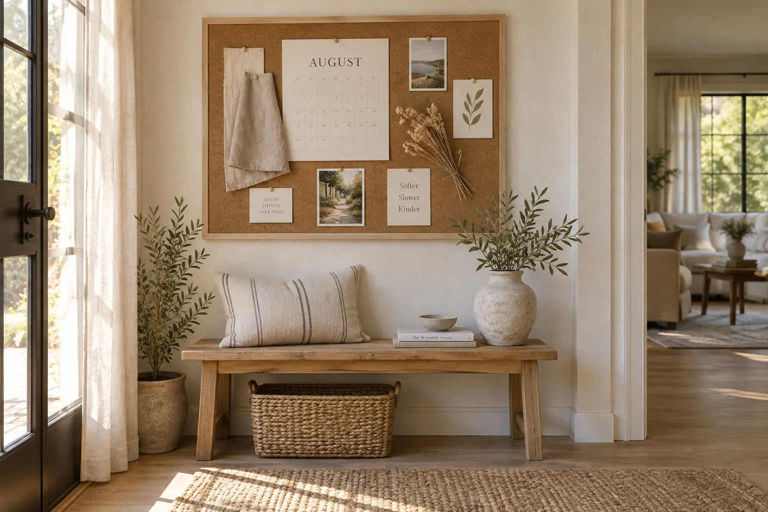
August is that weird bridge between lazy summer days and the chaotic back-to-school rush, which makes it the perfect time to reset your family's drop zone. These bulletin board setups will help you wrangle the upcoming schedule while holding onto those last bits of warm weather.
1. Transition with Muted Tones
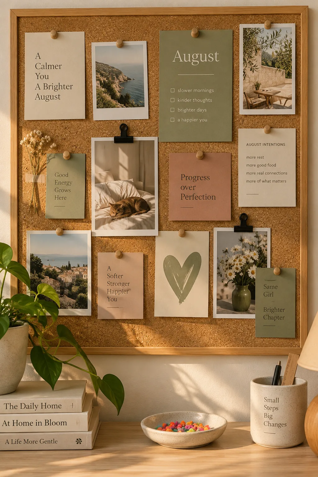
The late summer light fades faster now, making neon pushpins look a bit out of place. Transitioning to a muted color palette bridges the gap between bright July and cozy September. You can swap out neon plastics for wood accents and matte black clips to instantly ground the space.
- Wooden pushpins
- Matte black binder clips
- Kraft paper tags
2. Designate a Sorting Zone
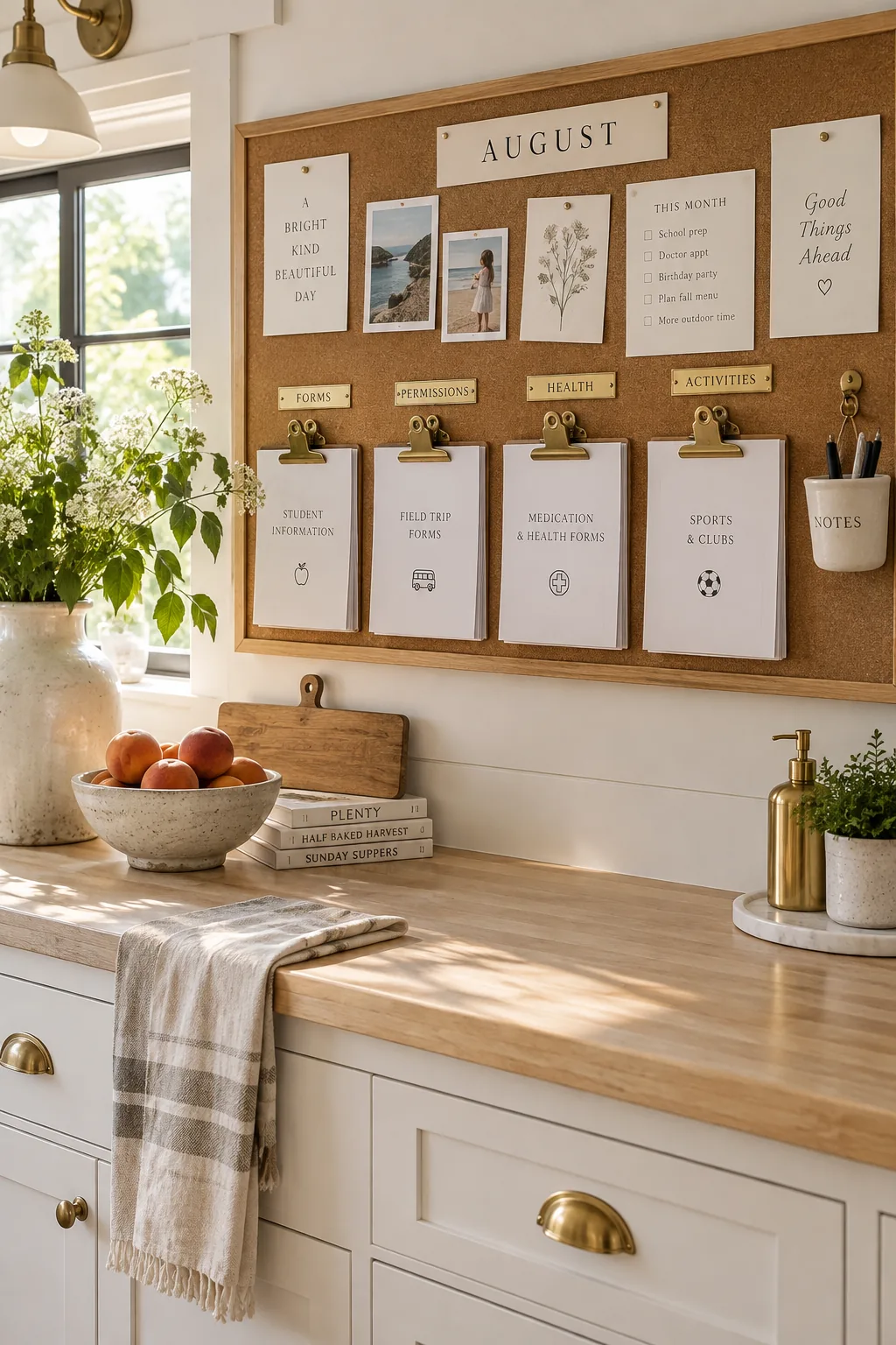
I always feel a little panic when the back-to-school flyers start rolling in. Creating a dedicated sorting zone right on the board keeps my kitchen counters completely clear. Use heavy-duty brass clips anchored into the cork to hold those thick packets of school forms. It gives you a visual reminder of what needs signing without creating visual clutter. Add a small hanging cup for a dedicated pen, and you will never scramble during the morning rush again.
3. Soften with Faded Linen
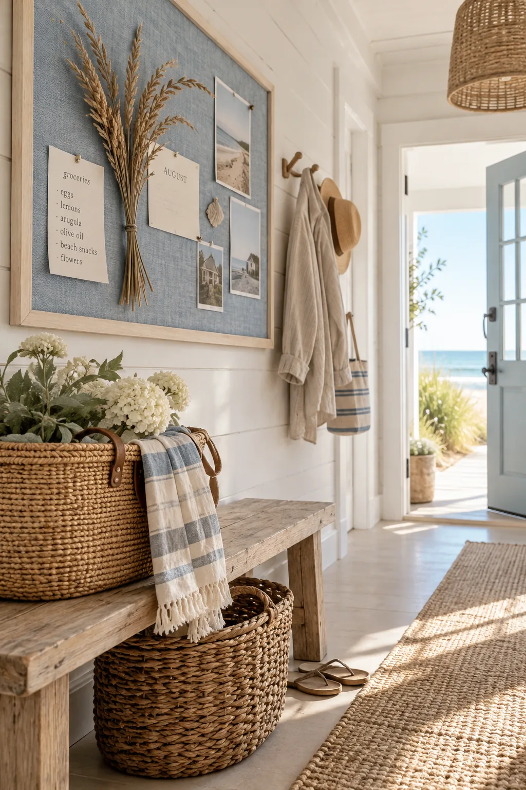
This setup brings a relaxed coastal vibe right into your mudroom. Faded blue linen fabric stretched over standard cork instantly softens the harsh edges of a basic frame. Pinning up a few dried sea oats alongside your grocery lists keeps the summer feeling alive.
Just make sure to pull the fabric tight before stapling the back.
4. Color-Code the Chaos
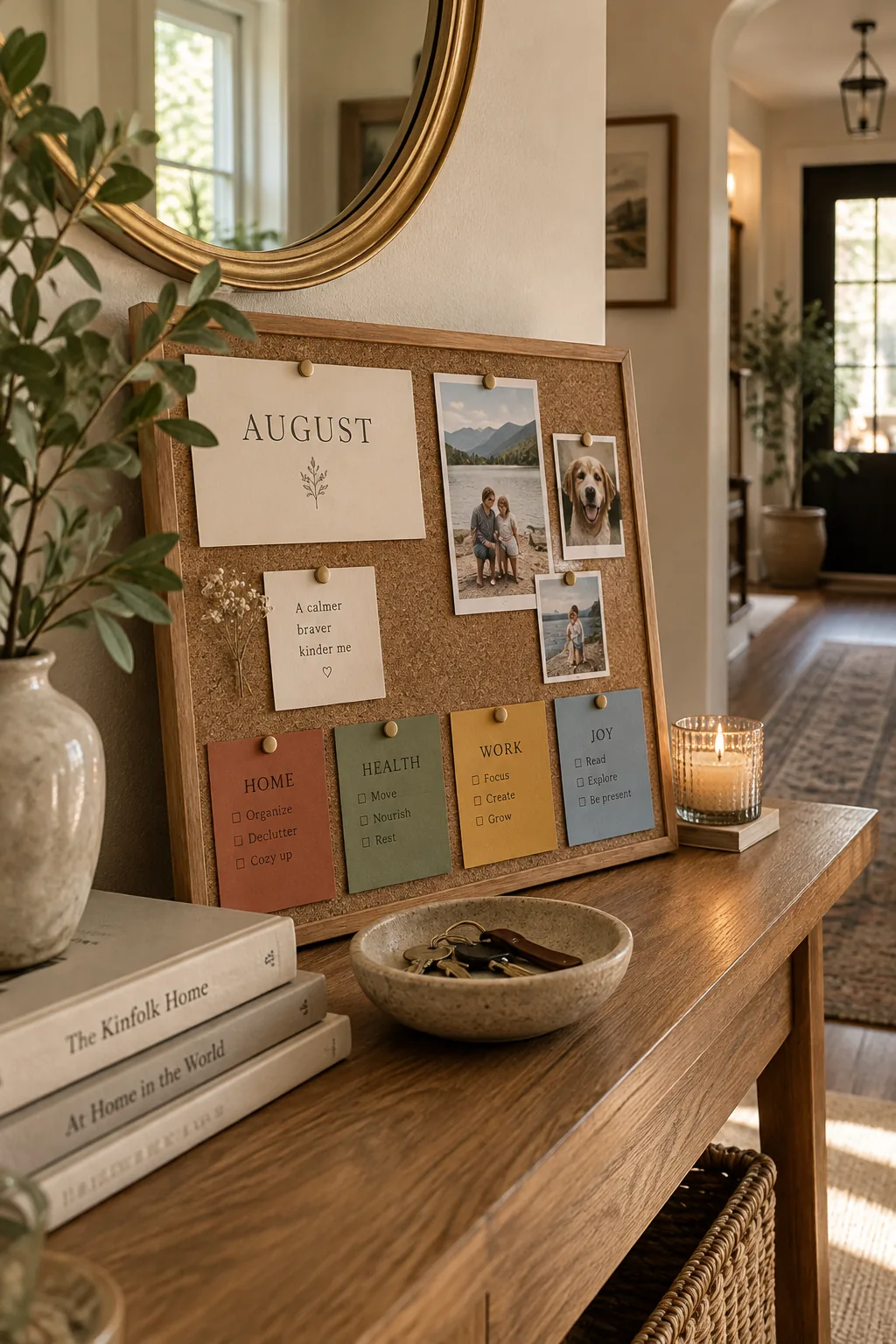
Group your upcoming schedules by family member using color-coded index cards. It takes the guesswork out of who needs to be where during those busy first weeks.
Keep the colors earthy rather than primary to maintain a calm aesthetic in your hallway.
A simple row of these cards along the bottom edge leaves plenty of room above for fun photos.
- Sage green for sports
- Terracotta for school events
- Warm gray for family dinners
5. Layer with Grass Mats
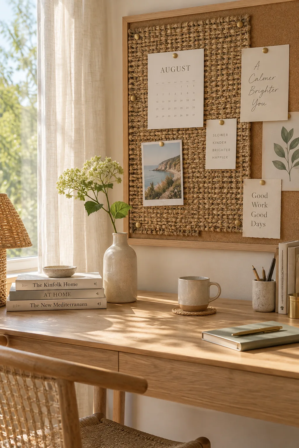
Layering different textures is what keeps a flat board from looking like a sterile office supply. Pinning a woven grass mat directly over a section of the cork adds immediate warmth and dimension. You can use standard thumbtacks to secure it, then layer your paper notes right on top of the weave.
Why it works: The rough texture of the grass mat contrasts perfectly with flat paper schedules, drawing the eye naturally to your most important notes.
6. Bring in Vintage Flashcards
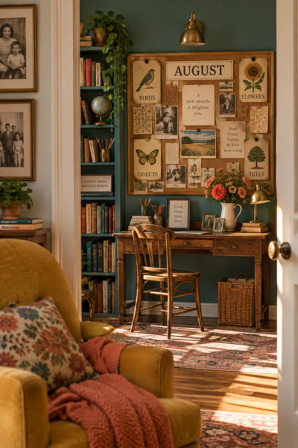
A vintage classroom aesthetic feels incredibly nostalgic and fitting for late August. Using old flashcards as decorative headers for different sections gives the board immediate character. Pair them with tarnished metal clips and sepia-toned family photos to complete the old-school vibe.
7. Center the Calendar
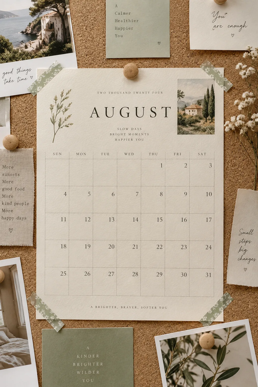
Pin a monthly calendar grid right in the center to anchor the entire layout. This gives your eye a central focal point before wandering to the peripheral notes.
Print it on heavy watercolor paper so it does not curl at the edges when the August humidity spikes.
Frame it out with thin strips of washi tape to make it pop against the cork.
8. Beef Up the Cork
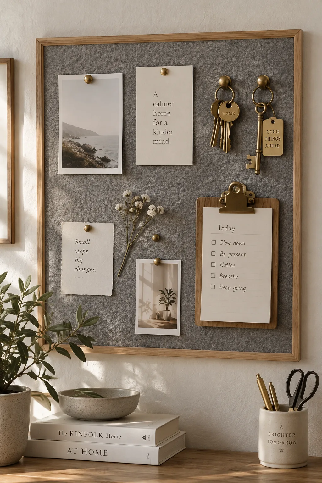
Standard cork boards are usually only half an inch thick, which limits how deeply you can push heavy-duty pins. Gluing a layer of thick acoustic felt over the cork gives you a deeper grip for holding heavier items like keys or small clipboards.
9. String Up Summer Memories
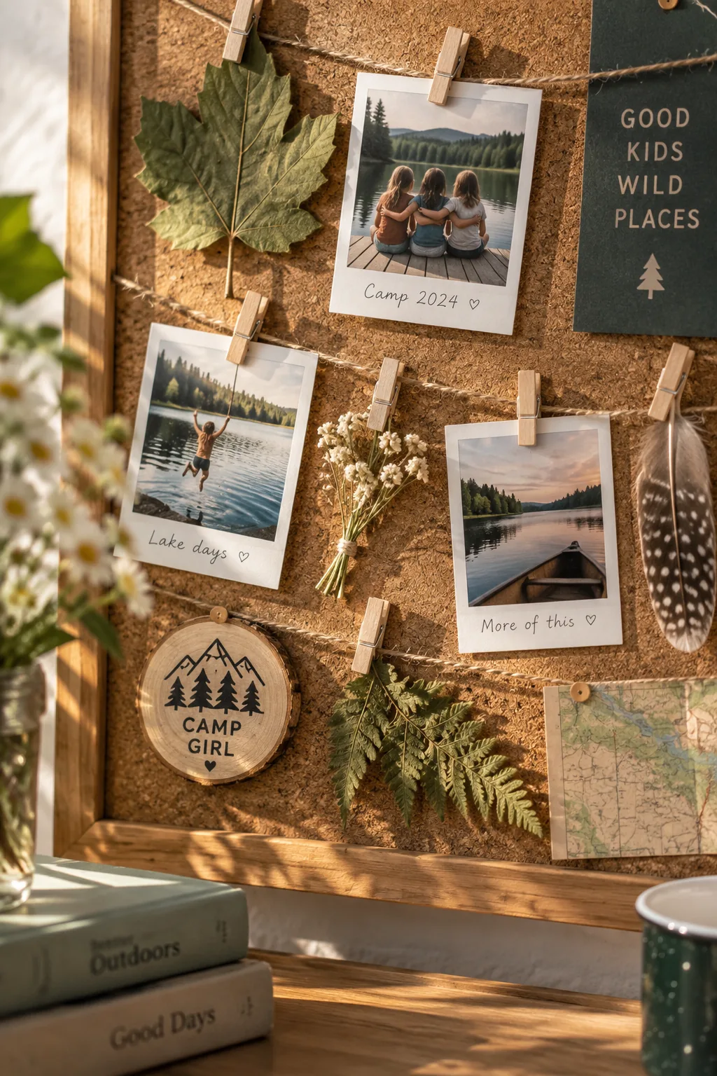
My kids always collect handfuls of random nature treasures during the last weeks of summer camp. Dedicating a small corner of the board as a summer memory display gives those pressed leaves and instant photos a proper home. String a piece of twine across the bottom left corner and use tiny wooden clothespins to hang their finds. It honors their summer experiences while keeping the rest of the board clear for upcoming autumn responsibilities.
Why it works: Confining the messy summer memories to one specific string prevents them from overwhelming your structured schedule zones.
10. Spell It Out
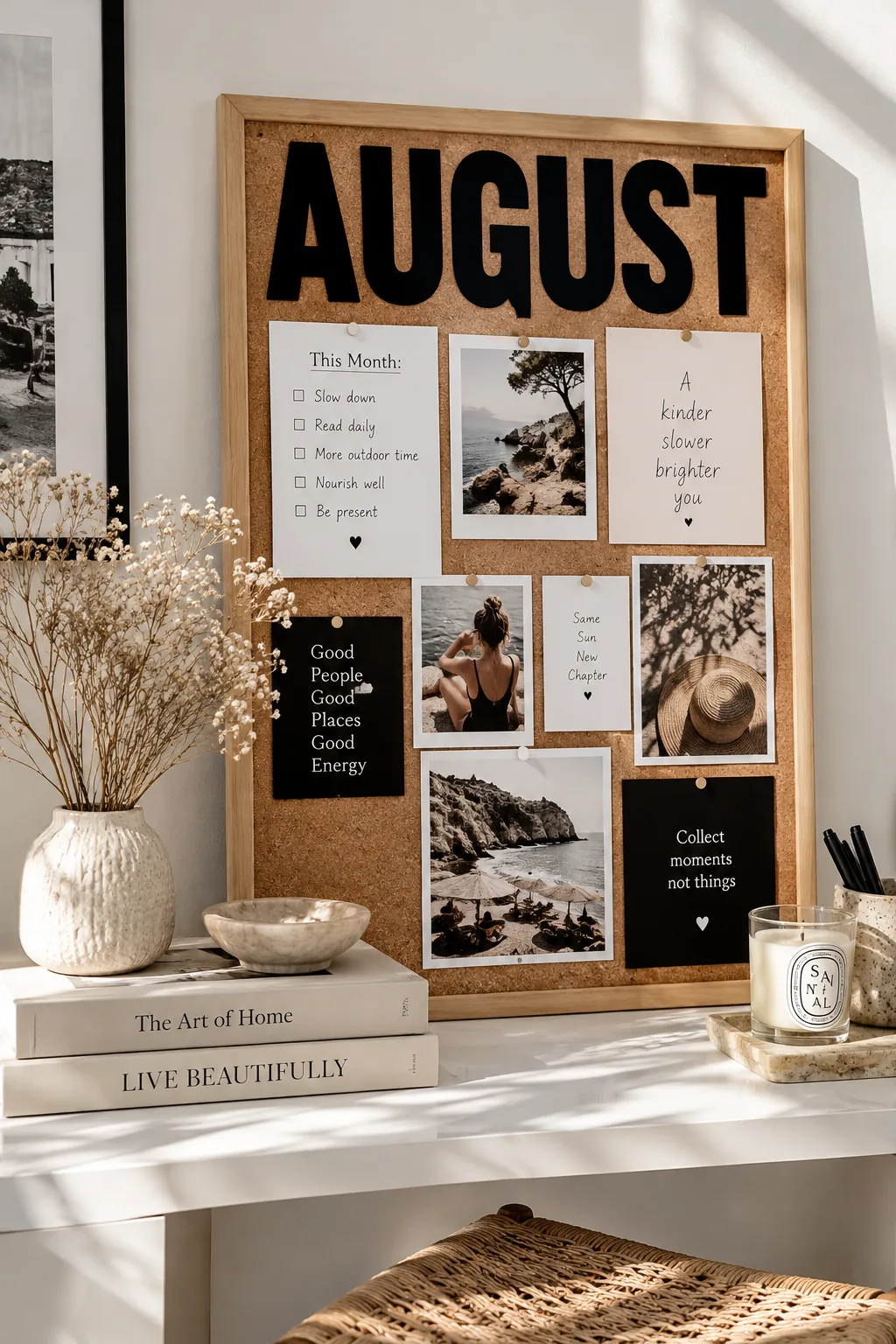
Using oversized typography is what turns a basic message board into a piece of graphic art. Cut large letters from black cardstock to spell out the month or a family motto across the top. It creates a bold header that instantly organizes the visual chaos below.
A simple sans-serif font works best to keep things looking modern and clean.
- Black cardstock letters
- Simple sans-serif font
- Double-sided tape
11. Paint the Frame to Match
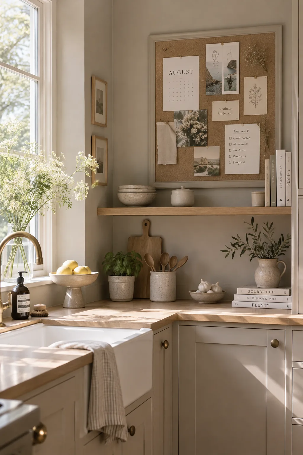
This creates a seamless built-in look that makes a cheap board feel custom. Painting the wooden frame the exact same color as your surrounding wall tricks the eye into seeing a built-in architectural feature. It is a brilliant way to handle a large board in a small kitchen without it feeling overwhelming. You can even paint the pushpins to match for an ultra-monochromatic finish.
Why it works: The matching paint eliminates the contrasting border, allowing the board to blend effortlessly into your existing decor.
12. Back Notes with Fabric
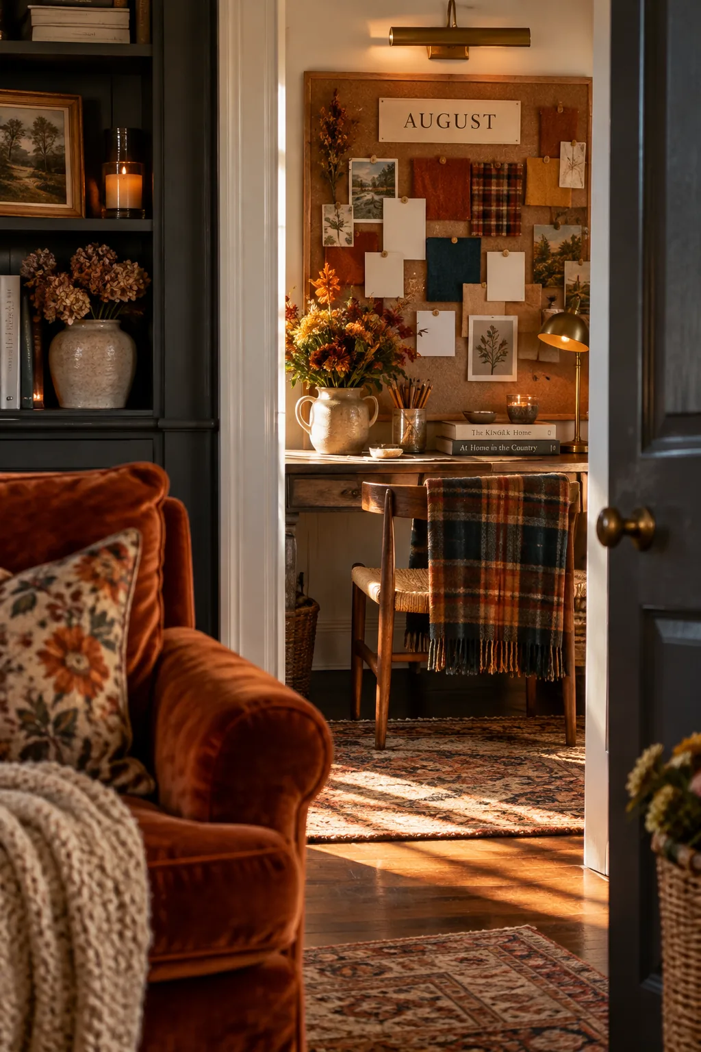
Swapping out standard paper for fabric swatches is what elevates the whole arrangement. Pinning up small squares of autumn-toned linen and plaid flannels hints at the upcoming season without going full pumpkins-and-leaves. Use them as beautiful backdrops behind plain white appointment cards.
Why it works: The fabric squares act like little frames, adding visual weight and seasonal texture behind your standard white paper notes.
13. Divide with Ribbon
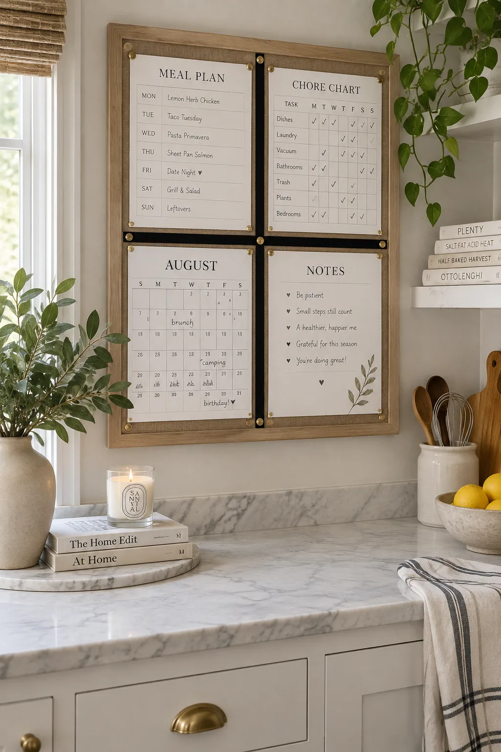
A grid layout creates an incredibly satisfying, organized aesthetic that calms the mind. Divide your board into equal quadrants using thin strips of black leather or velvet ribbon. Assign a specific category to each square so family members always know exactly where to look for meal plans or chore charts.
Why it works: The physical barriers created by the ribbon prevent categories from bleeding into each other, maintaining strict visual order.
14. Add a Mail Pocket
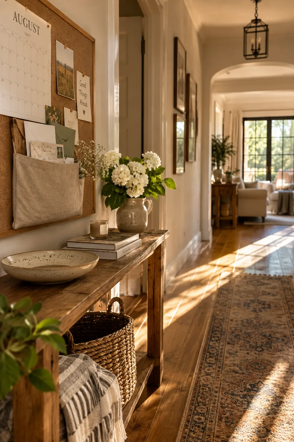
Envelopes tend to pile up on the counter the moment the mail comes inside. Pinning a sturdy canvas pocket directly to the cork gives you an immediate drop zone for incoming bills and outgoing letters.
15. Wrap It in Burlap
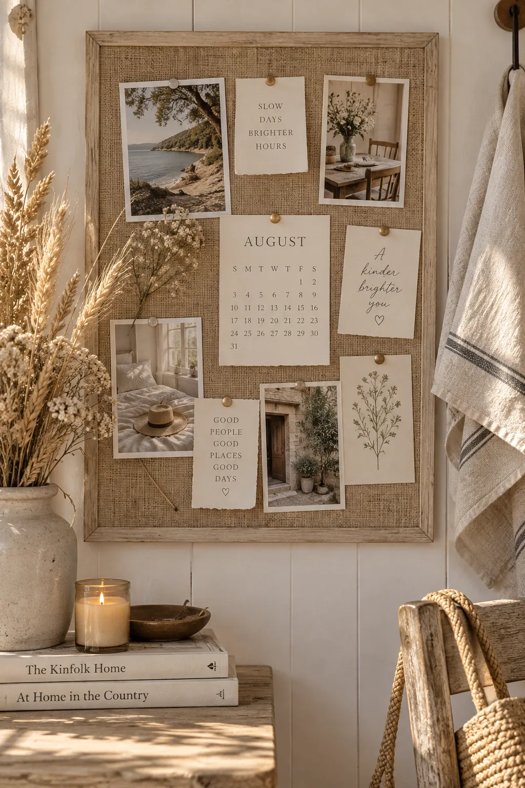
Wrap your board in burlap fabric to give it a rustic, late-summer farmhouse feel. The loose weave of the burlap hides pinholes much better than tight cotton or standard cork. It is a highly forgiving material if you tend to move your notes around daily.
Iron the burlap on a low setting before attaching it to avoid deep creases.
16. Hang a Mini Clipboard
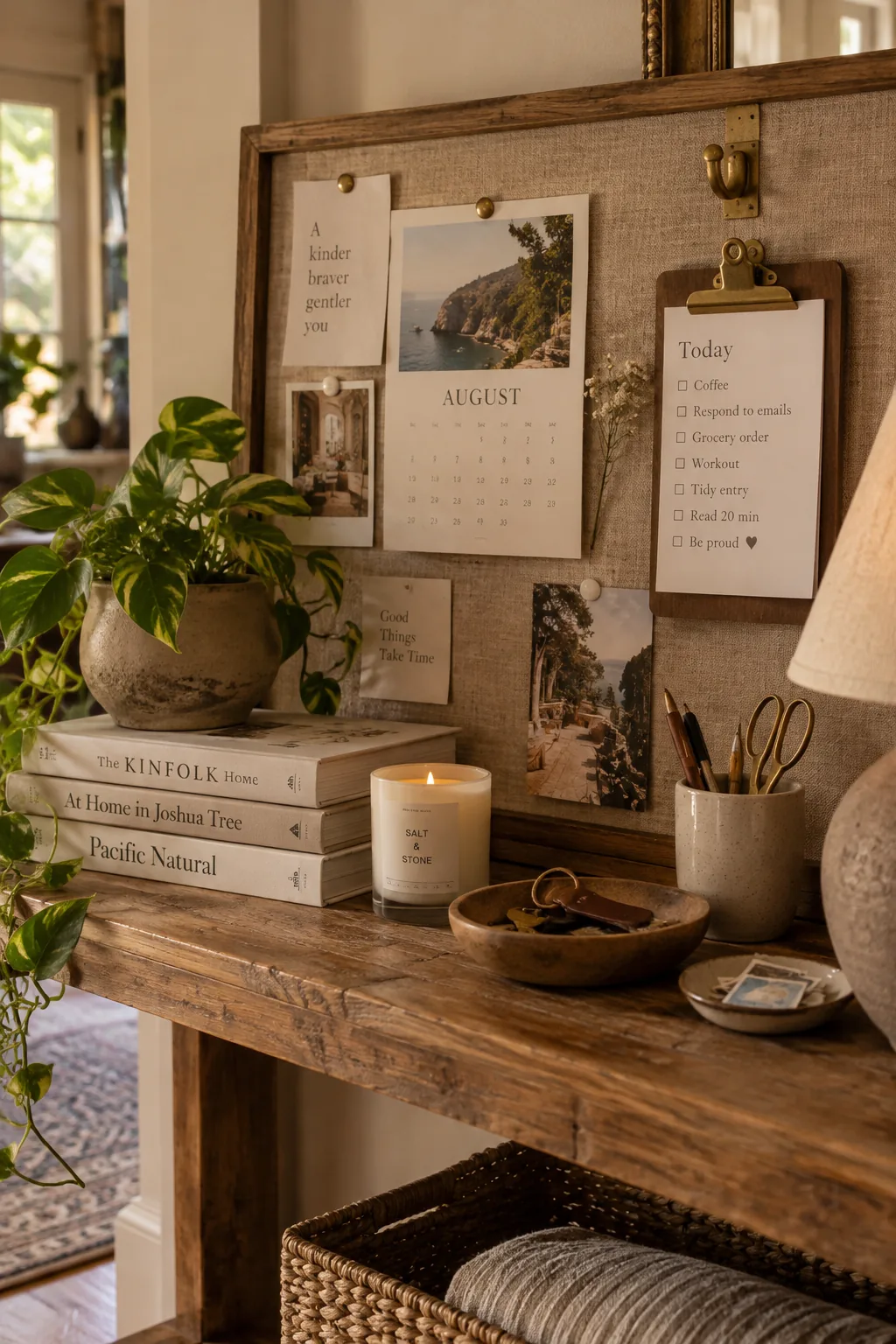
More than half of the paper clutter on a family board is usually outdated within a week. Adding a mini hanging clipboard just for today's immediate tasks forces you to cycle through the old papers constantly.
Why it works: Highlighting only the current day's priorities on a raised clipboard naturally encourages you to toss expired notes from the surrounding cork.
17. Embrace Asymmetry
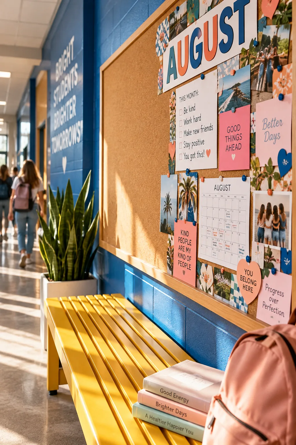
An asymmetrical design creates a modern, slightly edgy look that feels less rigid than a standard grid. Cluster all your heavy items and important schedules tightly in the bottom right corner.
Leave the top left completely blank to let the cork or fabric breathe.
This negative space acts as a palate cleanser for the eye in a busy hallway.
18. Upgrade Your Pins
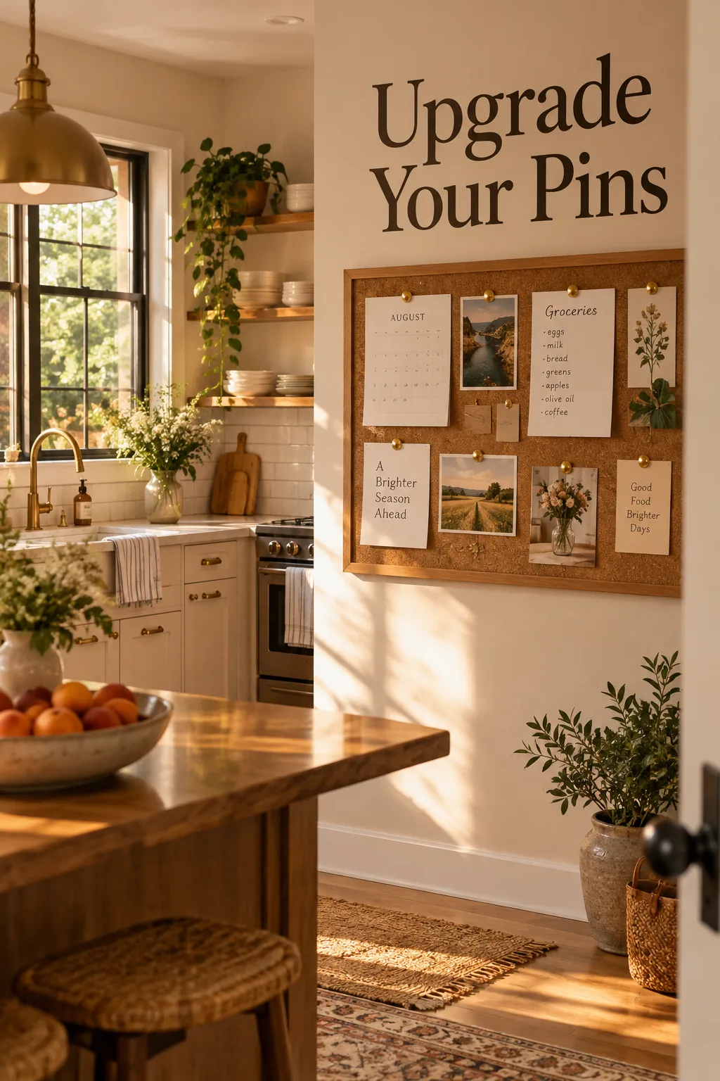
Incorporating small metallic elements is what makes a casual board feel polished and intentional. Swap out dull thumbtacks for oversized brass map pins to instantly upgrade the look of simple grocery lists. The warm metal catches the late summer sunlight beautifully and ties in with other brass fixtures in your kitchen.