Modern Hallway Paint Colors & Complete Sheen Cheat Sheet
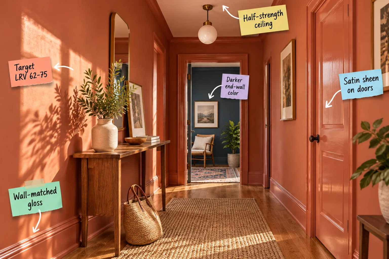
You can confidently select the exact paint colors, light reflectance values, and finish sheens to transform your dark hallway into a welcoming transition space by using our complete hallway paint and sheen cheat sheet. I use this specific layering strategy to build cohesive, color-drenched corridors that invite you home.
The Complete Hallway Paint & Sheen Cheat Sheet
To master the modern color-drenched look without your corridor feeling flat, you must pair your chosen hue with highly specific finish sheens across different surfaces.
- Baseboards and trim: High-gloss finish for durable scuff resistance against shoes.
- Main hallway walls: Eggshell or matte finish to absorb artificial light softly.
- Interior doors: Satin finish for a subtle, fingerprint-resistant warm glow.
- Ceiling: Flat finish mixed at a fifty-percent lighter tint for height.
Mixing these precise finish sheens allows you to use the exact same color family from floor to ceiling while creating essential visual depth and architectural interest.
Grounding the Space with Wall-Matched Gloss
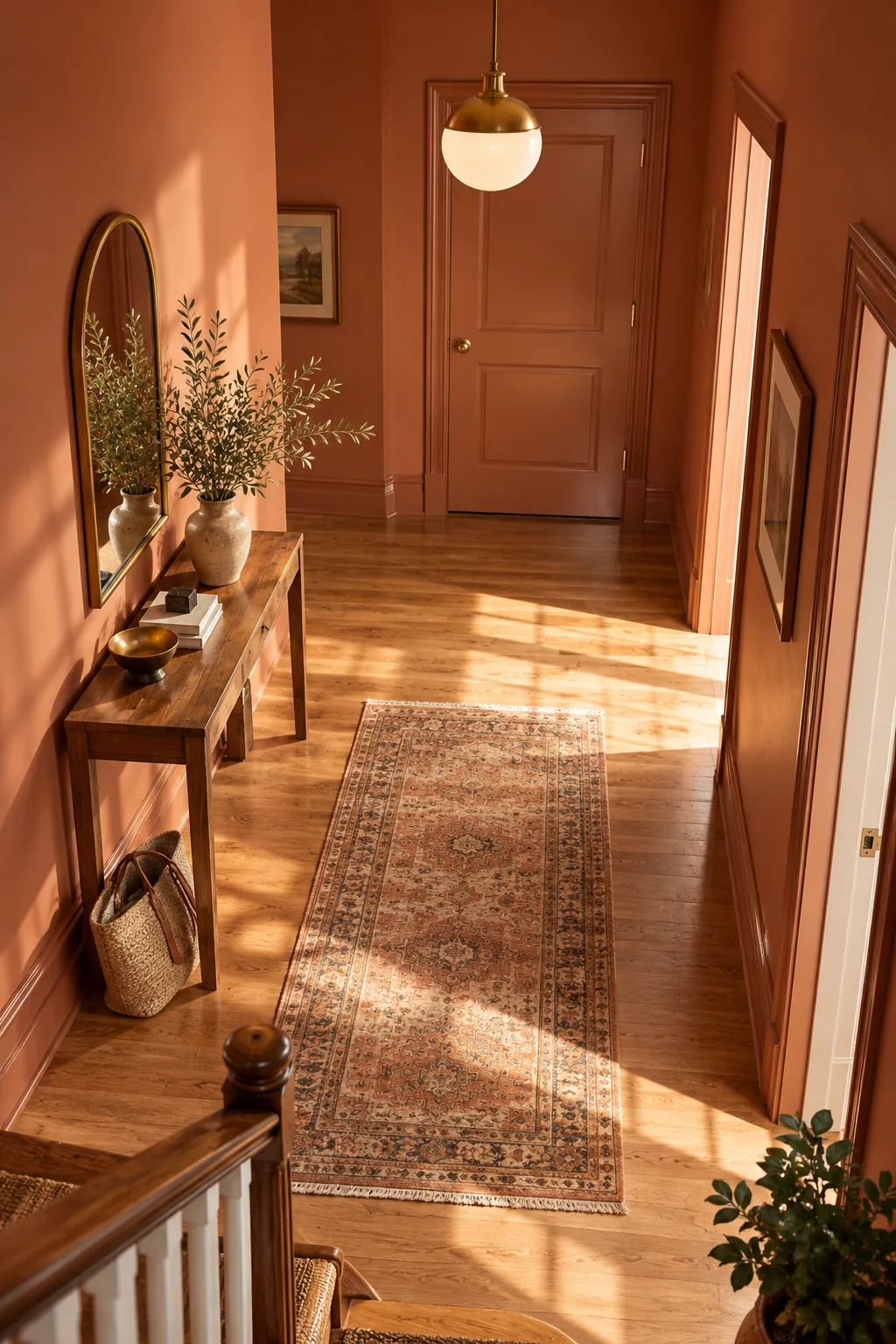
Painting your baseboards the exact same color as the wall but in a high-gloss finish anchors the space beautifully. This technique establishes a seamless, color-drenched aesthetic from the floor up while protecting high-traffic hallway zones.
| Surface Area | Recommended Sheen | Primary Benefit |
|---|---|---|
| Lower Baseboards | High-Gloss | Deflects daily vacuum impacts |
| Door Casings | Semi-Gloss | Resists hand smudges effectively |
| Wall Panels | Matte | Hides minor drywall flaws |
The glossy floor trim creates a durable, scuff-resistant barrier against shoes and cleaning tools that a standard matte wall paint could never withstand over time.
Protecting High-Traffic Zones with Washable Formulas
Beyond selecting the correct sheen, specifying a highly washable acrylic paint formula ensures your corridor remains pristine. Hallways endure constant friction from heavy grocery bags and winter coats, making a durable, scrubbable paint chemistry just as vital as the color itself.
Selecting the Proper Primer for Dark Corridors
Before applying your rich terracotta or clay hues, laying down a high-quality tinted primer is absolutely essential for achieving true color accuracy. A gray-tinted primer blocks old wall colors from bleeding through and altering your final carefully chosen aesthetic.
Skipping this crucial preparation step often results in uneven coverage, requiring three or four expensive topcoats to achieve the deep, saturated look you originally envisioned.
Finding the Right Brightness: Target LRV 62-75
Light Reflectance Value dictates exactly how much illumination a color bounces back into the room, making it critical for narrow, shadow-prone corridors. Hitting the specific 62 to 75 LRV range ensures the painted walls feel beautifully luminous and welcoming.
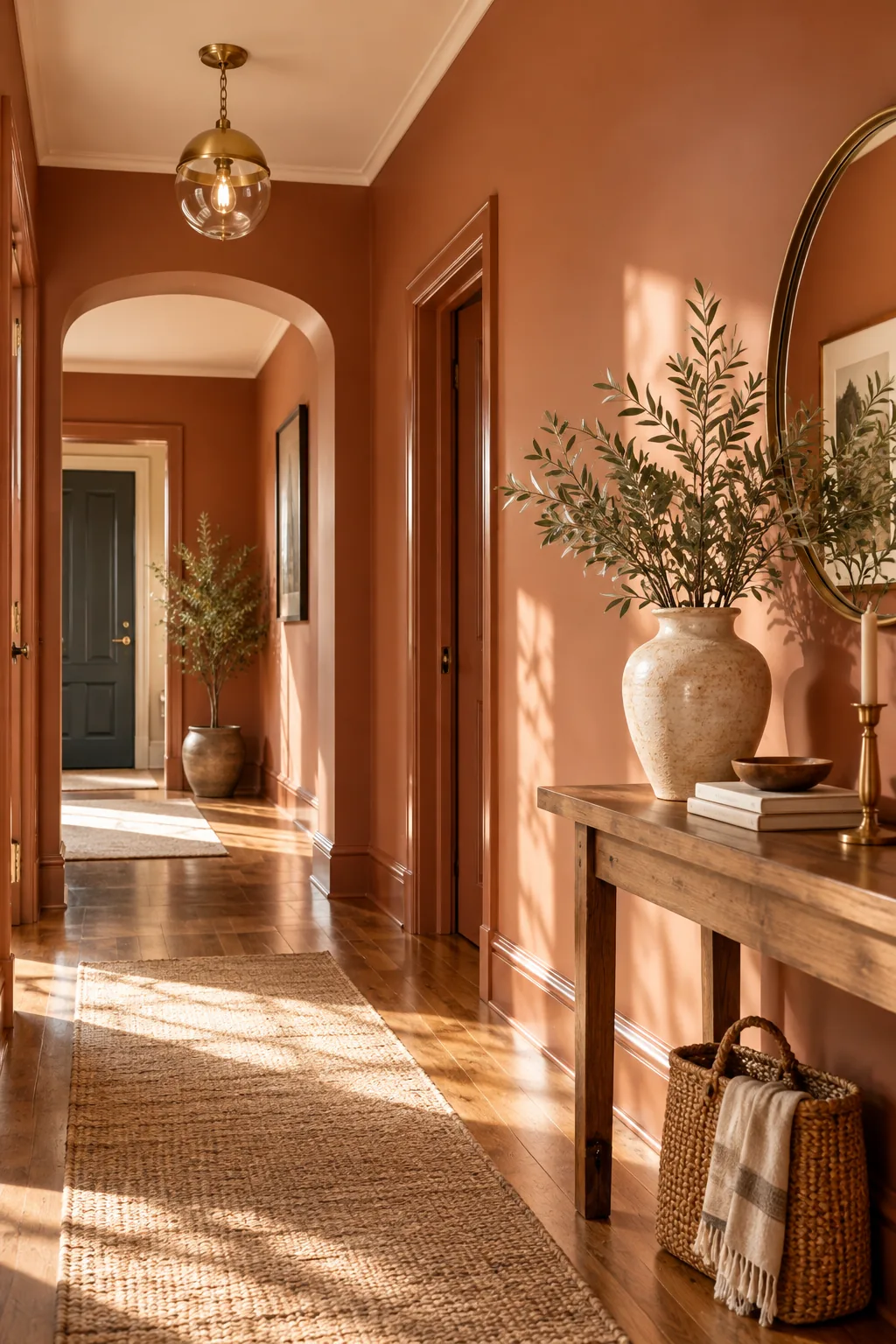
Staying strictly within this mid-tone brightness bracket prevents the hallway from crossing into stark, clinical white territory while keeping it bright enough to navigate comfortably at night.
Warming the Corridor with Terracotta Undertones
Selecting paint colors with rich terracotta or clay undertones instantly warms up chilly, sunless spaces. These earthy pigments naturally mimic the comforting glow of golden hour sunlight, transforming a previously sterile transition zone into an inviting extension of your living room.
Navigating Corner Shadows with Matte Finishes
Applying a true matte finish to your primary hallway walls helps absorb harsh shadows in tight, windowless corners. Because matte paint reflects almost zero light, it beautifully masks minor drywall imperfections and creates a velvety, enveloping texture throughout the corridor.
Softening Transitions with Satin Sheen Doors
Because hallways often lack natural light, the way your artificial fixtures reflect off different surfaces is crucial. A quick lighting test prevents unpleasant glare when transitioning from matte walls to your painted interior doors.
This subtle satin sheen provides just enough slickness to effectively hide daily fingerprints around the knob without introducing the harsh, blinding glare of a full gloss.
Lifting the Room with a Half-Strength Ceiling
Having the paint counter mix your main wall color at a 50% lighter tint for the ceiling keeps the color undertones perfectly matched while drawing the eye upward. In my own 1920s Denver bungalow, this exact formula made my cramped, shadowy central hall feel expansive and breathable.
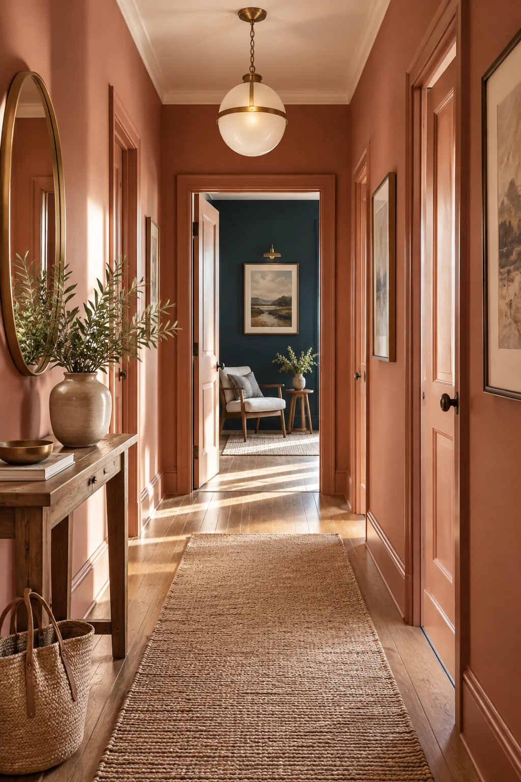
This subtle gradient technique is the most effective way to make standard eight-foot hallway ceilings feel significantly taller without resorting to a jarring, stark white transition.
Enhancing Hallway Proportions with Trim Alignment
Aligning your horizontal paint transitions with existing architectural features like door frames or picture rails creates a profound sense of visual order. Keeping these transition lines crisp and intentional prevents the narrow corridor from feeling cluttered or visually chaotic.
Creating Depth with a Darker End-Wall Color
Painting the visible wall in the adjoining room at the end of the hall a darker, contrasting shade creates a powerful and necessary focal point. This intentional contrast draws you naturally through the space rather than leaving the corridor feeling like a dead end.
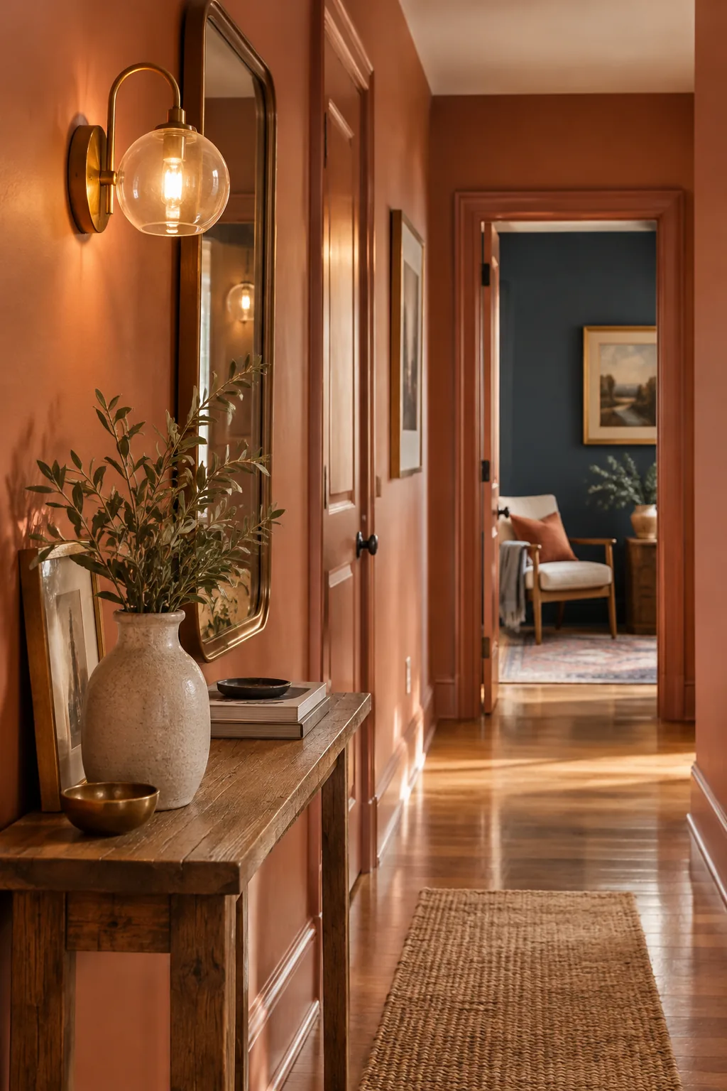
By placing a deep, saturated color at the furthest visual point, the lighter hallway walls actually feel brighter and wider by comparison.
Grounding the Floor with Cohesive Runner Colors
Pairing your newly painted walls with a coordinating vintage floor runner bridges the gap between your baseboards and the hardwood. Repeating a slightly darker variation of your main wall color in the rug pattern anchors the entire visual composition perfectly.
Balancing Artificial and Natural Hallway Light
Your chosen LRV and finish sheens will interact heavily with both natural spillover light from adjacent rooms and your overhead fixtures. When I recently redesigned a windowless rowhouse corridor, swapping the outdated bulbs was just as critical as selecting the paint itself.
- Evaluate the natural daylight spilling in from adjoining open doors at noon.
- Turn on all hallway sconces and pendants to assess the artificial evening glow.
- Replace any cool-toned bulbs that cast a harsh, blue tint on the walls.
I always recommend using 3000K warm-white bulbs in hallway pendants or sconces to keep rich terracotta and clay colors from looking muddy or overly yellow.
Testing Your Paint Swatches in a Windowless Space
Before you purchase gallons of premium paint, you must test your selected colors by painting large twelve-by-twelve inch swatches directly on the corridor drywall. Observe these test patches at 10 AM and 8 PM to check how the half-strength ceiling tint behaves.
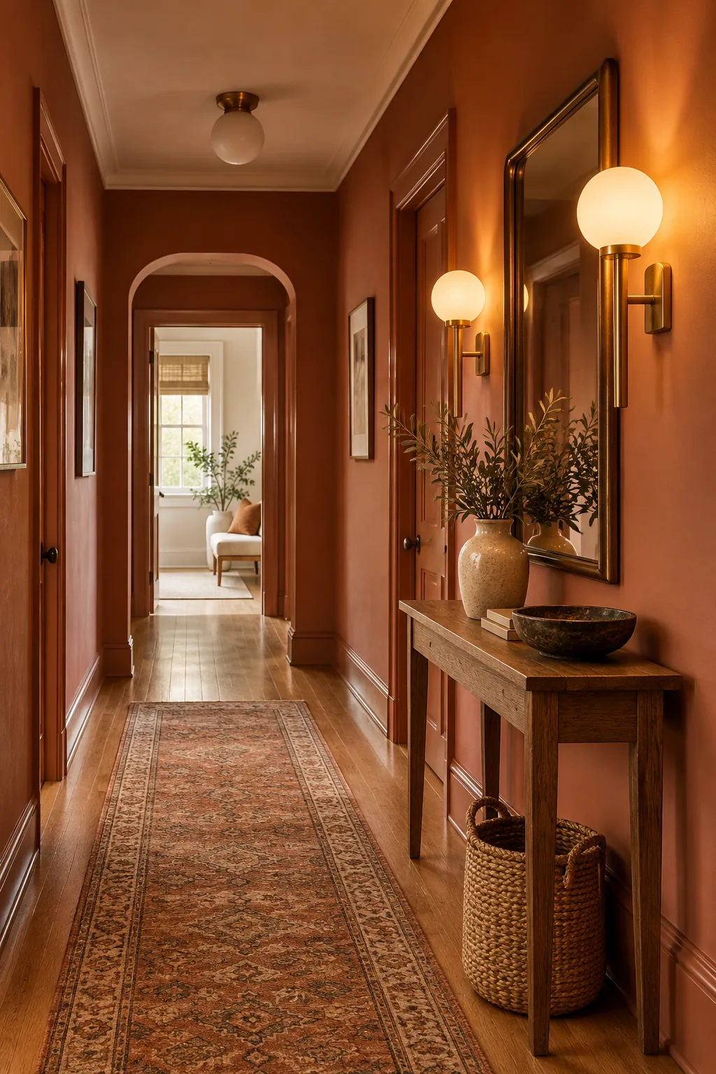
Before committing to a full gallon, it is essential to see how your chosen color behaves across a full day. Follow these final verification steps to guarantee a flawless finish.
4 Ways to Color-Drench Your Hallway
Explore how different palettes and architectural styles adapt this unified paint strategy.
Moody Olive Craftsman: Rich green wraps this traditional space in warmth, while the dark slate floors ground the dramatic color-drenched walls.
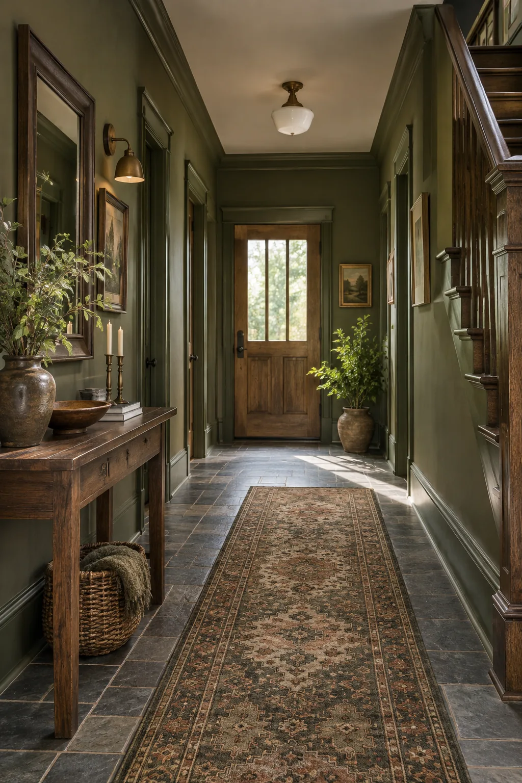
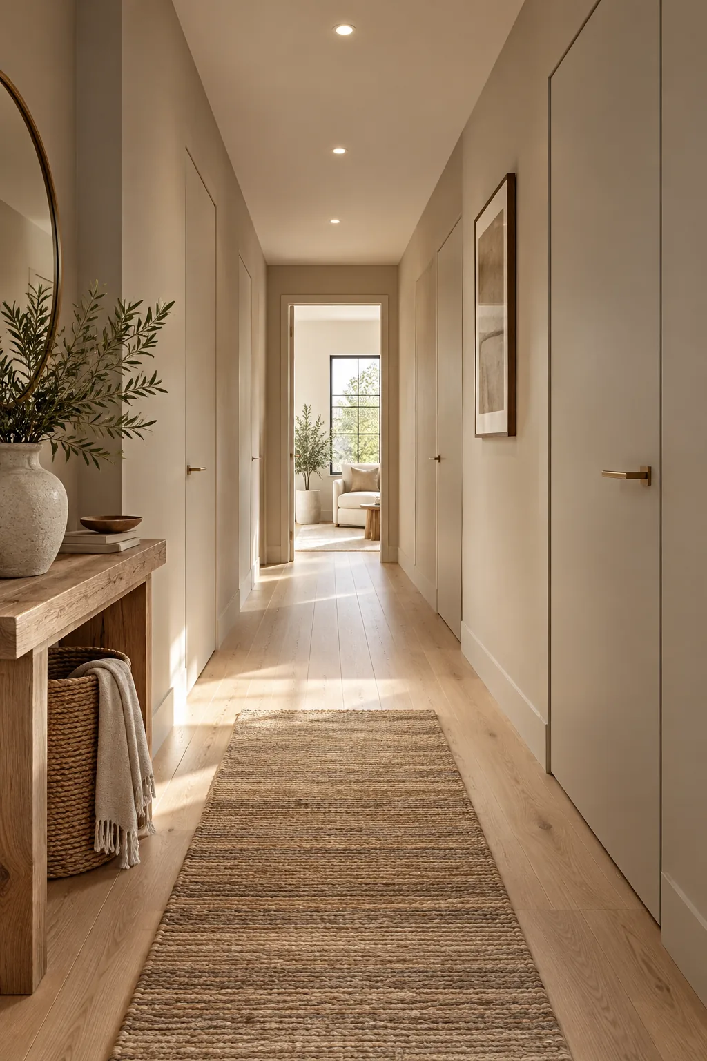
Warm Minimalist Greige: A soft neutral palette paired with flush doors creates an uninterrupted, calming visual flow through this modern corridor.
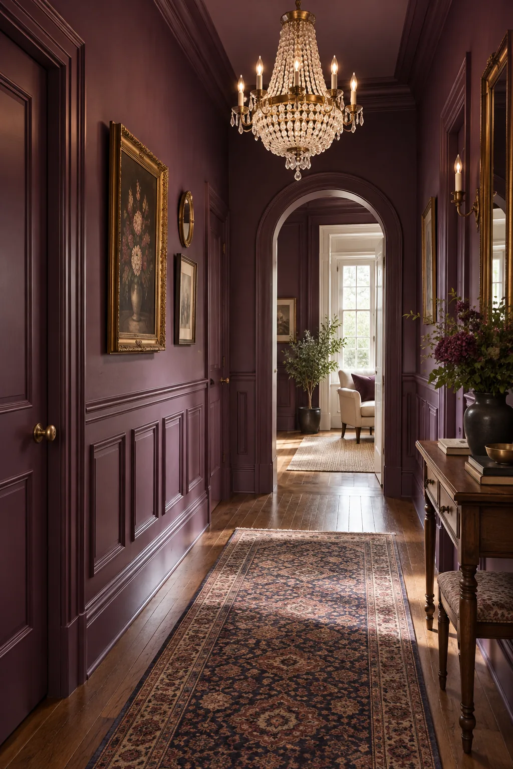
Rich Plum Victorian: Painting classic wainscoting and walls in the same deep plum modernizes ornate historic details without losing their elegance.
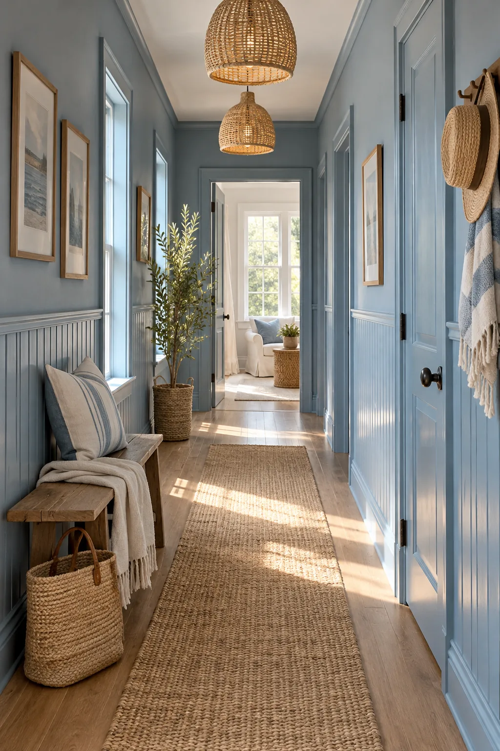
Soft Slate Coastal: A dusty blue applied equally to beadboard and drywall brings a fresh, breezy coastal feeling to a narrow space.