
Luxury Black and White Living Room: Designer Styling Guide
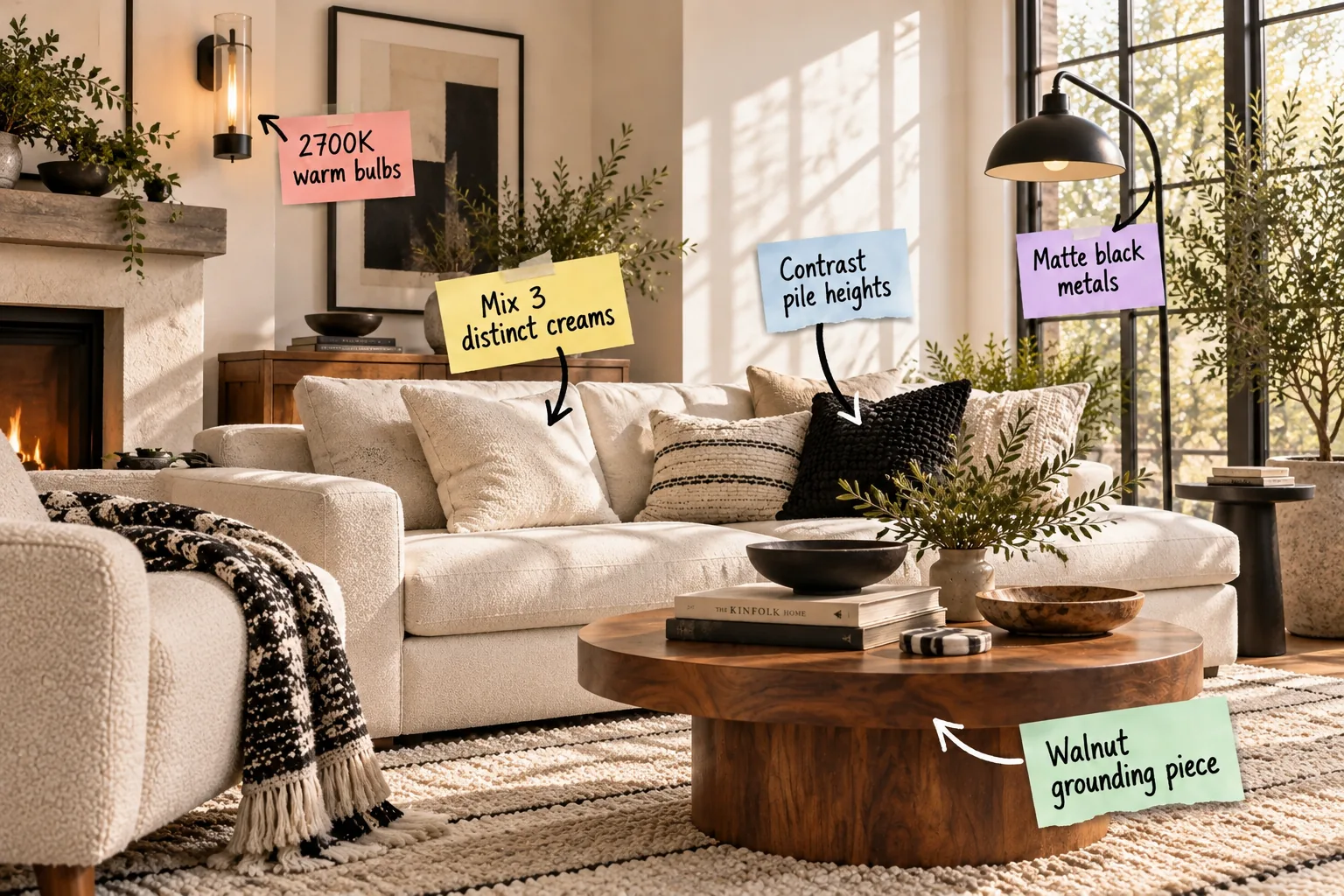
You will confidently layer creams, contrast textures, and balance warm lighting to create a high-end space using our complete B&W texture mixing checklist. Mastering a luxury black and white living room means moving beyond flat colors to build deep, tactile contrast.
The Secret to Warmth: A Walnut Grounding Piece
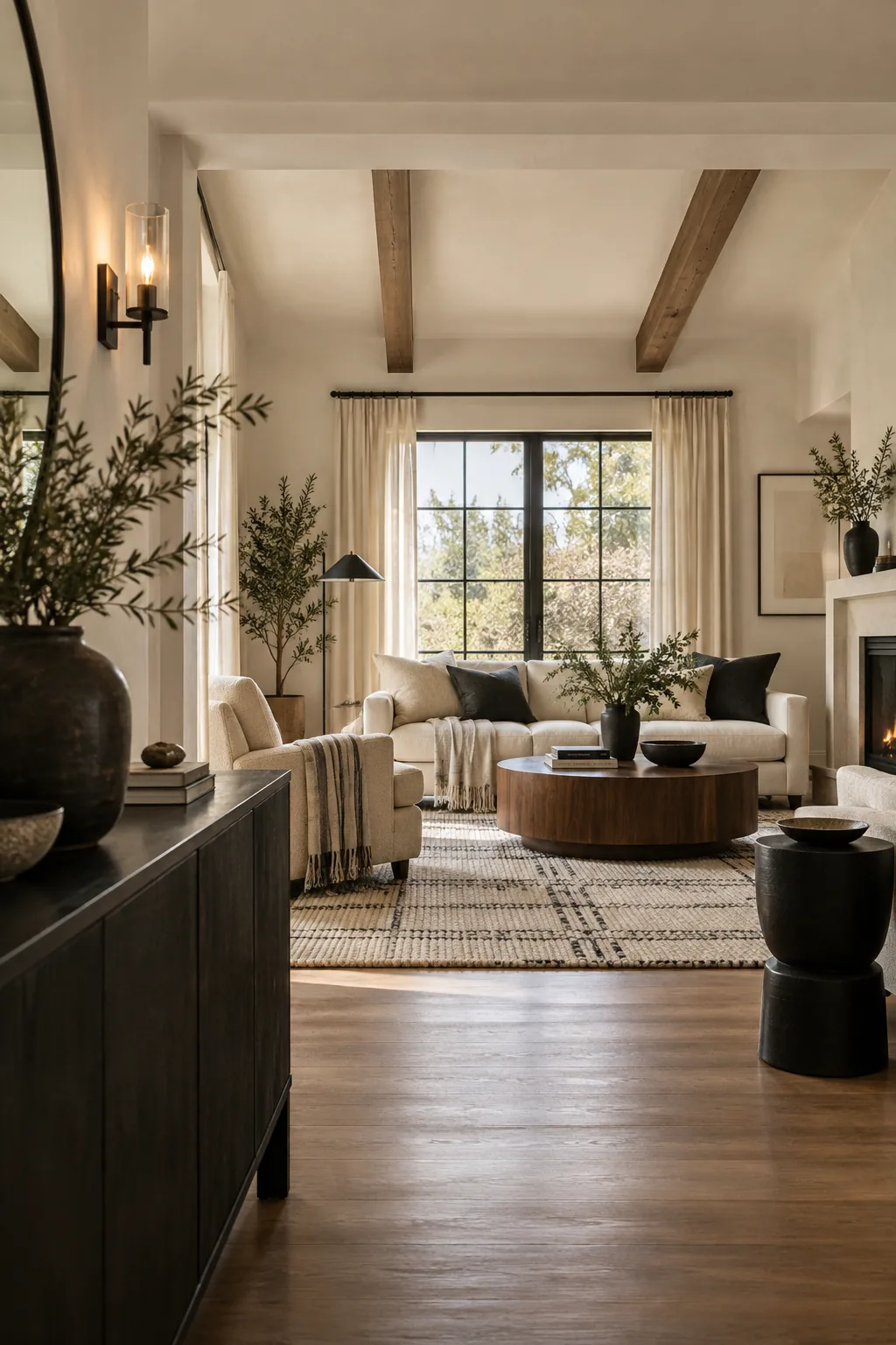
Stark black and white fails without a warm wood anchor to bridge the high-contrast gap and prevent the room from feeling sterile. I always recommend using a substantial walnut coffee table or media console to introduce natural warmth and ground your lighter base upholstery.
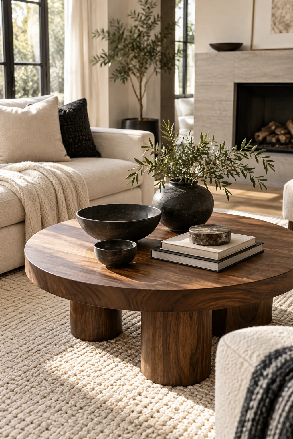
Selecting the right wood tone is critical because overly yellow or red woods clash with crisp black accents. You should look for mid-tone brown woods with ashy or neutral undertones that naturally ground the space without competing for attention.
- American Walnut: Provides a rich, chocolate base that grounds floating white sofas.
- Smoked Oak: Offers a cooler, desaturated brown perfect for ultra-modern monochrome spaces.
- Ebonized Ash: Delivers heavy wood grain texture while maintaining a nearly black finish for subtle warmth.
Sizing Your Wooden Anchor
Proportion matters just as much as the wood species when anchoring a two-color room. Your grounding piece must command enough physical space to register as a distinct third element, requiring specific spacing relative to your main seating arrangement.
| Furniture Piece | Minimum Length | Distance to Sofa | Visual Weight |
|---|---|---|---|
| Coffee Table | Two-thirds sofa length | 16 to 18 inches | Heavy/Solid |
| Media Console | 20 inches beyond TV | At least 36 inches | Medium/Open |
| Side Table | Equal to arm height | 2 to 4 inches | Light/Sculptural |
Balancing Wood and Contrast
Distributing this warmth prevents the room from feeling bottom-heavy. If your primary grounding piece sits low to the floor, pull that same walnut tone upward using a wooden picture frame or a floating shelf on the opposite wall to create a continuous sightline.
Base Upholstery: Mix 3 Distinct Creams
The foundational designer rule for monochrome spaces is mixing exactly three distinct cream tones—such as ivory, alabaster, and oatmeal—on your main seating area. This subtle gradation builds visual depth that a single flat white simply cannot achieve.
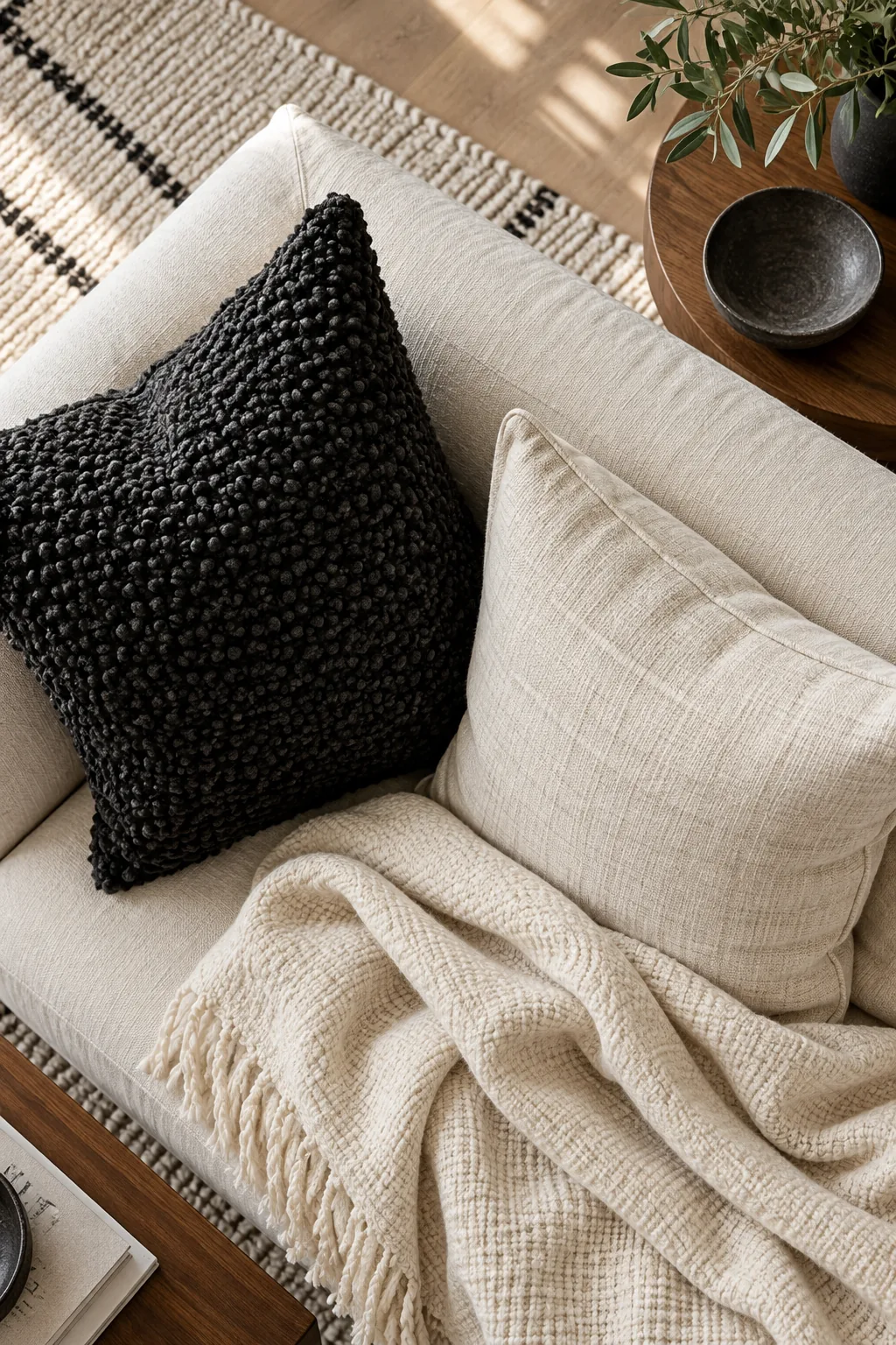
Layering these similar hues prevents the sofa from looking like a monolithic block of fabric. When you introduce slight variations in lightness, the upholstery instantly feels custom, expensive, and meticulously curated rather than bought as a matching showroom set.
Identifying Cream Undertones
Before purchasing expensive fabric, you must identify whether your creams lean yellow, pink, or gray. Always verify undertones by placing fabric swatches against a piece of pure white printer paper in natural daylight to reveal their true color bias.
Distributing the Lighter Shades
Place your darkest cream shade on the largest piece of furniture to securely anchor the main seating zone. You can then strategically layer the lightest ivory tones on smaller accent chairs or decorative pillows where they will catch the most sunlight.
Textile Layering: Contrast Pile Heights
Pairing flat weaves with chunky textiles is the secret to making a restricted color palette pop without adding new hues. You should aim for at least a half-inch difference in pile height between adjacent pillows or throws to maximize tactile interest.
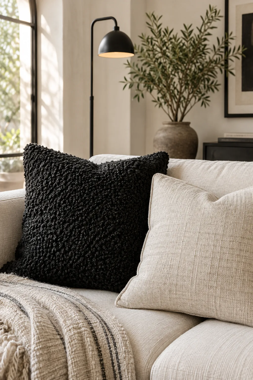
When monochromatic rooms feel flat or uninviting, a lack of tactile variety is almost always to blame. Forcing the eye to navigate heavy threads and raised loops creates natural shadows that bring the seating area to life.
Selecting High-Texture Fabrics
Natural fibers provide the most dramatic shadows in a black and white scheme. Heavyweight Belgian linen, nubby wool blends, and raw silk introduce organic imperfections that beautifully soften the stark contrast between your darkest metals and your lightest upholstery elements.
Anchoring the Room with Matte Black Metals
Matte black acts as the defining architectural line in the room, outlining the space without introducing distracting shine. Select non-reflective finishes for floor lamps and picture frames to absorb light and create softer, more sophisticated silhouettes.
Glossy black hardware reflects surrounding light, which dilutes its visual impact and makes it appear gray. A powdery matte finish ensures the metal reads as a true, grounding black from every angle in the living room.
Managing Metal Reflectivity
If you already own glossy black fixtures, you can easily tone them down without replacing the entire piece. Lightly buffing the surface with fine steel wool and applying a matte clear-coat spray instantly modernizes the hardware for a luxury aesthetic.
Distributing Visual Weight
Black metals should zigzag dynamically through the room rather than clustering heavily in one corner. If you place a stark black floor lamp on the left side, balance that visual weight with a dark curtain rod or a black-framed mirror on the opposite wall.
The Lighting Rule: 2700K Warm Bulbs
Choosing 2700K warm bulbs is the exact color temperature needed to keep creams looking rich and cozy after dark. Anything above 3000K introduces a blue tint that makes high-contrast rooms feel sterile and clinical.
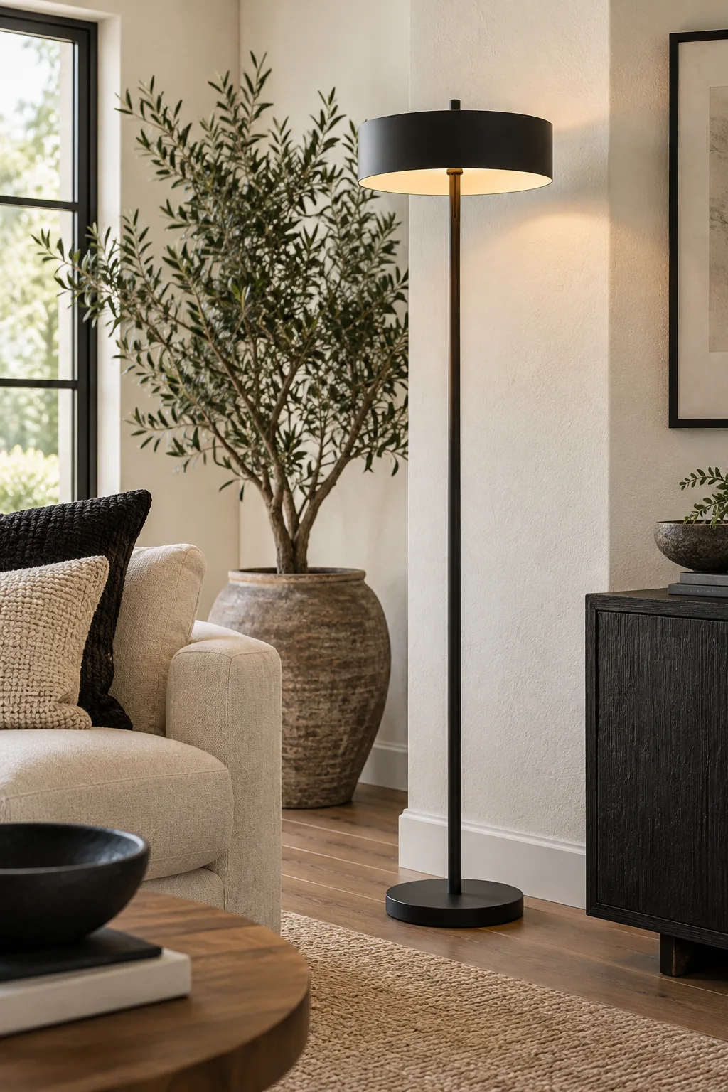
You must standardize this exact temperature across every single fixture to maintain a cohesive atmosphere at night. Mixing different bulb types creates conflicting color zones that instantly shatter the luxury illusion you worked so hard to build.
- Check existing bulbs: Read the printed base of your current bulbs to identify their exact Kelvin rating.
- Swap the overheads: Replace any daylight or 4000K recessed lights with 2700K dimmable LED alternatives.
- Match the lamps: Ensure your floor and table lamps use the identical 2700K temperature for seamless layering.
Avoiding the Clinical Blue Tint
Even one misplaced 4000K daylight bulb will cast a harsh, hospital-like glare across your carefully chosen cream upholstery. If a ceiling fixture features integrated LEDs that cannot be changed, I strongly advise replacing the entire unit to protect the room’s warmth.
Balancing Pattern Scale in Monochromes
To safely introduce patterns without causing visual chaos, pair one large-scale geometric rug with subtle, small-scale organic stripes on secondary textiles. Restricting bold graphics to a single focal point allows the softer upholstery patterns to breathe.
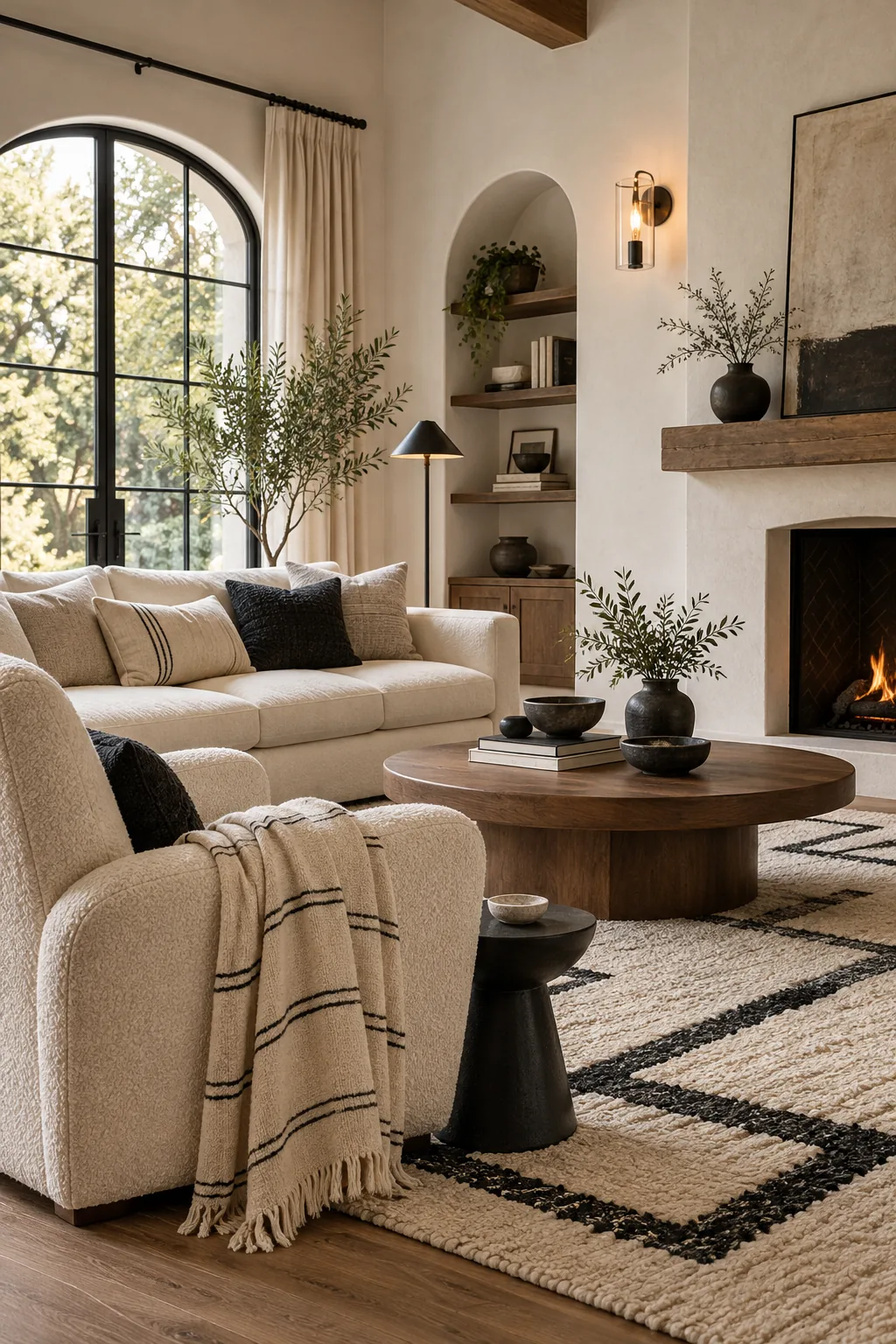
In my own Denver home, limiting a high-contrast geometric print to just the floor rug completely transformed the space. It provided the necessary drama without fighting the delicate herringbone weave on my accent chairs.
Layering Geometric and Organic Prints
Strict geometric grids can feel aggressive if left entirely unchecked in a two-color room. You should always soften rigid, straight-lined patterns by layering them near organic, flowing motifs like abstract brushstrokes or subtle botanical prints executed in quiet grays.
Softening with Organic Shapes
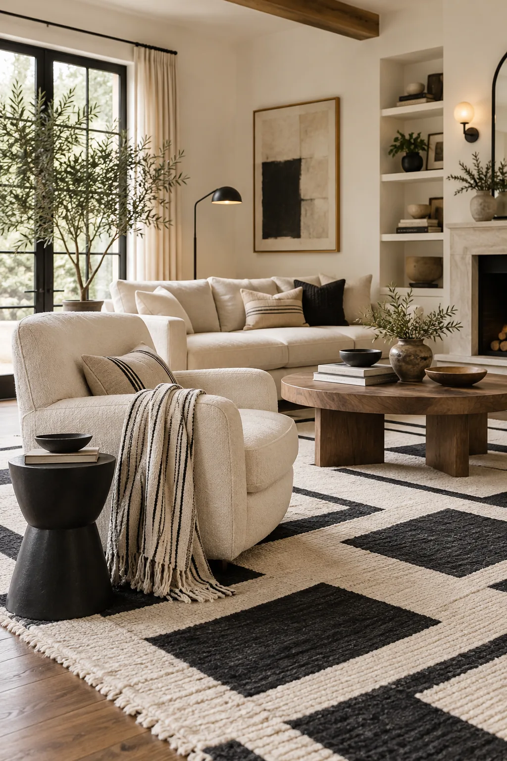
Curved lines are essential in a black and white space to successfully break up the rigid grid created by dark structural accents. Incorporating rounded ceramic bowls, gently arched mirrors, or a perfectly circular coffee table instantly introduces a welcoming, organic flow.
Breaking the Rigid Grid
Square rooms filled with square furniture and high-contrast colors quickly feel like a rigid chessboard. Introducing a heavily textured, asymmetrical sculptural piece on the mantle draws the eye smoothly away from the room’s sharp corners and stark architectural lines.
More Ways to Style Monochromes
Explore these distinct black and white variations to find the perfect mood for your home.
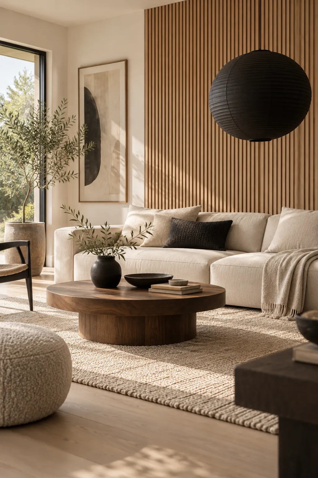
Minimalist Japandi Living Room: Embrace low-profile furniture and slatted oak accents to give the black and white palette a zen, architectural feel.
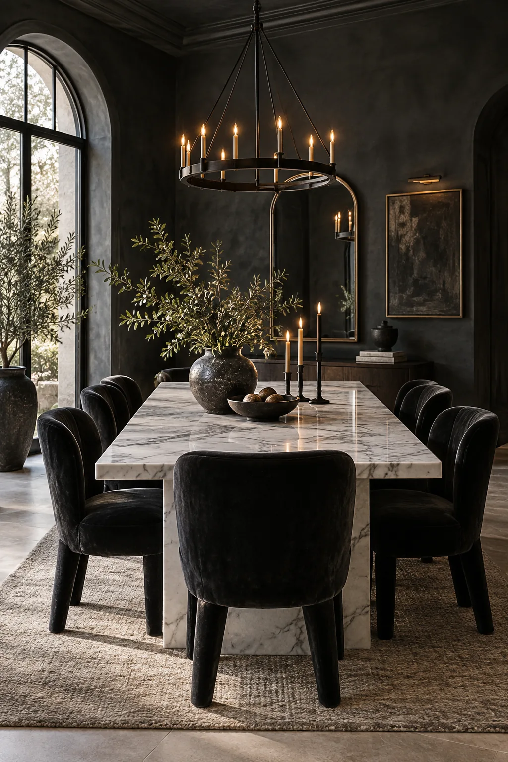
Modern Gothic Dining Room: Lean into drama with charcoal-black limewash walls, a white marble table, and heavy velvet drapery.
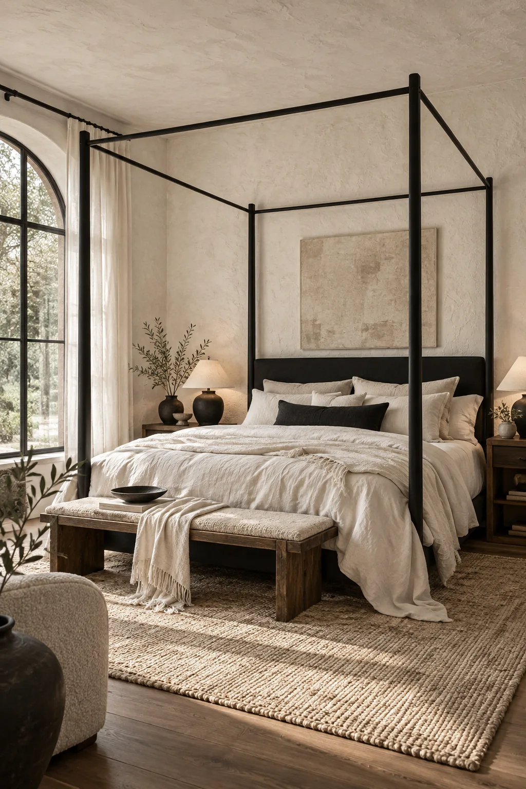
Organic Modern Bedroom Oasis: Soften the contrast by introducing heavily textured plaster walls and draped linen canopies in pure white and soft black.
Your B&W Texture Mixing Checklist
This complete framework provides the exact sequence for auditing a space to ensure your woods, creams, textiles, and metals are perfectly balanced for a luxury finish. In a recent loft project, using this sequence turned a cold white box into a rich sanctuary.
Use this final review to verify that your monochrome room achieves that high-end, designer-finished atmosphere before considering the space complete.