
Black Bedroom Furniture: How to Find and Style Your Undertone
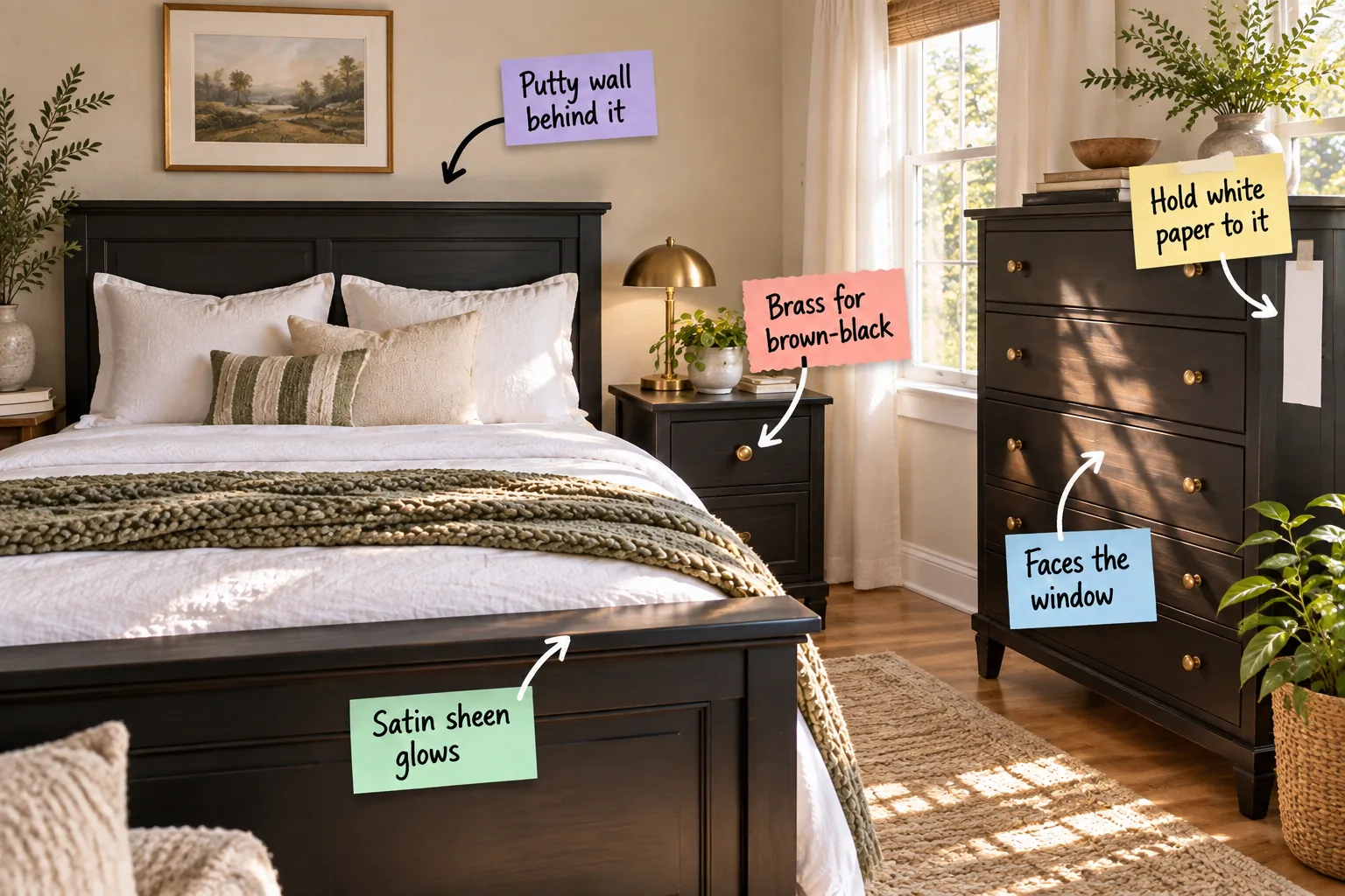
Finding the exact undertone of your dark furniture is the secret to a cohesive room, and I have created the Black Undertone Pairing Sheet to help you do just that. You will be able to identify your furniture’s exact black undertone and confidently select the hardware, paint, and textiles that make it look intentional.
The Three-Step White Paper Daylight Test
Taping a stark piece of standard white printer paper directly to your furniture creates a rigid visual baseline that immediately exposes hidden brown, blue, or green pigments. You must check this contrast during peak daylight hours when natural illumination reveals the true finish without interference.
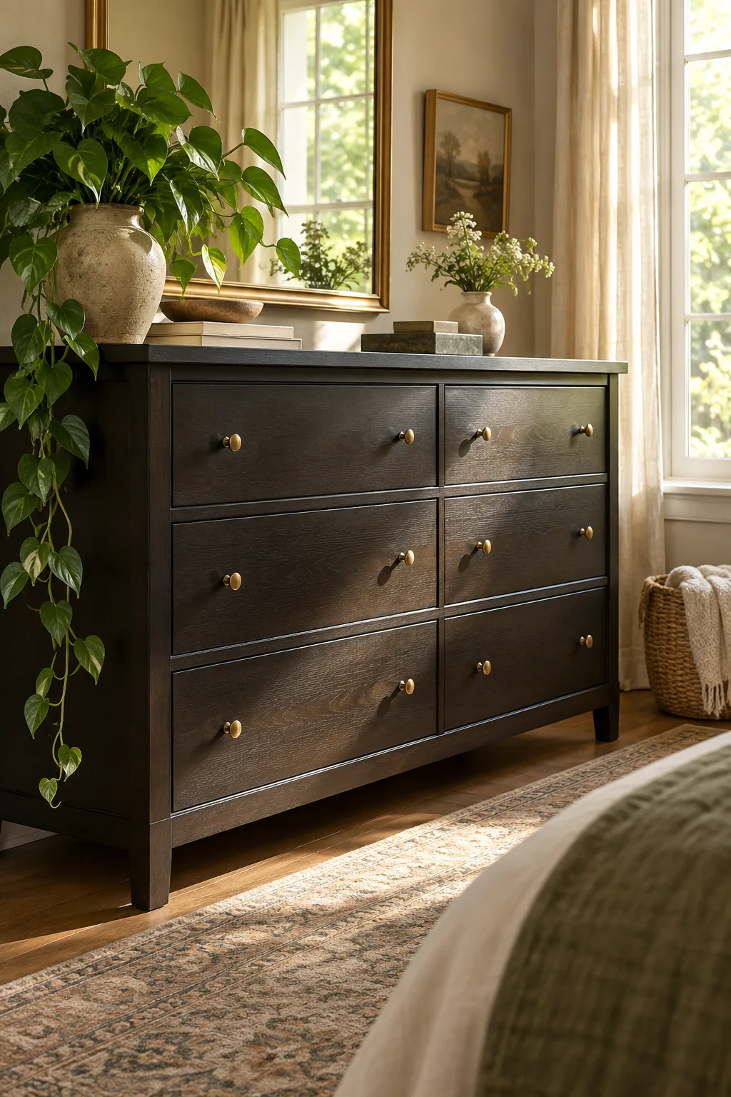
Getting an accurate read on dark furniture requires a strict baseline, and small testing errors will easily skew your results if you are not careful with your lighting environment. Consistency is key when diagnosing these subtle color shifts.
Identifying the Three Main Undertones
Once you complete the paper test, your furniture will clearly fall into one of three distinct color families that dictate your next design steps. Recognizing whether your piece leans warm, cool, or strictly neutral prevents you from buying clashing room accents.
| Undertone Family | Visual Read Against White | Best Room Atmosphere |
|---|---|---|
| Warm Black | Pulls slightly brown, muddy, or espresso | Cozy, traditional, or earthy spaces |
| Cool Black | Pulls faint navy, charcoal, or dark green | Crisp, modern, or high-contrast rooms |
| True Neutral | Remains stark black with no color shift | Minimalist or highly graphic designs |
Understanding this fundamental color shift allows you to treat your black furniture as a complex shade rather than a flat void. You can now build a palette that deliberately harmonizes with the hidden pigments in your specific pieces.
Testing Under Different Weather Conditions
While a sunny day provides the most accurate baseline, checking your paper test on an overcast afternoon reveals how the furniture behaves in cool, diffused light. This secondary check ensures your bedroom remains inviting even during the darker winter months.
Positioning Dark Pieces Near Windows
Direct natural light interacts beautifully with dark surfaces, preventing heavy black pieces from looking like textureless black holes in your bedroom. Allowing 100 percent natural daylight to wash over the piece highlights the subtle wood grain hidden beneath the dark stain.
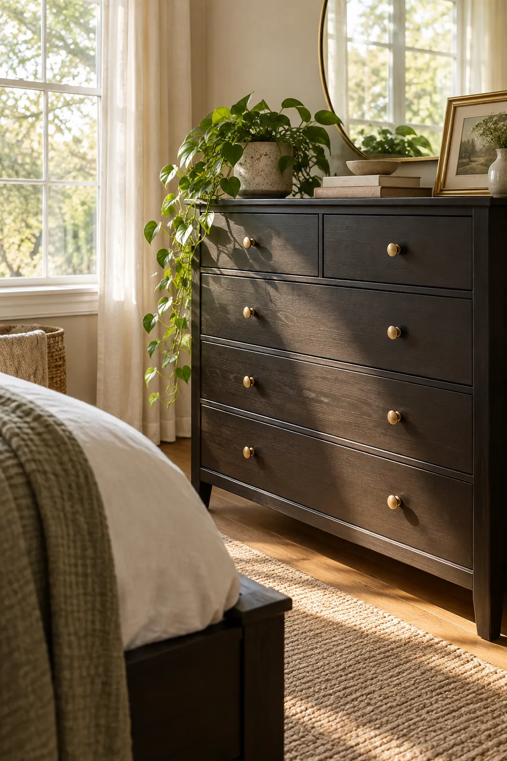
In my own primary bedroom, facing the darkest dresser directly toward the primary window completely transformed it from a visually heavy anchor into a dynamic, glowing focal point that changes beautifully as the sun moves across the sky.
Balancing Heavy Furniture in the Room
When you place a massive dark piece in a bedroom, you must distribute other visual weights throughout the space to keep the room from feeling lopsided. Proper spatial planning ensures your dark furniture grounds the room instead of sinking it.
- Place a lighter, highly reflective mirror directly above the dark dresser to bounce natural light back into the center of the room.
- Anchor the opposite side of your bedroom with a dark accent chair or deep-toned curtains to maintain perfect visual symmetry.
- Use a heavily textured, light-colored rug underneath the dark bed frame to physically separate it from dark hardwood floors.
Implementing these simple balancing techniques ensures that your bold furniture choices feel intentional and perfectly integrated into the overall architecture of your bedroom, rather than looking like an afterthought.
Softening the Floor With Textured Rugs
Dark furniture placed directly on dark hardwood floors creates a heavy, grounded mass that visually shrinks the room. Slipping a thick, light-toned wool rug under the bed frame introduces essential negative space and separates the competing dark wood grains for an instant visual lift.
Avoiding the Matching Furniture Set Trap
Purchasing an entire matching set of black bedroom furniture instantly makes the space feel like a generic catalog showroom. Mixing one or two dark anchor pieces with vintage wood or upholstered items creates a curated, highly personal environment.
Why a Satin Sheen Outperforms Matte
A satin finish is absolutely ideal for black furniture because it reflects just enough ambient light to create a soft, elegant glow along the edges. While flat matte black absorbs light and quickly looks dusty, a satin sheen adds 3D dimension.
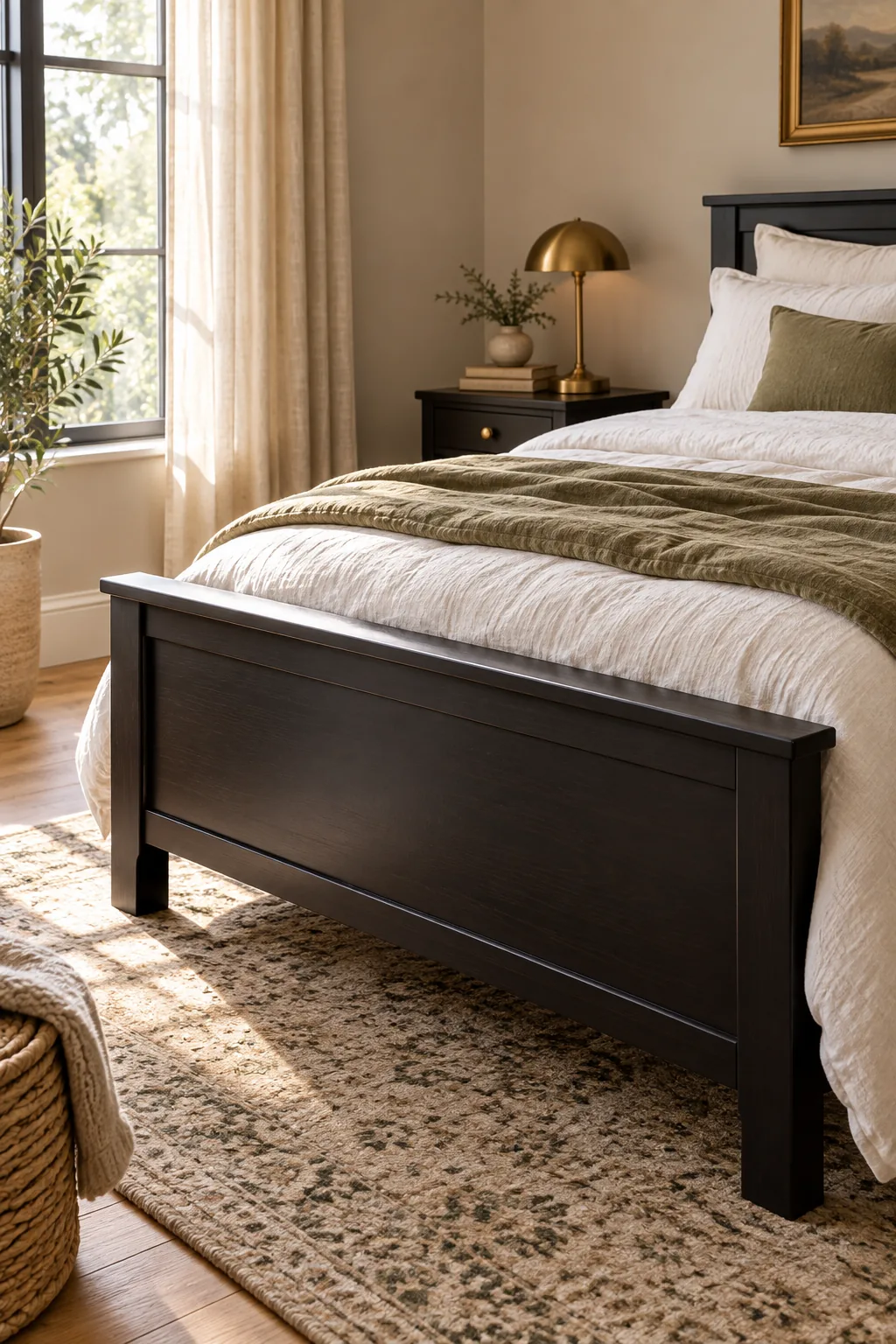
In my recent design projects, I always specify a satin finish for dark nightstands because those subtle glowing highlights keep the bedroom feeling alive, layered, and incredibly sophisticated even on cloudy days.
How Sheen Impacts Daily Maintenance
Beyond pure aesthetics, a slight gloss provides a protective barrier that makes dusting and wiping down dark surfaces significantly easier. Matte finishes trap oils from your hands, leaving permanent smudges that ruin the clean, tailored look of your bedroom furniture.
Matching Hardware to Your Black Undertone
Warm brown-blacks require unlacquered brass or antique bronze to intentionally enhance their richness, while cooler blue-blacks pair beautifully with polished nickel or chrome. Selecting the correct metal instantly harmonizes the furniture with the rest of your bedroom decor.
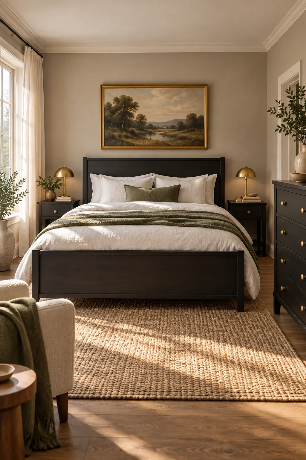
Once you know your furniture’s true color family, you can use metal accents to deliberately enhance or cool down the overall warmth of the piece, creating a highly customized look.
Selecting Cool Metals for Blue-Blacks
If your paper test revealed a cool blue or green undertone, warm brass will often clash and look overly yellow against the dark wood. Sticking to polished nickel or brushed steel hardware enhances the crisp, modern edge of these cooler finishes.
Why Antique Bronze Elevates Warm Wood
Antique bronze hardware features a subtle, living patina that perfectly echoes the muddy brown undertones found in warm-black furniture. This tonal pairing creates a sense of age and history, grounding newer pieces with a beautifully established, traditional character.
Choosing the Right Wall Color Contrast
Bridging the visual gap between dark furniture and light walls requires a mid-tone putty, greige, or taupe paint. Selecting a wall color with a Light Reflectance Value (LRV) between 45 and 60 softens the harsh contrast of stark white walls.
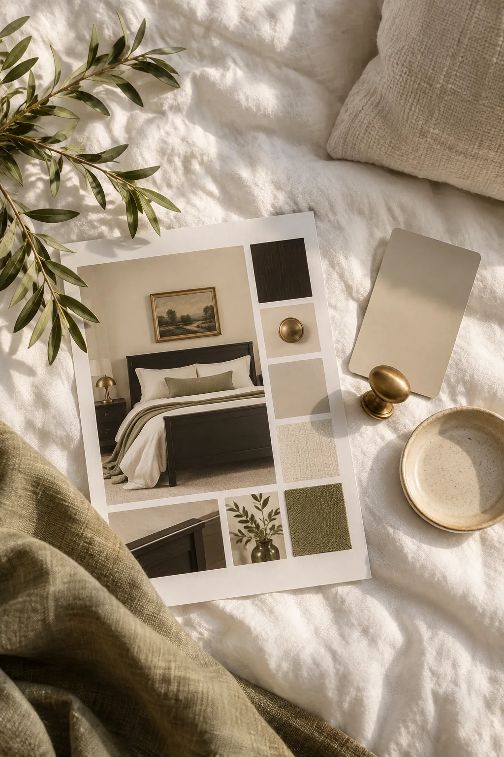
Using these mid-tone putty shades directly behind a dark headboard ensures the visual transition feels deliberate, creating a deeply soothing atmosphere for sleep that stark white walls simply cannot provide.
Why Stark White Walls Fail Dark Wood
Placing black furniture directly against a bright white wall creates a jarring, high-contrast environment that strains the eyes and feels overwhelmingly stark. A slightly muddied wall color absorbs the intensity of the black, making the entire room feel warmer and far more inviting.
Layering Textiles to Bridge the Contrast
Just like your wall paint, your bedding should act as a gradient between your dark bed frame and the rest of the room. Layering oatmeal, sage, or soft linen blankets breaks up the heavy block of black with inviting, tactile warmth.
Incorporating Natural Wood Accents
Introducing a medium-tone walnut or white oak bench at the foot of your black bed prevents the room from feeling entirely monochromatic. These organic wood elements inject essential warmth and texture, ensuring the dark furniture remains a striking focal point.
Using Greenery to Break Up Dark Blocks
Placing a tall olive tree or a trailing pothos plant near your black dresser introduces a vibrant, organic shape that softens the rigid geometry of the furniture. The vibrant green leaves naturally complement both warm and cool black undertones beautifully.
The Role of Ambient Evening Lighting
While daylight dictates your true undertone, your bedroom primarily functions at night under artificial bulbs. Using soft white bulbs rated at 2700 Kelvin ensures your black furniture retains its rich depth without pulling harsh, clinical blue tones after dark.
Four Ways to Style Black Bedroom Furniture
Explore how different undertones and finishes completely change the mood of a dark bedroom setup.
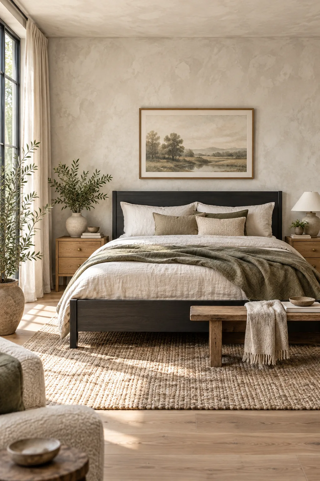
Modern Organic Charcoal: Pair a matte charcoal finish with raw oak accents and textured limewash walls for an earthy, grounded atmosphere.
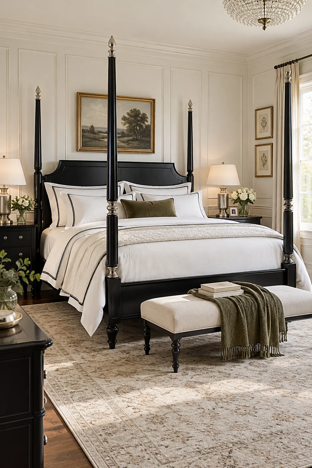
Classic Traditional True Black: Embrace high contrast by placing a glossy true-black frame against crisp white wainscoting and polished nickel fixtures.
Moody Eclectic Blue-Black: Lean into cooler undertones by surrounding a blue-black dresser with dark teal walls and rich velvet textures.
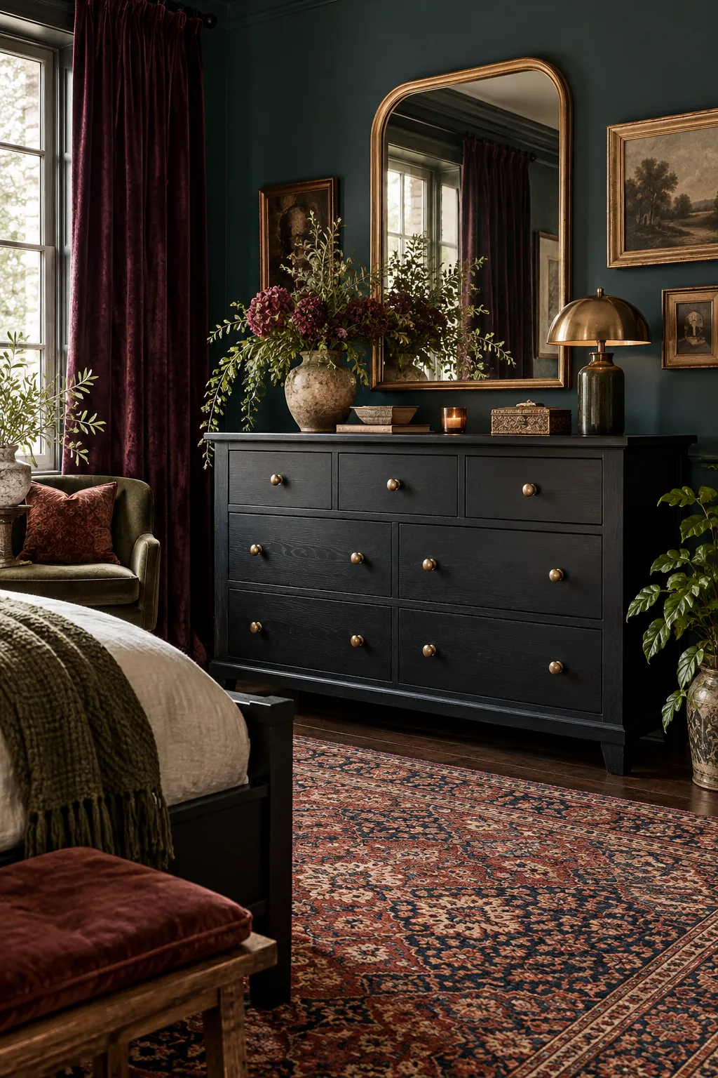
Soft Minimalist Brown-Black: Highlight a warm brown-black finish by keeping the surrounding room minimal with beige textured wallpaper and sheer linens.
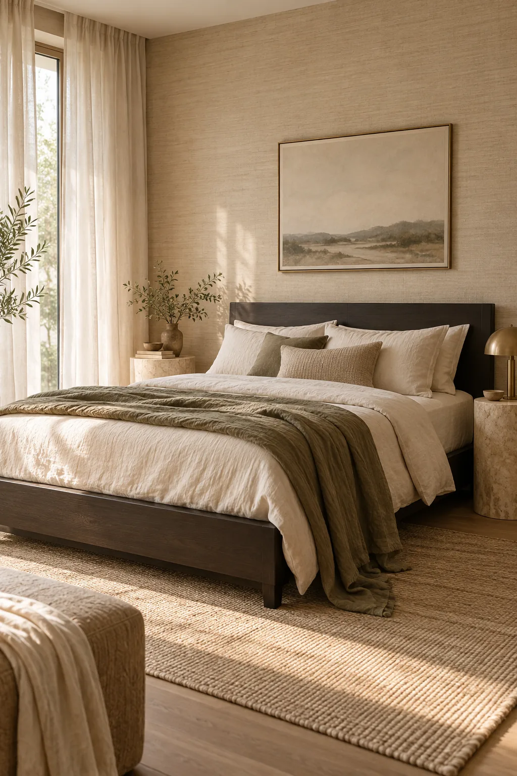
The Black Undertone Pairing Sheet
The Black Undertone Pairing Sheet is your one-page chart matching warm-black, blue-black, and neutral-black furniture to their ideal hardware metals, wall paint undertones, and bedding whites. I keep this printed guide in my own sourcing binder to confidently match specific finishes on the go.
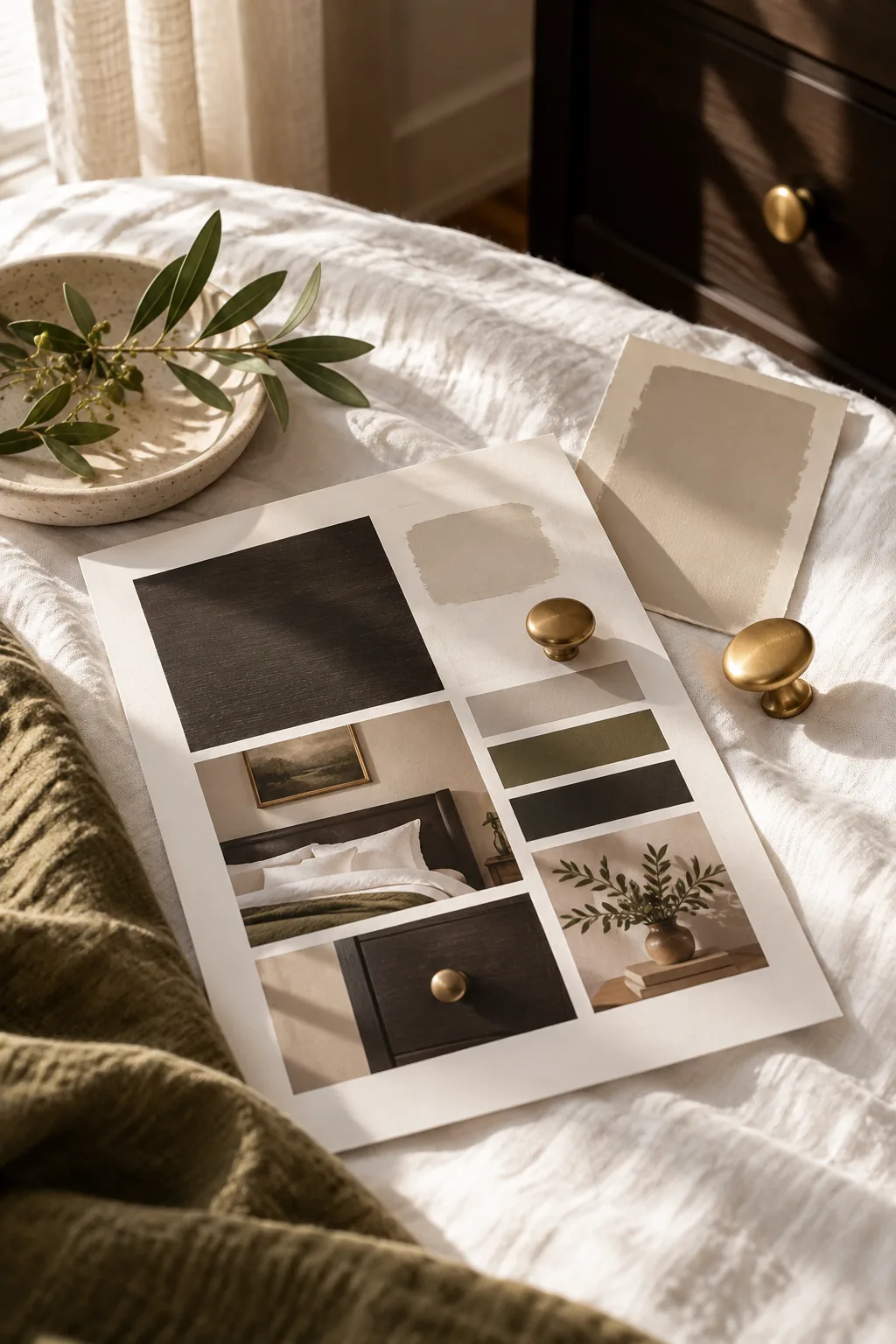
Keep this quick reference list handy when shopping for textiles, hardware, or paint to ensure every new layer beautifully complements your dark furniture and maintains the room’s carefully planned harmony.