Foolproof Bathroom Paint Colors: The Tile Matching Guide
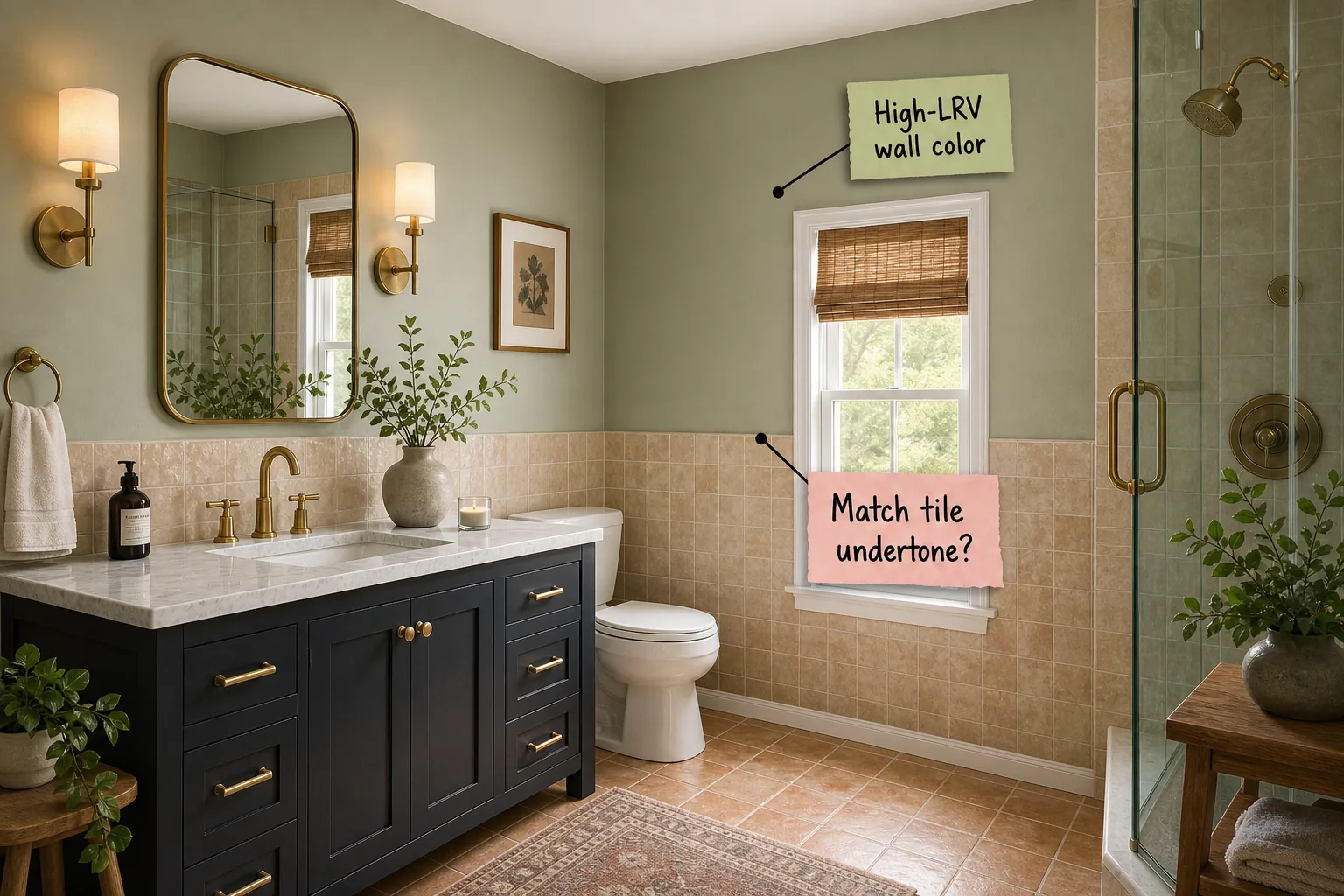
Master your bathroom palette with our step-by-step guide to matching wall paint undertones directly to your existing tile. You will be able to identify your tile’s underlying hues and confidently select a cohesive palette using The Tile & Paint Undertone Matching Guide.
The Ceiling: Tinting Your White Paint
Stark white ceilings can feel jarring against colored bathroom walls, so soften the transition by mixing a tinted ceiling white that envelops the room. This technique eliminates harsh overhead contrast and creates a continuous, soothing visual wrap above the vanity.
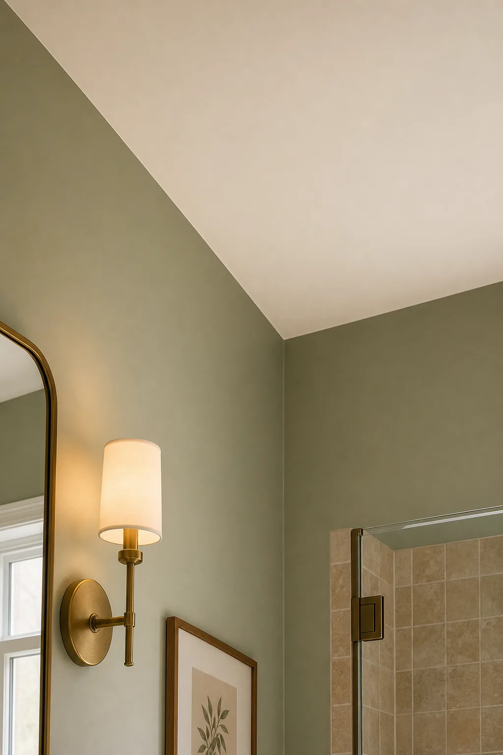
Achieving this subtle blend is much easier than attempting to mix leftover wall paint into your ceiling bucket at home, which often results in an uneven, streaky finish that draws unwanted attention upward.
Calculating the Ideal Ceiling Tint Ratio
The exact amount of pigment required depends heavily on your ceiling height and the natural light available in the space. Use standard architectural measurements to determine how much tint will achieve a cohesive look without darkening the room.
| Ceiling Height | Light Level | Recommended Tint | Visual Effect |
|---|---|---|---|
| 8 feet | Low natural light | 10 percent | Subtle warmth |
| 9 feet | Medium natural light | 15 percent | Gentle envelopment |
| 10+ feet | High natural light | 20 percent | Distinct color echo |
| Vaulted | Varied lighting | 15 to 25 percent | Dramatic canopy |
Adjusting these specific percentages ensures the overhead surface feels intimately connected to the room without lowering the perceived height of the ceiling, allowing your chosen wall color to take center stage.
Choosing a High-LRV Wall Color
Bathrooms require paint that maximizes available light, making a high-LRV wall color essential for preventing the space from feeling cavernous. Selecting a shade with a Light Reflectance Value between 55 and 70 keeps the footprint bright and open.
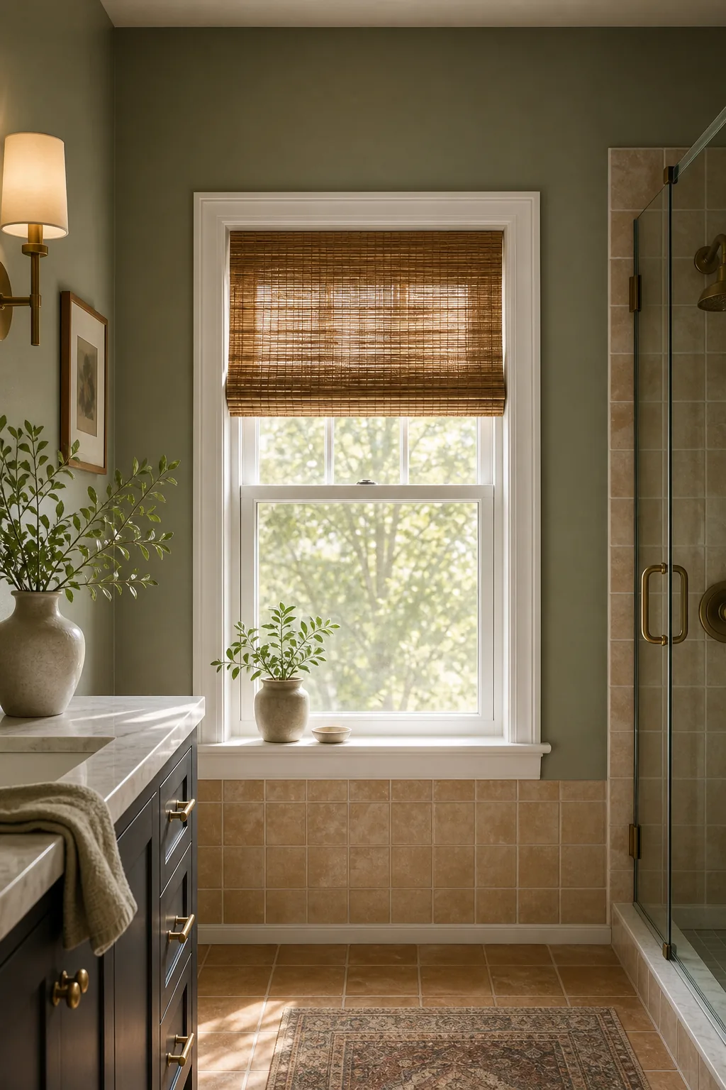
This optimal reflectance range ensures the color bounces light around the room effectively without washing out entirely under bright vanity bulbs, maintaining the paint’s true character throughout the day.
How Natural Light Impacts LRV
The Light Reflectance Value dictates how much illumination a painted wall bounces back into the room versus how much it absorbs. You must evaluate your specific lighting conditions before committing to a final paint sheen or shade.
- Check the paint manufacturer’s website or the back of the physical swatch to locate the specific LRV number.
- Select a shade with an LRV above 60 for rooms with minimal or no natural light.
- Test the color on multiple walls to see how direct sunlight and shadows alter the perceived brightness.
- Adjust your vanity bulb temperature to 3000K to ensure the paint color reads true even after the sun sets.
Following these sequential steps guarantees your chosen color maintains its intended vibrancy regardless of the time of day, weather conditions, or the specific wattage of your overhead light fixtures.
Selecting a Moisture-Safe Finish
Bathrooms endure heavy humidity daily, so you must select a moisture-safe finish to protect your drywall from lingering dampness and steam. Opting for a slight satin sheen repels moisture and prevents stubborn water spots near the shower.
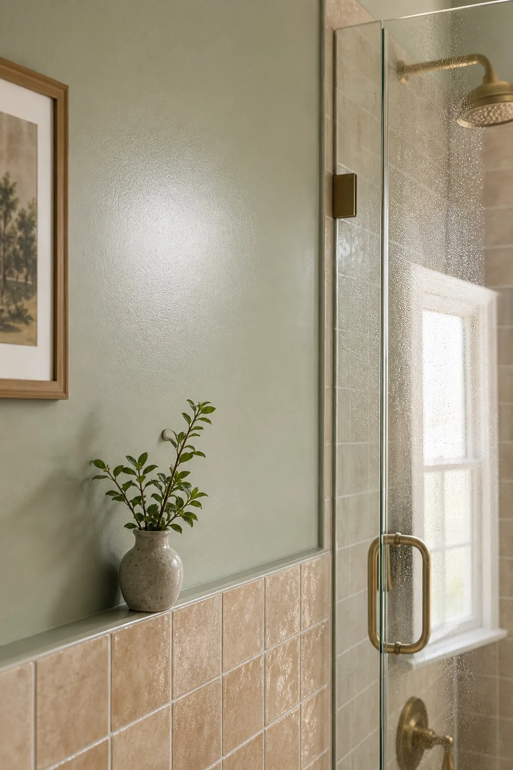
This durable sheen level combats bathroom humidity effectively while remaining much easier to wipe down than a traditional matte surface, ensuring your walls look freshly painted for years.
Preparing Drywall for High-Moisture Environments
Before rolling your moisture-safe finish, you must apply a high-quality, mildew-resistant primer to seal the drywall completely. This crucial preparation step creates an impermeable barrier that prevents steam from penetrating the porous surface and compromising your new paint job.
The Tile & Paint Undertone Matching Guide
The secret to a foolproof bathroom is aligning your paint with your hard finishes, which is why you must match tile undertone intentionally. The Tile & Paint Undertone Matching Guide dictates pairing warm terracotta tiles with complementary warm green walls.
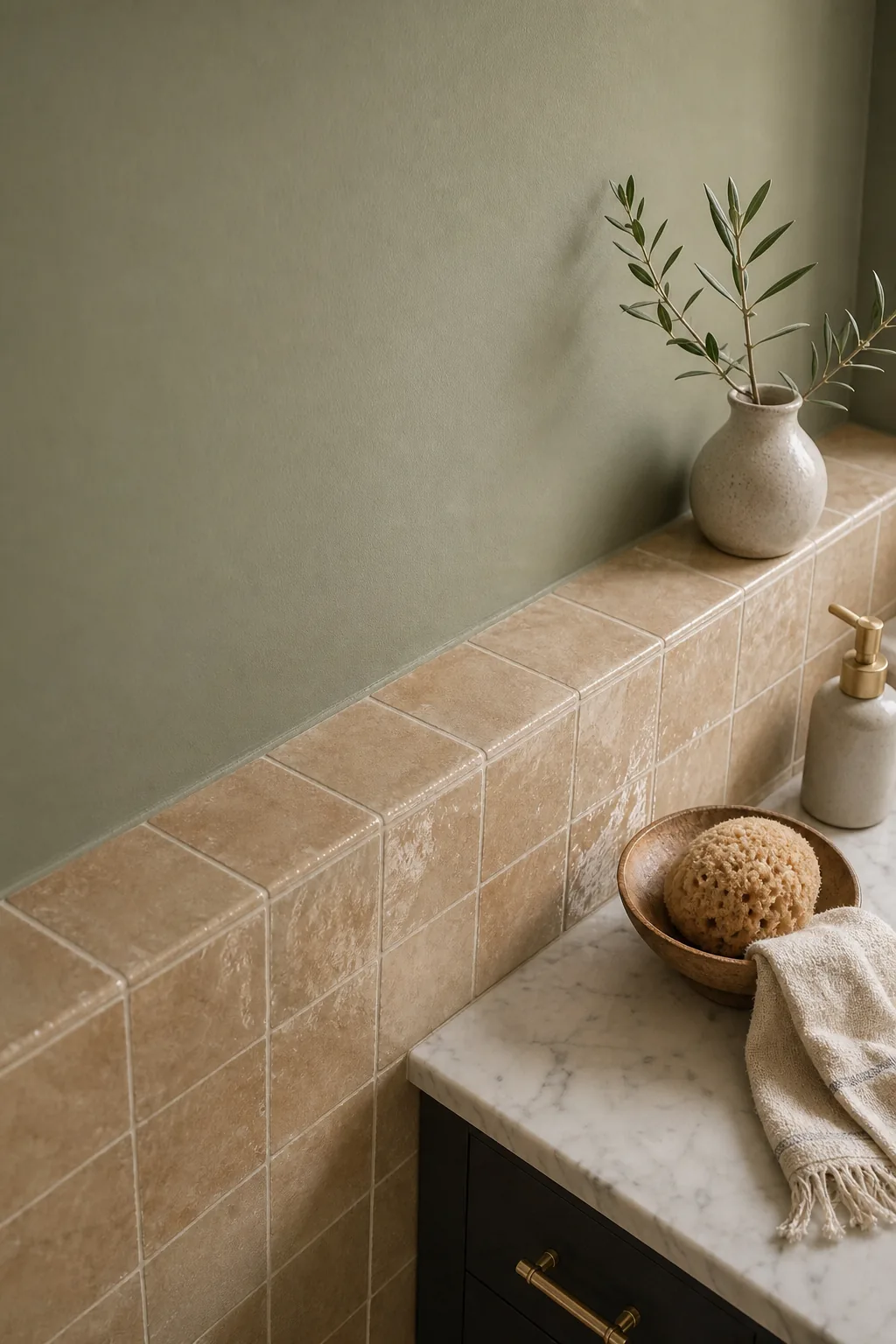
Applying this core rule prevents the jarring visual clash that occurs when warm and cool elements fight for dominance, ensuring a harmonious transition between the painted drywall and the textured wainscoting.
Decoding Warm vs. Cool Hard Finishes
Before selecting a wall color, you need to categorize your existing flooring, shower surround, and wainscoting into distinct temperature families. This classification determines which side of the color wheel your paint palette should pull from.
- Warm terracotta and tumbled travertine pair beautifully with soft sage greens, creamy whites, and rich earthy taupes.
- Cool slate and crisp white subway tiles harmonize seamlessly with icy blues, cool grays, and stark charcoal accents.
- Neutral marble with subtle gray veining offers flexibility, allowing you to pull either warm or cool tones.
- Warm brass fixtures naturally enhance yellow or pink undertones found in natural limestone and zellige clay.
Identifying these inherent material temperatures allows you to build a cohesive, designer-grade palette that feels intentional rather than accidental, elevating the entire bathroom renovation.
Identifying Your Tile’s Core Undertone
You must determine if your tile leans warm or cool before finalizing any paint decisions for the surrounding drywall. Using the white paper method isolates the tile’s true color family by removing distracting background hues.
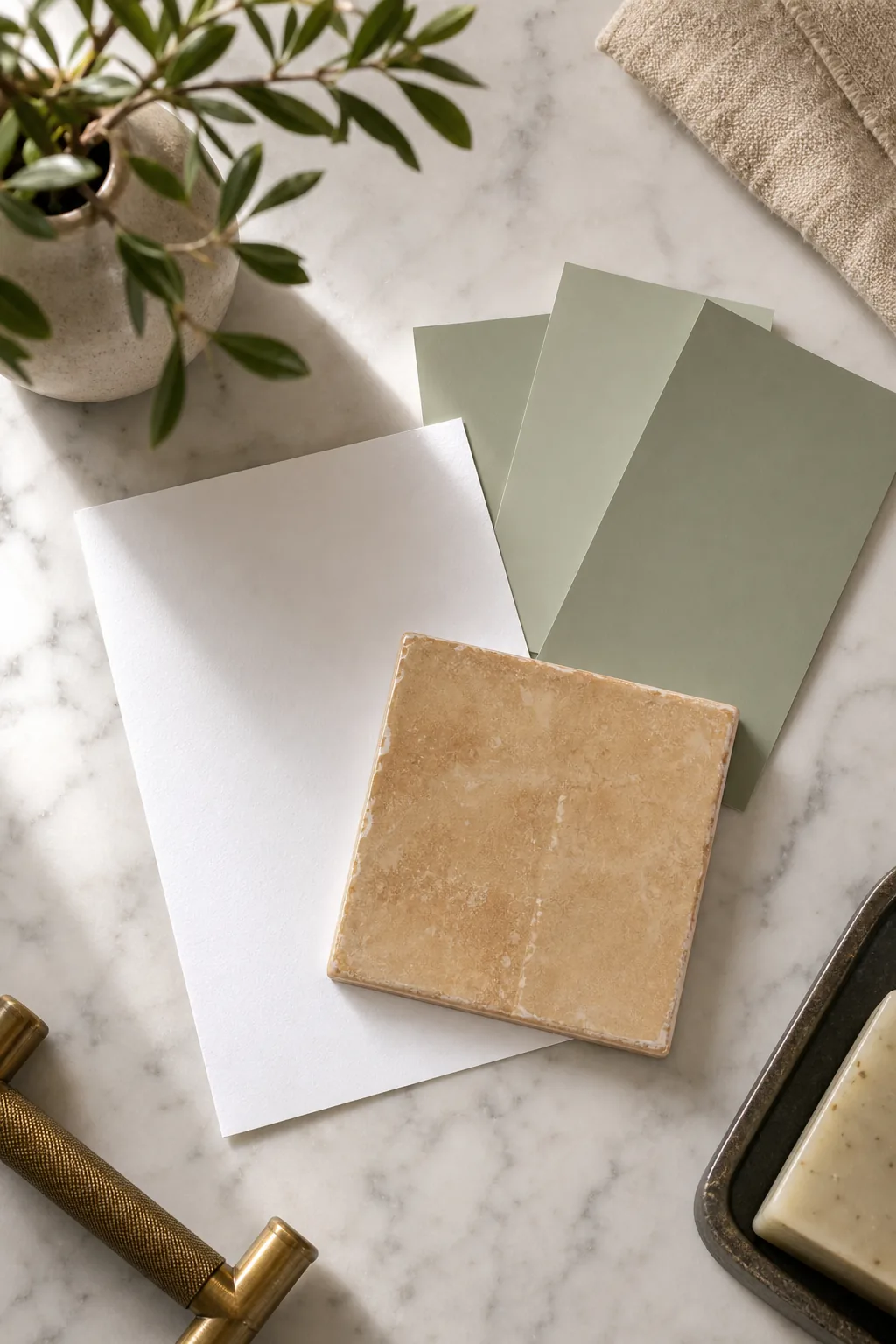
You can quickly reveal these hidden hues using items you already have around the house rather than relying on guesswork, saving you from purchasing incompatible paint samples.
Isolating Complex Stone Hues
Natural stone often contains multiple competing flecks of color, making it difficult to pinpoint a single matching paint shade. Focus entirely on the dominant background shade rather than the prominent veining to ensure the overall room feels balanced and grounded.
Testing Paint Swatches Against Tile
Never rely on tiny paper paint chips when committing to a room’s final color palette. Paint large sample boards and tape them directly above your tile wainscoting to observe how the undertones interact across a broader surface area.
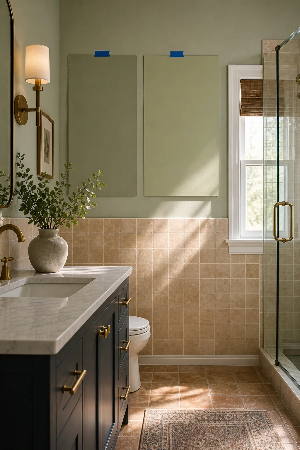
Evaluating large painted swatches against the tile in varying light conditions prevents expensive repainting mistakes after the final coat dries, giving you complete confidence in your color selection.
Evaluating Swatches Throughout the Day
Leave the painted boards in place for at least 24 to 48 hours to observe them thoroughly. This waiting period reveals how the undertones shift dramatically between crisp morning sunlight and warm evening vanity lighting.
Anchoring the Room With a Dark Vanity
Airy walls and warm tiles need a visual anchor to prevent the room from floating. A grounding dark tone provides necessary visual weight to balance the light walls and warm floors effectively.
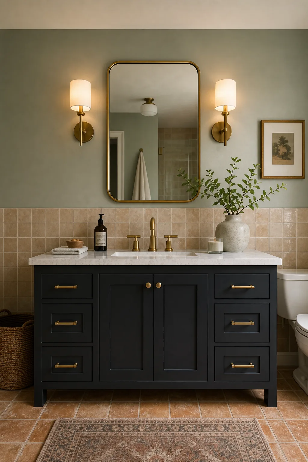
Introducing deep cabinetry prevents airy palettes from feeling weightless and adds a layer of sophisticated contrast to the lower half of the vanity area.
Selecting the Right Grounding Shade
Deep charcoal, stark navy blue, or rich forest green cabinetry instantly modernizes traditional tile layouts. Ensure this dark focal point shares a complementary undertone with your chosen wall paint to maintain a unified, highly curated aesthetic across the space.
Balancing the Hardware and Accents
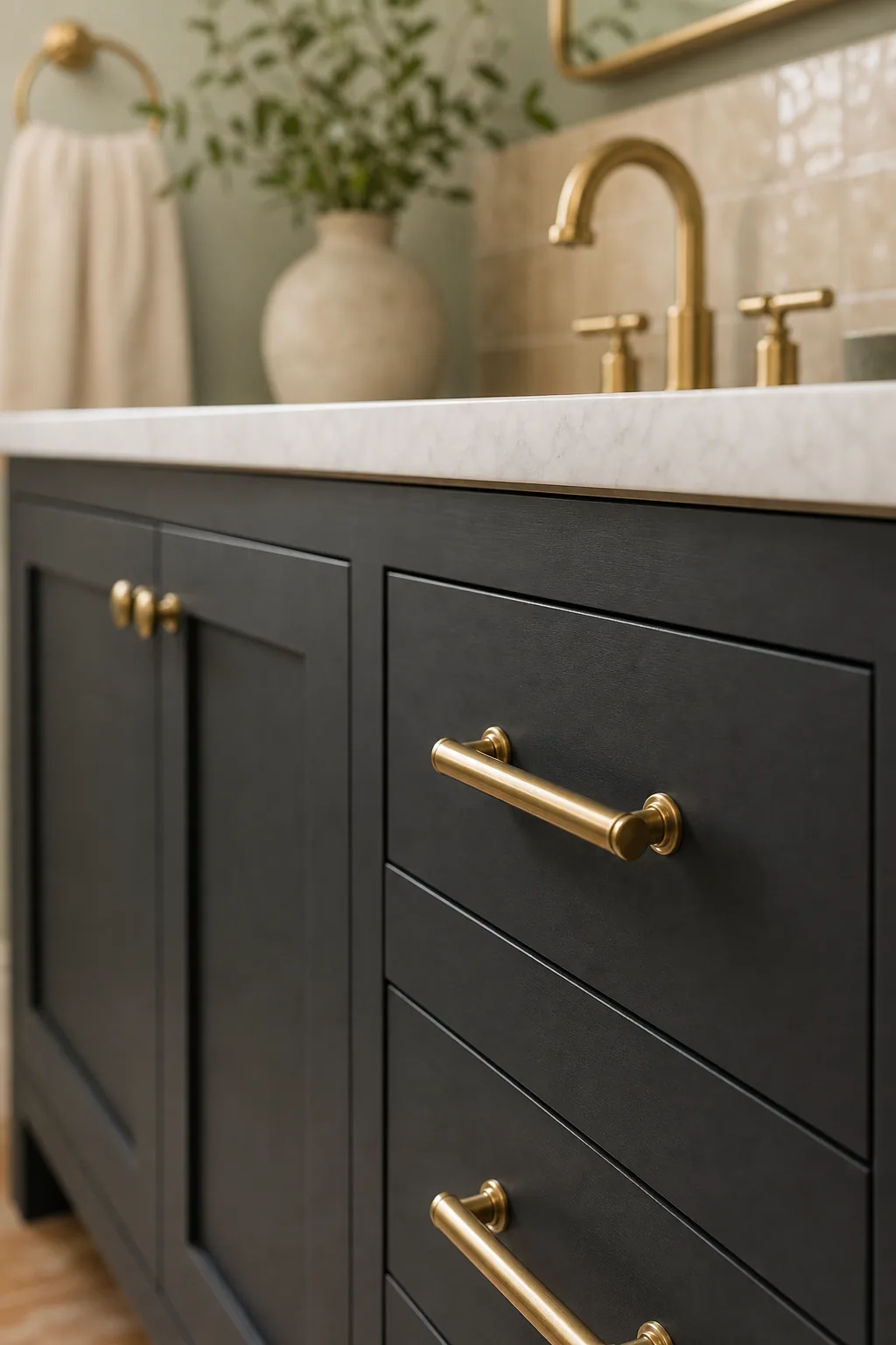
Bridge the visual gap between a dark vanity and light walls by incorporating warm metallic accents. Brass hardware echoes the undertones of beige or tan tiles, tying the entire palette together seamlessly.