
The 60-30-10 Exterior House Color Rule (Plus 3-Part Guide)
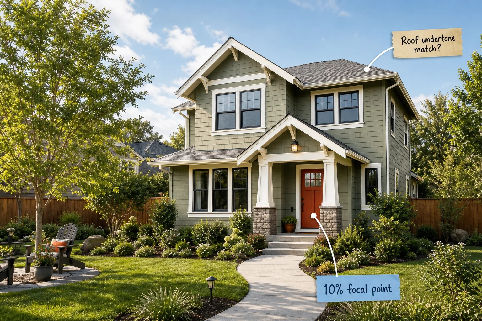
Master your home’s curb appeal and confidently select a cohesive palette that perfectly matches your fixed architectural elements with this 3-part exterior color guide. You will learn exactly how to balance your siding, trim, and front door using the proven 60-30-10 exterior formula.
Match Your Roof Undertone First
Before selecting any paint, evaluate the largest unpainted surface on your home in direct midday sunlight to determine its dominant color family. Roof shingles dictate whether your entire exterior palette must lean toward a warm, cool, or strictly neutral spectrum.
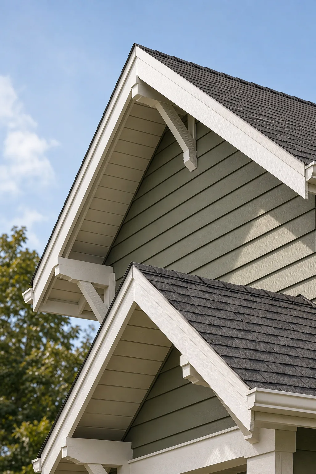
Identify if your roof reads as a warm brown, a cool grey, or a neutral charcoal, as this fixed element anchors your subsequent color choices. Answering the critical roof undertone match question prevents your new primary siding color from clashing visually.
Identify Your Hardscape Colors
Driveway pavers, retaining walls, and natural stone pathways introduce secondary undertones that must harmonize intimately with your primary siding choice. Mapping these existing hardscape temperatures establishes a reliable baseline before you begin physically testing any new exterior house paint colors.
| Hardscape Material | Dominant Undertone | Best Siding Match |
|---|---|---|
| Red clay brick | Warm rust and brown | Warm beige or earthy sage |
| Natural slate walkway | Cool blue and grey | Cool grey or crisp white |
| Limestone porch base | Neutral yellow and tan | Warm white or soft taupe |
| Poured concrete path | Cool stark grey | Cool blue or charcoal |
| Warm fieldstone | Earthy brown and beige | Warm cream or olive green |
Comparing your permanent hardscape materials against this structural matrix ensures your final paint selections will seamlessly integrate with the existing masonry. Ignoring these permanent structural colors consistently results in a disjointed exterior that feels visually unbalanced from the public street.
Anchor the House with 60% Field Color
The main siding takes up exactly 60% of your visual space and serves as the foundational field color for your entire property. Choosing this dominant shade correctly ensures the house feels permanently grounded rather than floating against the surrounding natural landscape.
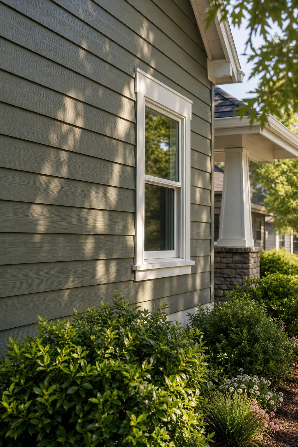
Choose a field hue with a Light Reflectance Value between 20 and 60 to prevent the structure from looking blindingly stark in direct sunlight. This specific mid-range prevents the house from appearing excessively gloomy when heavily shaded by large mature trees.
Select the Right Siding Finish
Matte and flat finishes naturally absorb direct sunlight, making your chosen field color appear slightly darker and much richer on textured wood lap siding. Satin finishes offer superior moisture protection and easier cleaning, but they reflect more light and expose minor surface imperfections.
Define the Structure with 30% Framing Hue
Trim, fascia, and eaves make up the essential 30% framing hue that cleanly outlines your home’s intricate architectural boundaries. This secondary color acts as a crisp visual border, purposefully separating the heavy roofline from the expansive primary siding below.
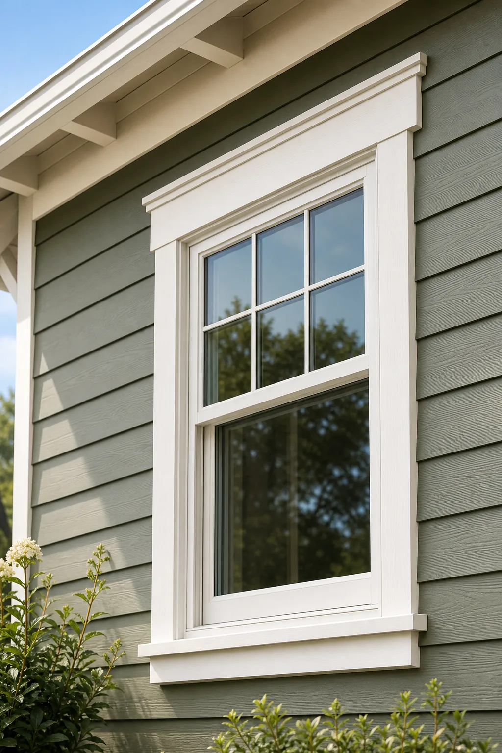
Select a trim shade sitting at least 20 LRV points away from your field color to provide the necessary structural contrast. This mathematical difference ensures the window frames and corner boards stand out sharply without overwhelming the delicate primary siding color.
Balance the Gutters and Downspouts
Paint vertical downspouts to perfectly match the 60% field color so they disappear seamlessly against the siding rather than interrupting the vertical visual flow. Horizontal gutters should always match the 30% framing fascia to maintain an unbroken structural line across the roof edge.
Draw the Eye with a 10% Focal Point
The front door serves as your distinct 10% focal point, purposefully designed to immediately draw approaching visitors directly to the primary entryway. Use a complementary color from the exact opposite side of the color wheel to make this specific element pop vibrantly.
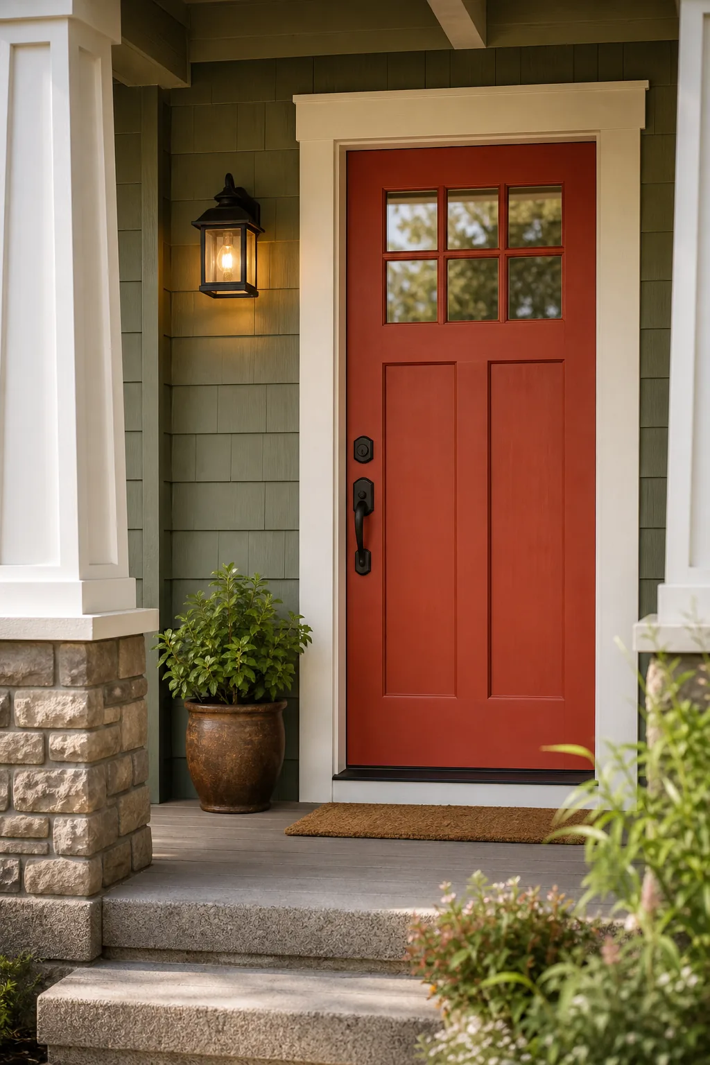
Applying your accent color too broadly dilutes its visual impact and confuses the carefully planned architectural lines of your welcoming front porch. Restricting this bold shade solely to the entryway maintains the sophisticated balance of the entire 60-30-10 exterior color formula.
Coordinate the Garage Doors
Unless your garage features custom architectural wood, paint the large doors the exact same color as your primary siding to minimize their visual dominance. Highlighting standard metal garage doors with your contrasting trim color unnecessarily pulls attention away from your carefully planned entryway.
Account for Fixed Masonry and Stone
Stone bases, brick chimneys, and exposed concrete foundations act as immovable secondary elements that must bridge the hardscaping and the painted wood. These heavily textured surfaces require careful color coordination to prevent a harsh horizontal line from bisecting your home’s front facade.
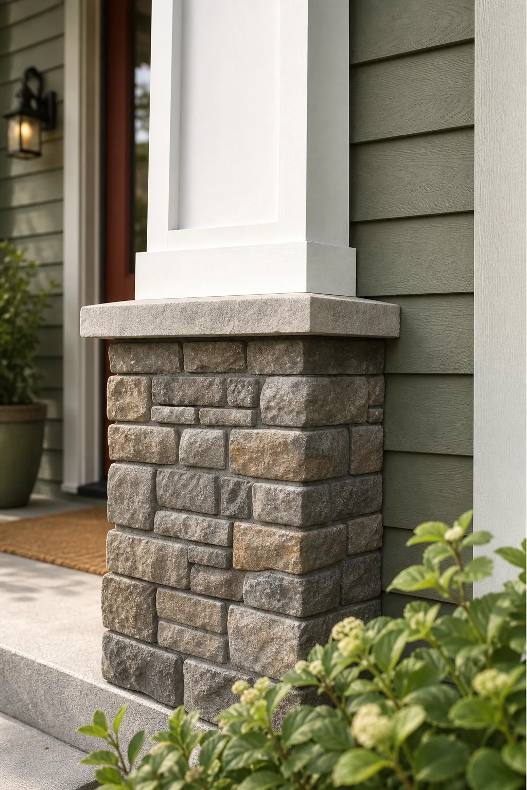
Pull one prominent mid-tone directly from the masonry to use as a foundational guide for your expansive 60% field color. This deliberate matching technique ensures a seamless vertical transition from the rugged natural foundation up into the smooth painted wooden siding.
Measure the Light Reflectance Value
Verify the exact LRV printed on the back of your physical paint chip to confirm the mathematical contrast between your chosen siding and trim. Relying on visual estimation alone often leads to a severely washed-out palette once the paint is exposed to full daylight.
Test Paint Swatches Across Sun Exposures
Exterior paint looks drastically different on north-facing versus south-facing walls, shifting undertones significantly from early morning to late afternoon. Paint large test squares of your chosen field and trim colors on at least two different sides of the house to observe these dramatic shifts.
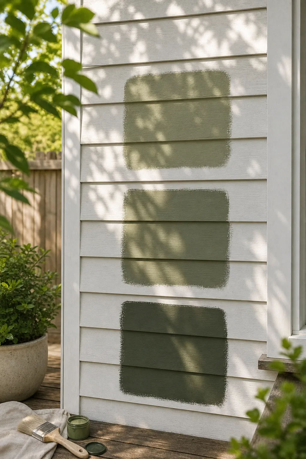
Even the most carefully planned exterior palette fails if you do not physically test how specific pigments react to your lot’s unique natural lighting. Observing these painted sections over a full 24-hour cycle reveals hidden blue, green, or pink undertones before you commit.
Factor in Neighborhood Context
Evaluate the two houses immediately adjacent to your property to ensure your new palette neither clashes violently nor mimics them identically. Selecting a complementary but distinct color scheme respects the street’s established character while allowing your home to maintain its unique visual identity.
The 3-Part Exterior Color Guide
Use this concrete breakdown to assign your home’s exterior features to the correct percentage bucket and completely eliminate painting guesswork. This structured approach guarantees that your final exterior palette remains cohesive, beautifully balanced, and visually appealing across the entire architectural property.
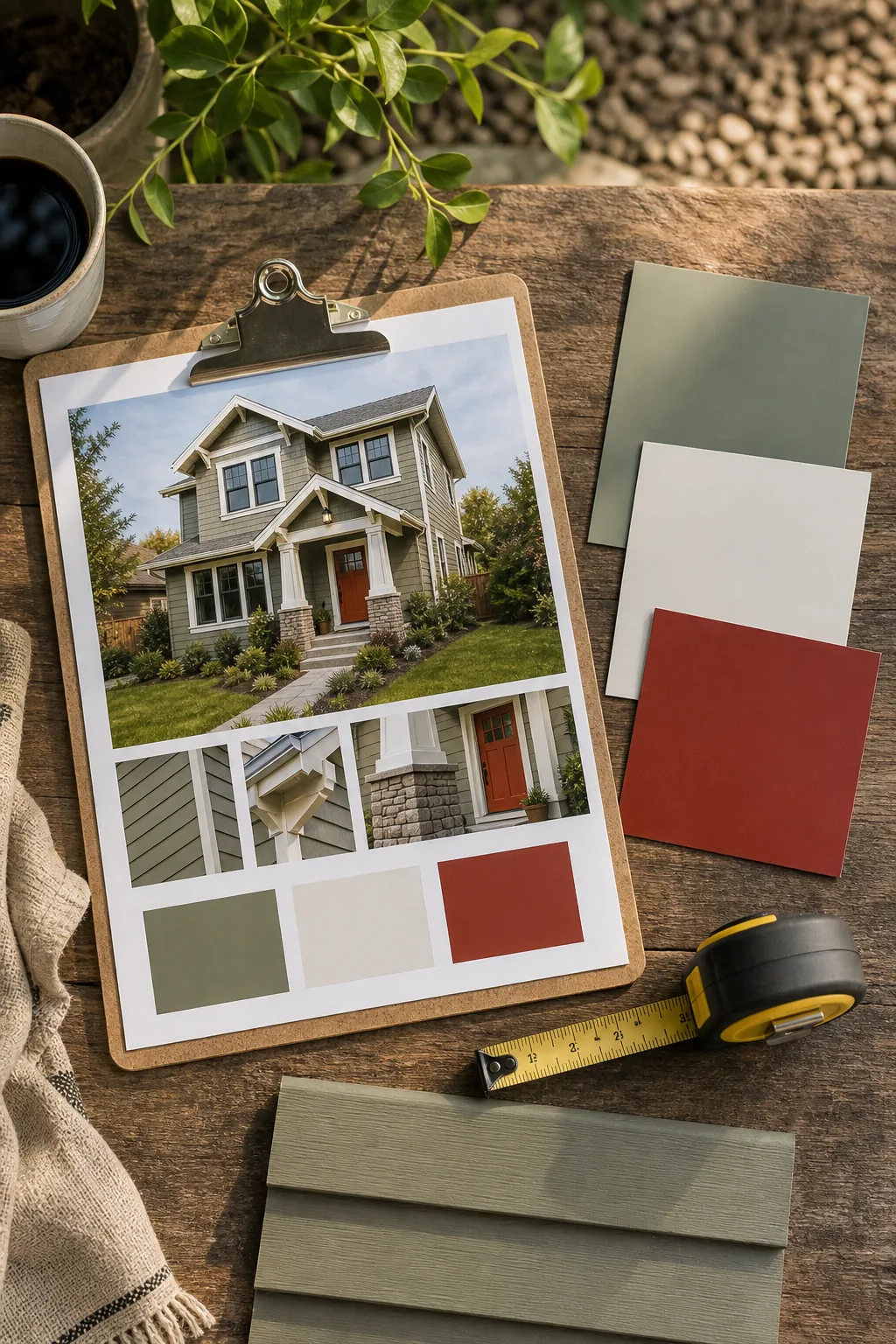
Following this strict visual hierarchy ensures each architectural element receives the correct visual weight without overwhelming the property. Stick to these specific categorizations to effortlessly maintain the proven ratio that professional exterior designers rely on for maximum curb appeal.
- Assign all lap siding, composite shingles, and textured stucco to the 60% field color category.
- Group window casings, corner boards, horizontal gutters, and fascia into the 30% framing hue.
- Reserve the vibrant 10% focal point exclusively for the front door and optional decorative shutters.
Finalize the Painting Sequence
Establish a logical application order before opening any paint cans to prevent accidental drips onto freshly finished architectural surfaces. Working methodically from the highest roof peaks down to the concrete foundation ensures gravity works in your favor during the entire painting process.
- Power wash all siding, trim, and masonry surfaces thoroughly to remove dirt.
- Apply high-quality exterior primer directly to any exposed raw wood.
- Paint the 30% framing trim before addressing the primary siding.
- Roll the expansive 60% field color as the absolute final step.
Reviewing the Final Palette On-Site
Step back to the public curb to view the entire architectural composition at scale before purchasing your bulk exterior paint order. This wide perspective reveals whether your chosen hues provide enough structural definition when viewed from the street.
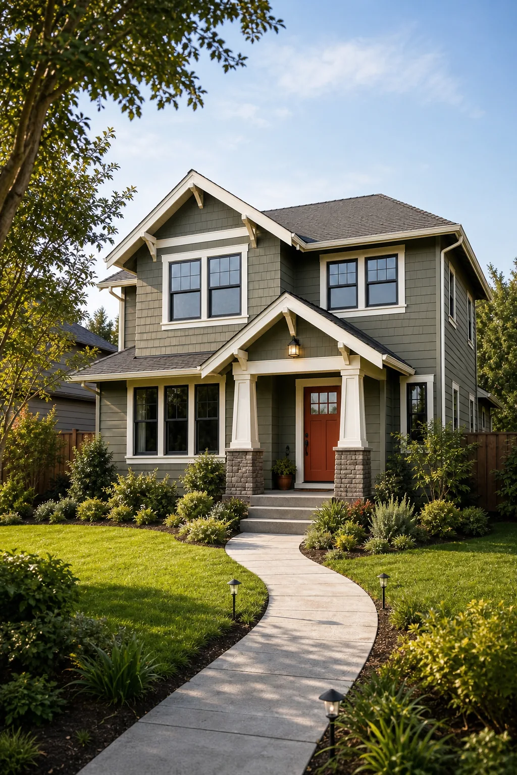
Ensure the focal point remains clearly visible from at least 50 feet away, confirming your three-part palette successfully guides the eye. A well-executed exterior color scheme effortlessly directs attention from the public sidewalk straight to your welcoming front door.