
How to Make a DIY Acrylic Wedding Sign (Reverse Painted)
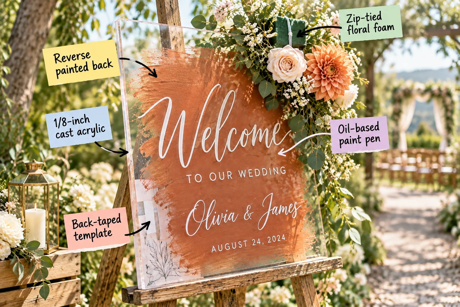
You can easily build a stunning DIY acrylic welcome sign that perfectly matches your wedding colors, and I am sharing the exact printable typography and sizing template guide to make your lettering flawless. We will build this project layer by layer, starting with the blank acrylic and finishing with a lush floral display.
Selecting 1/8-Inch Cast Acrylic
Start with a solid foundation by choosing a standard 18×24-inch or 24×36-inch sheet of clear acrylic for your welcome display. These dimensions perfectly match standard easel heights and provide enough surface area for a legible, elegant greeting.
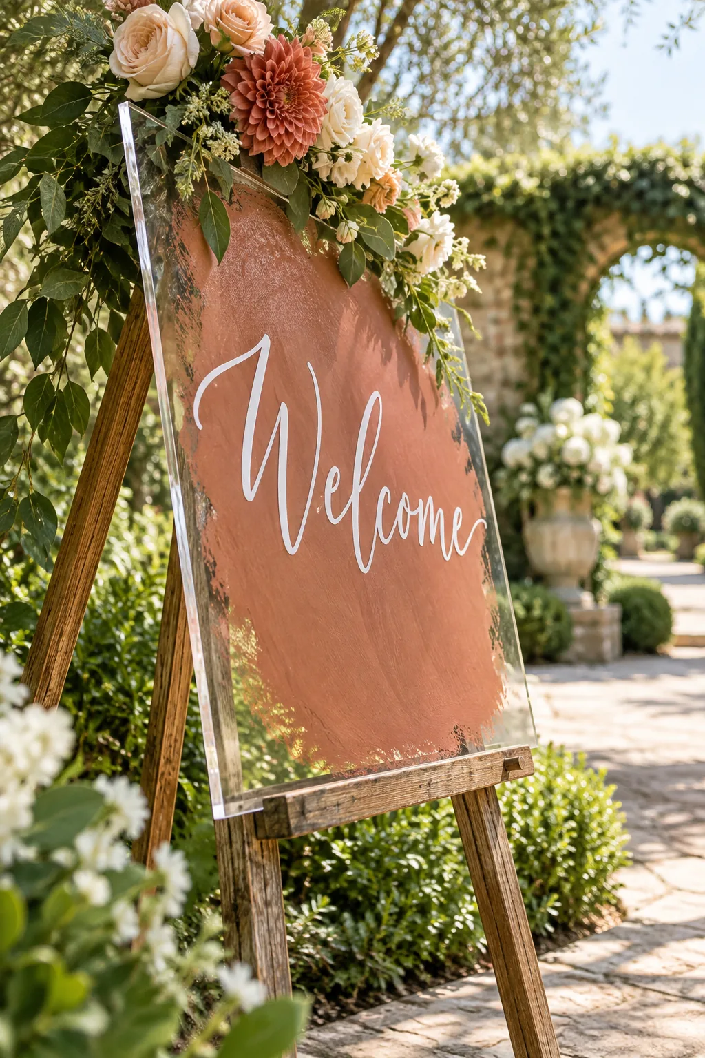
I always insist on 1/8-inch cast acrylic because it provides the necessary rigidity for the project. This specific thickness guarantees the sign will not bow or warp when resting on an outdoor easel in the warm afternoon sun.
Sourcing Your Acrylic Blanks
Purchasing pre-cut cast acrylic from a dedicated plastics supplier often yields better, smoother edges than the thin extruded sheets found at local hardware stores. High-quality cast material also resists scratching much better during the painting and tracing process.
| Sign Size | Thickness | Easel Height | Best Use |
|---|---|---|---|
| 18×24 inches | 1/8 inch | 60 inches | Intimate weddings |
| 24×36 inches | 1/8 inch | 72 inches | Grand entrances |
| 36×48 inches | 1/4 inch | Heavy duty | Large seating charts |
Matching your sheet dimensions to the appropriate easel height ensures the display remains proportional. A massive sign on a tiny stand looks top-heavy, while a small sheet gets completely lost on a towering wooden frame.
Removing the Protective Film
Keep the brown paper or plastic protective film attached to both sides of the acrylic sheet until you are completely ready to begin. Premature removal exposes the glossy surface to floating dust, pet hair, and accidental tool scratches.
Typography and Sizing Template Guide
Proper scale makes the design look professional, so download our printable guide which uses 4-inch script for the names and 1.5-inch block lettering for the date. This established visual hierarchy draws the eye naturally down the board.
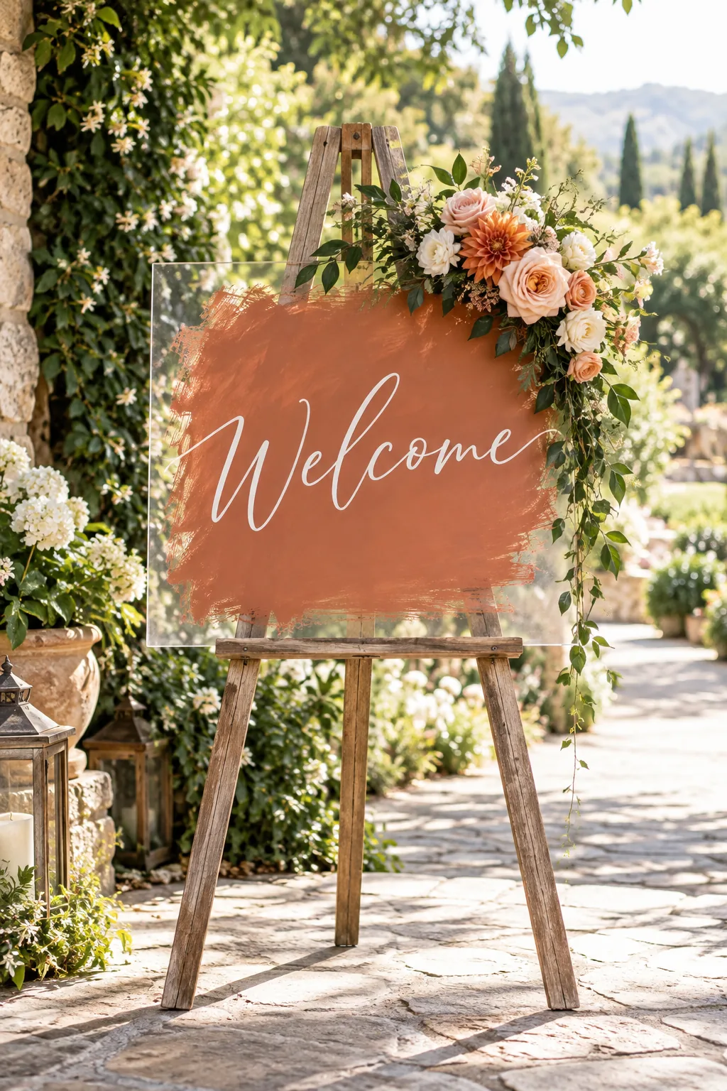
I learned the hard way at my own sister’s wedding that freehand lettering always slopes downward, so using a scaled template is absolutely non-negotiable. Before printing your downloaded template, run through these quick settings to ensure your lettering scales correctly across multiple pages.
Taking five minutes to trim those overlapping paper margins guarantees your spacing remains mathematically perfect before you start tracing. Precise alignment on the paper translates directly to a flawless, centered design on your final acrylic display.
Trimming the Printed Pages
Use a sharp craft knife and a metal ruler to slice off the unprinted white borders from each standard sheet of printer paper. Taping trimmed edges together creates a seamless, continuous word without awkward gaps between the letters.
Securing the Back-Taped Template
Position your assembled paper guide behind the acrylic sheet, leaving exactly two inches of clear space around the outer border. Taking the time to center the paper ensures your greeting sits perfectly in the middle of the board.
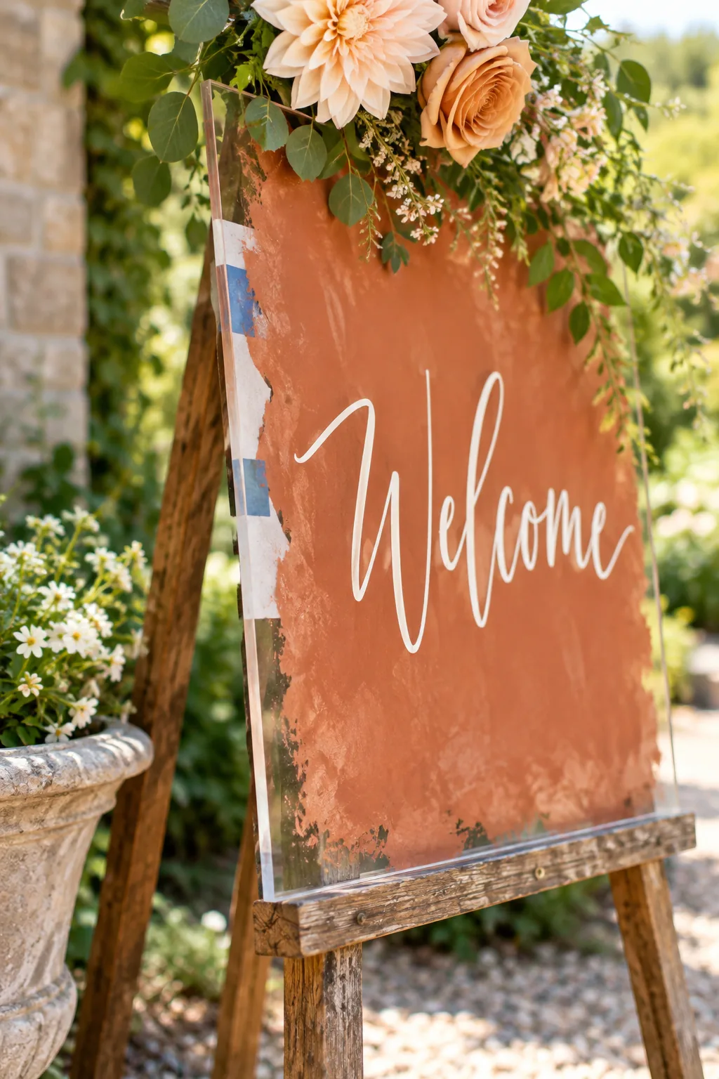
Secure it tightly with painter’s tape around the back edges so the template cannot shift while you are tracing the letters. Even a millimeter of movement during the tracing process will ruin the crisp alignment of your calligraphy.
Cleaning the Front Surface
Wipe the front of the acrylic with a microfiber cloth and a splash of rubbing alcohol to remove any oily fingerprints. A perfectly clean surface helps the paint pen adhere smoothly without skipping or beading up over invisible residue.
Tracing With an Oil-Based Paint Pen
Trace the front of the acrylic over the taped template using a steady hand and light, even pressure. Work from left to right to avoid accidentally dragging your palm through the freshly laid wet paint.
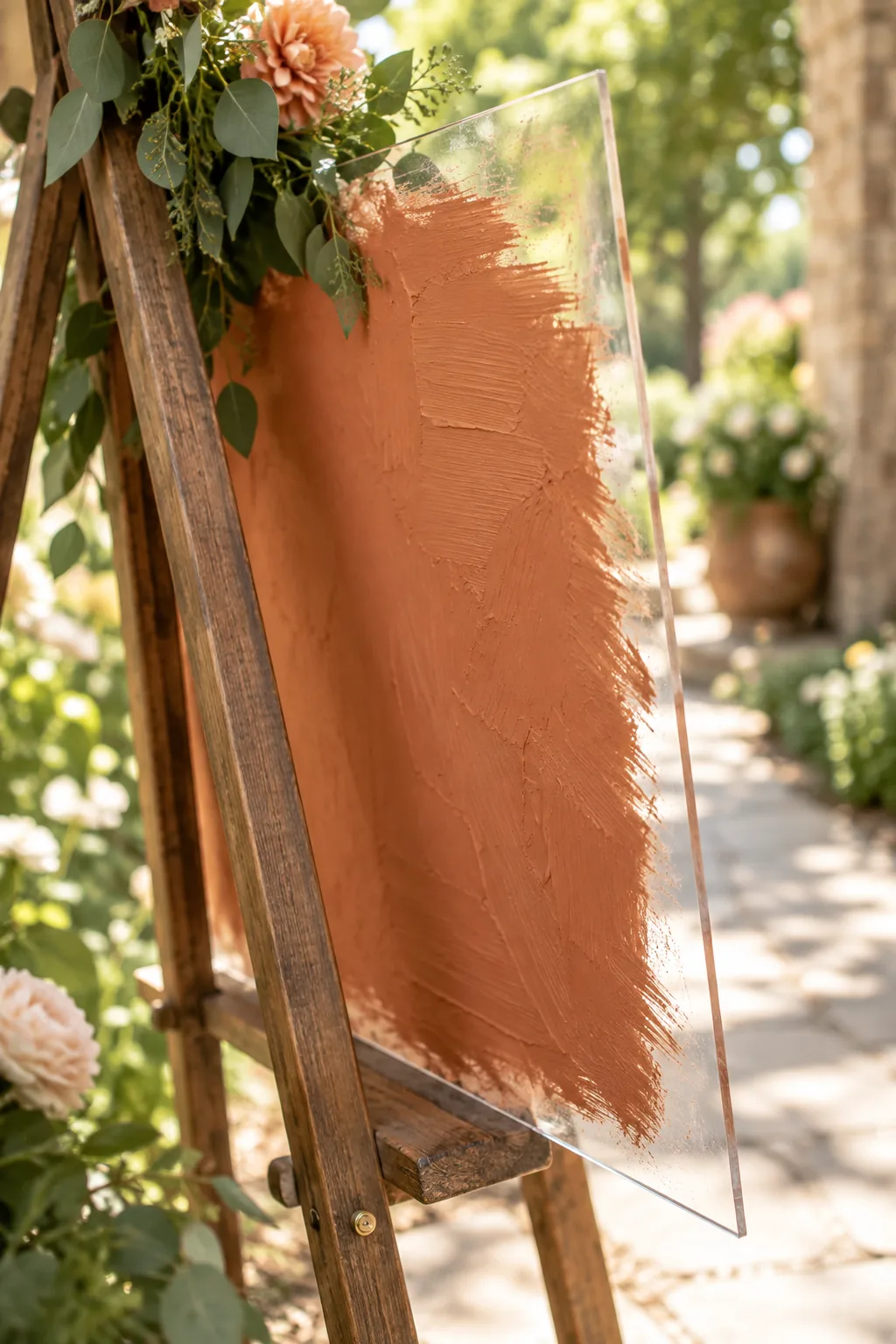
Use a medium-tip oil-based paint pen to ensure the white calligraphy is fully opaque. Choosing the wrong marker will leave your lettering streaky and highly vulnerable to smudging during transport to the venue.
Correcting these common habits ensures your lettering looks professionally printed rather than hastily drawn on the morning of the event. A little extra care during the tracing phase saves you from frustrating touch-ups later on.
Managing Paint Pen Flow
Keep a scrap piece of paper nearby to periodically depress the marker nib, which keeps the oil-based paint flowing smoothly. Pumping the pen directly on the acrylic often results in a disastrous puddle that ruins your neat lettering.
Fixing Minor Calligraphy Errors
If your hand slips while tracing a complicated script letter, let the wet oil-based paint dry completely before attempting to wipe it away. Smearing wet paint creates a cloudy haze that is incredibly difficult to remove from clear acrylic.
- Dip a pointed cotton swab in rubbing alcohol.
- Gently rub the dried mistake until it lifts.
- Wipe the area clean with a dry microfiber cloth.
This targeted removal method keeps the surrounding perfect letters completely intact so you never have to start over from scratch. Precision cleaning guarantees your acrylic remains pristine and free of frustrating white streaks.
Prepping the Back for Paint
Once the front lettering is entirely dry to the touch, carefully flip the heavy acrylic sheet over onto a soft, lint-free towel. This protective layer prevents the fresh calligraphy from scratching against your hard work surface.
Applying the Reverse Painted Back
Apply terracotta acrylic craft paint to the back of the sign using a wide, stiff bristle brush to create rich texture. Sweeping, overlapping strokes give the background that highly sought-after artisanal, hand-painted aesthetic.
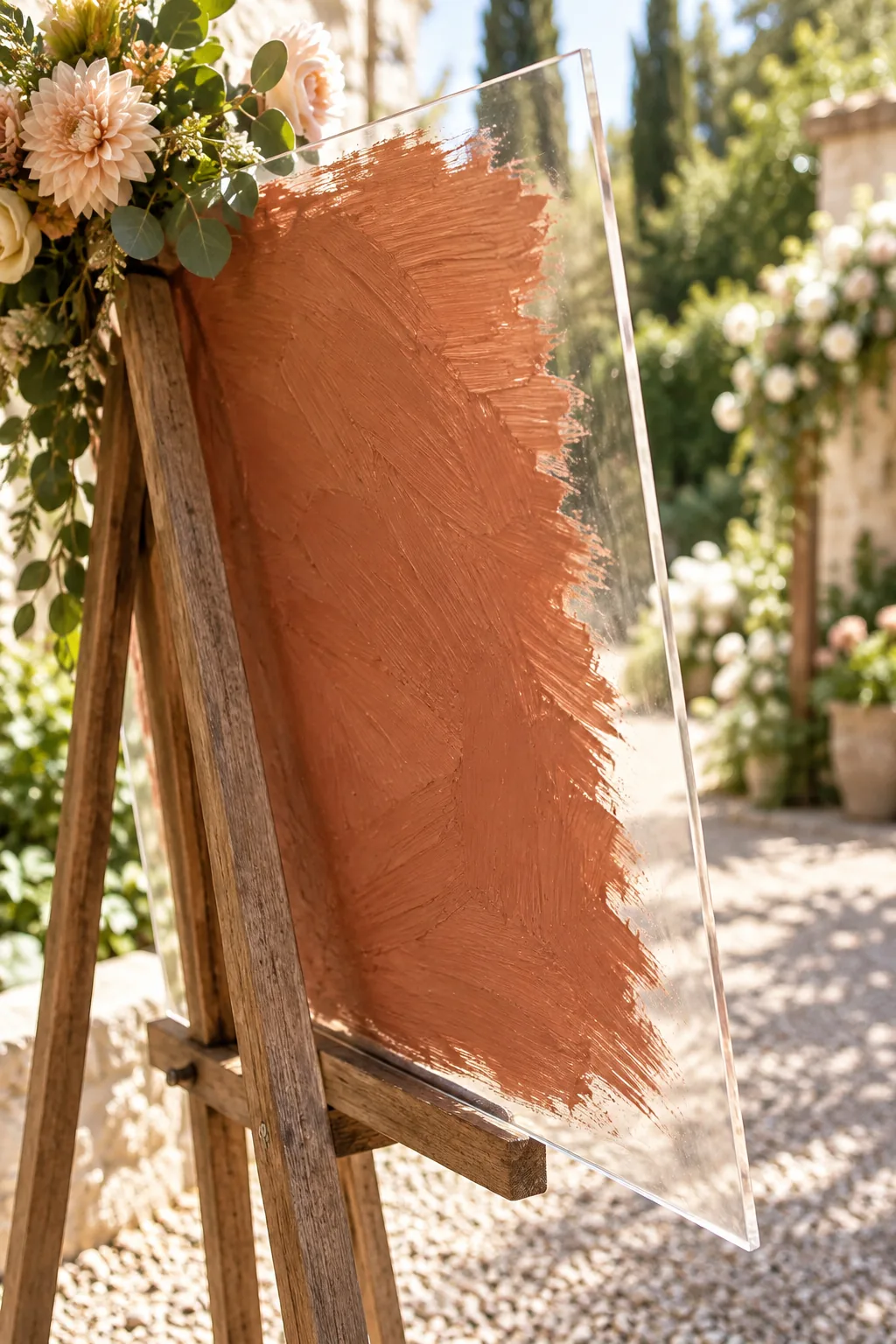
Leave a two-inch unpainted border around the edges to create a modern floating effect that highlights the clear acrylic material. This transparent frame draws the eye inward and makes the terracotta color pop brilliantly.
Adding a Second Paint Coat
Wait twenty minutes for the first layer to become tacky, then brush on a second coat in the opposite direction to block out the light. Cross-hatching the layers builds true opacity so the easel legs will not show through.
Curing the Painted Background
Move the finished piece to a safe, dust-free room where the brushed acrylic paint can cure undisturbed for a full 24 hours. Proper curing hardens the thick acrylic medium so it can withstand handling.
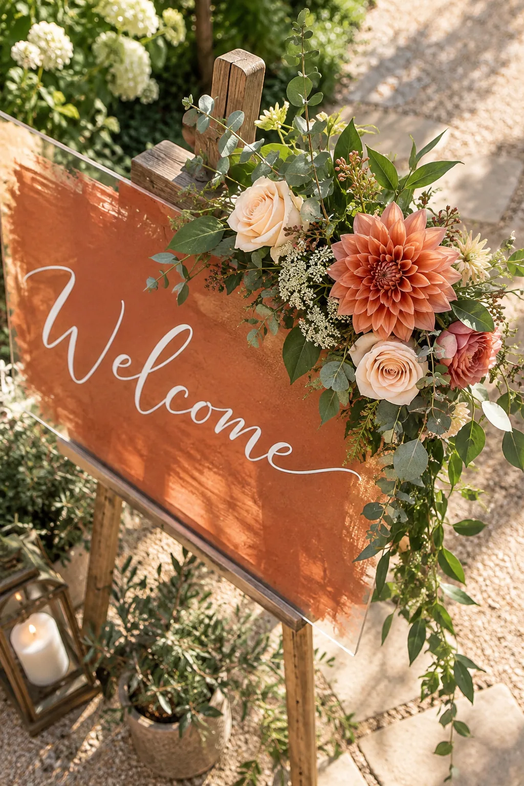
When I rushed this step for a backyard workshop, the thickest brush strokes dented immediately, so giving it a full day prevents peeling. Patience here guarantees your beautiful texture survives the chaotic packing process.
Packing the Sign for Transport
Wrap the fully cured sign in a clean moving blanket, ensuring nothing rigid rubs against the painted terracotta backing during the car ride. Secure the blanket with bungee cords so it cannot slip off while navigating bumpy roads.
Selecting the Right Easel
Choose a sturdy wooden easel with adjustable support pegs that can safely hold the substantial weight of a thick cast acrylic sheet. Flimsy wire stands often buckle under the heavy plastic, risking a disastrous crash during the ceremony.
Hiding the Zip-Tied Floral Foam
Anchor your blooms securely to the upper corner by wrapping heavy-duty zip ties around a small block of wet floral foam. Cinching the ties tightly to the wooden easel leg prevents the arrangement from sliding down the frame.
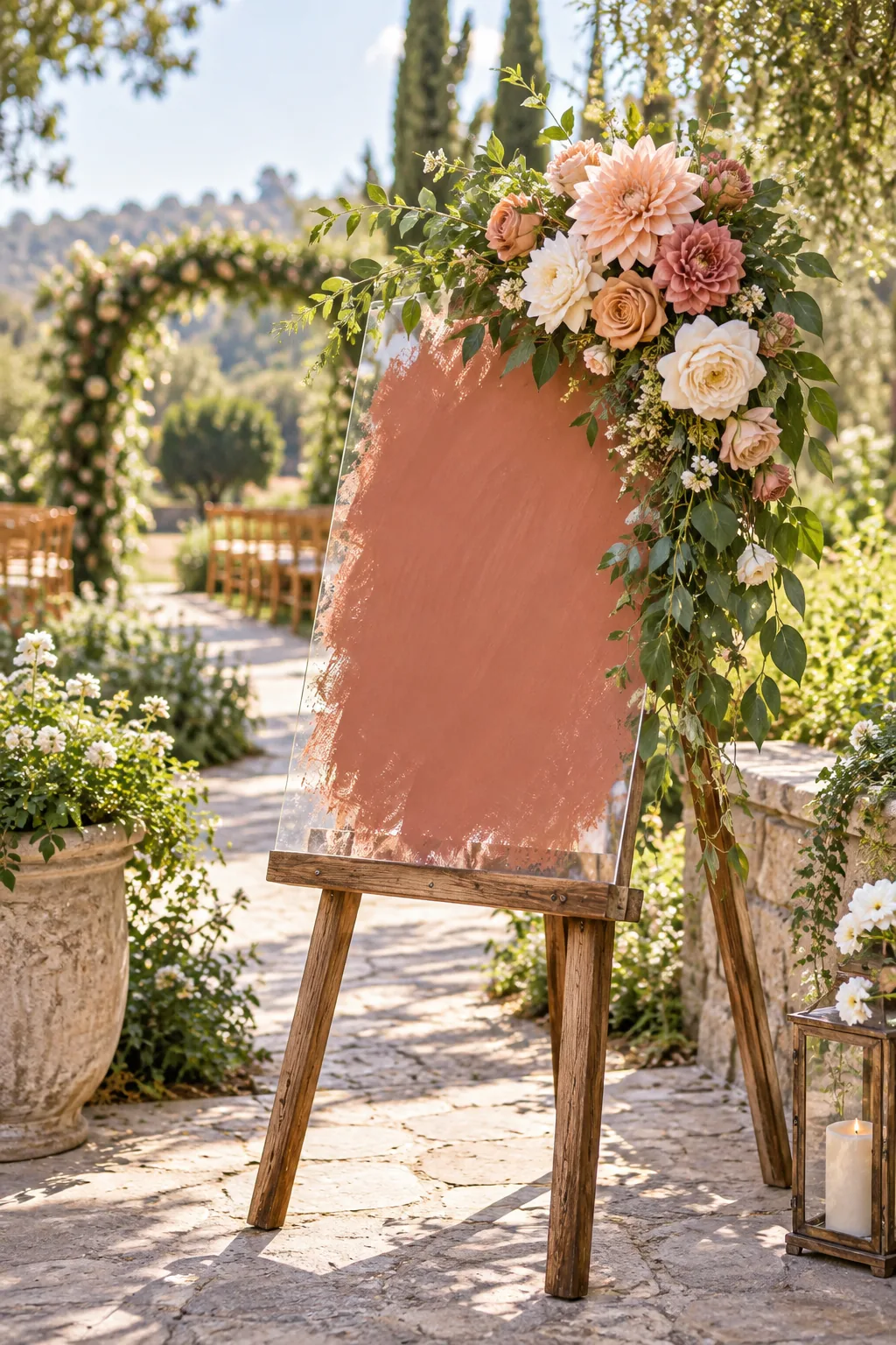
Insert your flowers directly into the foam cage to conceal the mechanical base completely from your arriving wedding guests. A dense cluster of blooms creates a magical, floating illusion that softens the modern acrylic edges.
Attaching the Corner Blooms
Start by inserting your largest focal flowers into the foam first, then fill in the empty gaps with textured greenery and smaller filler stems. Building the shape outward guarantees a lush, balanced arrangement that frames the lettering beautifully.
Positioning the Easel for Visibility
Set up the wooden easel in a shaded area of the venue to prevent harsh sunlight from creating a blinding glare on the glossy acrylic. Soft, indirect lighting allows your guests to actually read the beautifully painted welcome message.
More Painted Acrylic Sign Ideas
Explore these different color palettes and easel styles to find the perfect match for your wedding theme.
Modern Minimalist Black and Gold: A stark black brushed background creates striking contrast against a delicate gold metal stand.
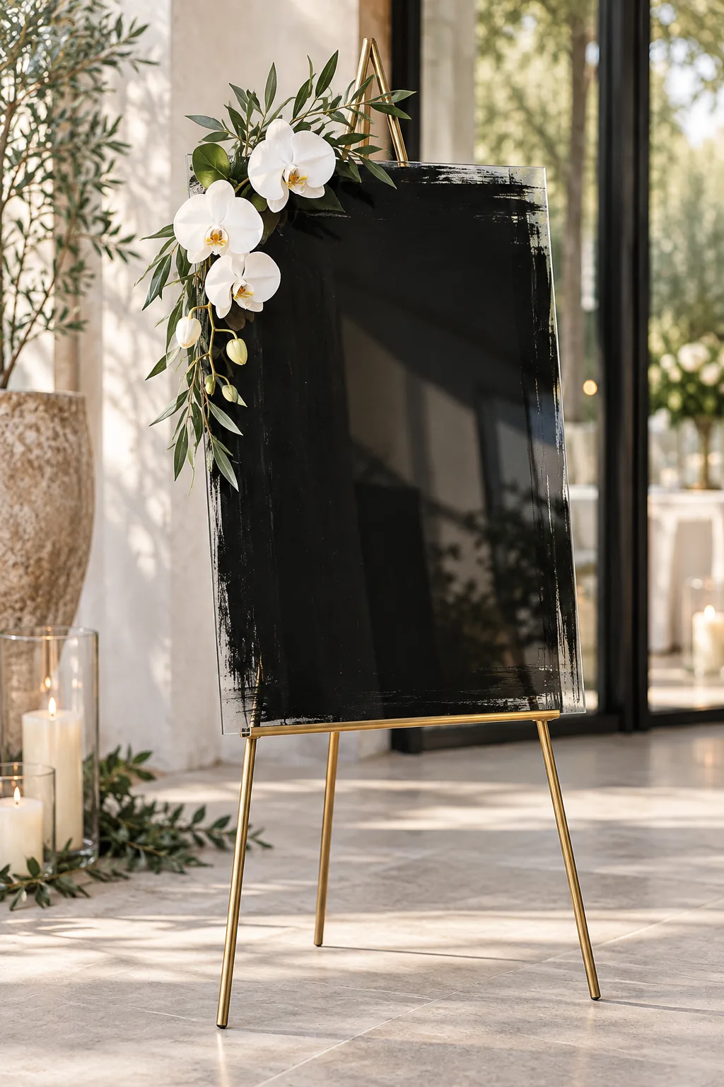
Boho Desert Sand Arch: Choose an arch-shaped acrylic sheet and surround it with dried pampas grass for a relaxed bohemian vibe.
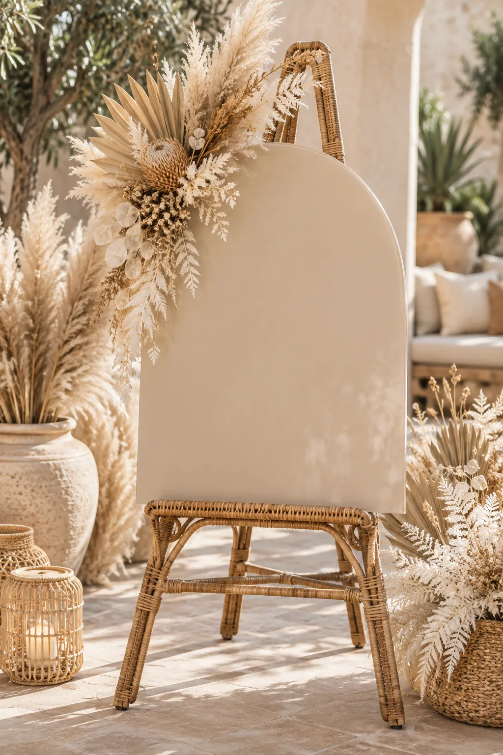
Romantic Garden Blush and Copper: Soft blush pink paint pairs beautifully with a warm copper stand and overflowing, romantic garden roses.
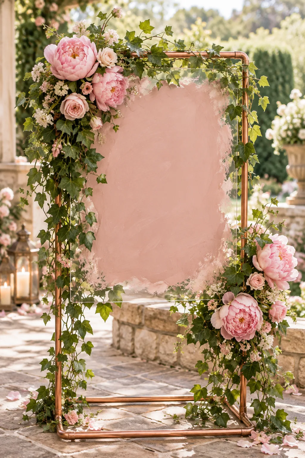
Moody Industrial Dark Grey: Deep charcoal paint and a matte black easel give this welcome sign a sophisticated, moody edge.
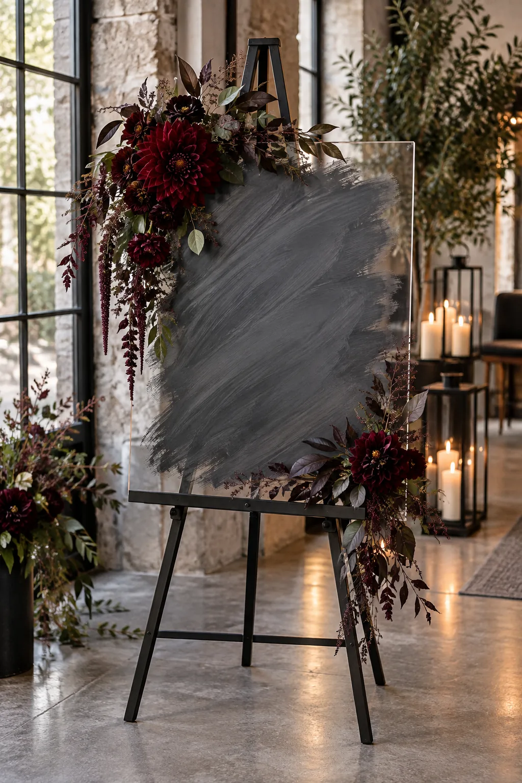
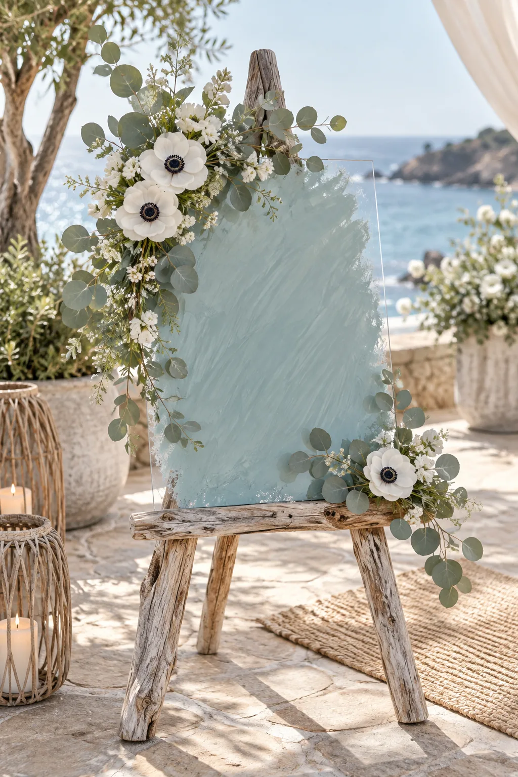
Coastal Chic Sea-Glass Blue: Bring in ocean tones with a sea-glass blue background displayed on a beautifully weathered driftwood easel.
Positioning on the Wooden Easel
Carefully lift the finished welcome sign onto the leveled pegs, making sure the clear unpainted border rests evenly against the wood. Double-check that the floral arrangement does not obscure any part of the couple’s names or the wedding date.
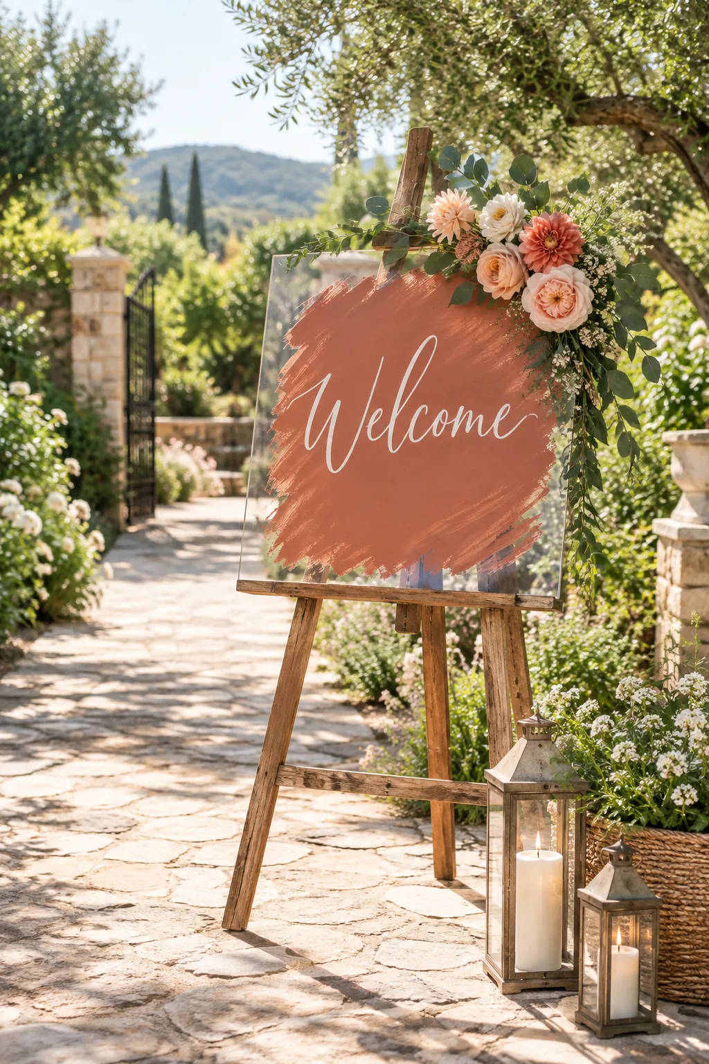
Adjust the back leg of the easel outward to create a wide, stable base so the display remains upright in a light outdoor breeze. A secure setup lets you enjoy the celebration without worrying about your beautiful handiwork tipping over.