
Spanish Revival Meets Punk: Library
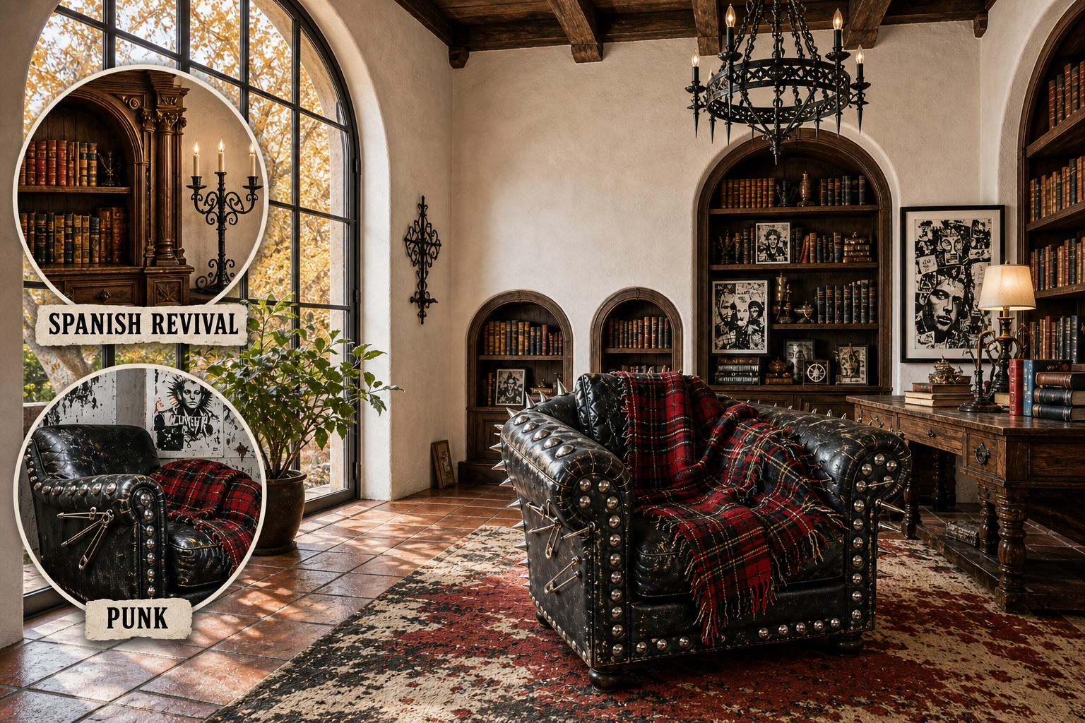
The heavy, aristocratic formality of historic Spanish Revival architecture naturally clashes with the raw, anti-establishment chaos of DIY Punk. Yet, this library resolves the contradiction by grounding aggressive hardware and distressed textiles within a warm, carefully carved-wood architectural shell.
Grounding the Architecture
Historic architecture provides a commanding foundation that prevents rebellious decor from feeling like a chaotic teenager’s bedroom. We start with heavy, carved walnut and smooth stucco to establish undeniable permanence, anchoring the room in a distinctly aristocratic tradition.
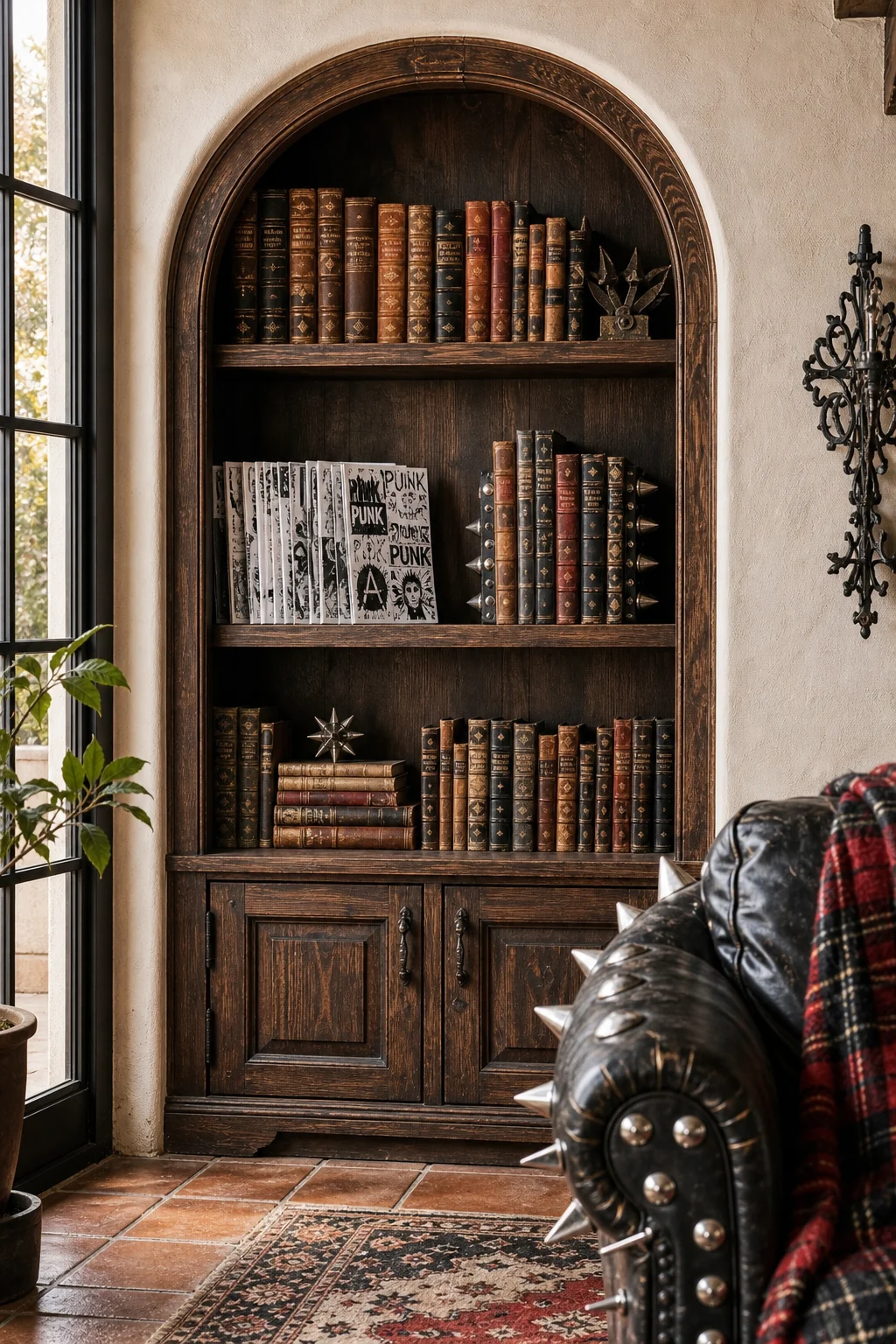
Notice how the deep arched alcoves embrace the chaotic media without losing their structural dignity. Warm white stucco and dark ceiling beams dictate the physical boundaries, containing the visual noise while providing a beautifully textured, historic canvas for future rebellion.
By preserving the integrity of the architectural envelope, we create a safe zone for radical experimentation. The ornate, traditional backdrop ensures that every subsequent rebellious design choice feels like a deliberate, authored intervention rather than a haphazard, uncoordinated design accident.
Introducing Rebellious Energy
With the architectural shell secured, aggressive accents can safely take center stage. Distressed black leather and heavy metal studding introduce a necessary friction against the aristocratic backdrop, ensuring the space feels intensely lived-in rather than preserved under sterile museum glass.
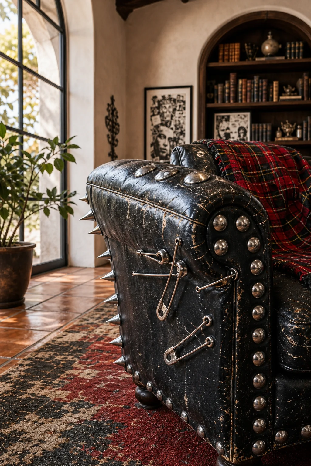
The seating must carry the rebellious weight of the room. We rely on distressed black leather and exposed metallic zippers to inject raw energy into the historic space, deliberately disrupting the quiet formality of the classic terracotta floor tiles.
- Choose seating with highly visible wear to perfectly echo the anti-establishment, lived-in ethos of the punk movement.
- Prioritize oversized chrome studs and heavy spikes over delicate, traditional brass nailheads on all leather upholstery.
- Incorporate exposed zippers, oversized buckles, or safety-pin hardware directly onto the fabric of the main reading chairs.
- Select matte or heavily distressed finishes to completely avoid a cheap, factory-new appearance in the finished room.
Forging the Connection
Successful tension relies entirely on a shared material language. The weathered, centuries-old patina of antique Spanish wood perfectly mirrors the distressed, anti-establishment ethos of Punk culture, proving that these two seemingly opposed worlds actually share a deep appreciation for imperfection.
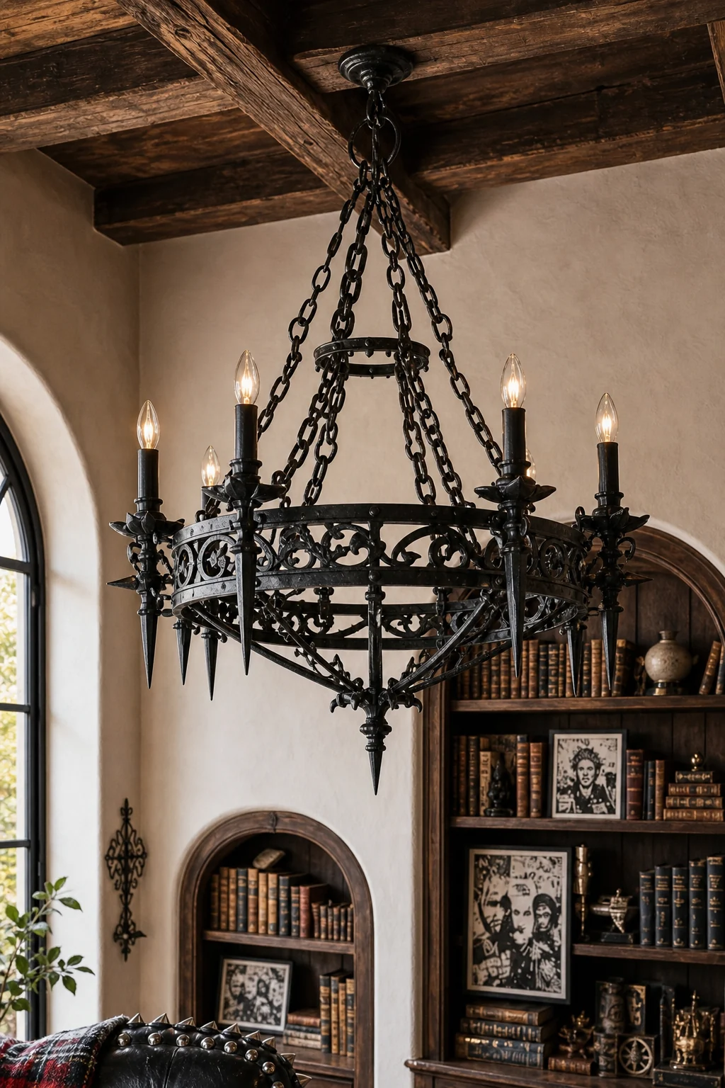
Traditional wrought iron scales down effortlessly into aggressive spikes and studs. This shared love of heavy ironwork bridges the gap between aristocratic scrollwork and rebellious hardware, creating a seamless visual transition from the vaulted ceiling fixtures down to the furniture.
When the hardware speaks the same rugged language, the eye accepts the contradiction. A spiked chandelier no longer feels like a novelty when its raw iron finish perfectly matches the historic clavos on the heavy library door and solid metal bookends.
Assembling the Space
Assembling the focal point requires distinct, uncompromising roles for each aesthetic. The seating vignette merges a rebellious centerpiece with a historic anchor, united by a strict palette of deep crimson, matte black, and warm white.
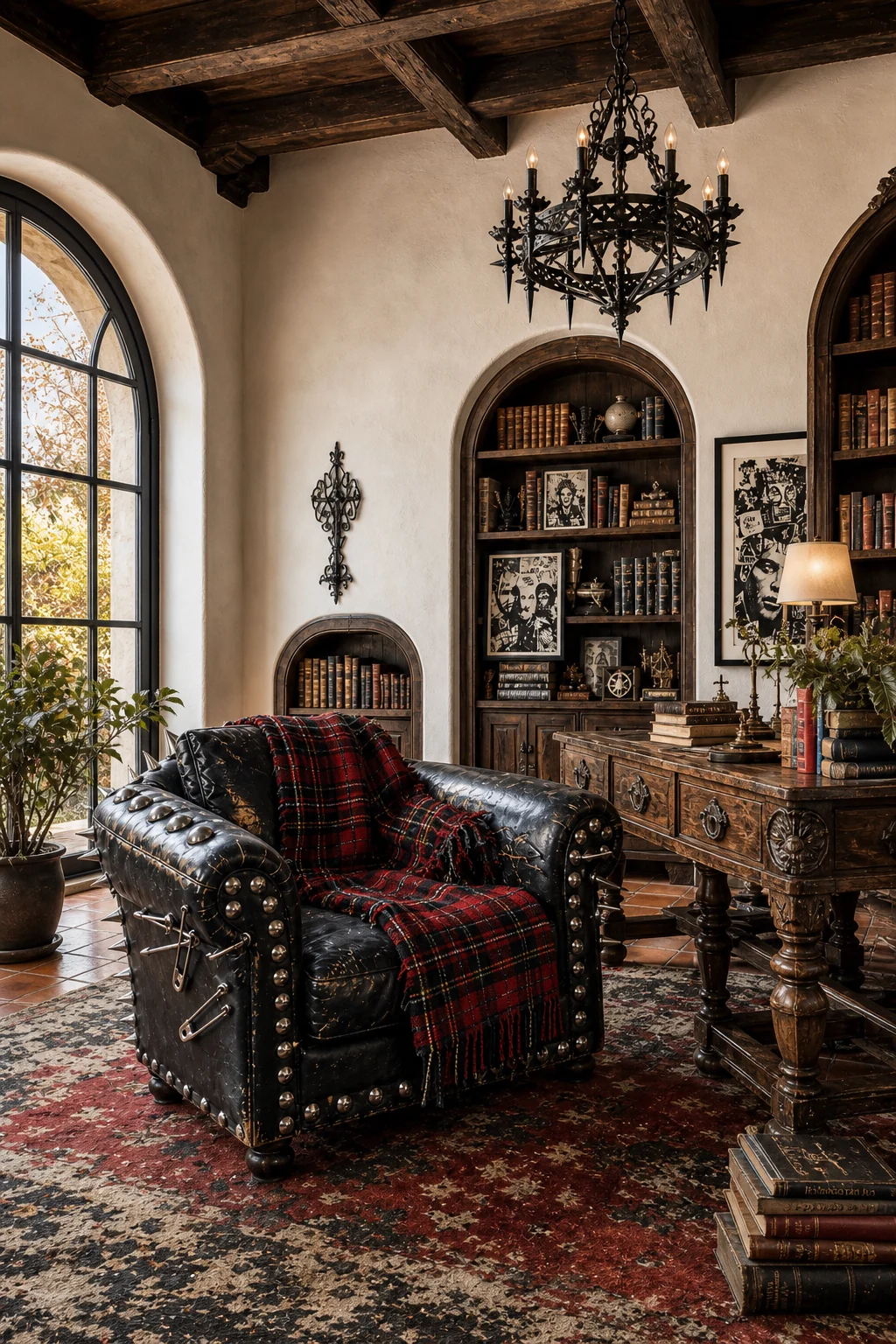
We assign specific design layers to maintain this delicate balance. Spanish Revival controls the perimeter and the heavy foundational pieces, while Punk dictates the tactile touchpoints, ensuring the user interacts directly with the rebellious elements while surrounded by historic architecture.
| Layer | Spanish Revival Role | Punk Role | Bridge Decision |
|---|---|---|---|
| Shell | Warm white stucco and dark walnut beams | Graphic black-and-white zine art | High-contrast visual weight |
| Large Furniture | Heavy carved wood side tables | Distressed leather club chairs | Weathered, tactile surfaces |
| Textiles | Antique terracotta floor tiles | Frayed red and black tartan | Deep, earthy crimson tones |
| Lighting | Classic wrought-iron chandeliers | Sharp, spiked metal silhouettes | Raw, unpolished ironwork |
| Accents | Antique leather-bound books | Bleach-splattered vintage rugs | A shared embrace of imperfection |
This strict division of labor prevents the room from descending into visual chaos. By isolating the rebellious graphics to the art and the historic carvings to the wood, the two styles remain distinct, powerful, and perfectly balanced within the central reading space.
Illuminating the Contrast
Generous daylight is crucial to keep dark leather and heavy wood from turning gloomy. Bright, balanced editorial exposure lifts the midtones, ensuring the graphic contrast feels intentional, aspirational, and highly tactile rather than neglected, muddy, or overwhelmingly dark and oppressive.
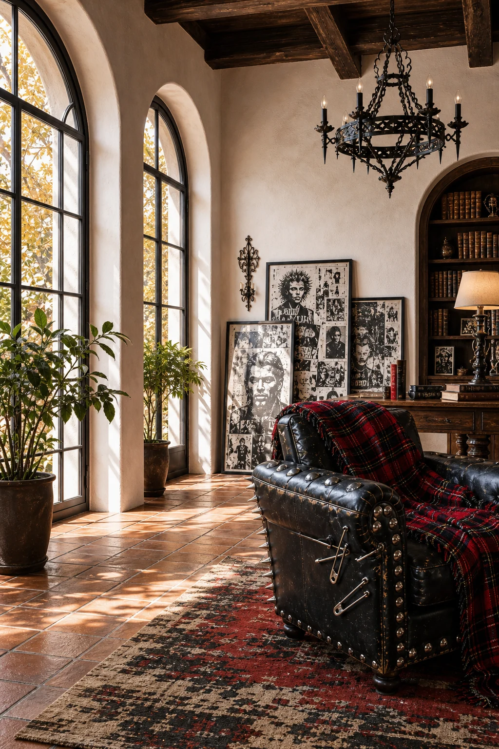
We leave the tall arched windows uncovered to maximize natural light. The golden autumnal sun highlights the tactile texture of the stucco, softening the aggressive graphic collage art and revealing the rich, nuanced patina of the dark leather seating.
- Leave tall arched windows entirely uncovered to maximize the flow of natural autumnal daylight into the room.
- Position dark seating directly where the afternoon sunlight can reveal its rich, weathered leather patina over time.
- Use warm bulbs in all fixtures to beautifully highlight the tactile, uneven texture of the historic stucco walls.
- Avoid harsh overhead spots that flatten the intricately carved wood details of the room’s historic architectural shell.
Curating the Surfaces
Surface styling is where the narrative becomes intensely personal. Leaning framed, high-contrast collage art against historic leather-bound books creates immediate, tactile friction on every shelf, console, and side table, bringing the rebellious energy right up to eye level for guests.
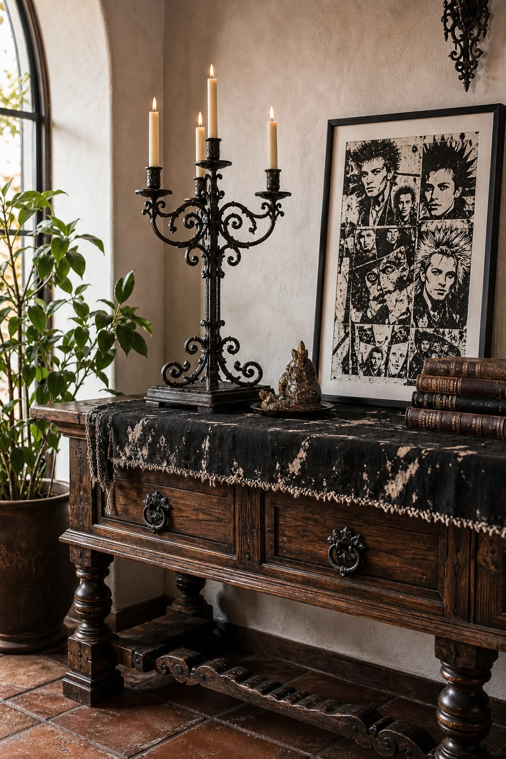
To successfully style these surfaces, focus on high-contrast visual anchors. We mix classic iron candelabras with aggressive, spiked metal bookends, ensuring every vignette contains a miniature version of the room’s overarching architectural tension.
- Frame raw, DIY zine posters in simple black galleries to instantly elevate their visual importance on the shelves.
- Mix classic wrought-iron candelabras with aggressive, spiked metal bookends to maintain the stylistic tension across all surfaces.
- Drape frayed tartan wool throws casually over rigid wooden chairs to break up the formal, aristocratic architectural lines.
- Display antique leather-bound books alongside heavily distressed, bleach-splattered vintage textiles for maximum material contrast and tactile interest.
Expanding the Logic
This logic easily translates beyond a grand, high-ceilinged library. In a smaller study, hallway, or transitional zone, you can apply the exact same material tension without needing soaring ceilings or massive, built-in architectural shelving to successfully anchor the space.
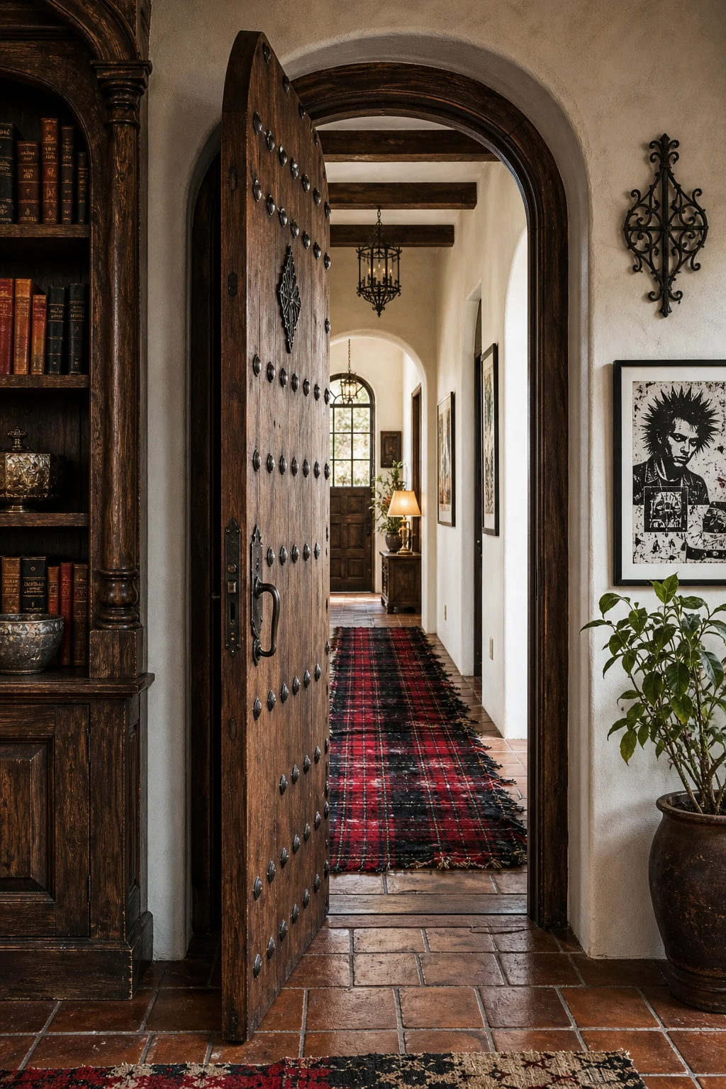
A transitional space requires fewer elements to make a profound impact. We pair a heavy, traditional wooden door with a frayed red tartan runner rug, instantly signaling the stylistic collision to anyone walking through the historic threshold of the home.
By focusing on the friction between the floor covering and the furniture, even a narrow corridor becomes a compelling design statement. The key is maintaining the strict color palette of crimson, black, and white to unify the disparate elements beautifully.
Achieving True Balance
The greatest risk is creating a space that feels like a themed movie set. True balance requires immense restraint, ensuring neither the historic gravity of the architecture nor the rebellious energy of the decor completely overwhelms the other in practice.
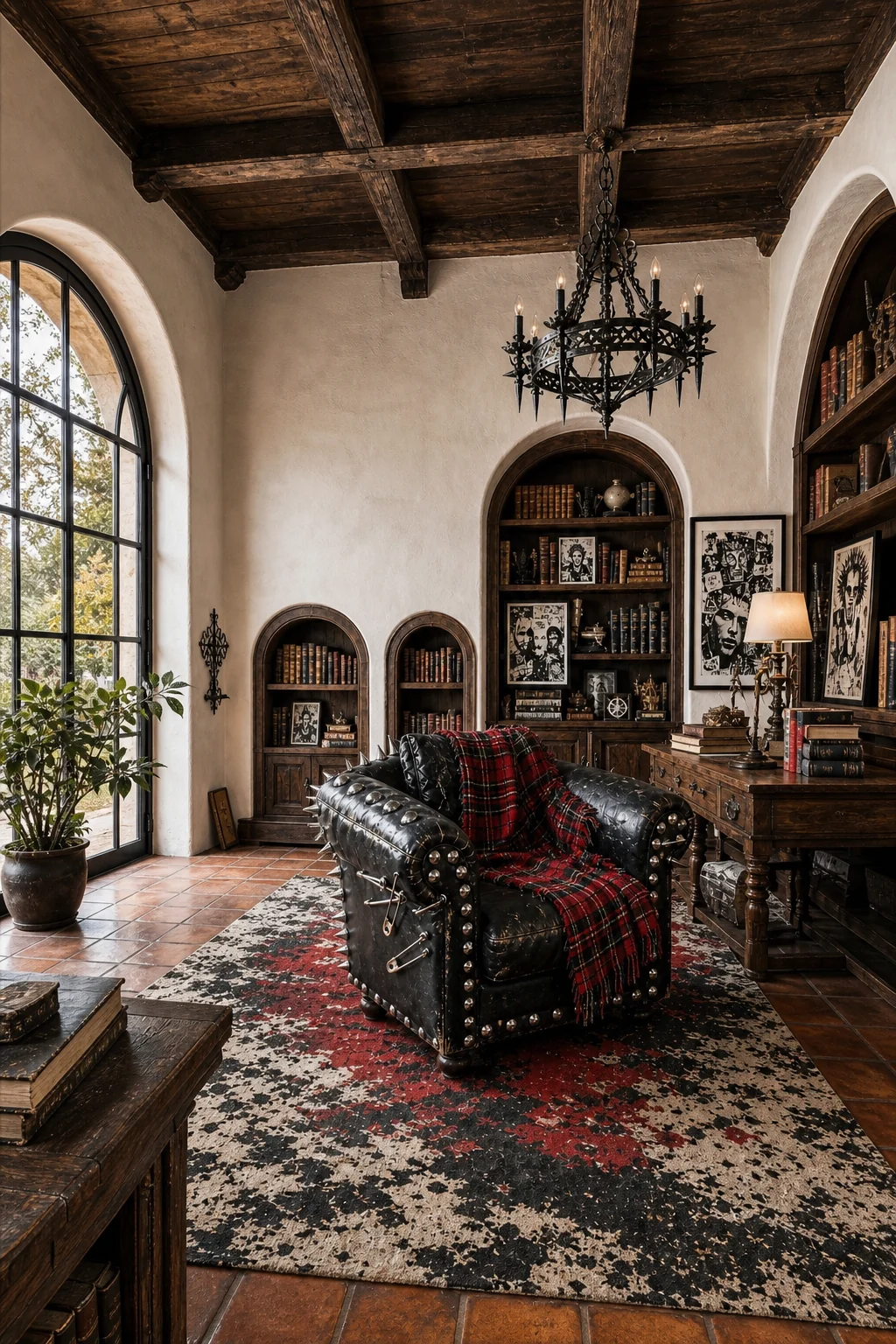
Avoid pristine, factory-new leather at all costs, as it instantly ruins the illusion. By strictly enforcing the boundary between the Spanish Revival shell and the Punk decor, the contradiction resolves into one beautifully authored, cohesive room.
- Avoid pristine, factory-new leather upholstery; it completely ruins the carefully constructed, lived-in illusion of the space.
- Do not cover every wall in graphic art; leave the warm white stucco bare to breathe naturally.
- Never use lightweight plastic hardware; insist on raw, heavy metal for all visible fixtures and structural studs.
- Restrain the color palette strictly to crimson, black, and white to prevent visual exhaustion and maintain focus.