
Hanok Meets Gothic: Reading Nook
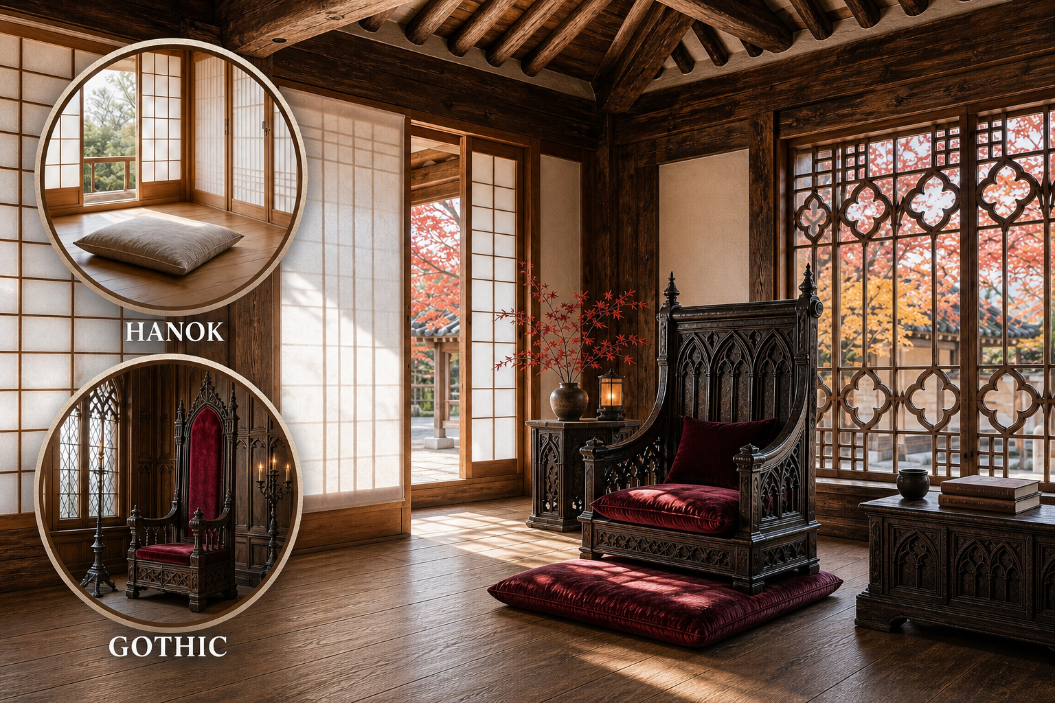
Hanok architecture relies on horizontal grounding and breathable minimalism, while Gothic design demands vertical aspiration and heavy ornamentation. We resolve this specific contradiction by letting Hanok dictate the architectural shell, while Gothic informs the carved detailing and rich textiles perfectly.
Grounding the Architecture
Traditional Korean architecture provides a serene, highly structured horizontal foundation for the entire space. Exposed interlocking pine ceiling beams and low wooden floors establish a breathable, minimalist shell that prevents heavier, darker historical additions from feeling oppressive, overly cluttered, or visually exhausting.
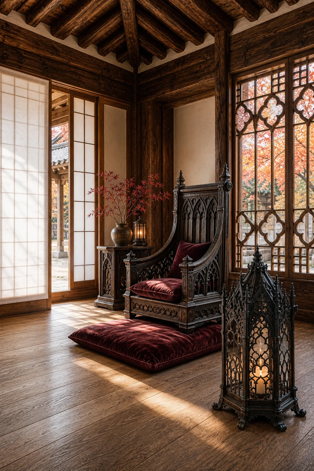
This bright structural envelope acts as a quiet, highly intentional canvas for the room. By keeping the perimeter completely unadorned, the breathable minimalist shell gives darker, more complex historical elements the necessary space to exist without overwhelming the eye or the architecture.
Maintaining this strict discipline at the architectural level allows you to take much greater risks with the furnishings. The empty space above the seating area becomes a crucial design feature, balancing the intense visual density of the carved wooden pieces resting below.
Introducing Ornate Weight
Gothic design thrives on vertical aspiration and intricate ornamentation that commands immediate visual attention. We introduce this intensity strictly through furniture and textiles, allowing heavily carved motifs to stand out sharply against the quiet, naturally illuminated background of the traditional room.
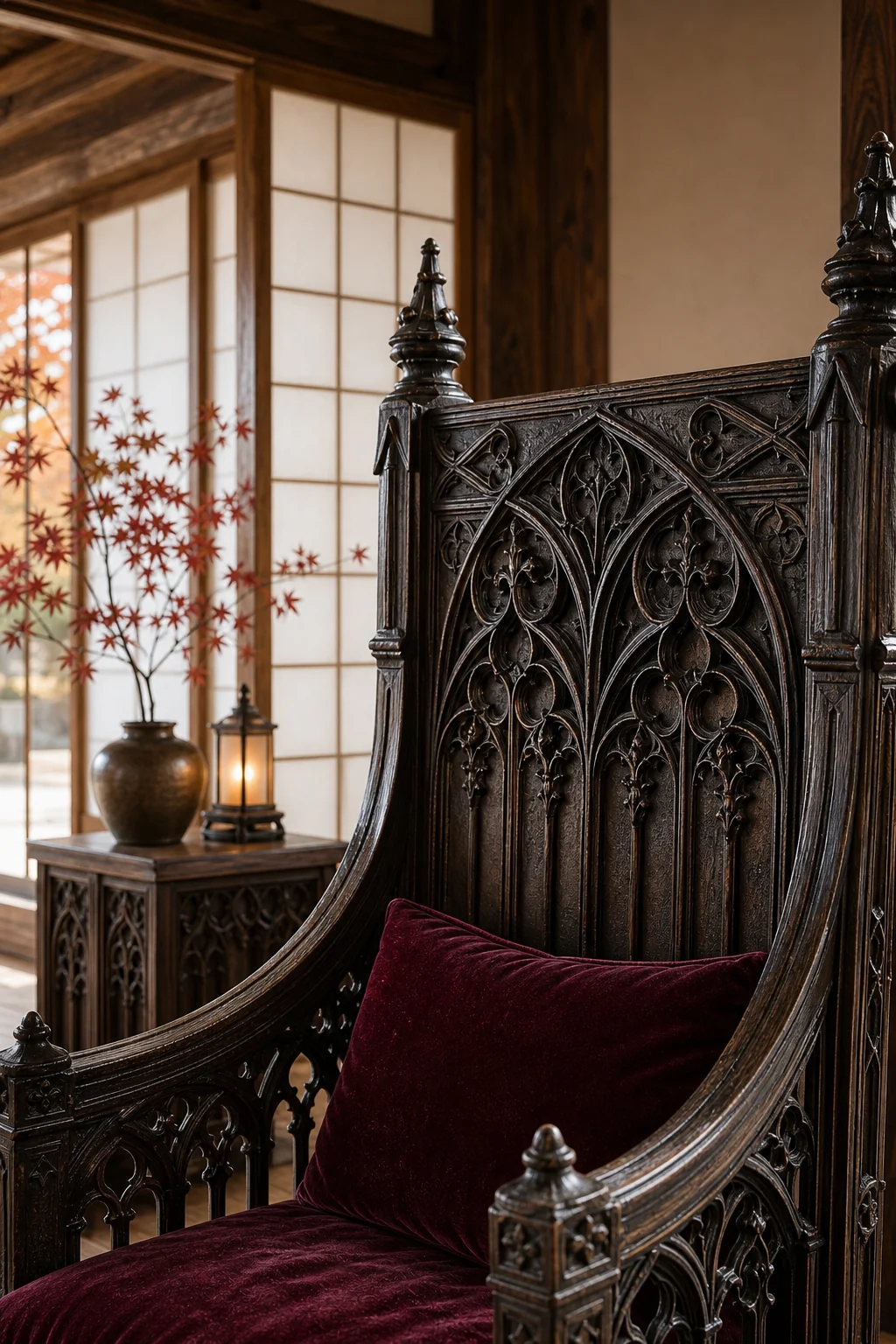
Notice how the intricate woodwork commands immediate attention when placed against a simple paper screen. To properly ground these heavily carved motifs, their visual weight must be carefully managed through specific upholstery choices and highly deliberate furniture placement strategies throughout the room.
- Limit heavy wood carvings to primary seating to prevent the space from feeling like a cluttered antique shop.
- Use deep burgundy velvet for all upholstery to introduce a rich, tactile contrast against the smooth traditional pine.
- Keep furniture silhouettes low to respect the traditional floor-level perspective while maintaining their imposing, dramatic ornamental presence.
Bridging the Timbers
A beautifully shared material palette of dark, aged timber unifies these contrasting historical worlds. The transition happens seamlessly when traditional geometric grids subtly incorporate pointed-arch tracery motifs, proving that distinct architectural languages can converse beautifully when sharing a consistent, rich finish.
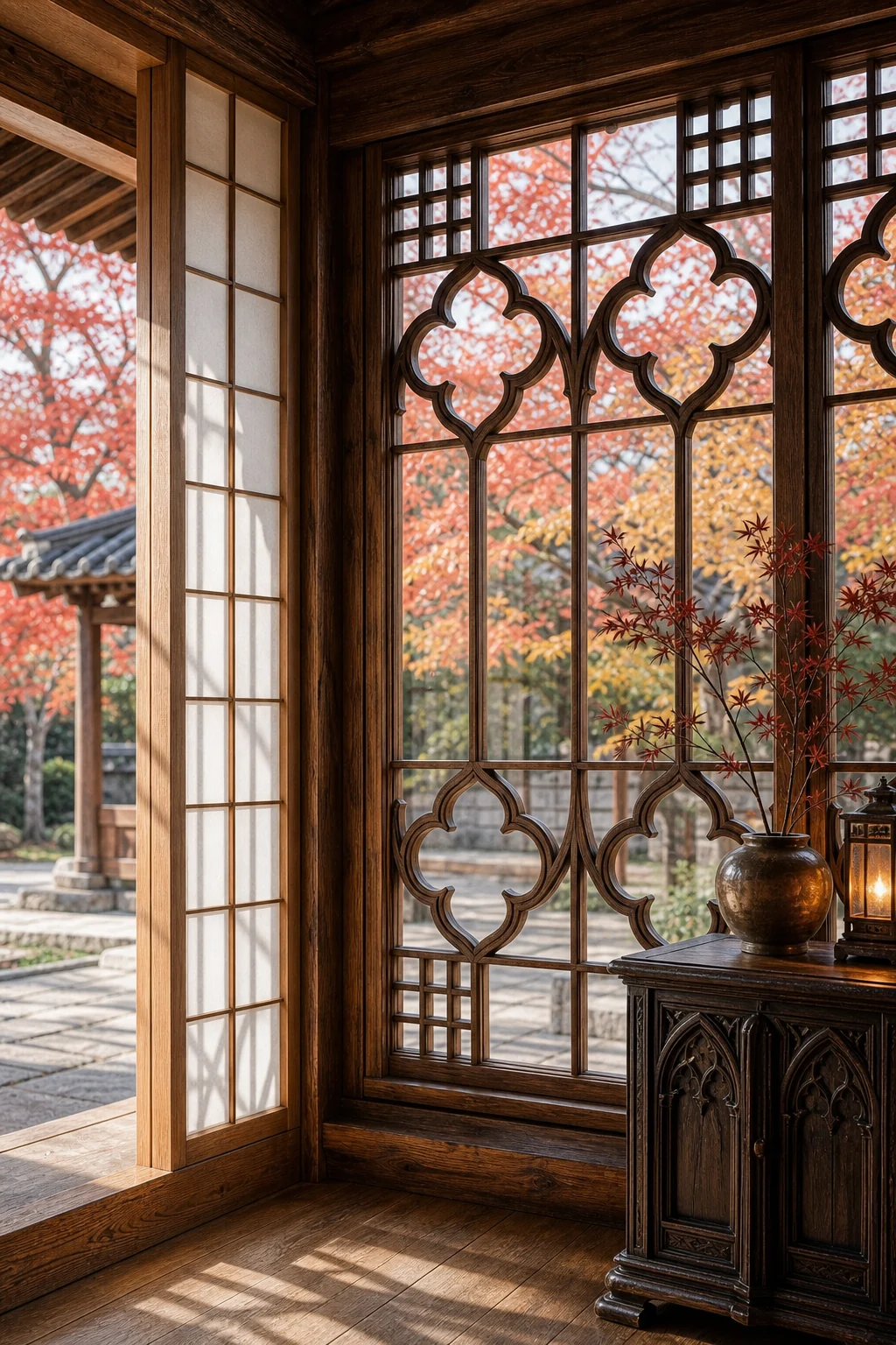
This custom woodwork perfectly demonstrates how to blend distinct historical languages without creating visual friction. The dark aged timber acts as the ultimate diplomat, making the intricate Gothic geometry feel entirely native to the Korean structural framework and the sliding paper doors.
Absolute consistency in the wood grain prevents the eye from perceiving the two styles as a mismatched collection. When the heavy European carvings share the exact same tonal depth as the traditional Korean lattices, the entire room feels incredibly deliberate and resolved.
Anchoring the Reading Nook
Constructing the core seating area requires carefully balancing ornate texture with floor-level living traditions. A low-slung, heavily carved reading chair rests on rich floor cushions, respecting traditional heights while delivering the dramatic visual presence expected from historical European furnishings and architecture.
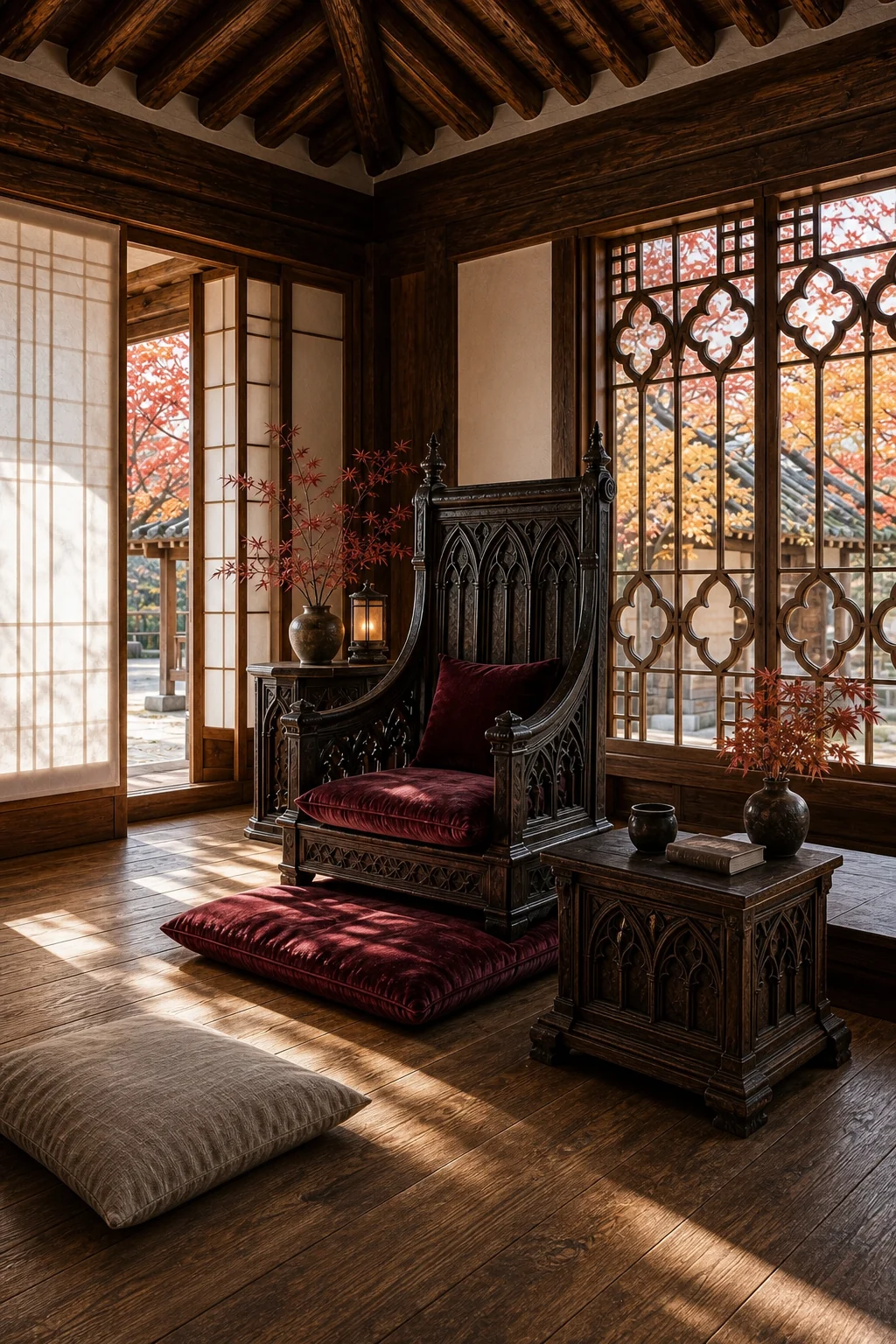
Lowering the overall center of gravity is the absolute secret to mastering this space. By combining floor-level proportions with heavy European carving, the seating vignette resolves the room’s central tension perfectly, offering comfort without sacrificing the dramatic, highly curated aesthetic.
| Design Layer | Hanok Role | Gothic Role | Bridge Decision |
|---|---|---|---|
| Architectural Shell | Exposed pine beams and low wooden floors | Pointed-arch motifs and vertical lines | Dark, aged timber material palette |
| Large Furniture | Floor-level seating proportions | Heavily carved dark oak details | Low-slung ornate reading chairs |
| Soft Textiles | Flat, unadorned floor cushions | Rich burgundy velvet upholstery | Tactile, deep-toned floor seating |
| Room Lighting | Paper-filtered natural daylight | Wrought iron accents and shadow | Soft daylight balancing dark woods |
| Small Accents | Minimalist, breathable placement | Heavy, dramatic geometric shapes | Intentional, sparse placement of items |
This deeply layered approach ensures neither historical style dominates the other. The architecture remains quietly supportive, while the furniture provides the necessary tactile richness, resulting in a reading nook that feels both historically grounded and entirely unique to this specific architectural home.
Filtering the Drama
Gothic interiors often lean into gloomy shadows, but this specific space requires bright, aspirational illumination. Translucent mulberry paper sliding doors filter natural daylight, softening the heavy oak furniture and preventing the dark velvet upholstery from swallowing the room’s essential ambient light.
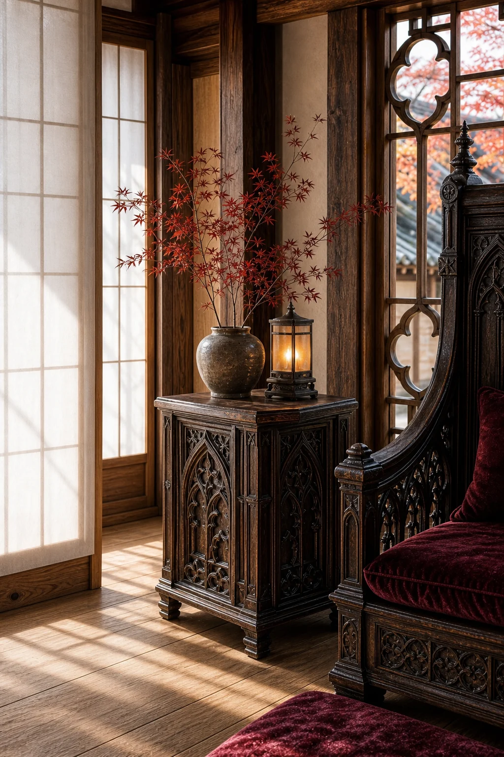
The traditional paper screens act as a massive, gentle softbox for the entire room. This paper-filtered natural daylight lifts the midtones of the dark oak, ensuring the intricate carvings are clearly visible rather than lost in deep, cinematic, or gloomy shadows.
- Maximize natural light through traditional paper screens to keep the dark timber from feeling visually oppressive or overly heavy.
- Lift midtones to highlight intricate wood grain, allowing the carved details to serve as the primary texture and focus.
- Avoid heavy drapery that blocks the sun, relying entirely on the sliding doors for essential privacy and light control.
Curating the Surfaces
Surface styling must remain remarkably restrained to properly honor the minimalist architectural shell. A carefully chosen mix of wrought iron accents and traditional ceramics provides the necessary visual tension without cluttering the visual field or distracting from the primary architecture and furniture.
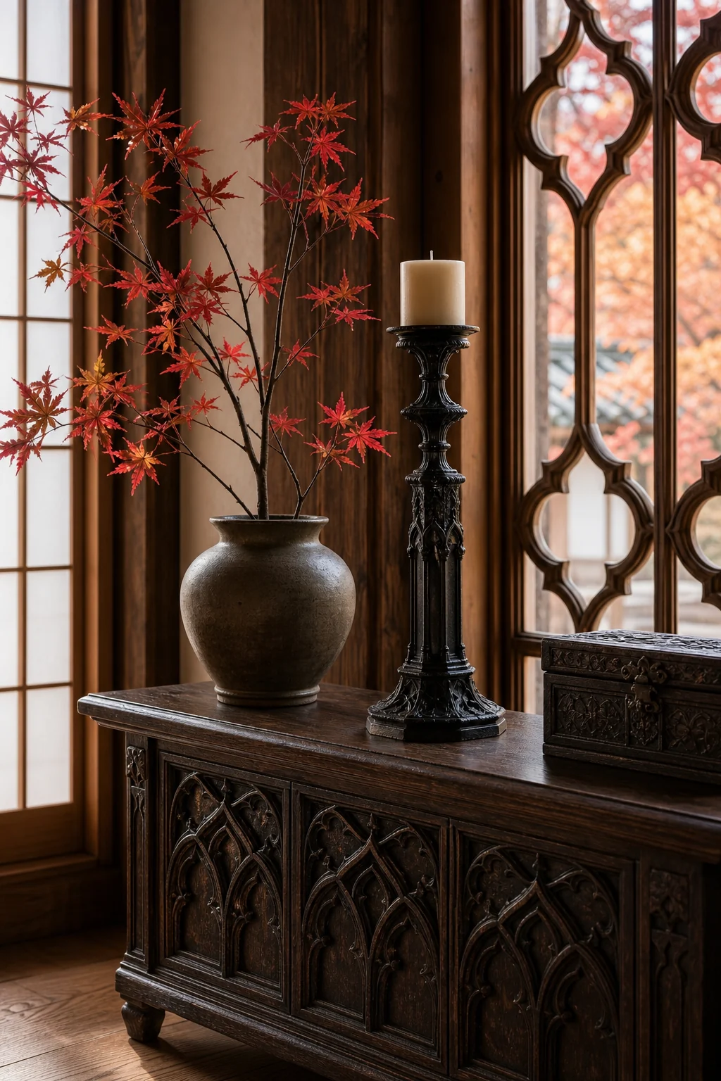
Every single object must definitively justify its exact placement on these limited surfaces. A heavy wrought iron accent paired with an unglazed ceramic vase creates a localized micro-tension that perfectly echoes the broader architectural strategy of the entire reading nook space.
Always resist the urge to fill every available tabletop with small decorative items. The negative space surrounding your chosen ceramics and ironwork is just as important as the pieces themselves, reinforcing the serene, horizontal grounding that makes this specific aesthetic function beautifully.
Transitioning Through Spaces
Translating this specific logic beyond a single corner means treating thresholds with extreme care. A simple passage framed by traditional pine can beautifully house a single, striking piece of carved dark oak, teasing the aesthetic before you fully enter the room.
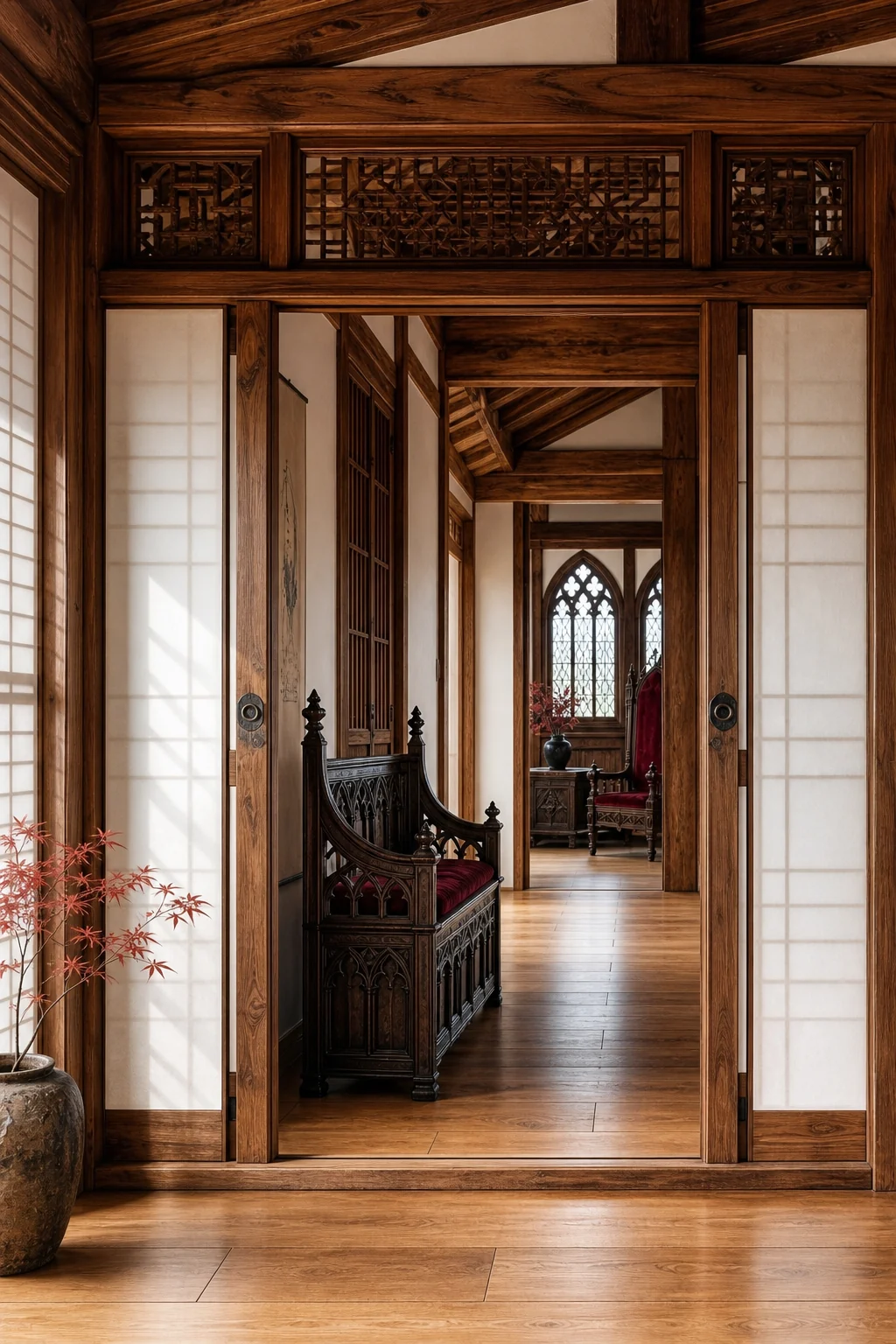
The transitional hallway acts as a vital palate cleanser between distinct functional zones. By letting the continuous wooden flooring run uninterrupted, the eye accepts the sudden presence of a heavy Gothic bench as a deliberate, highly curated sculptural moment of transition.
- Keep hallways completely free of heavy, blocking furniture to maintain the essential feeling of breathable minimalism between the rooms.
- Use dark iron hardware on traditional wooden doors to subtly hint at the heavier aesthetics waiting inside the space.
- Let the wooden flooring run continuously between rooms to visually link the distinct historical styles together seamlessly and quietly.
Avoiding the Costume
The greatest design risk is creating a split personality where two historical styles fight for dominance. Success comes from letting the architecture breathe quietly while the furniture provides the ornamental weight, ensuring the room never feels like a theatrical costume set.
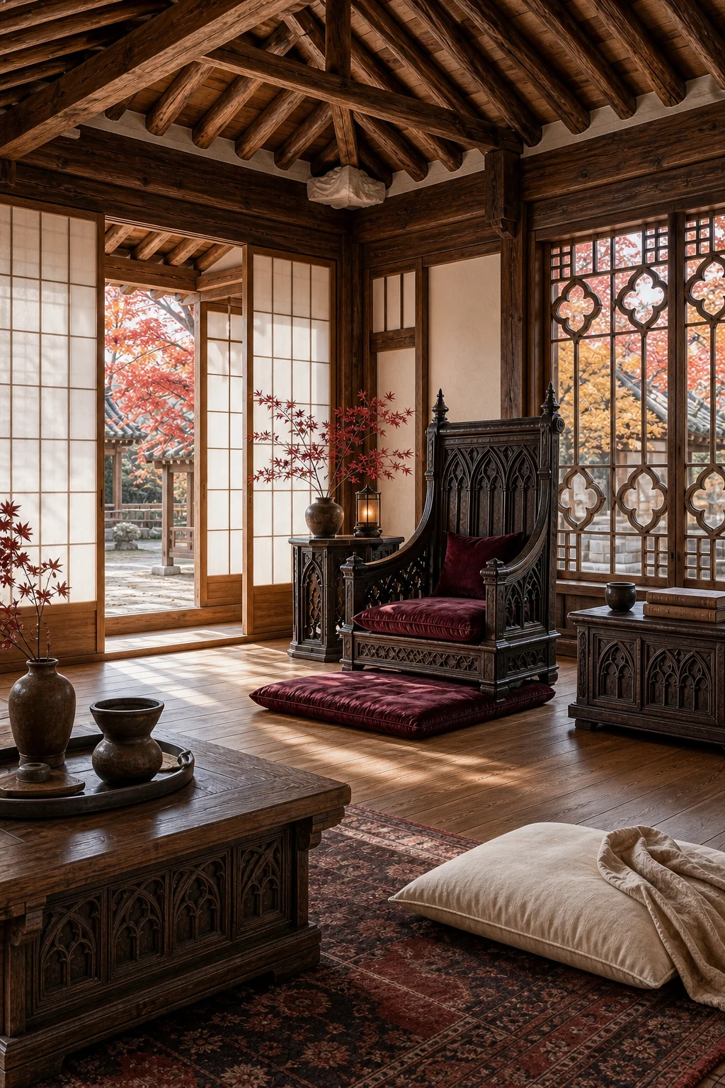
When executed correctly, the finished room feels like a singular, deeply grounded reality. The tension relies entirely on the shared timber palette, proving that heavy ornamentation can thrive inside a minimalist envelope if the foundational proportions are strictly respected and maintained.
- Do not mix light modern woods or bright contemporary colors into this highly specific historical space to avoid visual confusion.
- Ensure tension relies entirely on the shared timber palette to maintain visual coherence across the two distinct historical styles.
- Trust the minimalist envelope to balance the heavy ornamentation without requiring additional decorative bridge elements that might clutter the room.