Small Living Room Layout Rules: The Printable Spacing Sheet
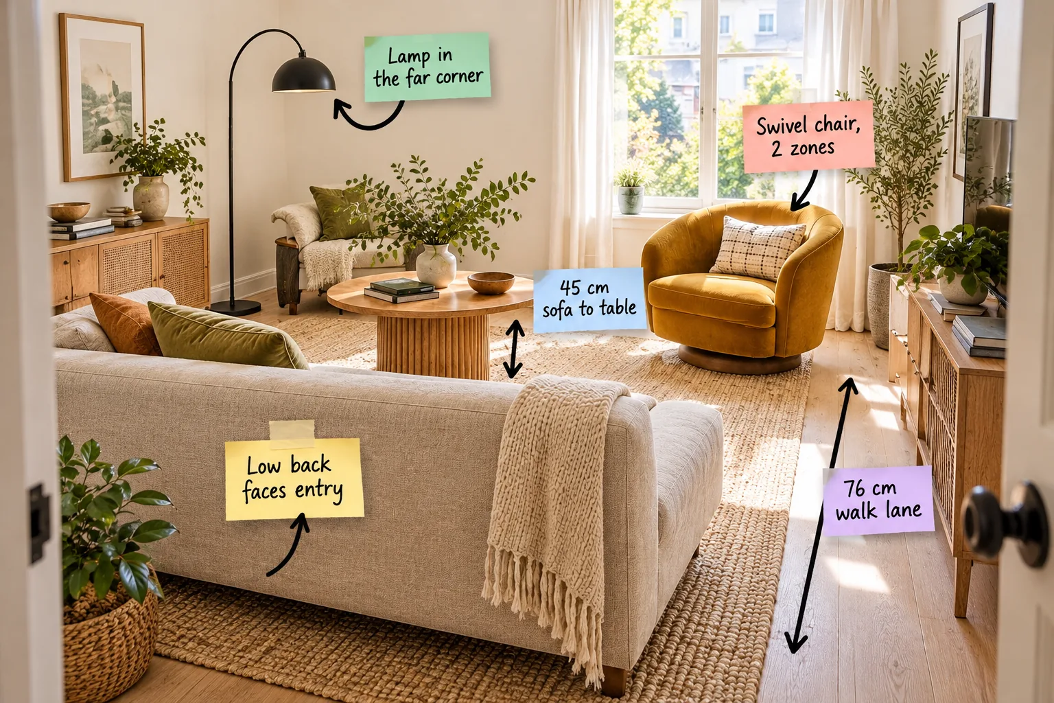
Arranging a tight space feels like a frustrating puzzle, but you will be able to arrange your furniture with absolute confidence using this printable small living room spacing sheet. It provides the exact measurements for every gap, path, and sightline so you can place your sofa perfectly.
The Doorway Sightline
Positioning the largest piece of furniture dictates how spacious the room feels upon entering, which is why floating a low-backed sofa with its back to the doorway works so well. This defines the seating area without building a visual wall that abruptly blocks your line of sight.
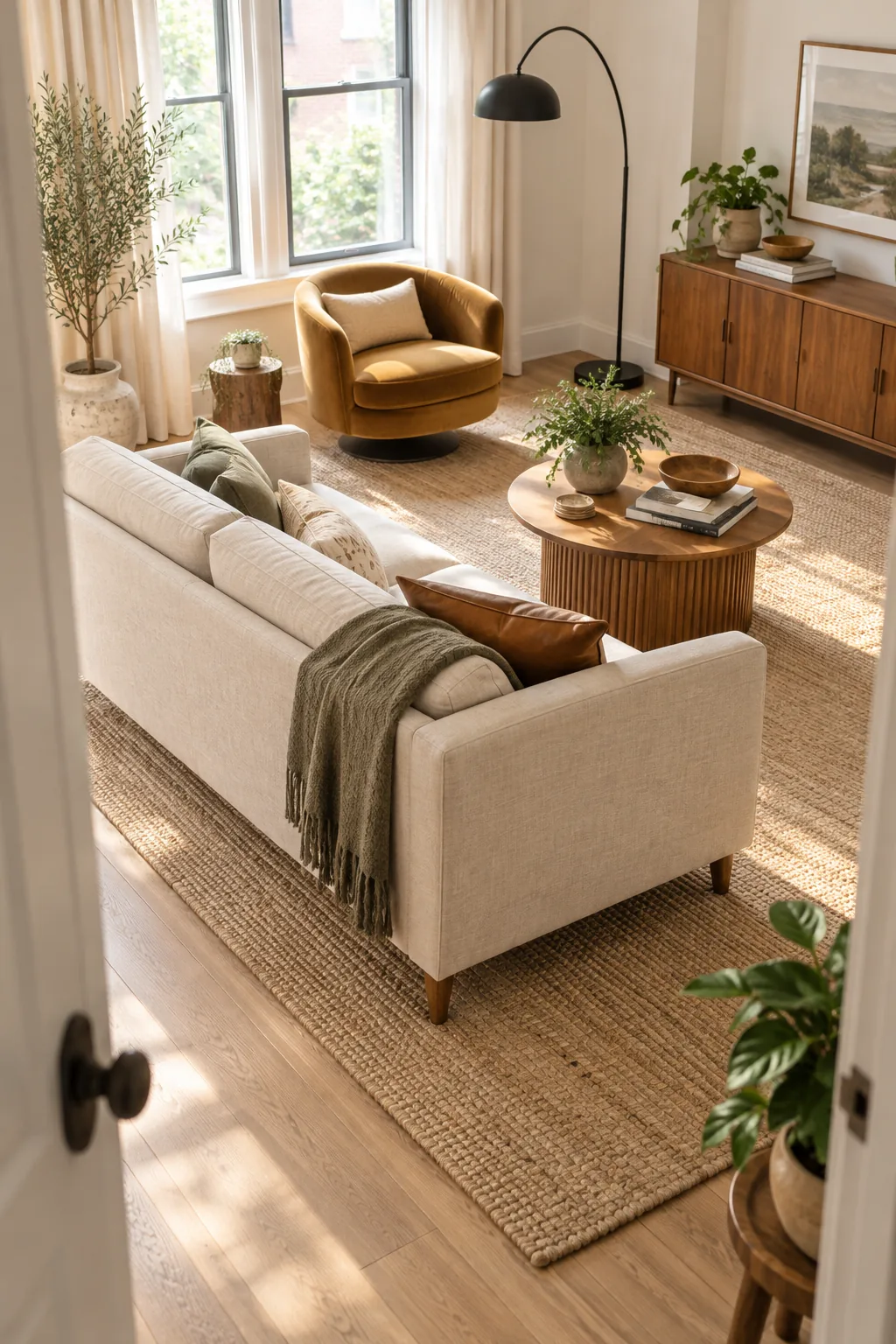
Keeping the sofa back low allows the eye to travel completely across the room, making the footprint feel instantly larger and more welcoming. Once that primary visual anchor is set, we can map out exactly how you will actually move around the newly defined space.
Map the Primary Walkway
Establish the main traffic route before placing secondary furniture, maintaining a strict 76 cm clear path from the door past the sofa’s edge. This specific clearance prevents bottlenecking when multiple people use the room or walk through with heavy bags and groceries.
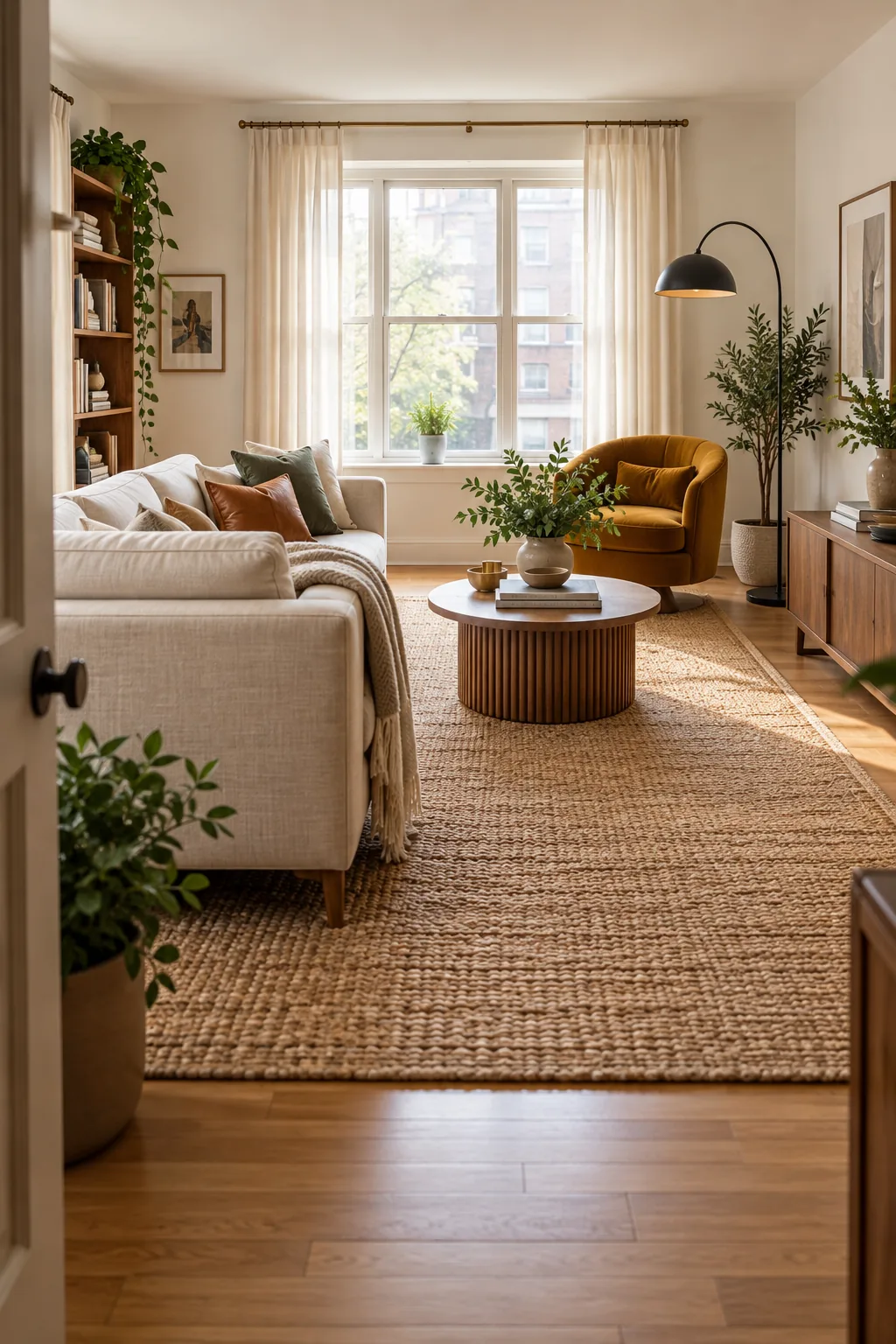
Before finalizing your floor plan, check your primary routes to ensure you have not fallen into these common traffic traps that instantly make a compact room feel cramped and difficult to navigate on a daily basis.
Define the Secondary Paths
While the main artery needs generous spacing, the secondary routes between accent chairs and side tables can be slightly tighter to encourage intimacy. Balancing these different flow zones ensures the room feels cozy rather than cluttered when guests navigate toward their designated seats.
| Path Type | Minimum Clearance | Best Application |
| Primary Walkway | 76 cm | Main entry to hallway |
| Secondary Route | 60 cm | Between chair and wall |
| Service Gap | 30 cm | Accessing window treatments |
Maintaining these exact clearances prevents the space from feeling like a frustrating obstacle course during social gatherings. With the walking routes firmly established, we can focus our attention on the critical distances within the central conversation zone.
Set the Coffee Table Gap
The distance between the seating and the central surface must balance reachability with legroom, relying on a strict 45 cm gap between the sofa’s front edge and the coffee table. This measurement allows easy access to drinks while leaving enough space to sit comfortably.
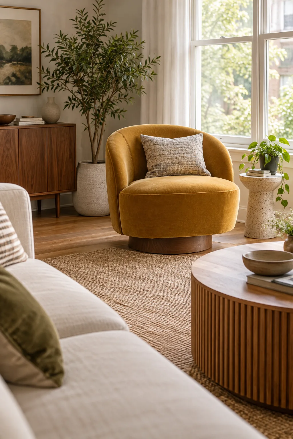
Using a round coffee table softens the hard angles of the sofa and makes slipping through this tight clearance feel much more natural. The shape of this central surface dictates how easily you can move into the corners of the room.
Scale the Center Surface
Choosing the right proportions for your central surface is just as important as the gap surrounding it, as an oversized table will immediately dwarf a small sofa. Aim for a coffee table that spans roughly two-thirds the total length of your main seating piece.
This flexible approach to surfaces keeps the center feeling airy and highly adaptable to different hosting needs throughout the week. With the center locked in, you can look to the corners to add versatile seating options.
Optimize the TV Viewing Distance
Positioning your media console requires precise math to prevent eye strain and ensure the screen does not visually overpower a compact space. The ideal viewing distance is roughly one and a half times the diagonal measurement of your television screen, keeping the layout balanced.
Bridge Zones with a Swivel Chair
Maximize corner utility by introducing multi-directional seating, like an armless swivel chair that essentially creates two distinct zones within a single compact footprint. It can face the sofa for conversation or easily rotate toward the window for a quiet afternoon of reading.
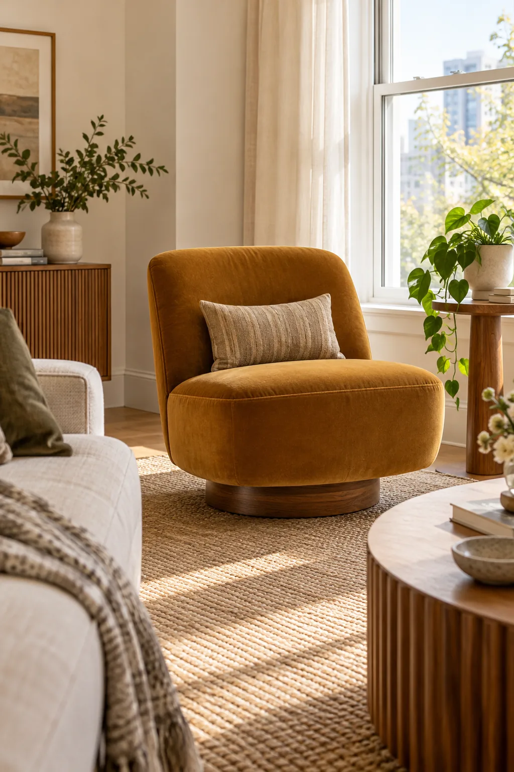
In my own Denver bungalow, placing a velvet swivel by the front window completely changed how we use the room, giving my husband a sunny morning coffee spot that pivots right back into the evening conversation circle. This dual-purpose approach frees up valuable square footage.
Balance the Room’s Corners
Leaving one corner completely empty while overstuffing another throws off the spatial equilibrium of a compact room. Distributing visual weight evenly across diagonal corners ensures the eye moves continuously around the perimeter rather than getting stuck in one heavy, cluttered zone.
- Add a tall, slender bookshelf to draw the eye upward in a tight corner.
- Place a large structural plant on a low stand to fill vertical space organically.
- Install a floating corner shelf to hold decorative objects without consuming floor area.
Activating these overlooked pockets of space makes the entire floor plan feel intentional and fully utilized rather than haphazardly arranged. The most effective way to highlight these newly balanced corners is through strategic and layered illumination.
Light the Furthest Corner
Prevent the room from shrinking visually at night by actively illuminating the darkest edges, placing a tall floor lamp in the corner diagonally opposite the doorway. This strategic glow draws the eye outward, expanding the perceived boundaries of the entire layout.
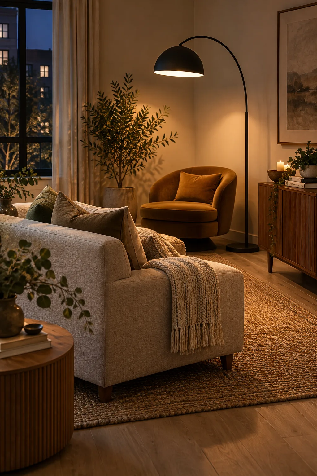
I used a sweeping arc lamp in a client’s tiny loft last month, and the moment we turned it on, the ceiling felt a foot higher and the back wall seemed to push outward. Once your lighting pulls the eye to the edges, you need a strong base.
Layer the Ambient Lighting
Relying solely on overhead fixtures casts harsh shadows that make a small room feel stark and uninviting during the evening hours. Combining your corner floor lamp with a low-wattage table lamp on the opposite side creates a warm, overlapping wash of light that softens the space.
Control the Color Palette
Keeping the foundational pieces in a tight, neutral color family prevents the compact footprint from feeling chaotic or visually overwhelming. Layering different tones of sand, cream, and warm gray allows you to introduce deep, saturated accent colors through pillows and art without shrinking the perceived space.
Anchor the Floating Layout
A floated layout requires a strong visual base to prevent the furniture from looking disconnected and floating away into the walkways. Use a rug large enough that its edges extend well beyond the outside legs of the sofa, establishing a clear room-within-a-room.
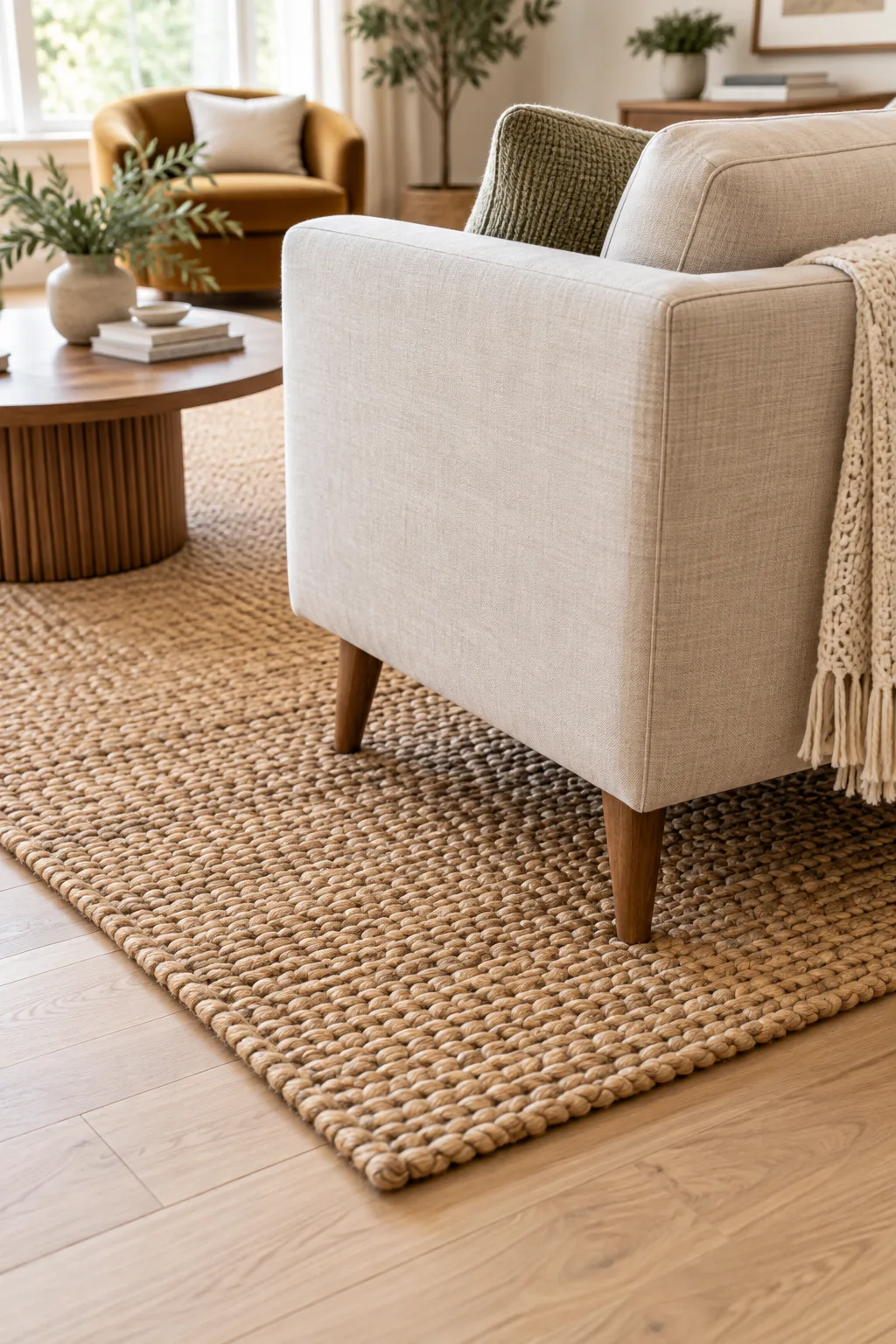
When the rug border frames the seating arrangement generously, the layout feels intentional and grounded rather than cramped or temporary. Now that the major zones are permanently set, you can verify every single dimension against the master plan.
Select the Right Rug Texture
The material of your foundation piece significantly impacts how large the room feels, as heavy, high-pile shags visually absorb light and shrink the floor plan. Opting for a low-profile flatweave or natural jute rug keeps the floor visually lightweight while still providing essential acoustic dampening.
Manage Window Treatments
Heavy, dark curtains absorb natural daylight and create visual boundaries that instantly make a small living room feel boxed in and claustrophobic. Installing sheer linen panels allows filtered sunlight to penetrate deep into the room, blurring the line between indoors and outdoors to expand the space.
Prioritize Hidden Storage
Clutter is the fastest way to make a carefully measured layout feel completely chaotic and unlivable on a daily basis. Incorporating dual-purpose furniture, like a storage ottoman or a media console with solid doors, hides everyday items and keeps your precious walking lanes completely clear.
The Complete Spacing Sheet
Take the guesswork out of your room arrangement with the comprehensive small living room spacing sheet, which lists every essential layout clearance from TV viewing distances to conversation gaps. Having these master dimensions on hand makes shopping for right-sized pieces incredibly straightforward.
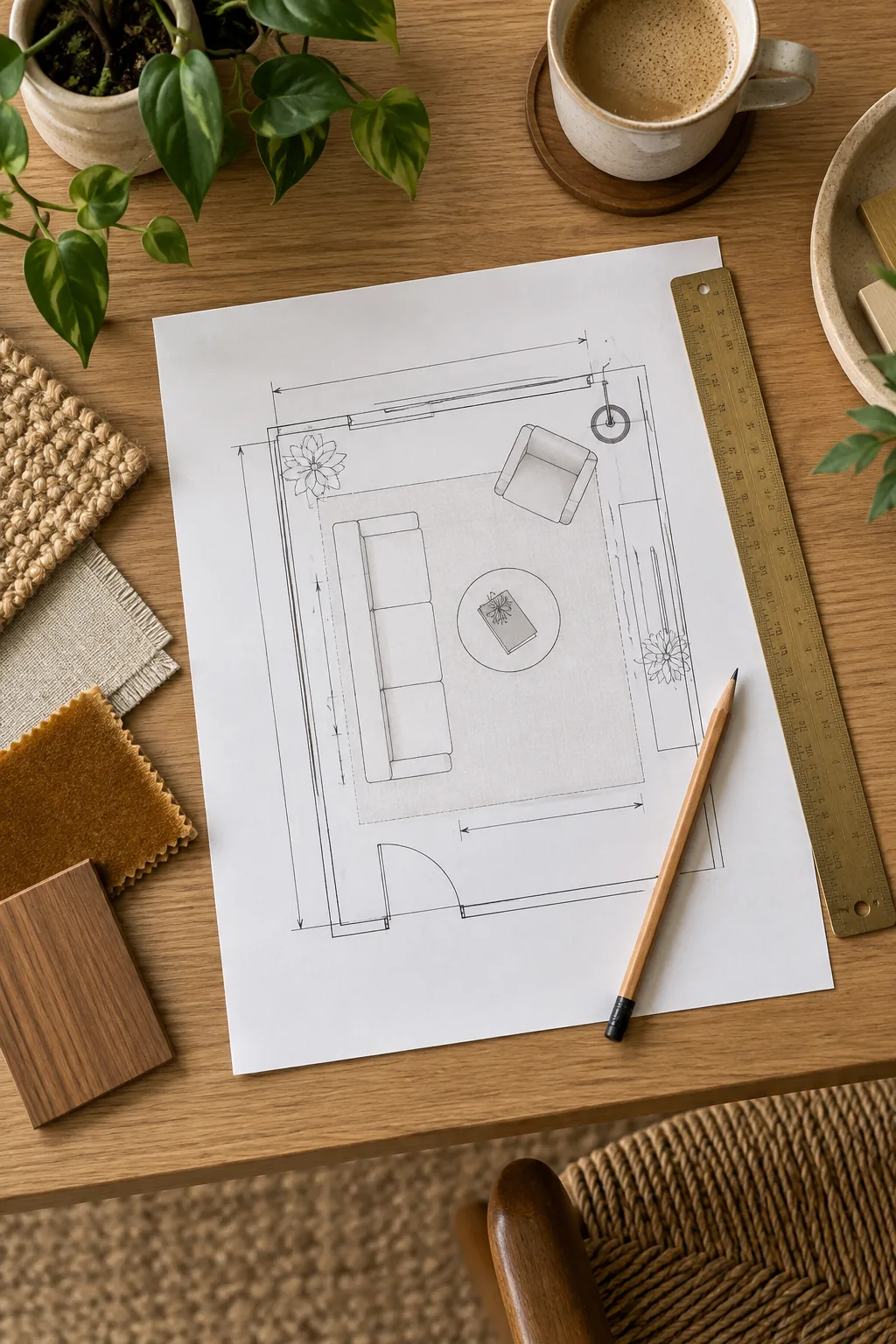
Use this quick five-step checklist to position your anchor piece correctly from the doorway before you begin measuring the smaller gaps and placing your accent furniture.
Small Layouts in Five Distinct Styles
Explore how these spacing rules adapt to different aesthetics and room shapes.
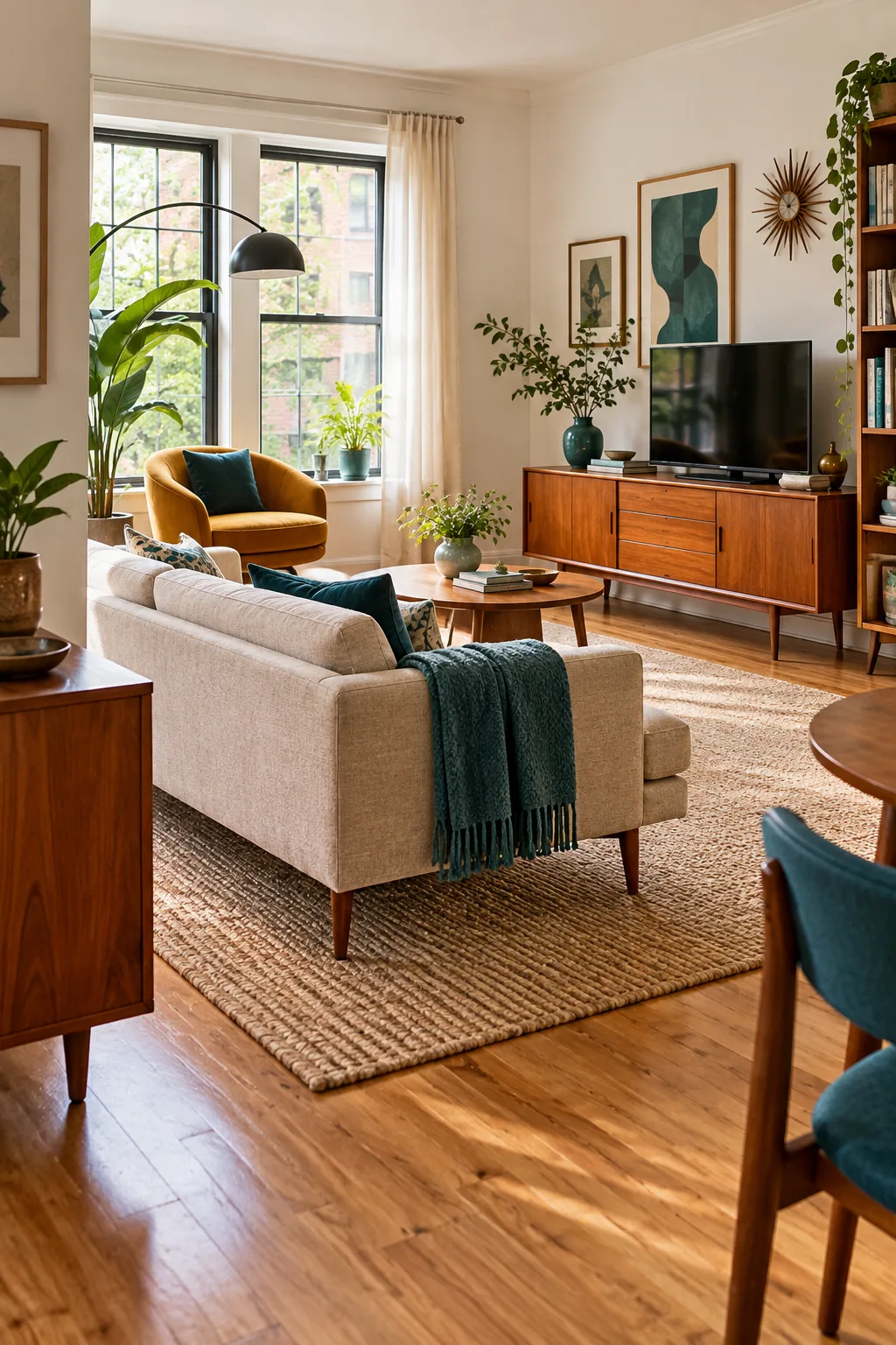
Mid-Century Teak and Teal: Tapered legs on the sofa and chairs expose more floor space, instantly making this retro apartment layout feel larger and less heavy.
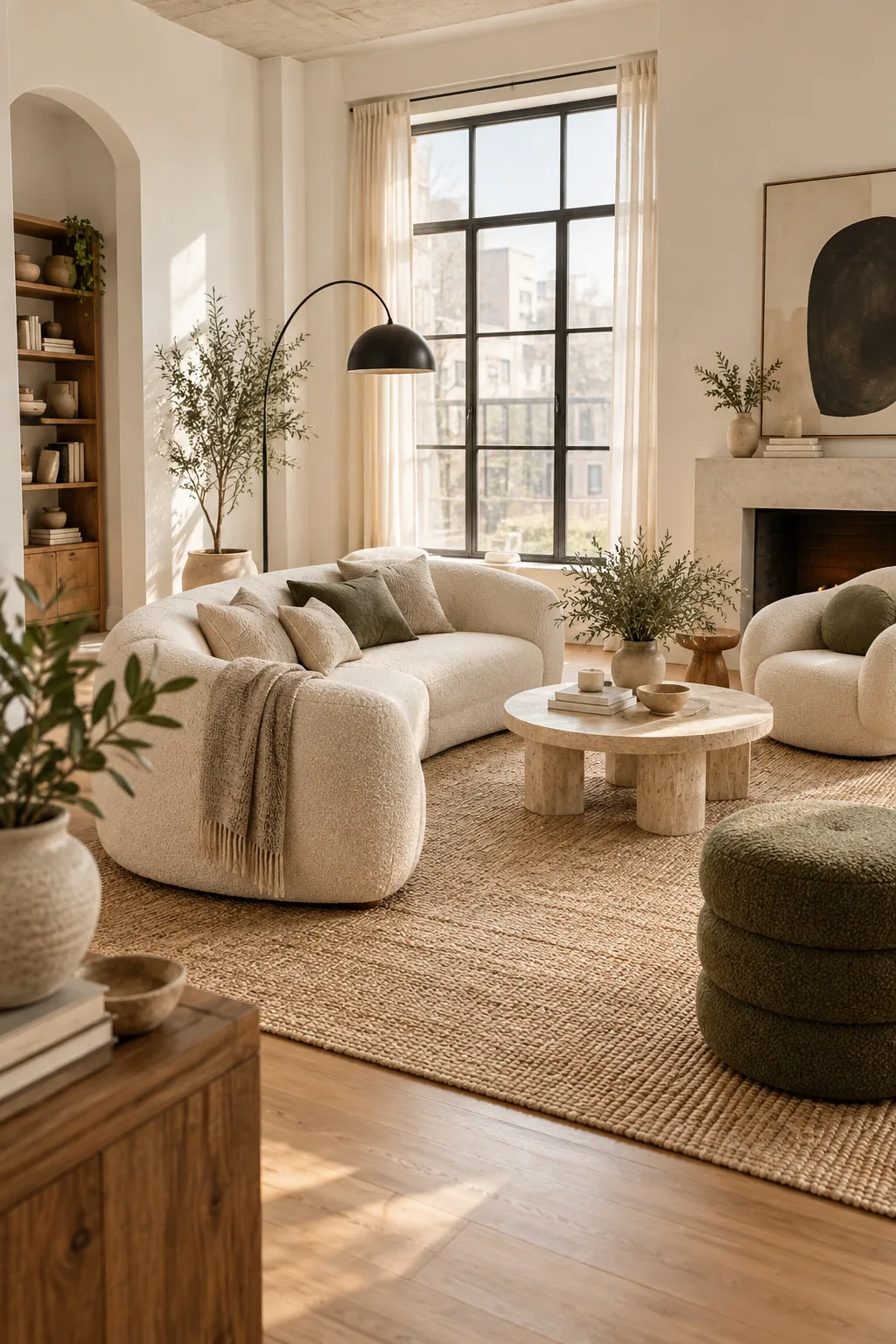
Organic Minimalist Cream Loft: A continuous palette of soft whites and creams blurs the boundaries between the furniture and walls, expanding the visual footprint of the room.
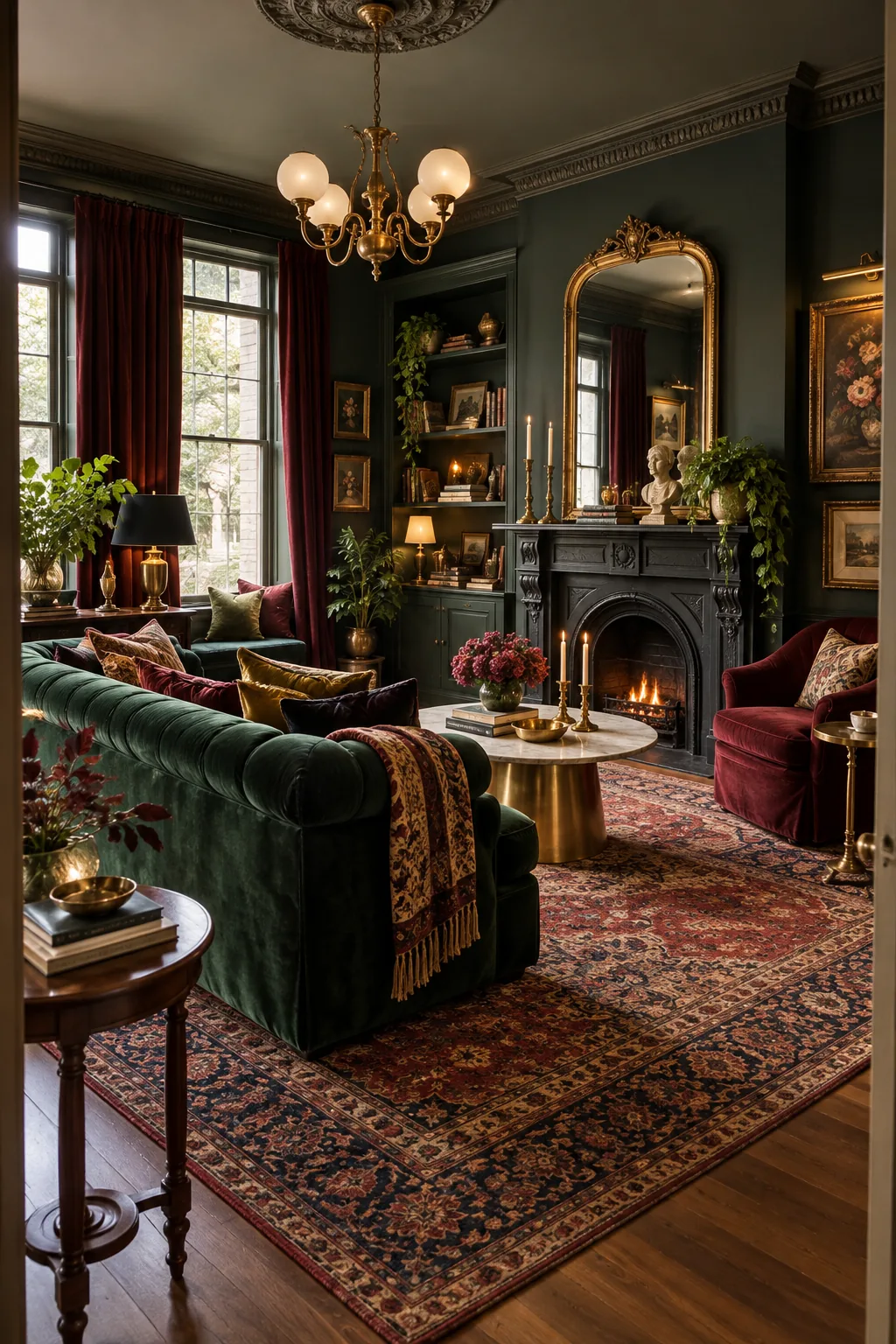
Moody Emerald Victorian Parlor: Rich jewel tones and reflective brass surfaces create depth in this compact historic space, proving that dark colors can work beautifully in small layouts.
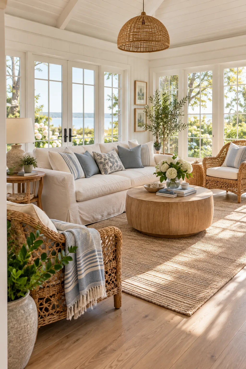
Coastal Slipcovered Sunroom: Woven rattan armchairs offer necessary seating without blocking the coastal light, maintaining an airy and relaxed flow around the central coffee table.
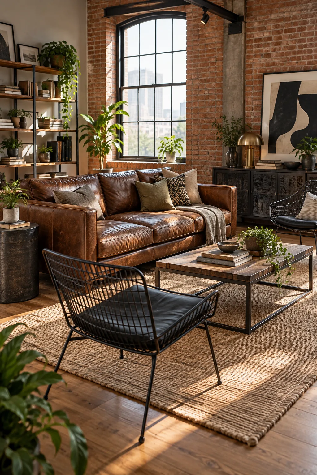
Industrial Leather Studio Loft: A low-profile leather sofa anchors the open plan, while wire-framed accent chairs provide functional seating that you can see right through.