Shelf Decor Without Buying a Thing: Free Styling Cheat Sheet
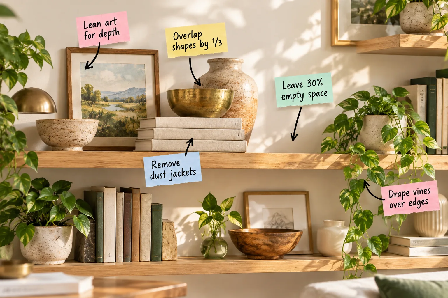
You can completely restyle your living room bookshelves using professional layering techniques without spending a single dollar. Download our free shelf styling cheat sheet to shop your own home and build beautiful vignettes using the books, art, and ceramics you already own.
The Free Shelf Styling Cheat Sheet
Our downloadable cheat sheet summarizes all the essential placement rules, ratios, and overlapping techniques needed to achieve a curated designer look.
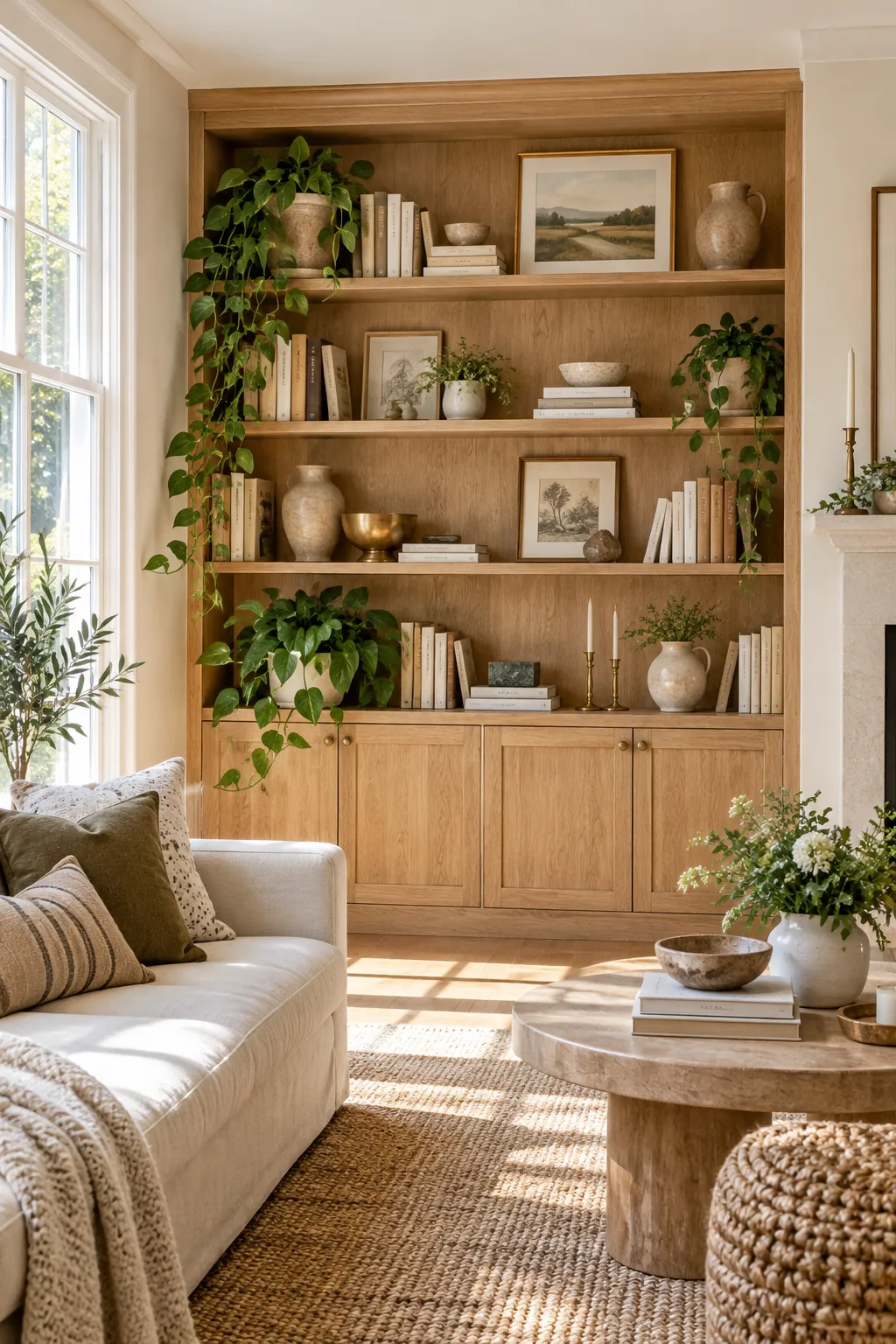
Print this one-page guide to reference while you gather objects from around your house, ensuring you always have the right scale and proportion on hand.
Gathering and Sorting Your Home’s Inventory
Before placing a single item on the wood, walk through every room and collect forgotten vases, unused bowls, and previously read books to see exactly what you have.
- Group all gathered items on your dining table by category.
- Remove anything damaged, overly bright, or heavily patterned.
- Sort the remaining approved pieces by their dominant color.
Establishing the Bottom Anchor Layer
Always begin your styling process by placing your largest, heaviest storage baskets, vintage wooden crates, or oversized art books on the very bottom shelf to firmly ground the entire unit and establish a strong visual foundation.
Stripping Books for a Cohesive Base
Removing paper dust jackets reveals beautiful solid linen, embossed, or matte covers that instantly calm down a cluttered display.
Stack three to four flat books to act as sturdy, neutral risers that elevate your smaller decorative objects into the spotlight.
Alternating Horizontal and Vertical Stacks
Prevent the library from looking like a rigid retail store display by mixing traditional vertical rows with low horizontal stacks of books, which naturally creates varied heights and provides perfect platforms for showcasing smaller sculptural pieces.
Leaning Art to Build Background Depth
In my own Boston apartment, I always start by leaning framed art casually against the back wall instead of hanging it. This creates a solid background layer that anchors the arrangement and effortlessly hides unsightly gaps between the shelves.
Selecting the Right Frame Proportions
Choose artwork that fills at least two-thirds of the vertical space between shelves so the background layer feels intentional rather than minimized or forgotten.
| Shelf Height | Ideal Frame Size | Orientation |
|---|---|---|
| 12 inches | 8×10 inches | Vertical |
| 14 inches | 11×14 inches | Horizontal |
| 16 inches | 12×16 inches | Vertical |
Layering Smaller Frames in the Foreground
Once your large background art is securely leaned against the back panel, tuck a smaller, contrasting frame slightly in front of it to build immediate visual depth and create a relaxed, collected-over-time aesthetic.
Overlapping Shapes by One-Third
Pull shorter, heavier items to the front edge so they cover exactly 33 percent of the taller item behind them, connecting the pieces into a single intentional vignette.
When styling with items you already own, the biggest challenge is avoiding the look of a storage rack. A few common placement errors can instantly ruin the curated vibe.
Using Heavy Bowls to Anchor Vignettes
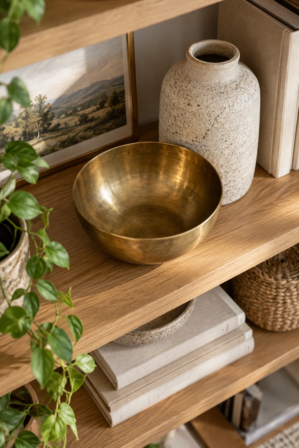
Position a dense ceramic or solid brass bowl at the base of a tall, slender vase to provide necessary visual weight, keeping the grouping grounded and preventing the taller items from feeling top-heavy or disconnected.
Mixing Textures for Visual Interest
Since you are not buying new items, combining opposite textures—like smooth glass or polished brass against rough ceramics and matte paper—is the most effective method to make old objects feel fresh and modern.
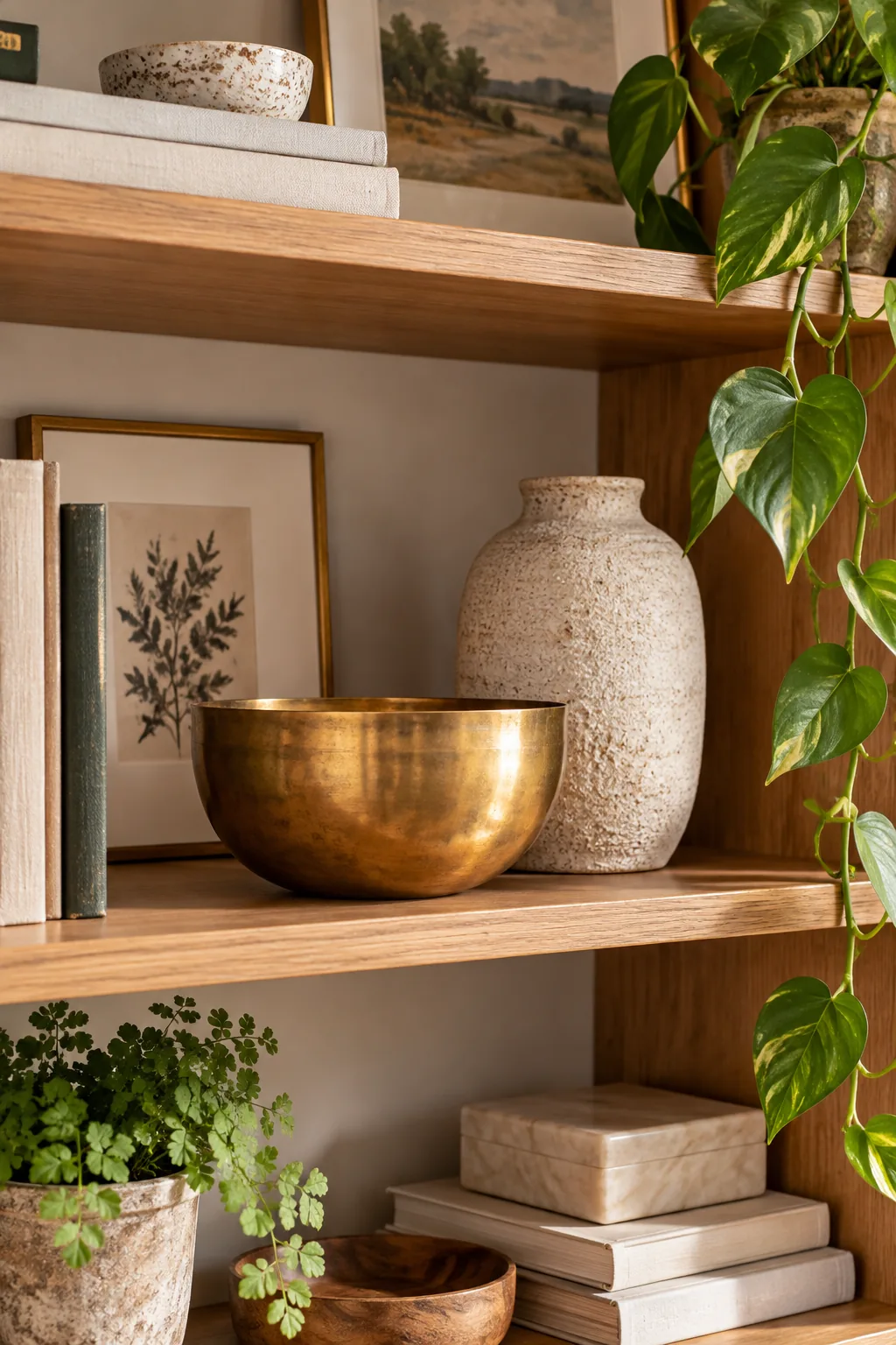
Pairing Polished Metals with Matte Clay
Place a highly reflective brass candlestick or polished silver tray directly next to a raw, unglazed terracotta pot to highlight the unique material qualities of both pieces through stark, intentional contrast.
Draping Vines to Soften Hard Edges
Position trailing plants like pothos or philodendrons near the center or far ends of a shelf to let the vines spill organically over the rigid wooden edge.
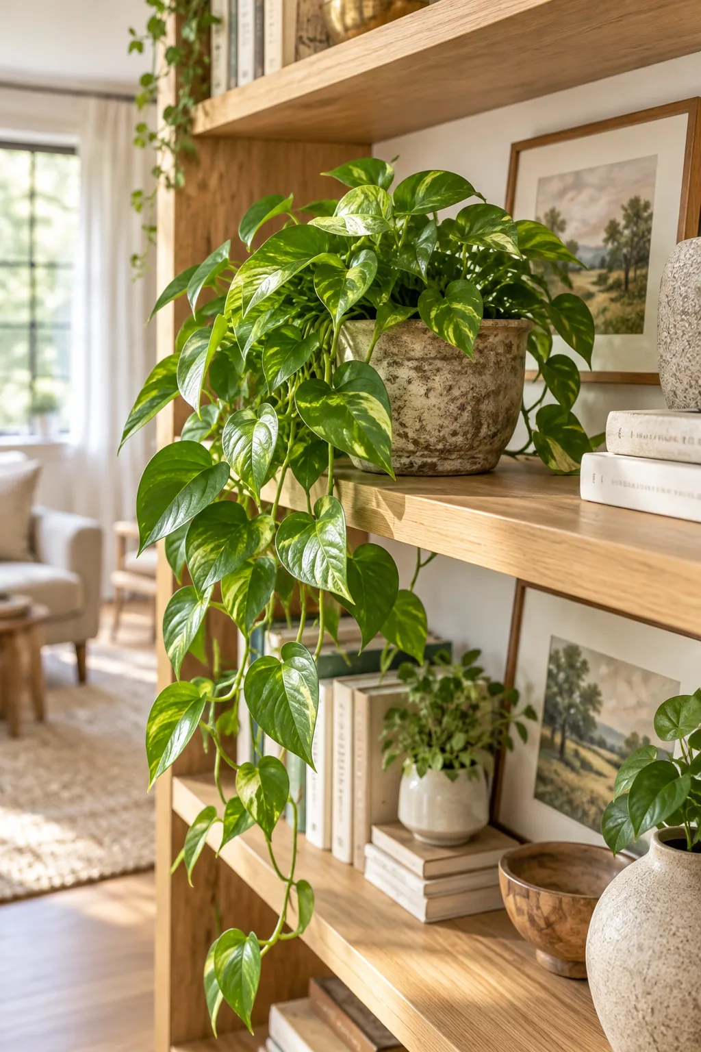
This cascading greenery breaks up the harsh horizontal lines of the bookcase and introduces vital, asymmetrical movement to the overall display.
Choosing the Best Trailing Houseplants
Select low-light tolerant varieties like heartleaf philodendrons or classic golden pothos that thrive indoors, ensuring your living natural elements remain vibrant and lush without requiring constant repositioning for direct sunlight.
Elevating Small Objects with Hidden Risers
If a treasured decorative object feels slightly too small for the shelf scale, place a discreet acrylic block or a small wooden box underneath to boost its physical presence and align it with surrounding pieces.
The Triangle Method for Visual Balance
Distribute visual weight by placing similar materials, such as three brass objects or three distinct wood tones, in a loose zig-zag triangle formation across multiple shelves to keep the eye moving.
Distributing Wood Tones Evenly
Prevent your shelves from feeling lopsided or visually unbalanced by ensuring that dark walnut frames, woven baskets, or pale oak accents are spread symmetrically from the top left down to the bottom right.
Curating Sentimental Items
Limit your cherished family heirlooms, framed photographs, or travel souvenirs to just one distinct piece per shelf, treating them as important focal points rather than crowding them into a single overwhelming and chaotic collection.
Grouping Small Objects on Trays
Corral tiny, disconnected items like matchbooks, small keys, or delicate shells onto a single stone or beautifully grained wooden tray to instantly transform a messy, scattered pile into a unified, purposeful collection.
Stepping Back for the Squint Test
Walk across the room and squint your eyes until the shelves blur into basic shapes, allowing you to easily spot any heavy, dark voids, awkwardly empty corners, or areas where the colors clash.
Leaving 30 Percent Empty Space
I used to pack every inch of wood, but dedicating roughly 30 percent of the shelf’s total linear width to empty space allows your styled vignettes to breathe and stand out clearly.
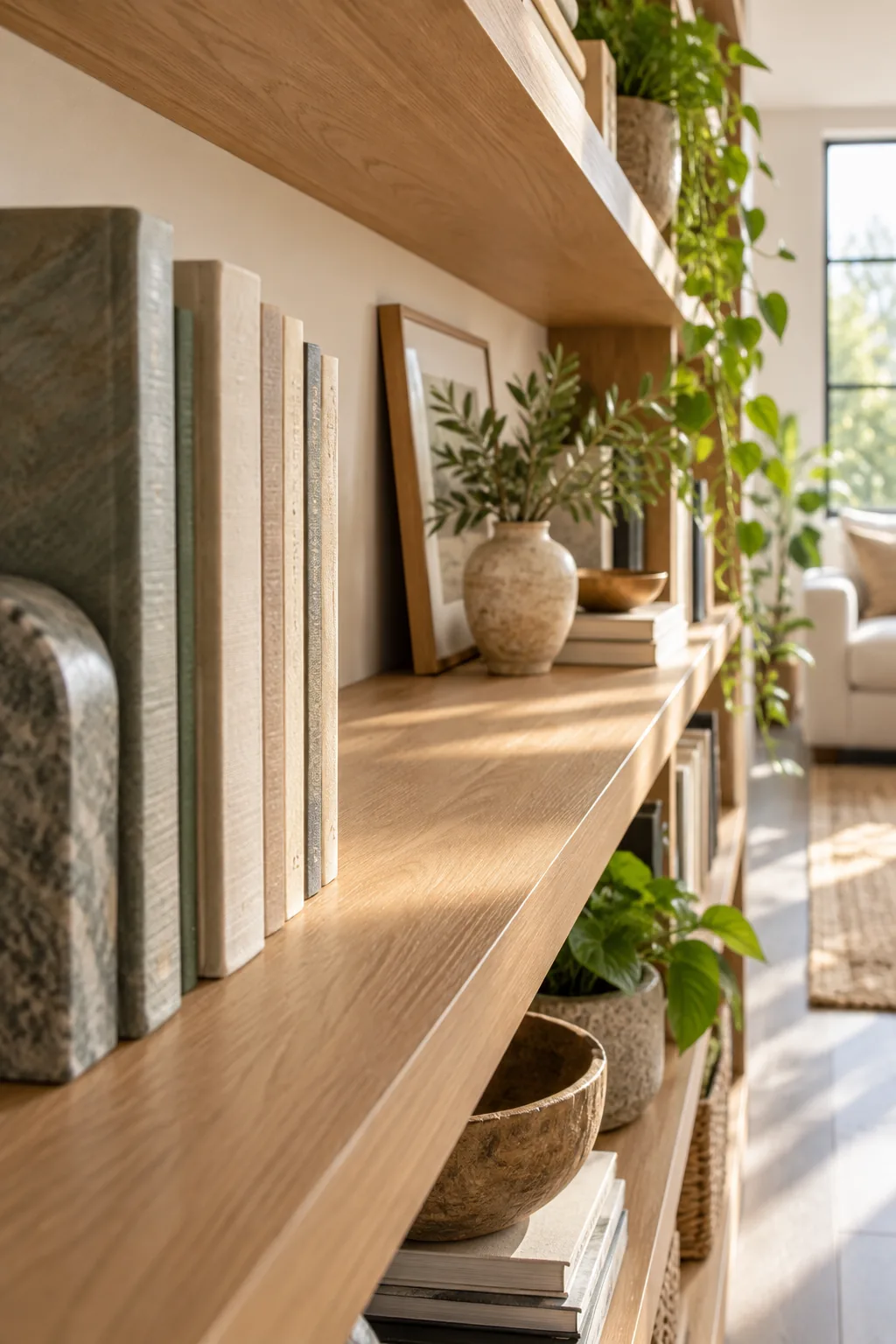
Resist the urge to fill these deliberate gaps with extra books or small trinkets, as this negative space is what elevates the design from cluttered storage to a curated showcase.
3 Ways to Style Shelves With What You Own
Get inspired to shop your own house by exploring these three distinct looks, all created using the exact same zero-dollar layering techniques.
Minimalist Tonal White Ceramics: Stick to a strict white and cream color palette with textured ceramics to make standard built-ins feel incredibly high-end.
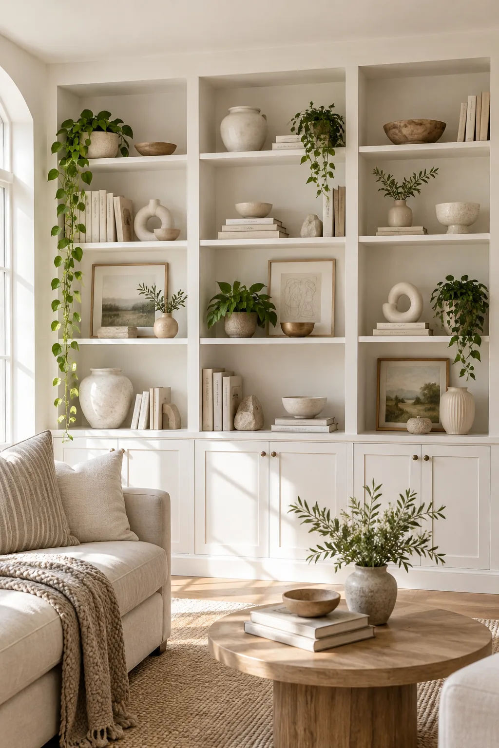
Moody Vintage Walnut Shelves: Pair dark walnut shelves with vintage brass accents and aged paperbacks to create a cozy, collected atmosphere in a home office.
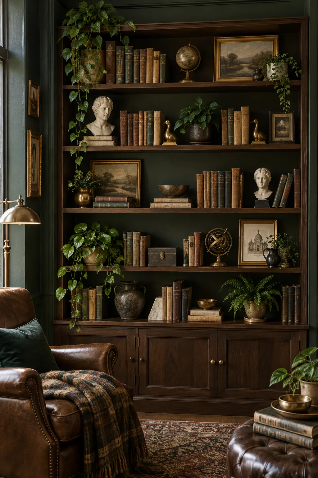
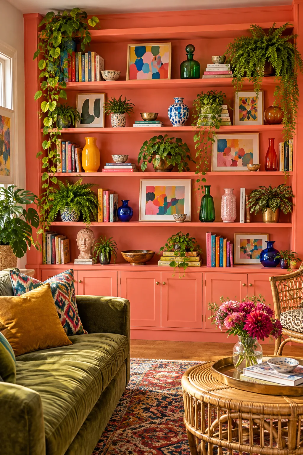
Colorful Eclectic Painted Built-Ins: Paint the back panel a vibrant color and mix lush ferns with brightly painted frames for a joyful, maximalist aesthetic.