
Picture Wall Math That Actually Works (Free Layout Cheat Sheet)
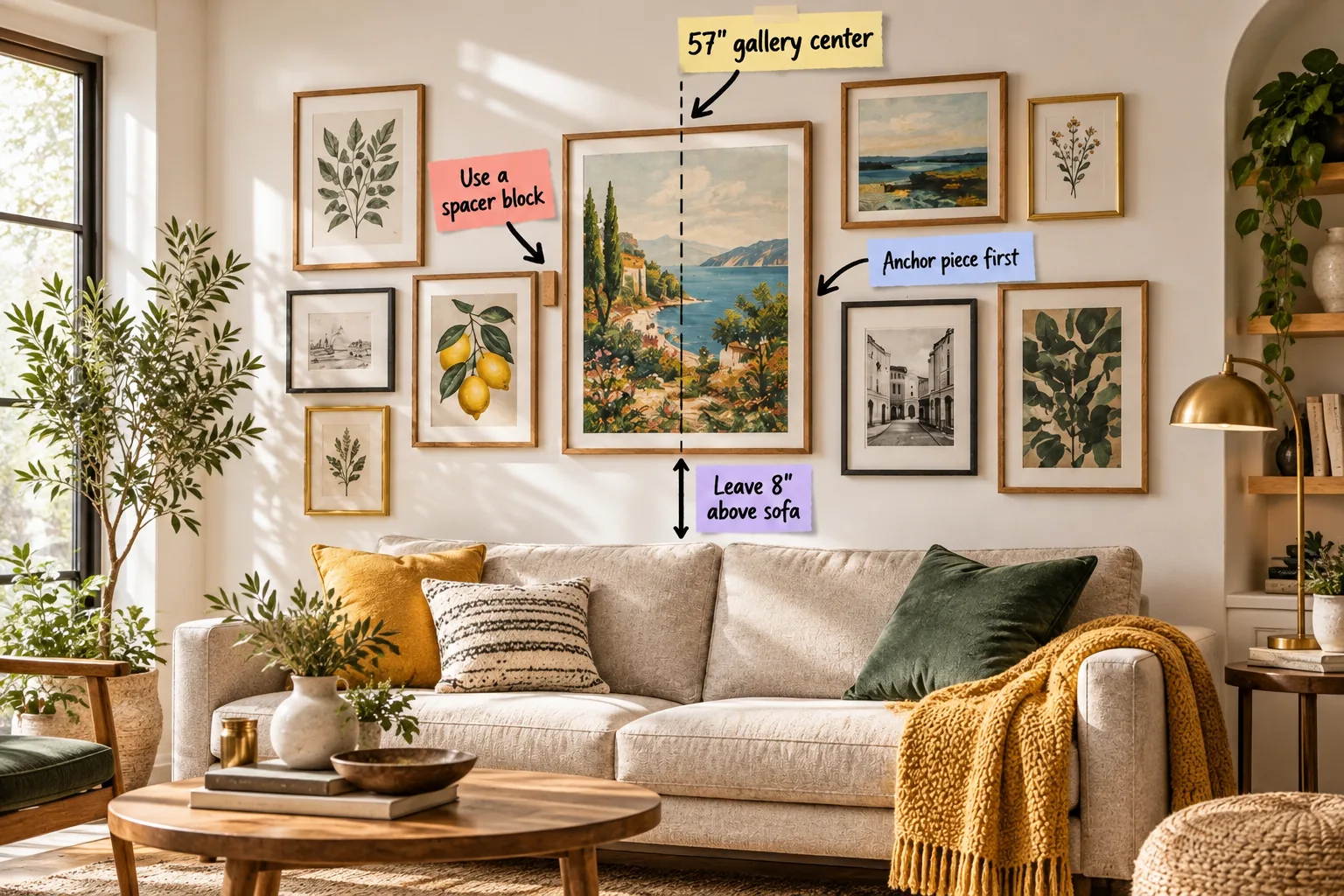
You can map out and hang a perfectly balanced gallery wall using specific measurements, and I am going to show you exactly how to do it. By the end of this guide, you will have a printable layout cheat sheet featuring five proven grid formulas.
The 57-Inch Center Axis Strategy
Galleries should always be centered at average human eye level, which is exactly 57 inches from the floor. In my own Denver living room, establishing this precise midpoint completely transformed how the artwork interacted with the architecture.
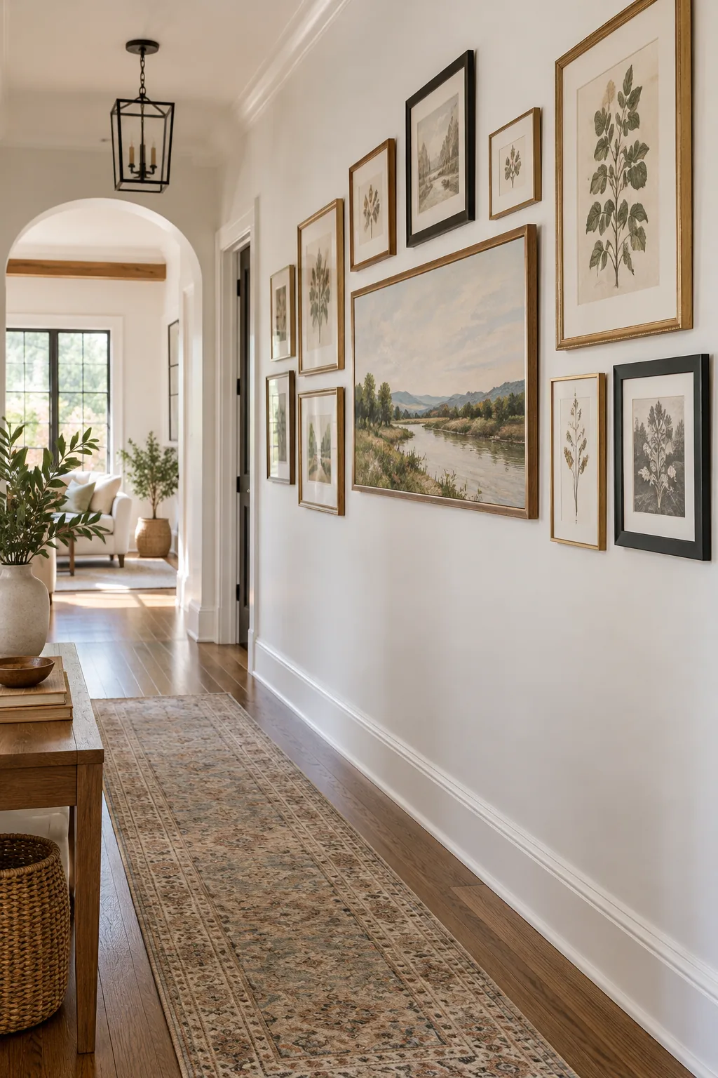
This measurement applies to the horizontal center of the entire arrangement, not the bottom edge of the lowest frames. Defining this vertical center point of the total gallery mass anchors the collection naturally within the room.
Finding the Horizontal Centerline
Before picking up a hammer, you must locate the exact horizontal midpoint of your available wall space. Measuring the total width and marking the center ensures your arrangement remains visually symmetrical within the architectural boundaries.
| Wall Width | Ideal Gallery Width | Sofa Width | Gallery Width |
|---|---|---|---|
| 60 inches | 40 inches | 72 inches | 48 inches |
| 84 inches | 56 inches | 84 inches | 56 inches |
| 108 inches | 72 inches | 96 inches | 64 inches |
| 120 inches | 80 inches | 108 inches | 72 inches |
A reliable spatial rule is to cover roughly two-thirds of the available wall or furniture width. This specific ratio prevents the artwork from looking like a tiny island floating on a massive blank canvas.
Accounting for Wall Switches and Outlets
Always scan your designated gallery zone for light switches, thermostats, and electrical outlets before finalizing the center axis. Shifting your entire arrangement just two inches left or right can seamlessly bypass these permanent functional obstacles.
Placing Your Anchor Piece First
Start your layout by positioning the largest or visually heaviest piece first. This dominant artwork establishes the visual gravity that all the smaller frames will eventually orbit around.
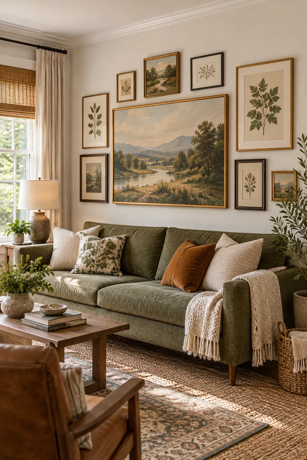
Placing this anchor slightly off-center prevents the arrangement from looking excessively rigid. You want to build outward from the heaviest frame, establishing an organic flow rather than a strict, unyielding grid.
Mapping the Visual Weight
Visual weight is not just about physical dimensions; it is heavily influenced by frame thickness and color depth. A small, dark oil painting in a heavy vintage brass frame can anchor a wall just as effectively as a massive, light-colored watercolor.
Counterbalancing the Heavy Anchor
When your primary anchor sits on the left side of the arrangement, you must deliberately pull the eye back to the right. Hanging two medium-sized, high-contrast pieces diagonally opposite the anchor achieves perfect asymmetrical harmony.
The 8-Inch Furniture Gap Rule
When hanging a gallery above a sofa, console, or bed, leave exactly 8 inches of breathing room between the top of the furniture and the bottom edge of the lowest frame.
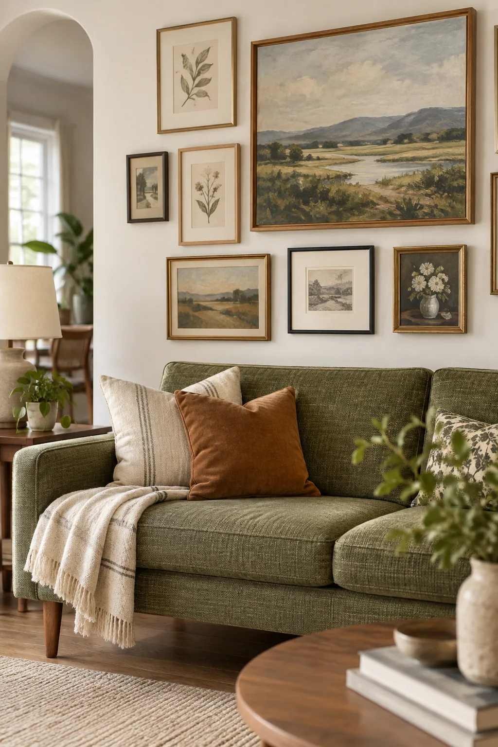
Getting the height right relative to your furniture is just as critical as the overall center line. Avoid these common placement errors that can make the room feel entirely disconnected.
Adapting for Low-Profile Furniture
Modern, low-profile seating fundamentally changes the spatial dynamics of your living room walls. If your sofa back sits lower than 30 inches, compress the gap to just 6 inches to maintain a cohesive relationship between the upholstery and the art.
Using a Spacer Block for Precision
Ditch the tape measure for individual gaps and cut a small block of wood to your desired dimension. Wedging this tool between frames as you hang them guarantees identical horizontal and vertical spacing every single time.
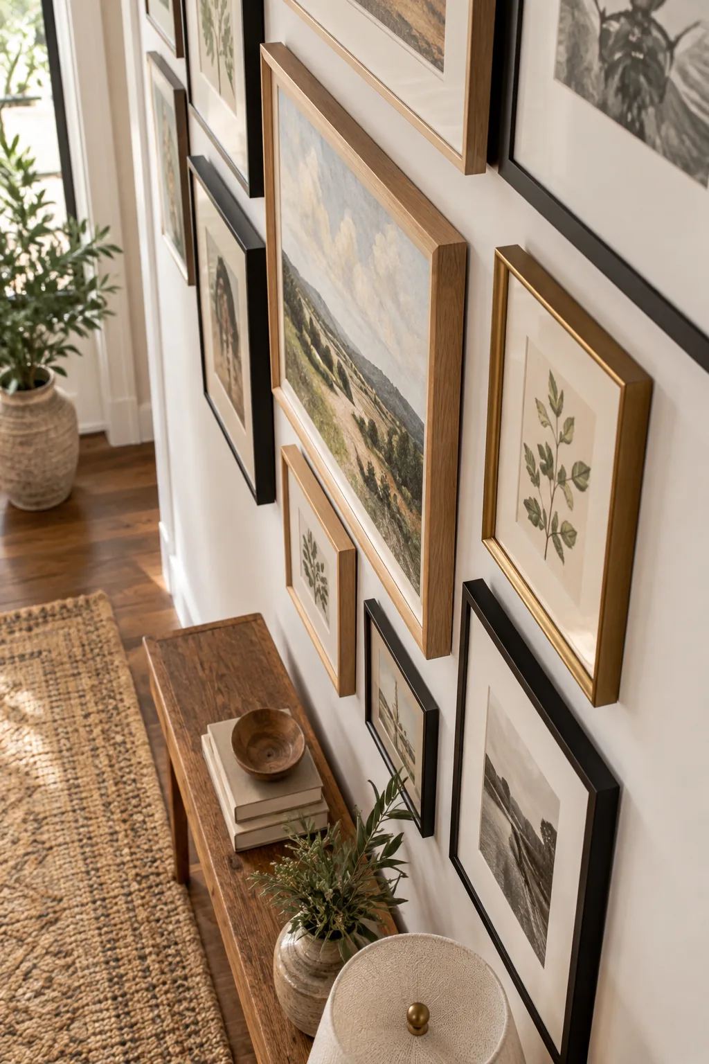
Using a dedicated spacer block ensures uniform gaps that instantly unify mismatched art styles. This simple technique eliminates the compounding mathematical errors that happen when measuring gap by gap.
Selecting the Right Gap Dimension
The ideal space between your frames depends entirely on the scale of your wall and the size of your artwork. Massive stairwell galleries require 3-inch gaps, while tight bathroom arrangements look best with a compact 1.5-inch separation.
Choosing the Right Hanging Hardware
Standard nails rarely provide the stability required for a perfectly aligned gallery wall. Opt for two-piece D-ring hooks on heavier frames to prevent the artwork from shifting off-axis whenever a heavy door slams.
Securing Frames with Museum Putty
Even the most mathematically perfect layout will look sloppy if the frames constantly tilt. Adding a tiny amount of adhesive to the bottom corners locks your exact spacing in place permanently.
- Roll a pea-sized ball of archival museum putty.
- Press it firmly onto the bottom two corners of the frame.
- Push the frame against the wall while checking your level.
Balancing Frame Styles and Finishes
Mix at least three distinct frame finishes, such as natural oak, matte black, and vintage brass. When designing my own home office, blending these varied materials made the collection feel genuinely curated over decades.
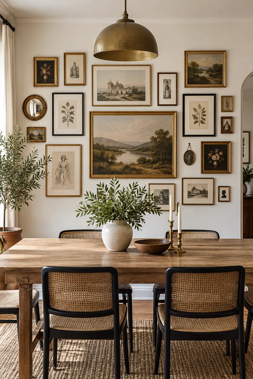
Distributing these materials evenly across the wall prevents any single finish from dominating one corner. A cohesive but varied frame palette adds crucial architectural depth to flat drywall.
Integrating Different Mat Sizes
Uniform framing can quickly make a thoughtful art collection feel like a generic store display. Pairing oversized, dramatic white mats with full-bleed vintage canvases creates a dynamic tension that keeps the eye moving across the arrangement.
Lighting Your Gallery Wall
Shadows cast by deep frames can obscure the precise alignment you worked so hard to achieve. Installing a hardwired picture light or adjustable track lighting highlights the art while minimizing harsh downward shadows.
Creating a Paper Template Mockup
Before drilling any holes, trace your frames onto kraft paper, cut them out, and tape them to the wall. This allows you to test the 57-inch center and 8-inch furniture gap dynamically.
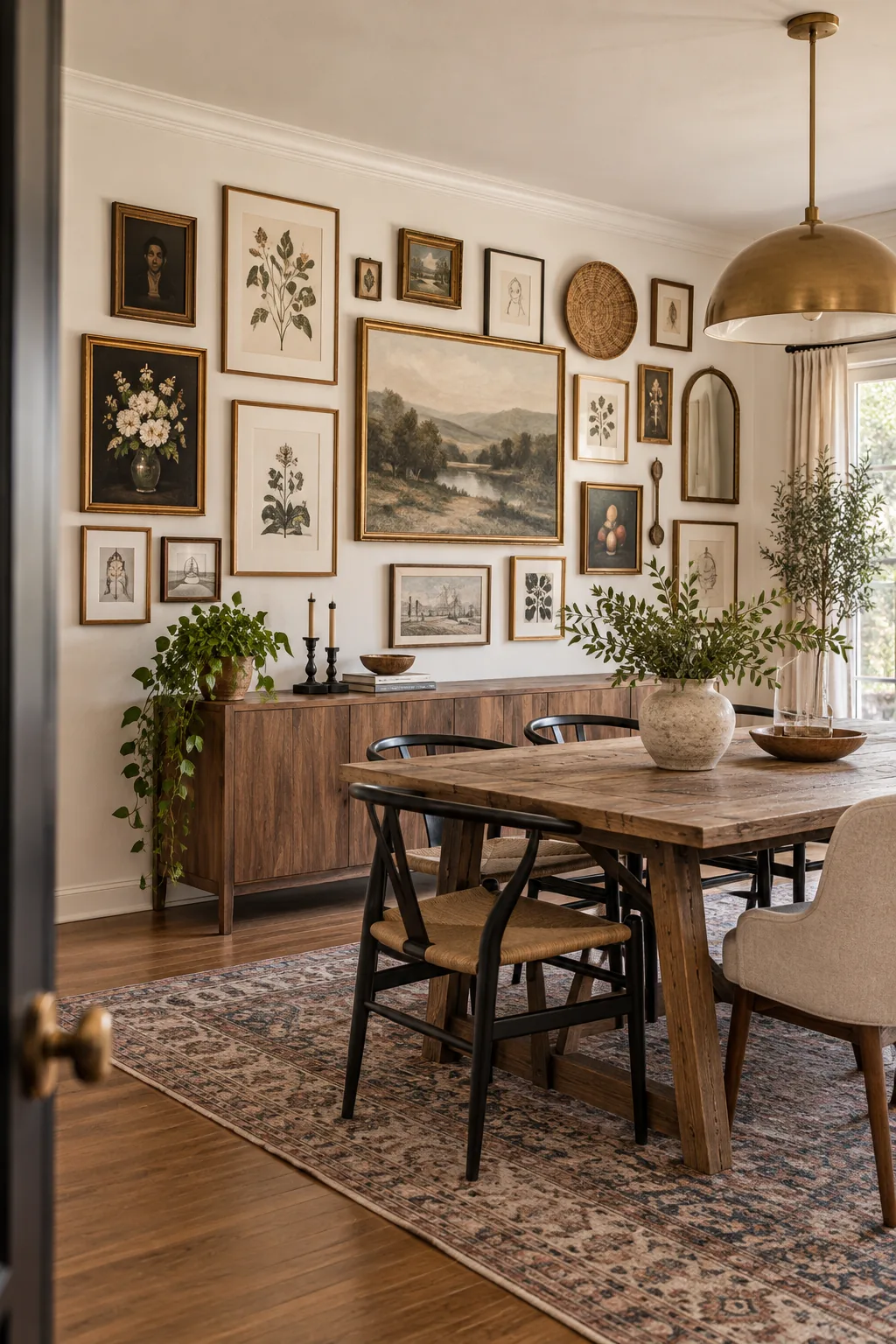
Mocking up asymmetrical arrangements is absolutely necessary to visualize the final balance. You can shift the paper templates endlessly to refine the layout without ever damaging your drywall.
Taping the Outer Boundaries
Before placing individual paper templates, define the absolute limits of your gallery zone. Running a border of blue painter’s tape establishes the maximum height and width, keeping your sprawling arrangement neatly contained.
Handling Sloped Ceilings or Staircases
Staircase galleries require a completely different mathematical approach to maintain visual harmony. Instead of a flat horizontal axis, you must measure up exactly 57 inches from each individual stair tread to create a stepped center line.
Maintaining the Perfect Alignment
Humidity and seasonal temperature shifts can cause drywall to expand, subtly shifting your carefully placed hooks. Check your frames with a small torpedo level every six months to ensure the entire grid remains mathematically crisp.
Three Ways to Style Your Gallery Grid
Once you master the math, the aesthetic possibilities are endless—choose a look that fits your space.
Minimalist Birch and Monochrome: Identical light wood frames and black-and-white photography create a calming, orderly atmosphere perfect for a restful bedroom space.
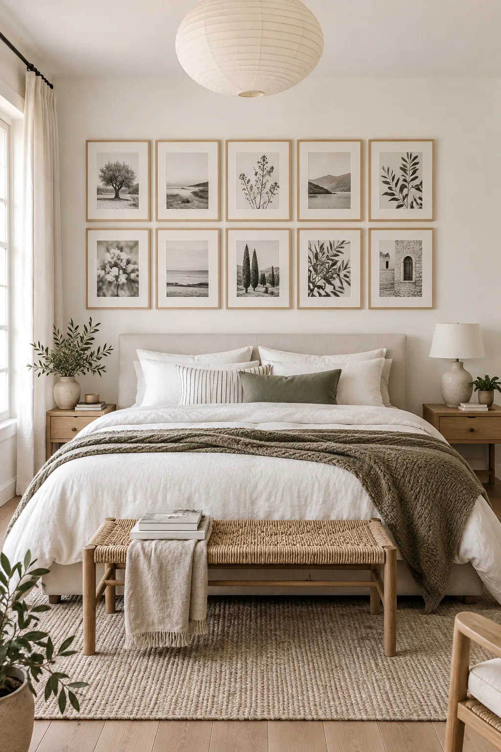
Moody Maximalist Vintage Gold: Embrace a dramatic library aesthetic by packing ornate gold frames tightly together against a dark, moody paint color.
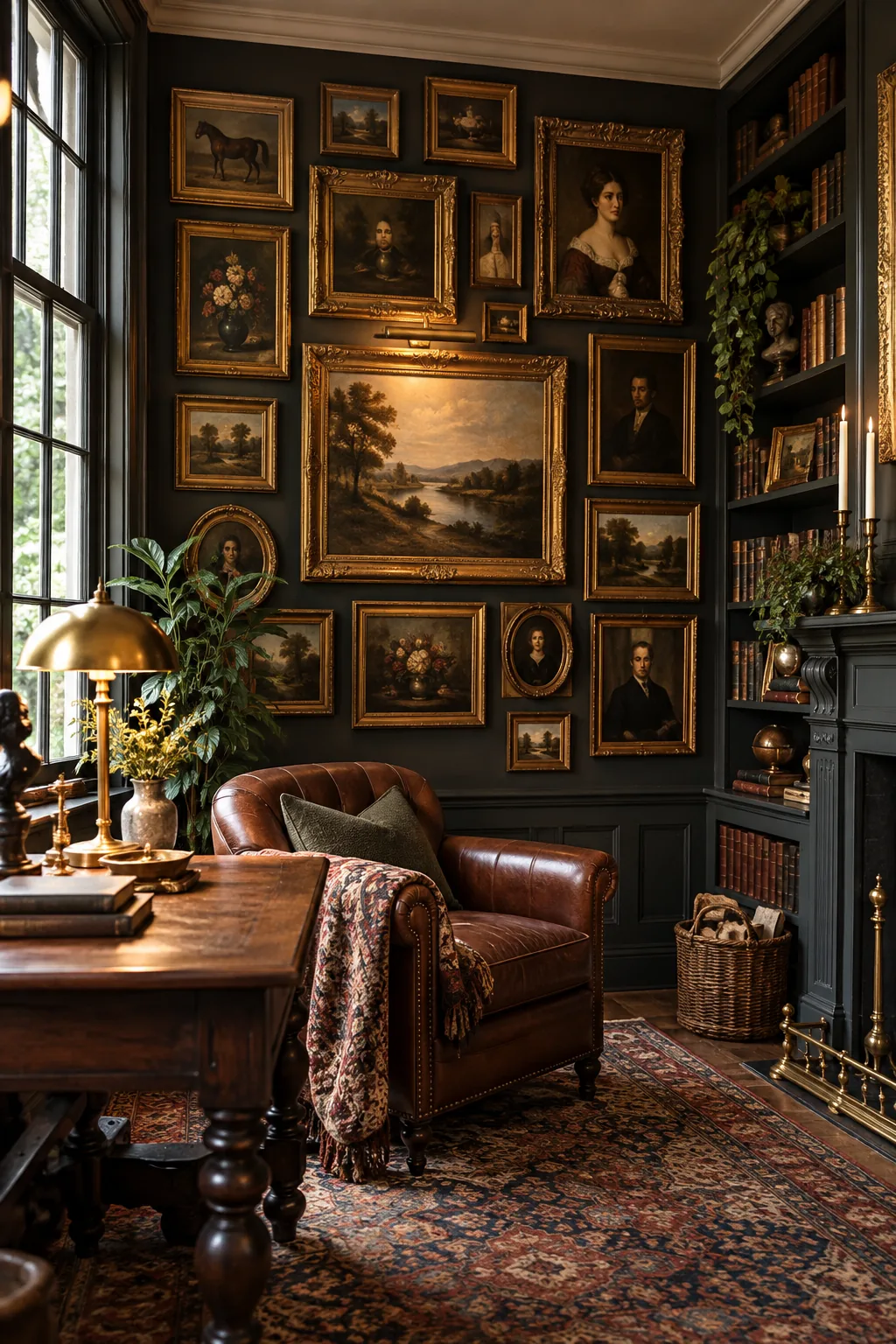
Bright Bohemian Organic Flow: Break the rules entirely by weaving three-dimensional objects like rattan baskets into an asymmetrical arrangement of vibrant, unframed art.
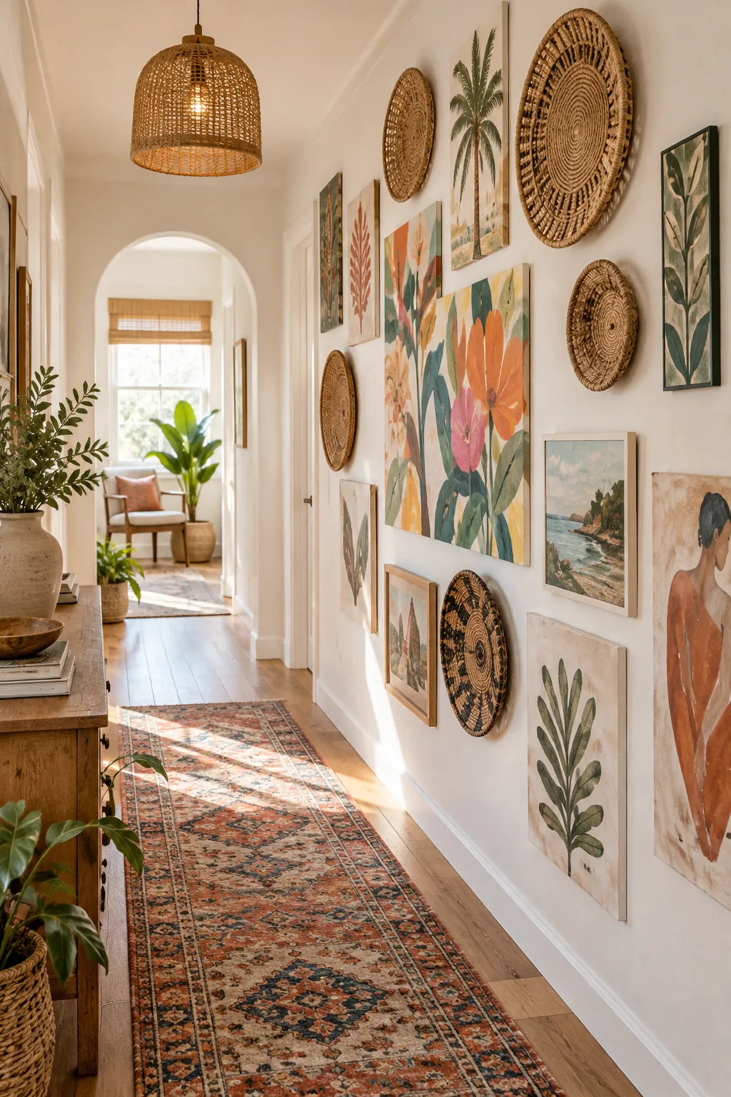
Your 5 Proven Grid Formulas Cheat Sheet
Download the printable layout cheat sheet to skip the guesswork entirely and execute a flawless design. It includes five foolproof grid formulas, from the classic symmetrical grid to the organic spiral, complete with exact measurement ratios.
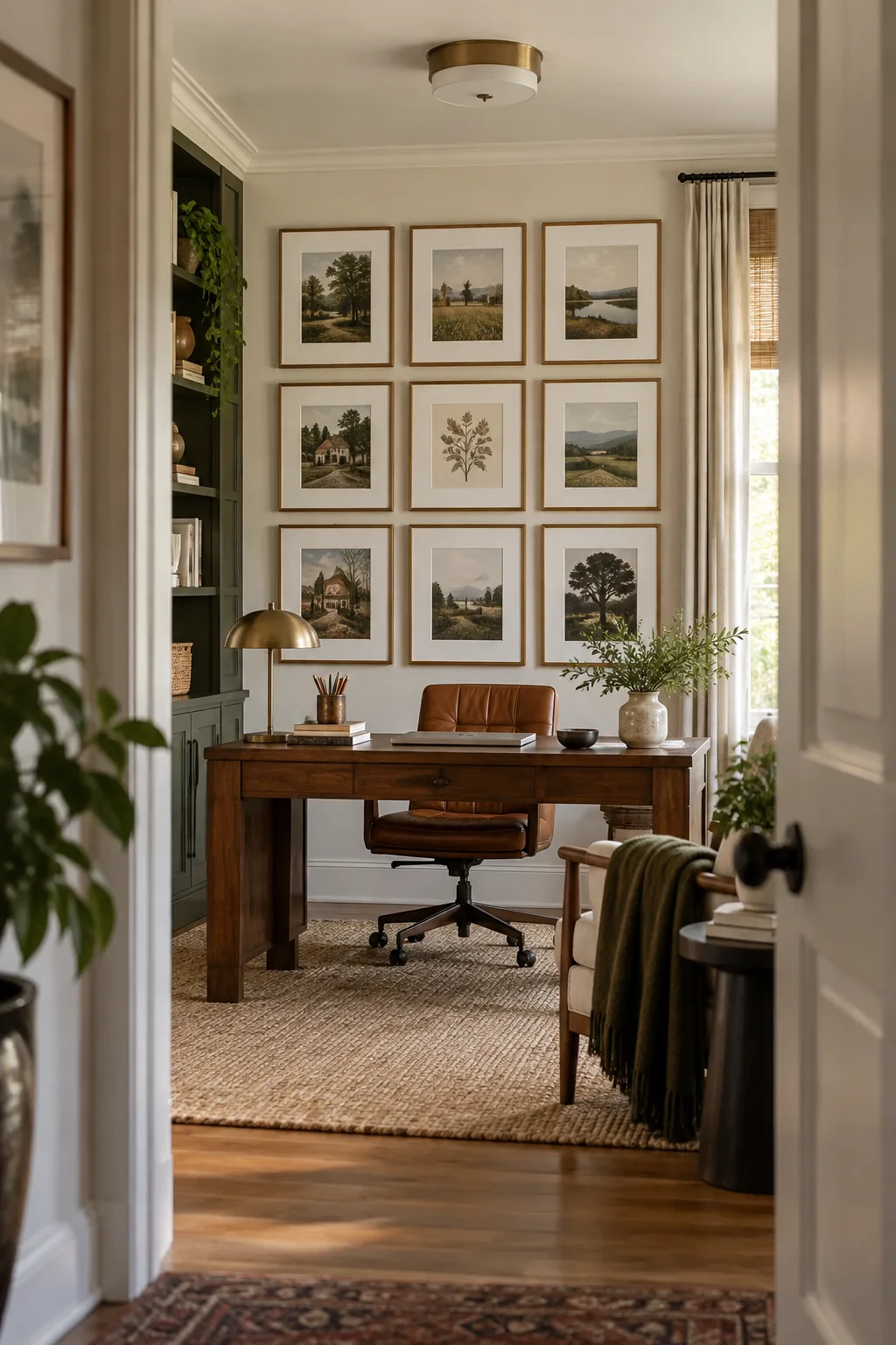
Once you have selected your preferred layout formula from the cheat sheet, run through this final verification before picking up your hammer.