
17+ Stunning Picture Frame Wall Ideas for Your Home
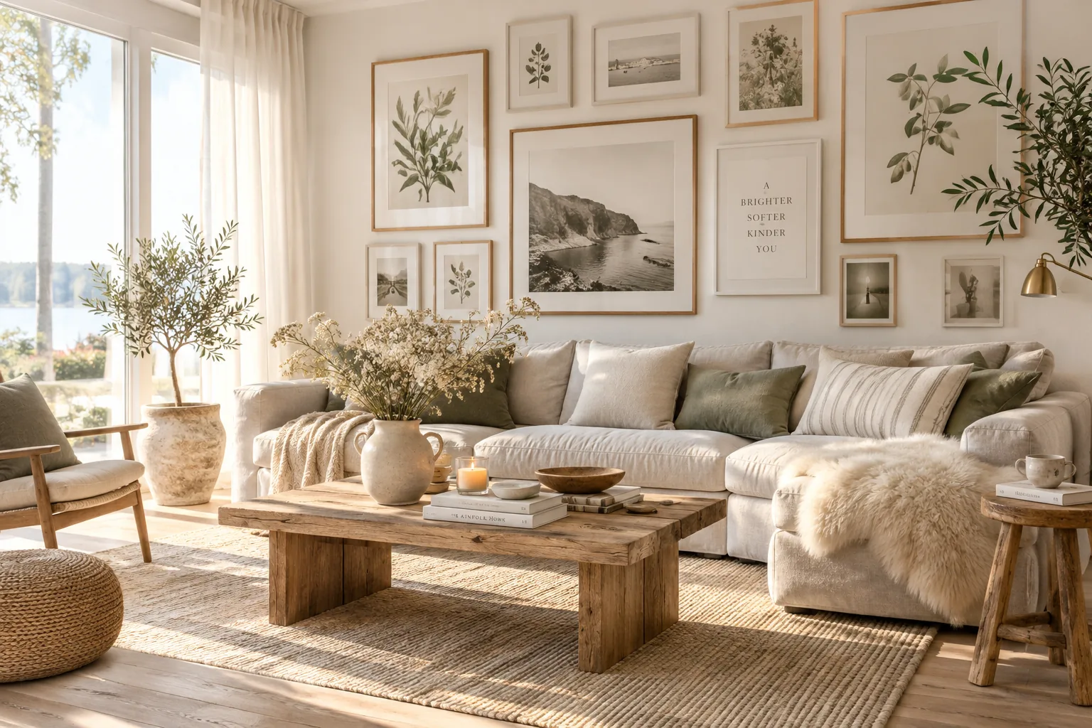
Creating a picture frame wall is the easiest way to give a room instant character without spending a fortune on large-scale art. I have put together my favorite layouts and styling tricks so you can finally tackle that blank space with confidence.
1. Start Off-Center
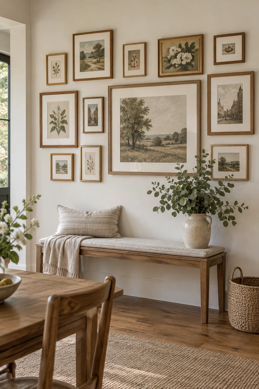
Anchor your picture frame wall with the largest piece slightly off-center. This keeps the arrangement from looking too stiff while still providing a clear focal point. Build outward with medium frames, filling the gaps with smaller pieces to create visual balance. Keep the spacing consistent at about two inches between every frame for a cohesive finish.
2. Use Kraft Paper Templates
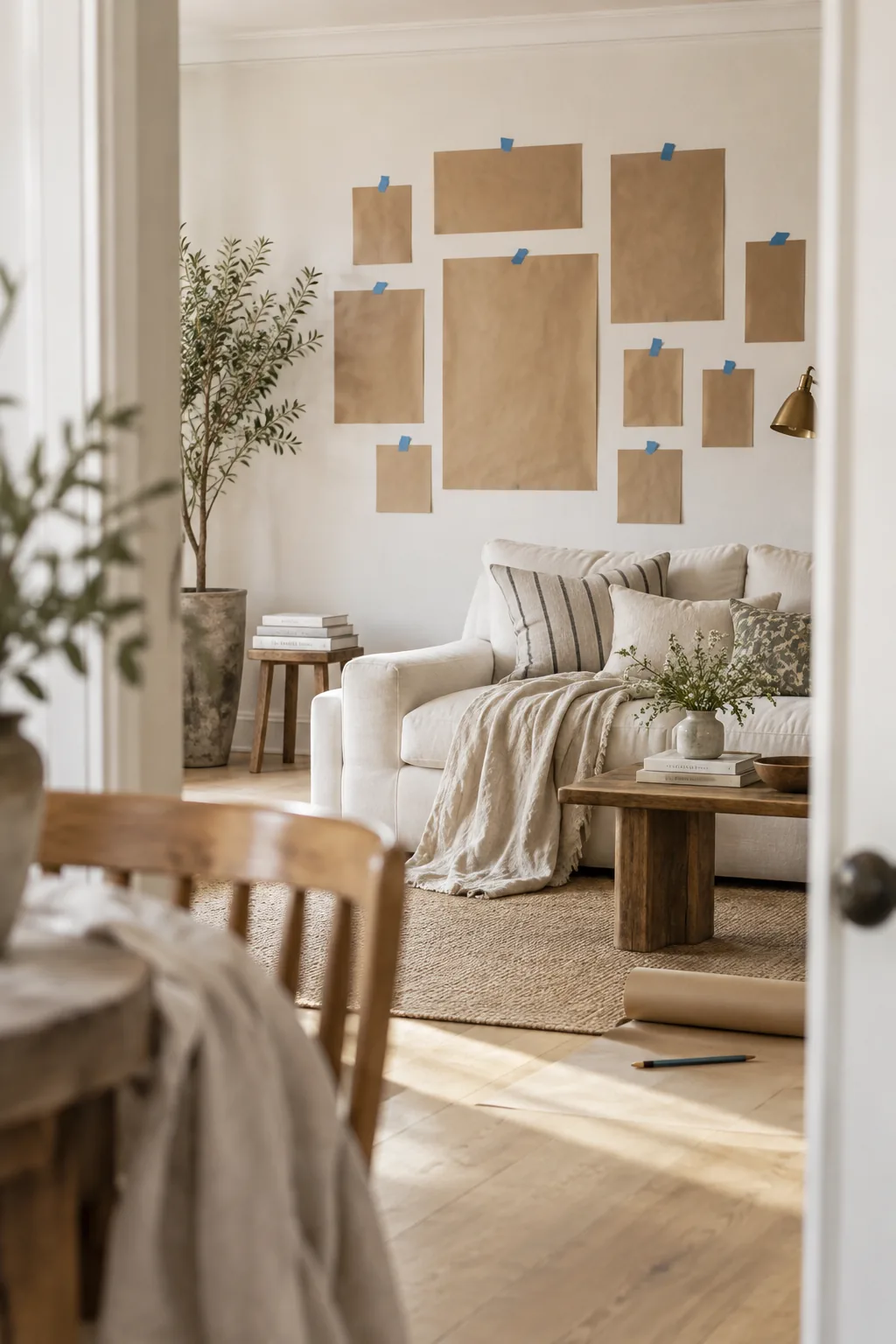
I always use kraft paper templates before putting a single nail in the wall. It saves me from patching unnecessary holes later.
Tape the cutouts up with painter's tape and step back. Move them around until the flow feels right.
This zero-risk planning method lets you visualize the exact scale.
Why it works: Why it works: Paper templates remove the fear of making mistakes and allow for endless layout adjustments.
3. Floor-to-Ceiling Grid
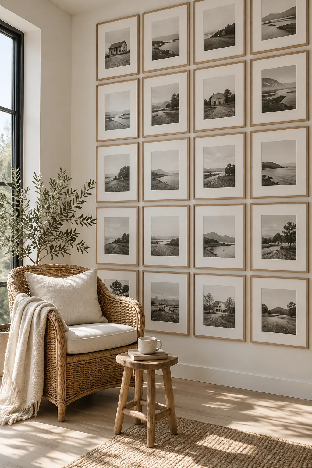
A floor-to-ceiling grid creates a striking architectural statement in a plain room.
You need identical gallery frames and identical matting to pull this off properly. The strict symmetry turns a random collection of photos into a custom wallpaper effect. Just make sure your bottom row sits at least six inches above the baseboard to avoid scuff marks from the vacuum.
- Matching square frames
- Oversized white mats
- Black and white photography
4. Nail the 57-Inch Rule
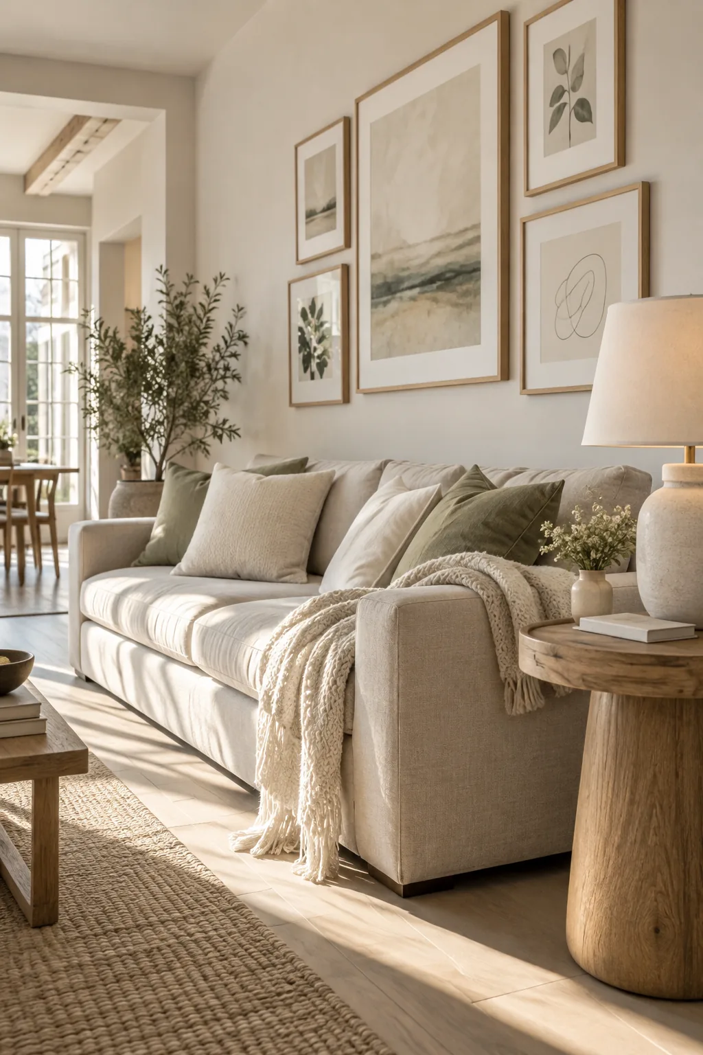
The ideal viewing height for a picture frame wall centers at 57 inches from the floor. This measurement reflects the average human eye level and instantly anchors your display to the room. If you are hanging frames above a sofa, leave a gap of about eight inches between the furniture and the lowest frame.
Hanging things too high is the most common design mistake I see.
5. Mix Your Frame Finishes
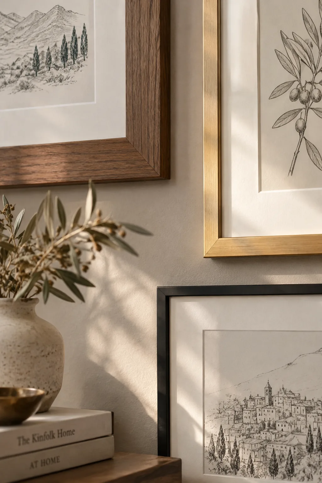
Mixing wood tones with metallic finishes prevents a large gallery wall from feeling flat. A room usually has multiple textures, and your wall art should reflect that depth. Try pairing warm walnut frames with brushed brass and simple matte black edges.
Just stick to three finishes total so it does not get chaotic.
6. The Sweeping Staircase Layout
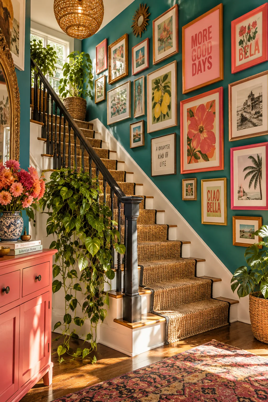
An organic, sweeping layout creates a relaxed bohemian vibe that feels collected over time. Start from the bottom left and let the frames climb diagonally toward the top right of the wall. This asymmetrical approach works beautifully on awkward walls or staircases. You can easily add new pieces to the edges as your collection grows.
- Vintage brass frames
- Unframed canvas panels
- Small floating shelves
7. Layer on Picture Ledges
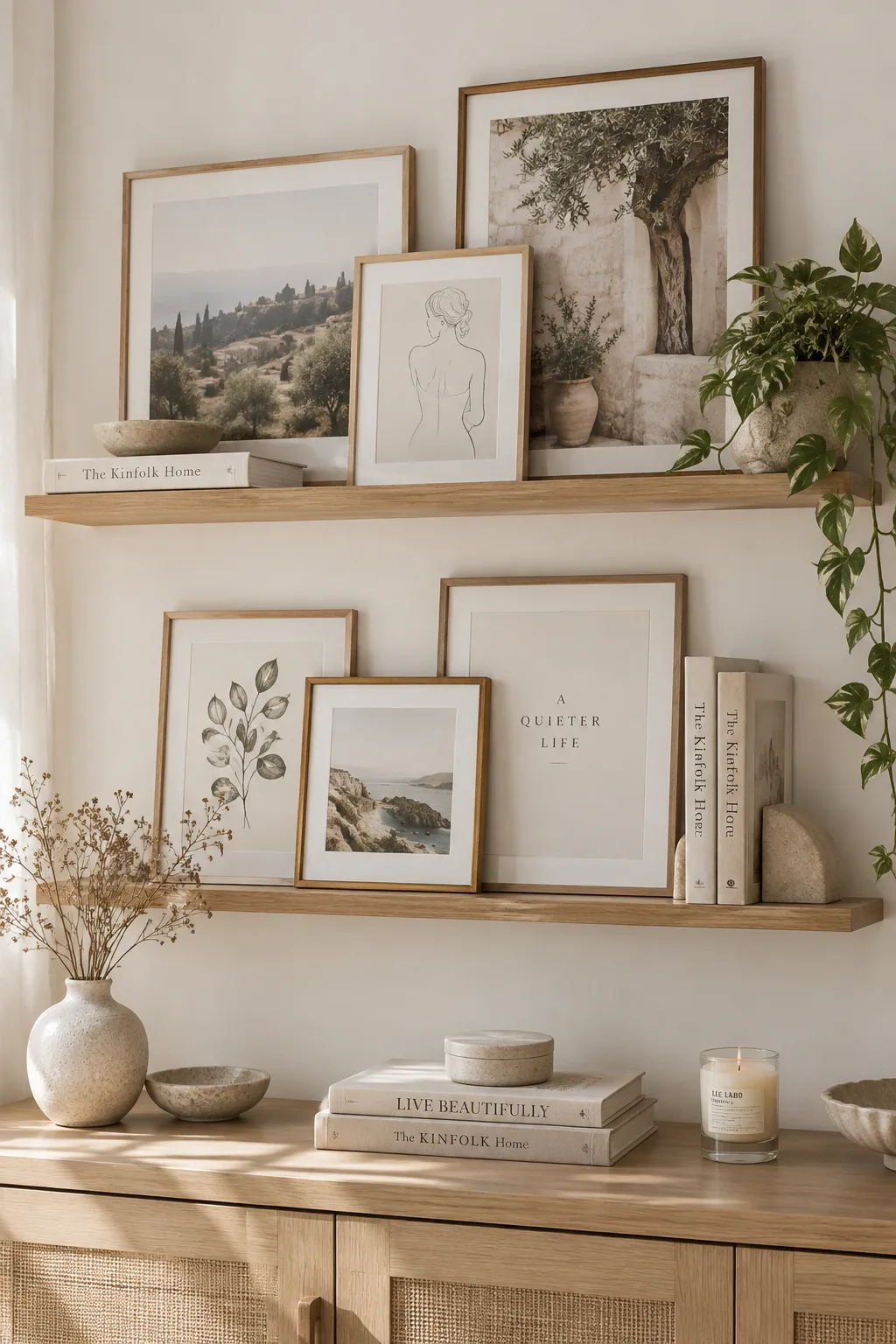
Use picture ledges if you love swapping out your artwork frequently. Install two or three ledges vertically, ensuring enough clearance for your tallest frames on the bottom shelves. Layer the pieces by overlapping a small frame in front of a larger one to build depth.
Why it works: Why it works: Ledges eliminate the need for precise measuring and nailing every time you want to refresh your art.
8. Elevate Kids' Art
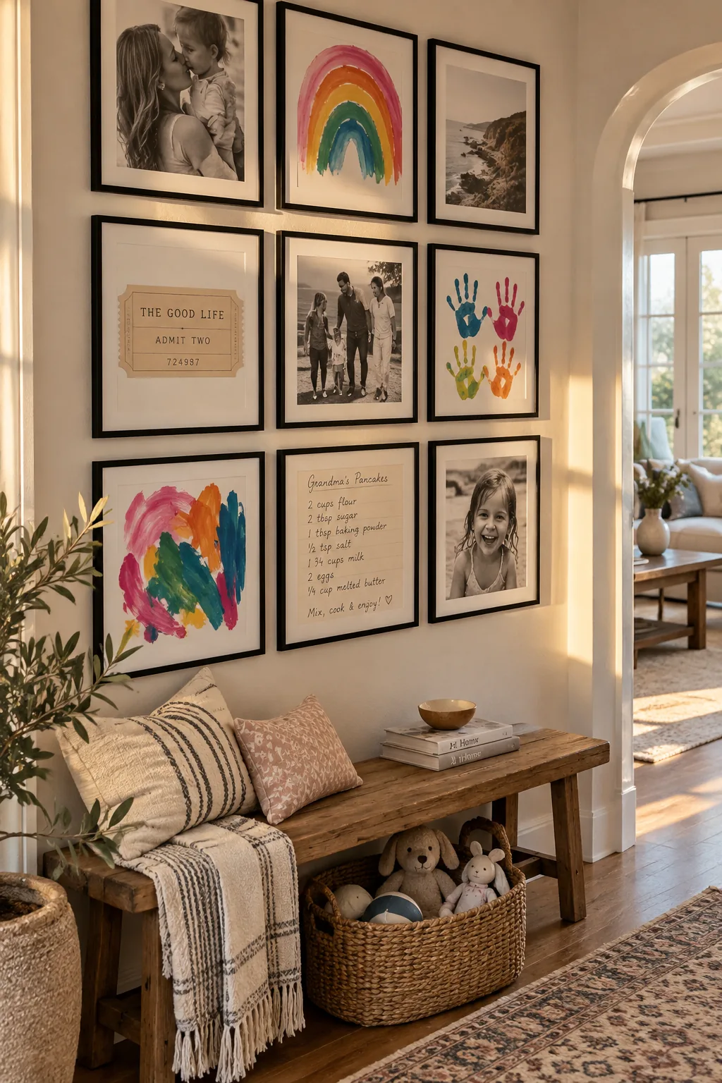
I recently helped a client frame their children's finger paintings alongside professional family portraits. We used identical frames to elevate the casual art, making the whole wall feel intentional and chic. Mixing high and low pieces adds incredible personality to a space. The uniform framing tricks the eye into seeing a curated collection rather than a messy fridge display. Do not be afraid to include ticket stubs or handwritten recipes in the mix.
9. Unify with Mat Boards
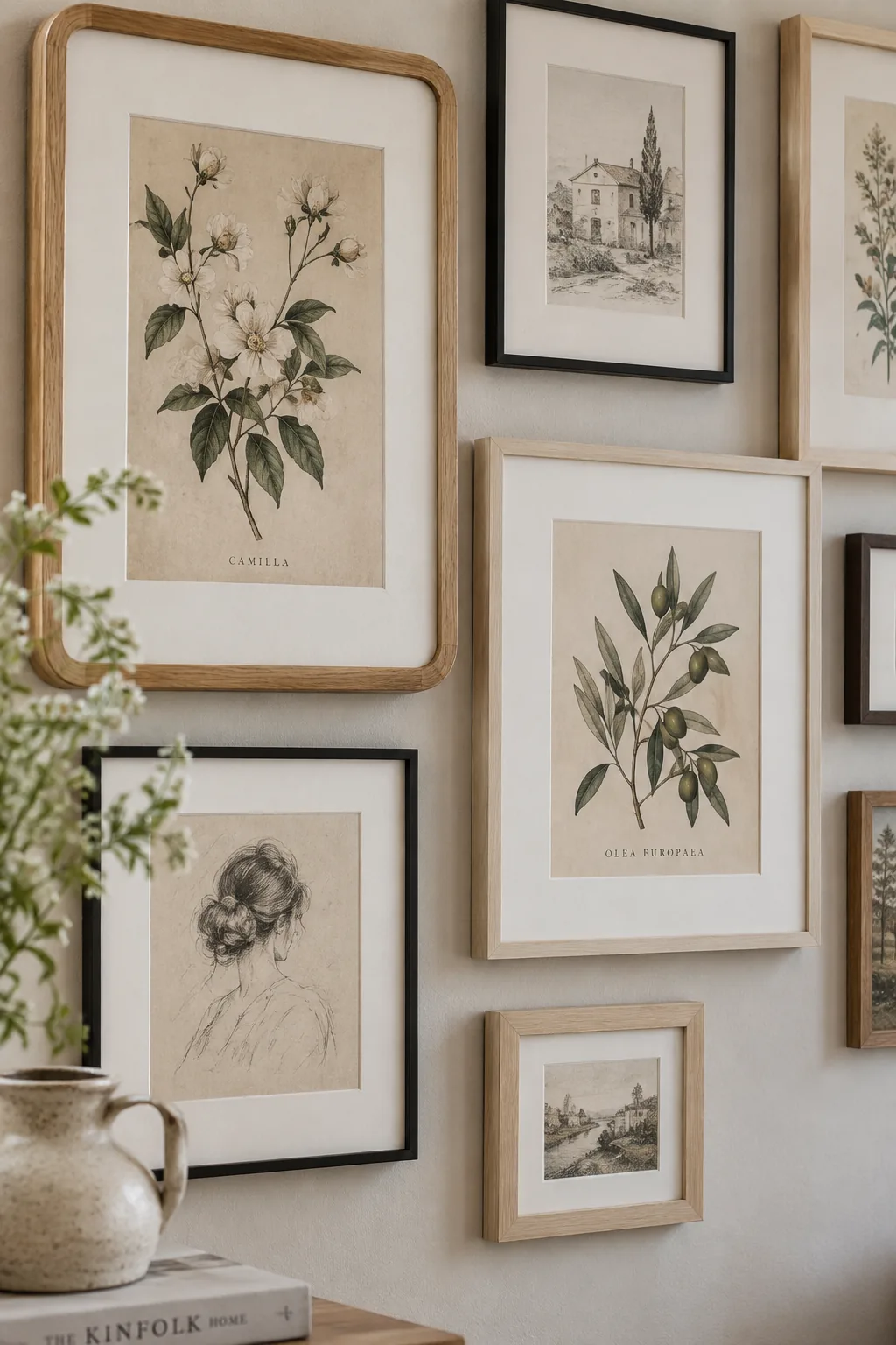
Consistent mat board is what makes a wildly diverse collection of art look like it belongs together. Even if your frames are different shapes and colors, using the same crisp white matting unites them. This negative space gives each piece room to breathe.
Custom mats are surprisingly cheap to order online for odd-sized vintage art.
10. The Vertical Column
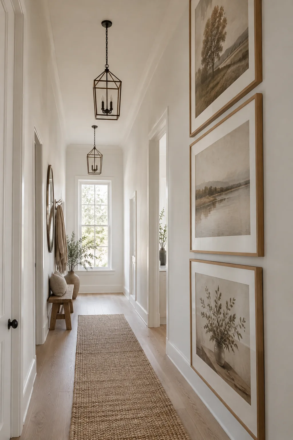
My favorite trick for narrow hallways is creating a vertical column of just three oversized frames. It draws the eye up to the ceiling and makes a cramped corridor feel grand and deliberate.
11. High-Contrast Monochromatic
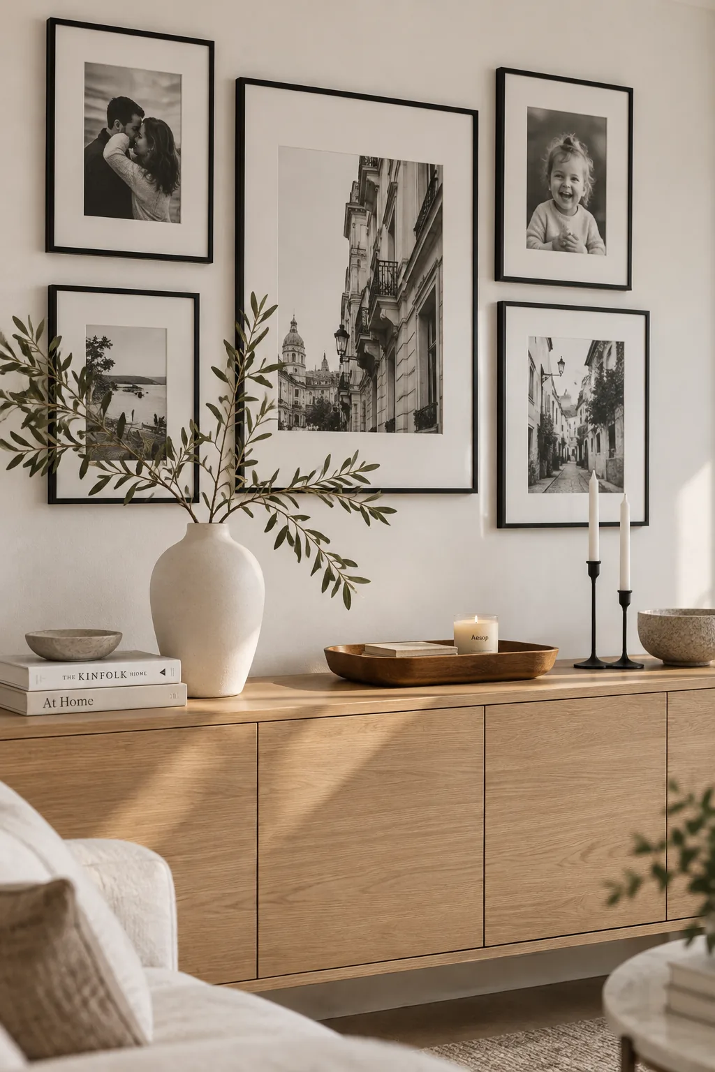
A monochromatic black and white wall creates a highly sophisticated, editorial atmosphere in a modern living room. Strip away the color, and the focus shifts entirely to the composition and subject matter of the photos. Use sleek black frames with wide white mats for maximum contrast. This high-impact style works especially well with architectural photography and candid family portraits.
12. The Invisible Equator
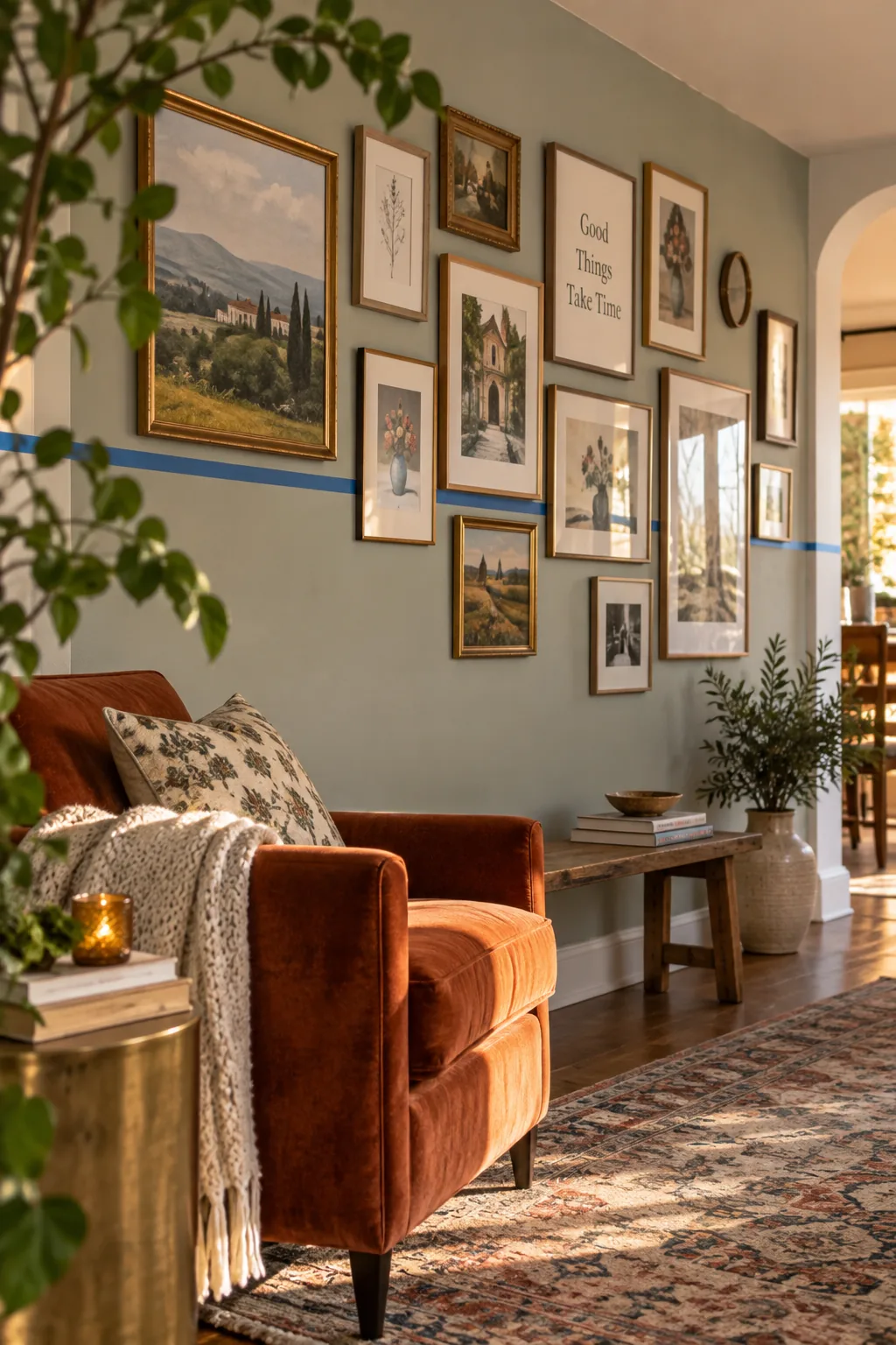
Anchoring your layout with a strong horizontal line makes an eclectic arrangement feel grounded and organized. Run a line of painter's tape across the wall and build your picture frame wall above and below it. The frames do not need to match, but their edges should touch that invisible center equator. This technique brings order to chaos without requiring strict symmetry. It is the perfect compromise if you love a collected look but hate visual clutter.
Why it works: Why it works: A central axis provides a hidden structural rule that the human eye naturally finds pleasing.
13. Push to the Ceiling
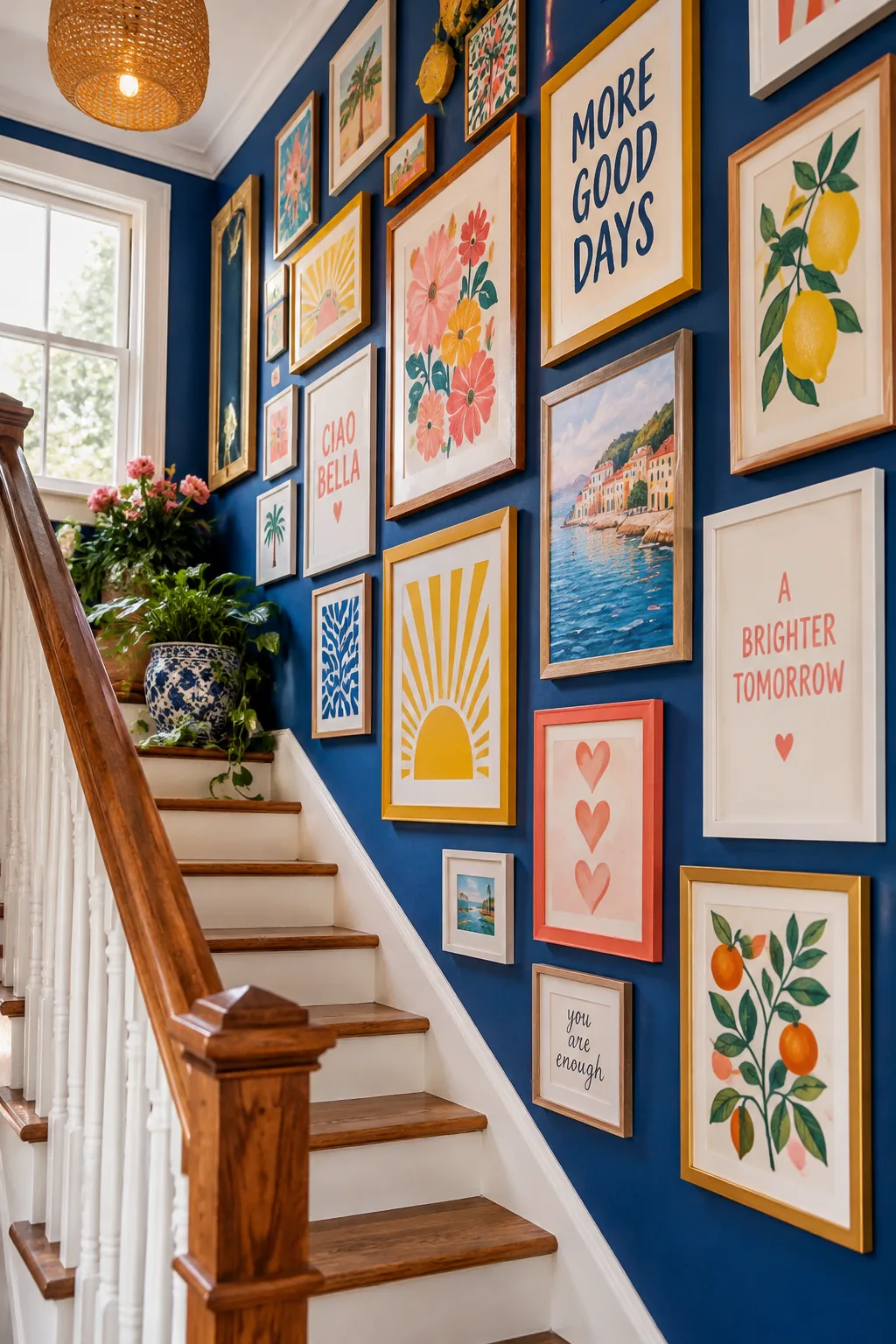
Rooms with low ceilings benefit massively from frames that stretch closer to the crown molding. Most people stop their gallery walls far too low, leaving awkward empty space up top. Pushing the frames higher draws the eye upward and fakes architectural height. Try continuing a stairwell display all the way up to the second-floor ceiling. The visual lift completely transforms the proportions of a tight space.
14. Add 3D Elements
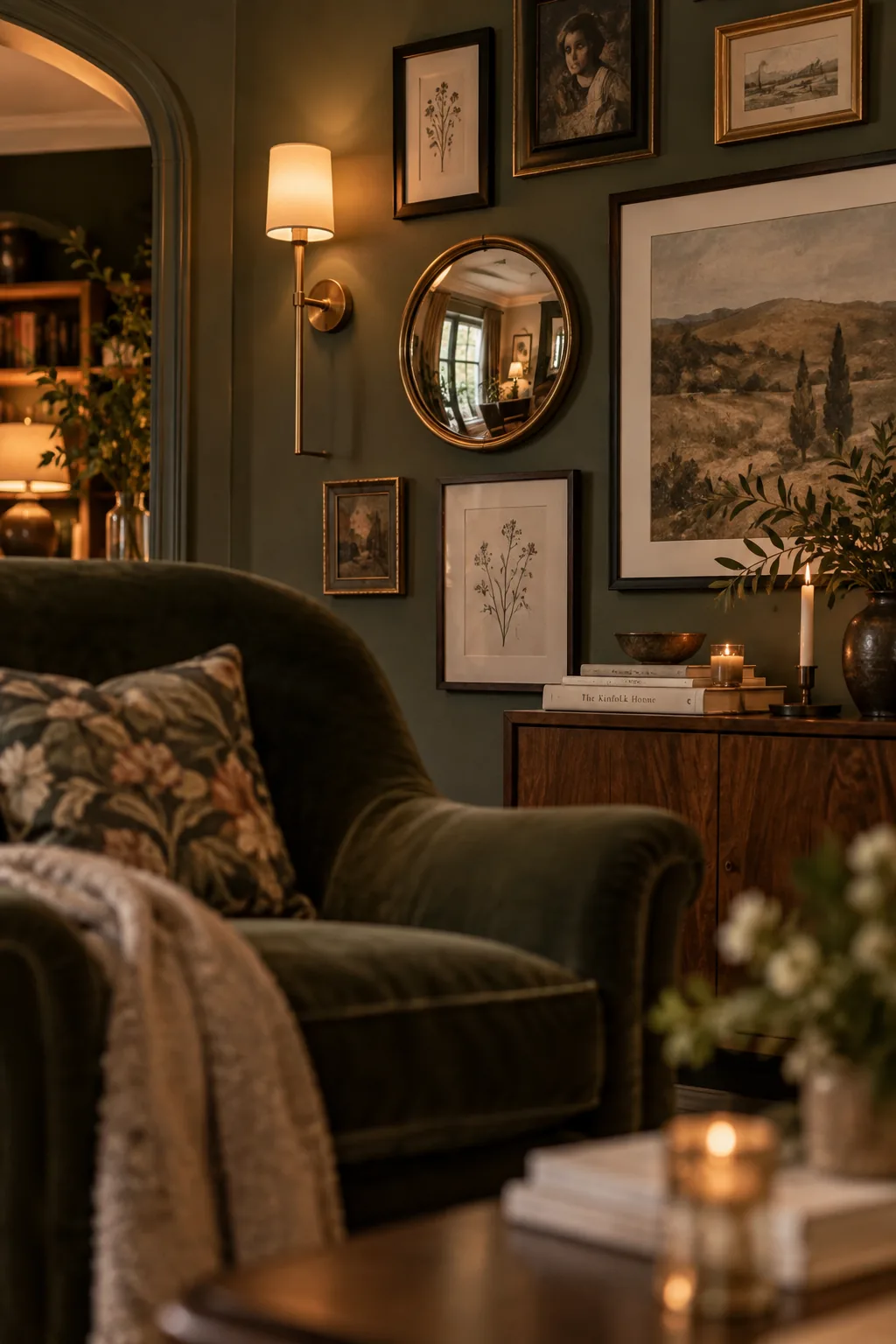
Incorporate 3D objects like small mirrors or wall sconces to break up the flat glass surfaces. This adds unexpected texture and catches the light differently throughout the day.
15. Secure with Museum Wax
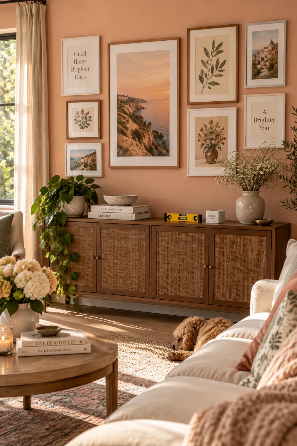
I always keep a small level and museum wax in my back pocket on installation days. Nothing ruins a beautiful picture frame wall faster than frames that tilt every time a door shuts. A tiny ball of museum wax on the bottom corners holds the frame perfectly flush against the drywall. It is completely removable and will not damage your paint job. You will never have to straighten your artwork again.
Why it works: Why it works: Museum wax secures the bottom edge of the frame, preventing shifts from vibrations or drafts.
16. Wrap the Corner
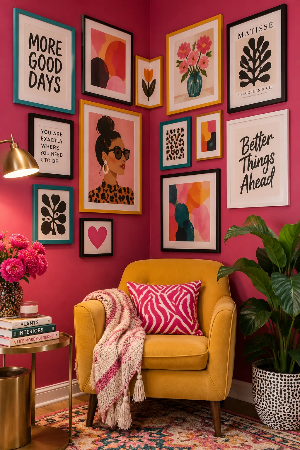
Wrapping a gallery wall around a corner makes a room feel incredibly cozy and custom. It blurs the harsh architectural lines of the room and creates an immersive viewing experience. Start your layout on the larger wall and let the smaller frames spill naturally onto the adjacent wall. Keep the spacing identical across the corner seam to maintain the illusion of one continuous display. This is a brilliant way to handle awkward nooks or short hallway transitions.
17. The Leaning Studio Look
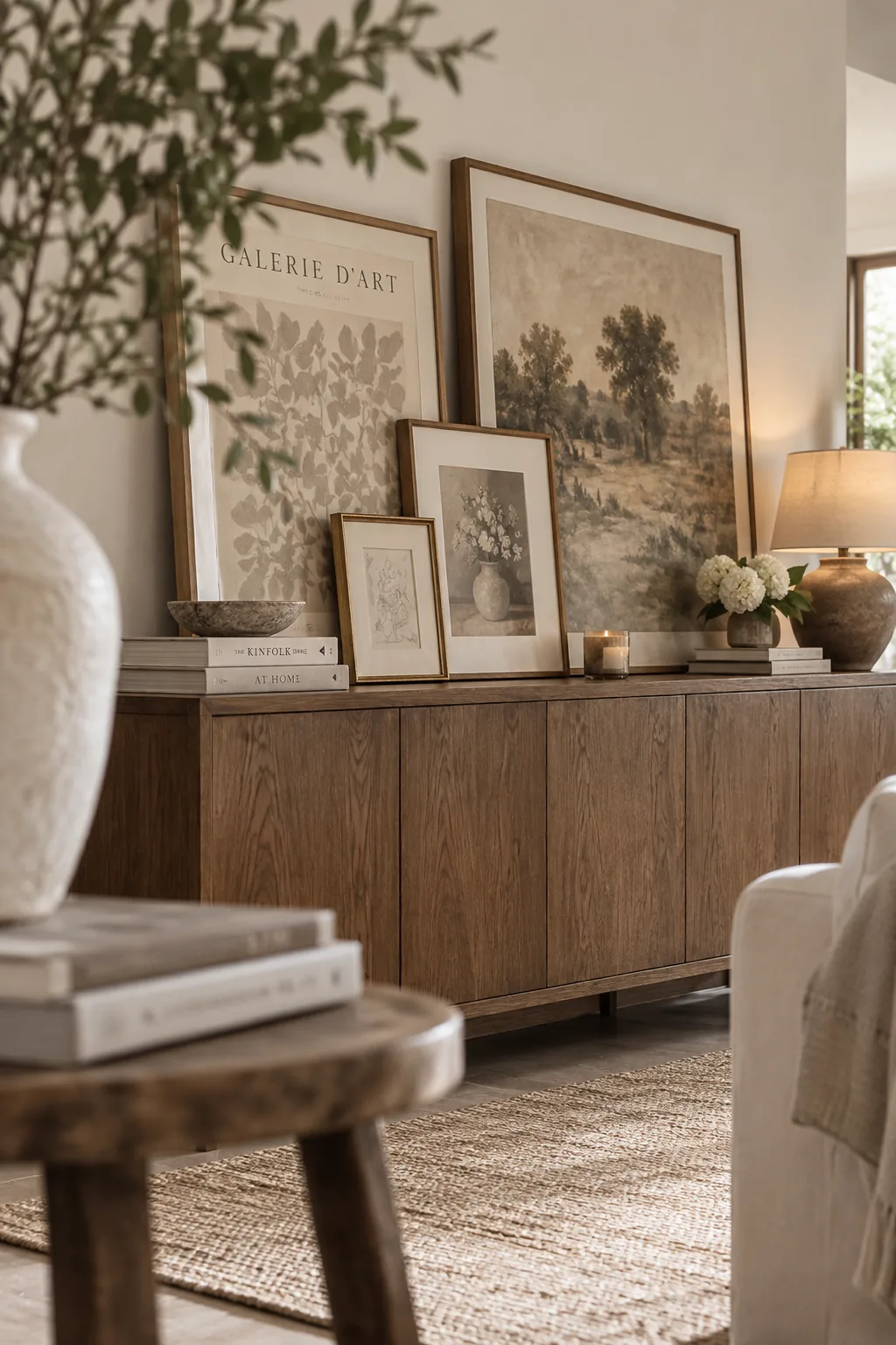
A leaning display on a deep credenza creates a relaxed, studio-like aesthetic.
Skip the hammer entirely and simply prop your largest frames against the wall. Layer smaller pieces in front, letting the frames overlap slightly to build physical depth. This casual approach is perfect for renters or anyone who changes their mind frequently.
18. Camouflage the TV
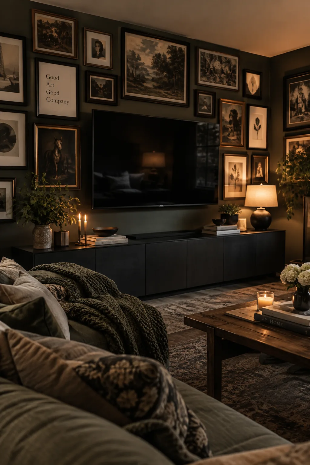
Treating your television as just another frame is what makes a media wall successful. Surround a smart TV with a dense arrangement of dark-toned frames to camouflage the black screen. When the TV is off, it blends seamlessly into the picture frame wall instead of looking like a giant electronic void. Keep the art surrounding it low-contrast so it does not distract when you are actually watching a movie.