
Cute Desk Poster Layouts: Download Your Free Cheat Sheet
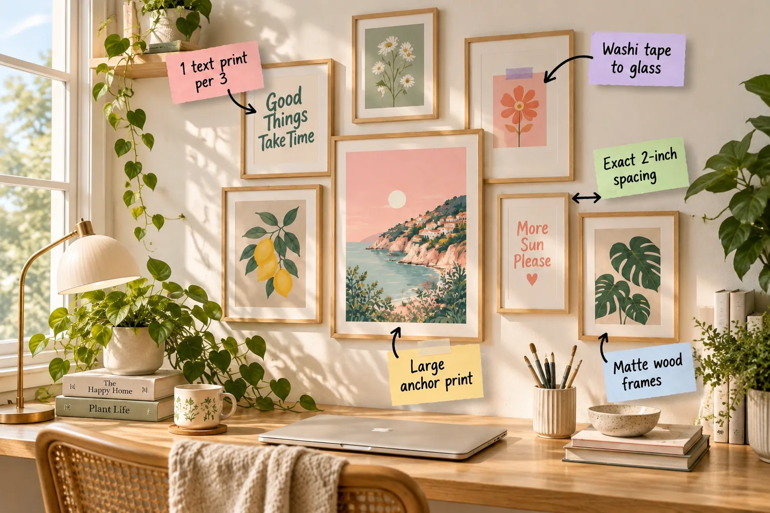
Transform your workspace from a blank wall into a beautifully balanced creative zone by downloading our free desk poster layout cheat sheet. You will quickly learn to measure, space, and hang a perfectly proportioned gallery wall over your desk using our exact formulas.
Start With a Large Anchor Print
Begin your arrangement by placing the largest poster near the center-bottom of your available wall space. This heavy visual element grounds the entire layout and prevents the gallery from feeling like it is floating away from the desktop.
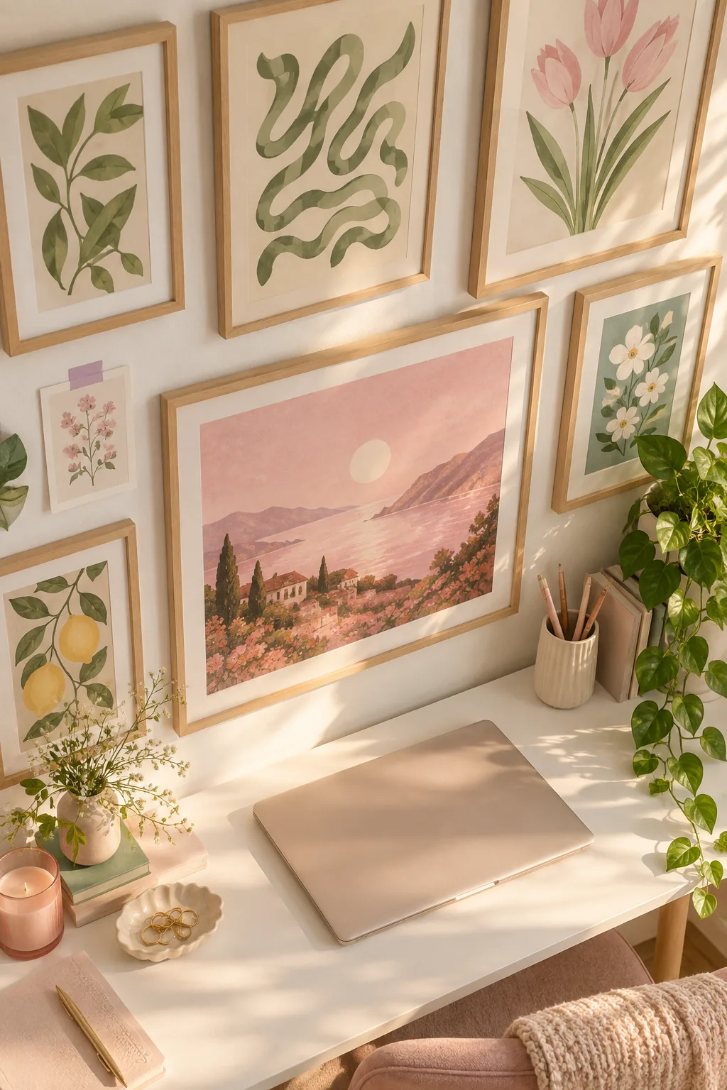
Positioning this large anchor print first establishes the core geometry of your arrangement. Every subsequent frame will build outward from this central foundation, ensuring the final cluster remains cohesive rather than chaotic.
Position the Anchor for Seated Viewing
Finding the correct height for this central piece requires you to sit in your primary desk chair. You want the middle of the anchor artwork to align perfectly with your natural sightline while typing.
- Adjust your desk chair to your everyday ergonomic working height.
- Sit up straight and look forward without tilting your chin up or down.
- Mark the wall exactly where your gaze naturally lands to establish your center.
Using this precise center mark guarantees your art remains intimately connected to your workspace. Hanging the anchor any higher disconnects the gallery from the desk entirely, ruining the cozy atmosphere.
Choose Soft Pastel Color Palettes
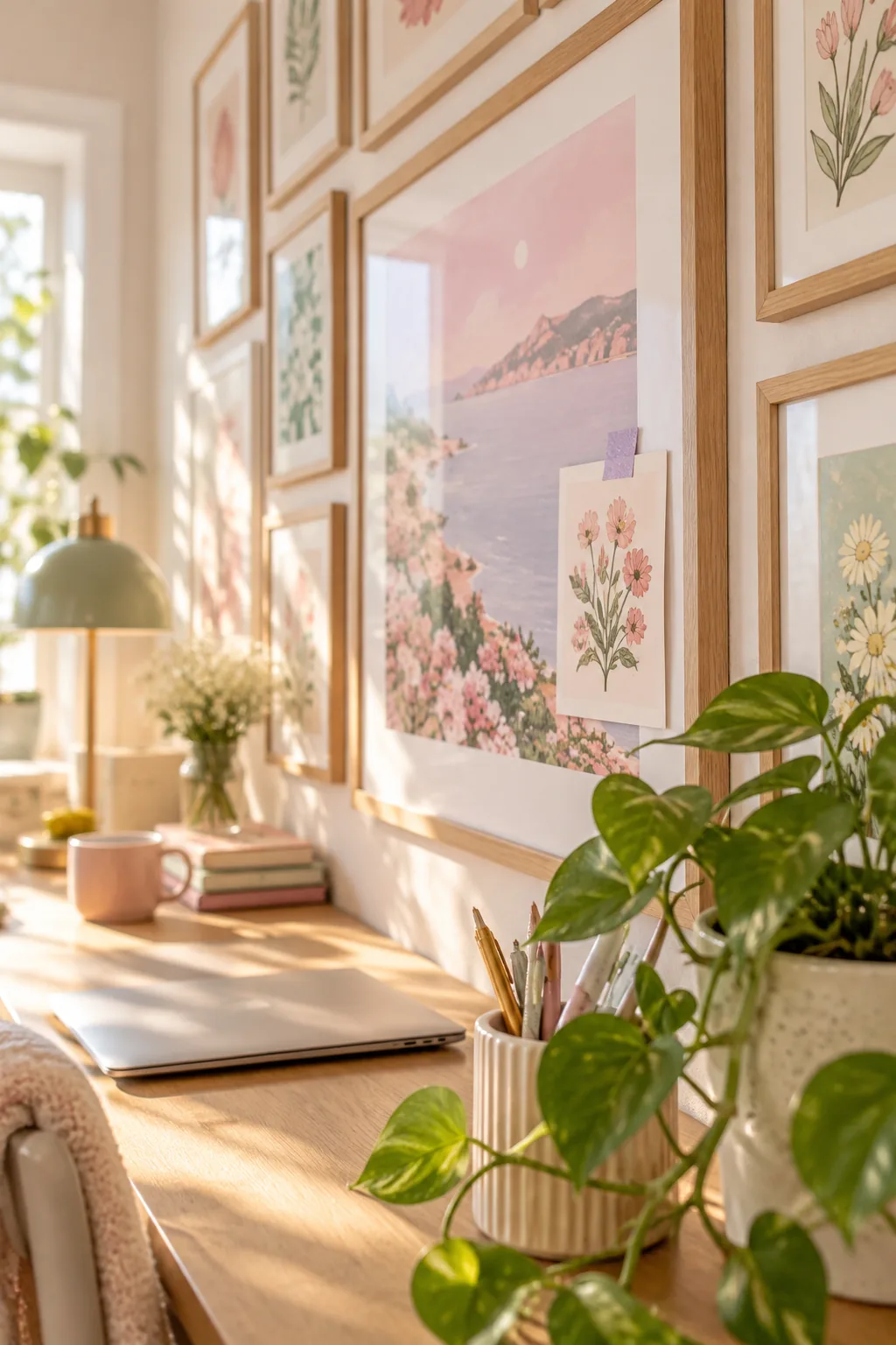
Maintain a calm working environment by selecting artwork rooted in soft, muted pastel tones. Gentle blush pinks, sage greens, and pale lavenders provide beautiful visual interest without demanding too much of your attention during deep focus sessions.
Outline the Perimeter With Painter’s Tape
Before picking up a hammer, define the outer boundaries of your entire arrangement using gentle painter’s tape. This temporary border gives you a clear visual container, preventing the gallery from creeping too far toward the ceiling.
Stick to Matte Wood Frames
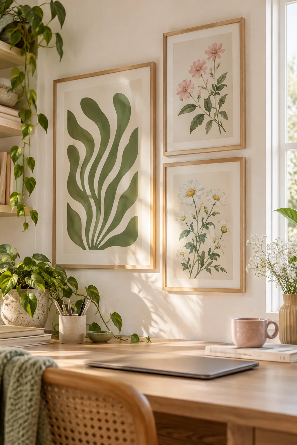
Keep the foundation cohesive by using light, non-reflective wooden frames for the majority of your prints. I learned this the hard way in my sunny Denver home office, where glossy frames turned my beautiful art into blinding white squares every afternoon.
| Frame Material | Glare Level | Visual Weight | Best Application |
|---|---|---|---|
| Matte Wood | Very Low | Medium | Core gallery foundation |
| Glossy Metal | High | Heavy | Single statement pieces |
| Clear Acrylic | Medium | Light | Small layered accents |
Selecting matte wood frames minimizes harsh glare from your desk lamp or nearby windows. This soft finish keeps the pastel artwork readable and maintains a calm, focused atmosphere while you work.
Avoid Heavy Black Frames
While black frames look striking in a living room, they create harsh, high-contrast borders that easily overwhelm a small desk area. Sticking to pale ash or natural oak preserves the delicate, airy quality of your pastel prints.
Match Frame Weights to Desk Furniture
The thickness of your wooden frames should ideally echo the visual weight of your desk legs or surface. Pairing chunky frames with a delicate glass desk creates a top-heavy room, while thin frames complement slender furniture beautifully.
Mix Wood Tones Carefully
While consistency is key, you can successfully mix two distinct wood finishes if you distribute them evenly. Pair a dominant pale ash with a secondary warm walnut, ensuring the darker frames are spread across the grid.
Follow the 1-to-3 Typography Ratio
Prevent visual clutter by balancing your art types carefully across the arrangement. For every three illustrated or photographic prints, include exactly one text-based poster to give the eye a natural place to rest.
Maintaining this strict 1 text print per 3 rule prevents the gallery from feeling overwhelming. Typography breaks up dense color blocks and provides necessary negative space within the curated cluster.
Select the Right Typography Style
When choosing your text prints, opt for bold, highly legible fonts rather than intricate, flowing scripts. Simple sans-serif typography acts as a visual palate cleanser, allowing the surrounding detailed illustrations to truly shine.
Incorporate Meaningful Quotes
Select text prints that offer genuine motivation or calm reflection for your daily workday. A beautifully typeset phrase that resonates with your personal goals adds emotional value to the wall, making the space feel uniquely yours.
Maintain Exact 2-Inch Spacing
A cute, collected layout still requires underlying structure to look intentional and professional. Keep an exact 2-inch spacing between every adjacent frame to create a crisp grid that ties the different poster sizes together.
Measuring the gaps with a tape measure while holding a heavy frame is incredibly frustrating. Instead, you need a reliable method to guarantee perfect spacing every single time you drive a nail.
Measure Gaps From the Frame Edge
Always calculate your two-inch gaps from the outermost edge of the frame itself, never from the hanging hardware. The physical borders of the frames dictate the visual flow, so their edges must align flawlessly.
Level Each Frame Individually
A precise grid quickly falls apart if even one frame hangs at a slight angle. Place a small spirit level on the top edge of every single frame during installation, adjusting the hardware until the bubble sits perfectly centered.
Use Damage-Free Hanging Strips
Protect your drywall by using adhesive hanging strips instead of traditional nails for lightweight frames. These strips allow for micro-adjustments during installation, making it much easier to achieve that flawless two-inch gap.
Layer With Washi Tape on Glass
Break up the rigid grid by introducing a casual, tactile layer to the arrangement. Take a small, unframed print or postcard and tape it directly onto the glass of a larger frame.
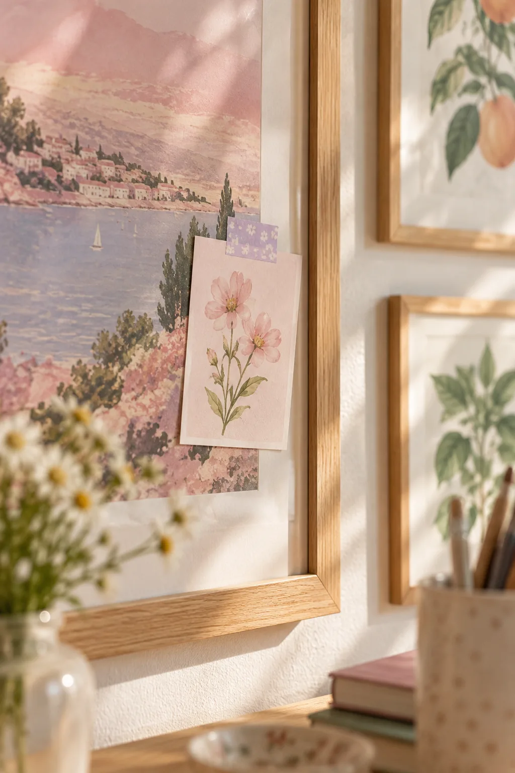
Applying washi tape to glass instantly adds depth and makes the gallery feel organic and collected over time. This technique works best when the small print slightly overlaps the underlying mat board.
Choose the Best Washi Tape Width
For the most balanced look, select a standard 15-millimeter wide washi tape. This specific width is substantial enough to hold the paper securely without obscuring too much of the beautiful artwork beneath it.
Update the Taped Accents Seasonally
The beauty of this tape method lies in its complete flexibility and lack of commitment. Swap out the small postcards or sketches every few months to refresh your workspace aesthetic without needing to buy new frames.
Download Your Desk Layout Cheat Sheet
Take the guesswork out of your gallery wall with our printable guide. It includes three distinct layout templates, exact measurement formulas, and a checklist for hanging your posters perfectly on the first try.
- A scaled grid mapping the exact two-inch gaps between varied frame sizes.
- A ratio calculator to easily balance your typography and illustration prints.
- A hardware checklist for securing both heavy anchors and delicate light accents.
Keep your printed desk layout cheat sheet nearby as you arrange your frames on the floor. Testing the configuration flat on a rug ensures you love the balance before putting any holes in the drywall.
Print the Templates at Full Scale
When printing your layout guides, always verify that your printer settings are locked to exactly 100 percent scale. Allowing the software to shrink the document to fit the page will distort the crucial spacing measurements.
Test the Layout on the Floor First
Clear a space on your rug that matches the exact dimensions of your wall area. Arranging the physical frames flat on the ground allows you to swap pieces effortlessly until the color distribution feels balanced.
Set the Right Bottom Clearance
Leave 4 to 6 inches of breathing room between your desk surface—or the top of your monitor—and the lowest frames. I once hung a client’s gallery too low, and they constantly bumped the bottom frames every time they moved their coffee mug.
Account for Monitor Adjustments
If you use a sit-stand desk or an adjustable monitor arm, always measure your bottom clearance from the highest possible screen position. This ensures your artwork remains visible and protected regardless of how you configure your workstation.
More Desk Poster Aesthetics to Try
Choose a gallery wall style that matches your unique workflow and room decor.
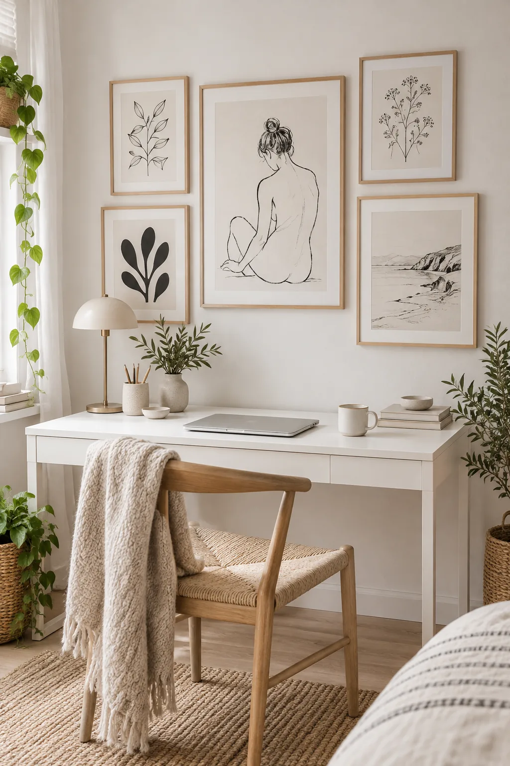
Minimalist Scandi home office.: Stick to black-and-white line art and raw birch frames for a distraction-free workspace.
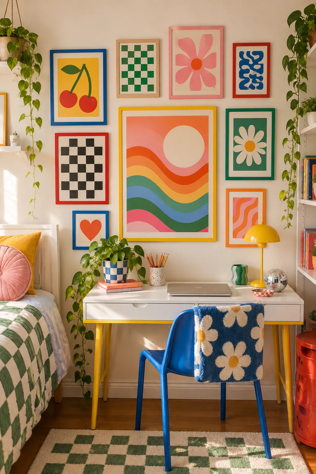
Vibrant Retro bedroom desk.: Energize your study space with bold checkerboard prints and brightly painted frames.
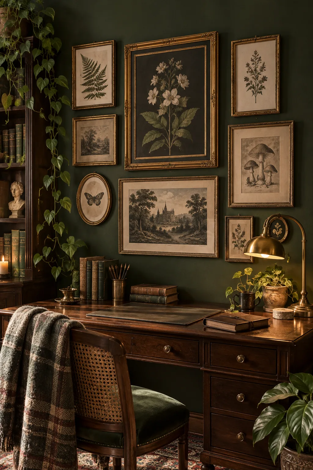
Dark Academia library corner.: Mix vintage botanical illustrations in ornate gold frames against a moody, dark-painted wall.
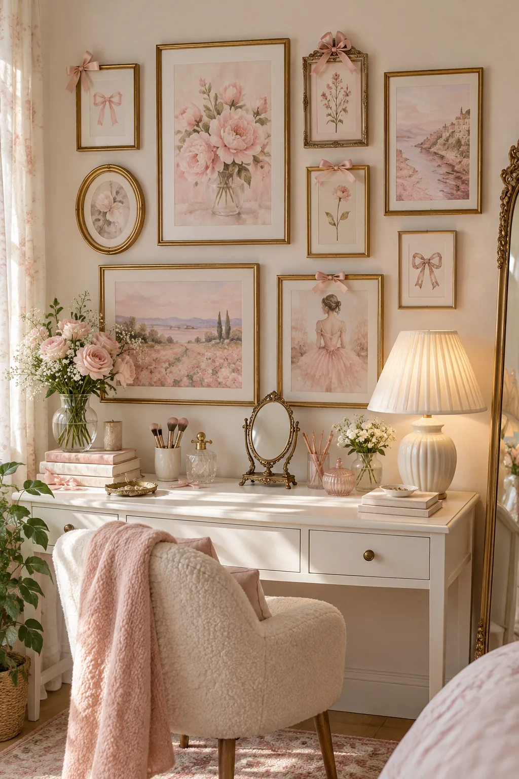
Soft Coquette vanity workspace.: Layer soft pink watercolor prints with tiny satin bows taped directly to vintage brass frames.
Blend the Wall With Your Desk Setup
Connect your new gallery wall to the desk surface so they feel like one cohesive zone. Let a tall pencil cup or a trailing houseplant overlap the bottom corner of your lowest frame to bridge the gap.
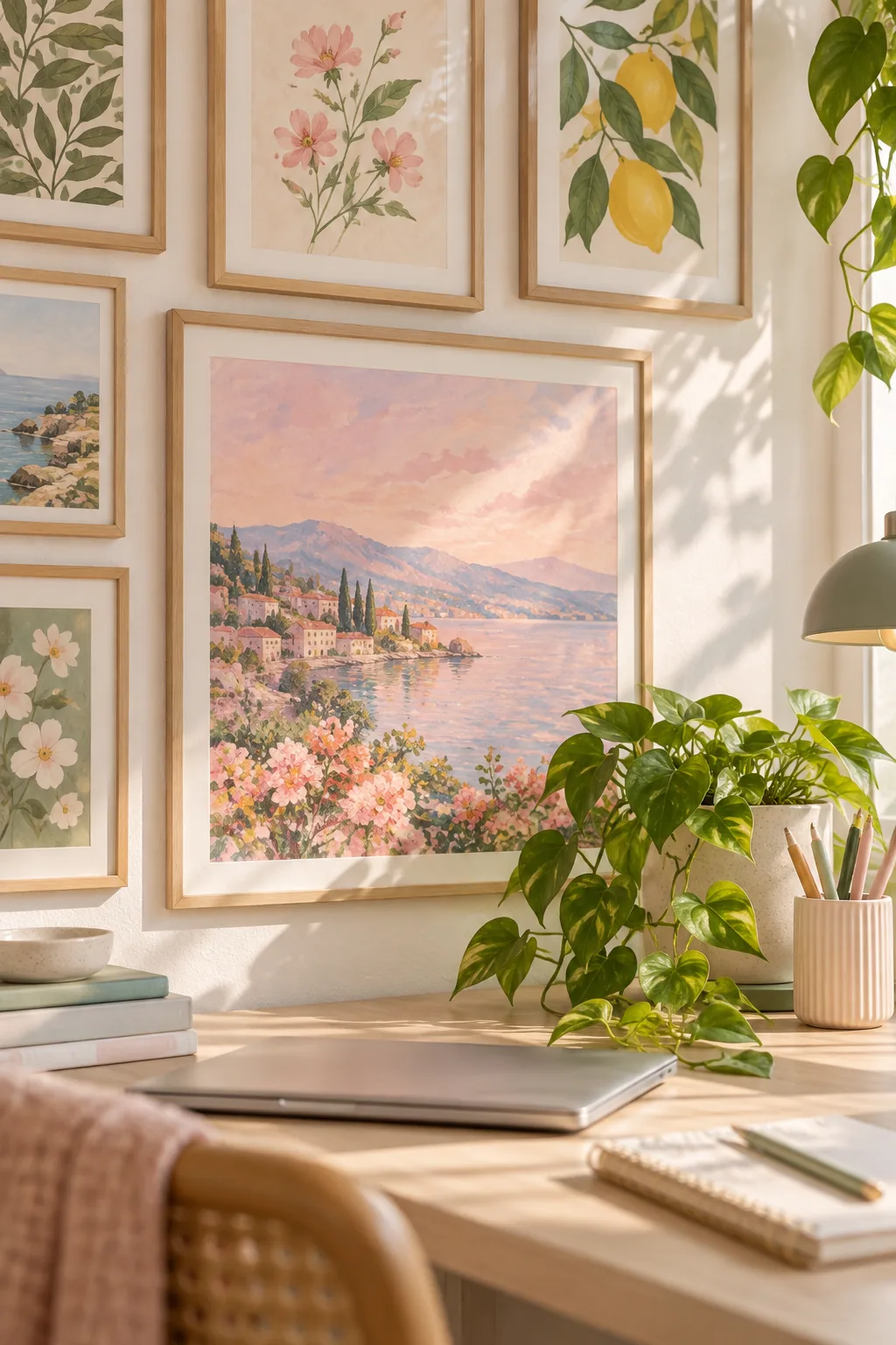
Allowing physical objects to break the plane of the artwork softens the transition between the horizontal desk and the vertical wall. This intentional overlapping transforms a sterile office into a warm, inviting creative studio.
- A trailing pothos plant cascading gently over the corner of an anchor print.
- A ceramic pencil cup standing just tall enough to cross the lowest frame edge.
- A sleek desk lamp positioned to subtly illuminate the central artwork.
While a few overlapping accessories enhance the aesthetic, avoid crowding the space directly beneath the artwork. Maintaining a clean work surface ensures your beautifully mapped gallery wall remains the undisputed focal point of the room.