
Easy DIY Textured Abstract Art: The Weekend Canvas Plan
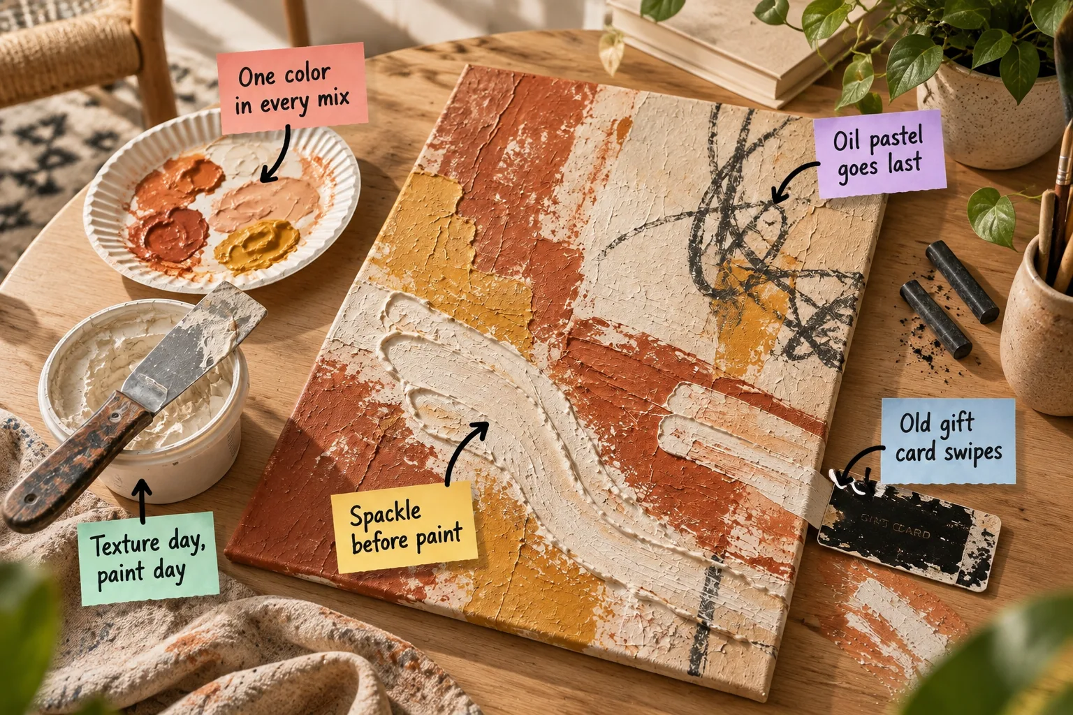
Grab our printable Saturday-to-Sunday layer guide to build a gallery-worthy 16×20 canvas with spackle and acrylics. You will be able to build deep physical texture, mix a cohesive three-color palette, and print the exact mixing ratios to finish your artwork by Sunday evening.
Splitting Texture and Paint Days
Dedicating your Saturday entirely to applying the heavy compound and Sunday to color work creates a stress-free weekend timeline. Breaking the project into two distinct phases prevents you from rushing through the delicate layering process.
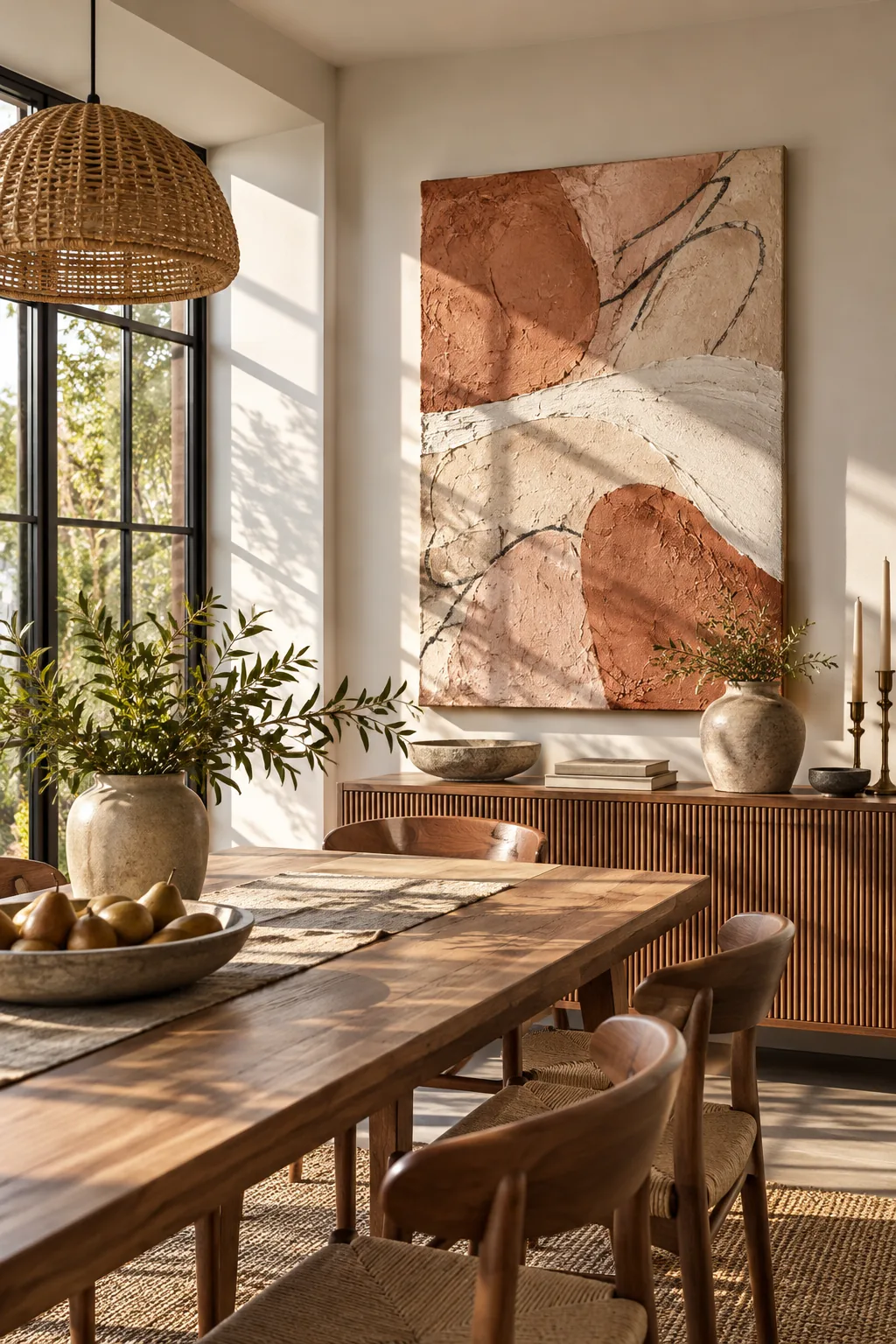
You must enforce a strict texture day, paint day rule so the moisture from wet acrylics does not reactivate the drying base. Rushing into the color phase too early will turn your crisp ridges into a muddy paste.
Sizing the Canvas for Impact
A standard 16×20 canvas offers enough surface area for sweeping physical gestures without overwhelming a small dining room or entryway. It also fits perfectly on a standard kitchen island, making it the ideal scale for a weekend project.
Prepping the Workspace for Mess
Lay down a thick canvas drop cloth because aggressive scraping will inevitably fling small flecks of material off the edges. Protecting your floors now means you can focus entirely on building bold, expressive textures without worrying about cleanup.
Gathering the Right Compound
Standard all-purpose spackle from the hardware store works beautifully for this technique and costs a fraction of professional modeling paste. Its airy consistency holds sharp peaks effortlessly while remaining lightweight enough for a standard stretched fabric frame.
Spackle Before Paint for Deep Texture
Applying your spackle before paint builds a rigid, sculpted foundation that catches the ambient room lighting beautifully. I love how leaving heavy, unrefined ridges makes an inexpensive project look like a high-end impasto gallery piece.
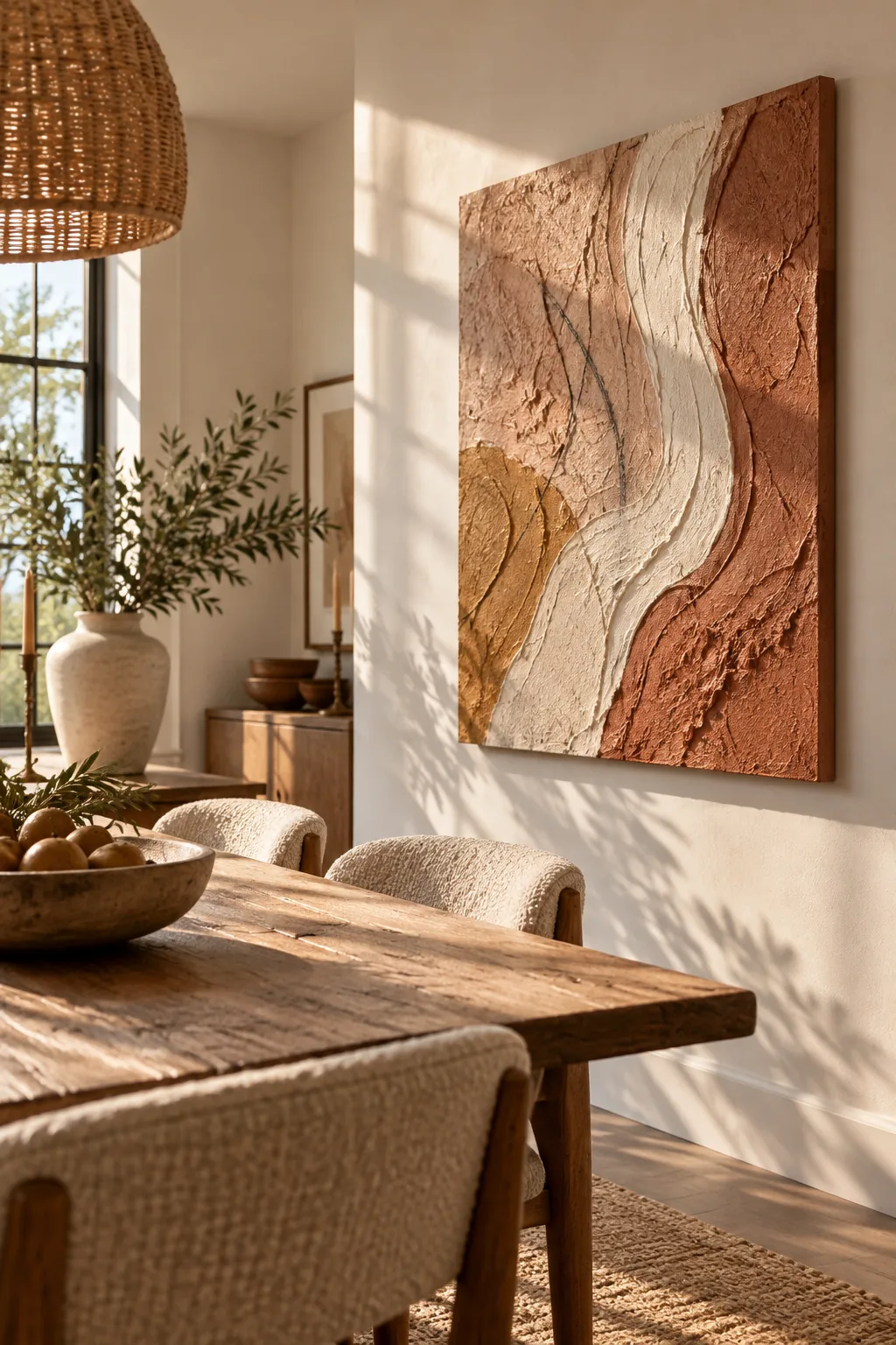
While building deep, dramatic texture is the goal, applying the compound too heavily in a single pass can cause structural issues.
Choosing the Right Putty Knife
A flexible three-inch metal putty knife gives you the perfect amount of leverage to push the dense paste across the fabric. The metal edge creates much sharper, more distinct valleys than a flimsy plastic spreading tool.
Shaping the Lower Third
Concentrate your heaviest swooshes across the bottom third of the frame to give the composition a grounded, structural weight. Leaving the upper portion relatively flat creates a striking visual contrast that draws the eye downward.
Smoothing the Canvas Edges
Wrap a thin layer of the compound around the sides of the frame to give the finished piece a solid, sculptural appearance. This small detail hides the fabric folds and makes the artwork look like a heavy plaster slab.
Curing the Foundation Overnight
Resist the urge to speed up the process with a hair dryer, which bakes the outer shell while leaving the inside mushy. Giving the canvas a full 24-hour cure time ensures the foundation is completely rock-solid.
Choosing a Well-Lit Drying Spot
Place the wet canvas in a warm, dry room with plenty of natural airflow to encourage even evaporation. Avoid dark basements or humid garages, which can extend the drying time and cause the thickest peaks to remain soft.
Anchoring the Palette With One Shared Color
The secret to cohesive abstract art is mixing a small dab of one color in every mix on your paper plate. Injecting a warm blush or terracotta into your cream and ochre ensures the distinct tones share a unifying DNA.
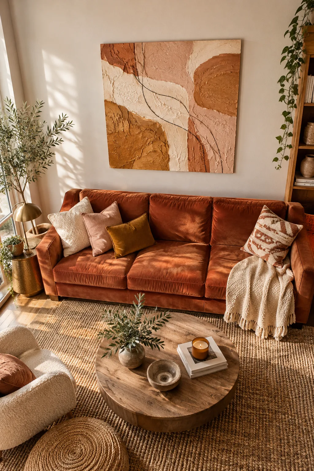
This simple mixing trick guarantees that your starkest contrasting shades will still harmonize beautifully when layered on the canvas. It completely eliminates the risk of accidentally creating a jarring, mismatched color scheme.
Mixing the Ratios
Creating the right volume of paint prevents you from having to color-match a dried section halfway through your Sunday session.
| Target Color | Base Paint Ratio | Shared Undertone |
| Terracotta | 3 parts red-brown | 1 part warm blush |
| Mustard Ochre | 3 parts yellow | 1 part warm blush |
| Warm Cream | 3 parts white | 1 part warm blush |
Always mix these batches in small airtight deli containers if you anticipate needing touch-ups later in the week.
Testing the Color Mix on Scrap Paper
Before committing your custom tones to the canvas, brush a small swatch of each color onto a scrap piece of heavy watercolor paper. Let the swatches dry completely, as acrylic paints typically darken by a full shade once the moisture evaporates.
Applying the Terracotta Base
Brush the deepest terracotta shade into the deepest crevices first, ensuring no raw white canvas peeks through the shadows. Establishing your darkest values early gives you a clear roadmap for where the lighter highlights should go.
Cleaning Your Mixing Tools
Wash your plastic cards and putty knives immediately after laying down the base colors so the acrylic does not permanently bond. A clean scraping tool is essential for achieving the sharpest possible lines in the next step.
Storing Leftover Acrylics
If you mixed larger batches of your custom terracotta and ochre, seal the deli containers tightly and store them in a cool, dark cabinet. Having these exact tones saved makes it incredibly easy to fix any accidental scrapes or smudges later.
Dragging Cream Bands With a Gift Card
Using old gift card swipes across the dried terracotta deposits a sheer, broken layer of cream that highlights the raised peaks. I actually used my expired Austin coffee shop rewards card for this exact piece, and the stiff plastic edge created flawlessly crisp lines.
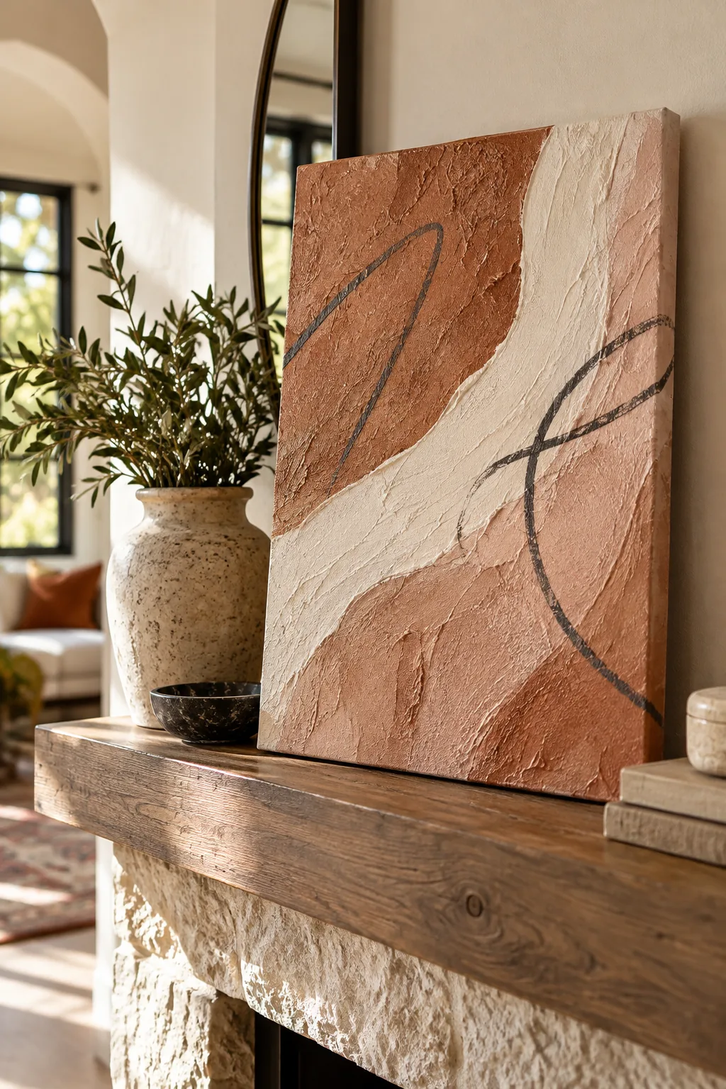
The firm, straight edge of the card skips over the deeper valleys, leaving the dark terracotta visible in the recesses. This scraping technique instantly creates a sharp modern contrast against the organic, flowing spackle texture.
Feathering the Ochre Transitions
Use a dry, stiff-bristled brush to aggressively stipple the mustard ochre where the cream and terracotta borders meet. This dry-brushing method softens the harsh dividing lines and creates a glowing, gradient effect between the distinct color blocks.
Working Wet-in-Wet for Soft Edges
If you want a softer transition between the warm hues, mist the canvas lightly with a spray bottle while the acrylics are still damp. The added moisture allows you to blend the overlapping borders into a seamless, cloudy wash.
Allowing the Acrylics to Fully Dry
Give the painted surface at least two hours in a well-ventilated room before attempting any dry media applications. The acrylic skin must be completely cured to the touch so it does not peel away under the pressure of a pencil.
Layering Oil Pastel Over Dry Paint
Remembering that oil pastel goes last is crucial because its waxy binder will repel any water-based acrylics painted over it. When I hung this piece in my living room, those erratic charcoal scribbles were the first thing my guests complimented.
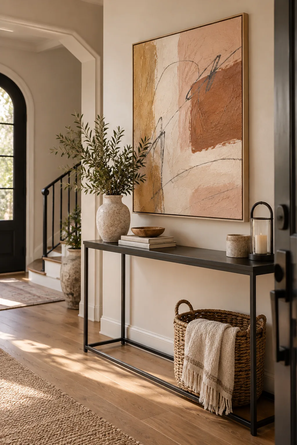
Waiting until the very end to add these loose, expressive marks introduces dynamic movement and stark contrast. The rough acrylic texture grabs the soft pastel wax, creating beautifully broken, skipped lines.
Balancing the Composition
Concentrate your darkest scribbles in the upper right quadrant to counterbalance the heavy physical texture sitting in the lower left. This diagonal relationship keeps the viewer’s eye moving constantly across the entire painted surface.
Stepping Back to Evaluate
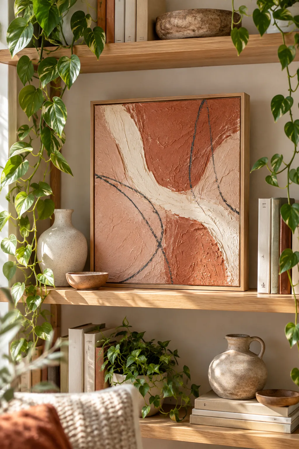
Prop the canvas vertically on a shelf and walk across the room to see how the dark scribbles interact with the physical shadows. Viewing the piece from a distance helps you spot any empty corners that need an extra charcoal mark.
Protecting the Spackle and Pastel Layers
A porous mixed-media surface requires a workable matte fixative to lock the fragile pastel dust in place permanently. Without a protective topcoat, the charcoal-grey pigment will inevitably smear onto your hands or adjacent walls.
Two light, sweeping coats of spray varnish will also stop the unsealed compound from absorbing ambient humidity from your home. Always spray outdoors or in a highly ventilated garage to avoid inhaling the strong chemical fumes.
Selecting a Floating Frame
Mounting the finished piece in a natural oak floating frame elevates the presentation and protects the fragile textured edges. The small gap between the canvas and the wood border makes the heavy spackle appear to hover in mid-air.
Hanging the Finished Piece
Position the artwork on a wall that receives strong directional sunlight to cast dramatic, shifting shadows across the sculpted ridges. The appearance of the canvas will completely transform from morning to late afternoon as the light angle changes.
More Abstract Canvas Color Palettes
Adapt the weekend texture method to fit your home's unique style with these different color and room combinations.
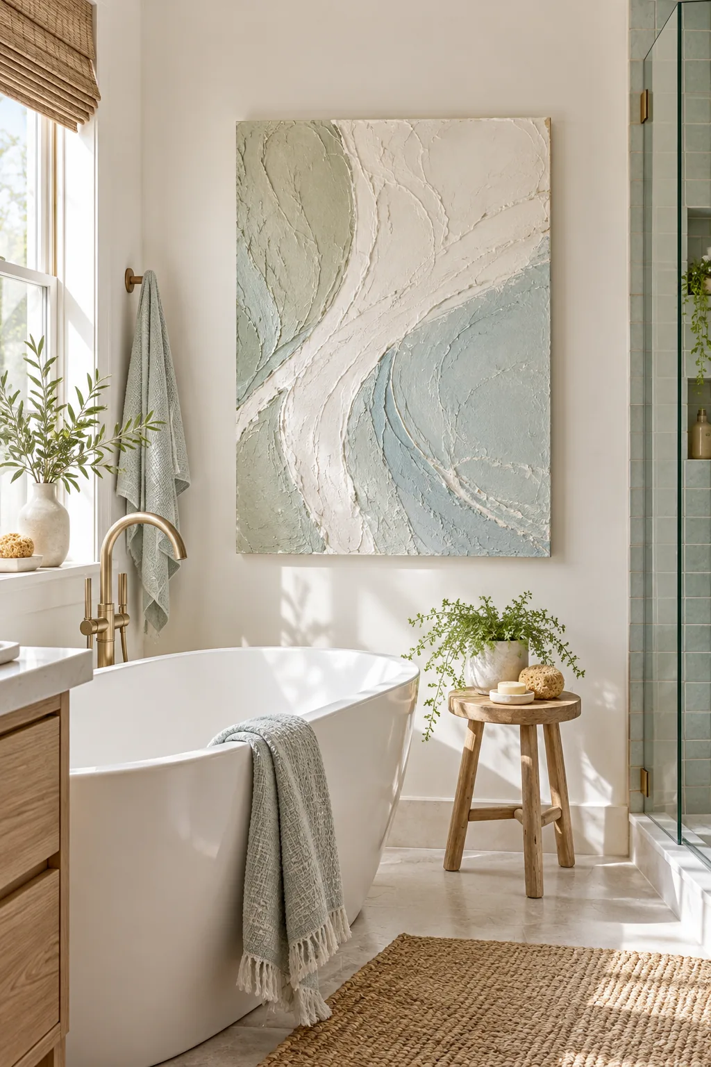
Coastal Minimalist: Swap warm ochres for pale sage and sea glass blue to create a serene, textured focal point for a bright bathroom.
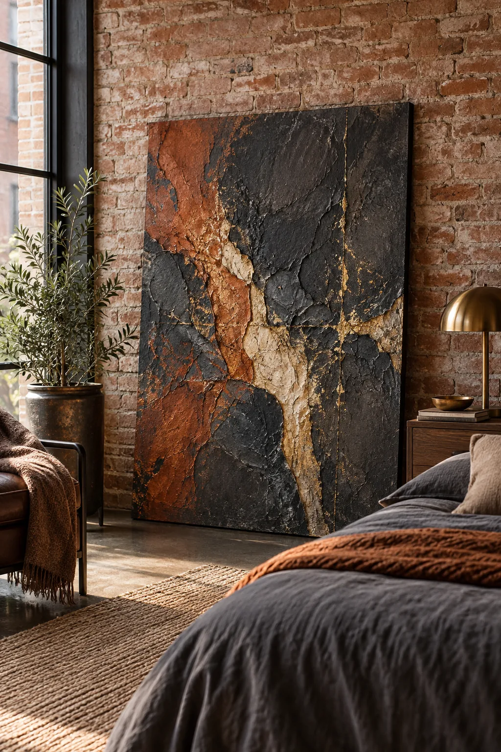
Moody Industrial: Layer deep charcoal and rust acrylics over the spackle base for a dramatic, heavy look that suits exposed brick.
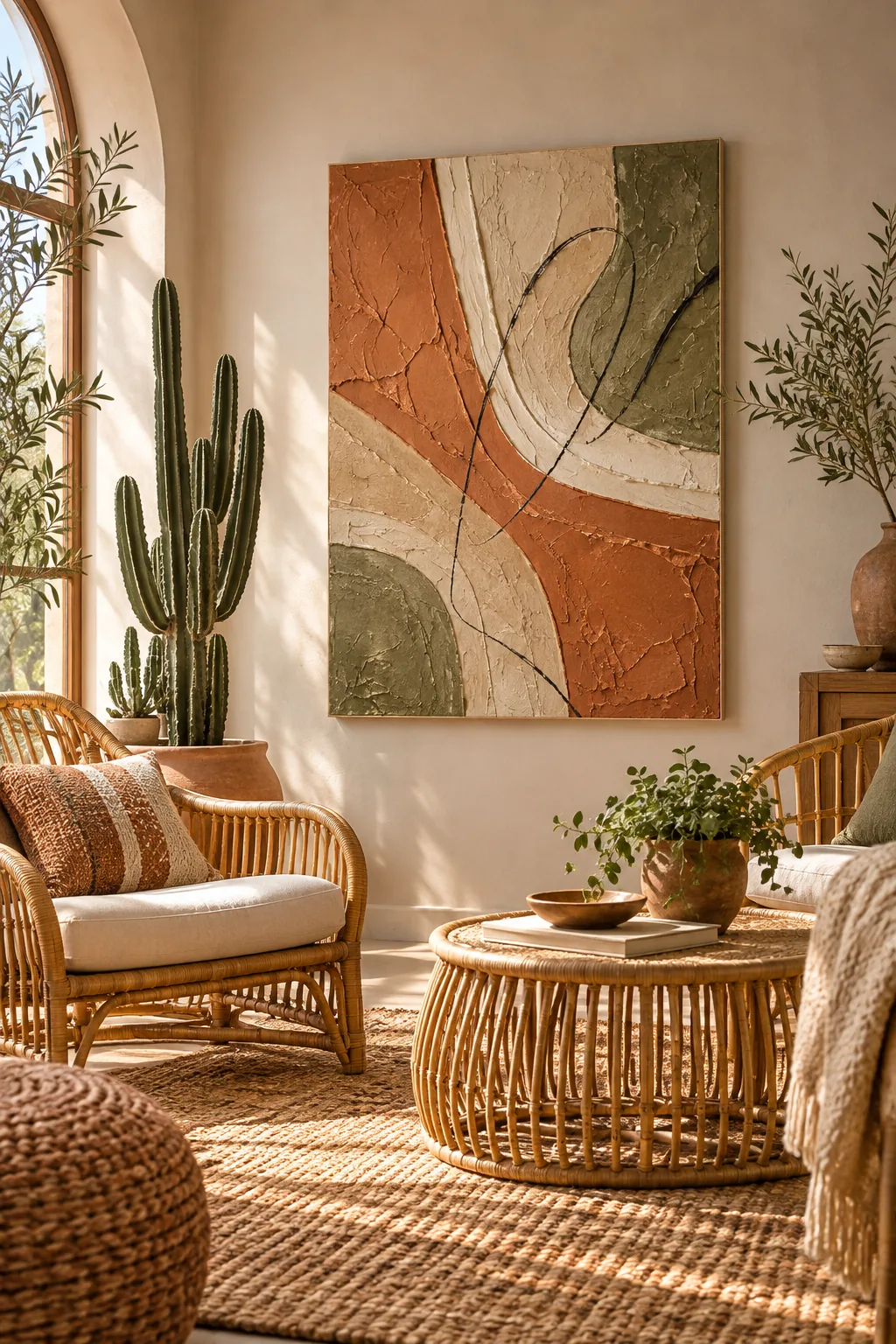
Warm Desert: Mix terracotta, sand, and muted olive greens to instantly warm up a bohemian living space filled with natural rattan.
Your Printable Weekend Canvas Plan
Having your mixing ratios and layer sequence mapped out on paper keeps your hands free and your momentum going. This printable two-page plan includes the exact supply list for a 16×20 canvas so you can shop efficiently.
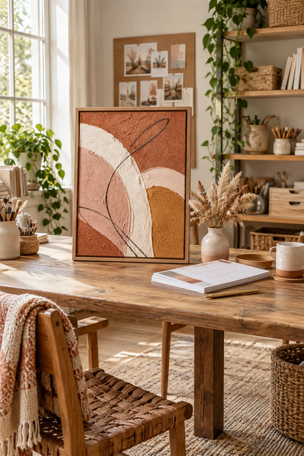
Before starting your Saturday texture layer, make sure your workspace is fully prepped for a two-day project.