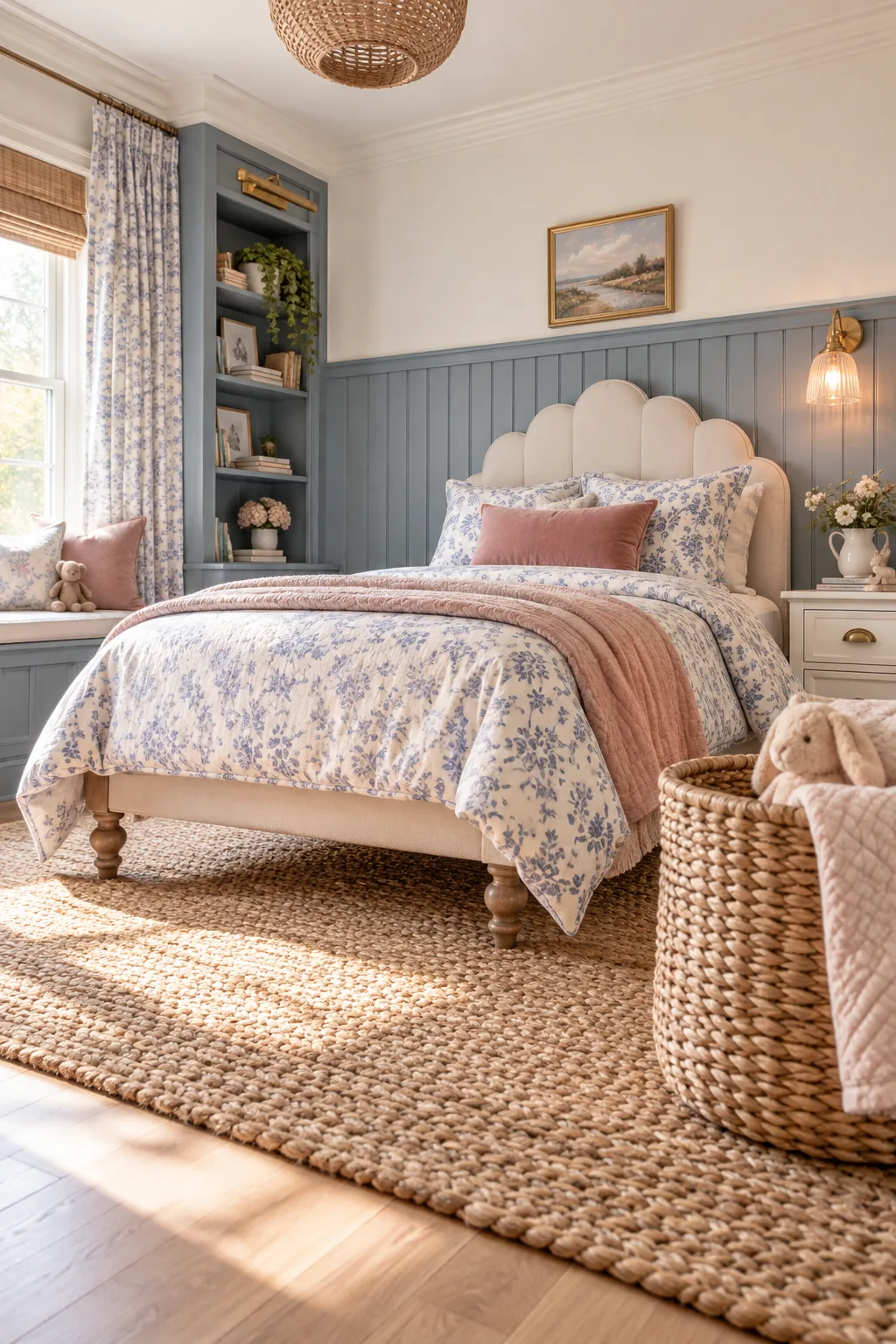
Blue Bedroom for a Girl: The Warm Blue Mixing Checklist
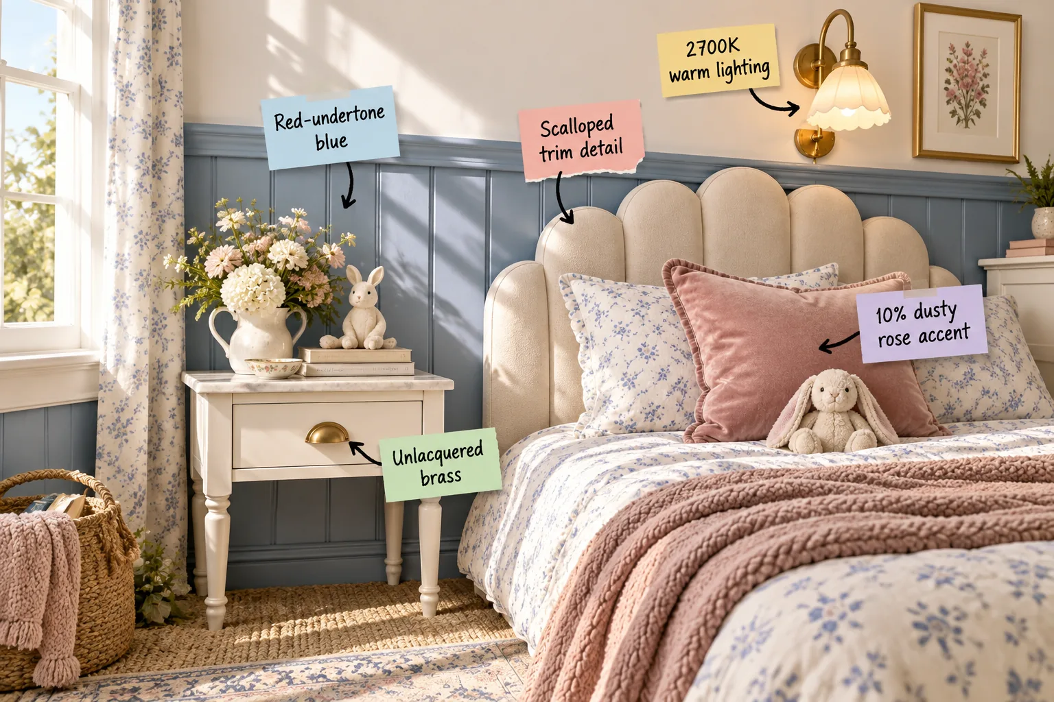
Mastering the designer method for a cozy, sunlit room means perfectly balancing cool walls, which you can easily achieve using our warm blue mixing checklist. You will confidently mix soft paint with warm metals and dusty rose accents to create a timeless, inviting bedroom.
Choosing a Red-Undertone Blue
Selecting a blue with red undertones, like a classic French blue, fundamentally prevents the room from feeling icy or cold in shifting light. When I designed my own daughter’s bedroom, choosing a red-undertone base paint instantly transformed the chilly north-facing walls into a welcoming retreat.
| Paint Color Type | Dominant Undertone | Natural Light Effect | Best Room Facing |
|---|---|---|---|
| French Blue | Warm Red | Neutralizes cool shadows | North or East |
| Powder Blue | Cool Gray | Amplifies chilly light | South or West |
| Cornflower | Subtle Yellow | Brightens dark corners | East or North |
| Navy Blue | Deep Black | Absorbs ambient light | South Facing |
| Teal Blue | Warm Green | Warms up flat light | West Facing |
| Slate Blue | Heavy Gray | Flattens sunny rooms | South Facing |
Understanding how the red undertone in the paint interacts with natural light is the secret to keeping the room feeling consistently warm. This crucial base layer ensures that shadows never turn gray, providing the perfect canvas for your subsequent design choices.
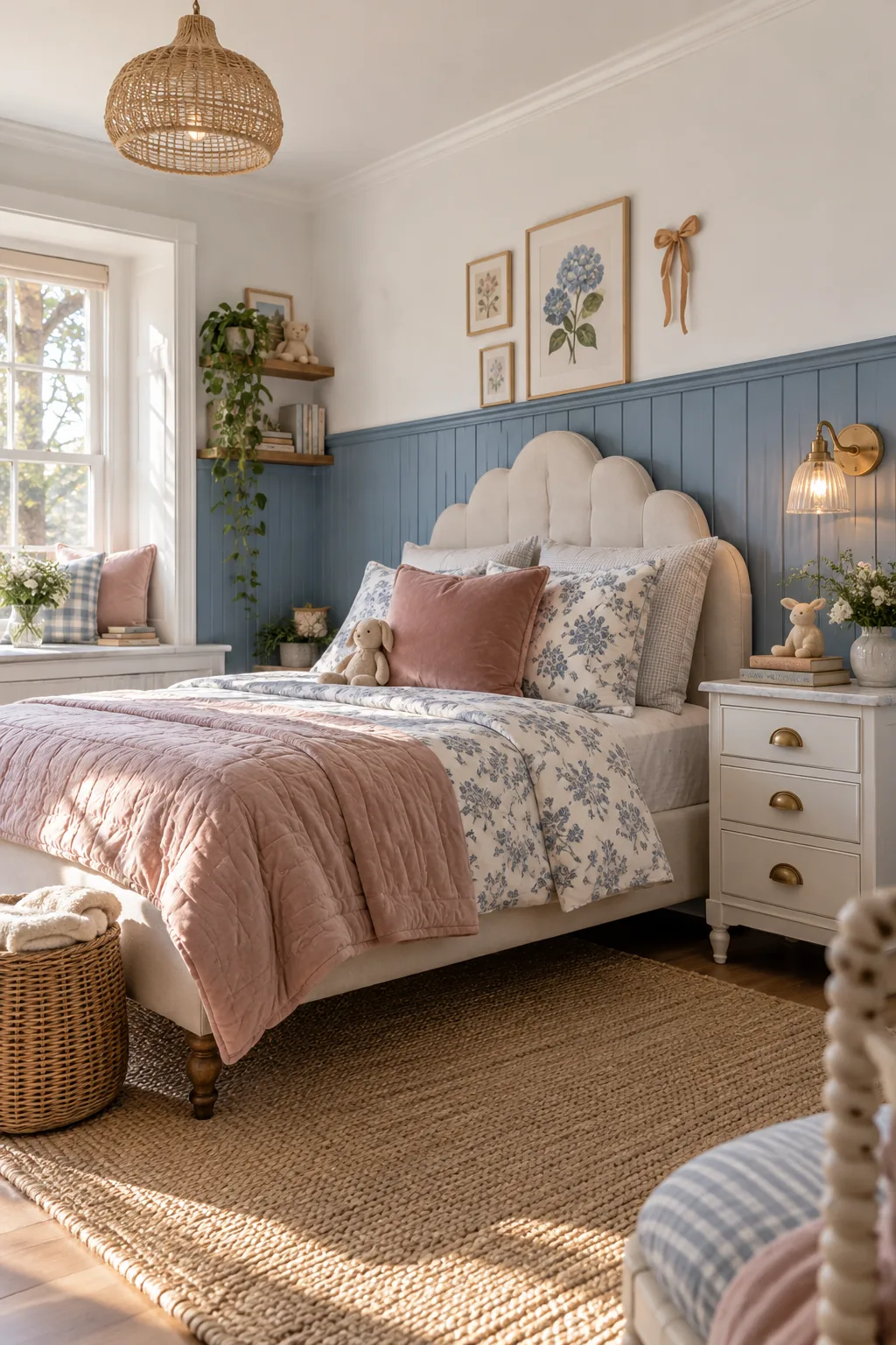
Grounding the Lower Wall with Wainscoting
Installing beadboard wainscoting at a classic 42-inch height grounds the color on the lower half of the wall while adding architectural interest. This traditional height perfectly frames standard furniture pieces and prevents the saturated blue paint from overwhelming the upper sightlines of the room.
- Measure exactly 42 inches from the finished floor to establish your level top line.
- Locate and mark all wall studs to ensure secure fastening for the beadboard panels.
- Apply a continuous bead of construction adhesive to the back of each vertical panel.
- Secure the panels using a brad nailer, placing nails directly into the marked studs.
- Cap the raw upper edge with a substantial chair rail to create a crisp transition.
- Fill all nail holes with wood putty and sand completely smooth before applying primer.
Capping the wainscoting with a substantial chair rail creates a crisp transition line between the blue lower wall and the lighter upper section. This horizontal break visually widens the bedroom and establishes a structured framework for layering your varied textile patterns.
The Warm Blue Mixing Checklist
Delivering the core designer method for an inviting space requires balancing specific material ratios across your entire design plan. In my projects, I always rely on this exact formula to guarantee a cozy result before purchasing a single piece of furniture or decor.
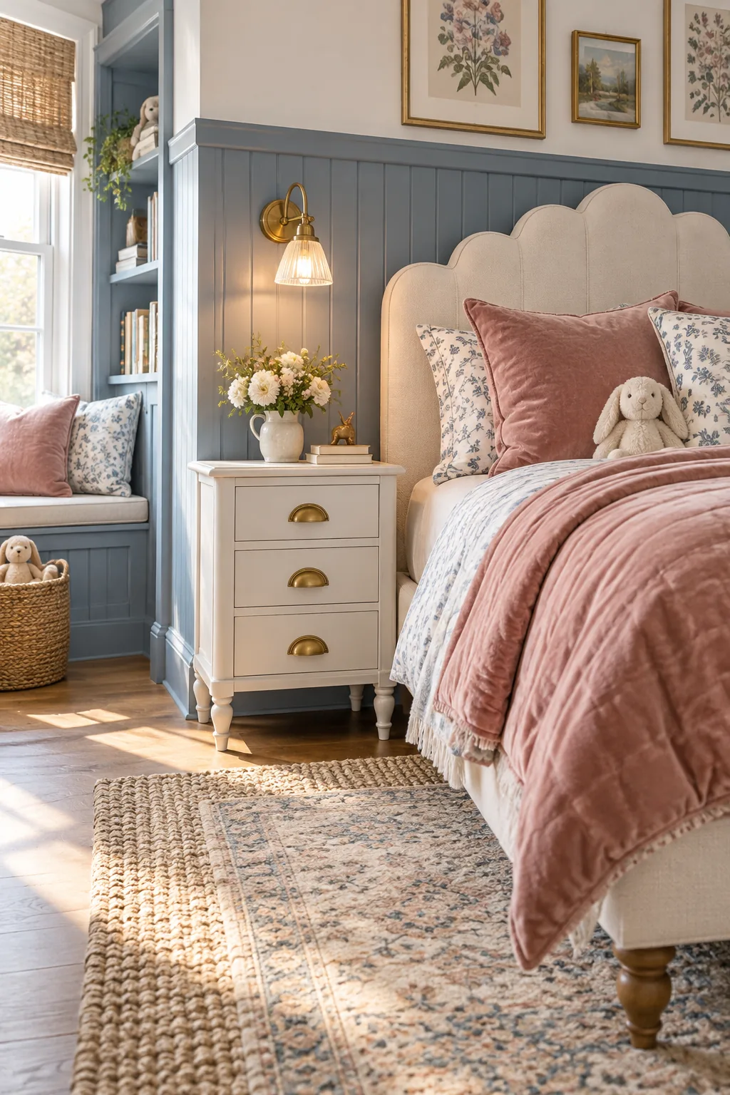
Before buying furniture or decor, run your design plan through this exact formula to guarantee a cozy result. Validating your material choices against these specific ratios ensures the finished space achieves that elusive balance between sophisticated color and tactile warmth.
Softening the Lines with Scalloped Trim
Introducing a scalloped upholstered headboard provides a necessary structural contrast to the rigid vertical lines of the beadboard wainscoting. I specifically chose a scalloped trim detail for my latest guest room project because those gentle curves immediately soften the architectural rigidity of the paneling.
- Curved furniture profiles instantly break up the monotony of straight architectural wall panels.
- Soft upholstery absorbs ambient sound, making the heavily paneled room feel quieter and calmer.
- Rounded edges on a headboard prevent the sleeping zone from feeling overly formal or stiff.
- Scalloped detailing introduces a subtle, playful rhythm without relying on busy printed fabrics.
- Contrasting a cream fabric against the blue wall highlights the custom shape of the trim.
- Layering curved silhouettes creates a welcoming visual flow that draws the eye naturally inward.
The visual contrast between the curved headboard and the straight vertical wall panels creates a dynamic tension that elevates the entire design. This deliberate juxtaposition of shapes prevents the traditional wainscoting from feeling too formal or heavy for a child’s space.
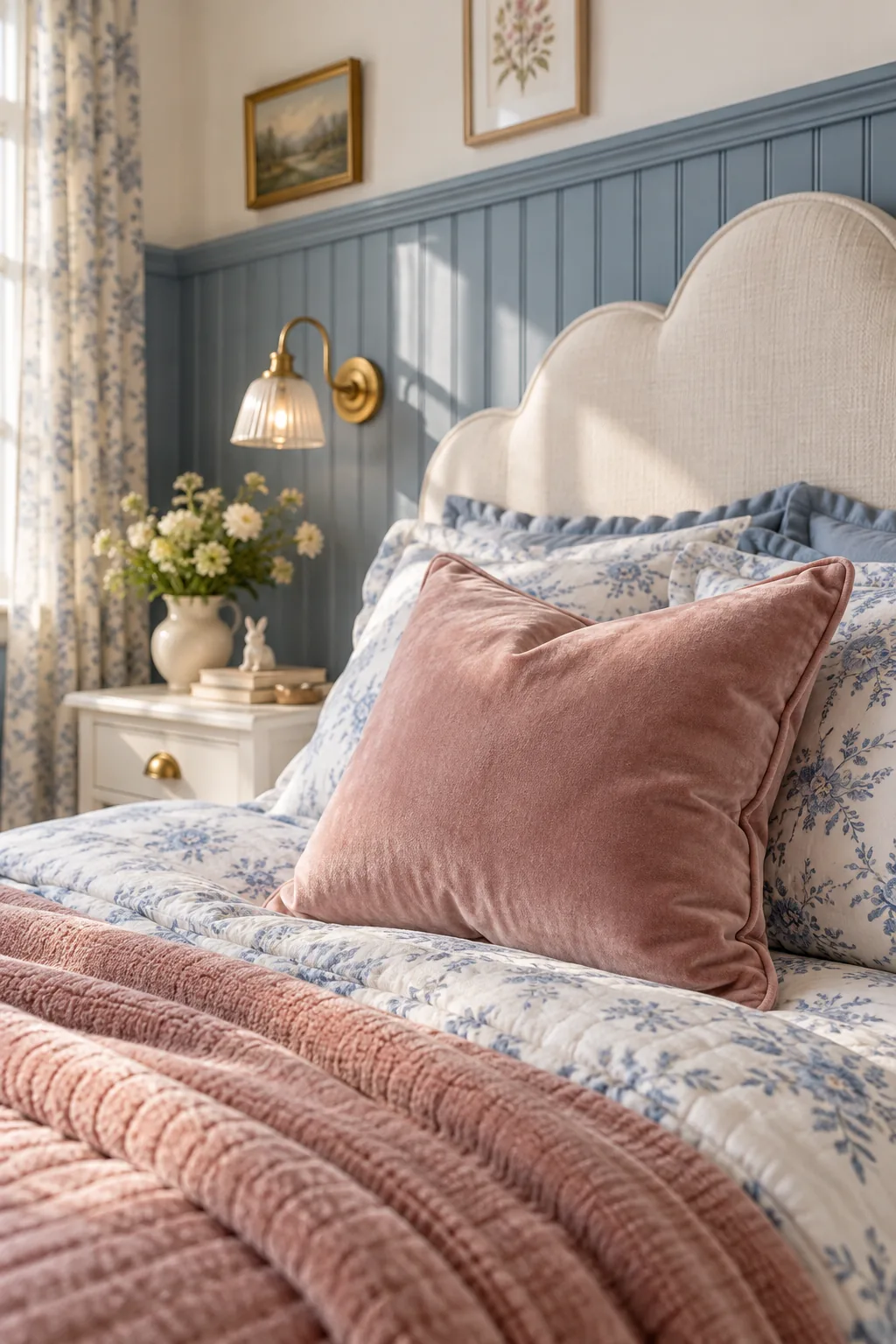
The 10 Percent Dusty Rose Accent Rule
Implementing the 10% dusty rose accent rule ensures the pink tones remain a sophisticated highlight rather than an overwhelming theme. Limiting this warm hue to easily swappable textile layers keeps the sophisticated blue base dominant while satisfying the desire for a playful pop of color.
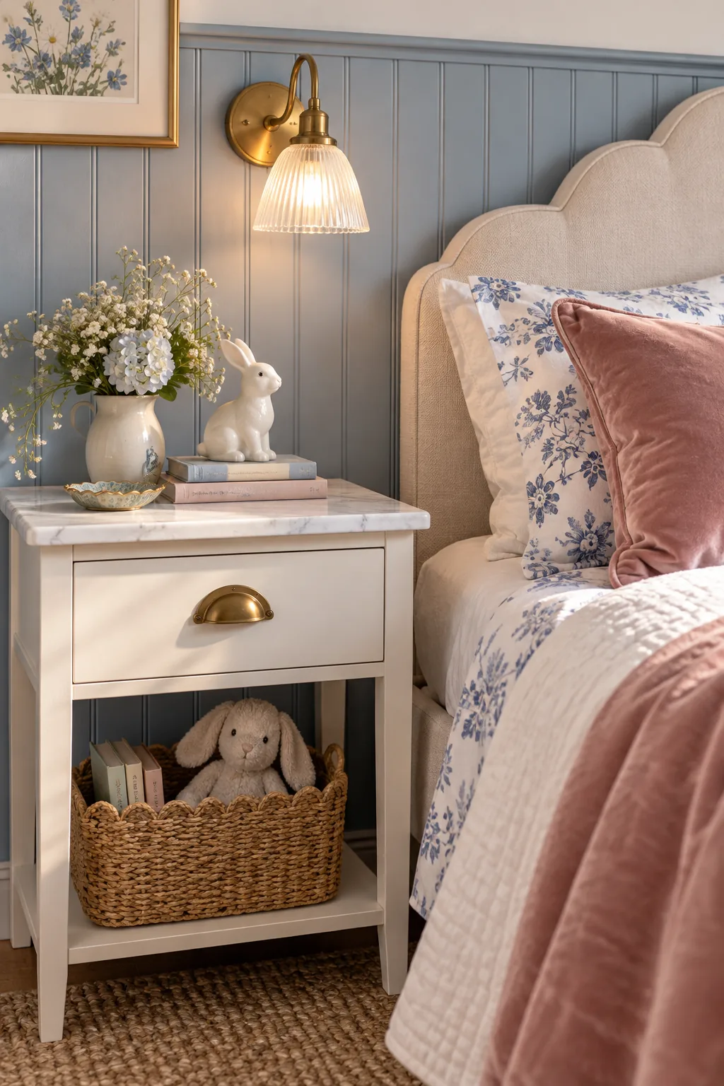
Executing this strict ratio through a single focal pillow avoids overwhelming the blue foundation while providing essential visual warmth. This calculated restraint allows the dusty rose to draw the eye precisely where you want it without competing with the architectural wall details.
Layering Textiles for Visual Depth
Mixing distinct fabric weights, such as breathable linen sheets against heavy velvet pillows, introduces crucial tactile friction to the bedding arrangement. This deliberate layering strategy amplifies the cozy factor and ensures the bed looks inviting rather than flat or overly styled.
- Pair crisp percale cotton sheets with a chunky knit blanket to build immediate tactile contrast.
- Introduce a subtle floral print on the duvet cover to bridge the blue and white tones.
- Keep the heaviest velvet fabrics restricted to small accent pillows so the bed remains breathable.
- Use a lightweight linen bed skirt to softly ground the mattress without adding visual bulk.
- Fold a woven wool throw at the foot of the bed for easily accessible evening warmth.
- Ensure all chosen textiles share the same muted saturation level for a cohesive, calm aesthetic.
Rotating these specific textile layers seasonally allows the bedroom to adapt to changing temperatures while maintaining its cohesive color palette. The interplay between matte fabrics and subtle sheens continuously catches the natural light, adding quiet movement to the static furniture pieces.
Grounding with Unlacquered Brass Hardware
Swapping standard drawer pulls for unlacquered brass hardware introduces a living finish that evolves beautifully over time. I always specify these untreated metal accents on nightstands because their gradual patina process adds an authentic, aged character that factory finishes simply cannot replicate.
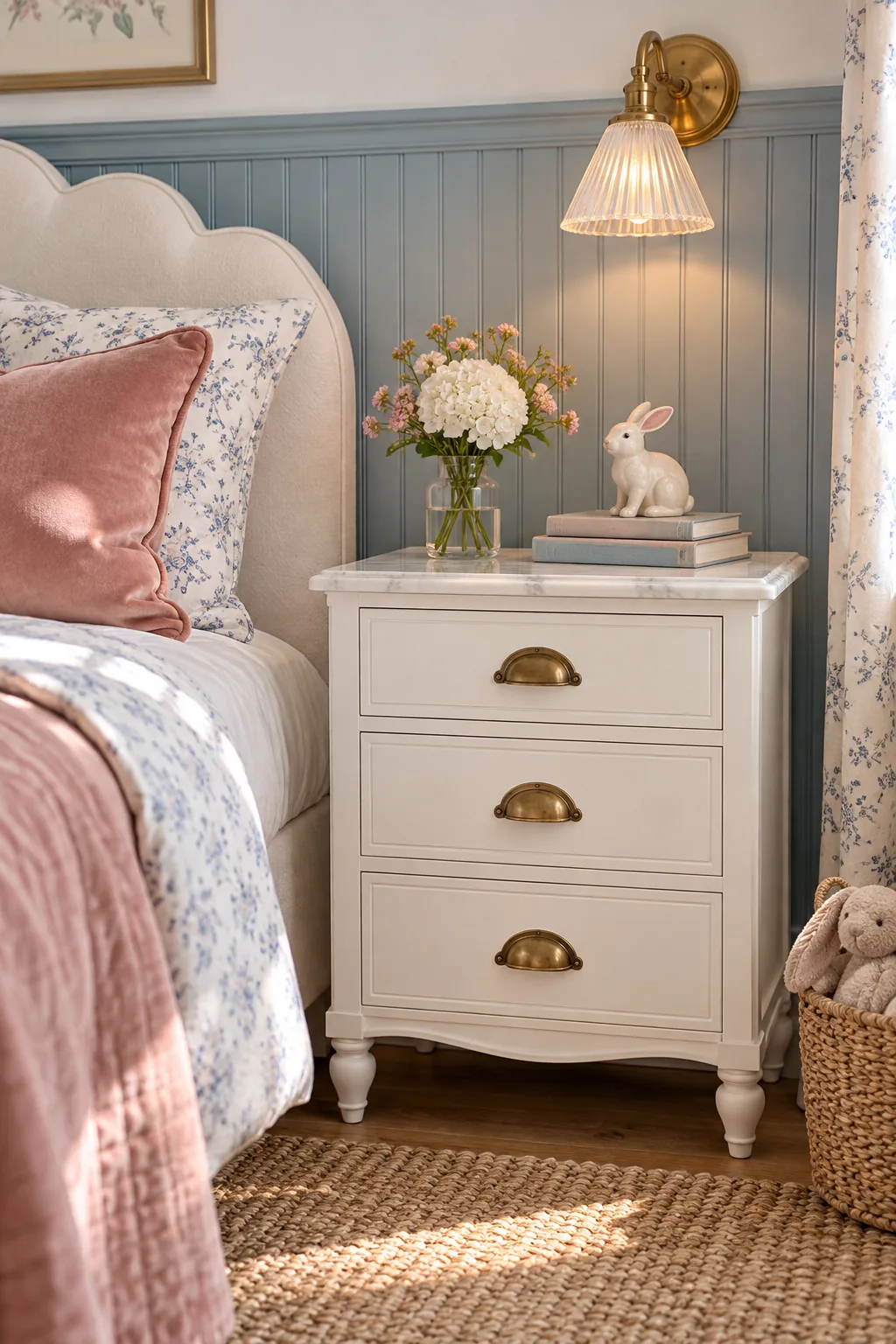
The reflective warmth that living brass finishes bring to a cool blue color palette acts as a crucial counterbalance. These small metallic touchpoints catch the evening light, sparkling against the matte painted wood to create a layered, thoughtfully collected aesthetic.
Setting the Mood with 2700K Lighting
Installing specific 2700K warm lighting in bedside sconces mimics the gentle glow of sunset, fundamentally altering how the paint reads after dark. This precise color temperature is absolutely critical to prevent the French blue walls from looking sterile, gloomy, or excessively gray at night.
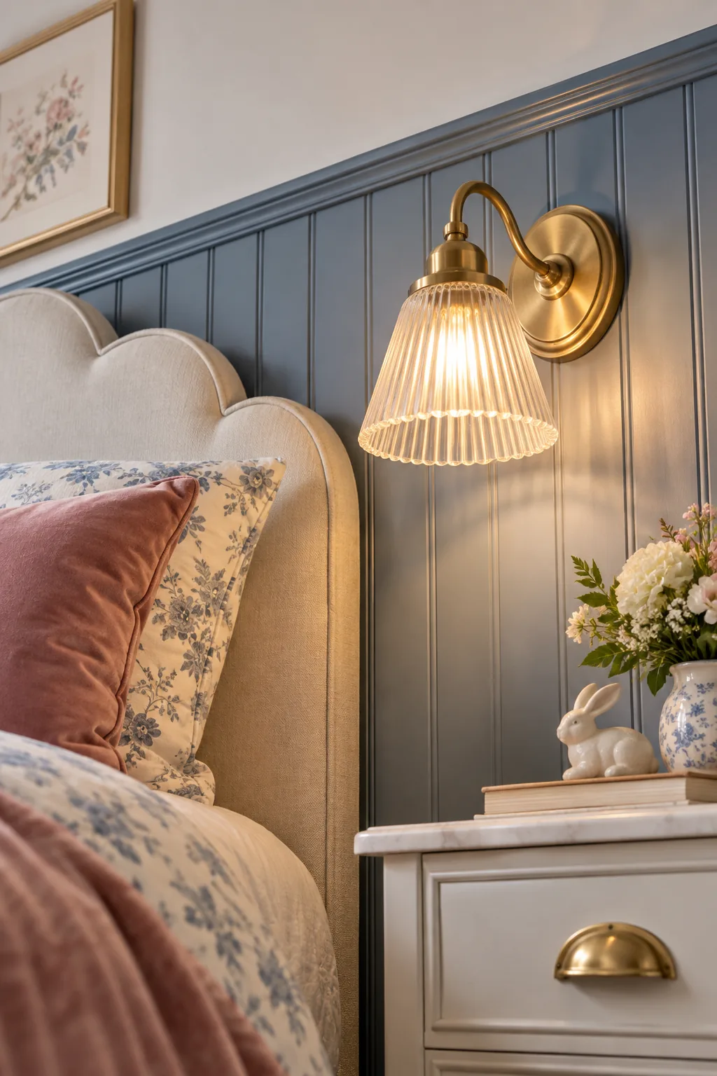
Even the perfect paint color can be ruined at the flip of a switch if you choose the wrong bulb temperature. Understanding how artificial light interacts with your chosen undertones is the final step in preserving the room’s carefully cultivated warmth.
Maximizing Natural Light in Blue Rooms
Positioning a large mirror directly opposite the primary window bounces essential daylight back into the space, amplifying the paint’s natural warmth. This strategic placement ensures the red undertones in the blue wainscoting remain vibrant and active throughout the shifting afternoon shadows.
5 More Ways to Style a Blue Girl's Room
Explore these distinct variations to find the perfect blue palette and style for her personality.
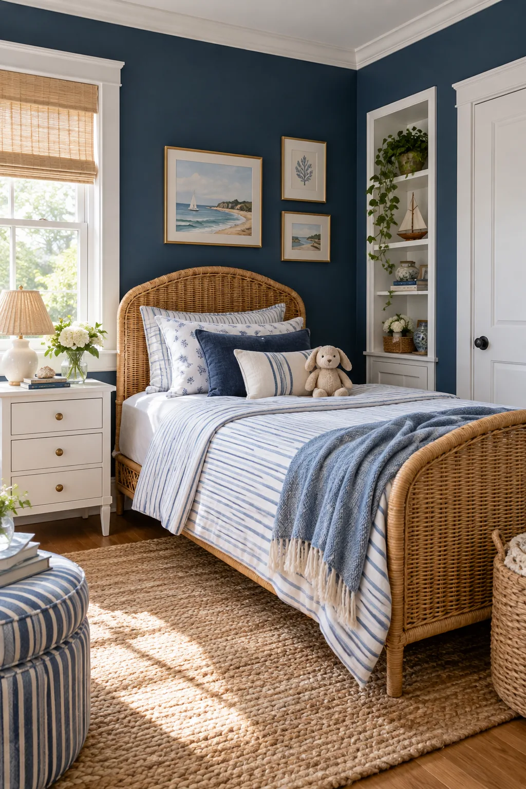
Classic Coastal Prep: Deep navy walls paired with crisp white trim and a rattan bed create a timeless, slightly nautical look that feels fresh and structured.
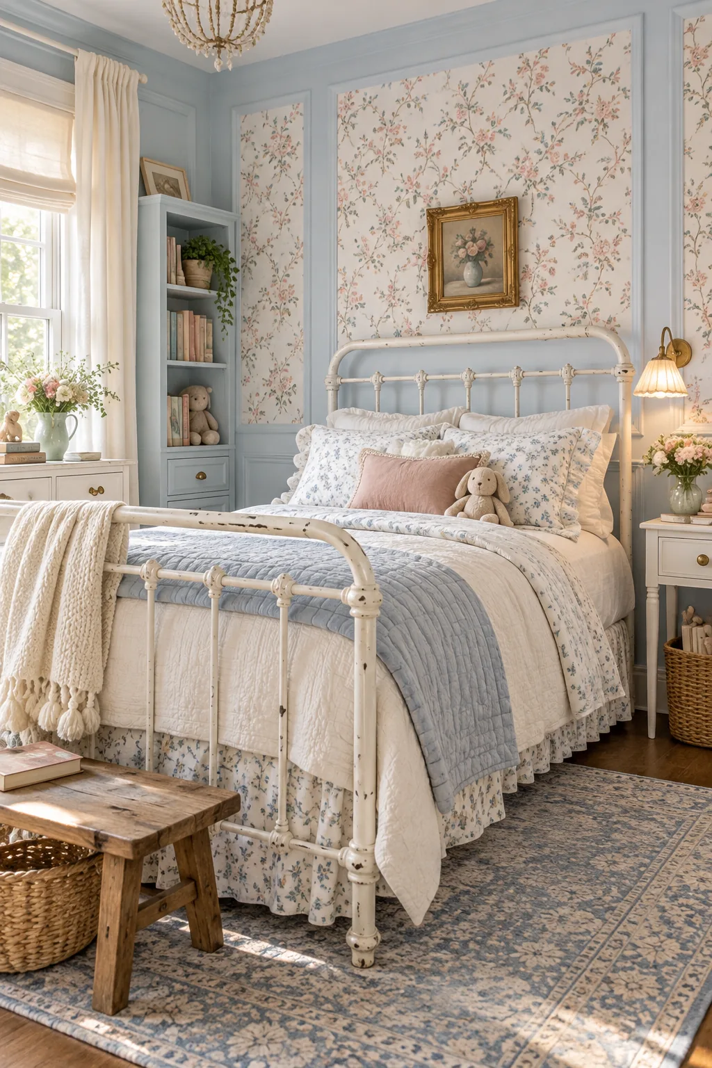
Soft Vintage Cottage: Powder blue walls and a classic white iron bed frame evoke a sweet, nostalgic charm when layered with vintage floral textiles.
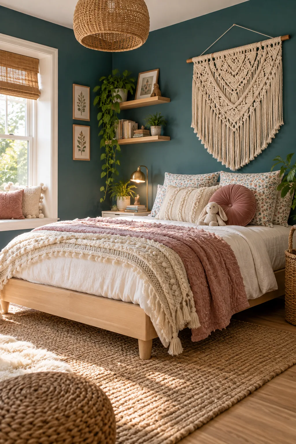
Earthy Modern Boho: Rich teal provides a moody backdrop that makes light maple wood furniture and textured macrame wall hangings pop beautifully.
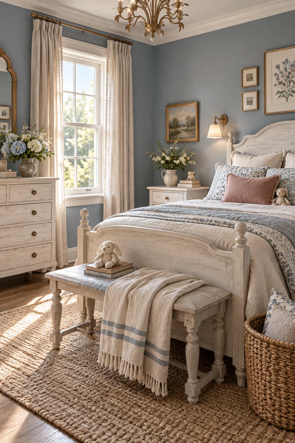
Relaxed French Country: Muted slate blue feels incredibly sophisticated when paired with whitewashed wooden furniture and relaxed, unironed linen bedding.
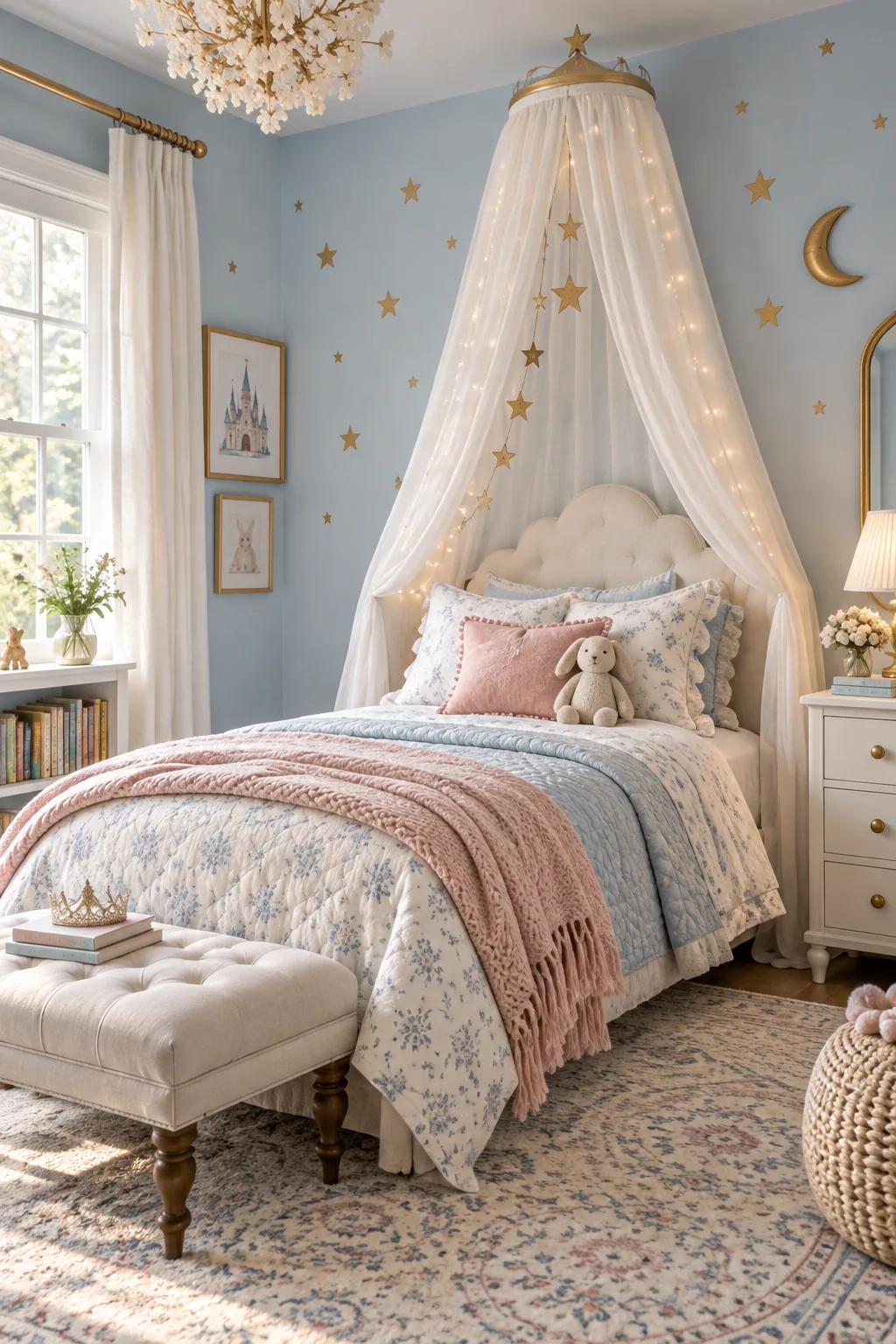
Whimsical Fairytale: Light sky blue walls become magical with the addition of subtle gold star decals and a dreamy sheer canopy draped over the bed.
Anchoring the Room with Natural Textures
Layering natural floor textures like a chunky jute or wool rug completes the warm room formula by adding necessary organic friction. This rugged foundation contrasts beautifully with the soft pastel palette, grounding the delicate colors and preventing the design from feeling overly precious.