
How to Choose a Warm Grey for North-Facing Rooms
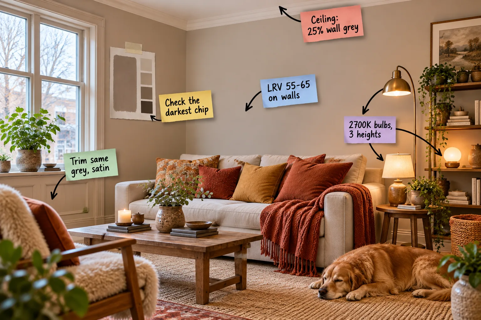
Struggling with a chilly north-facing space? Download our printable North-Light Grey Swatch Log to master hidden undertones, ideal LRV ranges, and custom ceiling tints for a room that stays beautifully warm.
Finding the Hidden Warmth
North-facing rooms receive cool, bluish natural light that instantly turns standard greys icy and unwelcoming. My own Denver living room looked like a commercial freezer until I learned to properly decode the manufacturer’s paint strip.
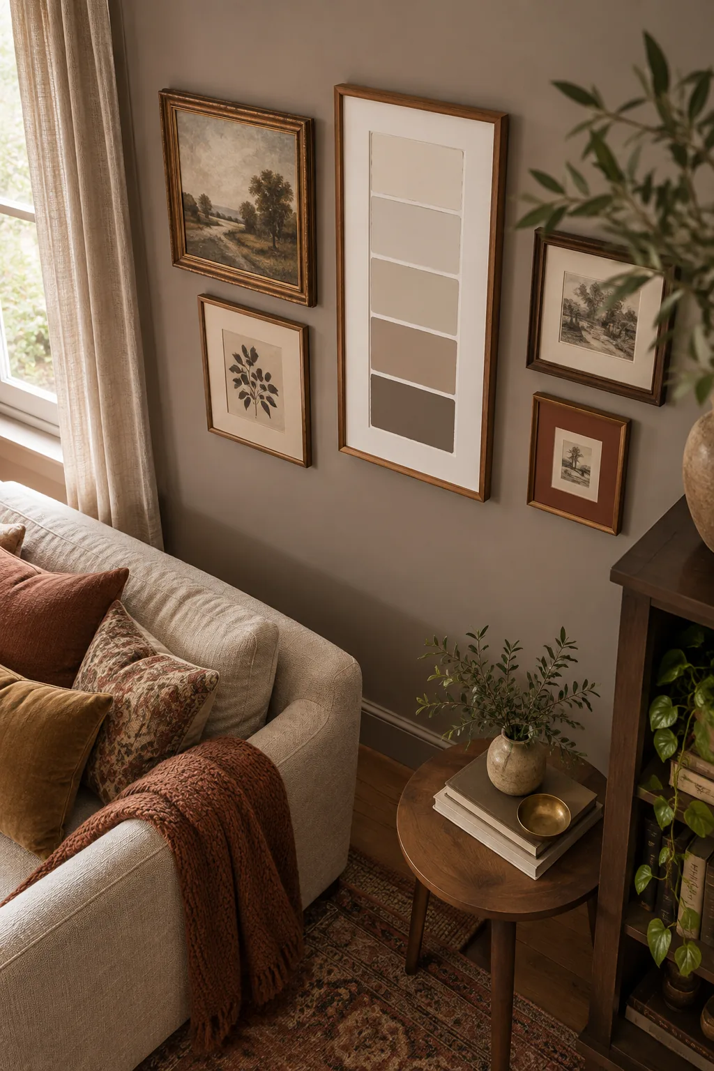
Always check the darkest chip at the absolute bottom of the swatch card. If that deep base reveals a warm brown-grey, the lighter shades above it will confidently maintain that toasty undertone on your walls.
Decoding the Paint Strip
Paint companies formulate their entire strips by adding varying amounts of white base to a single dark anchor color. Understanding this foundational anchor is the only reliable way to predict how a lighter mid-tone will ultimately behave.
Testing Large Paint Swatches
Tiny color cards are entirely insufficient for evaluating how a shade will perform on a large scale. You must paint generous samples on movable foam boards to truly understand how the color will react to your specific room’s architecture.
Evaluating Corner Shadows
North-facing rooms naturally produce deep, heavy shadows in the corners that can make even a warm grey look muddy. Always place your painted sample directly in the darkest corner to ensure the color retains its clarity and warmth.
Hitting the Right Brightness
In an early design project, picking too light a shade made a north-facing office look dingy instead of bright. Light Reflectance Value (LRV) dictates exactly how much natural light a paint color bounces back into the room.
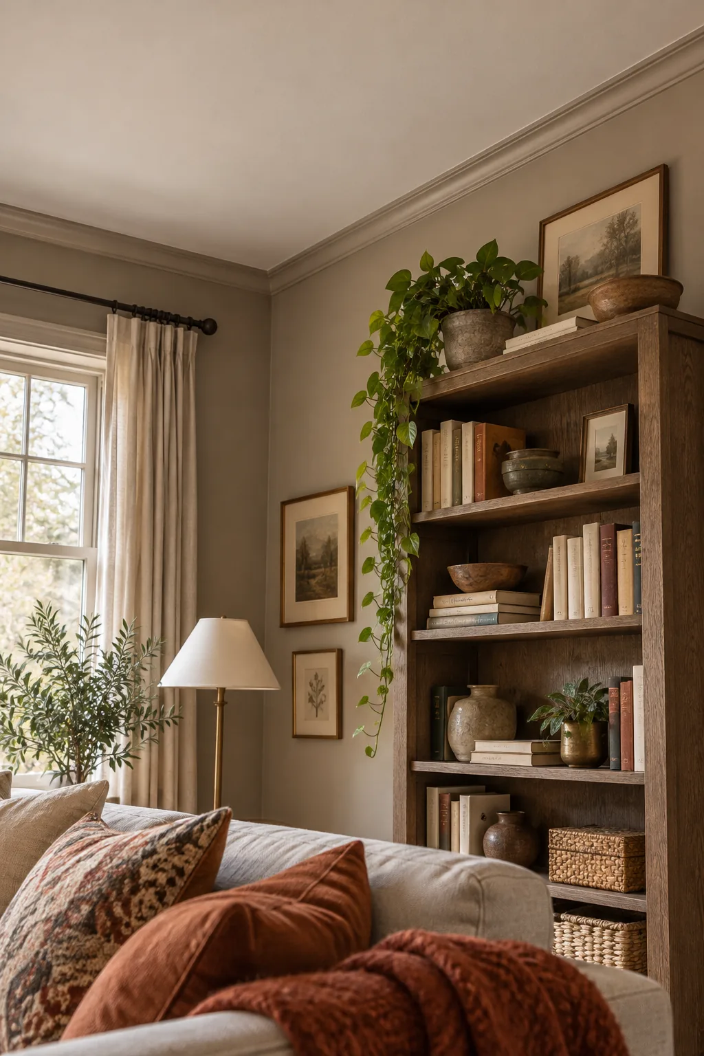
Before committing to a specific shade, it is absolutely crucial to understand how different brightness levels interact with weak, indirect natural light to avoid ruining the mood of your space.
Working With Low Natural Light
Because northern exposure lacks direct sunlight, the illumination entering your windows is inherently weak and heavily shadowed. You must consciously select a paint value that possesses enough inherent depth to hold its own character throughout the day.
| LRV Range | Visual Effect | Best Application |
|---|---|---|
| 80 to 100 | Washes out, looks dingy | South-facing rooms |
| 66 to 79 | Feels ungrounded and cold | East or west exposures |
| 55 to 65 | Holds warmth and depth | North-facing walls |
| 40 to 54 | Creates a moody atmosphere | Cozy dens or libraries |
| 0 to 39 | Absorbs all ambient light | Accent features only |
Understanding Undertone Shifts
As the sun moves across the sky, the color temperature of the natural light entering your windows will fluctuate. A grey that looks perfectly balanced at noon might pull an unexpected purple or green hue by late afternoon.
Choosing the Right Paint Base
Premium paint lines offer different base formulations that directly affect the depth and richness of the final color. Always request a deep base when mixing warm greys to ensure the brown undertones develop fully without looking chalky.
Softening the Ceiling Line
I used to paint every ceiling stark white, but that creates a harsh, contrasting line above the walls. This sharp visual break immediately shatters the room’s cozy envelope and draws the eye directly to the shadowy corners.
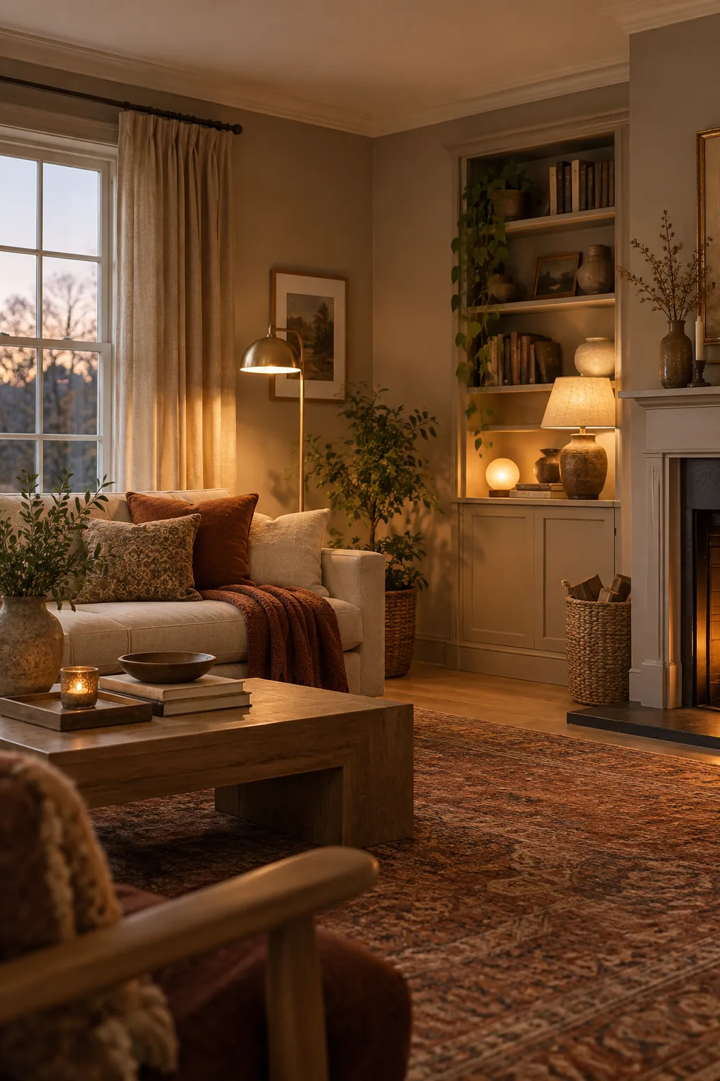
Instead, ask your local paint store to mix your chosen wall color at 25 percent strength. This custom approach creates a soft, barely-there tint that glows warmly above the walls without ever looking heavy or oppressive.
Customizing Your Ceiling Tint
Most premium paint retailers can easily adjust the saturation of your chosen color at the mixing counter. This custom mix ensures the ceiling shares the exact same warm undertones as your walls, maintaining perfect visual harmony.
- Provide the clerk with the exact name and number of your primary wall color.
- Explicitly request a custom quarter-formula mix, rather than a pre-tinted ceiling white.
- Verify the newly mixed shade by dabbing a small sample onto a spare piece of white cardboard.
Selecting the Right Primer
Applying your new greige over an existing strong color will drastically alter how the final shade appears. Always use a high-quality, bright white primer to create a neutral baseline before you begin testing your carefully chosen grey swatches.
Wrapping the Room in Satin
Traditional white trim often feels jarring against a warm greige wall, abruptly interrupting the flow of the space. Painting the skirting boards and window frames in the exact same grey provides seamless architectural definition.
- Select a soft satin sheen for all your wooden trim so it gently reflects ambient light.
- Keep the main drywall surfaces in a flat or matte finish to absorb shadows and hide imperfections.
- Let the contrasting finishes do the visual work, creating a seamless, enveloping warmth.
Creating Architectural Definition
When you eliminate contrasting trim colors, the room feels noticeably taller and significantly more expansive. The subtle shift in gloss levels highlights your millwork beautifully without demanding immediate visual attention or breaking the serene atmosphere.
Avoiding Cool White Trim
Pairing a warm greige wall with a stark, cool-toned white trim will instantly make the walls look dirty. If you absolutely must use white trim, select a creamy, warm white that shares the same underlying brown notes.
Balancing Textiles and Paint
Your wall color does not exist in a vacuum; it constantly interacts with your furniture and fabrics. Introduce rust-colored pillows, warm leather chairs, and textured wool rugs to physically reinforce the toasty undertones of your selected paint.
Layering Warm Illumination
Artificial lighting must actively counteract the cool, bluish window glare that dominates north-facing spaces. A single overhead fixture will only cast harsh, unflattering shadows directly across your carefully chosen paint, ruining the cozy aesthetic.
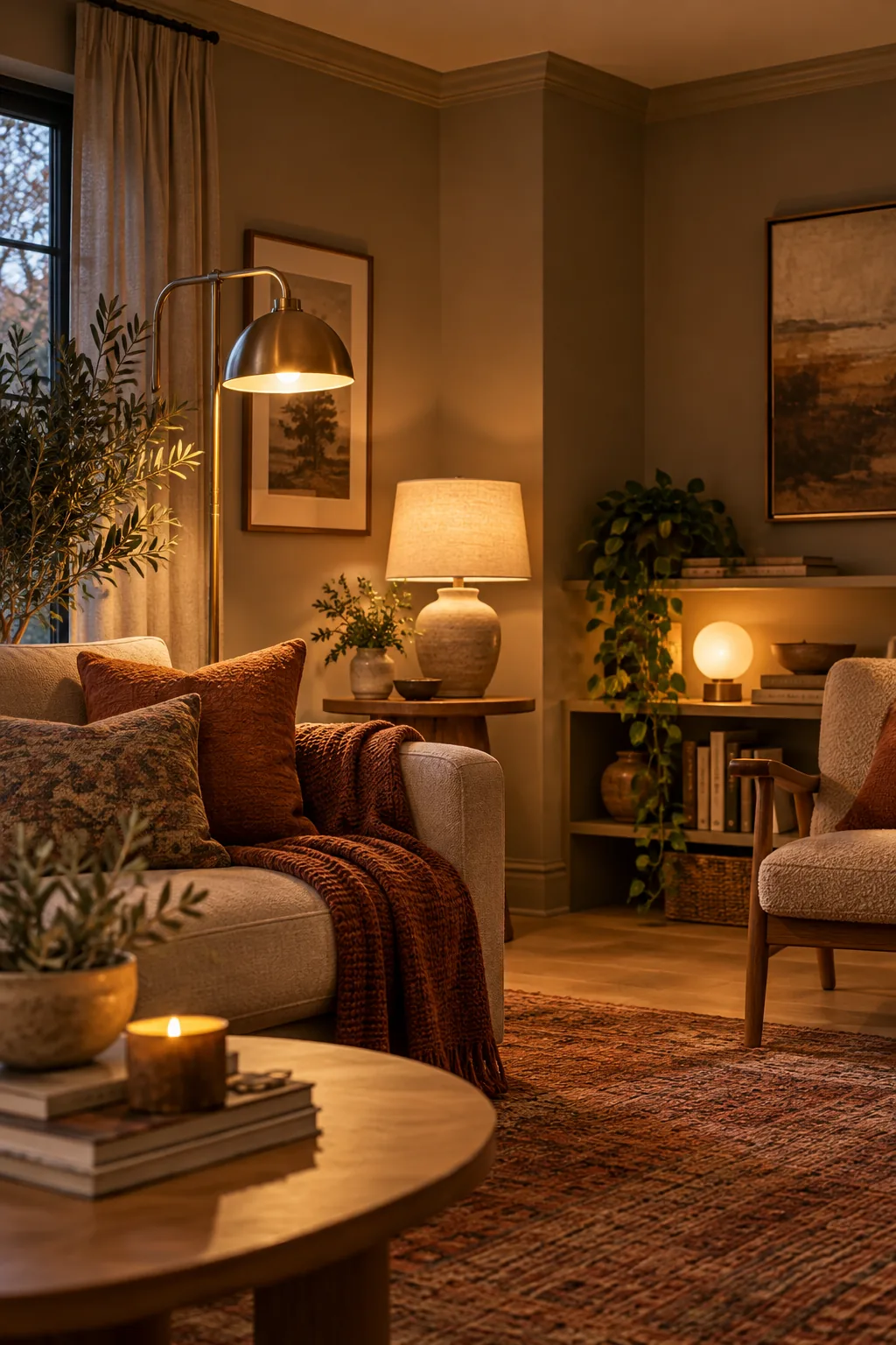
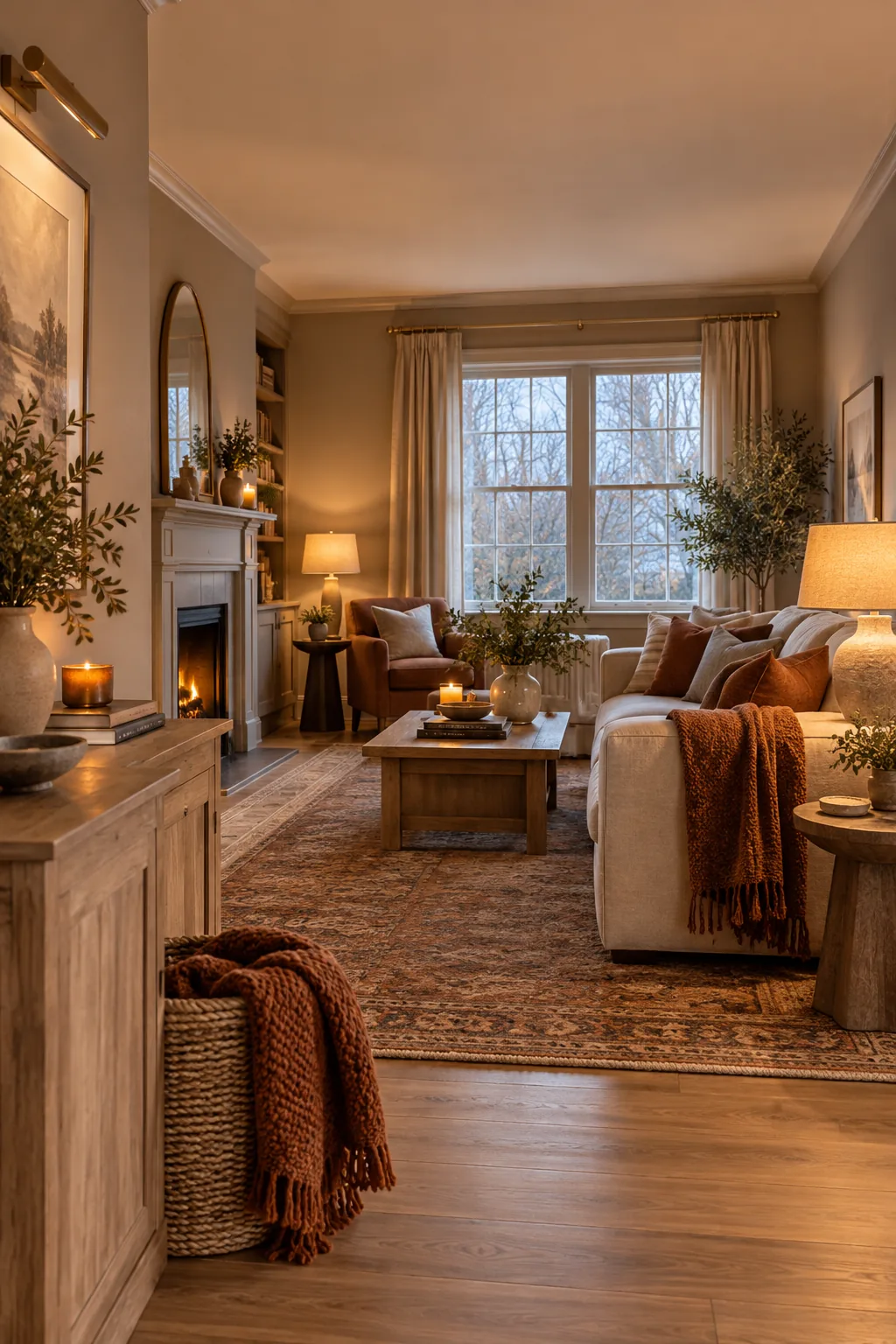
Use 2700K warm white bulbs and distribute them across three distinct heights. Placing a floor lamp, a table lamp, and a low shelf light creates inviting, overlapping pockets of warmth that wash over the greige walls.
Positioning Your Light Sources
By spreading your illumination across multiple elevations, you effectively wash the entire room in a cozy, amber glow. This strategic layering eliminates dark corners and actively enhances the brown-grey undertones of your selected paint color.
Incorporating Metallic Accents
Polished chrome and brushed nickel hardware will amplify the cool, chilly nature of northern light. Swap out your light fixtures and cabinet pulls for unlacquered brass or warm antique bronze to introduce an additional layer of visual heat.
Embracing Matte Finishes
High-gloss walls reflect the cool window glare directly back into your eyes, emphasizing the room’s northern exposure. A flat or matte finish absorbs the light beautifully, creating a soft, velvety texture that enhances the room’s cozy feeling.
Warm Grey Styling Ideas
See how different decor styles embrace a warm greige foundation.
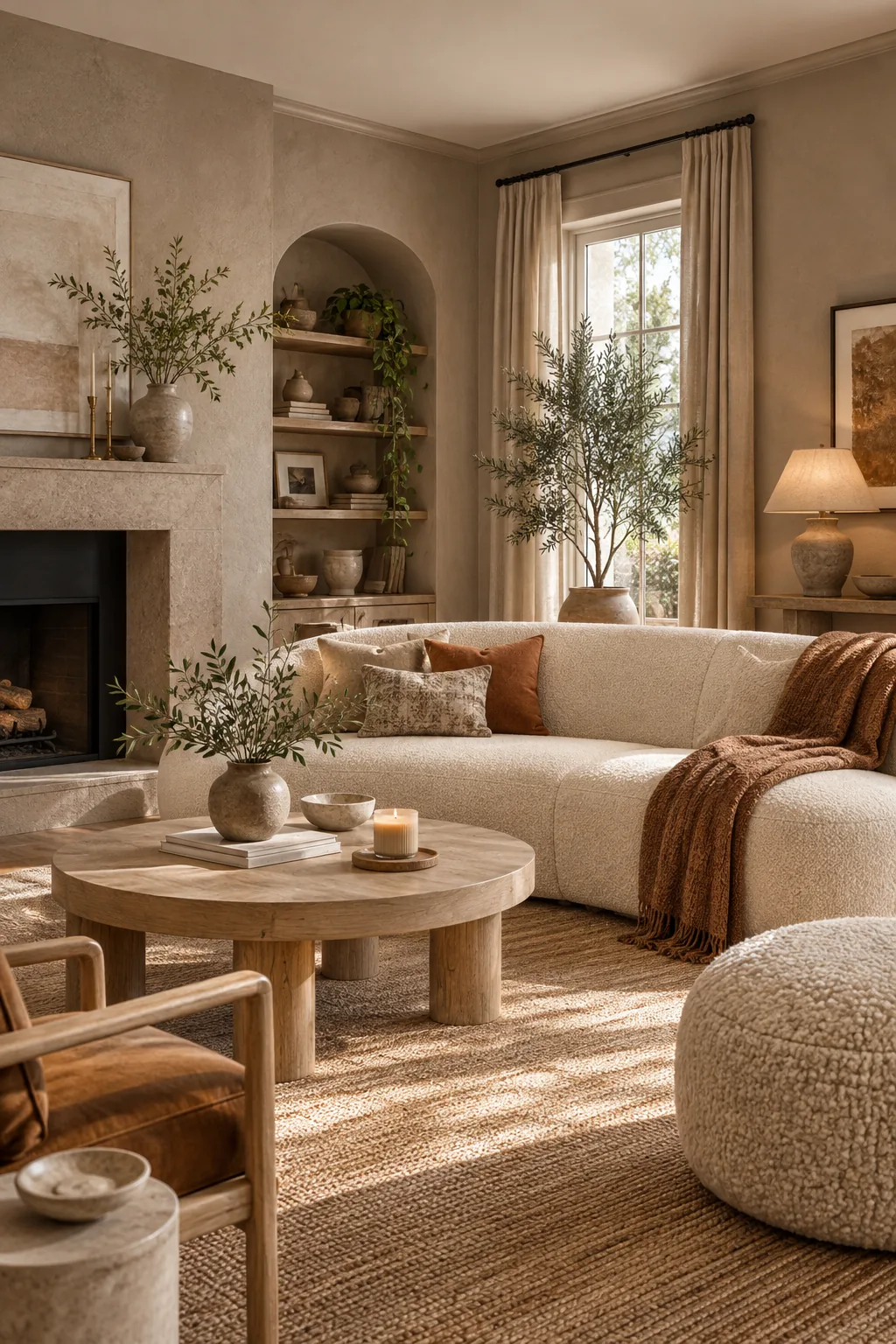
Organic Modern Sand: Embrace a lighter, sand-toned greige paired with bleached oak and heavy linen textures for an airy feel.
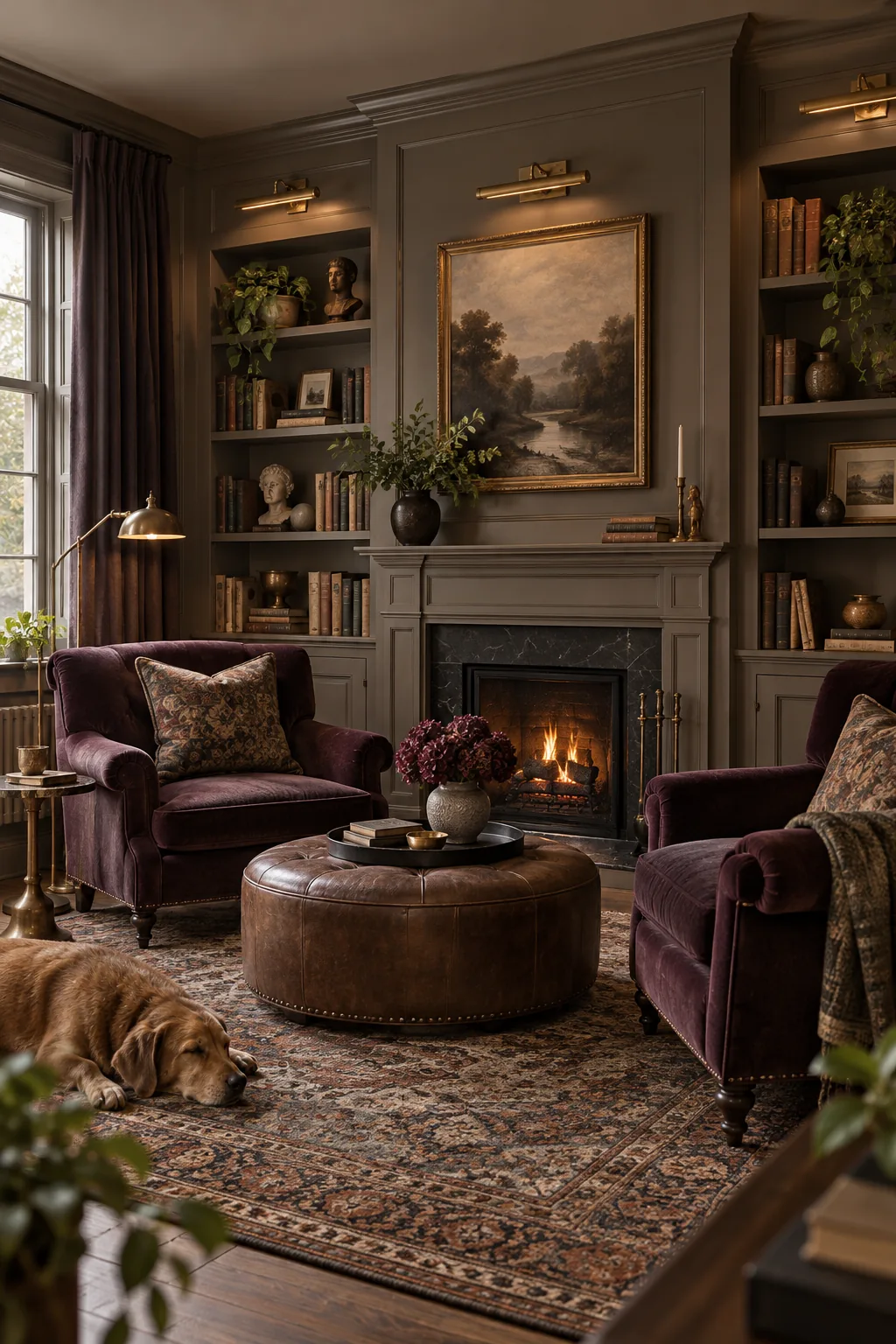
Moody Traditional Plum: Push the LRV lower for a dramatic, enveloping space accented with rich plum velvet and antique brass.
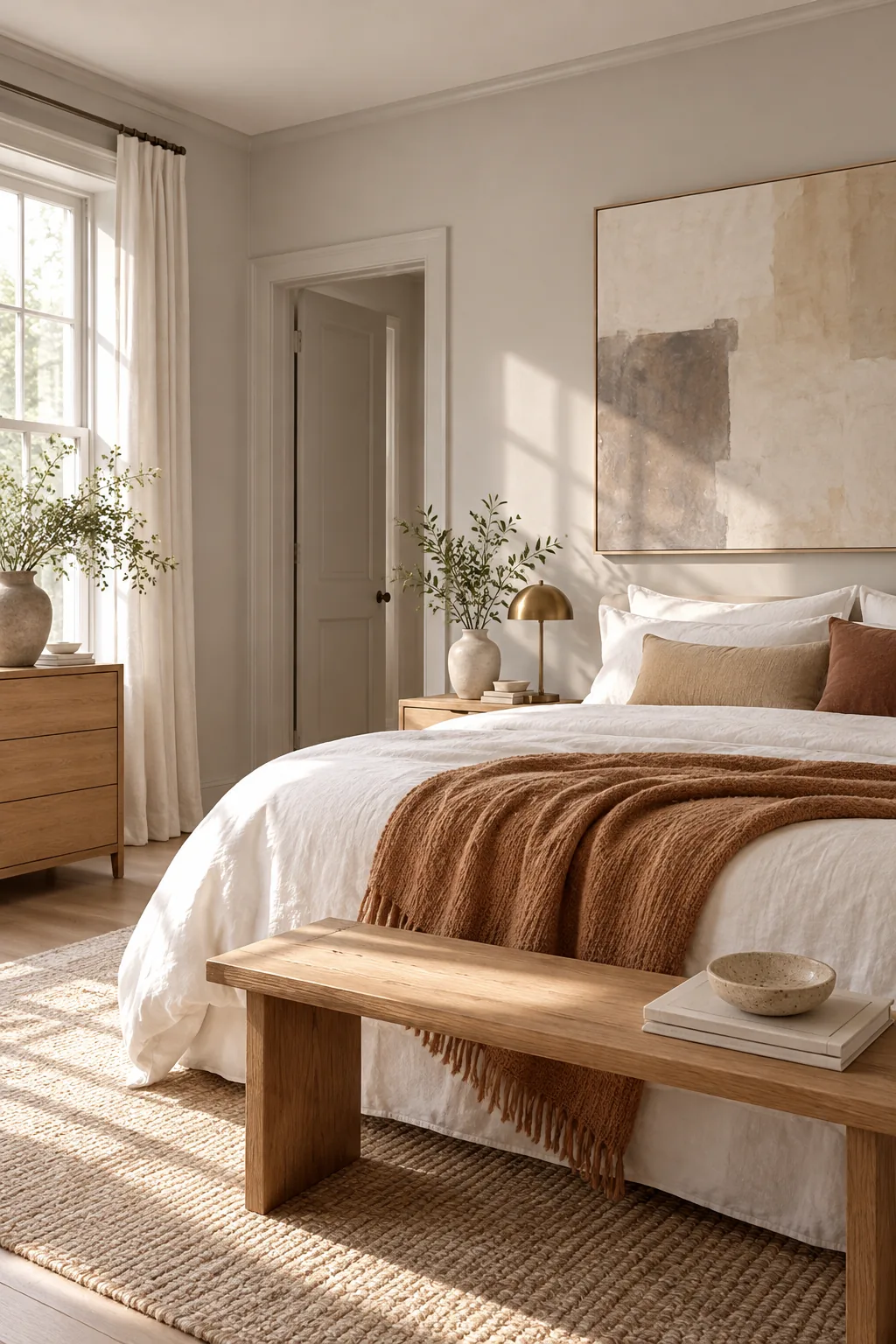
Soft Minimalist Canvas: Keep the walls incredibly pale but distinctly warm to soften a minimalist space without feeling stark.
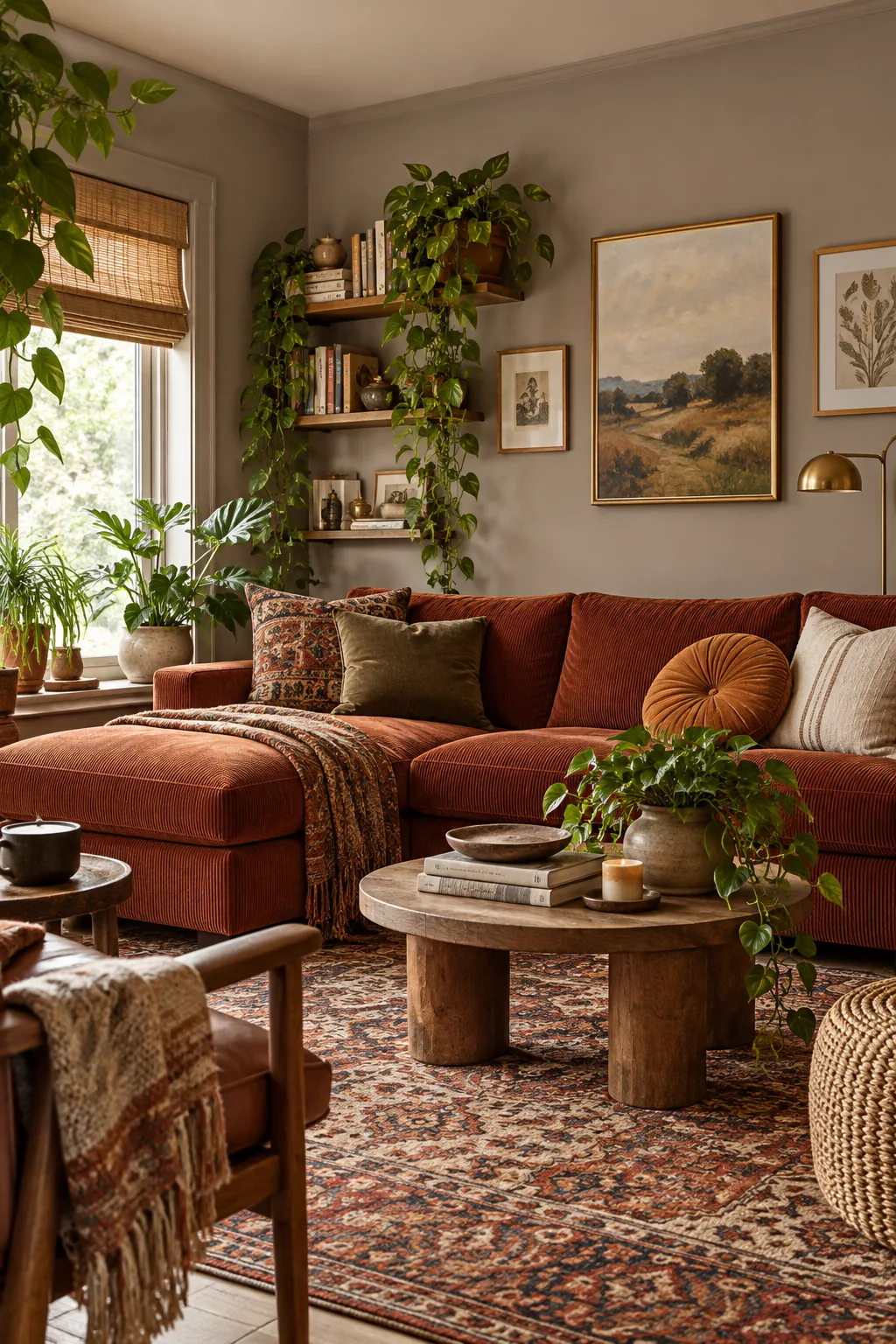
Earthy Eclectic Rust: Use a solid mid-tone greige to ground a vibrant mix of rust corduroy, vintage rugs, and trailing greenery.
The North-Light Swatch Routine
Because northern light shifts dramatically in temperature and intensity throughout the day, a single glance is never enough. You must actively observe how the color behaves as the sun moves across the sky.
Use our printable North-Light Grey Sampling Sheet to log your painted swatches. Track the undertones in morning shadows, bright noon glare, and evening lamp light before confidently making your final design decision.