Exterior Brick & Paint Color Pairings (Plus Undertone Chart)
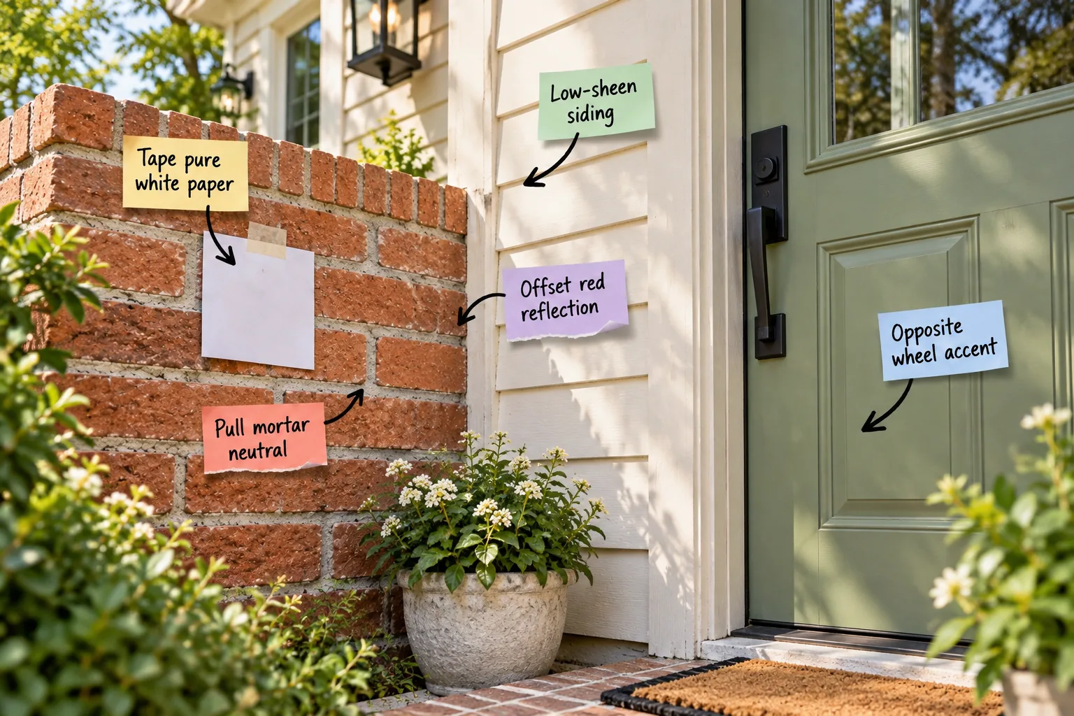
Stop guessing which paint colors work with your masonry and use our brick undertone pairing chart to confidently select harmonious siding, trim, and door paints. You will be able to identify your brick’s true color cast and build a perfectly balanced exterior palette without the usual frustration.
Identify your brick’s true undertone
When I bought my Denver bungalow, the exterior looked vaguely brown until I held up a color swatch and realized it was intensely orange. You must tape pure white paper directly to the masonry to force your eye to see the underlying color cast accurately.
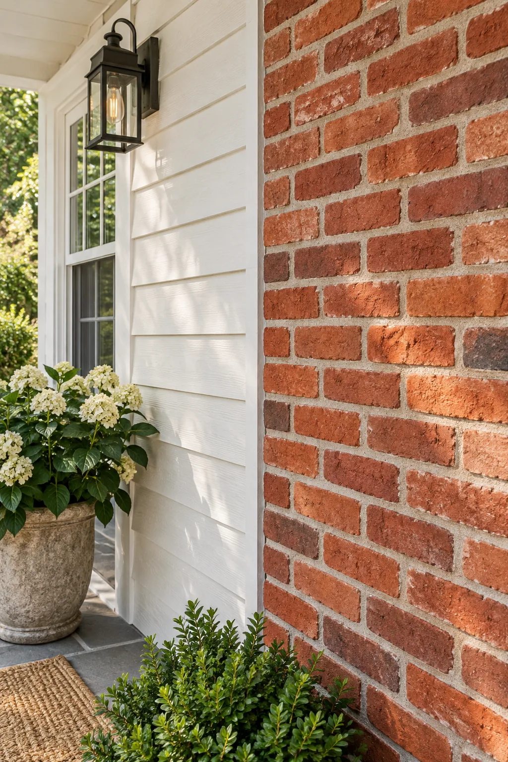
Viewing this stark white baseline from 10 feet away reveals whether your brick’s true undertone leans pink, orange, or yellow. This foundational step dictates every subsequent paint choice for your home, ensuring your final palette feels intentional and cohesive.
Stand back ten feet for accurate reading
Distance blends the varied hues of individual bricks into one cohesive mass color that you can actually work with. Evaluating the wall from the curb prevents you from hyper-focusing on a single anomalous dark brick that does not represent the entire facade’s true character.
Clean the masonry before color testing
Years of accumulated dust and environmental soot will temporarily dull the natural vibrancy of your exterior clay. Power wash a small test section and let it dry completely before attempting to identify the dominant hue, as wet masonry always appears artificially dark and saturated.
Pull your primary neutral from the mortar
I always tell my design clients to look closely at the light gray or beige mortar joints between the bricks to find their ideal trim color. Because you must pull mortar neutral tones that physically integrate with the brick, matching this shade guarantees a harmonious palette.
Match the mortar’s exact color temperature
Take a physical piece of crumbling mortar to the paint store to ensure you capture its precise warmth or coolness under commercial lighting. A beige mortar requires warm white siding, while a gray joint demands cooler, ash-toned trim to maintain structural visual balance.
Choose a low-sheen finish for siding
You must specify a flat or satin paint finish with under 15 percent gloss for your wood or fiber cement siding. High-gloss paint looks artificial and aggressively competes with the naturally matte, porous texture of the surrounding natural brick architecture.
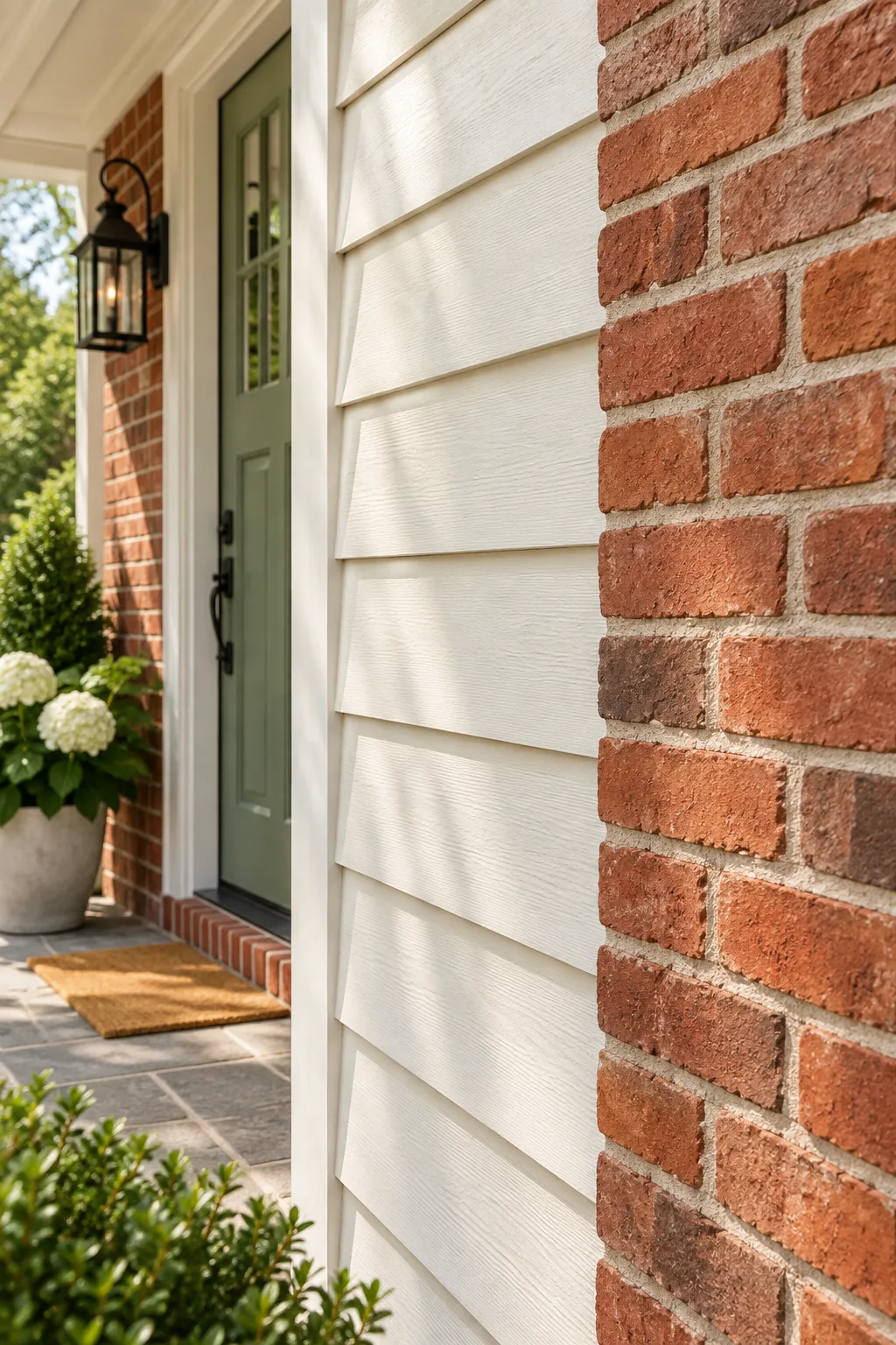
A low-sheen siding finish absorbs light beautifully, allowing the textured surface of the masonry to remain the visual focal point of the exterior. This subtle contrast in material sheen makes the entire home look more expensive and thoughtfully designed.
Avoid high-gloss trim near natural brick
Reflective surfaces highlight every imperfection in the wood and create a plastic-like appearance next to organic clay materials. Stick to eggshell for the trim to provide just enough durability against the elements without introducing unwanted glare that distracts from the brick.
Offset the brick’s color reflection
Brick casts a colorful shadow onto adjacent light-colored siding, meaning a red wall will reflect a pink cast onto pure white paint. You must offset red reflection issues by choosing a siding paint with a very subtle green undertone to absorb the color.
Neutralize pink casting with subtle greens
Because green sits directly opposite red on the color wheel, a faint sage tint in your white siding naturally absorbs the reflected pink light. This optical trick keeps your trim looking crisp and intentionally neutral regardless of how bright the sun shines.
Select an opposite-wheel accent door
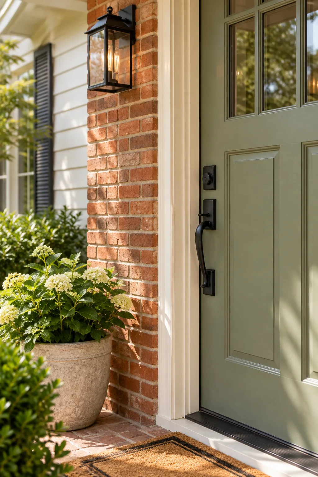
In my own home, pairing a muted sage door with my orange brick completely transformed the entryway from boring to striking. Find your brick’s primary undertone on the color wheel and look exactly 180 degrees across for your perfect opposite wheel accent.
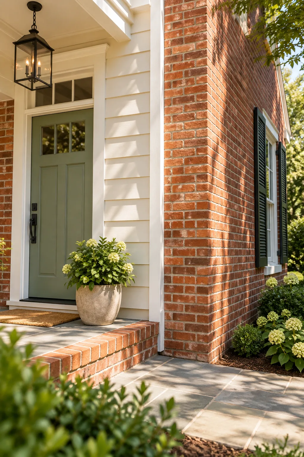
A red-orange brick exterior pairs beautifully with a deep navy or muted green front door to create maximum curb appeal. This high-contrast complementary pairing makes both the masonry and the painted wood look significantly more vibrant and welcoming to guests.
Balance the door’s visual weight
Because the opposite-wheel color provides such strong contrast, you must ground it with an appropriate depth of shade. A pale pastel door will look washed out against heavy brick, so always opt for rich, highly saturated tones that hold their own visually.
The brick undertone pairing chart
After years of manually matching swatches for clients, I developed this reference table to instantly map the five most common masonry types to their chemically ideal paints. Use our brick undertone pairing chart to skip the guesswork and find your perfect combination.
| Brick Undertone | Ideal Siding Tone | Trim Color Match | Accent Door Color |
|---|---|---|---|
| Red | Subtle green-gray | Soft ash gray | Deep navy blue |
| Orange | Warm cream | Beige mortar match | Muted sage green |
| Yellow | Cool crisp white | Light charcoal | Plum or eggplant |
| Brown | Earthy taupe | Warm tan | Rich teal or aqua |
| Whitewashed | Soft blue-gray | Bright white | Classic black |
This matrix ensures that every element of your exterior works in harmony with the raw materials already present on the site. Pinning down your exact category early in the process prevents costly repainting mistakes and endless trips to the hardware store.
Always cross-reference your chosen palette against the actual lighting conditions of your specific lot before making a final purchase. Surrounding mature trees, neighboring houses, and harsh streetlights will heavily influence the final read of these carefully selected undertones.
Map whitewashed brick to cooler tones
Heavily limewashed or painted brick loses its dominant warm earthy cast and takes on a cooler, more uniform appearance across the facade. This shift allows you to safely introduce crisp blue-grays and stark blacks that might otherwise clash violently with raw red clay.
Bridge the gap with landscaping
Greenery acts as a natural buffer between your foundation and the painted siding above, helping to integrate the house into the site. Layering structured shrubs against the masonry softens the hard transition and pulls natural earthy greens into your overall exterior color palette.
Factor in your roof shingles
Your roof covers nearly half of your home’s visible exterior and acts as a massive fixed color block that cannot be ignored. Ensure your selected siding paint bridges the gap between the warm brick walls and the typically cool tones of asphalt shingles.
Consider the visual weight of windows
Dark window sashes create a modern, recessed appearance that pairs beautifully with warm brick tones and draws the eye inward. If you have bright white vinyl windows, ensure your trim color matches them exactly to avoid a cluttered, mismatched facade that feels chaotic.
Test swatches in multiple exposures
Paint large 24×24-inch sample swatches on all four sides of the house before committing to a final exterior color scheme. Direct sunlight and deep shade will drastically alter how the paint’s undertone interacts with the brick throughout the changing day.
Observe the paint during golden hour
Because sunlight shifts dramatically, a color that looks perfectly neutral in the morning might turn surprisingly yellow by mid-afternoon. Golden hour light amplifies hidden warm undertones, exposing any clashing hues before you invest in dozens of gallons of expensive exterior paint.
Complete the look with matte hardware
Finish the exterior with entry hardware that bridges the transition between the painted door and the raw, unyielding brick. Opting for matte black or aged bronze provides a grounding, dark contrast without adding reflective glare that distracts from the architecture.
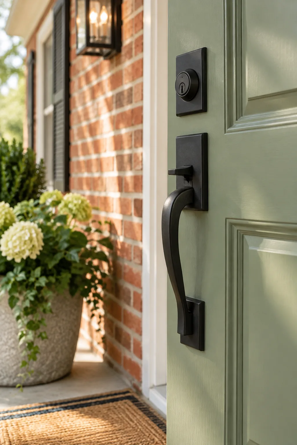
This dark, non-reflective finish prevents the handle from distracting from your carefully chosen color pairing while providing necessary functionality. It acts as the final punctuation mark on a well-balanced, professionally designed exterior that perfectly marries painted surfaces with natural masonry.
5 Stunning Brick and Paint Combinations
Explore these finished exterior palettes to find the perfect style for your own home.
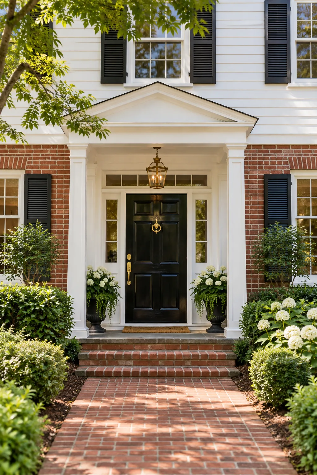
Classic Colonial Contrast: Crisp white siding and a stark black door provide a timeless, high-contrast frame for traditional red brick.
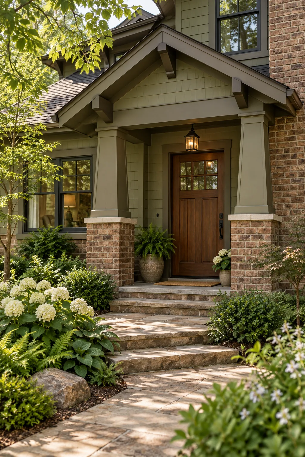
Earthy Craftsman Warmth: Muted olive siding pulls the subtle green undertones out of brown brick, while a stained wood door adds natural warmth.
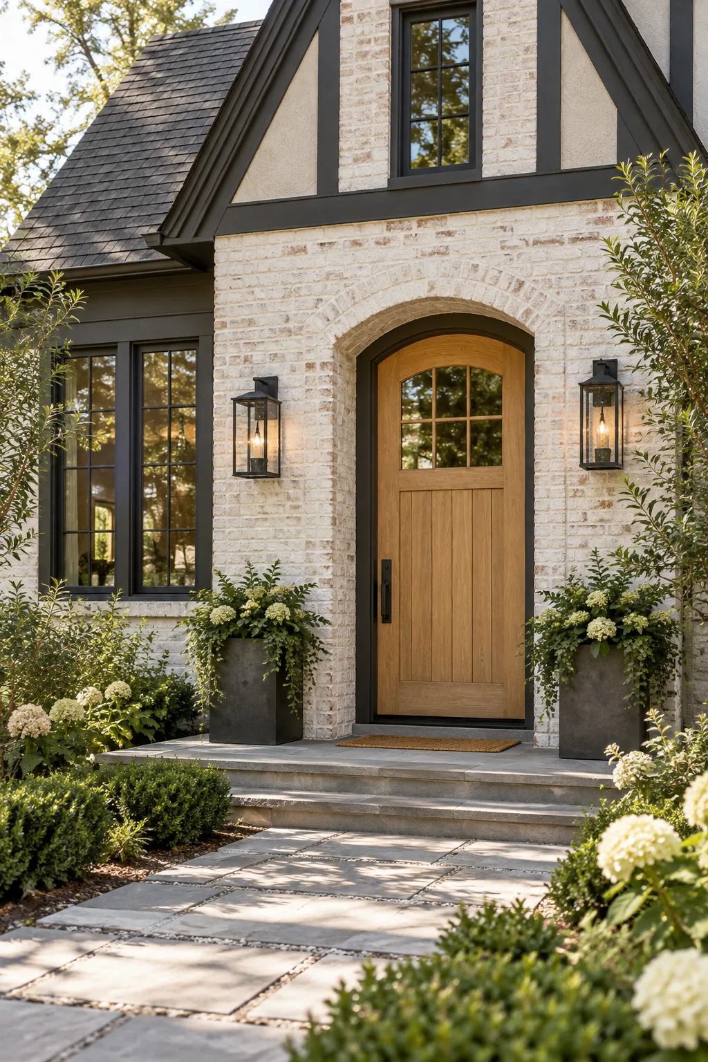
Modern Whitewashed Tudor: Dark charcoal trim provides a striking, modern edge against heavily whitewashed brick and a pale oak entry door.
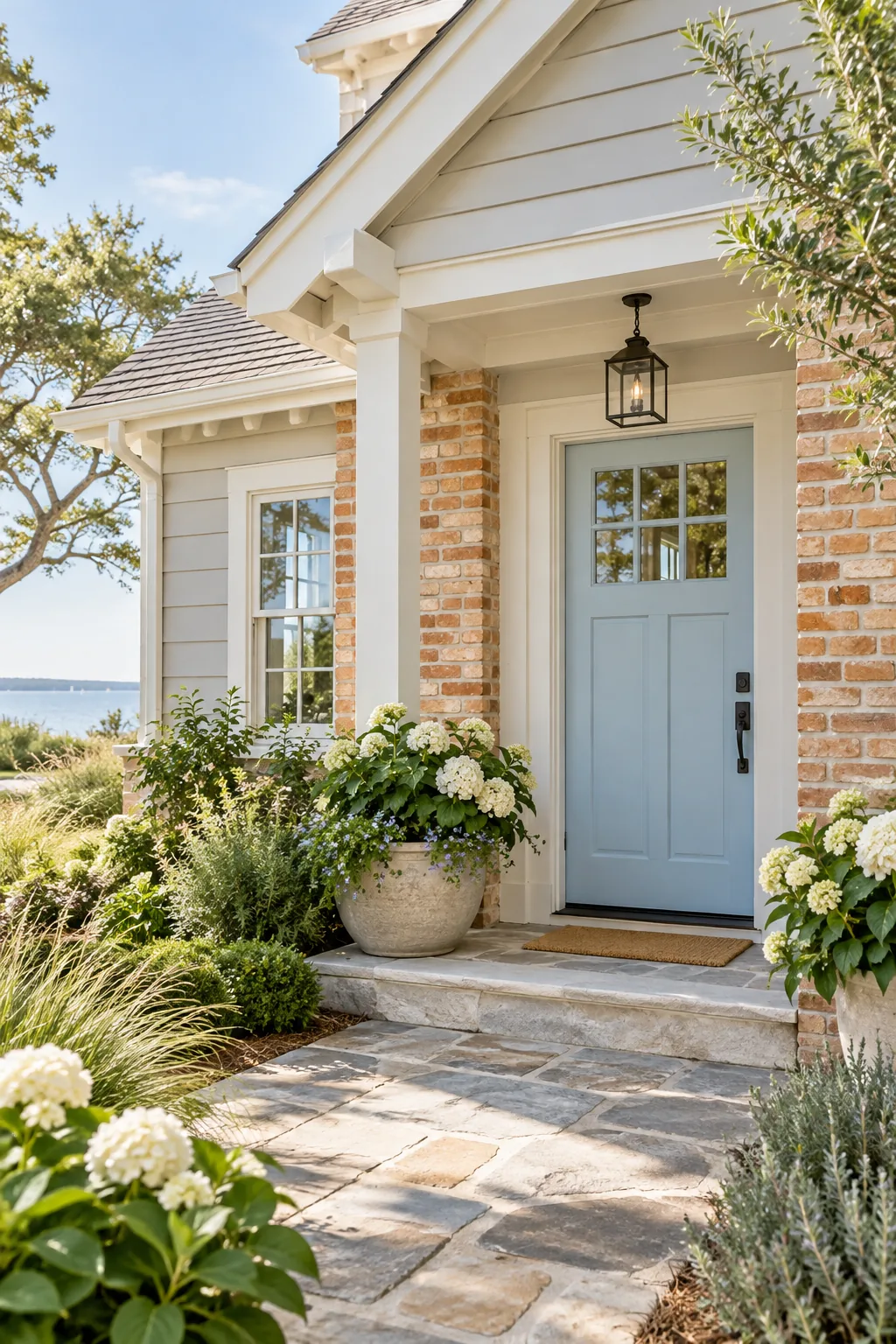
Breezy Coastal Cottage: A pale blue door cools down the warmth of light orange brick, creating a relaxed and inviting coastal atmosphere.
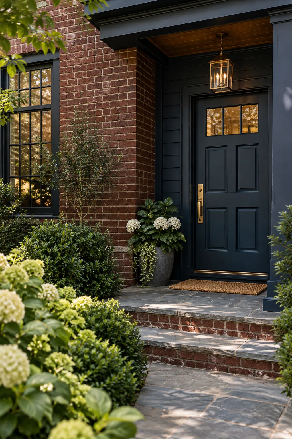
Moody Transitional Elegance: Dark navy siding absorbs the heavy tones of burgundy brick, creating a sophisticated, dramatic exterior highlighted by brass hardware.