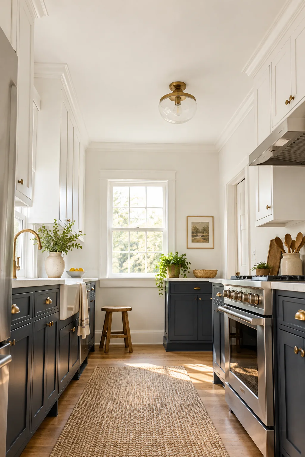
Small Kitchen Paint Colors: The LRV Chart That Adds Space
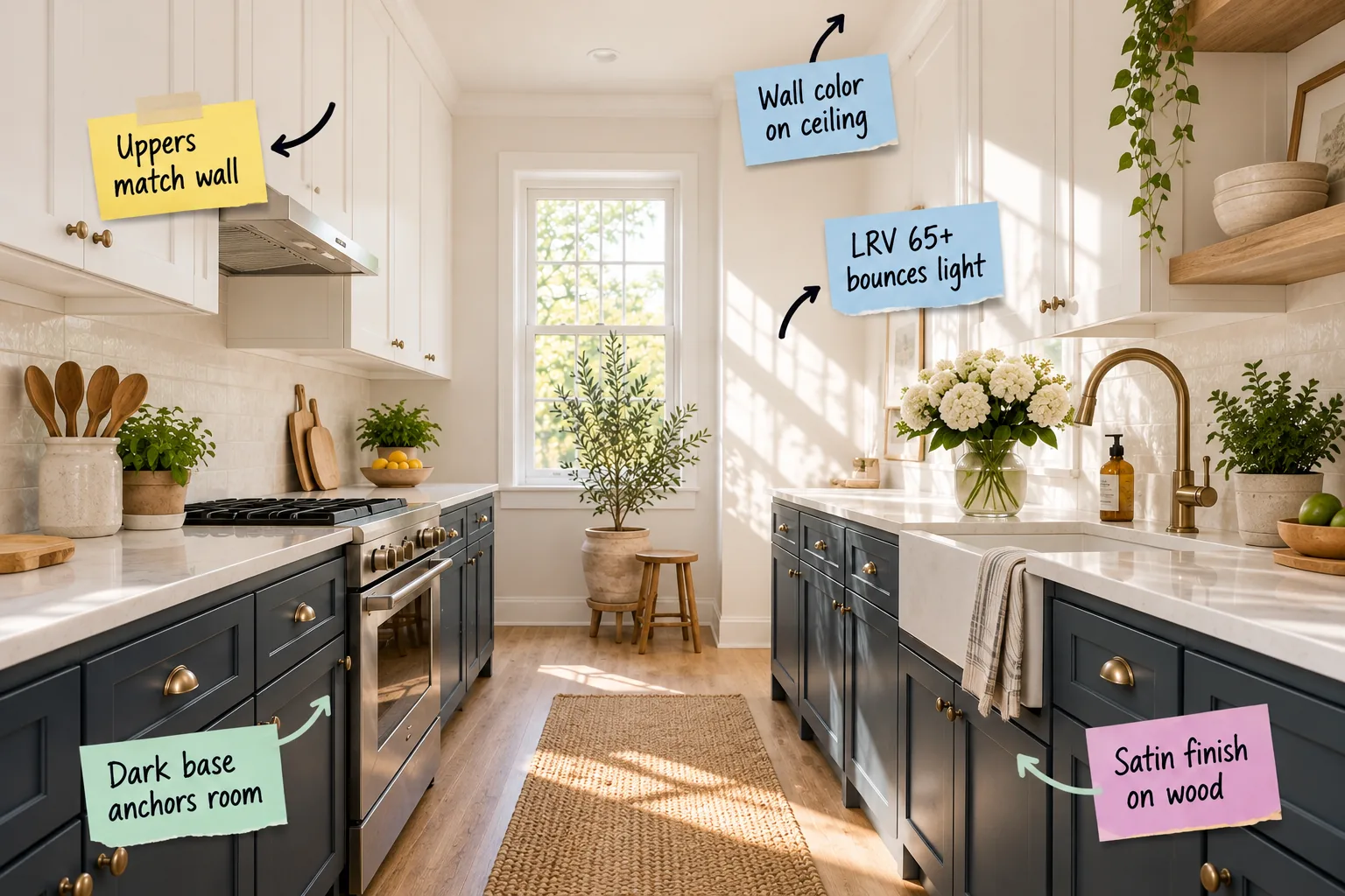
To make your compact cooking space feel instantly larger, you need to download our curated small kitchen LRV color chart. By following my structural approach to light reflectance, you will be able to select the perfect paint colors and finishes to visually expand your walls, cabinets, and ceiling.
The Space-Expanding Two-Tone Strategy
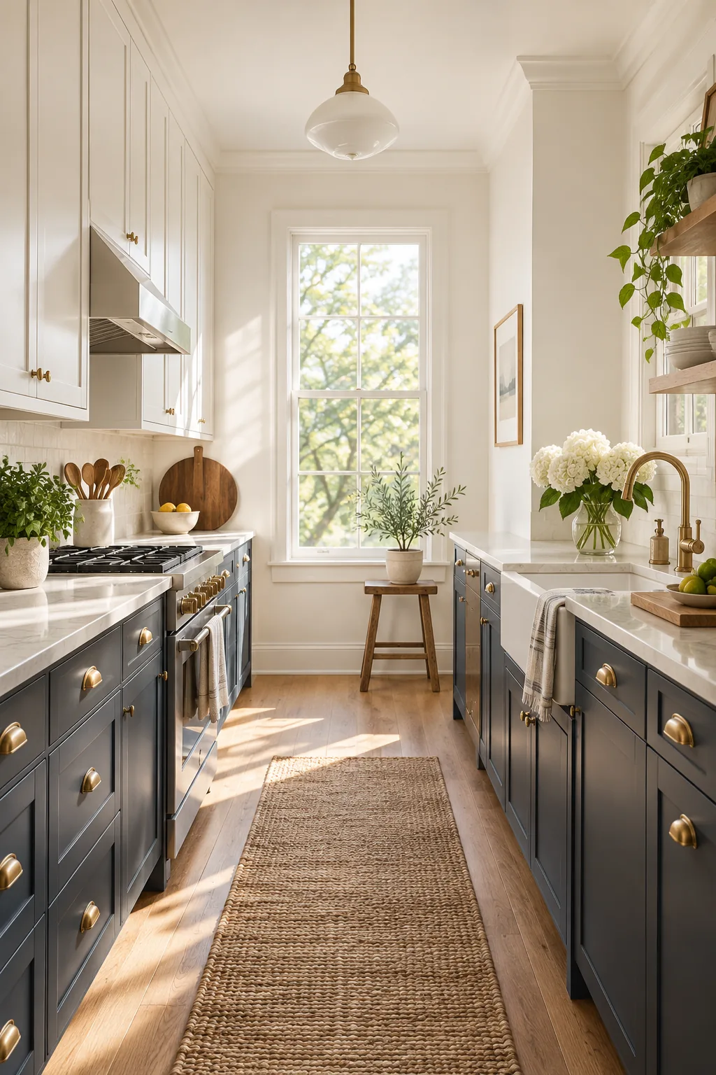
Dividing your kitchen horizontally with paint is the first strategic move in opening up a tight floor plan. By anchoring the darkest shades on the bottom half of the room, you prevent heavy, saturated colors from overwhelming a narrow footprint.
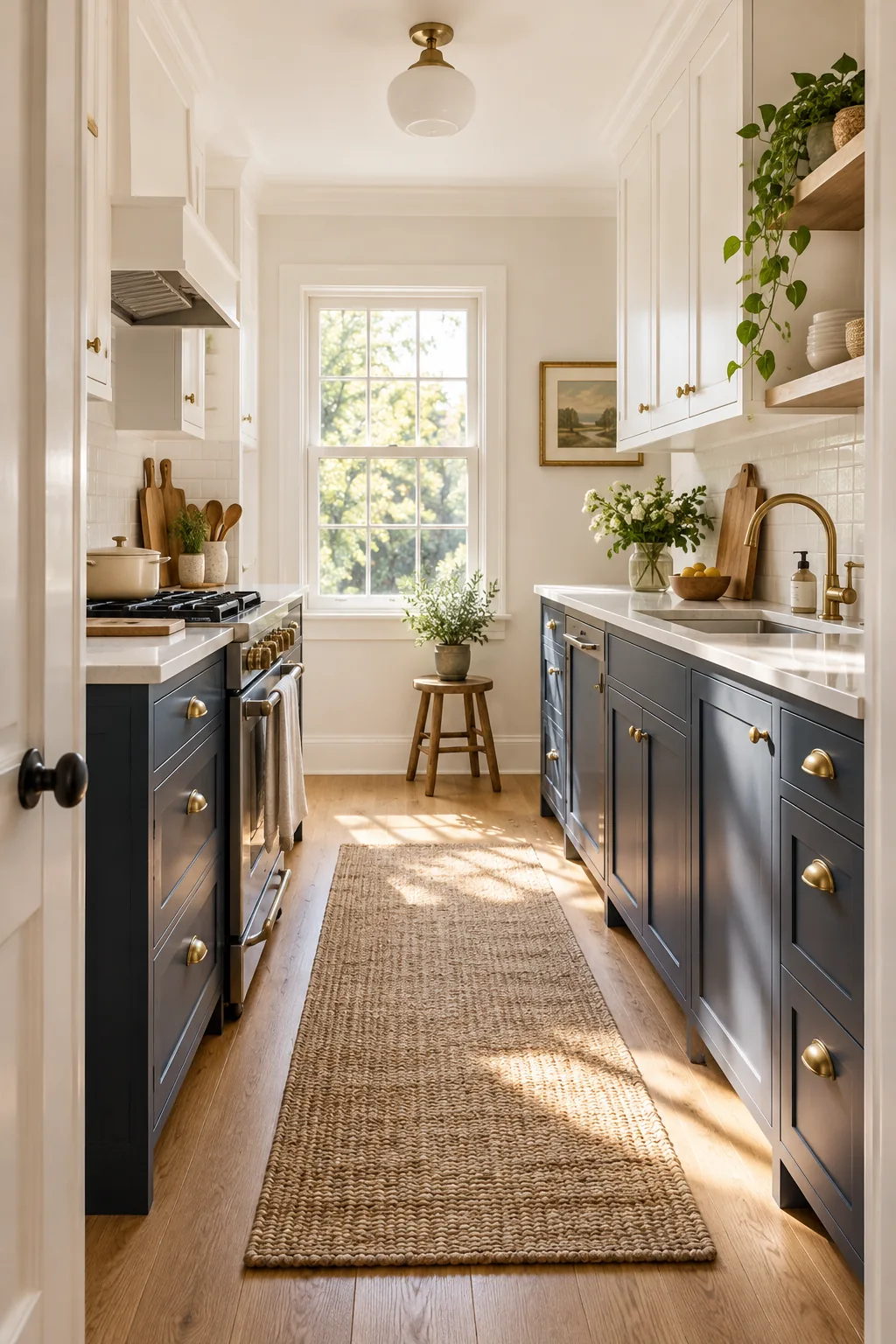
Breaking the Kitchen Horizontally
Think of your kitchen as a balanced landscape where the lower half grounds the design and the upper half mimics the open sky. Splitting the room at the 36-inch counter mark establishes a clear horizon line that instantly organizes the visual clutter of appliances and dishware.
Preventing Heavy Colors From Dominating
When balancing visual weight in a galley or L-shaped layout, you must sequence your color decisions deliberately to maintain an open feel. I always recommend following a strict bottom-to-top application order to ensure the darkest shades stay low.
- Establish the base: Commit to your dark lower cabinet color first to firmly anchor the room.
- Select the transition: Choose a countertop material that bridges the dark base and lighter upper walls.
- Lift the sightline: Apply your high-reflectance shade from the backsplash all the way up to the ceiling.
Why a Dark Base Anchors the Room
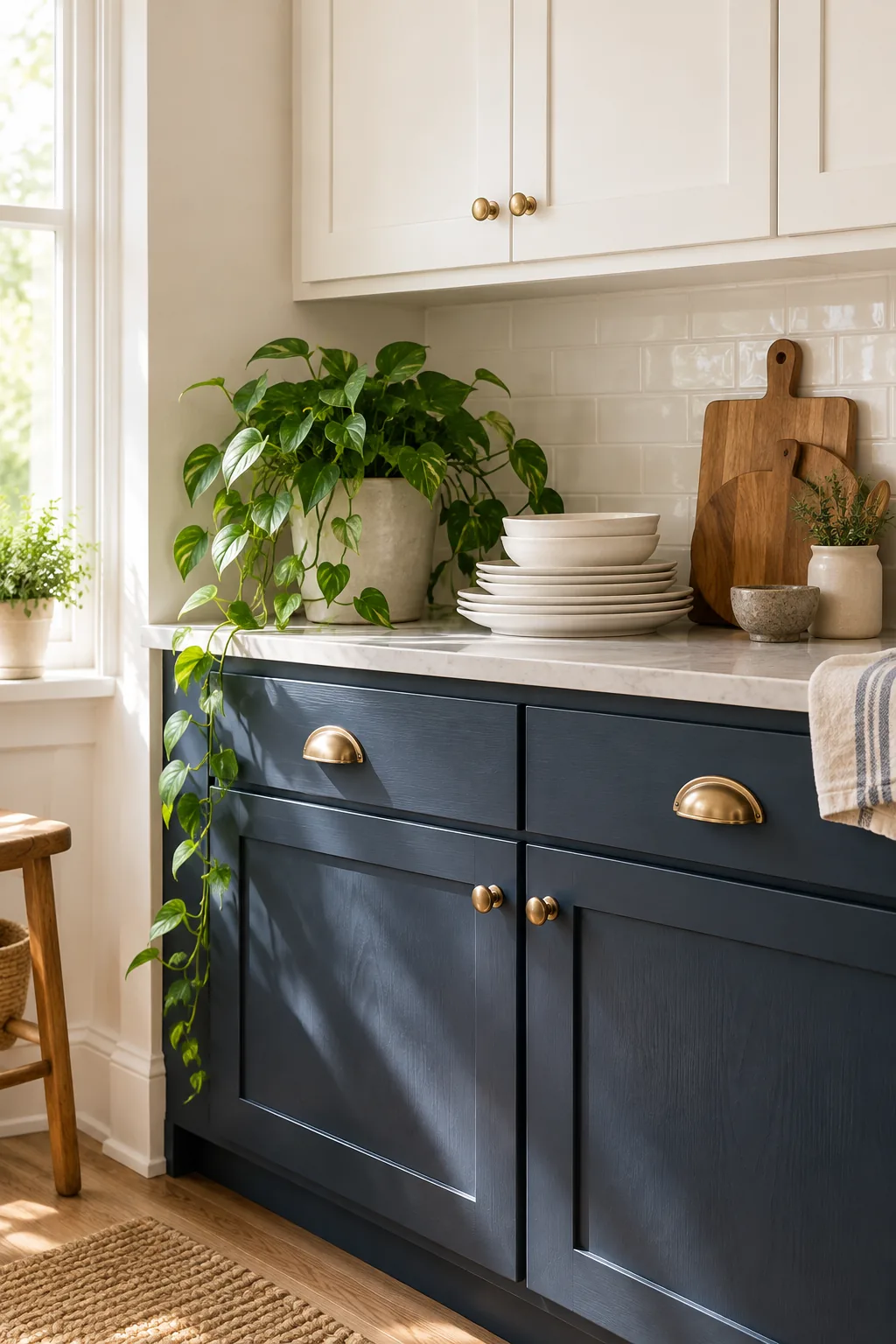
Using a rich, saturated color on the lower cabinets creates a solid foundation that visually pushes the lighter upper half upward. In my own Denver bungalow, painting my base cabinets a deep slate blue instantly made my low eight-foot ceilings feel significantly taller by contrast.
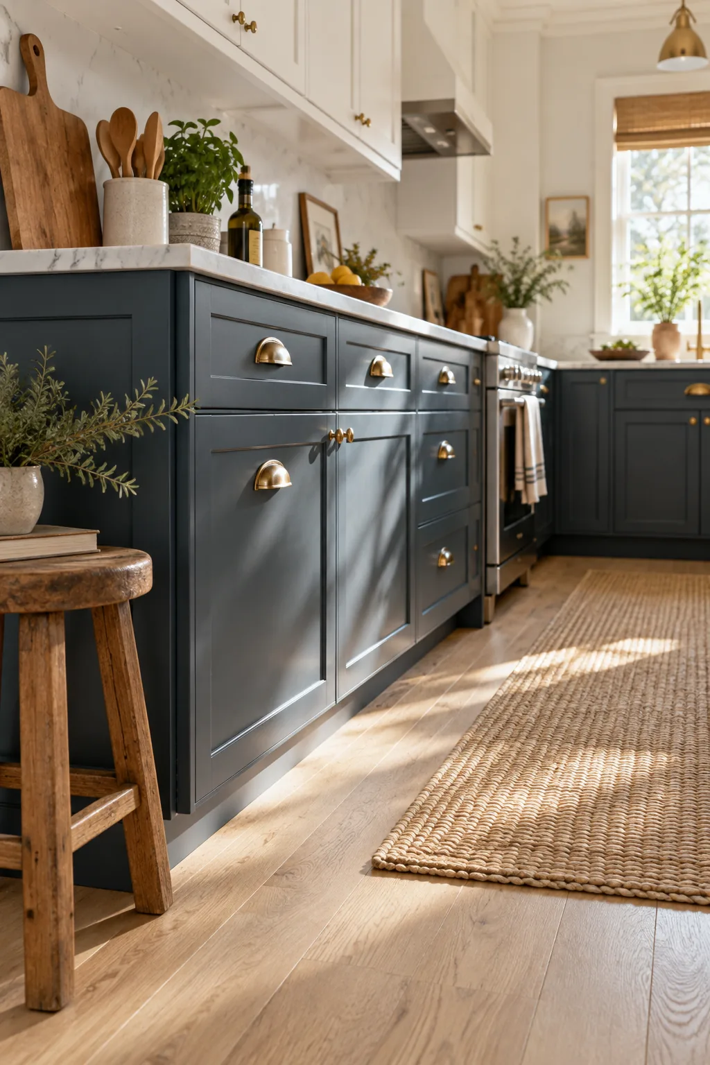
A dark base only works if the finish looks intentional and holds up to daily foot traffic. Avoid these common painting errors when tackling your lower cabinets.
Grounding the Layout With Solid Foundations
In Eastern design philosophies, a heavy base represents stability and permanence, which is exactly what a bustling cooking zone requires. Anchoring the room with deep tones allows the eye to relax, knowing the heaviest elements are firmly rooted to the floor.
Pushing the Upper Half Visually Upward
The stark contrast between a saturated base and airy upper walls creates an optical illusion of vertical expansion. Because dark colors absorb light and recede, the lower cabinets step back visually, allowing the brighter upper hemisphere to expand outward and upward.
Choosing a Satin Finish on Wood
A satin finish is the ideal compromise for painted wood cabinets, offering enough durability for lowers without looking artificially glossy. Its 20 to 30 percent gloss level provides a gentle, flattering reflection that highlights the cabinet profile beautifully without appearing plastic.
Hiding Everyday Scuffs and Fingerprints
Lower cabinets take a tremendous amount of abuse from pets, shoes, and cooking spills, requiring a surface that wipes clean effortlessly. The slight sheen of a satin finish creates a protective, washable barrier that resists moisture while remaining highly elegant.
Avoiding Plastic-Looking High Gloss
While high-gloss paints offer maximum durability, they act like mirrors that magnify every wood grain imperfection and brushstroke. Understanding the exact sheen percentages helps you select a finish that protects the wood without turning your kitchen into a sterile laboratory.
| Finish Type | Gloss Percentage | Durability Level | Best Kitchen Application |
|---|---|---|---|
| Flat / Matte | 0% to 5% | Very Low | Ceilings only |
| Eggshell | 10% to 15% | Low | Low-traffic dining walls |
| Satin | 20% to 30% | High | All painted cabinetry |
| Semi-Gloss | 35% to 50% | Very High | Doors and baseboards |
Make Uppers Match the Wall
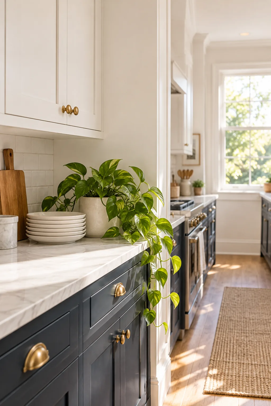
Painting upper cabinets the exact same shade as the walls removes jarring visual breaks and heavy outlines. When I applied this technique to a recent client’s narrow galley, the bulky upper boxes seemed to melt away, doubling the perceived width of the room.
Erasing Bulky Visual Boundaries
Contrasting upper cabinets chop a small wall into fragmented, busy rectangles that distract the eye. Matching the cabinet paint to the drywall creates a continuous, unbroken surface that hides the depth of the cabinetry and streamlines the architecture.
Letting Cabinetry Recede Seamlessly
When the eye cannot detect a color shift between the cabinet box and the surrounding wall, it registers the entire span as empty space. This camouflage technique is the single most effective chess move for making necessary storage feel invisible.
What is LRV in Paint?
Light Reflectance Value is the standard scale that measures exactly how much light a paint color reflects or absorbs. Understanding this metric allows you to predict how a shade will perform before you ever open a can of paint.
Reading the Zero to One Hundred Scale
On the LRV scale, absolute black measures at zero, absorbing all light, while pure, brilliant white hits one hundred. Most residential paint colors fall between 10 and 90, giving you a massive spectrum of reflectance to manipulate the brightness of your room.
Finding the Metric on Your Swatches
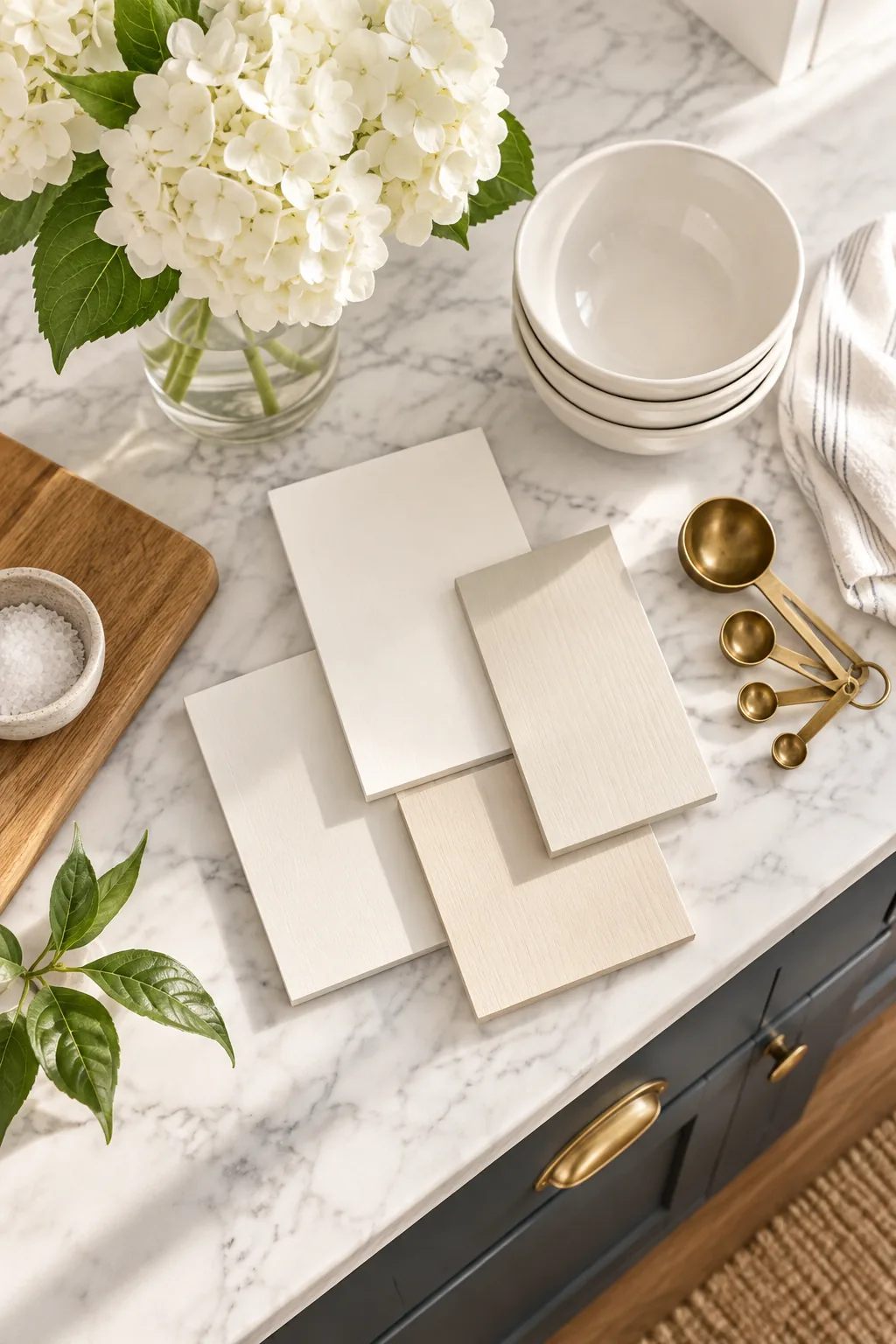
You never have to guess a color’s reflective power, as manufacturers print this crucial data directly on their materials. Simply flip over any standard paint chip at the hardware store, and you will find the two-digit LRV number listed near the color name.
Why LRV 65+ Bounces Light
Choosing wall and upper cabinet colors with an LRV above 65 ensures the paint actively bounces available light around the room. I learned this the hard way in my first apartment, where an LRV 50 gray swallowed every ounce of morning sunlight.
Multiplying Available Natural Sunlight
In a compact space with only one small window, your paint must work like a secondary light source. An LRV of 65 or higher acts as a subtle mirror, catching incoming solar rays and ricocheting them across the room to amplify the brightness.
Eliminating Dark Corners and Shadows
Low-reflectance colors allow shadows to pool in the corners, which visually shrinks the perimeter of the room. High-LRV shades push light deep into those recesses, erasing the gloomy pockets that make tight kitchens feel cramped and uninviting.
Your Small Kitchen LRV Color Chart
To maximize brightness in compact layouts, you need our curated small kitchen LRV color chart, which identifies the exact shades proven to expand tight spaces. Using these verified categories takes the guesswork out of selecting your upper wall and cabinet colors.
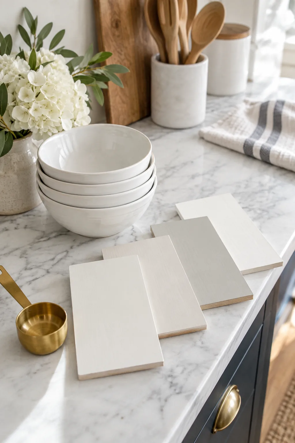
Even with the right LRV, the direction your kitchen faces will change how the color reads. Make sure you verify your choice in your actual space.
Selecting Proven High-Reflectance Categories
Not all bright colors feel expansive, as overly warm tones can visually advance toward you. I rely on three specific high-reflectance categories that consistently push walls outward while maintaining a crisp, clean aesthetic.
- Cool architectural whites: Ranging from LRV 80 to 92, these shades feature subtle blue or green undertones that mimic natural daylight.
- Soft luminous grays: Sitting between LRV 65 and 75, these pale tones offer depth without absorbing precious illumination.
- Barely-there greiges: Hovering around LRV 70, these balanced neutrals provide warmth while still actively bouncing light across the room.
Testing Swatches in Your Actual Space
Paint chips viewed under fluorescent store lighting will look entirely different once installed in your home. Painting large test patches on multiple walls is the only reliable way to ensure your chosen LRV performs correctly under your specific light bulbs.
Elevating the Perceived Room Height
A harsh white ceiling against a colored wall creates a heavy horizontal stripe that stops the eye dead in its tracks. Wrapping the entire upper hemisphere in one continuous shade blurs the architectural limits, making the room feel endlessly tall.
Selecting the Right Ceiling Finish
To maximize the ceiling height illusion, you must use a completely flat finish overhead. A matte surface absorbs glare from overhead fixtures, ensuring the ceiling recedes into the background rather than reflecting distracting hot spots.
Small Kitchen Two-Tone Color Looks
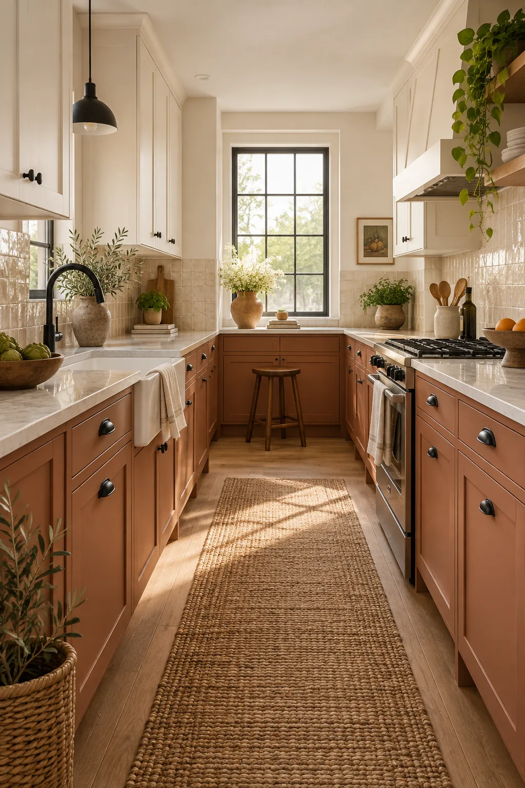
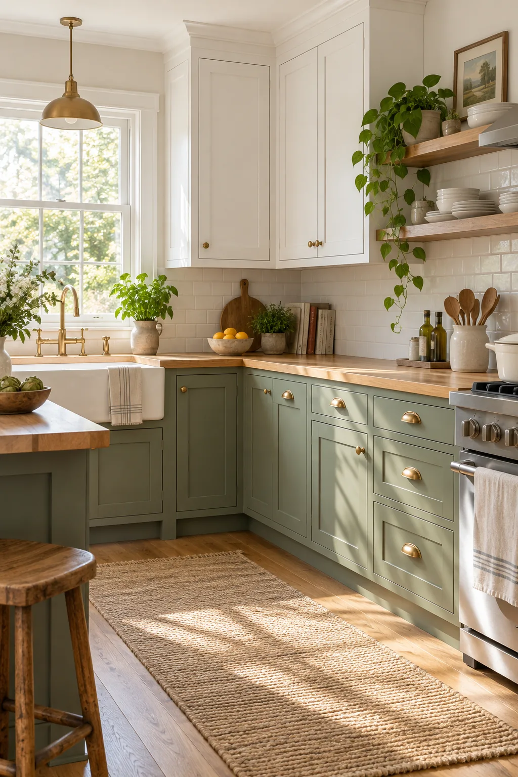
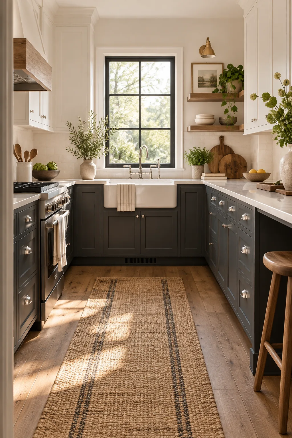
Explore these three distinct two-tone palettes to find the perfect mood for your compact kitchen.
Warm Terracotta Galley: Earthy clay lowers paired with creamy uppers create a cozy, sun-baked atmosphere that feels incredibly welcoming.
Soft Sage Corner: Muted green base cabinets bring a touch of nature indoors while keeping the overall palette light and airy.
Charcoal and Linen: Deep charcoal lowers offer a sophisticated, moody anchor that contrasts beautifully against soft linen-white walls.
Paint the Wall Color on the Ceiling
Carrying the wall color directly onto the ceiling removes the stark corner line that visually caps the room. This seamless boundary draws the eye up and immediately increases the perceived height in a tight space.