Front Door Colors: The Pro Matching Secret & Pairing Chart
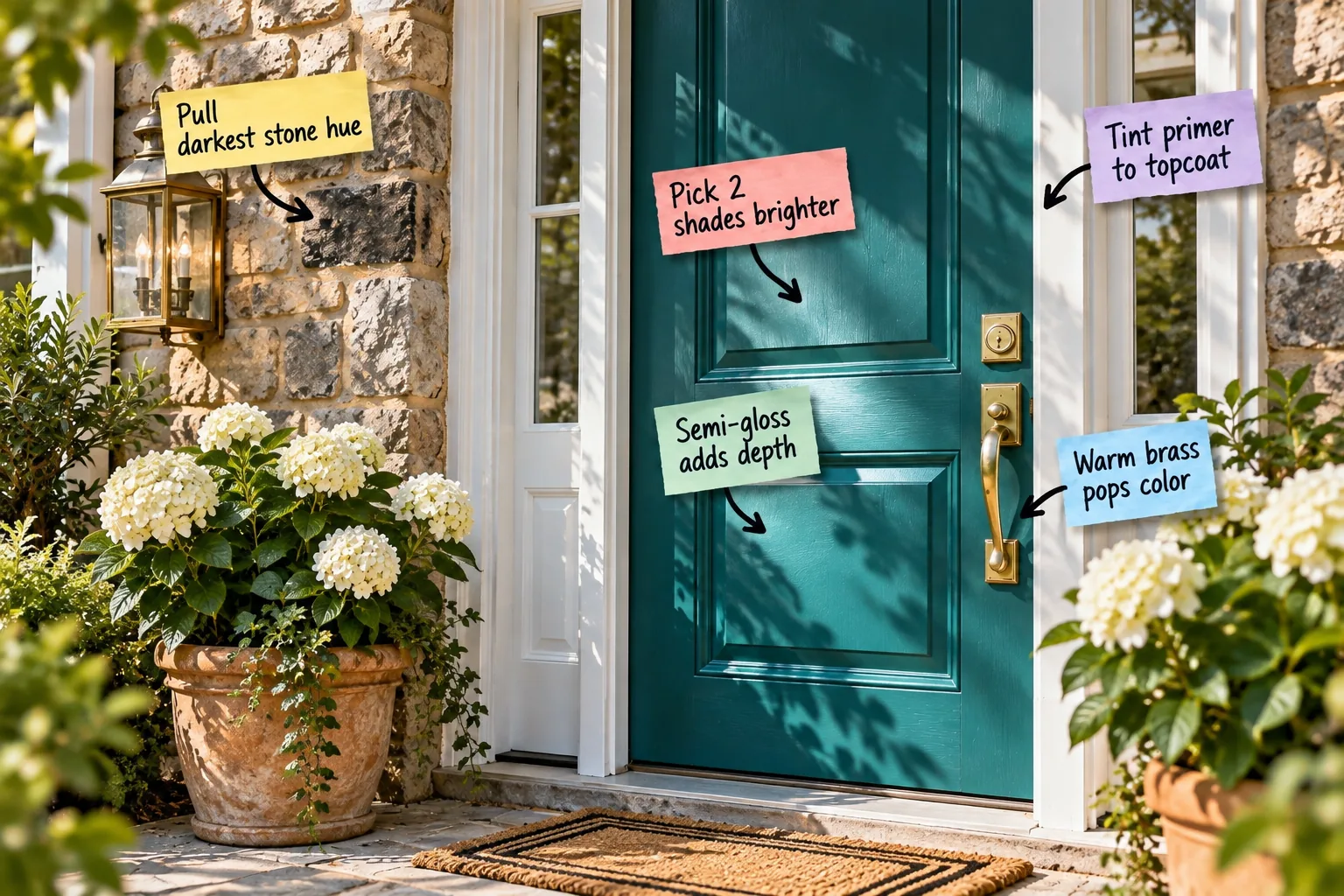
Choosing the exact front door shade that flatters your home’s brick or siding doesn’t have to be a guessing game. Use my exterior color pairing chart below to extract the right anchor undertones and confidently select a stunning, cohesive hue.
The Pro Matching Secret
The biggest mistake in exterior design is choosing a front door color in isolation rather than looking at your existing materials. When I renovated my own Denver bungalow, anchoring the bold entryway color to the fixed masonry completely transformed the facade.
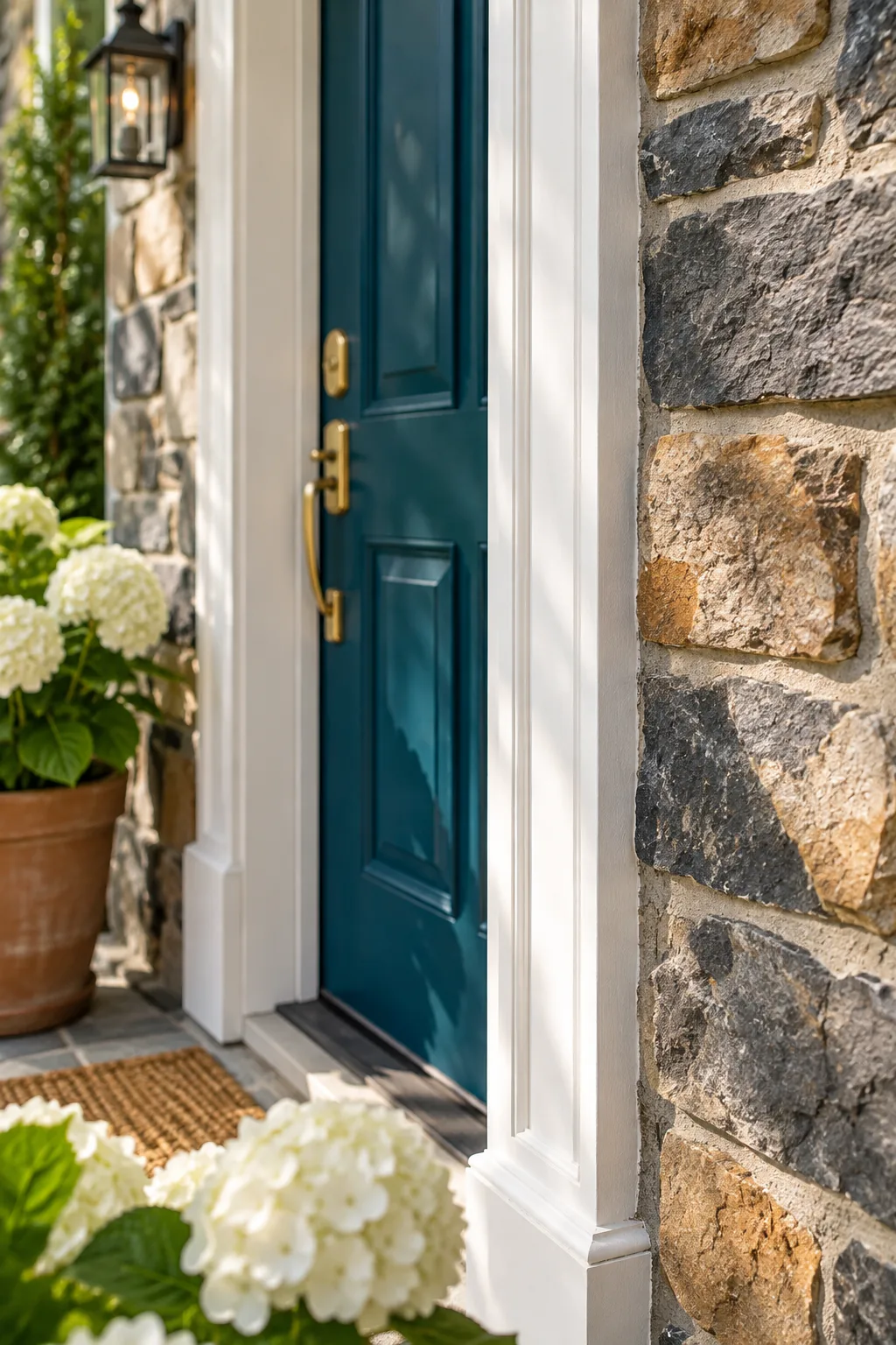
A cohesive, high-end look requires tying your bold color choice directly to the architectural elements already present. Anchor your paint choice to the fixed materials on your home’s exterior to guarantee a seamless transition from street to threshold.
Pull the Darkest Stone Hue
Start by examining your exterior brick or stone closely to find the deepest shadow or the darkest fleck of charcoal. I always carry my paint fan deck outside to match that exact undertone as my baseline, just like I did for my own river-rock porch.
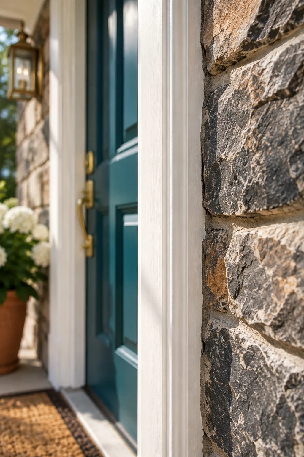
Once you locate that deepest tone, use it to establish your baseline undertone for the entire exterior palette. This ensures your front door color will harmonize organically with the masonry instead of fighting against it.
Pick Two Shades Brighter
After identifying the baseline undertone, move exactly two shades brighter on the same paint card for your door color. Direct sunlight washes out exterior paint, so stepping up the brightness prevents the entryway from looking like a black hole from the street.
Testing your chosen shade correctly is just as important as picking it. Avoid these common sampling errors before committing to a gallon.
The Exterior Door Color Pairing Chart
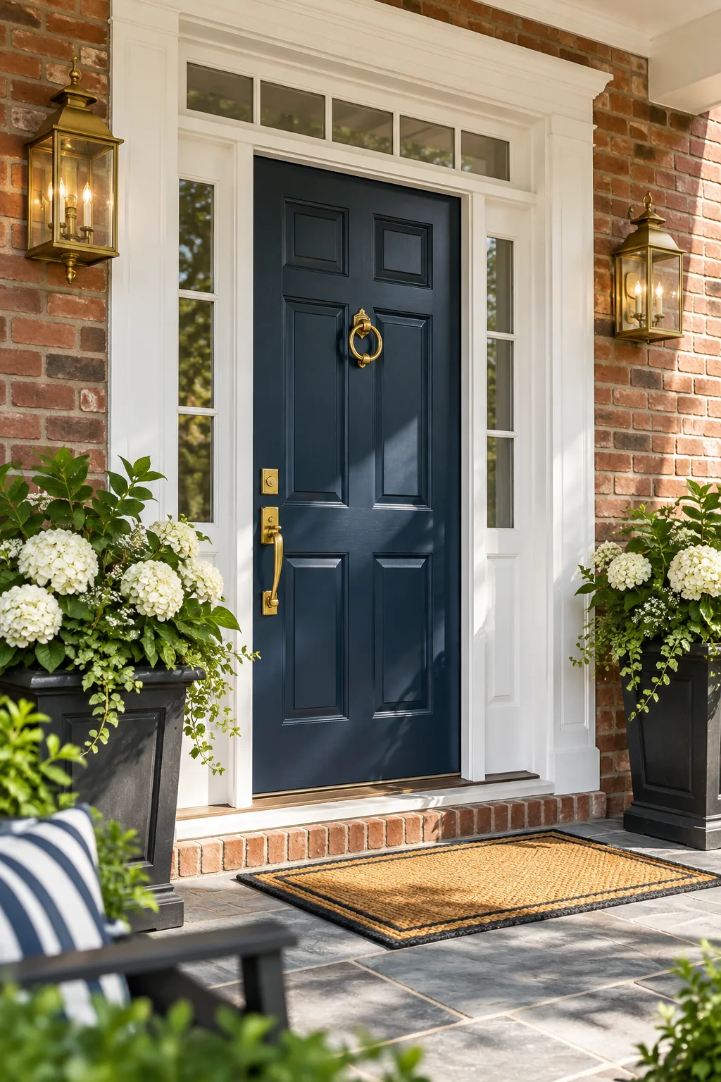
To skip the guesswork, rely on this exterior color pairing chart to match common exterior materials to their ideal complementary door colors. Warm natural stone pairs beautifully with rich teal, while classic red brick sings against deep navy or glossy black.
| Exterior Material | Undertone | Ideal Door Color |
|---|---|---|
| Red Brick | Warm Red/Orange | Deep Navy or Black |
| Natural Stone | Warm Beige/Brown | Rich Teal or Forest Green |
| Gray Siding | Cool Blue/Gray | Vibrant Yellow or Coral |
| White Stucco | Neutral | Charcoal or Sage Green |
Using these established pairings creates immediate visual harmony. This contrast relies on balancing warm and cool tones, ensuring your entryway feels both intentional and incredibly welcoming.
Tint Primer to Your Topcoat
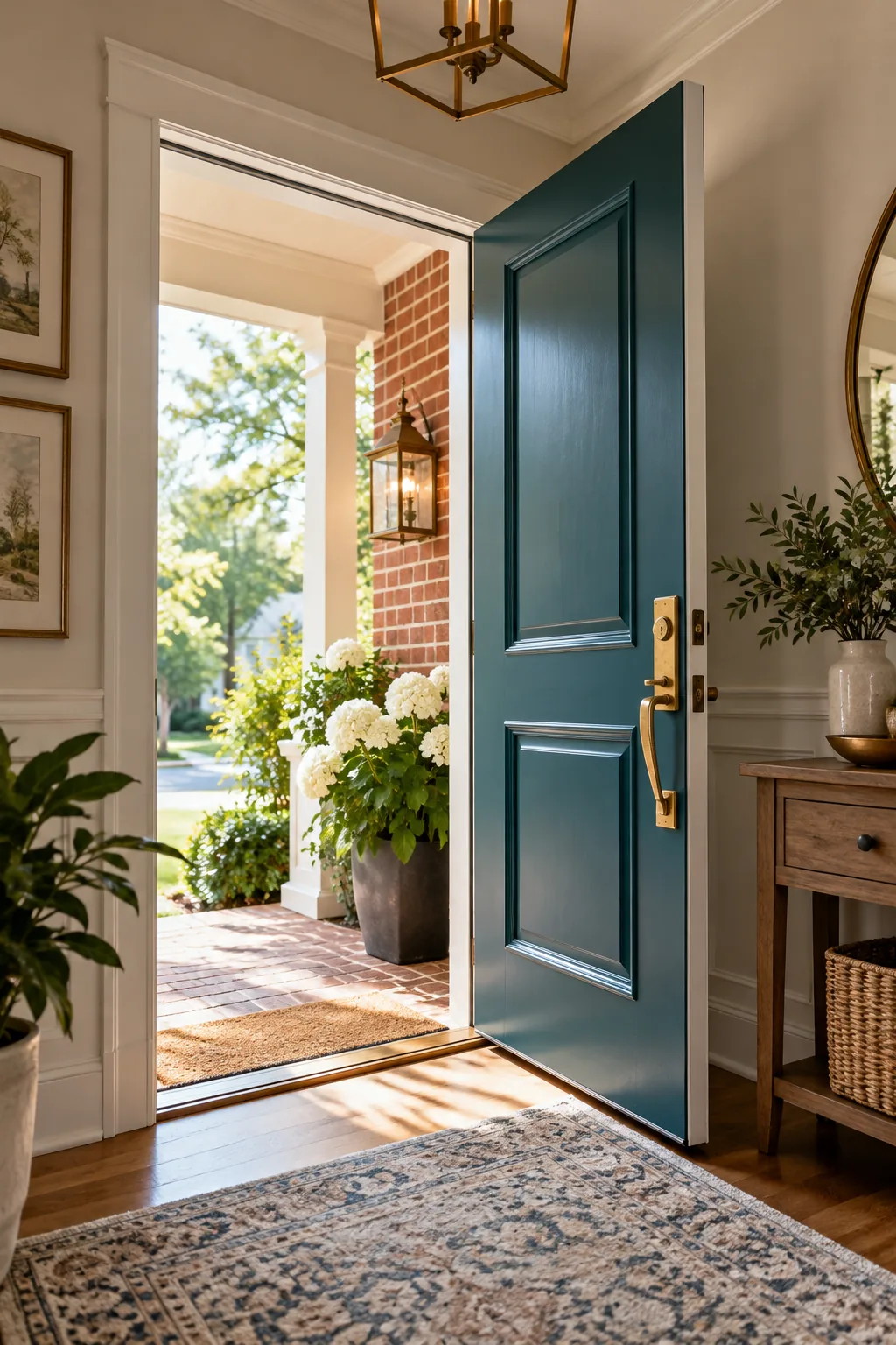
Dark or vibrant door colors require a solid foundation to prevent streaks and uneven coverage. When painting my own south-facing door, I learned to ask the paint counter to tint the exterior-grade primer to at least 50 percent of the final topcoat color.
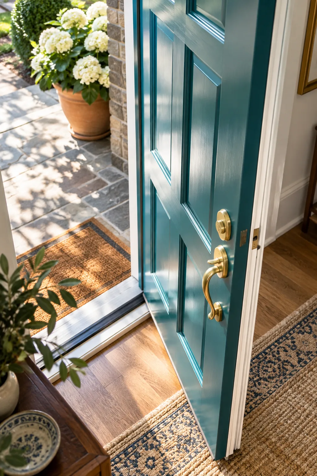
A tinted primer only works if it adheres perfectly to the door. Complete this quick prep sequence before opening the can.
Why Semi-Gloss Adds Depth
Always choose a semi-gloss finish for an exterior door to maximize both durability and aesthetic appeal. The 40 to 50 percent sheen level reflects sunlight beautifully, highlighting architectural panel details while adding rich depth to the color.
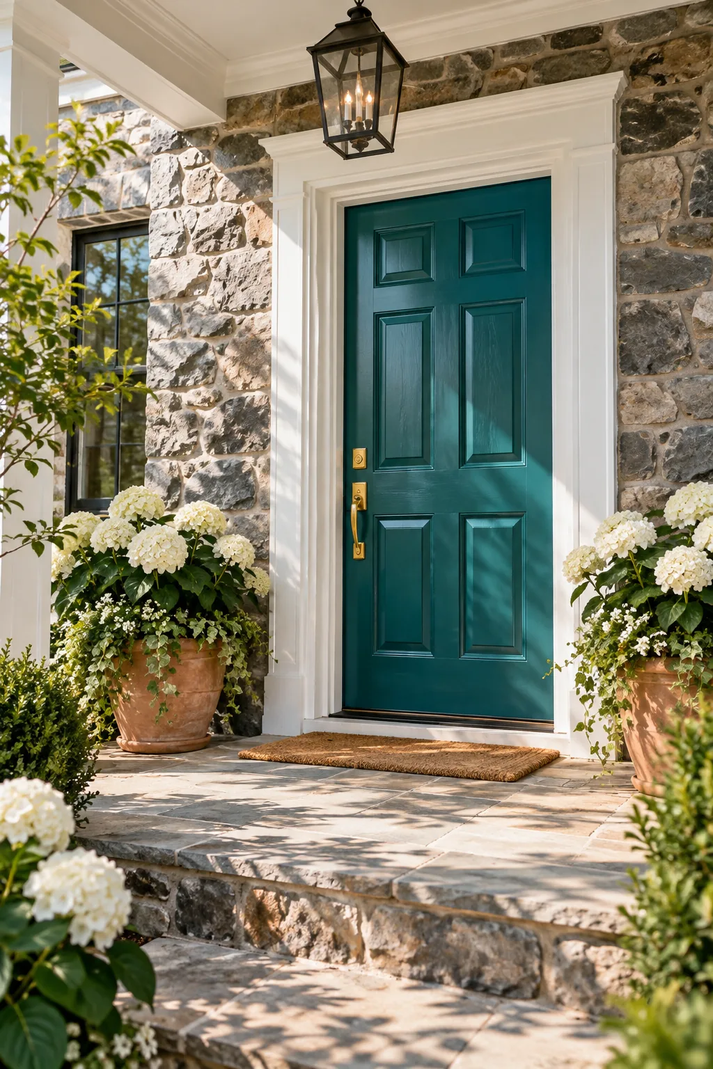
Beyond aesthetics, this reflective finish provides a tough, easy-to-wipe surface that resists daily wear and tear. The higher sheen level creates a brilliant protective barrier against harsh weather conditions.
Frame with Crisp White Trim
A bold door color needs a visual buffer to prevent it from clashing with textured masonry. I painted my own door casing and jamb a crisp, bright white to create a clean border that allows both the stone and the door to stand out independently.
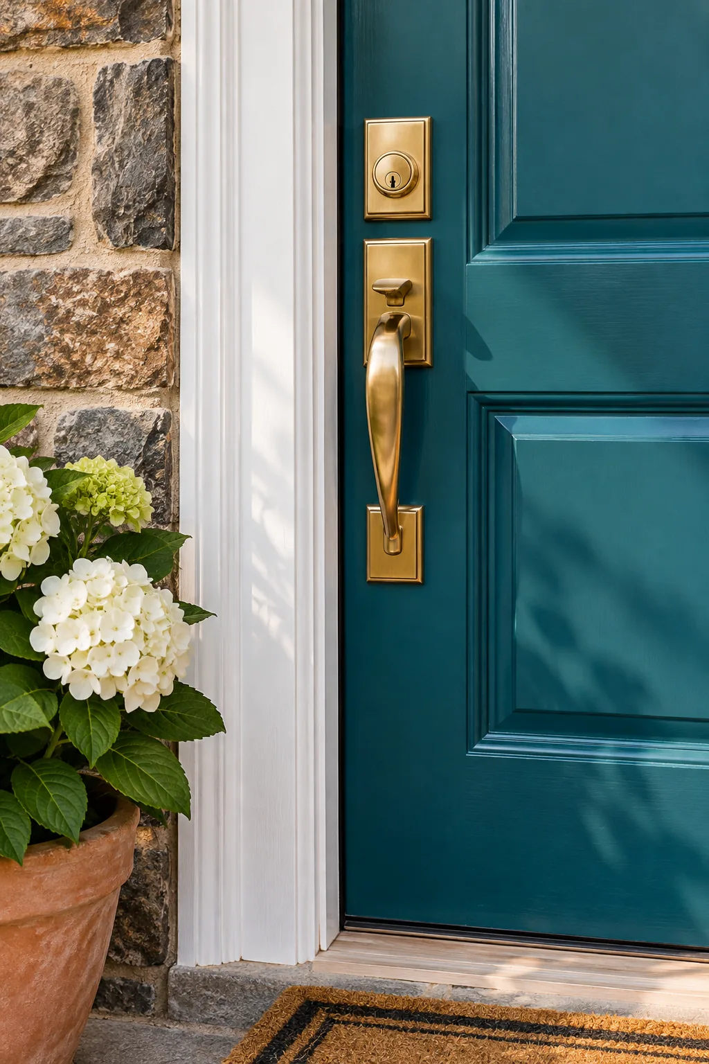
This stark white separation acts as a framing device for your entryway. It sharpens the contrast and ensures your carefully chosen door color commands attention without overwhelming the facade.
Warm Brass Hardware Pops Color
Finish the entry with unlacquered or satin brass hardware to elevate the entire design. The warm yellow and gold undertones sit opposite cool blues and greens on the color wheel, creating maximum visual contrast.
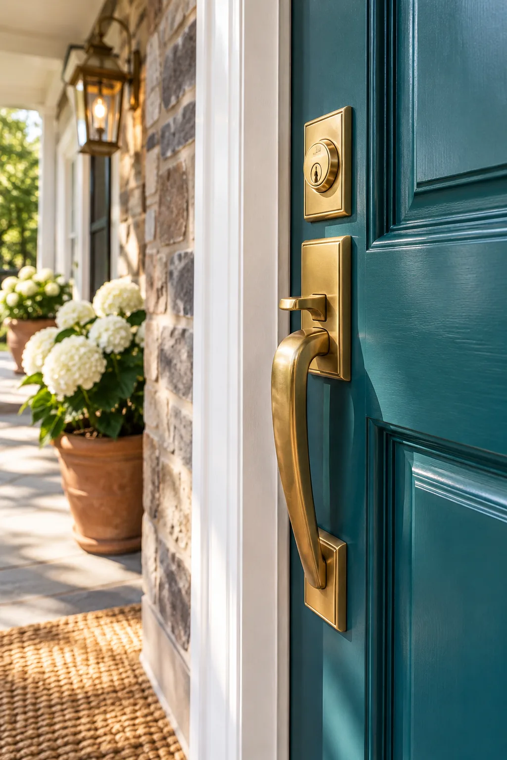
This metallic warmth instantly makes the door color pop while adding a touch of timeless elegance. Balancing those cool exterior tones with radiant hardware is the final step to a perfectly executed entryway.
3 Front Door Pairings to Steal
Explore how different architectural styles use exterior elements to guide their door color choices.
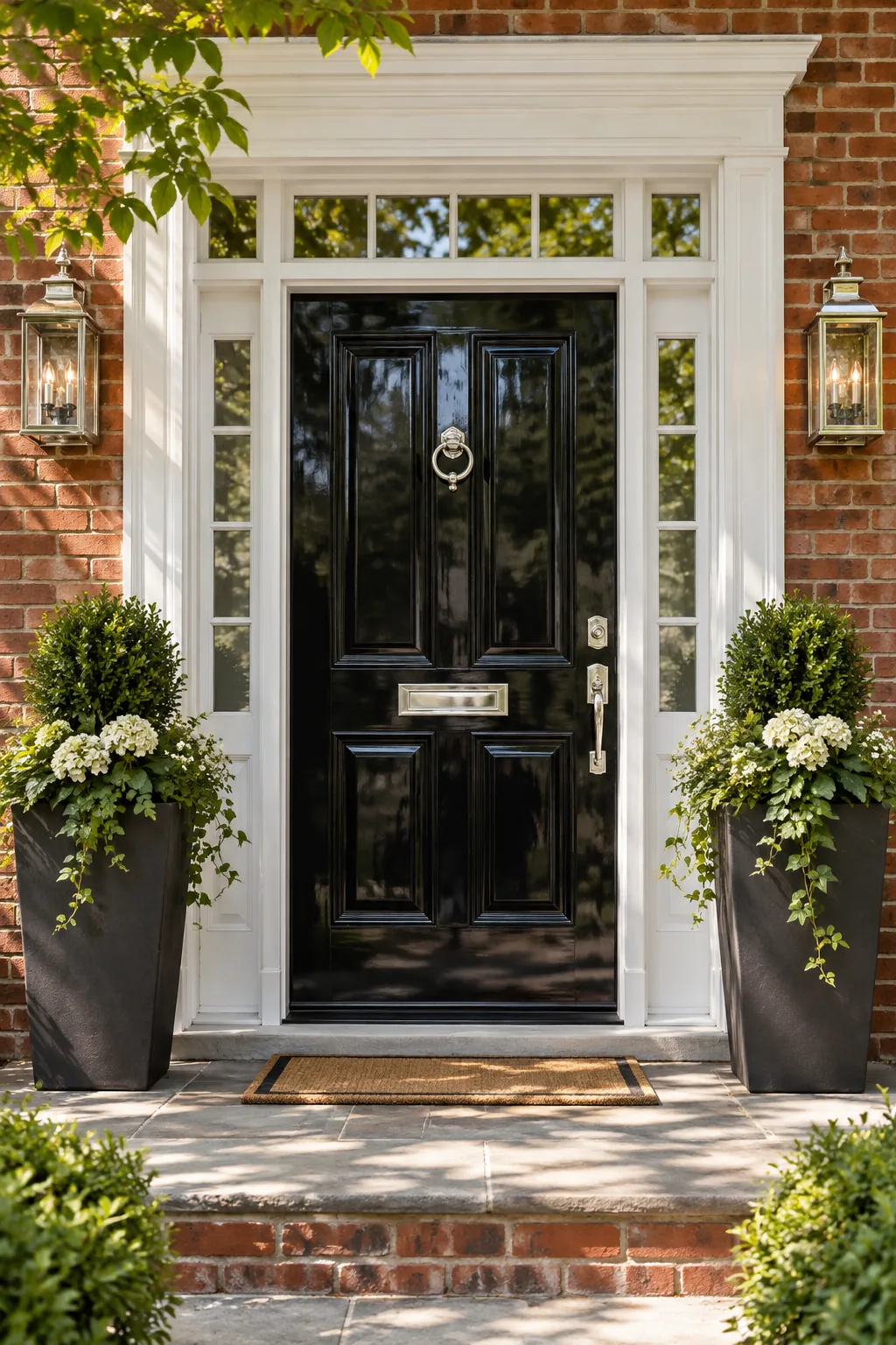
Traditional Brick and Black: A high-gloss black door provides timeless elegance against red brick, while polished nickel hardware adds a crisp, formal finishing touch.
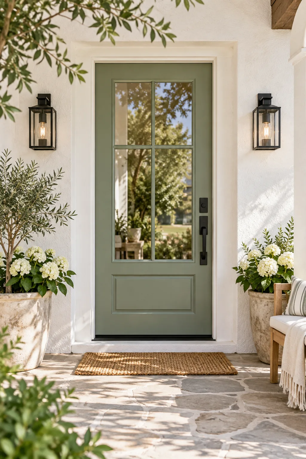
Modern Farmhouse Sage: Soft sage green breaks up the starkness of white stucco, while matte black hardware grounds the airy palette with a modern edge.
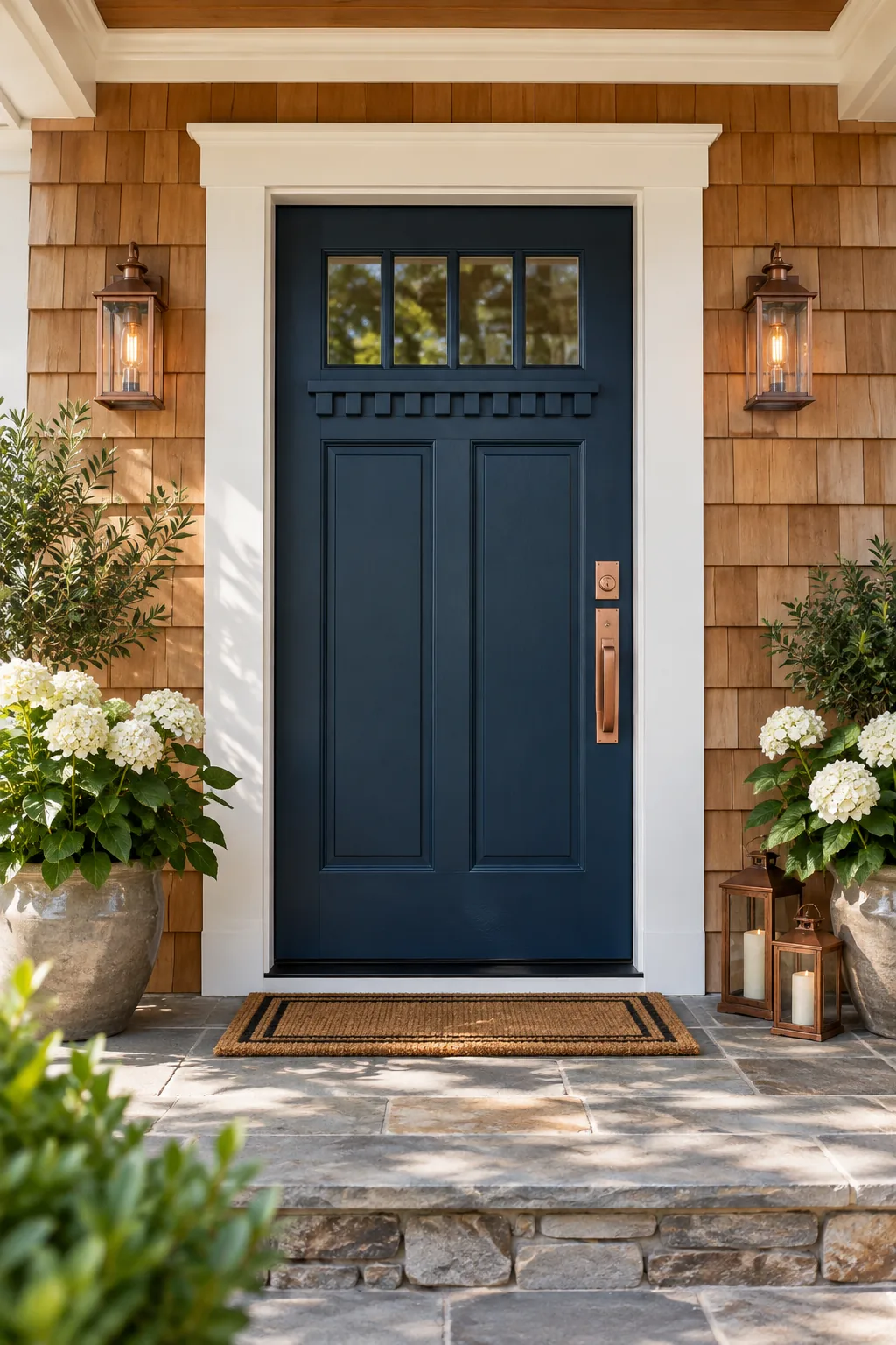
Craftsman Cedar and Navy: Deep navy blue cools down the heavy orange undertones of natural cedar siding, creating a perfectly balanced craftsman entry.