How to Hang a Family Picture Wall (with Spacing Cheat Sheet)
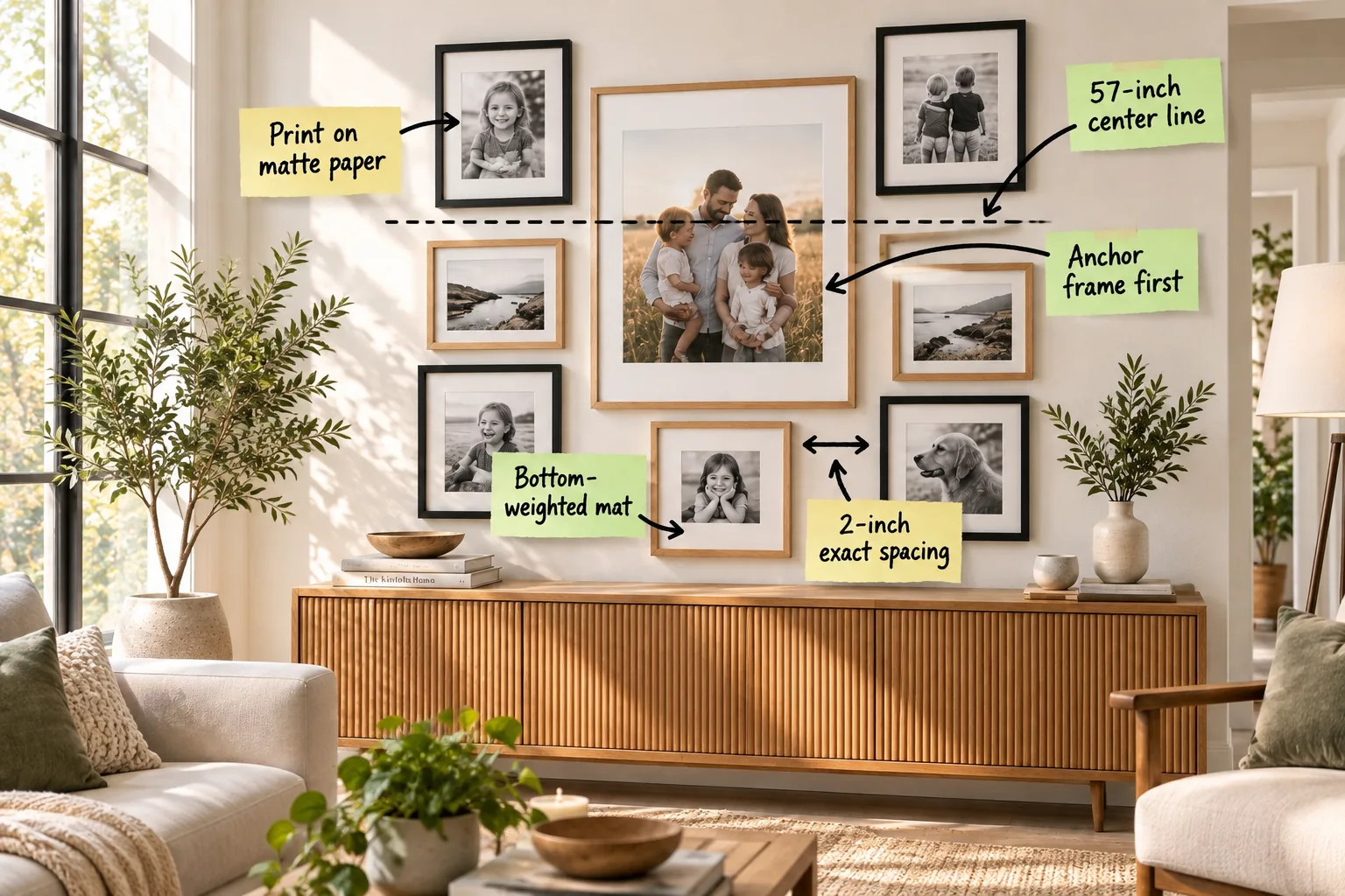
Designing a flawless family picture wall requires precise math and structural balance, which is why I created a printable gallery wall spacing cheat sheet and layout grid for you to download. You will be able to map out a perfectly spaced arrangement, choose the right custom-look mats, and hang your frames using a foolproof system.
Establish the 57-inch center line
To begin your installation, measure exactly 57 inches up from the floor to mark the horizontal middle axis of the gallery arrangement. This precise vertical placement honors classical architectural proportions, ensuring the center of your entire display sits naturally in the viewer’s field of vision.
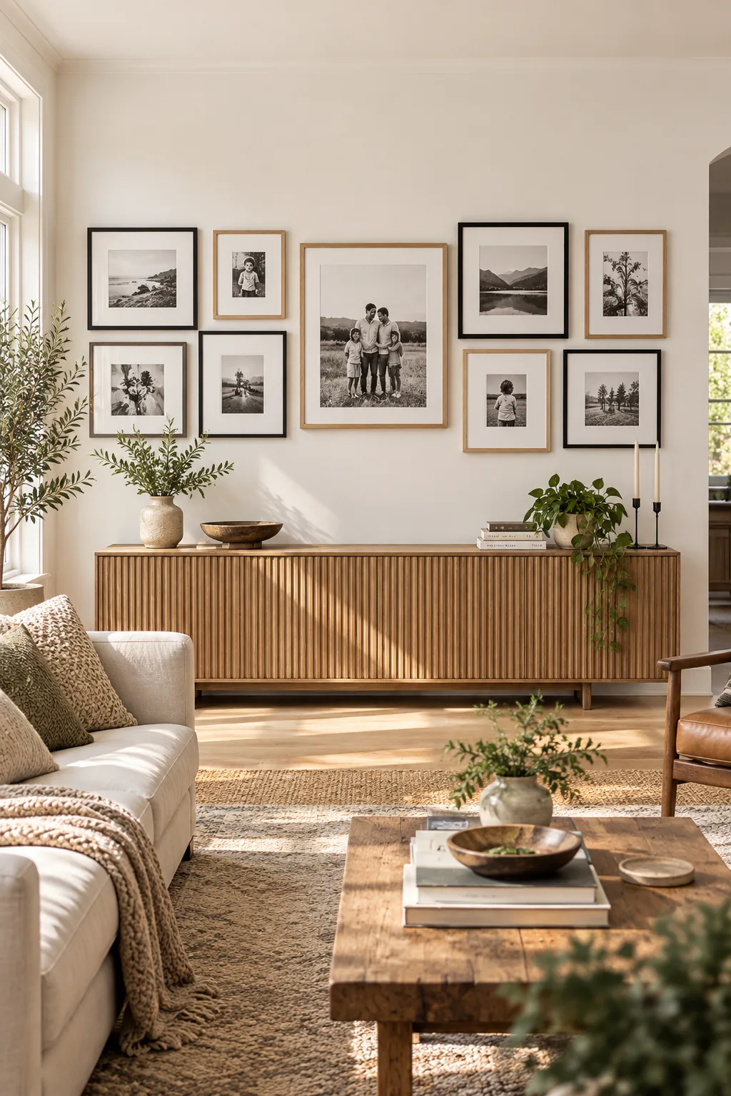
By establishing this foundational 57-inch center line, you anchor the room’s energy and prevent the artwork from floating awkwardly high near the ceiling. I always mark this primary axis with a long strip of painter’s tape to guide the entire installation process.
Level the horizontal axis
A visually calming gallery wall relies on a perfectly straight foundation, so you must verify your center axis before picking up a hammer. Using a standard spirit level ensures your grid remains mathematically parallel to the floor architecture.
- Place a 24-inch spirit level directly against your taped center line.
- Adjust the tape until the bubble rests precisely between the two center indicator lines.
- Mark light pencil guidelines every 12 inches along this leveled axis.
Eastern design principles teach us that a grounded, level foundation brings tranquility to a space, making this technical step essential for a peaceful room. Rushing this measurement guarantees a tilted layout that will subtly agitate the eye every time you enter.
Hang the anchor frame first
Start your physical installation by placing the largest, heaviest frame in the center so its midpoint directly intersects your leveled 57-inch mark. Building the rest of the layout outward from this central focal point ensures the visual weight remains beautifully balanced.
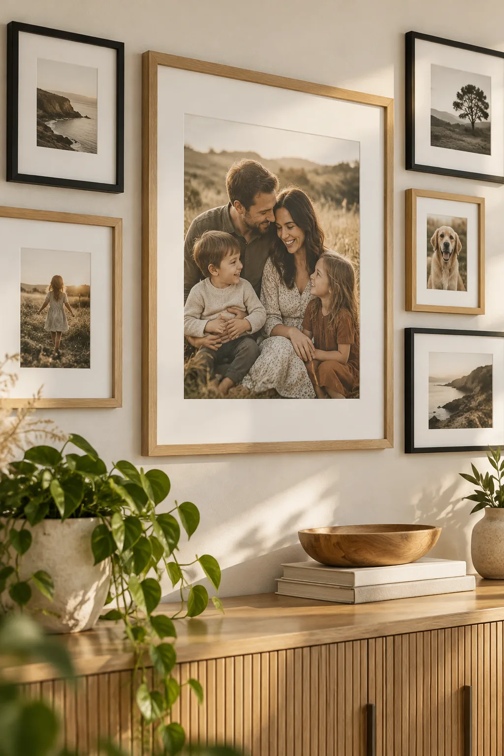
When you anchor the frame first, you create a gravitational core that holds the surrounding smaller pieces in a structured orbit. This central stabilization prevents the arrangement from feeling chaotic and gives the eye a clear, restful place to land.
Balance the visual weight
Distributing physical size evenly across your grid prevents the wall from feeling lopsided or top-heavy. You want to mirror proportions diagonally across the center axis to maintain a sense of structural harmony.
| Frame Size | Ideal Position | Visual Effect |
|---|---|---|
| 16×20 inches | Center axis | Anchors the arrangement |
| 11×14 inches | Inner perimeter | Bridges large and small pieces |
| 8×10 inches | Outer corners | Softens the grid edges |
By treating these frame dimensions like weights on a scale, you can mathematically ensure your family picture wall feels entirely stable. Symmetrical distribution of large and small elements creates a rhythmic, predictable pattern that feels incredibly soothing to experience.
Maintain a 2-inch exact spacing
Keep exactly 2 inches of empty wall space between every adjacent frame to create a tight, cohesive grid that reads as a single architectural unit. Use a hard wooden spacer block to measure the precise wall gap between two adjacent frames.
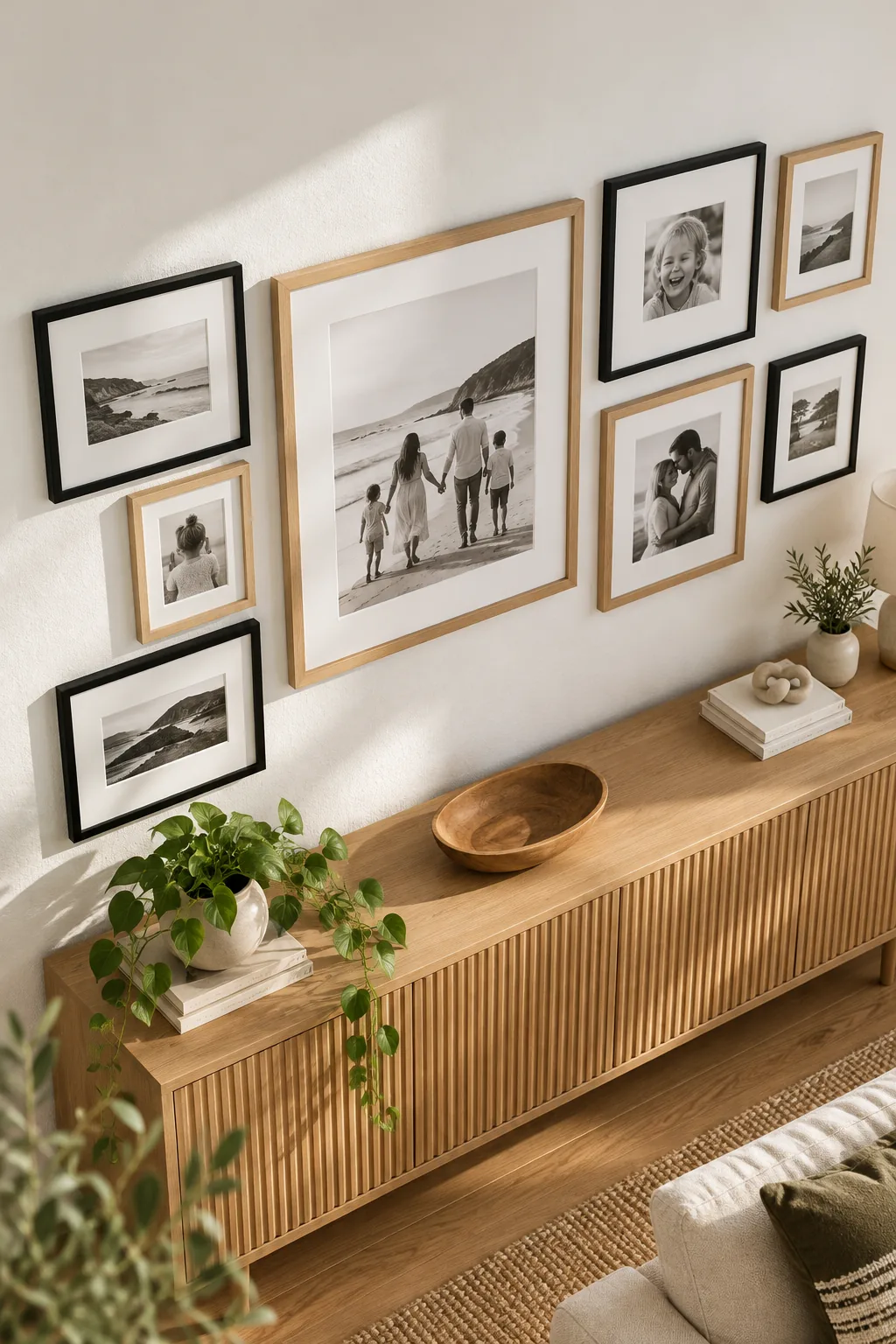
Even a quarter-inch variation between frames can make the entire grid look slightly off-balance and disrupt the clean, modern lines. Maintaining a 2-inch exact spacing unifies the distinct photos into one intentional, highly curated gallery statement.
Map the wall with paper templates
Before drilling any holes, trace each frame onto kraft paper, cut out the rectangles, and tape them to the wall using your spacer block. This physical rehearsal allows you to adjust the composition and verify your spacing without damaging the drywall.
Get the gallery wall layout cheat sheet
Take the guesswork out of your arrangement by downloading our printable gallery wall spacing cheat sheet and layout grid right here. I use this exact digital template in my Denver design studio to show clients how their family portraits will align perfectly before we print.
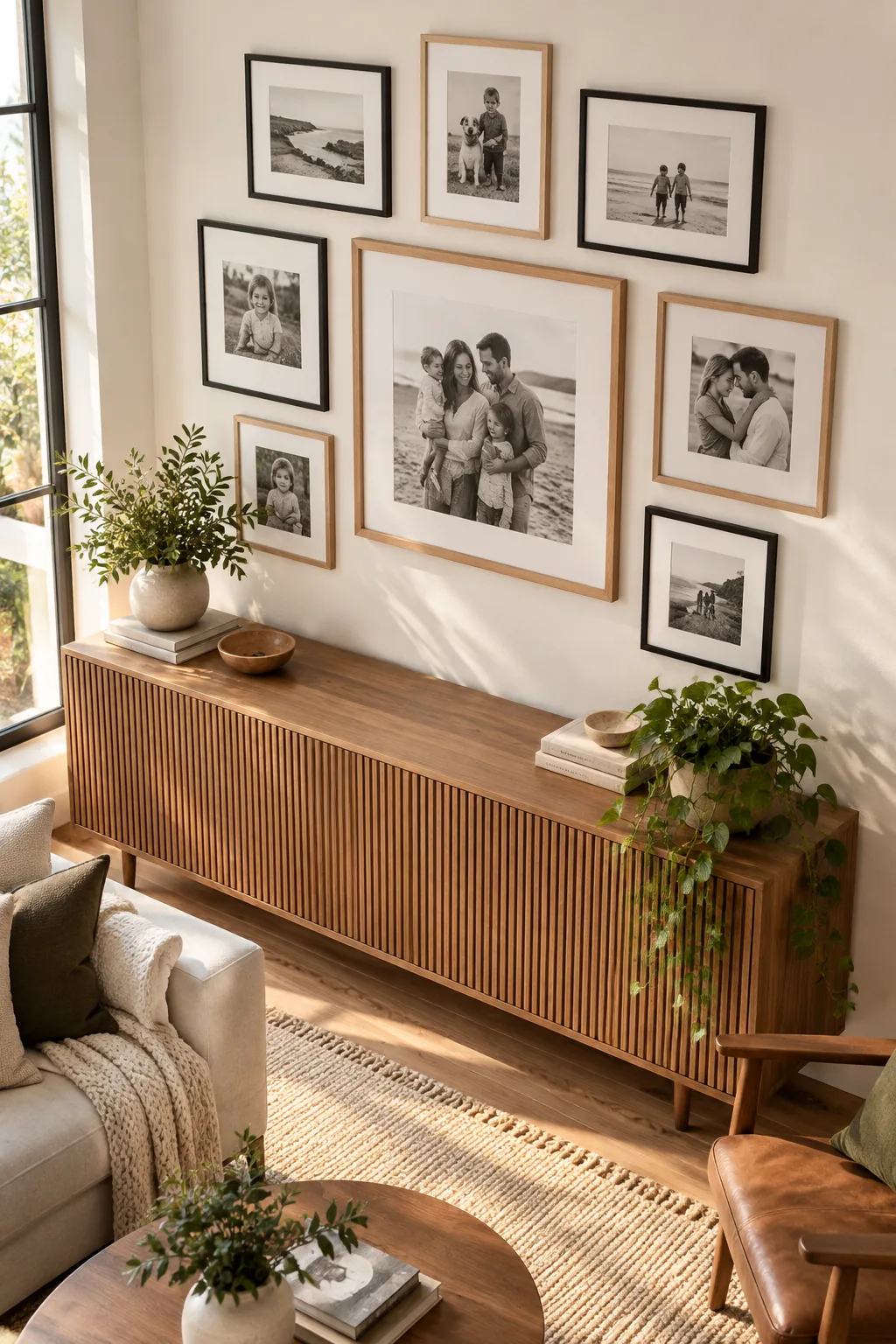
The download includes exact measurements for three common wall sizes and a cut-out spacing template to guarantee flawless execution. Using this pre-calculated guide ensures you achieve that crisp, professional symmetry without the frustrating trial and error.
Select a cohesive color palette
Treating your family photos with a consistent color profile unifies the grid, preventing a chaotic clash of different lighting conditions and seasons. Converting all images to a warm black-and-white or applying a uniform subtle preset creates an instant sense of editorial curation.
Upgrade with bottom-weighted mats
Elevate standard frames by swapping in a bottom-weighted mat, which is the thicker bottom section of a white mat inside a frame. I recently used this technique in my own hallway, and it instantly made budget-friendly store-bought frames look like expensive custom gallery pieces.
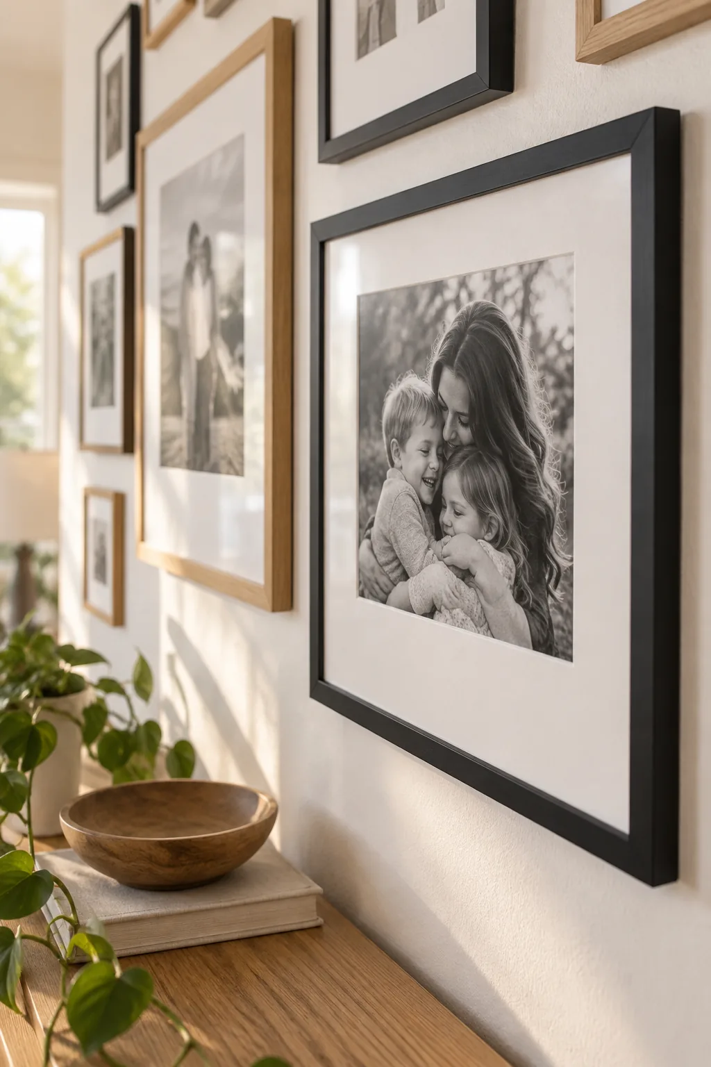
This classic curator trick grounds the image, drawing the eye upward to the faces while providing elegant negative space. The asymmetrical border adds a subtle architectural sophistication that traditional uniformly cut mats simply cannot achieve.
Standardize the frame profiles
Maintaining a consistent frame thickness across your entire collection is the secret to mixing different materials successfully. When the physical depth and width of the molding match, the frames read as a unified set regardless of their distinct finishes.
Print photos on matte paper
Order your family portraits printed on high-quality matte paper to utilize the non-reflective face of a printed photo. When designing a bright sunroom project last year, I insisted on matte prints to ensure the clients’ faces remained visible from every angle.
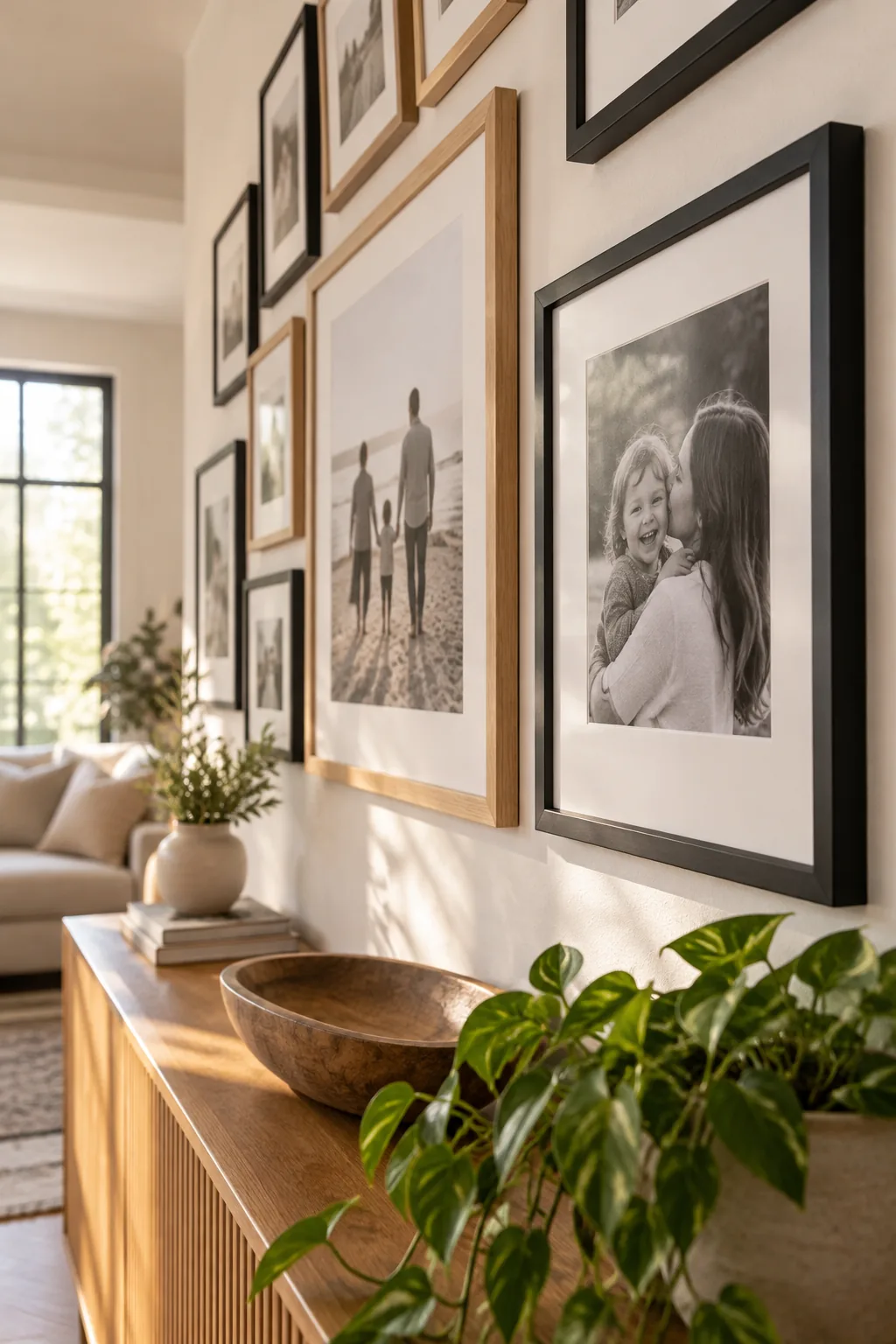
Choosing to print on matte paper absorbs ambient light, preventing harsh glare from nearby windows or overhead fixtures from obscuring the image. This soft, velvety finish feels inherently more artistic and sophisticated than standard glossy photo stock.
Control the ambient lighting
Proper illumination transforms a flat arrangement into a dynamic focal point, so consider how natural and artificial light hits your chosen wall. Installing a low-wattage picture light above the anchor frame washes the entire gallery in a warm, inviting glow.
Secure the bottom corners
Even perfectly spaced frames will shift slightly when doors close or heavy footsteps vibrate through the floorboards. Applying a tiny bead of mounting putty behind the lower corners locks each piece firmly into its designated grid position.
Securing the base of the frames prevents them from swinging out of alignment during routine dusting or daily household activity. This invisible stabilization is the final mechanical step that keeps your hard work looking pristine year after year.
Mix black and light wood frames
Break up a monotonous display by alternating matte black and natural oak frames throughout the grid to introduce organic warmth. As long as you keep the frame profiles similarly thin, the contrasting frame finishes will look intentionally curated rather than mismatched.
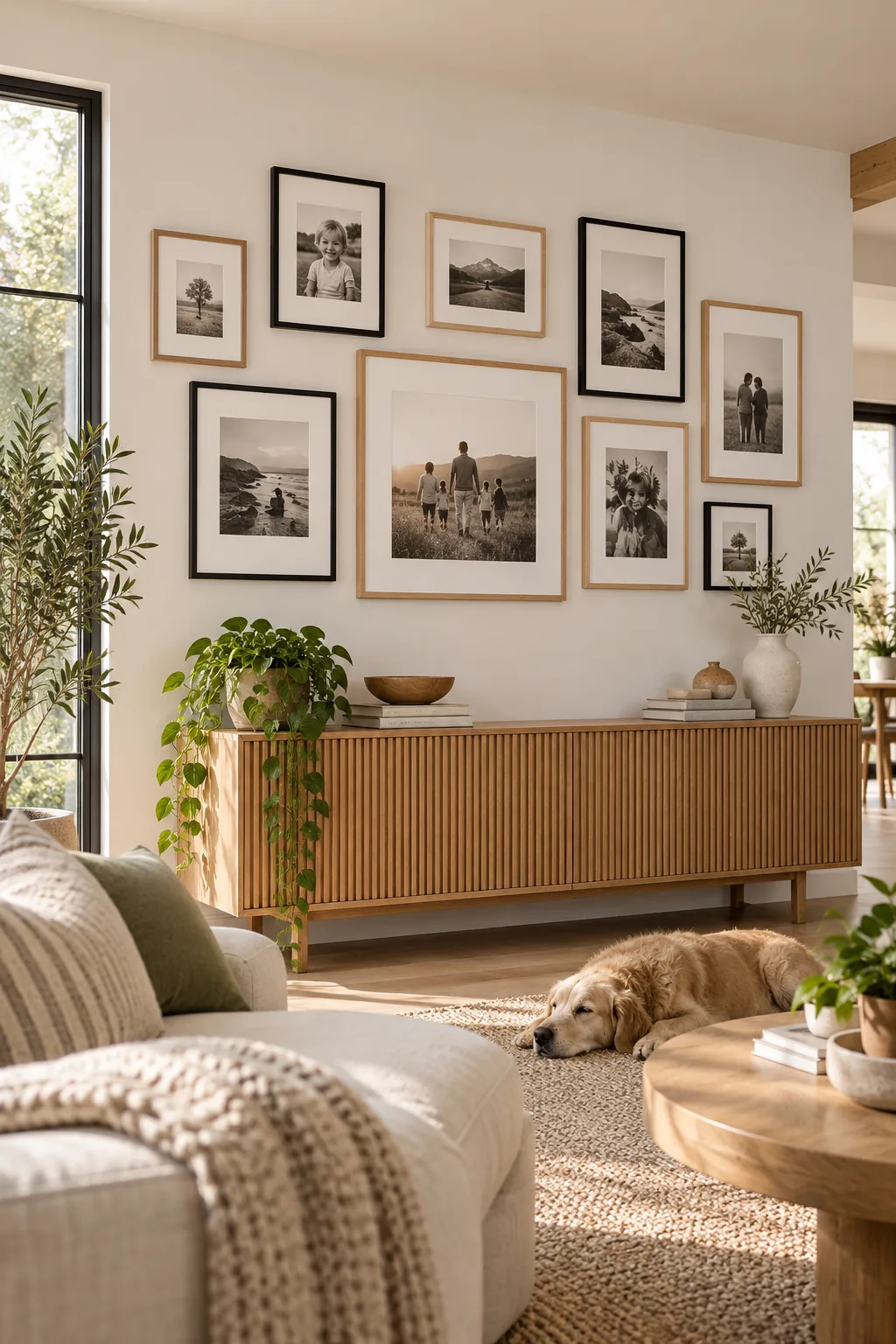
Blending these two distinct materials balances the sharp, graphic punch of black metal with the soft, earthy texture of pale wood. This strategic duality brings a welcoming, modern energy to the gallery wall that feels deeply personal and collected over time.
Clear the credenza styling zone
Leave at least 8 to 10 inches of negative space above the credenza to separate the furniture from the bottom edge of the lowest frames. This generous clearance allows ample room for styling decorative bowls and trailing plants without overlapping the art.
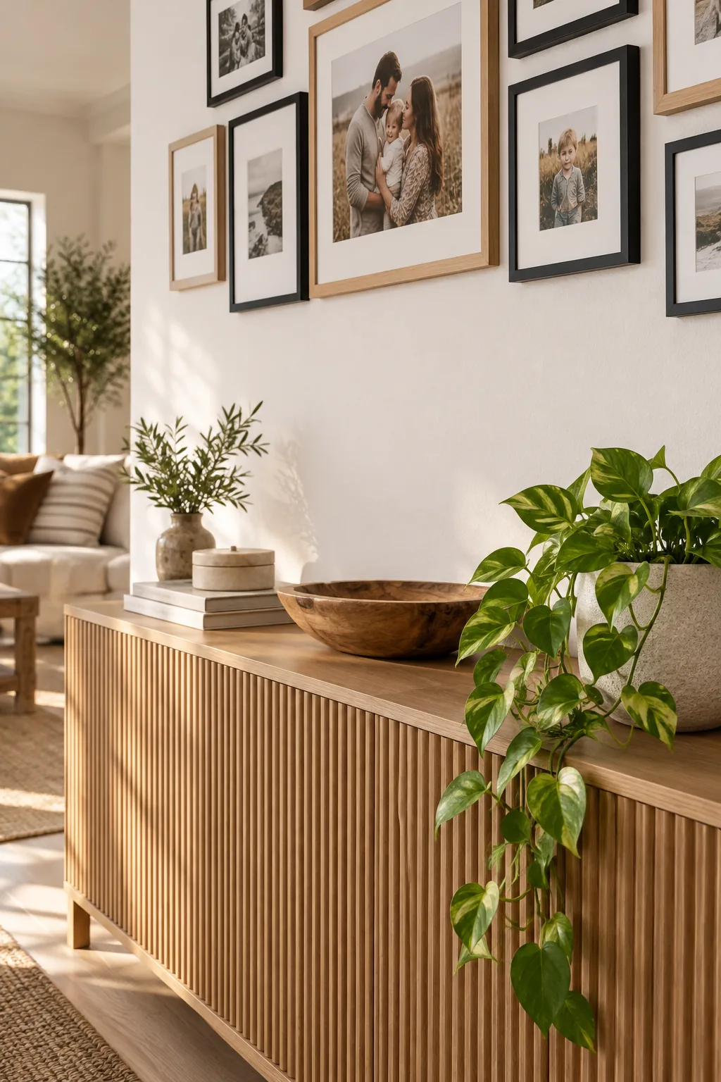
Before finalizing the display, step back to ensure the surrounding furniture complements rather than competes with the carefully mapped wall. Proper breathing room allows both the gallery arrangement and the credenza styling to shine independently.
3 Ways to Style Your Family Picture Wall
Discover how changing the frame style and room palette completely transforms the mood of a gallery wall.
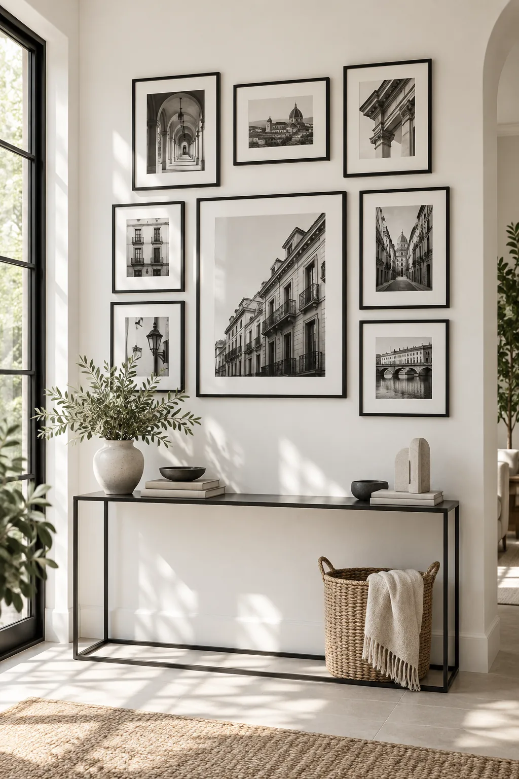
Minimalist Monochrome: Stick to strictly black frames and black-and-white photography to create a sharp, high-contrast look that feels instantly modern.
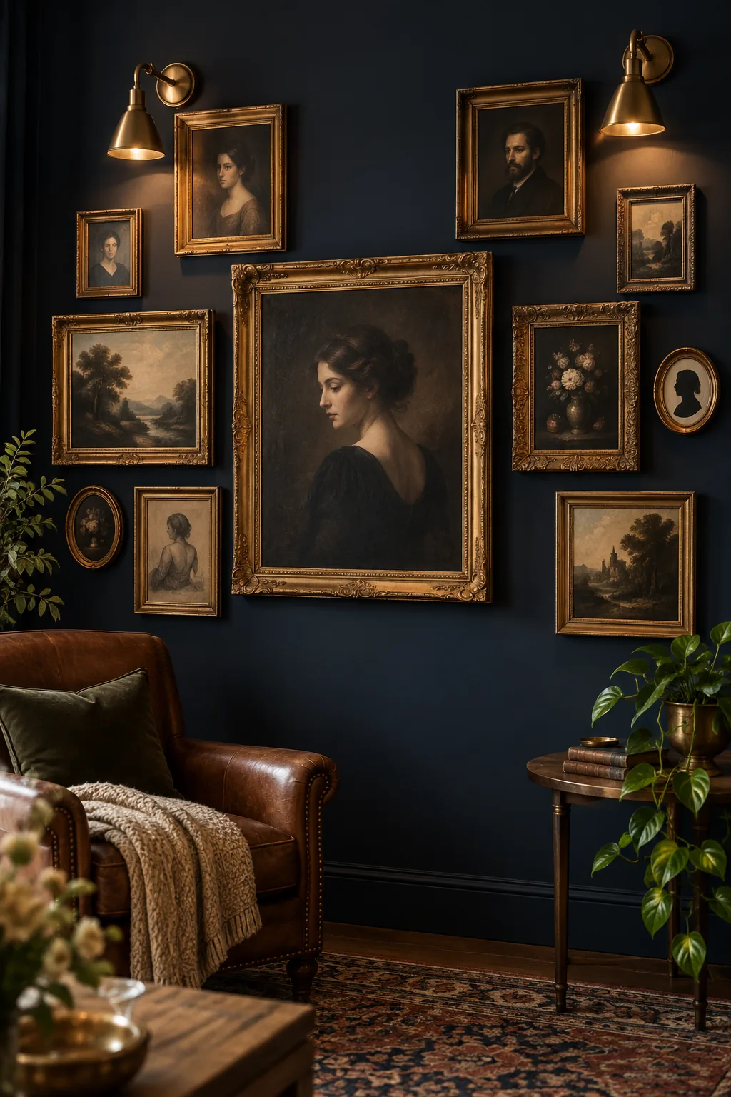
Moody Eclectic: Pair ornate vintage gold frames with a dark, moody wall color to give your family photos a rich, historical atmosphere.
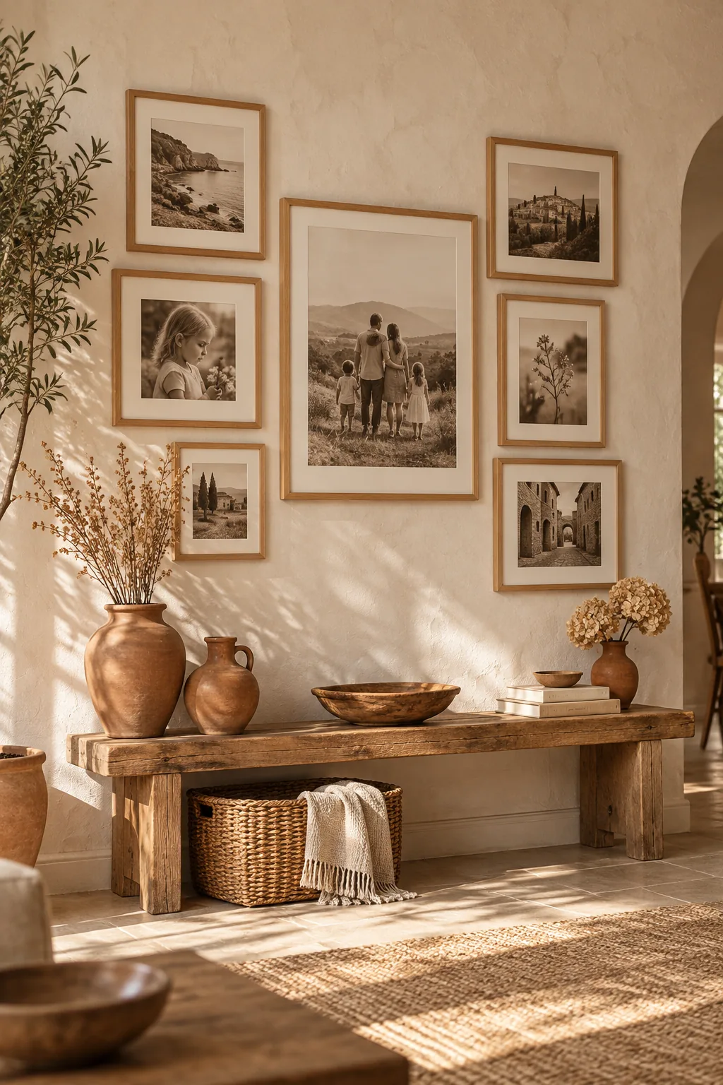
Warm Organic: Use exclusively natural oak frames and warm sepia tones against a textured plaster wall for a soft, inviting aesthetic.