
High-Impact Valentine's Bulletin Board with Printable Letters
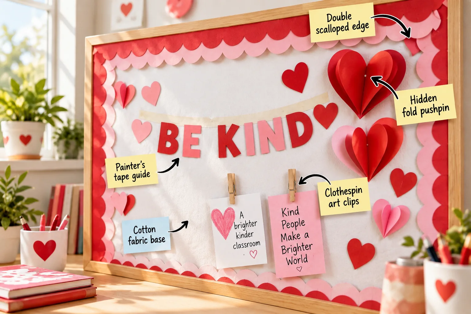
You will be able to assemble a perfectly aligned, multi-dimensional Valentine’s display using standard classroom supplies and our provided templates. Grab our free printable lettering and layout kit to build this vibrant, low-prep focal point in under an hour.
Preparing the Classroom Workspace
Clear away any old staples, faded backing paper, or leftover adhesive from previous displays before starting your fresh installation. Starting with a completely smooth, bare surface ensures your new materials will lay perfectly flat without any distracting bumps.
The Wrinkle-Free Fabric Foundation
Using white cotton fabric creates a durable, glare-free background that dramatically outlasts standard butcher paper while resisting fading from classroom windows.
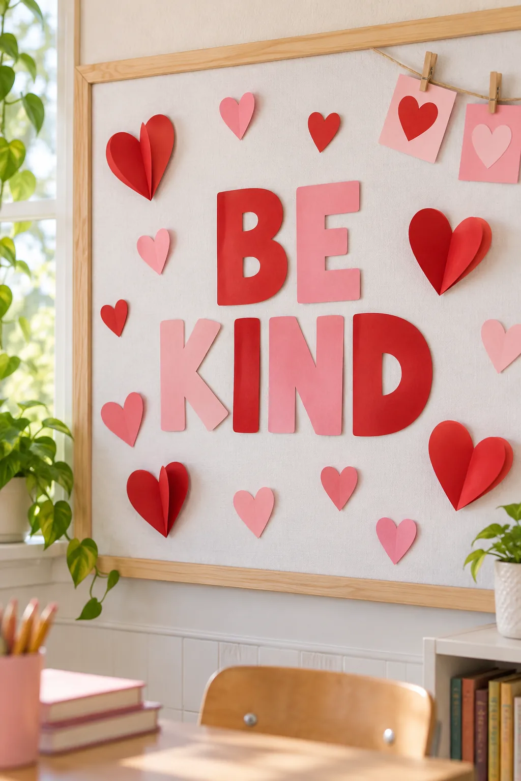
Cut the cotton fabric base exactly two inches wider than your board on all sides to provide plenty of gripping room.
Ironing the Cotton Fabric
Run a warm iron over the entire yardage before bringing it into the classroom to eliminate any deep creases from the fabric bolt. A perfectly smooth starting canvas makes the rest of the installation process significantly faster and easier to manage.
Selecting the Right Fabric Weight
A medium-weight quilting cotton provides the ideal balance of opacity and stretch, completely hiding the dark corkboard underneath without tearing during installation.
- Medium-weight white quilting cotton
- Heavy-duty classroom staple gun
- Sharp fabric shears
Gathering these specific materials beforehand keeps the installation process smooth and prevents unnecessary trips down the hall to the craft supply closet.
Stretching and Stapling the Fabric
Start stapling from the top center, pulling the material tightly toward the outer corners to eliminate any loose pockets or sagging spots. Placing a staple every four inches along the perimeter guarantees the tension remains perfectly even across the entire frame.
Trimming Excess Material
Once the perimeter is fully secured, use sharp fabric shears to carefully trim away any overhanging cotton behind the frame edges. Removing this excess bulk allows your decorative borders to sit perfectly flush against the wall without awkward gaps.
Choosing Complementary Border Colors
Selecting high-contrast shades like deep crimson and soft blush pink ensures your outer frame stands out brightly against the white background. This classic Valentine’s palette instantly sets a warm, welcoming tone for the entire classroom environment.
Layering the Scalloped Borders
Printing the provided templates on heavy cardstock ensures the letters remain crisp and durable throughout the entire month of February.
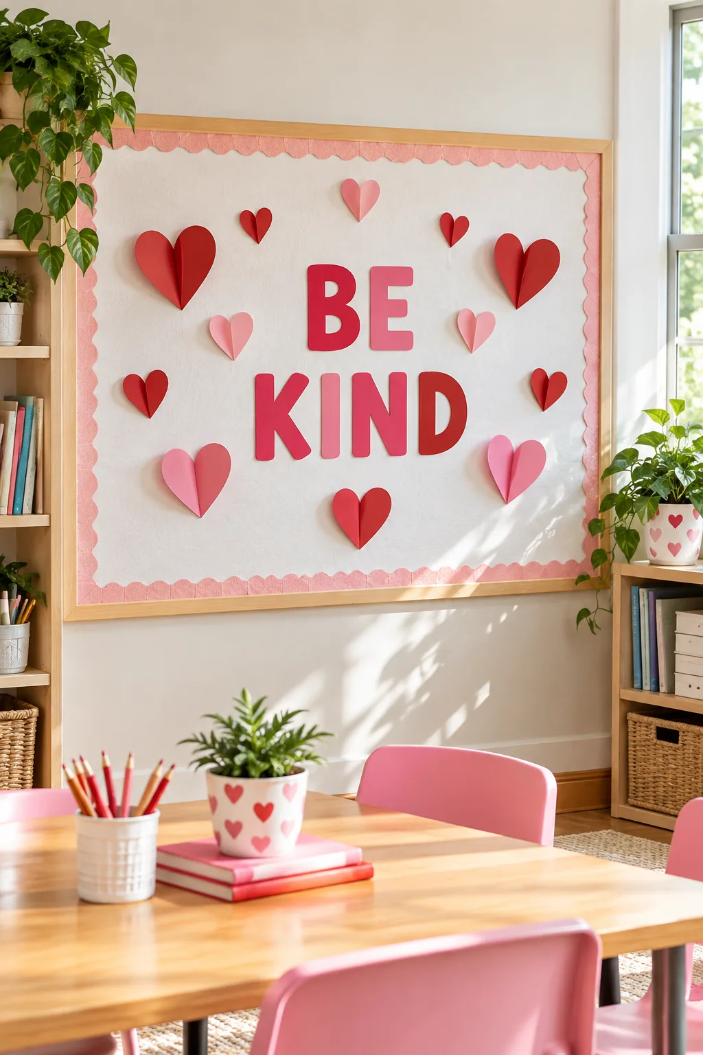
I used to struggle with flimsy paper borders tearing in my own Austin workshop, but switching to double-layered cardstock completely changed the game.
Offsetting the Border Colors
Create stunning visual depth by stacking a vibrant red scalloped border directly over a softer pink one along the entire perimeter.
- Staple the pink base layer flush to the frame edge.
- Place the red layer directly on top.
- Slide the red layer inward by exactly 1.5 inches.
This precise double scalloped edge exposes the pink curves underneath, creating a beautiful dimensional frame that instantly draws the eye inward.
Securing the Corners Cleanly
Overlap the border strips at a precise 45-degree angle in each corner to maintain a continuous, professional-looking scalloped pattern around the board. A dab of hot glue beneath these corner joints keeps them from curling forward over time.
Downloading and Prepping the Letters
Download our free printable lettering and layout kit to get the exact “BE KIND” template scaled perfectly for standard classroom boards.
| Board Size | Letter Height | Print Scale |
|---|---|---|
| 3×4 feet | 5 inches | 75% |
| 4×6 feet | 7 inches | 100% |
| 4×8 feet | 9 inches | 125% |
Print the provided lettering kit on heavy 65lb cardstock for maximum durability before carefully cutting out each individual character.
Choosing the Right Cardstock Weight
Standard printer paper will quickly curl under the fluctuating classroom humidity, so investing in a heavier weight material guarantees your display stays flat. The extra rigidity also makes it much easier to position the letters perfectly straight during installation.
Precision Cutting Techniques
Using a sharp craft knife rather than standard scissors guarantees crisp, clean interior corners on complex letters like the B, E, and D. A self-healing cutting mat protects your classroom tables while allowing you to apply firm, even pressure.
Organizing the Printed Letters
Lay out all the cut characters on a nearby table in their final spelling order before you begin mounting anything to the wall. This simple preparatory step prevents frustrating spelling errors and ensures you have every piece ready to go.
Mapping Out the Letter Spacing
Find the exact horizontal center of your board and mark it lightly with a pencil to serve as your starting anchor point. Working outward from the middle letter guarantees the entire phrase will be perfectly centered within the frame.
Perfect Alignment with Painter’s Tape
A horizontal strip of painter’s tape provides a foolproof guide for perfectly level lettering across the entire width of the display.
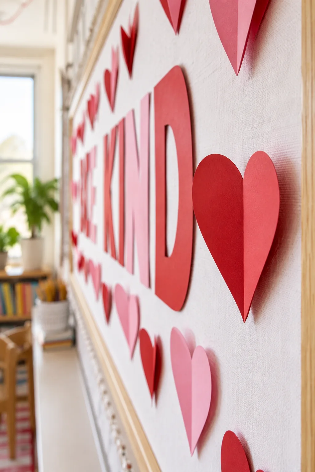
I once hung an entire welcome sign completely crooked, so now I always rely on a temporary baseline before securing anything permanently.
Verifying the Horizontal Baseline
Rest the bottom edge of each letter lightly on the painter’s tape guide to check the spacing before pressing them firmly into the board. This allows you to slide the characters left or right until the kerning feels visually balanced.
Applying Double-Sided Mounting Tape
Place a small square of double-sided foam mounting tape at the top, bottom, and center of each letter for maximum adhesion. The slight thickness of the foam tape lifts the letters slightly off the fabric, adding subtle shadow and depth.
Crafting the 3D Paper Hearts
Pushing a single pin through the nested center creases completely hides the mounting hardware while creating beautiful, leaping dimension.
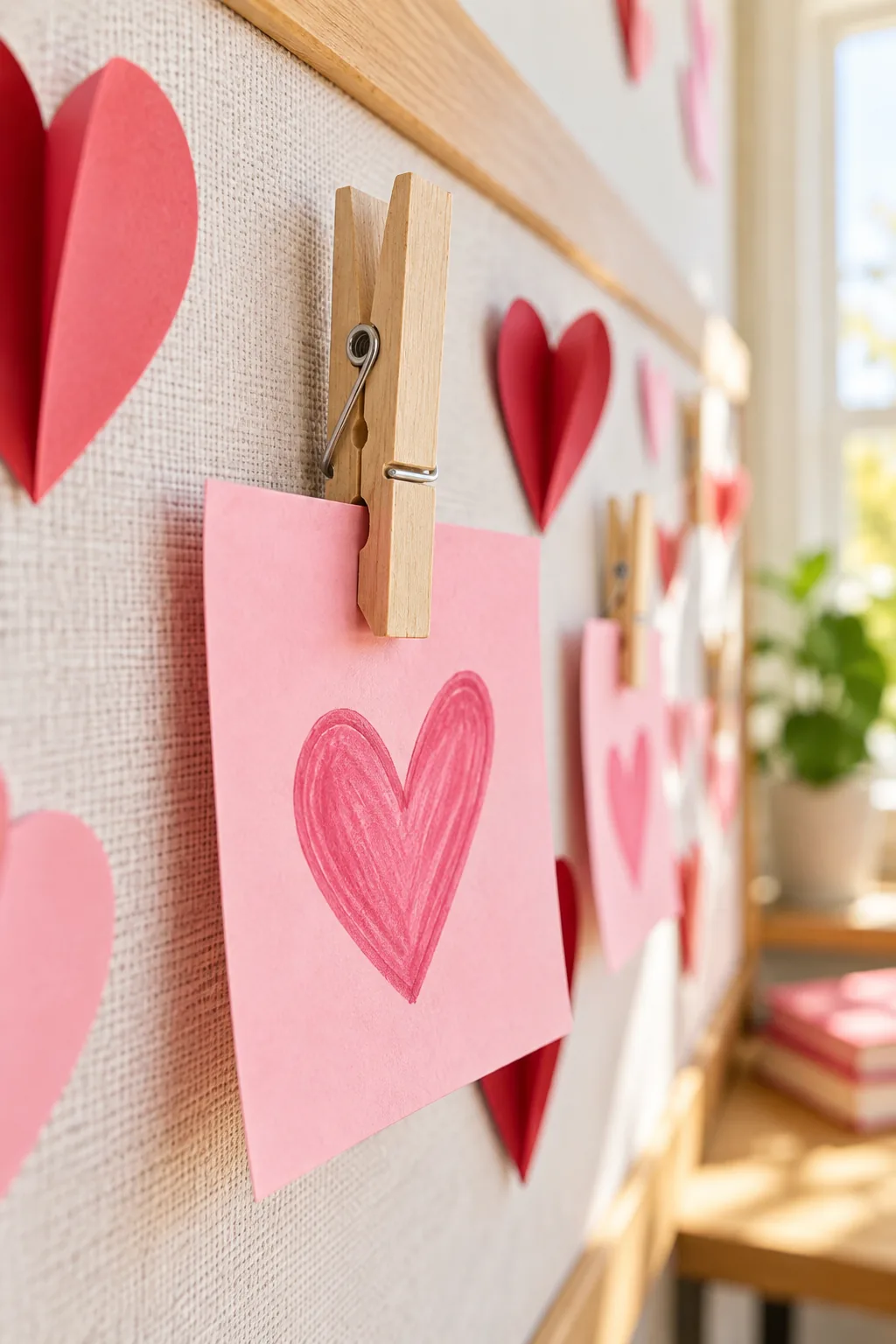
Whenever I host craft nights at my house, teaching this simple folding trick always gets the biggest reaction because it looks incredibly professional.
Folding for Maximum Dimension
Cut three identical heart shapes from standard construction paper for each 3D element to build the necessary volume and structural support. Stacking multiple layers prevents the paper from drooping and maintains that crisp, dimensional pop all month long.
Creating the Perfect Crease
Fold each heart precisely down the middle using a bone folder to create the sharp centerline that brings the board to life. A crisp fold is essential for giving the paper the structural integrity needed to stand away from the wall.
Securing Hearts with Hidden Pins
Nest the folded hearts tightly together and push a single clear pushpin through the center crease directly into the fabric-covered board. Pushing the pin all the way flush against the cork ensures the paper layers stay firmly anchored.
Springing the Folds Back
The outer paper layers will naturally spring back into place, forming a hidden fold pushpin mount that leaves a seamless floating effect. Gently fluffing the outer edges with your fingers maximizes the volume and completes the three-dimensional illusion.
Adding Clothespin Art Clips
Hot gluing wooden clothespins to the board creates an accessible, interactive space for swapping out student artwork throughout the month.
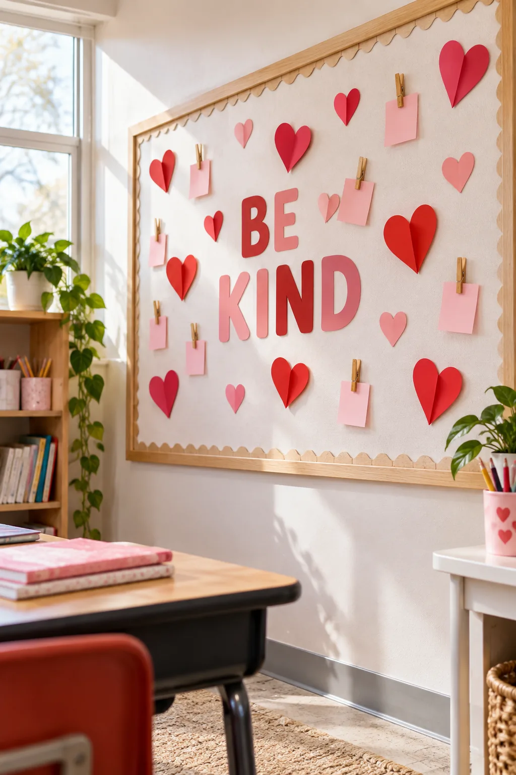
Apply a generous dot of hot glue to the back of standard 3-inch wooden clips and press them firmly onto the fabric base.
Choosing the Right Glue
High-temperature hot glue bonds securely to the porous cotton fabric base, ensuring the clips will not peel away when students tug on them. Hold each clip in place for a full ten seconds to allow the adhesive to cool and set completely.
Spacing the Interactive Elements
Space the clothespin art clips exactly 8 inches apart horizontally to comfortably hold standard student index cards without any overlapping edges. Using a scrap piece of cardboard cut to exactly eight inches makes this measuring process incredibly fast and consistent.
Prepping the Student Artwork
Pre-cut a stack of blank pastel cards so students can immediately start writing notes of kindness to fill the empty clips on day one. Having the materials readily available encourages instant participation and turns the board into a living, interactive classroom feature.
More Valentine's Board Styles
Adapt this high-impact layout to fit any classroom mood or color scheme.
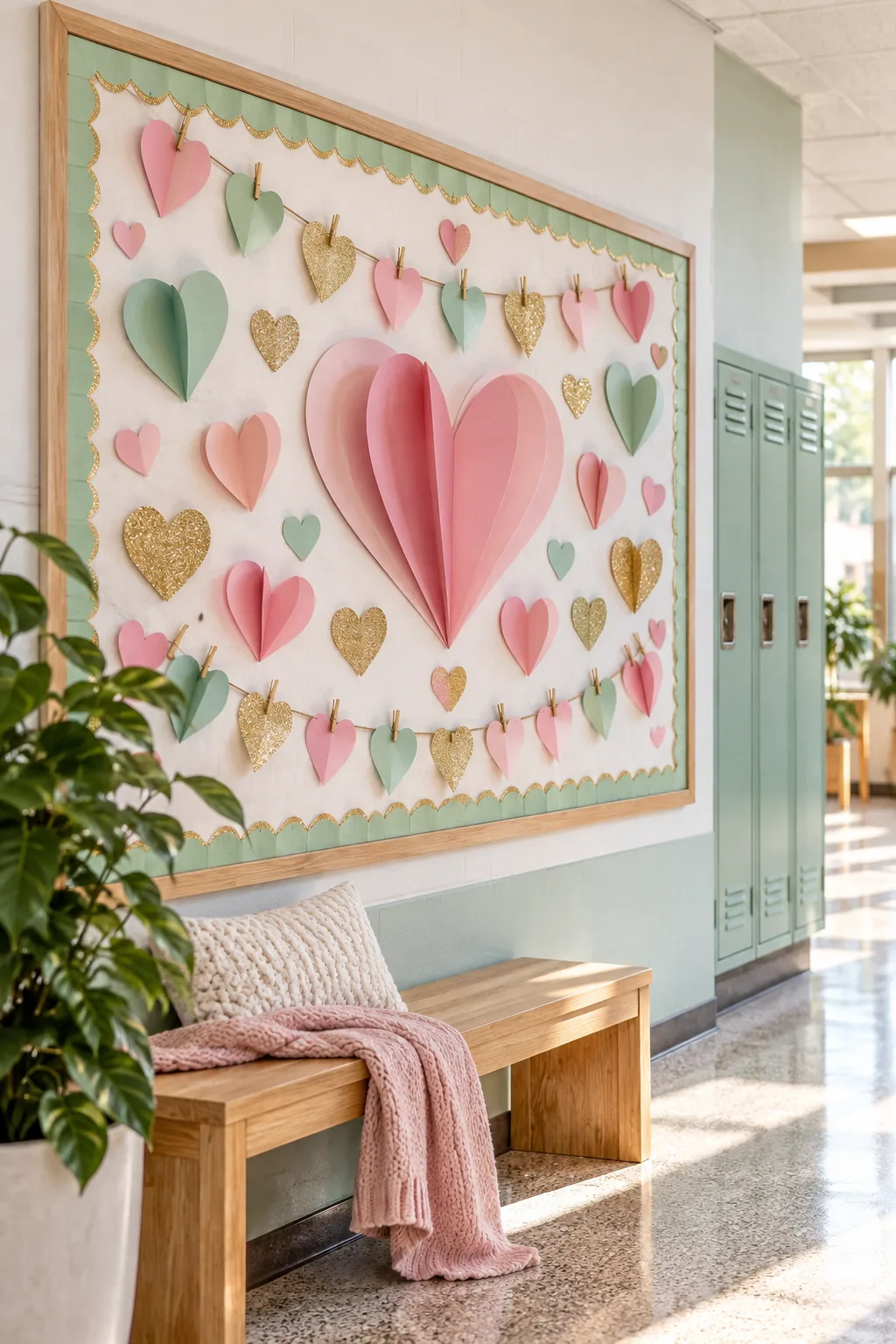
Pastel and Gold Hallway: Swap traditional reds for soft blush and mint greens to create a calming, modern aesthetic.
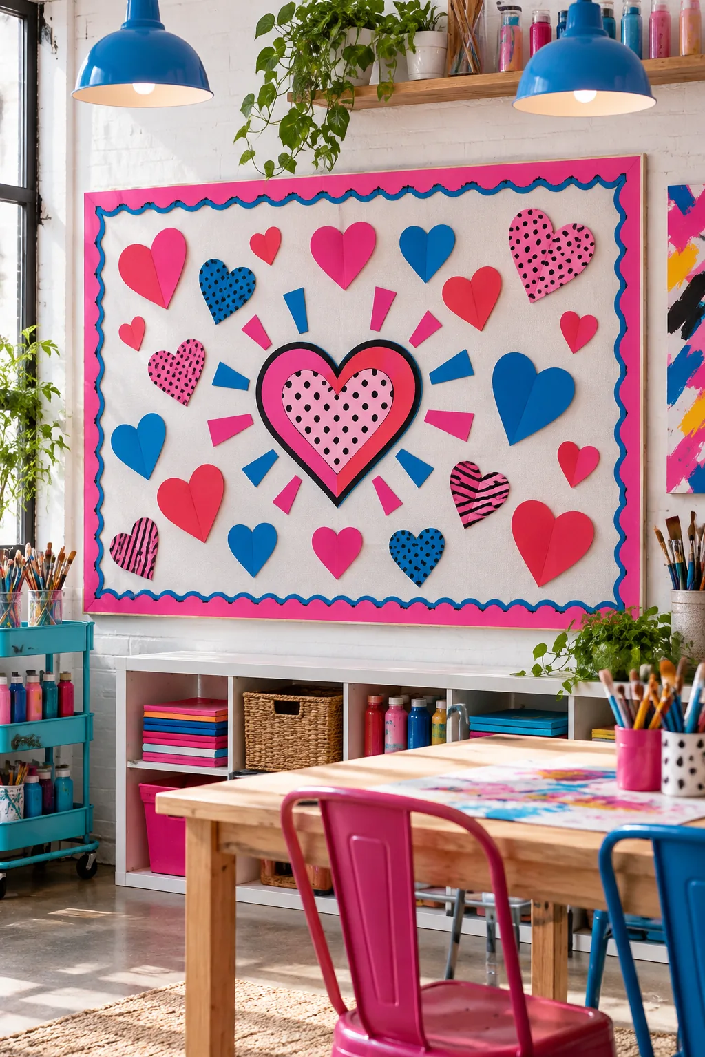
Neon Pop Art Studio: High-contrast neon colors and bold graphic shapes bring an energetic, creative vibe to the room.
Rustic Farmhouse Homeschool: Kraft paper backgrounds and deep crimson hearts provide a warm, textured look perfect for cozy spaces.
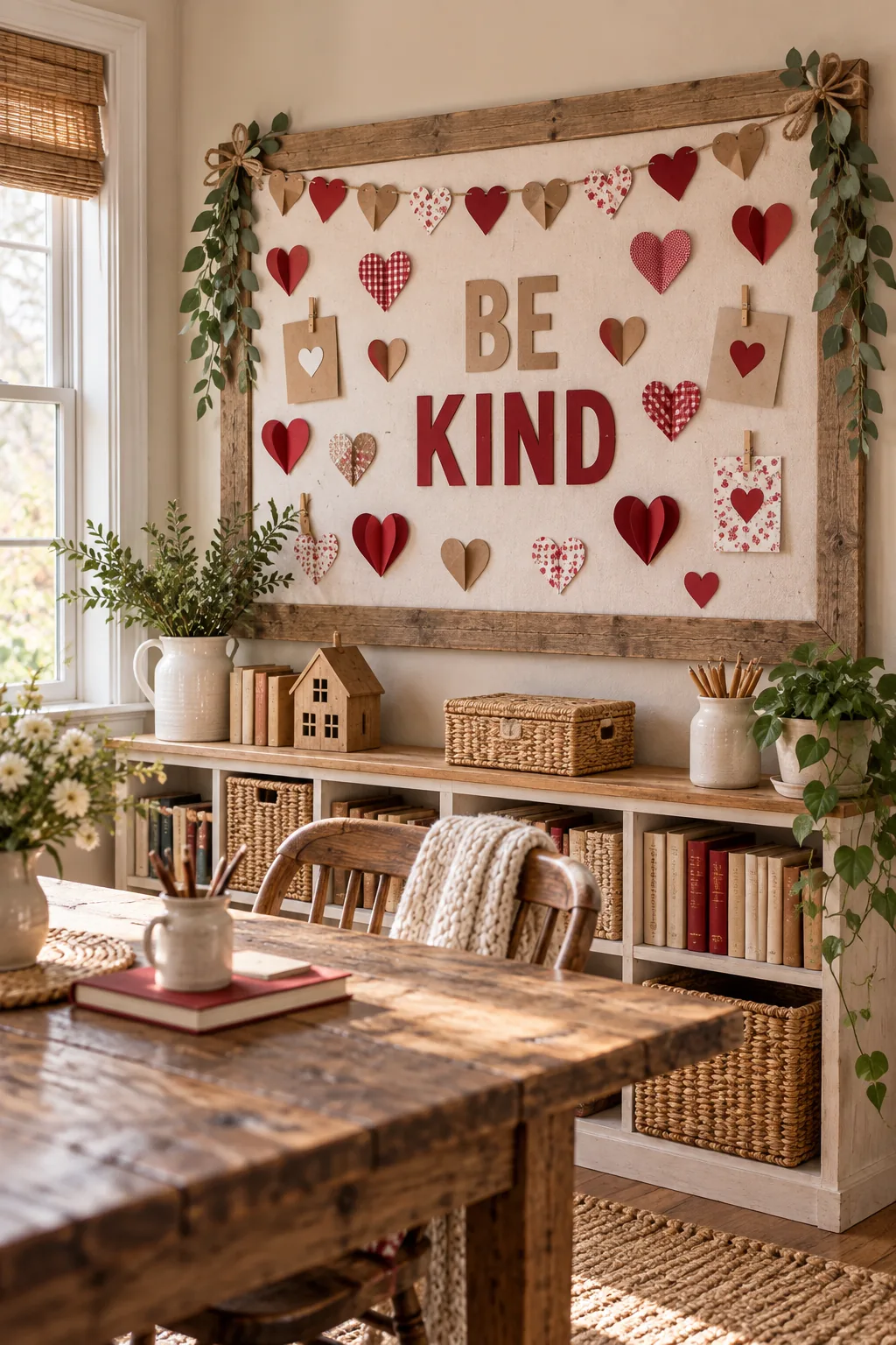
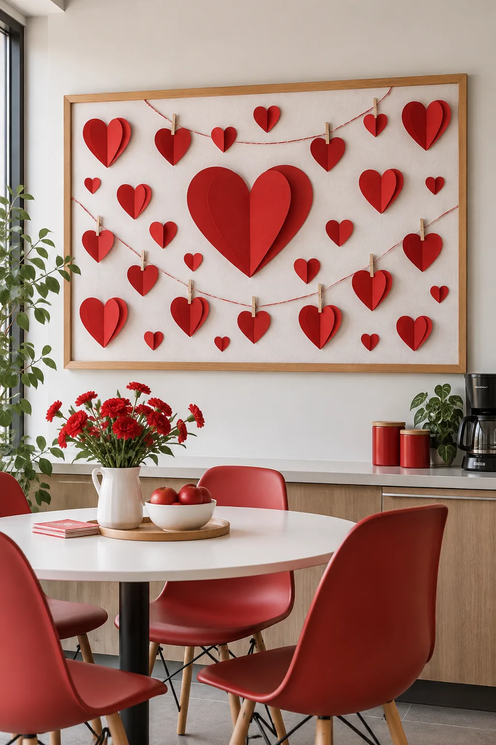
Monochromatic Red Office: Layering multiple shades of a single color creates a sophisticated, grown-up take on holiday decor.
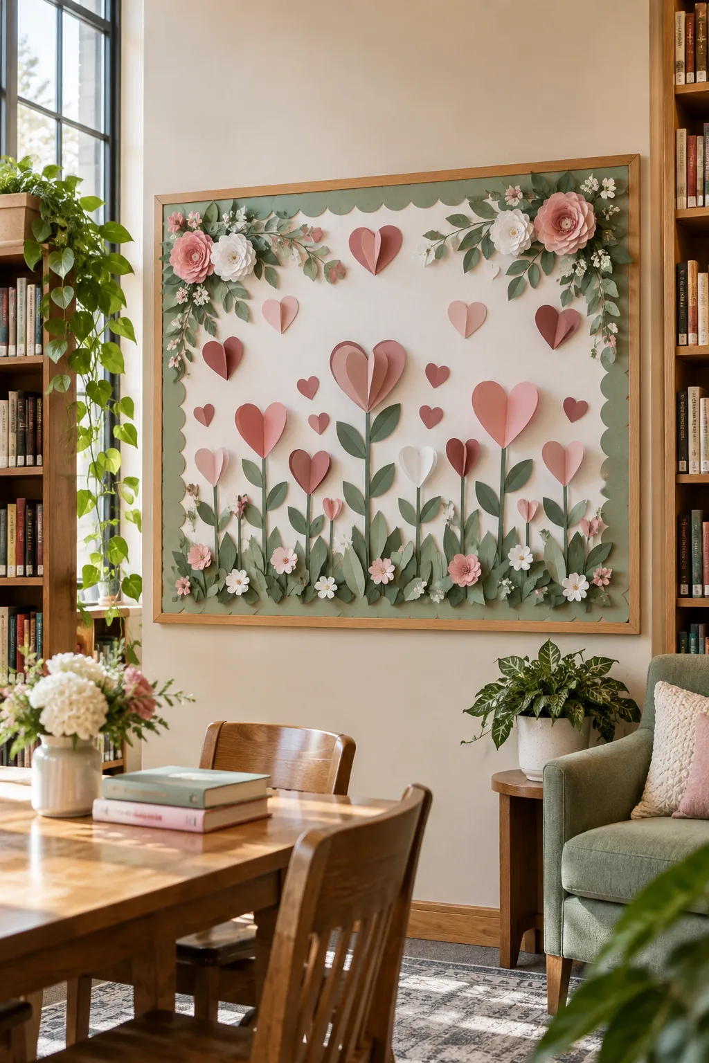
Botanical Floral Library: Integrate paper vines and sage green accents alongside the hearts for a fresh, nature-inspired display.
Maintaining High-Impact Balance
Grouping the 3D elements asymmetrically balances the visual weight of the entire display, keeping the focus clearly on the central message.
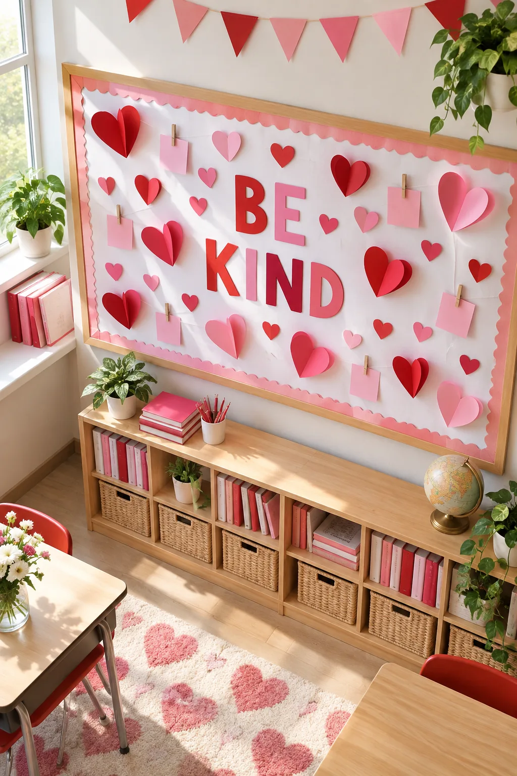
I always step back to evaluate the visual weight of a completed project, and a quick final review ensures the board remains both beautiful and functional.