
This Dip Pen Became a Home Library
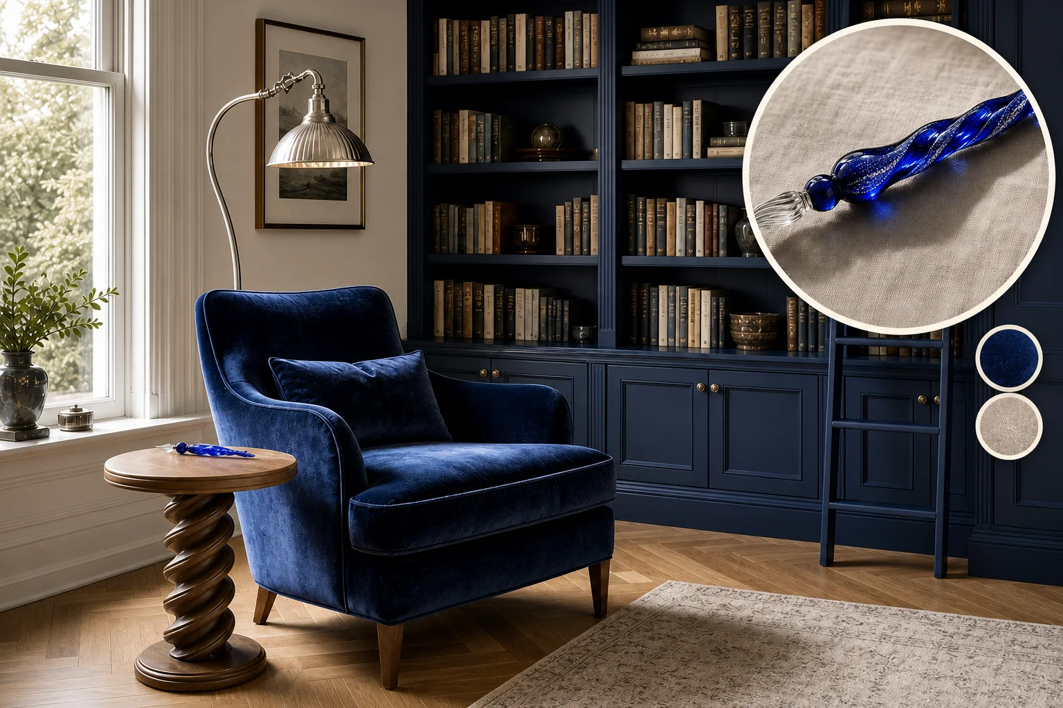
Transforming a delicate cobalt glass dip pen into a home library requires balancing deep, saturated focus with light-catching elegance. This sophisticated interplay of color and subtle metallic shimmer succeeds because matte architectural planes ground the high-sheen textiles and reflective metallic accents to prevent visual fatigue.
Grounding the Room in Deep Ink
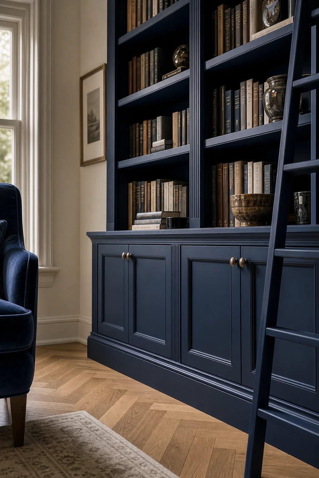
Wrapping the walls in a saturated, matte hue creates a heavy, focused perimeter that allows lighter elements to shine, grounding the room like dark ink. To achieve this anchor without making the space feel like a cave, contrast is essential. Soft parchment walls provide visual relief against the casework, while warm oak floors introduce necessary organic warmth to balance the cool blue palette. Following a sequence of concrete design moves establishes this foundational architecture, ensuring the library feels both enveloping and perfectly suited for hours of quiet, focused reading.
- Paint the floor-to-ceiling built-in bookcases in a matte cobalt finish to absorb light and create a heavy architectural anchor.
- Paint the remaining walls a soft parchment white to provide visual relief and contrast against the dark casework.
- Install warm oak herringbone flooring throughout the room to add necessary warmth that balances the cool blue palette.
- Position the reading armchair near the natural light source so daylight highlights the velvet’s sheen without harsh overhead fixtures.
- Add a directional brushed silver reading lamp to illuminate the pages while keeping the room’s overall mood serene.
Catching Light with Silver Shimmer
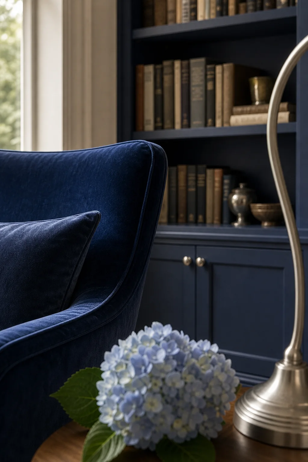
Introducing cool metallic sparks against the dark woodwork mimics the way silver flecks catch light inside deep blue glass. This delicate balance prevents the heavy cabinetry from feeling oppressive, adding just enough reflective contrast to guide the eye around the room. Antiqued silver and brushed nickel finishes on the cabinet hardware and reading lamp provide these necessary sparks without the harsh glare of polished chrome. This translation from object to room relies on a precise visual-DNA mapping table to ensure the metallic accents illuminate the shadows rather than overwhelming the serene space.
| Source trait | Visible evidence | Room move |
|---|---|---|
| Deep Ink Anchor | The saturated, dark cobalt blue of the glass body | Floor-to-ceiling built-in bookcases painted in a matte, dark cobalt, providing a heavy, grounding architectural element against parchment-colored walls. |
| Silver Shimmer | The metallic silver flecks suspended inside the glass | Antiqued silver and brushed nickel finishes on the cabinet hardware and the reading lamp, adding cool metallic sparks to the dark woodwork. |
| Vitreous Luster | The smooth, light-catching glossy surface of the glass | A plush reading armchair upholstered in a high-sheen cobalt silk-velvet that catches the light and mimics the depth and refraction of colored glass. |
| Helical Twist | The continuous spiraling shape of the pen’s stem | A solid wood side table featuring a subtle, spiraling turned base, echoing the pen’s twist without replicating its material. |
Illuminating the Dark Casework
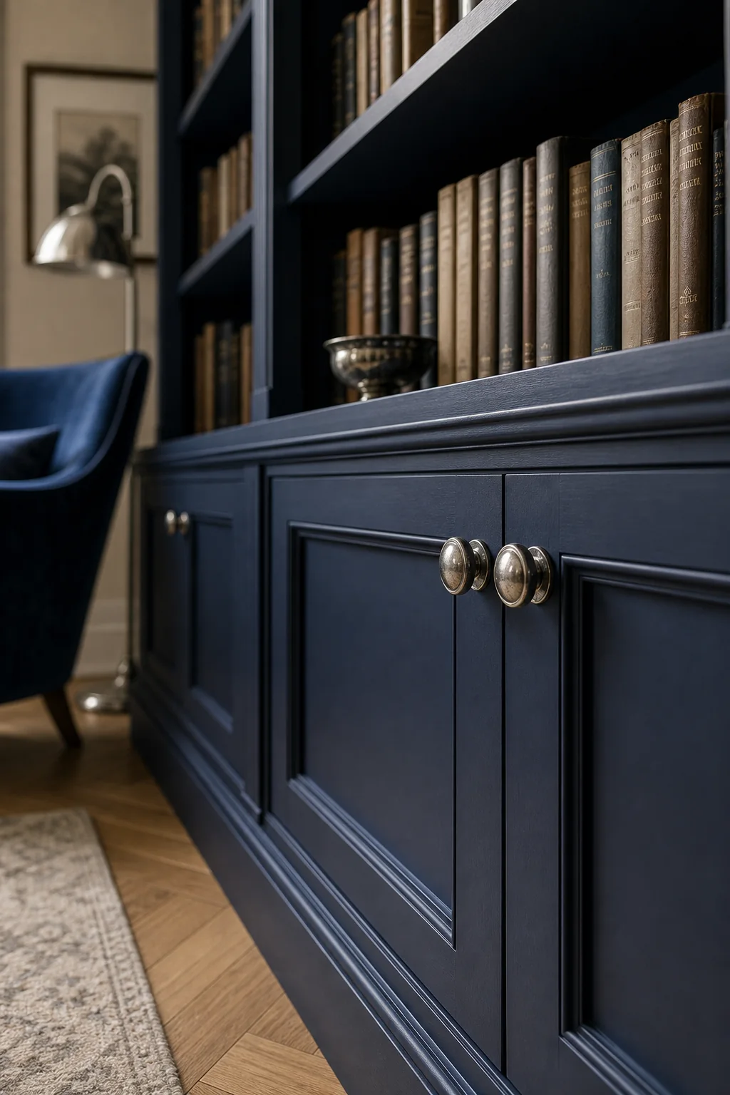
Antiqued silver pulls provide metallic sparks against dark matte wood, ensuring the casework feels elegant rather than heavy. By selecting brushed nickel finishes for the hardware, you perfectly capture the pen’s internal shimmer while maintaining a refined, subdued atmosphere suitable for a library. This subtle gleam catches the natural light spilling from the tall narrow window, creating a dynamic interplay of shadow and reflection across the built-in shelves. It is a small but vital detail that bridges the gap between the luminous glass source object and the practical requirements of a functional reading space.
Translating Vitreous Luster into Textiles
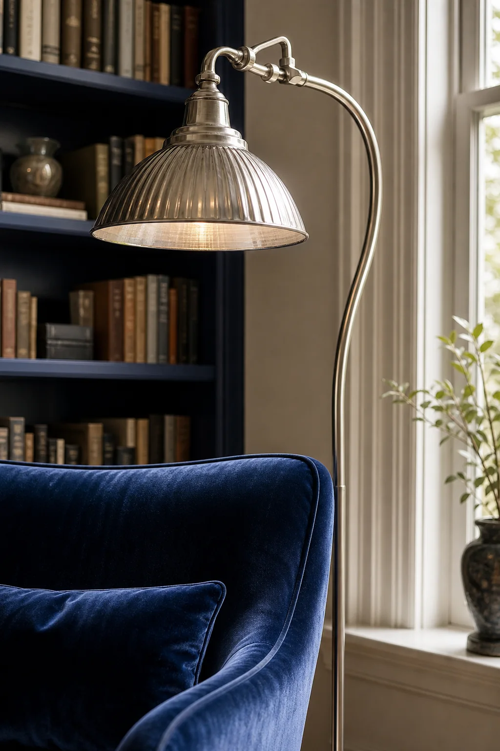
Translating the smooth, glossy surface of glass into high-sheen silk-velvet brings tactile comfort while maintaining the motif’s luminous quality. A plush reading armchair upholstered in this rich fabric catches the light, mimicking the depth and refraction of colored glass without the coldness of actual vitreous materials. When paired with the matte painted wood and brushed metal, the velvet adds a crucial layer of softness that invites you to sit and linger. Securing the right fabrics and finishes requires a focused material checklist to accurately capture the glass pen’s luxurious depth.
Layering Luminous Comfort
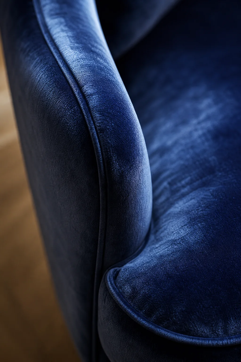
High-sheen velvet catches light exactly like the pen’s glossy surface, offering a plush retreat for quiet reading. Scaling this translation depends entirely on your design comfort level. A subtle approach might use matte cotton velvet and leave the upper shelves parchment white, incorporating only one small silver accent. A balanced room pairs a high-sheen velvet chair with full matte cobalt casework and a warm oak side table. For a truly bold execution, you could drench the entire room in matte cobalt blue, amplify the silver hardware, and introduce a fluted glass chandelier.
Echoing the Helical Twist
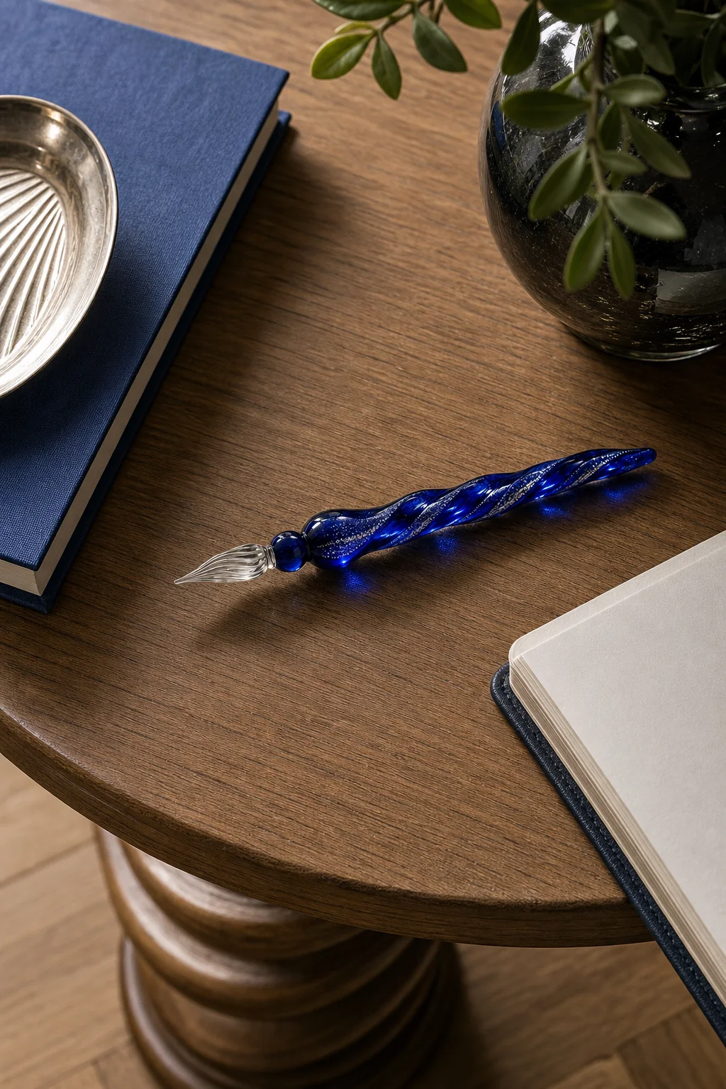
Introducing subtle, continuous curves through furniture silhouettes breaks up the rigid vertical lines of the bookcases, echoing the pen’s twisting stem. A solid wood side table featuring a spiraling turned base perfectly captures this helical movement without resorting to literal glass reproductions. This gentle rhythm softens the room’s strict architecture, providing a resting place for a book that feels organically connected to the overall design premise. By translating the spiral into warm oak rather than glass, the room maintains its cozy, grounded atmosphere while still honoring the fluid Art Nouveau geometry of the original source object.
Limit spiraling motifs to one or two key furniture pieces. Too many twists will make the room feel chaotic rather than serene, undermining the focused atmosphere required for a home library.