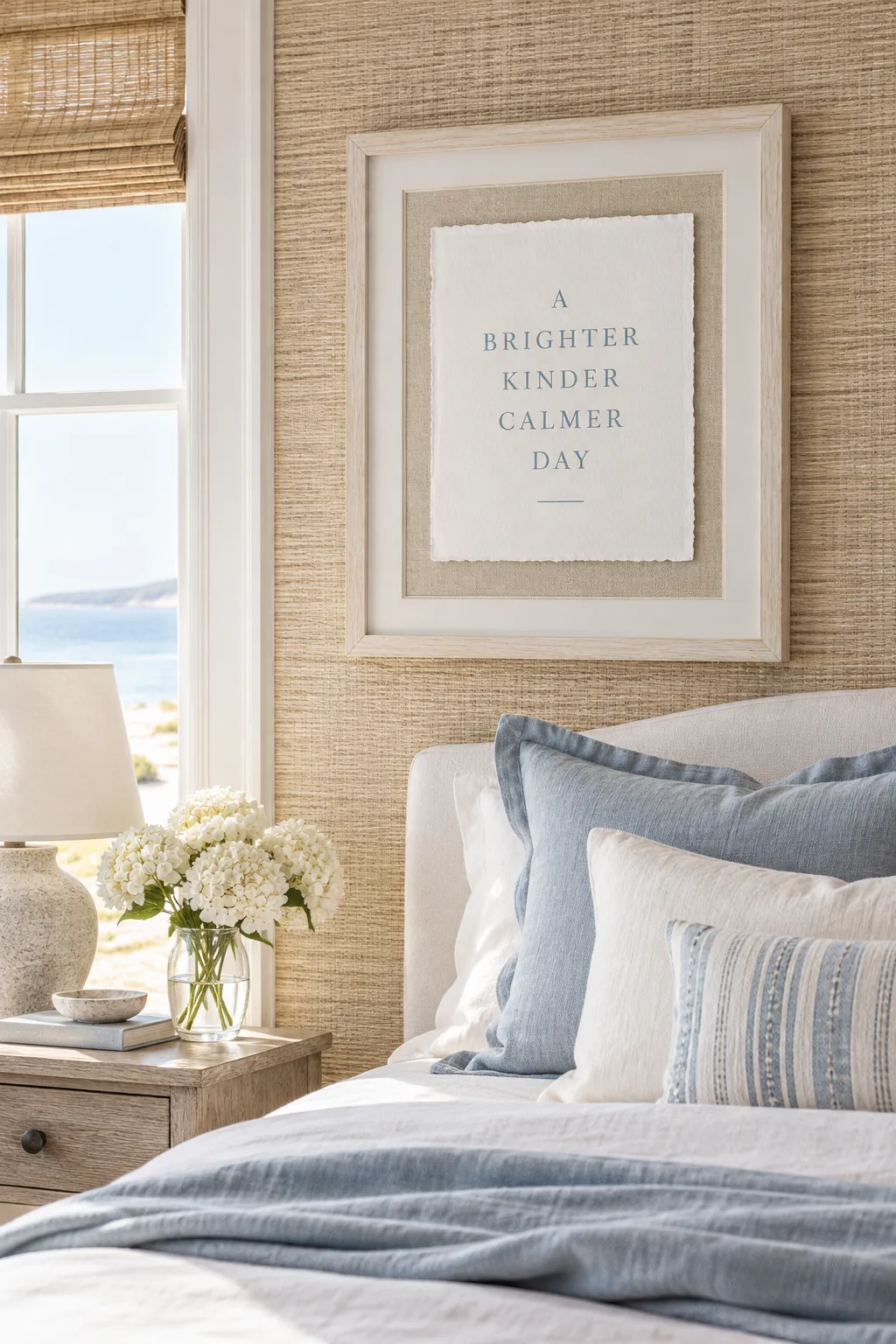
Custom Word Art Layouts: Typography & Margin Cheat Sheet
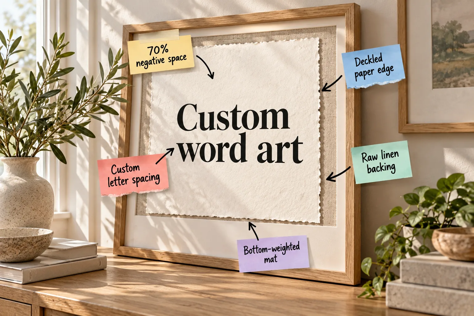
The difference between a mass-produced cheap printable and a stunning heirloom gallery piece lies entirely in the physical layers and spatial proportions. This is exactly why this typography and margin cheat sheet gives you the concrete formatting formulas needed to elevate your own custom word art. You will be able to format, print, and frame your favorite phrase using professional margin ratios and museum-quality layering techniques that command attention.
Elevating Simple Words to Gallery Art
Proper formatting transforms an everyday printed phrase into a deliberate, high-end focal point that commands attention in any living space. The secret to this dramatic transformation relies entirely on the physical materials and spatial ratios you build, rather than just selecting a beautiful font on your computer screen.
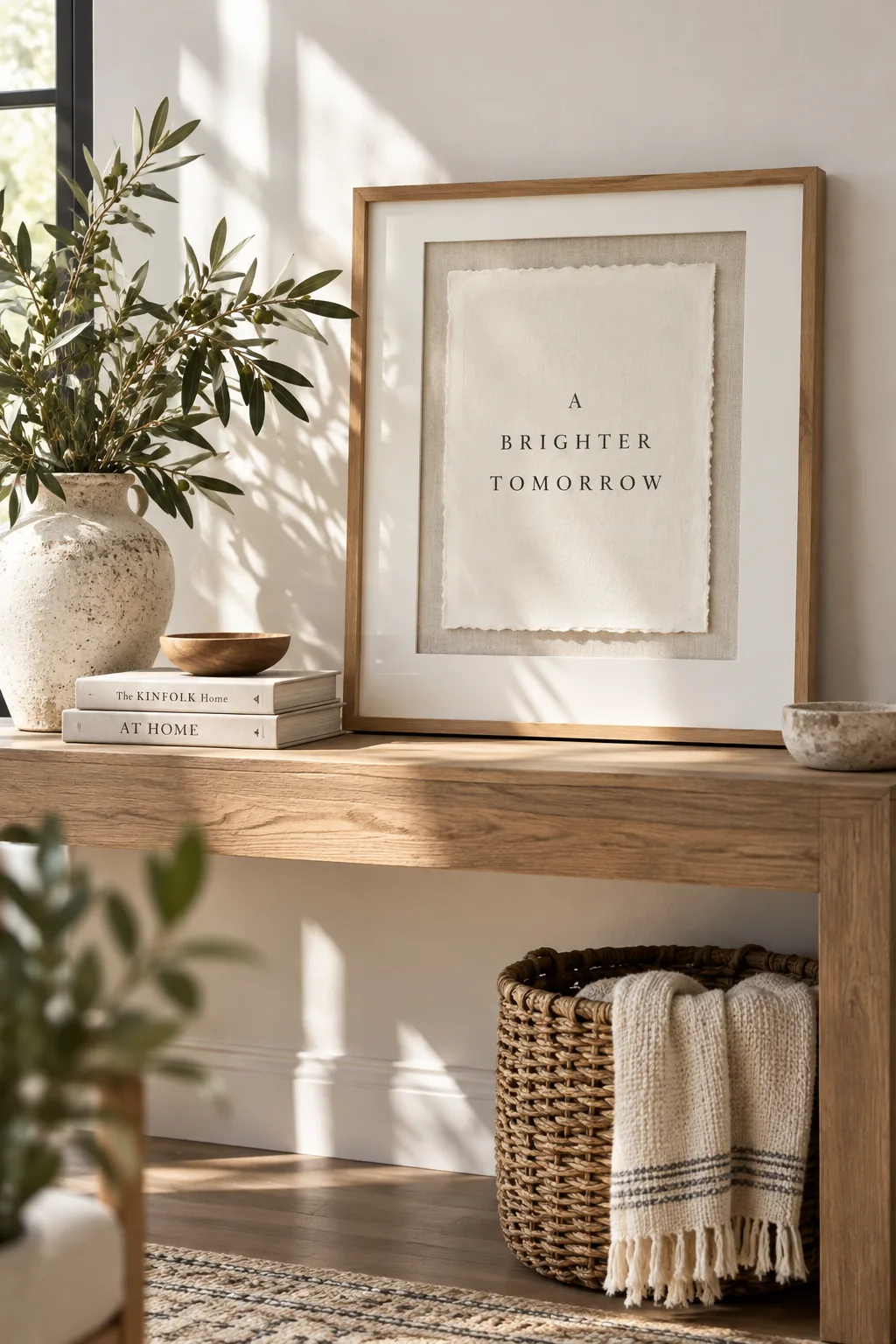
Building these structural layers requires a strategic outside-in approach, starting with the frame’s outer proportions and working all the way down to the subtle paper texture. By mastering these physical components first, you create a museum-quality foundation that makes even the simplest typography feel incredibly expensive and deeply intentional.
Anchoring the Frame with a Bottom-Weighted Mat
A standard perfectly symmetrical mat often creates an unfortunate optical illusion where the artwork appears to be sinking heavily toward the floor. I learned this the hard way in my own Denver studio, where a beautifully printed poem felt inexplicably heavy and unbalanced until I replaced the standard mat with a bottom-weighted alternative.
- Measure your top and side margins to establish the baseline border width for your custom frame.
- Calculate a bottom margin that is exactly 20 to 30 percent wider than your top and side measurements.
- Cut the mat board to these exact specifications to visually ground the piece at eye level and restore balance.
This subtle expansion at the base anchors the frame visually, giving the typography ample room to breathe while counteracting the natural downward pull of gravity in the room. It is a foundational gallery technique that immediately signals custom framing rather than a quick off-the-shelf purchase from a big box store.
Creating Contrast with a Raw Linen Backing
Before adding your fabric layer, ensure your bottom-weighted mat is perfectly proportioned to provide that essential visual grounding effect. I always double-check this wider bottom margin in my own projects, as it prevents the artwork from looking top-heavy once the textured backing and heavy glass are finally installed on the wall.
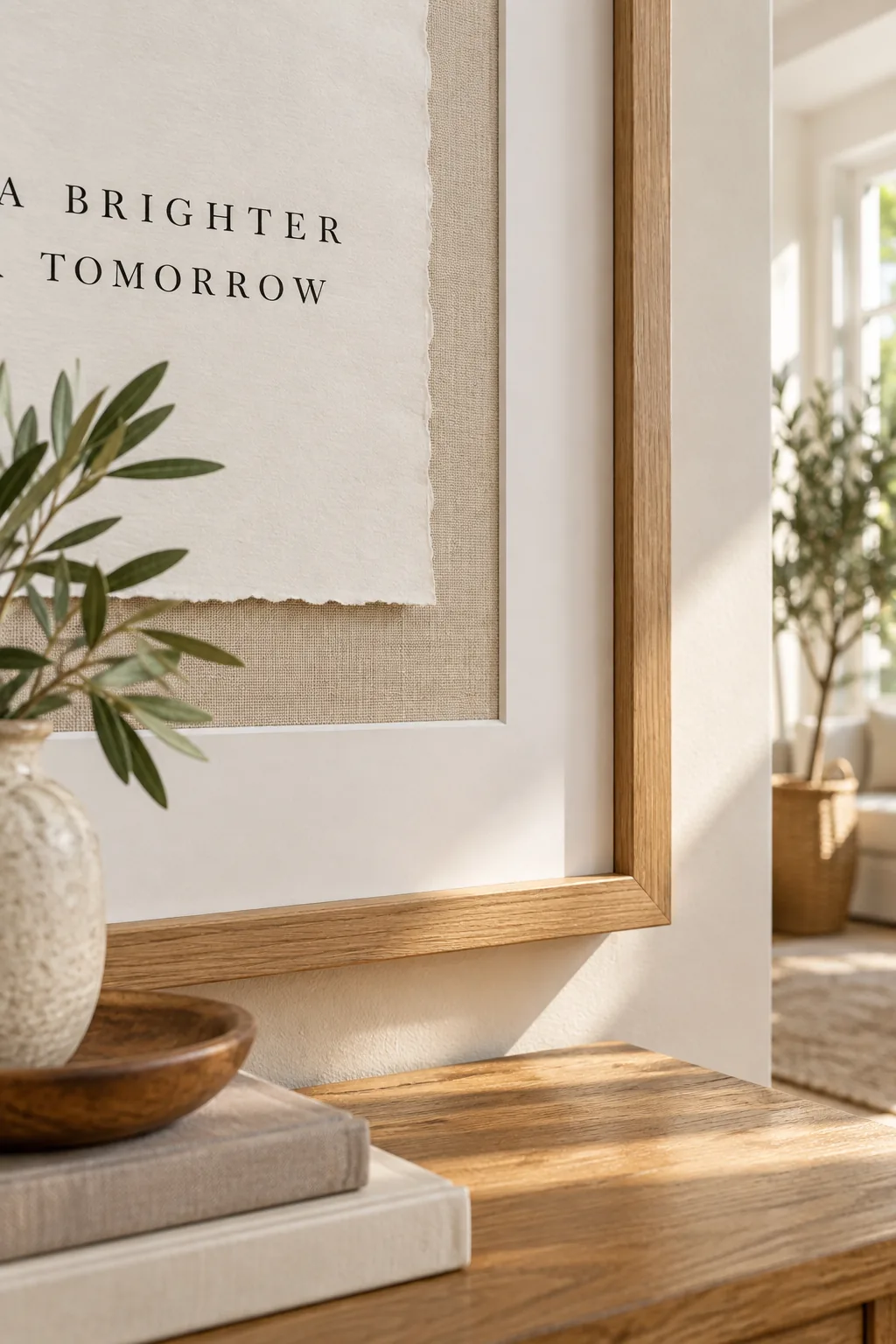
With the mat proportions securely locked in, you can introduce a neutral raw linen backing to absorb ambient light and provide a stunning tactile contrast to the smooth glass. Finding the right fabric doesn’t require a specialty framing supplier; you can source perfect backing materials from unexpected places to achieve this high-end look.
Adding Dimension with a Deckled Paper Edge
Heavy cotton watercolor paper with torn, feathery edges introduces an organic, handmade dimension that perfectly complements the structured linen backing behind it. Achieving this coveted deckled look successfully requires using a minimum paper weight of 300gsm so the fibers tear cleanly without curling or warping under seasonal humidity changes.
| Paper Weight | Edge Result | Best Application |
|---|---|---|
| 90gsm | Sharp cut only | Office documents |
| 150gsm | Fraying and curling | Budget posters |
| 300gsm | Clean feathery tear | Floating gallery art |
Carefully scoring and tearing this heavyweight paper against a sharp metal ruler creates that signature fibrous border that designers love. This deliberate raw edge catches the light beautifully, setting the perfect stage for the physical elevation techniques that will truly make your typography pop off the wall.
The Float Mount Technique
To properly showcase those beautiful deckled edges, you must elevate the paper above the linen backing rather than pressing it flat beneath the mat board. Utilizing hidden foam core spacers creates a precise 3/16-inch lift, generating a signature drop shadow that highlights every torn fiber and adds profound visual depth.
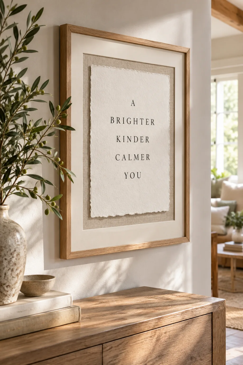
This physical separation between the art and the backing fabric ensures the paper feels like a suspended, highly valuable artifact within the frame. Once your structural float mount is perfectly calibrated, you can confidently apply the precise typographical formulas that will balance this stunning three-dimensional canvas.
The Typography and Margin Cheat Sheet
The physical framing is only half the equation; the actual text layout requires strict adherence to proven typographical formulas to look professional. In my own home office, I rely on setting the line height to 1.2em and keeping side margins exactly equal to ensure the layout never feels accidental or rushed.
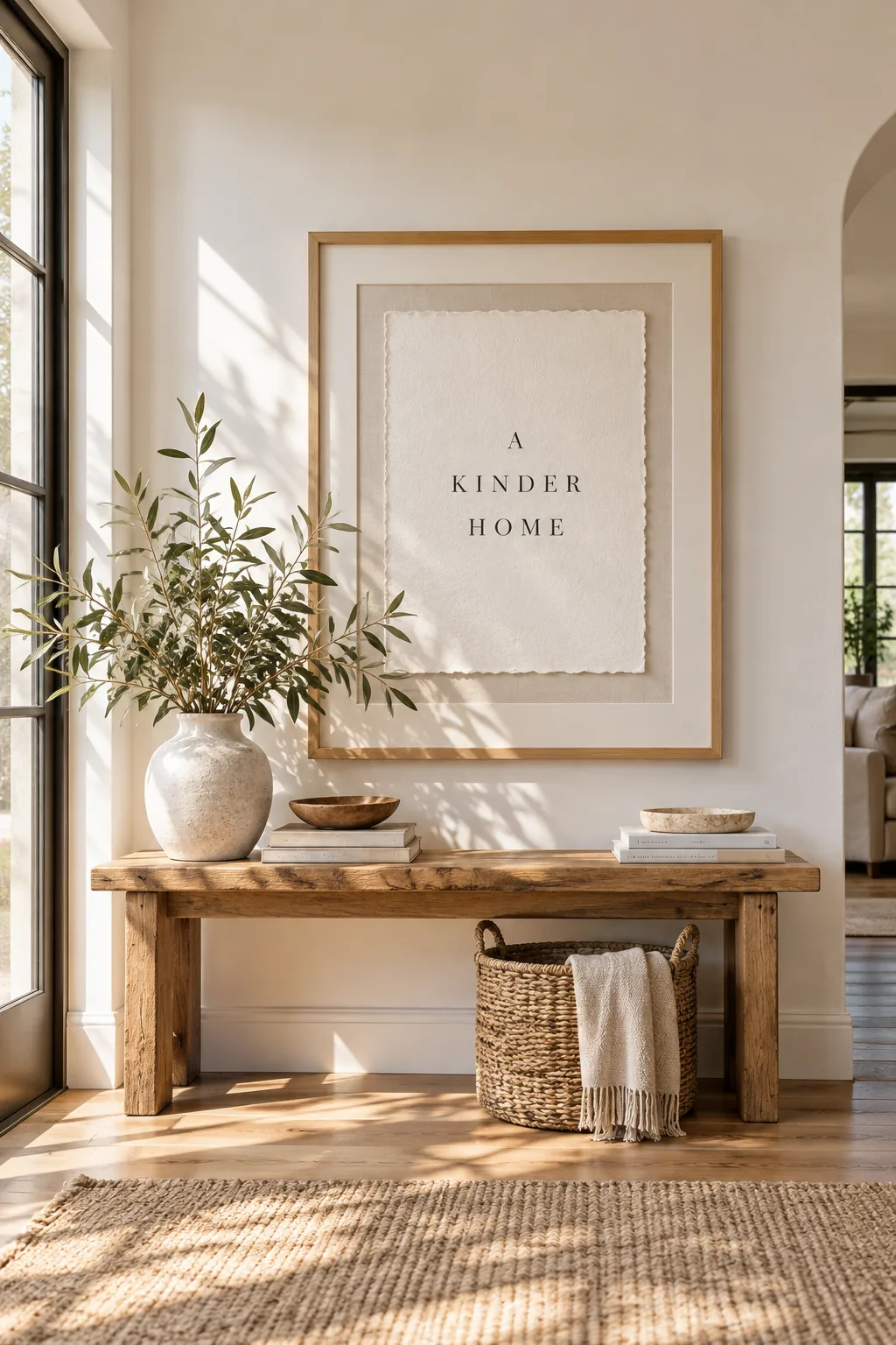
These concrete ratios scale flawlessly across any frame dimension, dictating that you choose heavier font weights for single words and lighter weights for longer, complex phrases. Before sending your final file to the printer, run through these essential layout checks to ensure your ratios translate perfectly to the physical paper.
Mastering the 70% Negative Space Rule
A hallmark of high-end galleries is the courageous use of empty space, which dictates that your text block should occupy only 30 percent of the paper’s total surface area. This vast 70 percent negative space intentionally draws the eye inward, forcing the viewer to focus entirely on the meaning of the words.
- Calculate the total square inch area of your torn watercolor paper.
- Multiply that total by 0.30 to find the maximum allowed footprint for your text block.
- Leave the remaining area completely blank to frame the typography with pure, uninterrupted texture.
Resisting the urge to fill the entire page is often the hardest part of custom word art design for beginners. Embracing this generous void elevates the phrasing from a simple printed message into a striking, sculptural element that effortlessly commands the entire room’s attention.
Refining the Details with Custom Letter Spacing
The final layer of sophistication happens at the micro level through deliberate tracking and kerning adjustments across your chosen font style. Increasing the tracking by 5 to 10 percent for all-caps serif fonts dramatically improves readability while injecting a sophisticated, airy feel into the overall phrase.
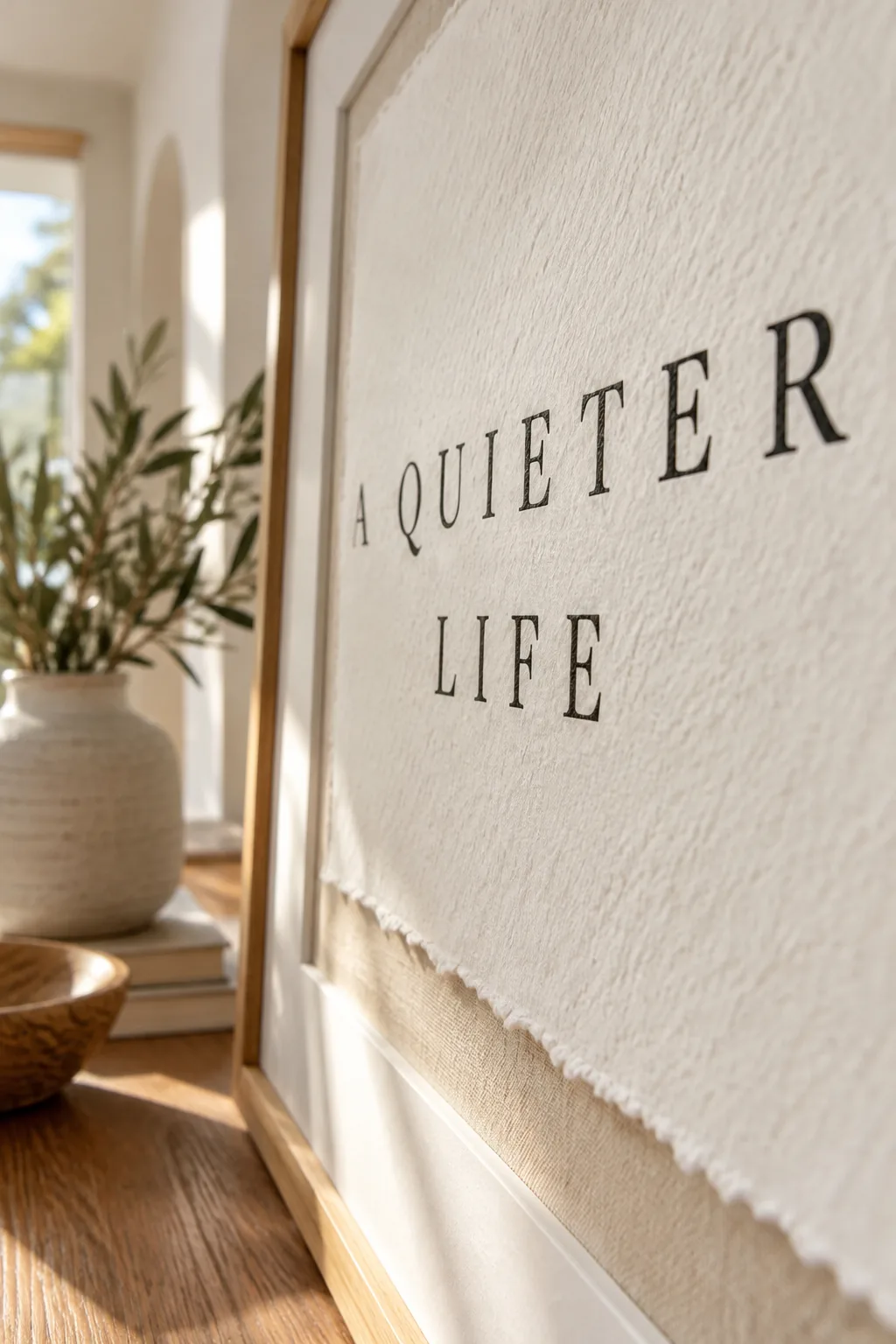
This expanded spacing prevents the heavy ink characters from bleeding together visually when viewed from across a large living room. By combining this precise letter spacing with your bottom-weighted mat and floated deckled edges, you successfully engineer a piece of custom gallery art that feels truly timeless and deeply personal.
Three Ways to Style Custom Word Art
Discover how changing the frame and backing materials can completely shift the mood of your typography.
Modern Monochrome Entryway: A sleek black metal frame and crisp sans-serif typography create a striking minimalist contrast perfect for a modern foyer.
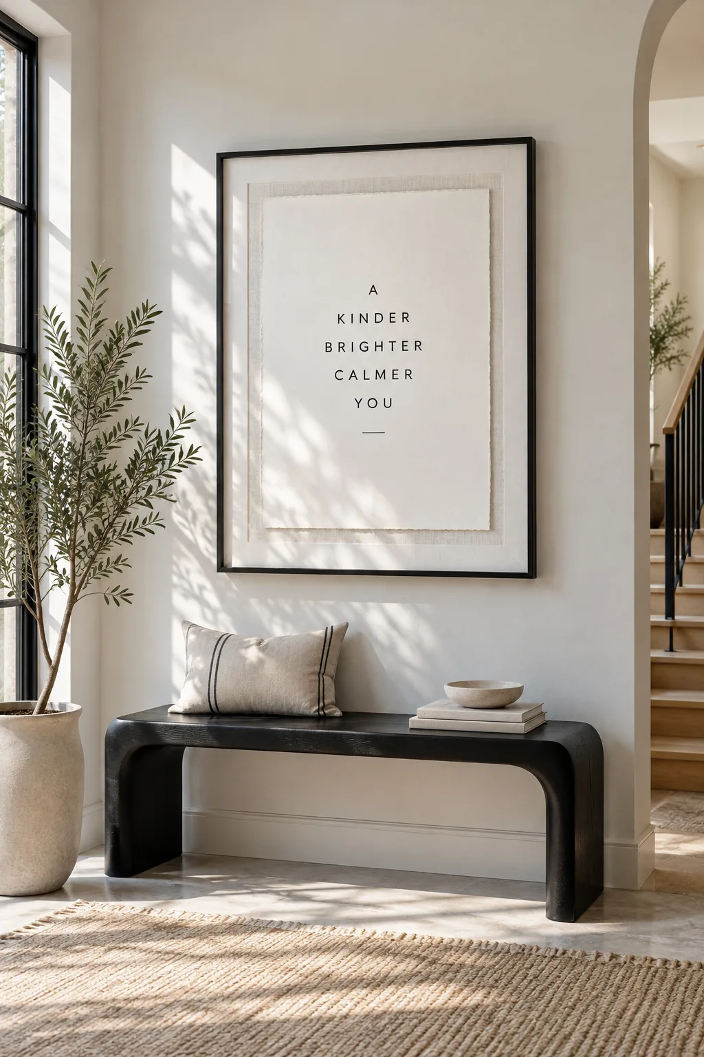
Vintage Eclectic Study: Swap linen for rich dark velvet and use an ornate brass frame to give modern words a moody, historical weight.
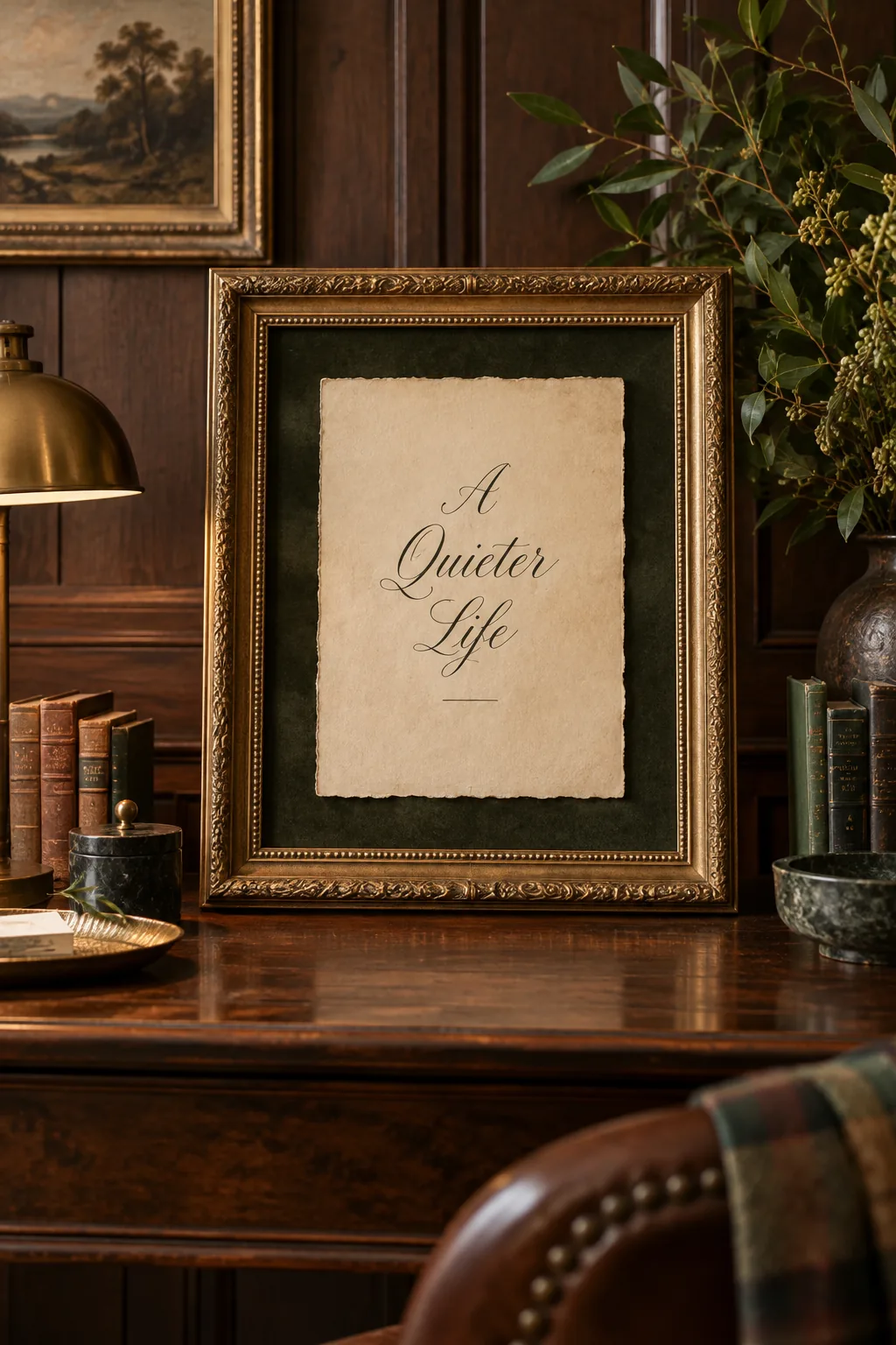
Coastal Organic Bedroom: Whitewashed ash wood and a woven grasscloth backing introduce a relaxed, breezy texture that softens the graphic text.