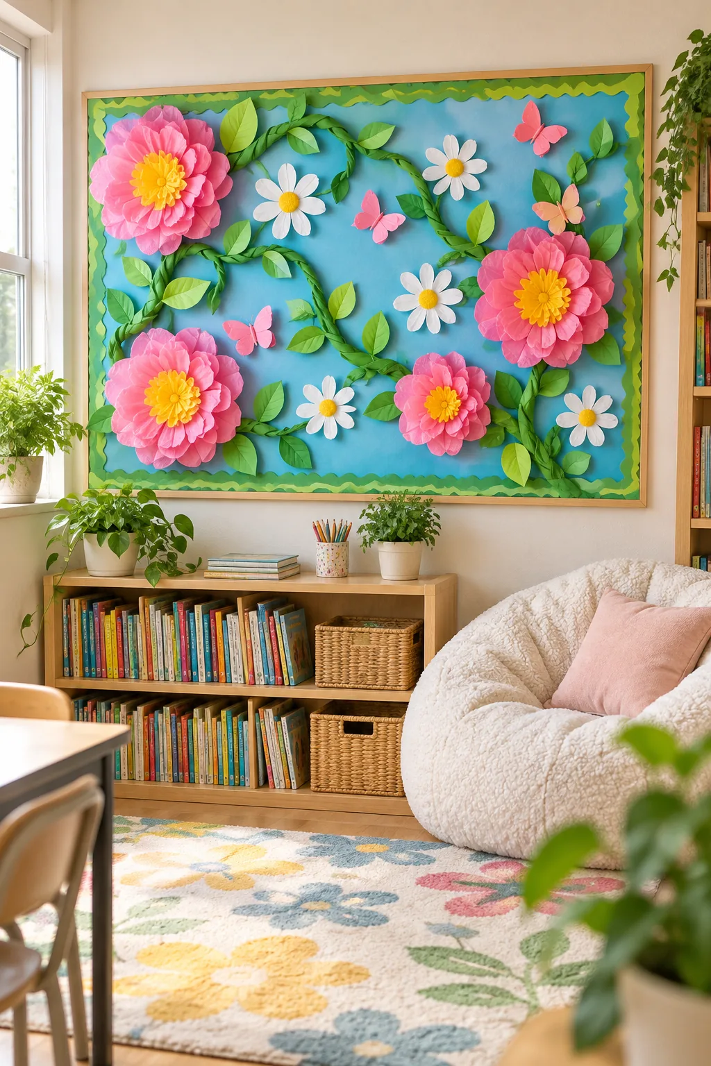
3D Spring Bulletin Board Ideas: Free Template & Layout Map
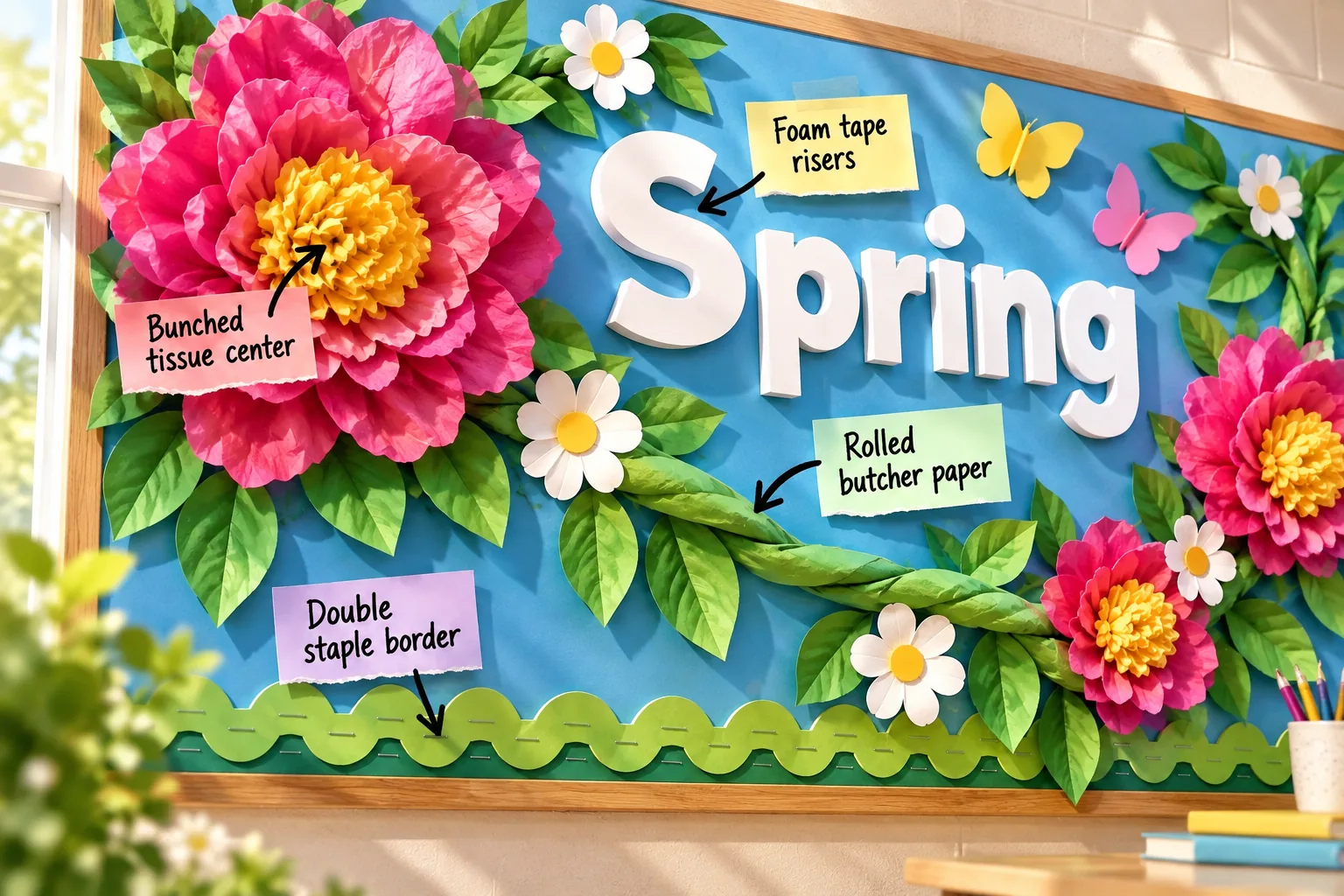
You will be able to build this exact vibrant classroom display using our printable templates and step-by-step spatial map, culminating in a complete 3D Spring Board Template & Layout Map. Let’s break down the assembly order from the flat background foundation outward to the floating 3D details.
Setting the Sky Blue Foundation
Start with a smooth, bright foundation to make the 3D elements pop, using a continuous roll of fade-resistant sky blue bulletin paper. Pull it tightly across the cork before securing the corners to prevent mid-season sagging.
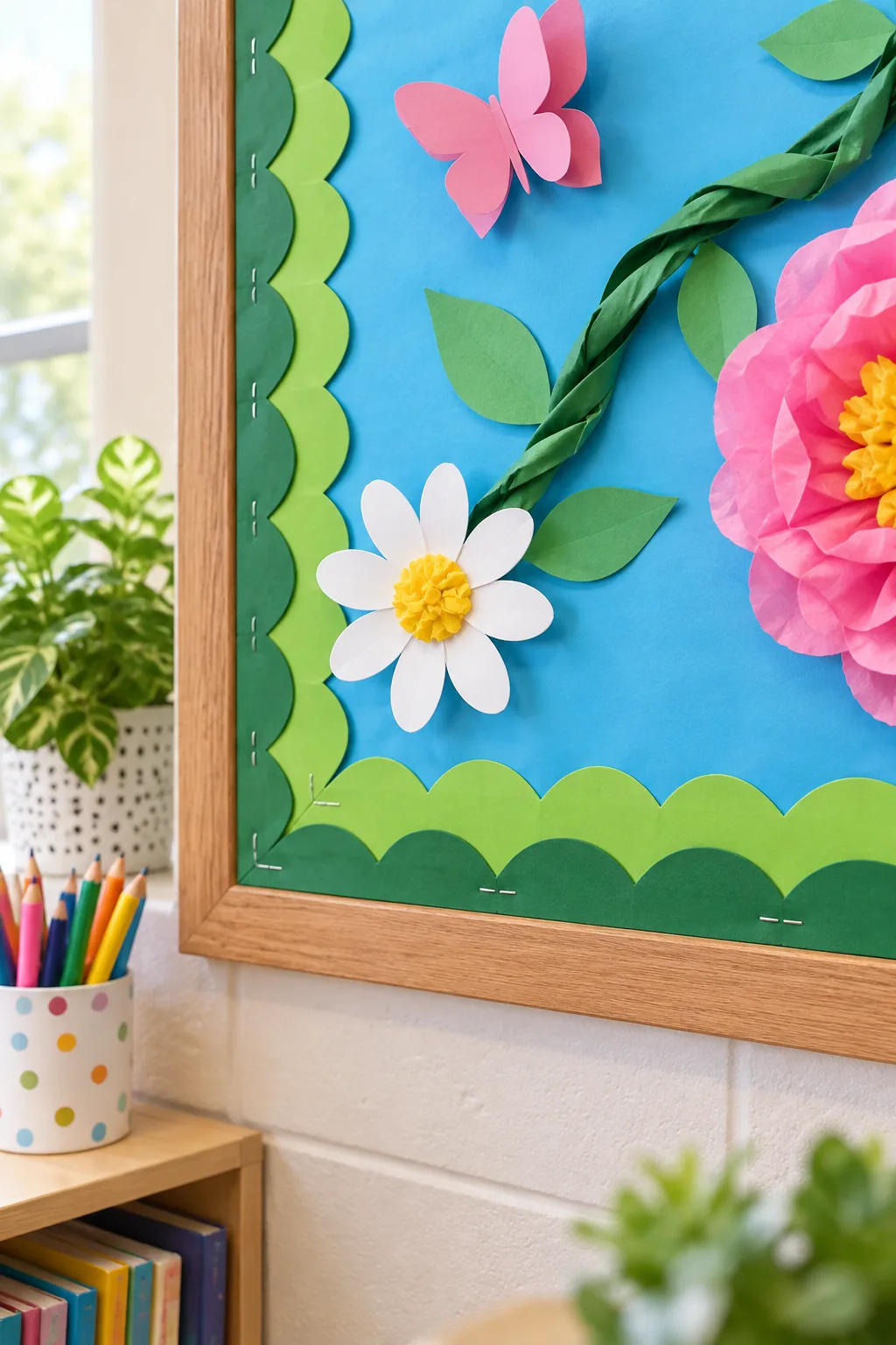
Gather your essential prep materials before unrolling the large background paper to ensure a seamless, wrinkle-free installation across the entire board.
- Heavy-duty construction stapler
- Push pins for temporary holds
- Utility knife with a fresh blade
- Leveling string line
Measuring Your Board Dimensions
A standard classroom board measures exactly 4×8 feet, requiring slightly more paper to wrap the edges cleanly. Leave a two-inch overhang on all four sides during your initial cut to guarantee complete cork coverage.
Trimming the Excess Paper
Run a sharp utility knife directly along the aluminum frame to slice away the excess blue paper. Changing the blade after every major bulletin board project ensures a crisp edge that will not tear or fray.
Preventing Mid-Season Sagging
Changes in classroom humidity will cause loose paper to ripple and droop by late April. Place a staple every four inches along the top edge first, then pull the bottom taut before anchoring the lower corners.
Smoothing Trapped Air Bubbles
Sweep your hands firmly from the center of the board outward to push trapped air toward the unanchored sides. This friction method flattens the sky foundation perfectly before you add the heavy borders and vines.
Layering the Double Staple Border
Frame the sky background with a dimensional edge by overlapping two standard scalloped borders. Offset the top layer by exactly 1/2 inch to reveal the contrasting color underneath and create a thicker visual frame.
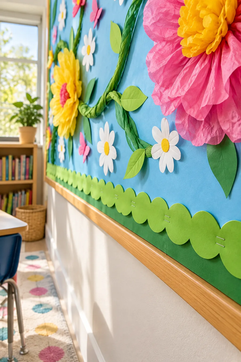
Secure both layers simultaneously using a double staple border technique to keep the heavy paper from curling under the weight of the climbing vines.
| Border Element | Spacing | Offset |
|---|---|---|
| Base Layer | Every 12 inches | Flush to edge |
| Top Layer | Every 6 inches | 1/2 inch down |
| Corner Joints | Every 2 inches | Mitered cut |
Mitering the Corner Borders
Instead of overlapping the thick scalloped edges awkwardly at the corners, cut both layers at a precise 45-degree angle. This creates a professional, picture-frame finish that draws the eye directly toward the center display.
Concealing the Outer Staples
Drive your staples strictly into the lowest valley of the scalloped edge rather than the raised peak. The overlapping waves will naturally cast a tiny shadow over the metal, hiding the hardware from everyday classroom view.
Twisting Rolled Butcher Paper Vines
Create the structural backbone using standard 36-inch wide green butcher paper cut into 12-inch strips. I actually recruit my kids to help crush the paper strips in our Austin living room before I twist them into thick, organic vines.
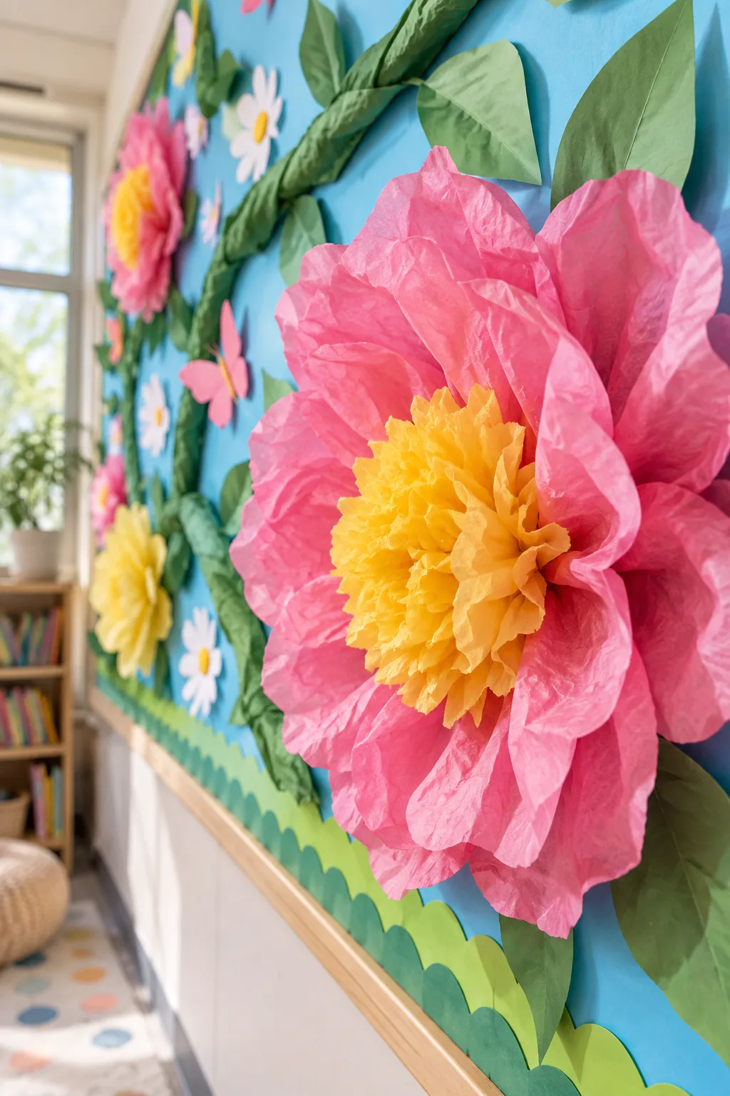
Getting the rolled butcher paper to look like a natural, woody vine requires breaking down the stiff fibers first.
Shaping the Organic Curves
Avoid pulling the vines in a perfectly straight diagonal line across the cork. Allow the twisted paper to dip and rise naturally, pinning it at the peaks to create realistic tension and dynamic visual movement.
Anchoring the Heavy Vines
Snake the twisted vines diagonally across the board, stapling them deeply into the cork every 18 inches. Hide the hardware by driving the staples directly into the deepest folds of the crumpled green paper.
Creating Vine Offshoots
Tuck smaller, six-inch strips of twisted paper behind the main vine to create branching offshoots. These secondary branches provide perfect resting spots for the folded butterflies and help balance the massive scale of the focal flowers.
Crafting the Bunched Tissue Center
Anchor the design with oversized, high-impact florals built by layering 6 to 8 sheets of tissue paper. Give them realistic depth by tightly crumpling a contrasting yellow center and fanning it out aggressively.
These oversized flowers act as heavy focal points, so they require a specific mounting sequence to stay secure without crushing the delicate bunched tissue center.
Fanning the Outer Petals
Once the core is securely stapled to the board, gently pull each pink tissue layer forward individually. Starting from the innermost petal, shape the paper into a rounded, voluminous bloom that extends up to six inches off the wall.
Securing the Giant Blooms
Prevent the heavy tissue flowers from drooping forward by adding a hidden loop of masking tape behind the top petal. Pressing this top edge flat against the blue sky foundation keeps the bloom facing directly outward.
Hiding the Mounting Hardware
Pinch the yellow center tissue aggressively over the central staple until the metal is completely invisible. The dense crumpling technique traps the hardware securely while maintaining the fluffy, organic texture of the flower core.
Adding Dimension with Daisies and Butterflies
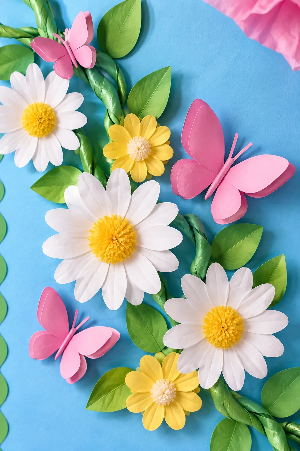
Fill the negative space along the vines with smaller, rigid paper daisies and folded butterflies. Crease the butterfly wings at a sharp 45-degree angle and attach only the center body so they appear to be landing.
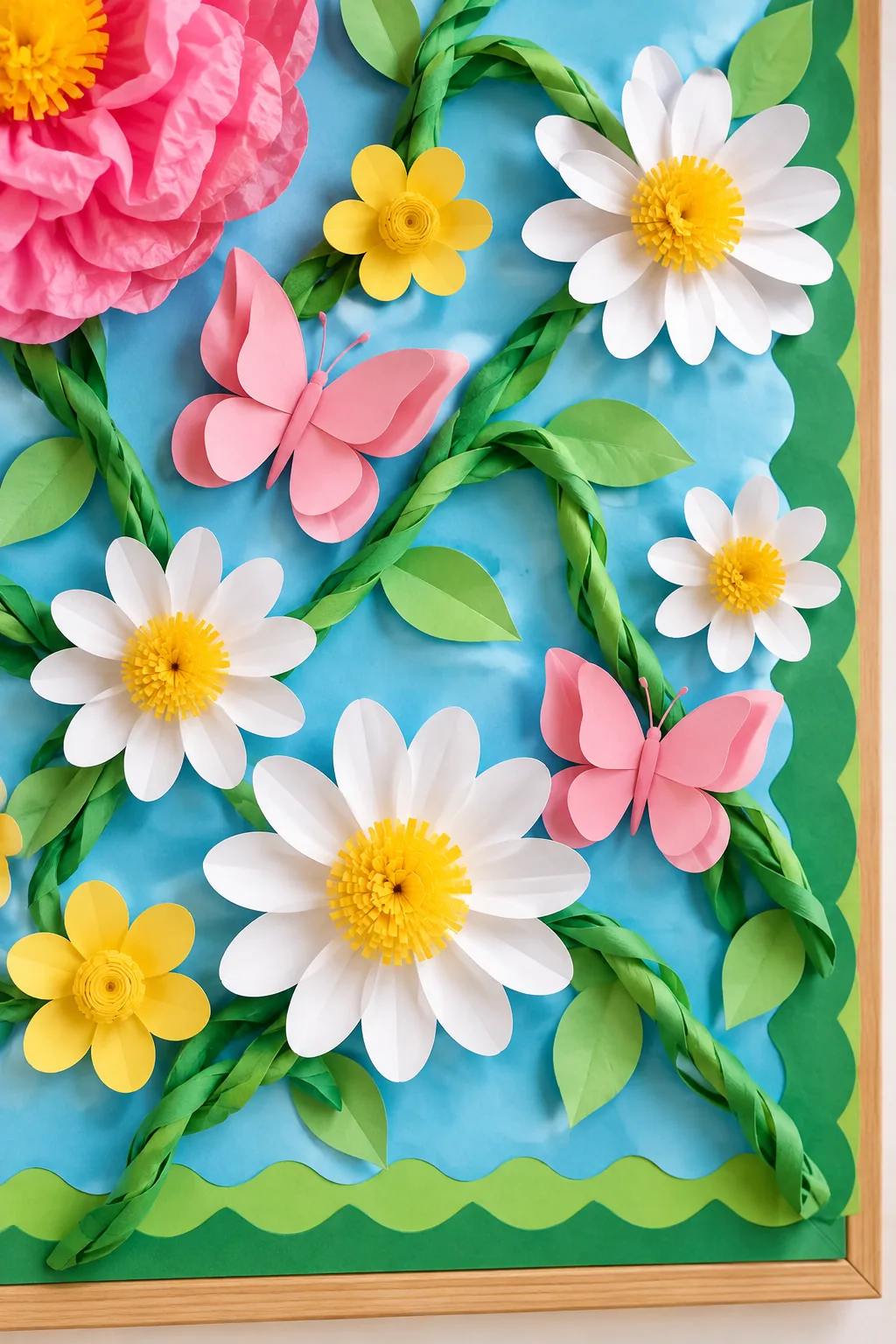
Balancing the massive pink blooms requires strategic placement of these smaller, delicate accents throughout the green foliage.
Creasing the Butterfly Wings
Use a bone folder to create a crisp, permanent crease down the spine of each cardstock butterfly. This rigid fold ensures the wings remain elevated and cast beautiful, delicate shadows against the blue background paper.
Selecting the Right Cardstock
Cut your smaller daisies and butterflies from premium 65-pound cardstock rather than standard printer paper. This heavier weight guarantees the delicate folded wings will hold their sharp 45-degree angle without wilting in humid classroom environments.
Placing the Smaller Accents
Avoid spacing the white daisies evenly across the board like polka dots. Clustering them tightly around the junctions where the vines branch off creates a much more natural, overgrown garden aesthetic.
Floating the Title with Foam Tape Risers
Make the seasonal greeting stand out from the busy floral background by applying 1/2-inch thick adhesive blocks. The first time I tried this in my own workspace, I used cheap tape and woke up to a pile of fallen letters, so always invest in heavy-duty adhesive.
Aligning the Floating Letters
Stretch a temporary leveling string across the top third of the board to keep your title perfectly straight. Press the foam tape risers firmly against the cork for ten seconds to ensure a permanent bond.
Testing the Adhesive Strength
Before committing to your final layout, test one foam riser on a scrap piece of the blue background paper. If the adhesive peels away easily, switch to an industrial-strength mounting square to prevent the title from falling.
Spacing the Title Words
Leave exactly two inches of negative space between each word to guarantee readability from the back of the classroom. The deep drop shadows cast by the risers can make tightly packed letters blur together visually.
Downloading the 3D Template and Layout Map
Recreate these exact proportions without the guesswork using our comprehensive digital packet. The downloadable PDF includes the printable petal shapes for the giant flowers and a gridded spatial map showing exactly where to anchor the vines.
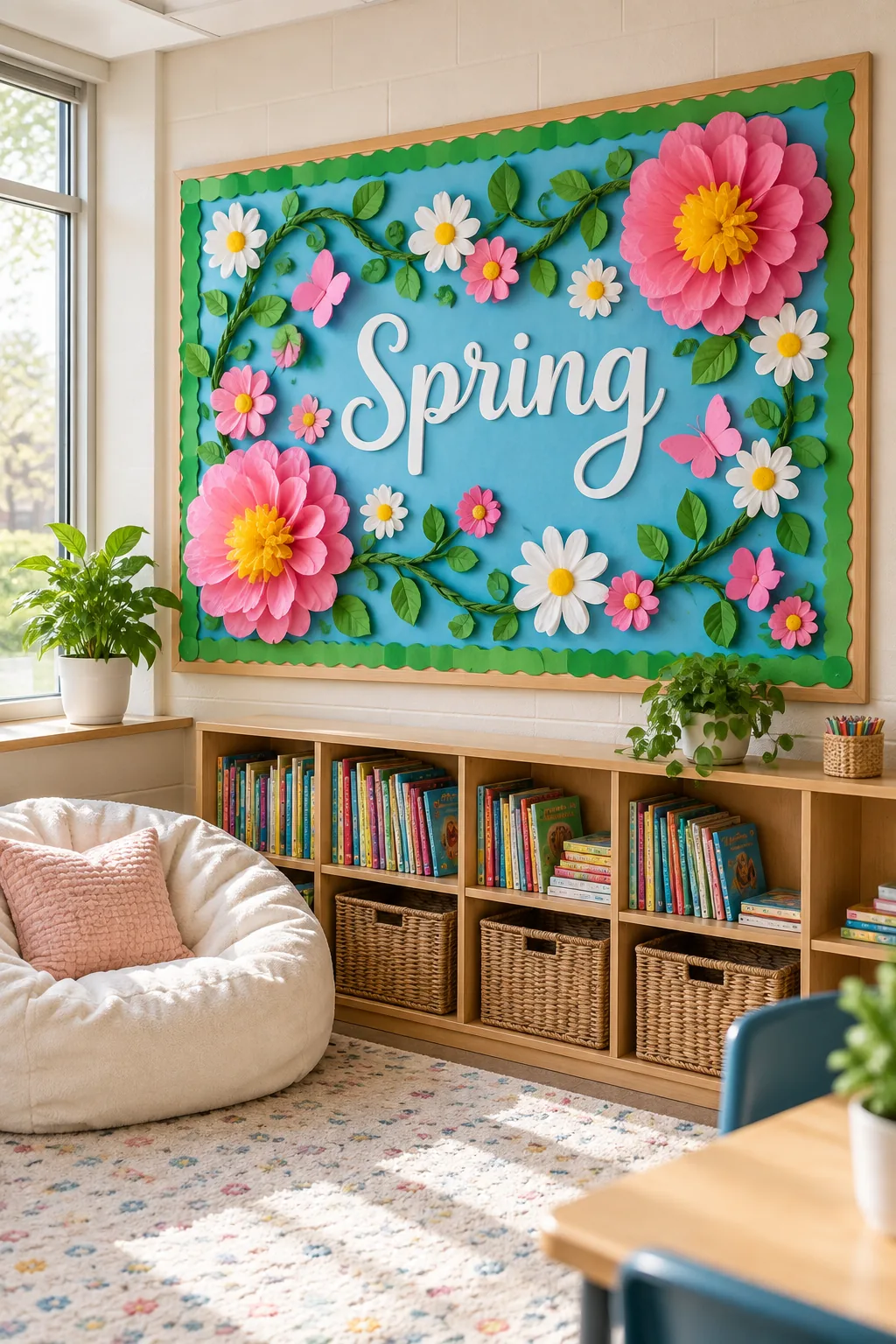
- Printable giant petal templates
- Scaled letter sizing guide
- Gridded 4×8 spatial layout map
- Butterfly and daisy cut files
Printing the Petal Shapes
Print the large petal templates directly onto heavy 80-pound cardstock to create durable tracing patterns. This allows you to quickly cut multiple tissue paper layers at once without the template tearing or shifting out of place.
5 More Ways to Style a Spring Board
Adapt these 3D techniques to fit any classroom theme or color palette.
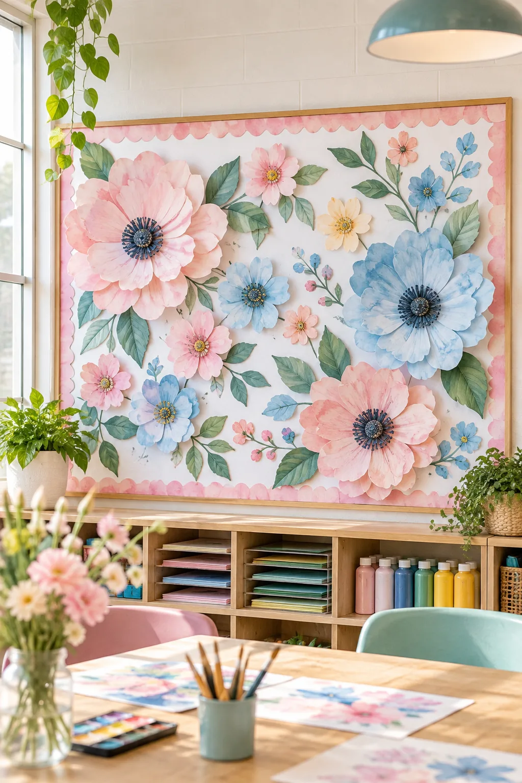
Pastel Watercolor Art Room: Swap bright tissue for hand-painted watercolor paper to create a softer, artistic focal point.
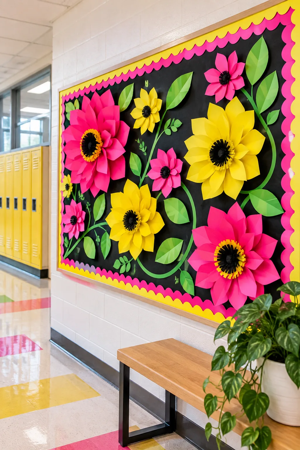
High-Contrast Neon Brights: Use a black background to make electric neon paper blooms absolutely pop in a dim hallway.
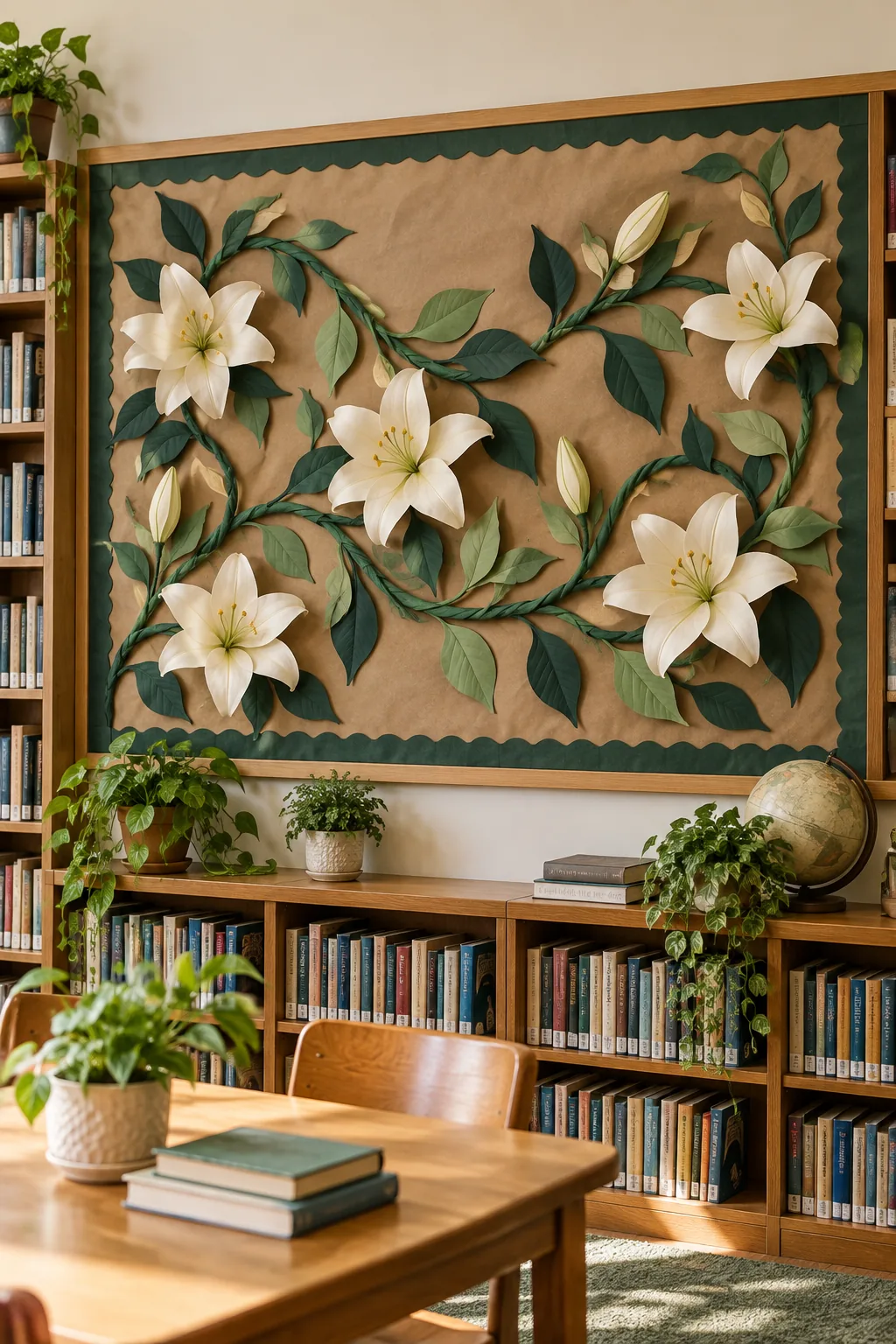
Earthy Kraft Paper Botanical: Pair brown kraft paper with deep greens and cream florals for a calming, natural library display.
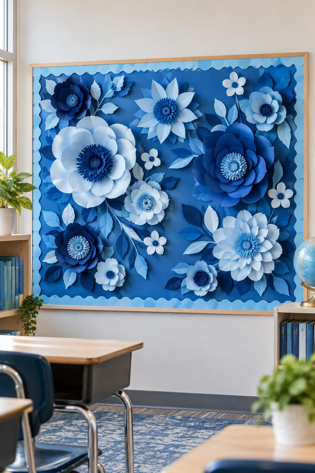
Monochromatic Layered Blues: Stick to a single color family with varying shades of blue for a structured, modern aesthetic.
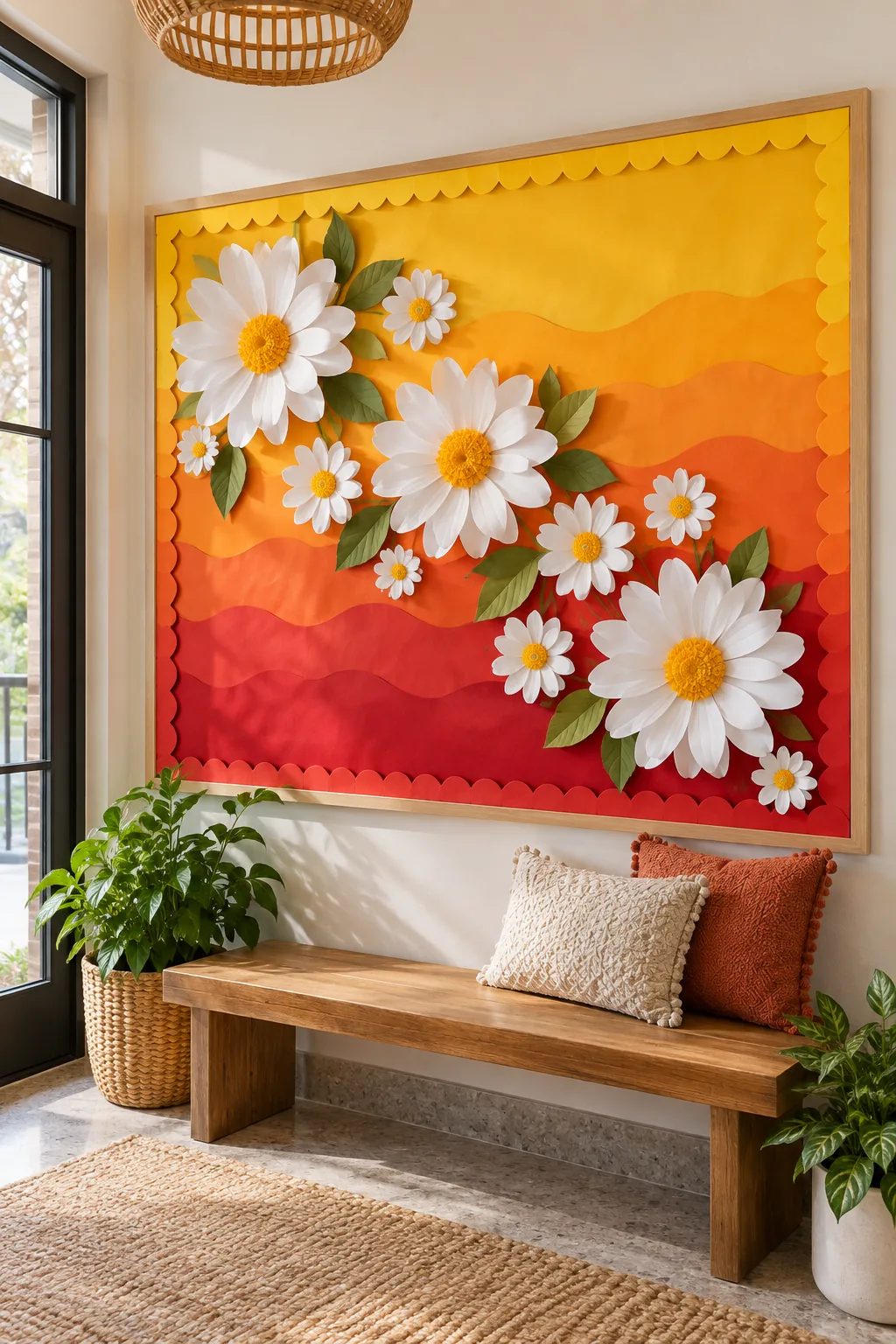
Vibrant Sunset Ombre: Blend warm orange and yellow background papers to create a striking sunset effect behind crisp white florals.
Keeping the 3D Elements Crisp All Season
Maintain the board’s fresh look through the end of the semester by positioning the deepest 3D elements safely. Keep the delicate blooms at least 18 inches above the floor or adjacent desks to prevent crushing from passing backpacks.