15-Minute Shelf Styling Map: Sort Decor Like a Pro
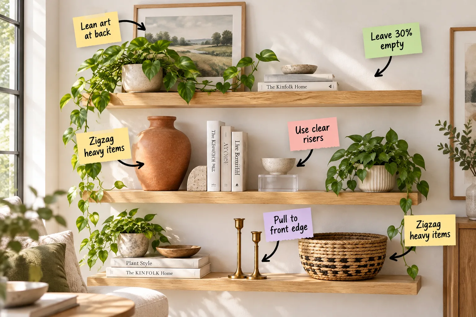
If you struggle with cluttered displays, you can finally sort your decor perfectly by downloading our free 15-Minute Shelf Styling Map. This step-by-step visual blueprint guarantees you will confidently arrange your books, art, and ceramics using a foolproof placement framework.
The 15-Minute Shelf Styling Map
Download the complete styling map to guide your process through three rapid 5-minute phases without overthinking a single placement. In my own Boston brownstone, keeping styling sessions strictly timeboxed prevents me from endlessly tweaking small objects.
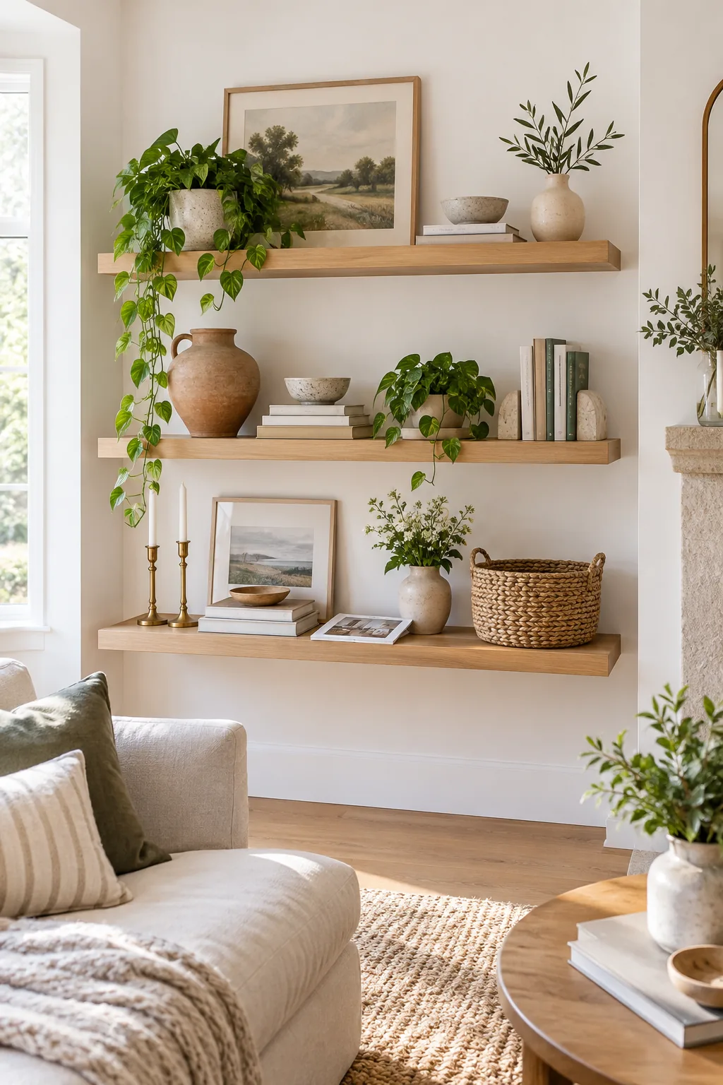
Before starting the clock on your styling map, gather your materials to ensure an uninterrupted workflow.
Build Depth With Leaning Art
Start your timer and establish the background layer first by leaning a framed landscape print against the back wall. This technique instantly creates depth and covers awkward expanses of blank paint without requiring a hammer and nails.
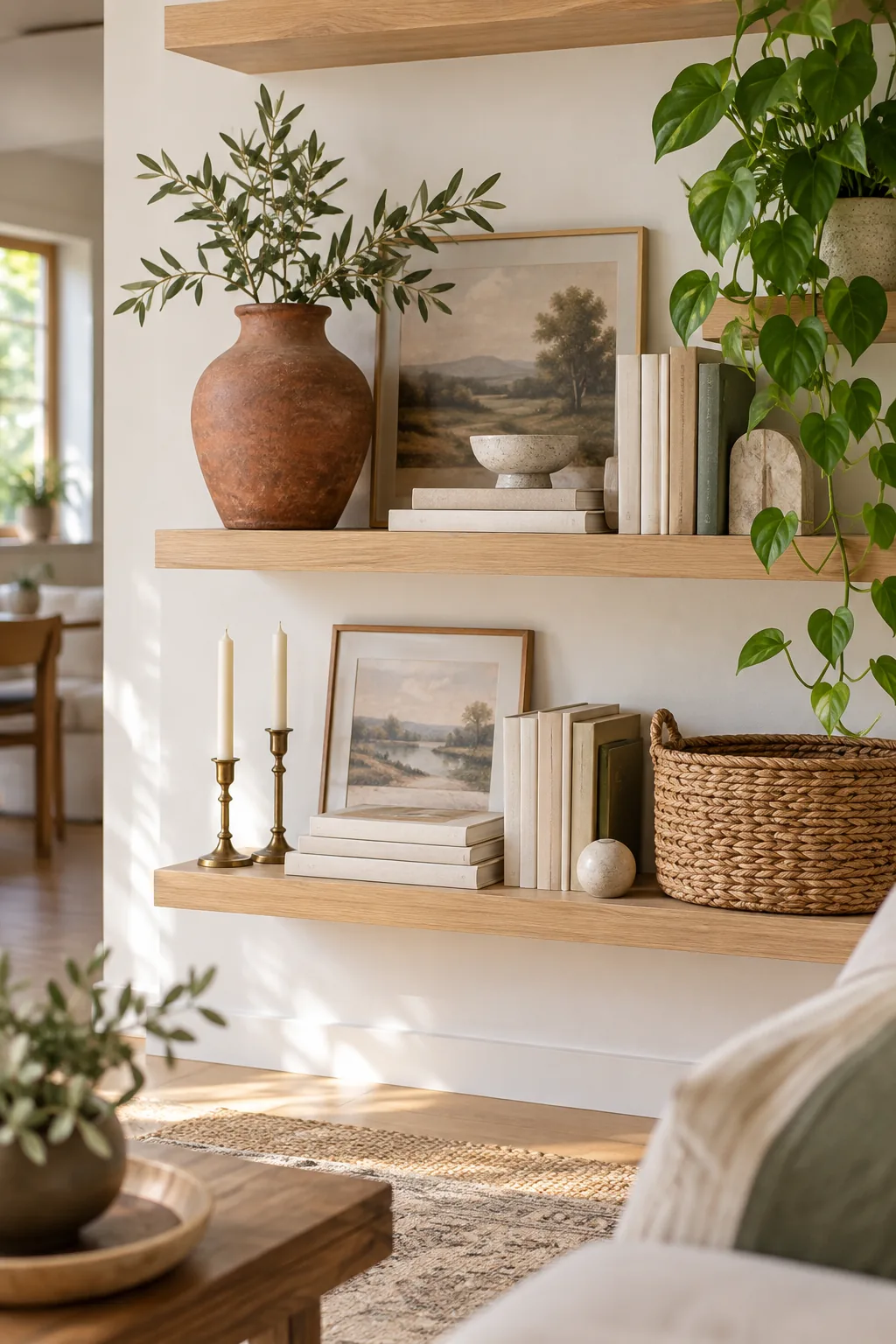
Tucking the frame slightly behind a trailing pothos plant softens the rigid corners of the artwork. This deliberate layering grounds the arrangement and makes the entire shelf feel intentionally curated rather than randomly assembled.
- Place your largest frame slightly off-center on the middle shelf.
- Lean a smaller, contrasting frame in front of it, overlapping the edge by two inches.
- Position a cascading plant adjacent to the frames to break up the straight vertical lines.
Zigzag Your Heaviest Anchors
Distribute physical and visual weight by placing your largest items on opposing sides of different tiers. I always start by positioning a large terracotta vase on the middle left and a heavy woven basket on the bottom right.
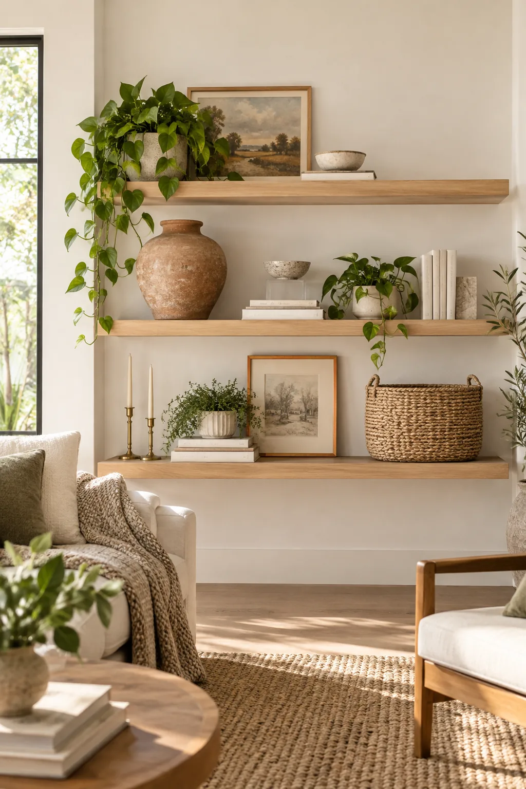
This stabilizing diagonal zigzag prevents the shelving unit from feeling lopsided or top-heavy. Balancing these substantial anchors early in the process creates a reliable structural framework for the smaller, more delicate layers to follow.
Protect 30 Percent Negative Space
Resist the urge to pack every inch of wood with objects by actively leaving exactly 30% of the shelf surface completely bare. This deliberate blank negative space on the top shelf gives the eye a critical place to rest.
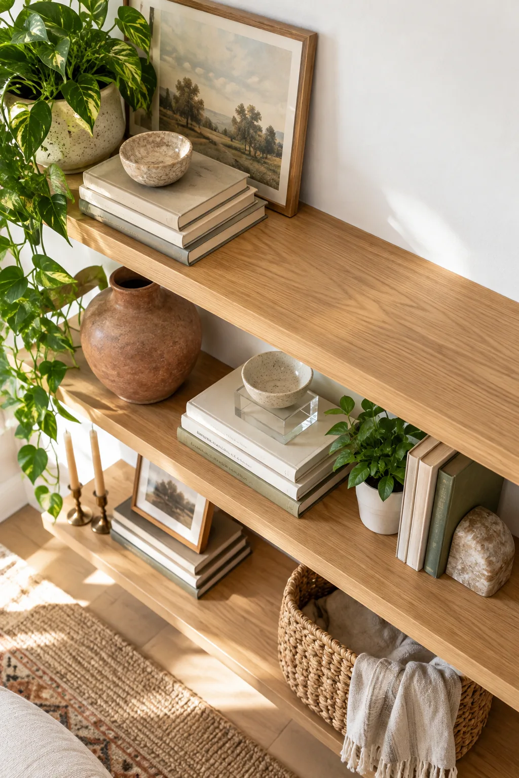
Protecting these empty zones elevates the remaining decor from cluttered to curated. When you allow breathing room around your favorite pieces, their unique shapes and textures stand out much more effectively against the wall.
| Shelf Tier | Decor Allocation | Negative Space |
|---|---|---|
| Top Shelf | 40% | 60% |
| Middle Shelf | 70% | 30% |
| Bottom Shelf | 80% | 20% |
Elevate Small Bowls on Clear Risers
Give petite ceramics enough height to be seen behind book stacks by placing a small ceramic bowl on a 2-inch transparent acrylic block. This clever trick makes the piece float effortlessly in the middle ground without adding visual bulk.
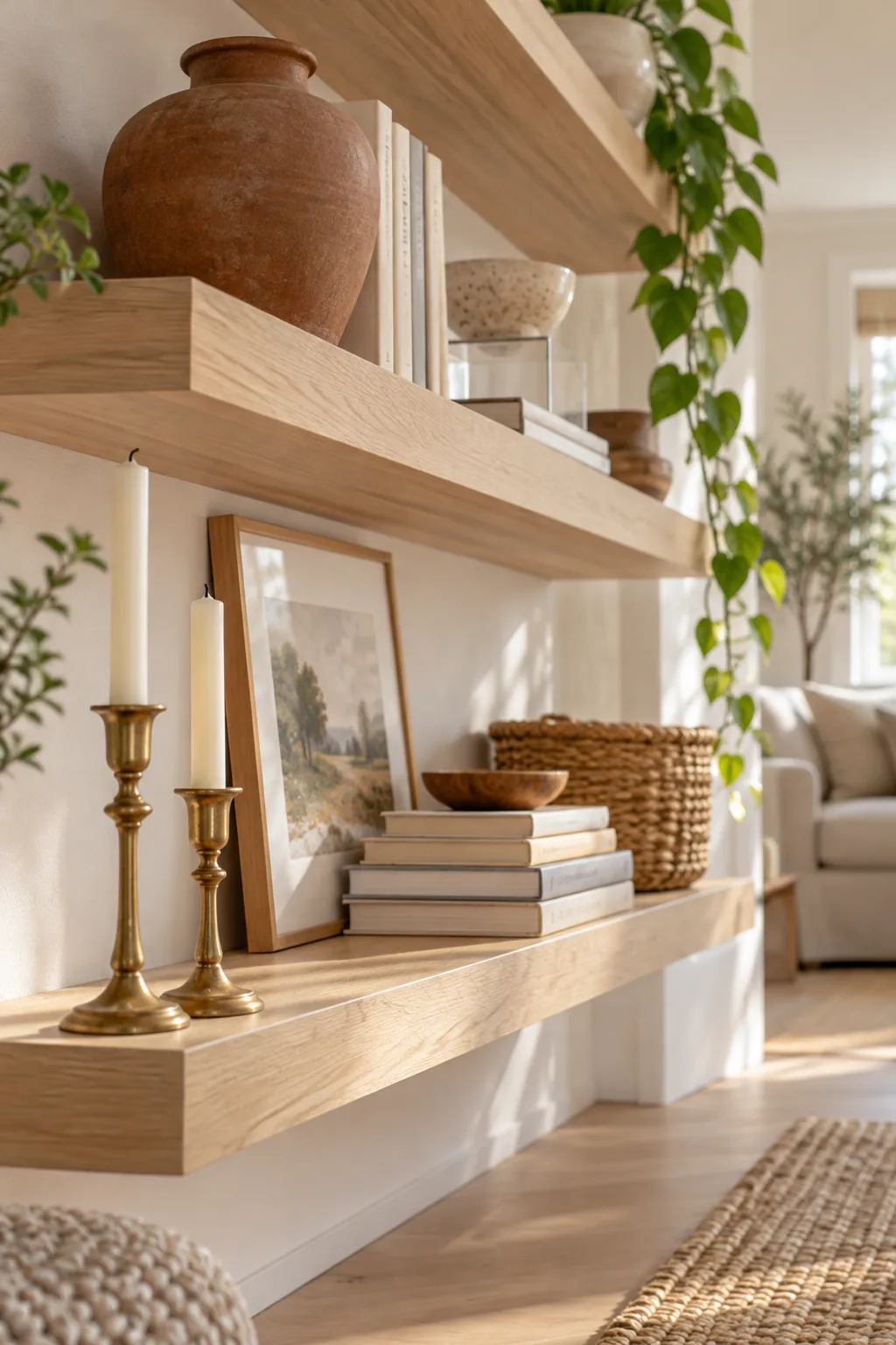
If you do not have acrylic display blocks on hand, you can easily fake the floating effect with everyday household items.
Pull Details to the Front Edge
Finish your 15-minute session by pulling slender foreground items all the way forward. In client projects, I always position brass candlesticks exactly at the front lip of the shelf to maximize the distance from the back wall.
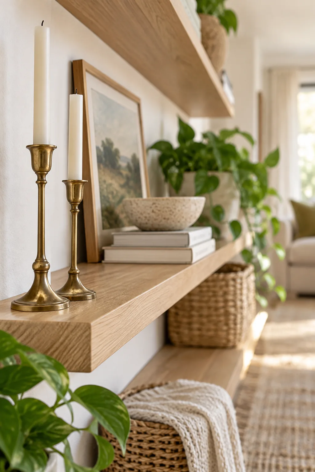
This simple adjustment dramatically enhances the room’s perceived depth by forcing the eye to travel from the immediate foreground to the leaning art behind it. Your styling is now complete, balanced, and perfectly layered.
5 Ways to Style Floating Shelves
Pick a styling direction that perfectly matches your room's mood and color palette.
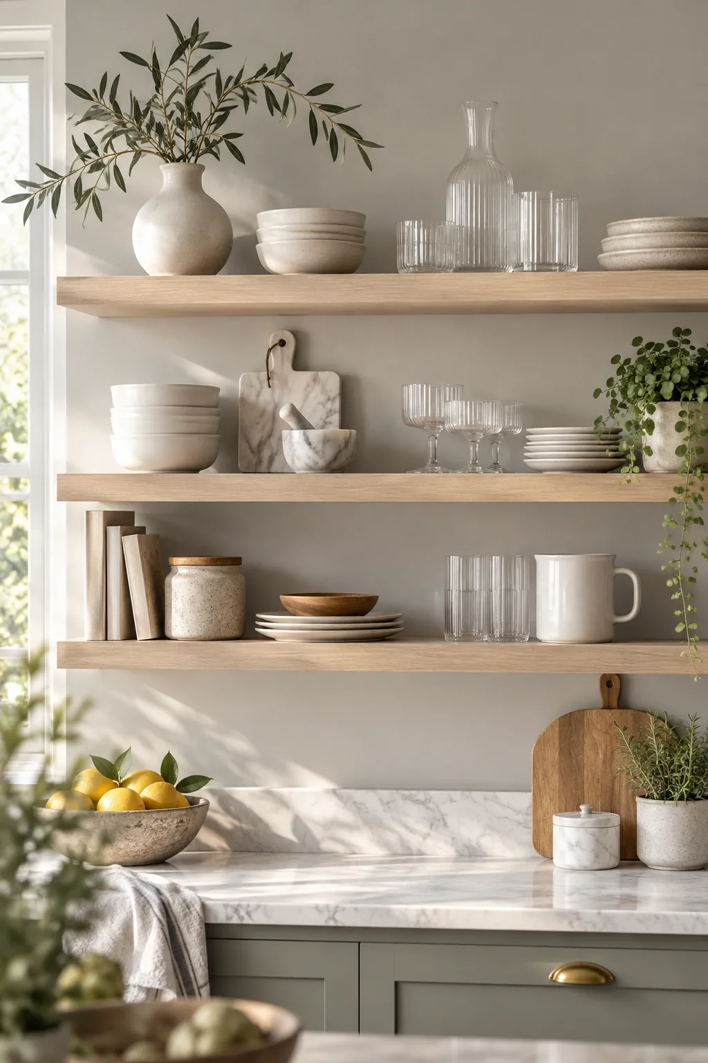
Minimalist Scandi Kitchen Shelves: Keep the palette strictly monochromatic with matte white ceramics and clear ribbed glass for an airy, uncluttered kitchen display.
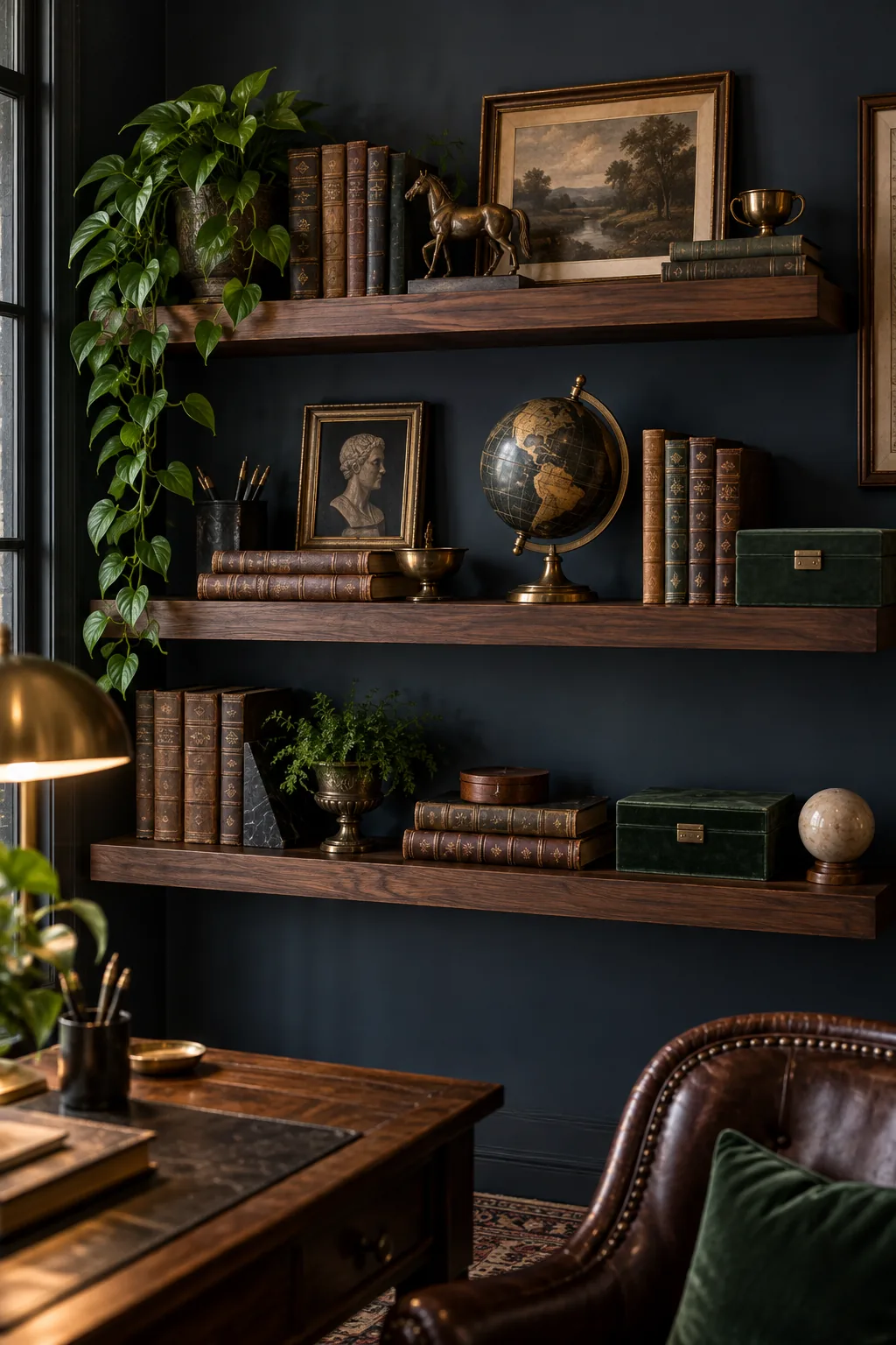
Moody Dark Academia Office: Embrace rich contrast by pairing dark walnut wood with antique brass accents and deep navy walls for a sophisticated study.
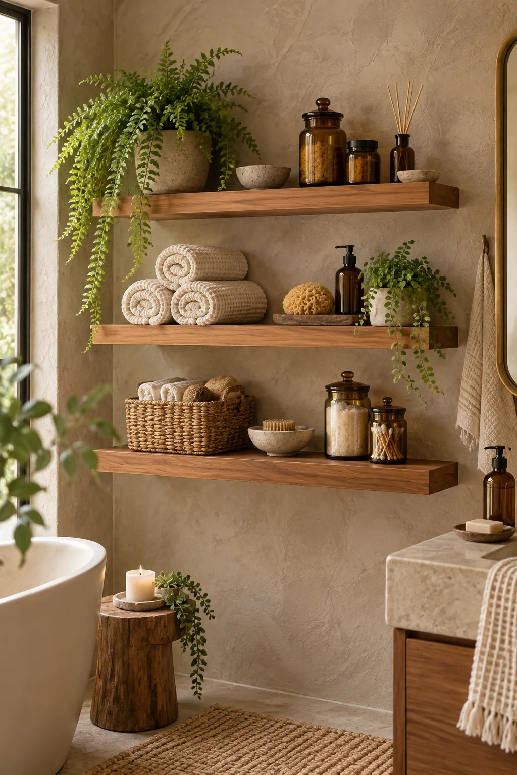
Earthy Organic Bathroom Display: Turn bathroom storage into decor by displaying rolled waffle towels alongside warm amber glass jars and moisture-loving ferns.
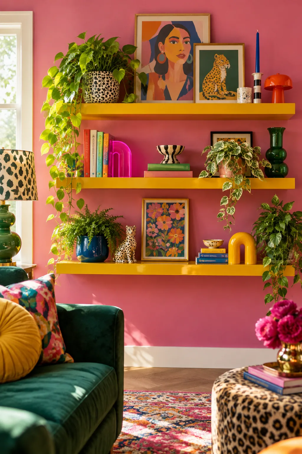
Colorful Maximalist Living Room: Break all the neutral rules by painting the shelves a glossy mustard yellow to contrast against vibrant pink walls and eclectic art.
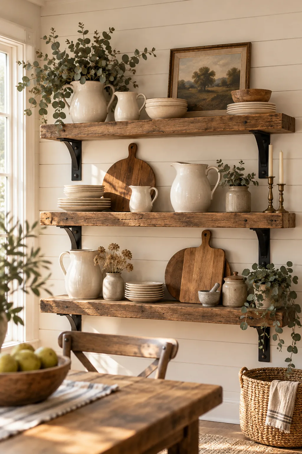
Rustic Farmhouse Dining Shelves: Lean heavy wooden cutting boards behind a collection of antique ironstone pitchers to create a warm, lived-in farmhouse dining room.