
16+ Playful Kids Room Color Ideas for Your Home
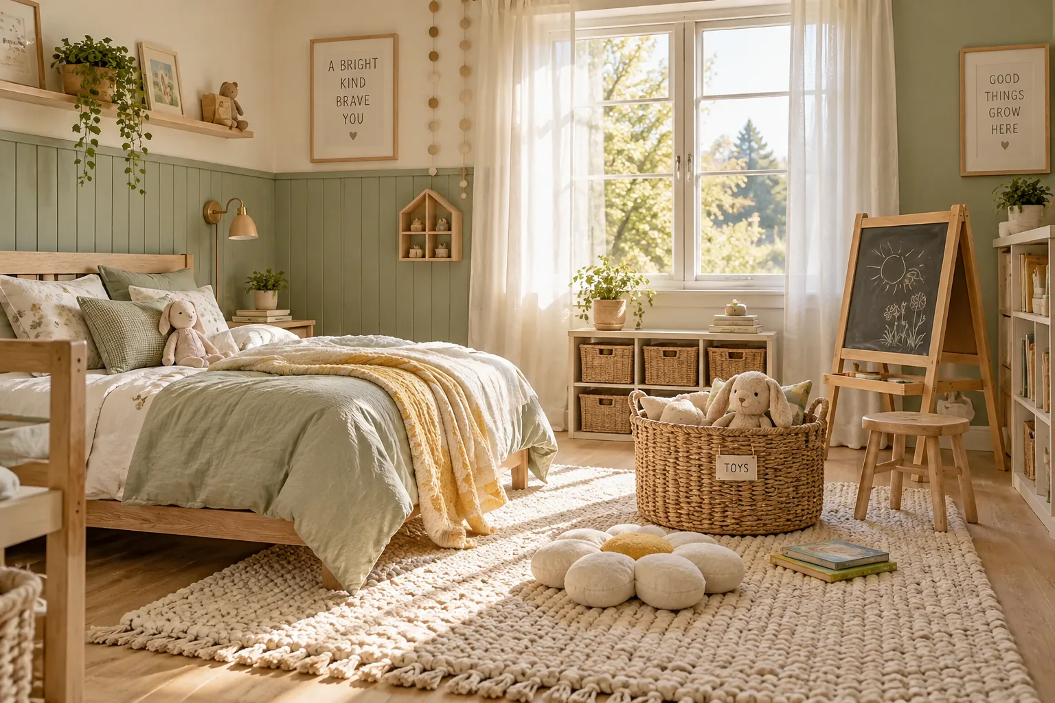
Picking the right paint for a child's space is all about balancing their current obsessions with a foundation that lasts. These color strategies give you a practical way to bring their personality into the room without needing to repaint every two years.
1. Deep Navy Accent Wall
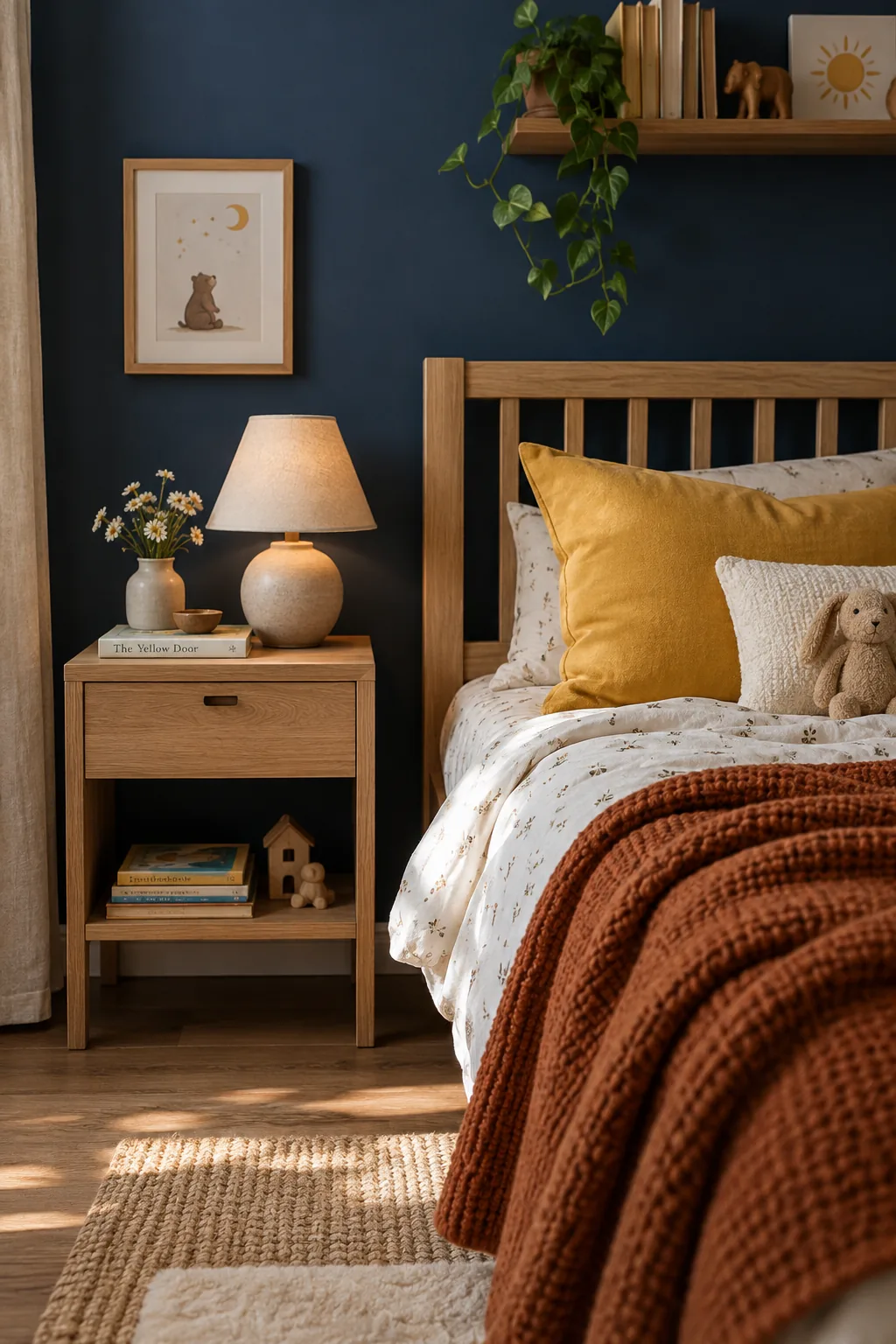
Anchoring a room with a deep navy accent wall makes it work because dark colors hide fingerprints while instantly grounding the space. You can pair this rich backdrop with light oak furniture to keep the room feeling airy and bright. Adding pops of mustard yellow or bright orange through textiles brings in that necessary youthful energy. It gives the room a sophisticated edge that easily transitions from toddler years right into the teens.
2. Half-Painted Wainscoting Effect
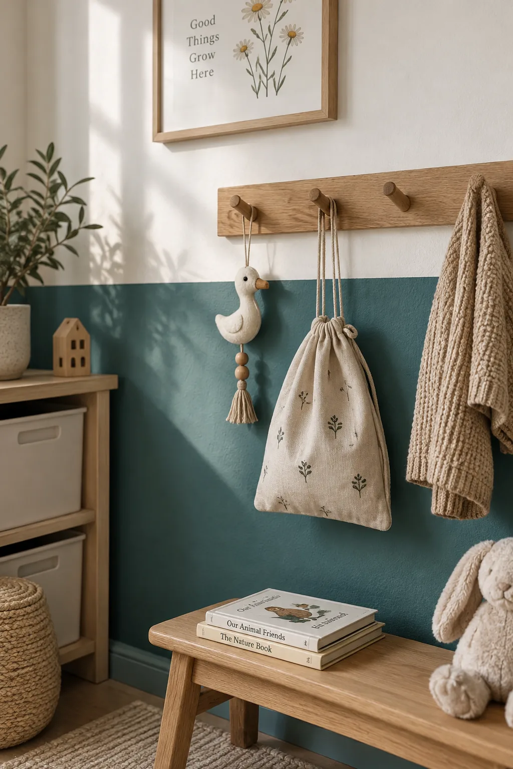
Kids naturally gravitate toward bright, saturated hues that can easily overwhelm a small bedroom.
You can tame those intense shades by painting just the lower third of the wall. This creates a colorful wainscoting effect without the need for actual wood paneling.
Keep the upper wall a crisp white to reflect light around the room.
3. Mint Green Split
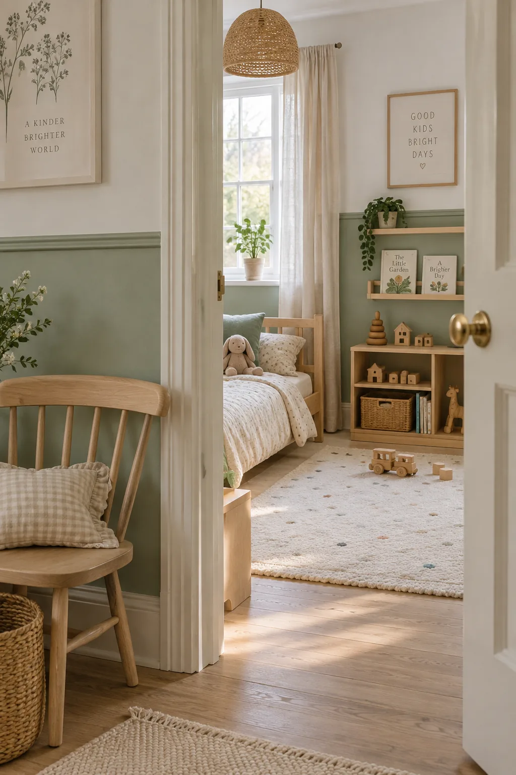
A 50/50 split of mint green and soft white instantly brightens a north-facing room.
This exact ratio provides enough color to feel playful without darkening the space. You just run a piece of painter's tape right at the chair-rail height and roll the color below. It leaves a clean, modern finish that works beautifully with natural wood toys.
4. Blush Pink Ceiling
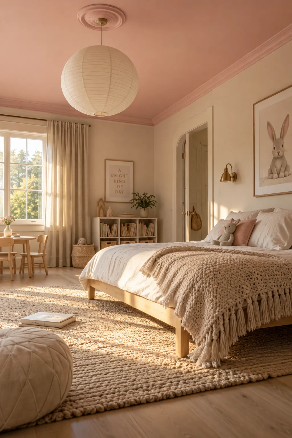
Most people forget to look up when planning a bedroom color scheme.
Painting the ceiling a soft blush pink draws the eye upward and makes the room feel taller. It acts like a canopy over the bed.
Leave the walls a warm oatmeal shade to let the ceiling be the star.
5. Warm Terracotta Tones
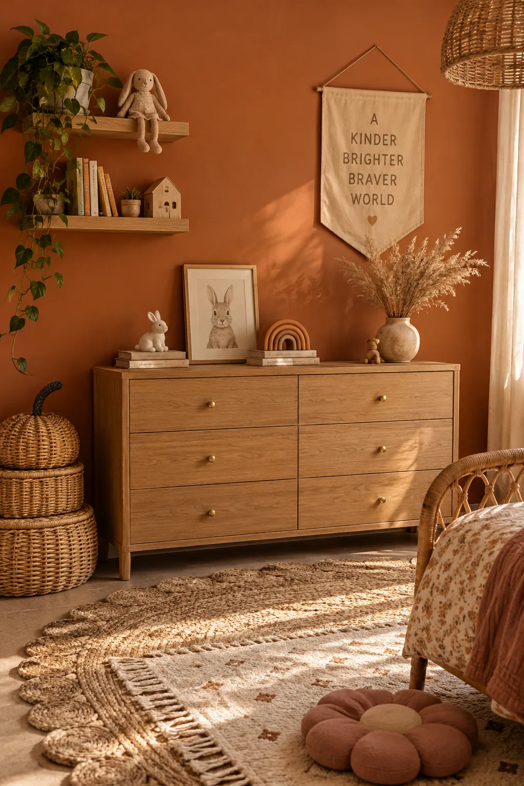
Using terracotta orange makes it work because this earthy tone brings incredible warmth to a space without feeling like a neon sign. It pairs flawlessly with rattan baskets, layered rugs, and simple brass hardware for a relaxed bohemian vibe.
6. Monochromatic Blue Layers
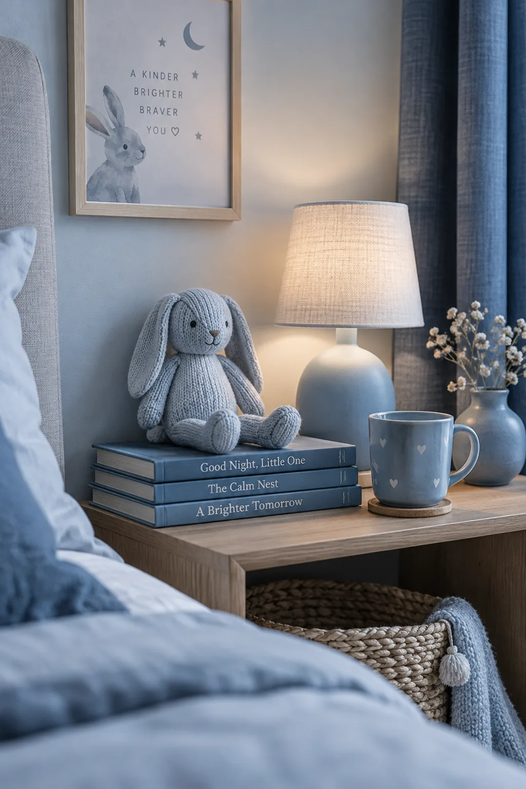
A monochromatic blue palette creates a soothing, underwater feel.
You can layer different shades of the same color, starting with a pale icy blue on the walls and using a deep denim for the curtains. This tonal approach keeps the room visually calm, which is exactly what you want at bedtime.
7. Painted Headboard Arch
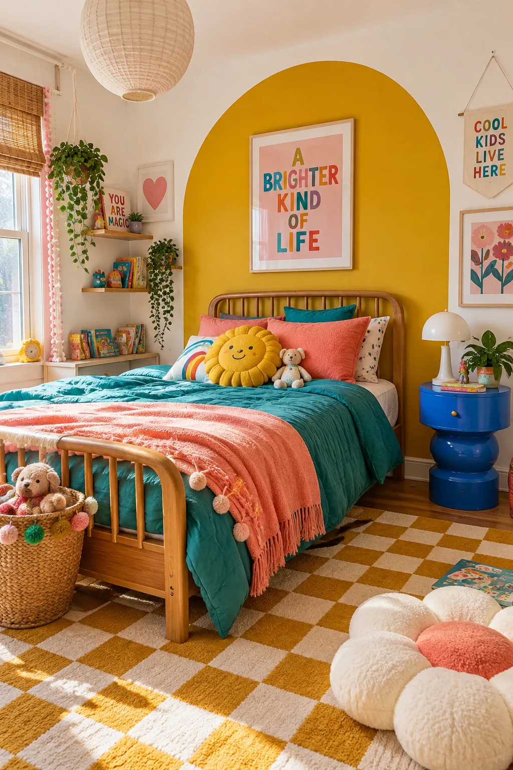
Color blocking geometric shapes makes it work by turning bare walls into instant art.
You can paint a giant mustard yellow arch directly behind the headboard to frame the bed. It costs the price of a single quart of paint but completely defines the sleep zone.
8. Moody Forest Green
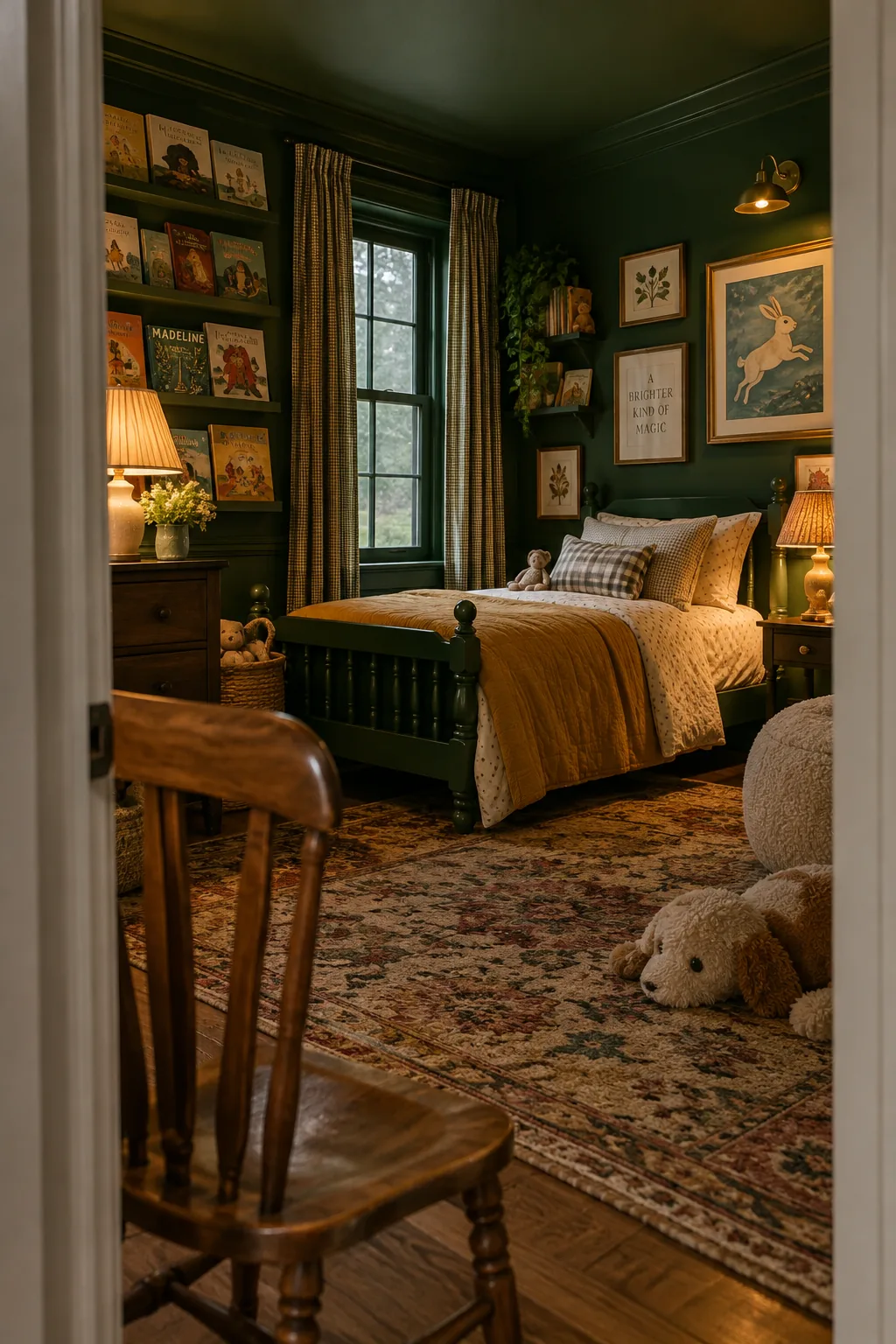
I always loved the idea of a dark, moody bedroom for kids, even though it goes against traditional advice. Wrapping a room entirely in forest green creates the coziest little den for reading and sleeping. You just need to ensure you have plenty of warm table lamps and overhead lighting. The rich color makes colorful book covers and artwork pop right off the walls.
9. Contrasting Trim
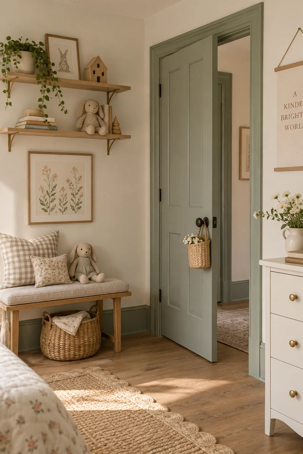
Painting all the trim and doors a contrasting color makes it work by highlighting the room's architecture.
Instead of standard white baseboards, try a dusty sage green against cream walls. It adds a subtle layer of custom design that feels incredibly high-end but only takes an afternoon to complete.
10. The Three-Color Rule
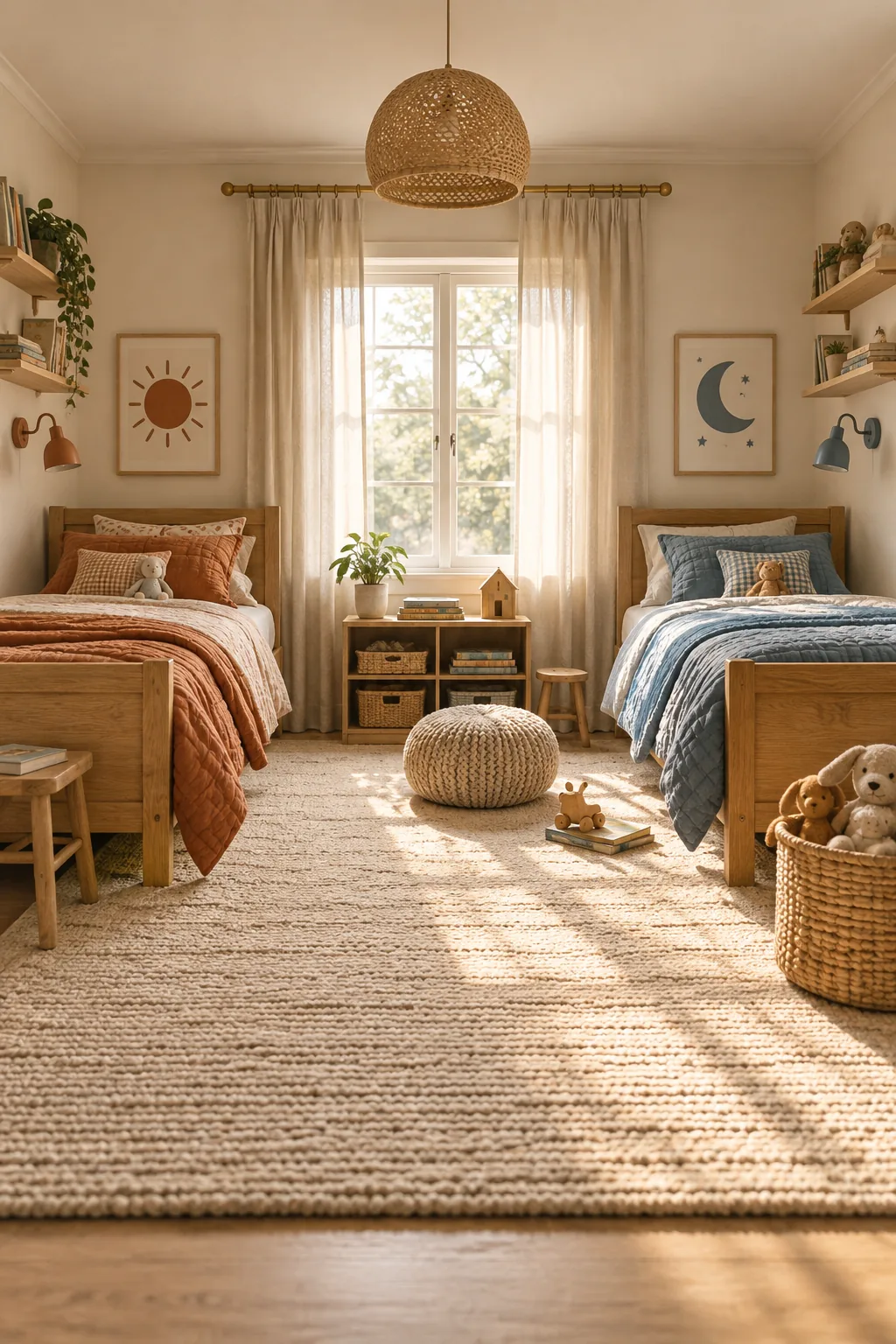
Stick to a strict palette of three colors to keep a shared bedroom from looking chaotic. You can use a warm beige as your base, then let each child pick one accent color for their bedding and art. This gives them individual ownership of their side while maintaining a cohesive look overall.
11. Testing Sunny Yellow
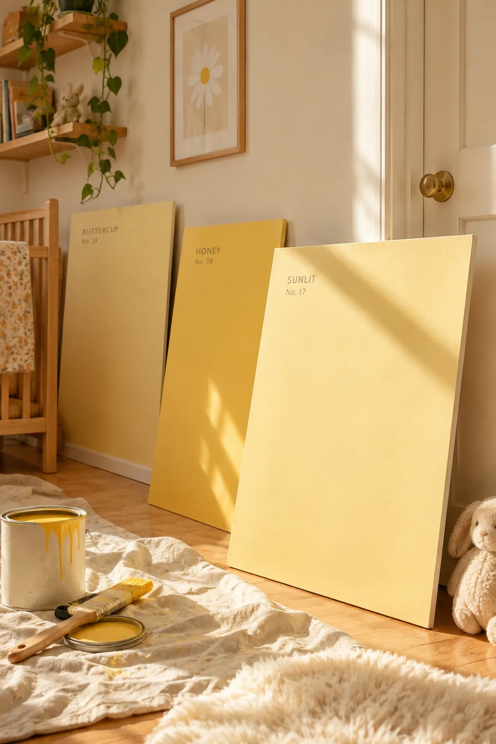
Always test your paint swatches on multiple walls before committing to a bright color. A sunny yellow might look cheerful by the window but turn completely neon in the dark corners of the room. Paint large poster boards and move them around at different times of the day to see how the light hits them. This extra step prevents those expensive repainting mistakes. It guarantees you get that soft, buttery tone you actually wanted.
12. Hidden Closet Color
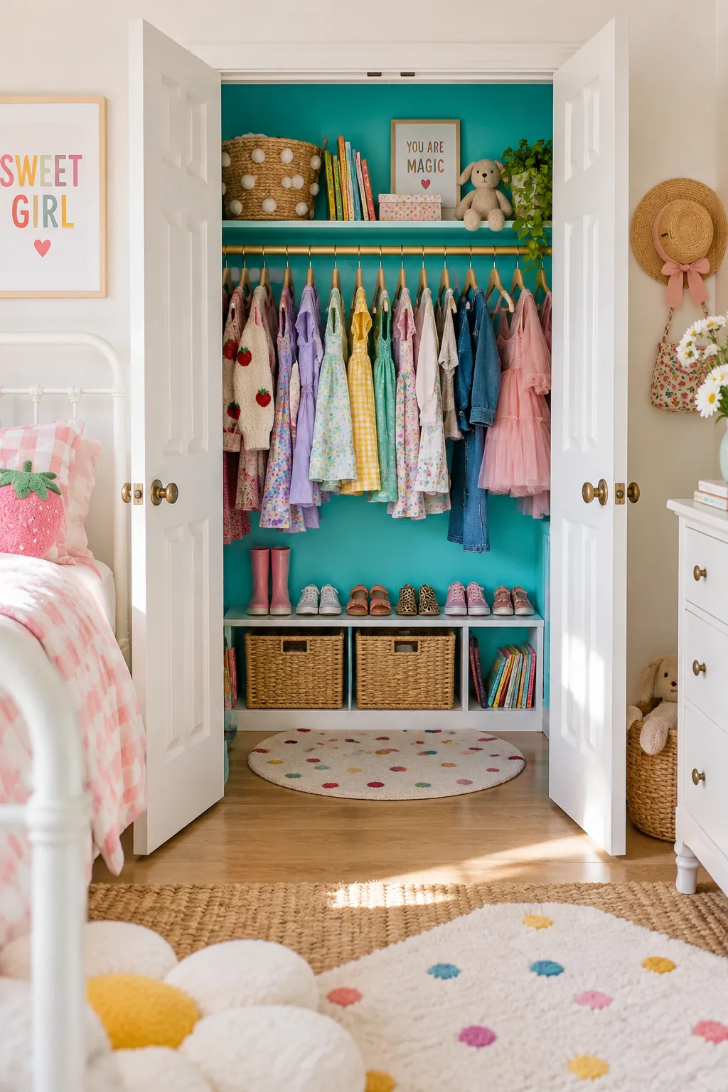
I recently painted my nephew's closet interior a vibrant turquoise.
It is such a fun surprise every time he opens the doors to grab his clothes. Using a bold hidden color is the perfect compromise when your kid wants a wild shade but you want to keep the main bedroom calm.
13. Tinted Chalkboard Walls
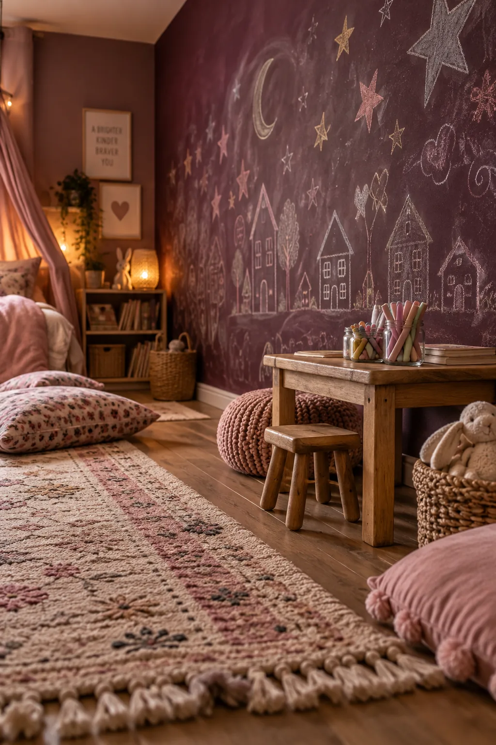
Chalkboard paint has evolved way beyond that classic schoolhouse black. You can now get a tintable chalkboard finish in almost any color you can imagine. We used a deep plum shade in a recent project, giving the kids a massive canvas that blends right into the decor.
Just remember to prime the surface with regular chalk before they start drawing.
14. Removable Wallpaper Patterns
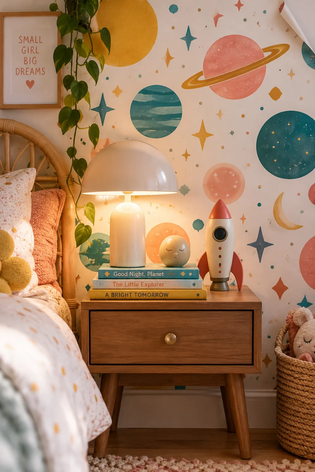
I am a huge fan of using removable wallpaper to introduce a vibrant color palette without the long-term commitment. It lets you easily incorporate fun patterns and swap them out when they inevitably outgrow the dinosaur or space phase.
- Bold floral prints
- Geometric retro patterns
- Abstract watercolor splashes
15. Painted Checkerboard Floors
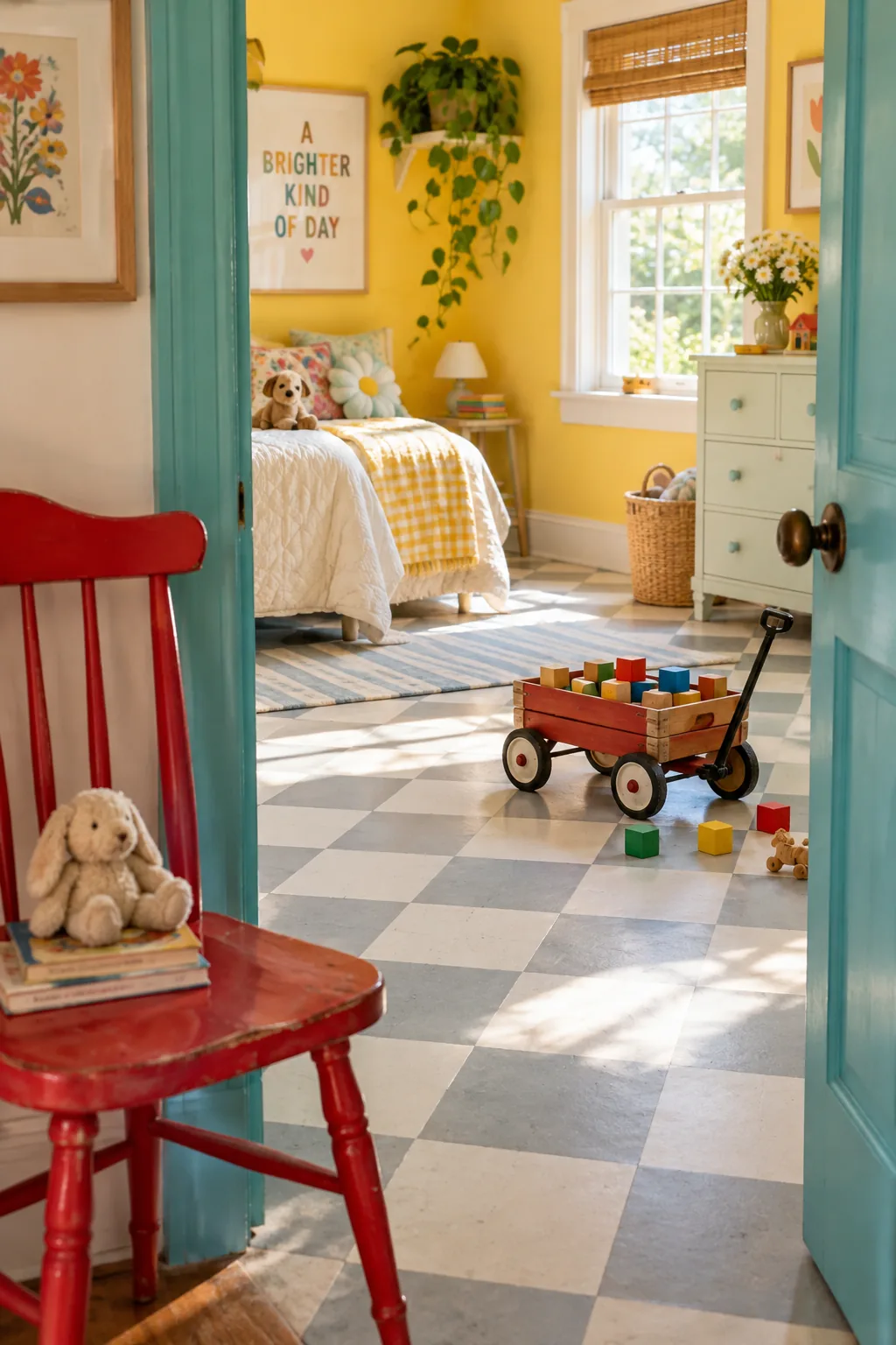
Painted floors are making a massive comeback in children's spaces right now. A classic checkerboard floor pattern in soft gray and white hides scuff marks while adding a playful graphic element underfoot.
16. Cozy Muted Peach
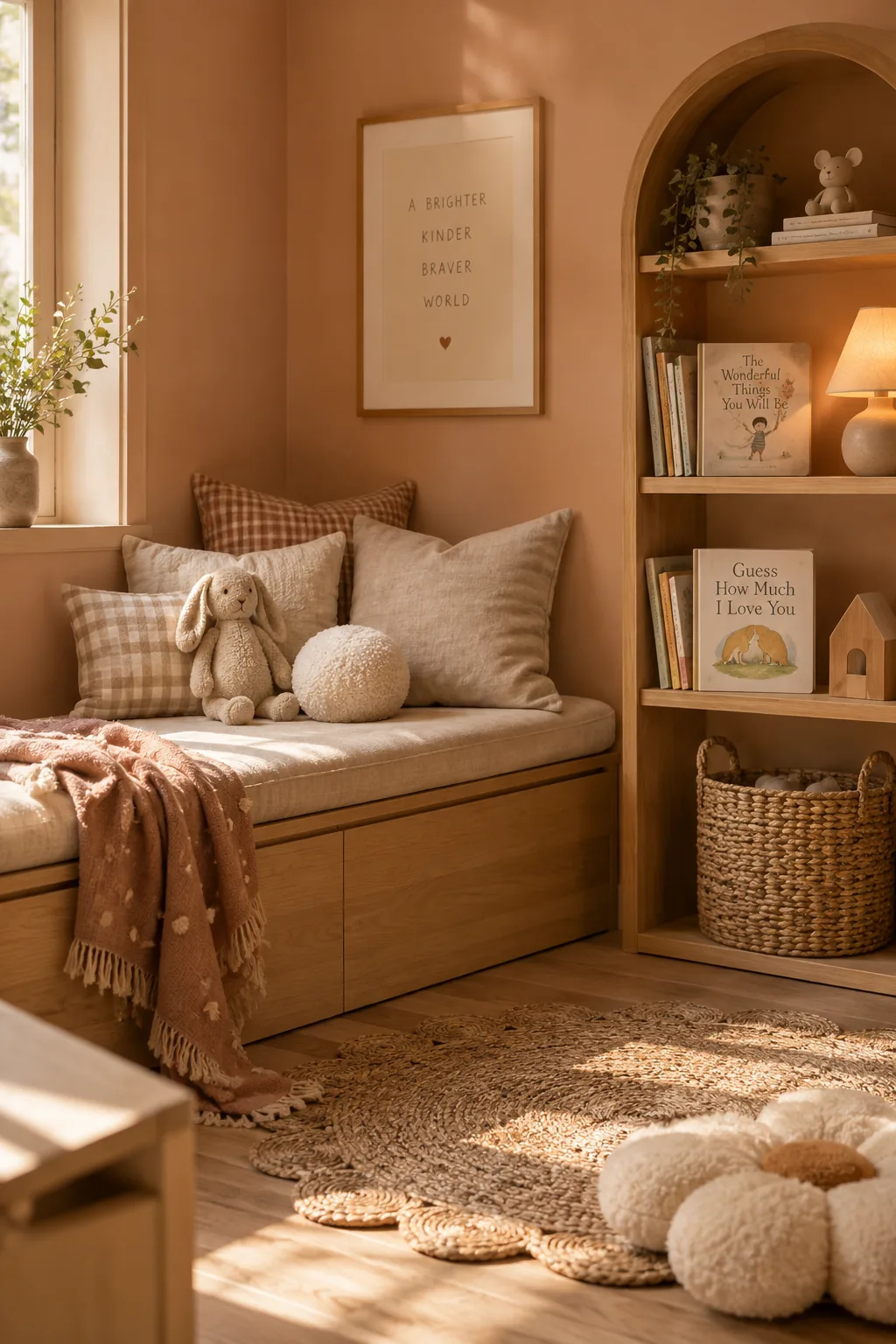
Warm colors can actually make a large, drafty room feel up to 10 percent cozier.
Wrapping the walls in a muted peach tone physically warms up the visual temperature of the space. It is a fantastic alternative to standard pink that feels a bit more modern and earthy.
17. Matte Charcoal Touch-Ups
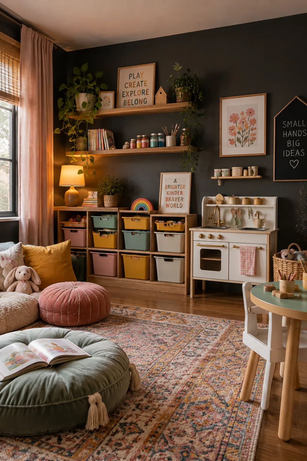
I always keep leftover paint in small glass jars for quick touch-ups. When you have a matte charcoal wall in a playroom, you will definitely need to fix the occasional toy-induced scratch.