
Blue Bedroom Styling: Your Tone & Texture Cheat Sheet
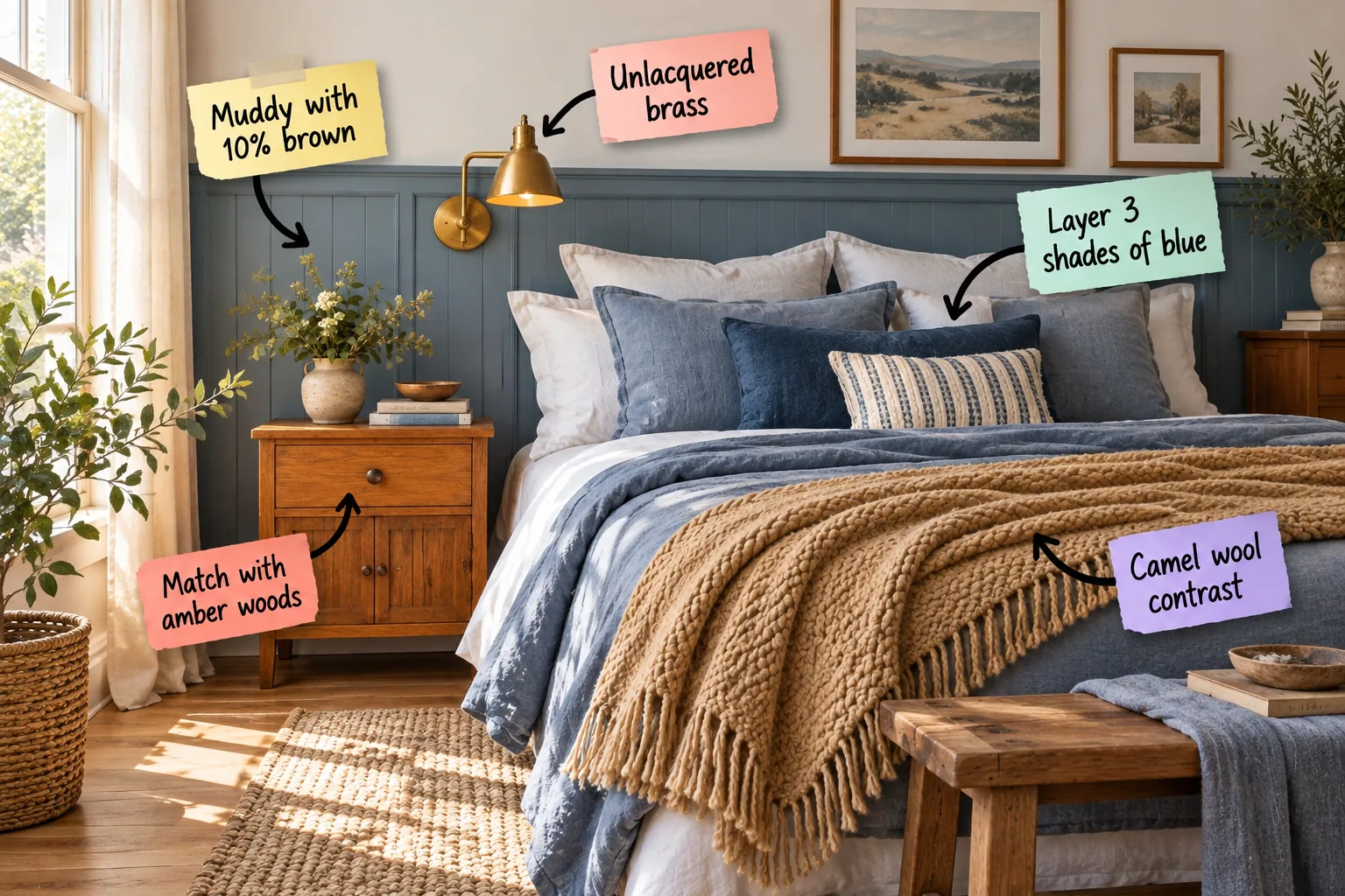
You will be able to confidently mix muddy blue paint, amber wood tones, and warm textiles using our step-by-step styling guide. Master the exact color ratios and material pairings to build your complete blue room tone and texture cheat sheet.
Grounding the Walls with Muddy Blue
Pure blue feels inherently cold in a bedroom, which is why I always specify a muddy blue with a 10 percent brown undertone. In my own Denver home, a pure blue guest room felt freezing until I repainted it with this exact earthy modification.
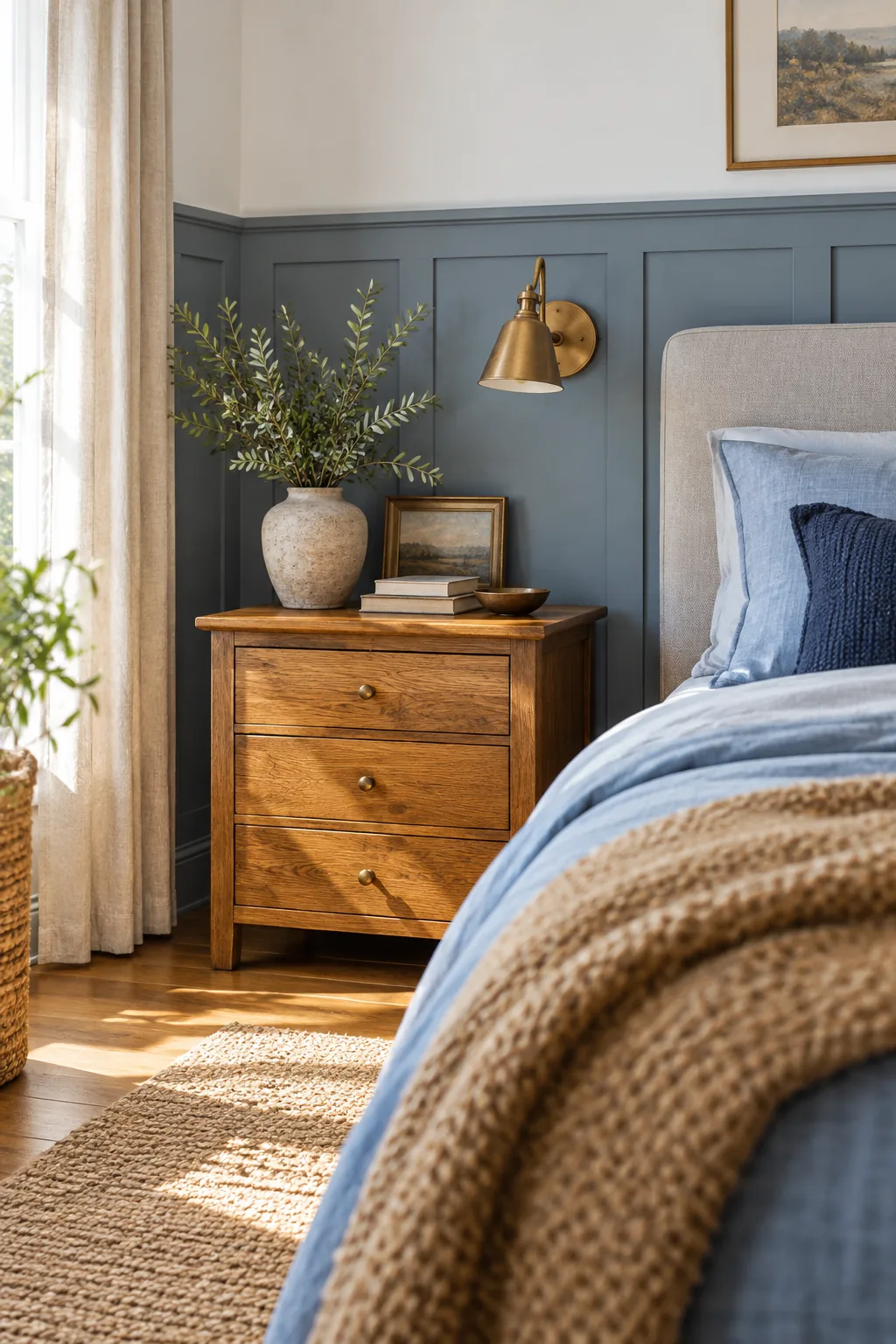
Installing the wainscoting at a standard height of 36 to 42 inches anchors the lower half of your room beautifully. Before you commit to your architectural paneling, you must verify your room proportions to ensure the horizontal lines feel intentional.
Managing Natural Light in a Blue Room
Rooms facing north receive cooler, bluer light that heavily amplifies the chill of any painted surface. If your bedroom lacks direct southern exposure, selecting a paint color with a slightly heavier brown base becomes absolutely critical to maintaining a welcoming, restful atmosphere.
Evaluating Your Bedroom Lighting Color
Your artificial lightbulbs will dramatically alter the perceived temperature of your muddy blue paint at night. Always specify bulbs with a color temperature of exactly 2700 Kelvin to cast a warm, inviting glow that enhances the brown undertones rather than washing them out.
Warming the Space with Amber Woods
Amber-toned wood furniture directly counteracts the cool expanse of blue architectural walls. I always tell my Denver clients that sourcing the right mid-tone oak or warm cherry nightstand is the secret to injecting immediate, undeniable warmth into a structured space.
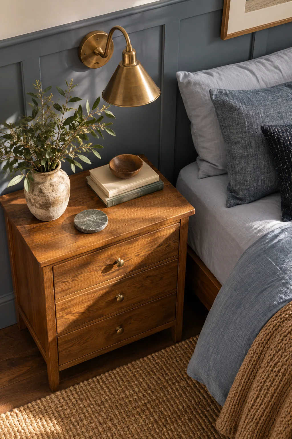
You must actively avoid ashy, gray-washed, or heavily bleached woods when styling against a cool palette. The rich amber tones provide a necessary visual bridge that prevents the room from feeling like a sterile, monochromatic icebox during the winter months.
Sizing Your Wooden Nightstands
Finding the correct nightstand proportions ensures your amber woods do not overpower the delicate wainscoting details on your walls. Use this sizing matrix to match your bedside tables to your mattress width while maintaining a perfectly balanced visual weight across the entire primary bedroom.
| Bed Size | Nightstand Width | Ideal Height | Sconce Spacing |
|---|---|---|---|
| Twin | 18 to 22 inches | 24 to 26 inches | 40 inches apart |
| Full | 22 to 24 inches | 26 to 28 inches | 58 inches apart |
| Queen | 24 to 28 inches | 26 to 28 inches | 66 inches apart |
| King | 28 to 36 inches | 28 to 30 inches | 82 inches apart |
| California King | 30 to 36 inches | 28 to 30 inches | 78 inches apart |
Positioning the Bed for Optimal Flow
Centering your bed on the longest solid wall establishes a commanding, symmetrical focal point for the entire room. Always ensure you leave a minimum clearance of 36 inches around the foot and sides of the bed for comfortable, unobstructed daily movement.
Adding Patina with Unlacquered Brass
Consider your wall sconce the crucial jewelry of the room that elevates the entire design scheme. Unlacquered brass introduces a living finish that ages gracefully, adding a subtle metallic warmth that beautifully complements the rich tones of your wooden furniture.
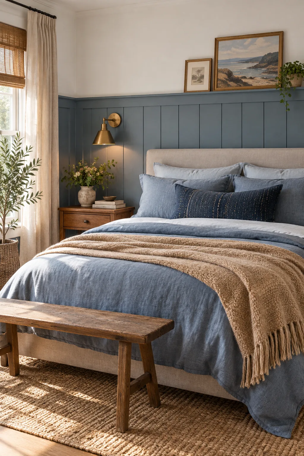
It is incredibly tempting to match cool painted walls with equally cool silver hardware. However, disrupting the room’s carefully calibrated warmth with the wrong metal finish will instantly ruin the inviting atmosphere you have worked so hard to build.
Maintaining the Unlacquered Brass Finish
Living metallic finishes require a specific mindset because they will naturally darken and spot over time from the oils on your hands. If the patina becomes too aggressive, applying a gentle polishing compound will quickly restore the original bright golden luster.
Stacking Three Shades of Blue Bedding
Building a luxurious bed requires a strict formula: a light blue base sheet, a mid-tone chambray duvet, and a dark navy accent. This specific gradient creates profound visual depth without overwhelming the eye with competing, chaotic colors.
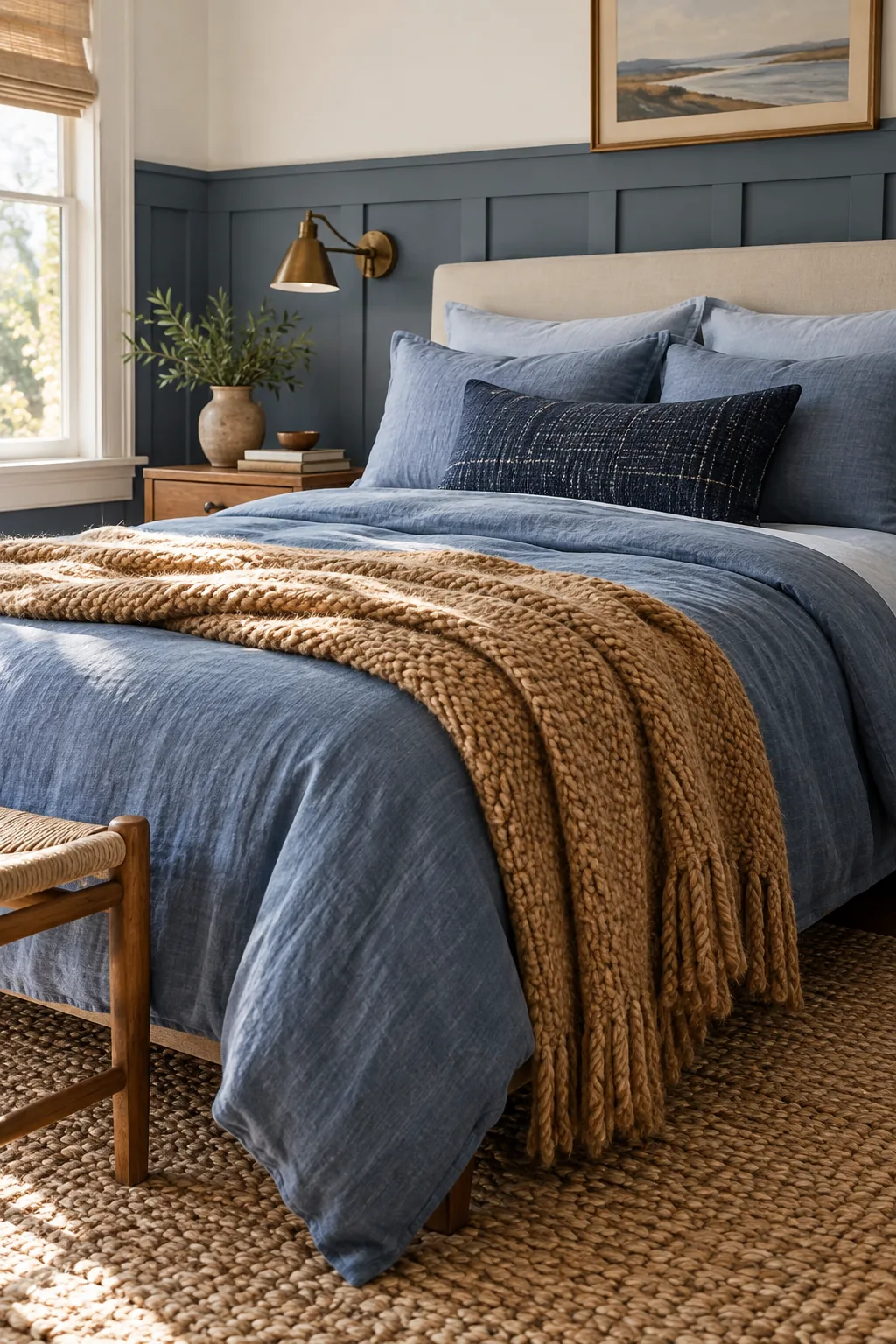
Layering tonal variations of a single hue allows the texture of the linen to take center stage. By restricting your palette to these three precise shades, you ensure the bed remains a calming focal point rather than a visual distraction.
Mastering the Pillow Arrangement
Executing the three-shade bedding rule requires a highly structured approach to your pillow placement. Follow this exact stacking sequence to build a dimensional, magazine-worthy bed that highlights every tonal variation from your darkest navy to your lightest crisp blue.
- Place two large European shams flat against the headboard to establish your darkest navy baseline.
- Layer your standard sleeping pillows in crisp light blue directly in front of the dark European shams.
- Center a single mid-tone chambray lumbar pillow at the very front to bridge the contrasting shades.
Selecting the Right Mattress Height
Your overall mattress height dictates exactly how much of your beautiful wainscoting remains visible above the pillows. Aim for a combined bed frame and mattress height of 24 to 28 inches to ensure your architectural wall panels are proudly and prominently displayed.
Introducing Camel Wool for Contrast
Relying on the classic color wheel principle, orange and camel tones serve as the perfect complementary hues to blue. Adding a chunky camel wool throw at the foot of the bed introduces necessary visual weight and profound tactile warmth.
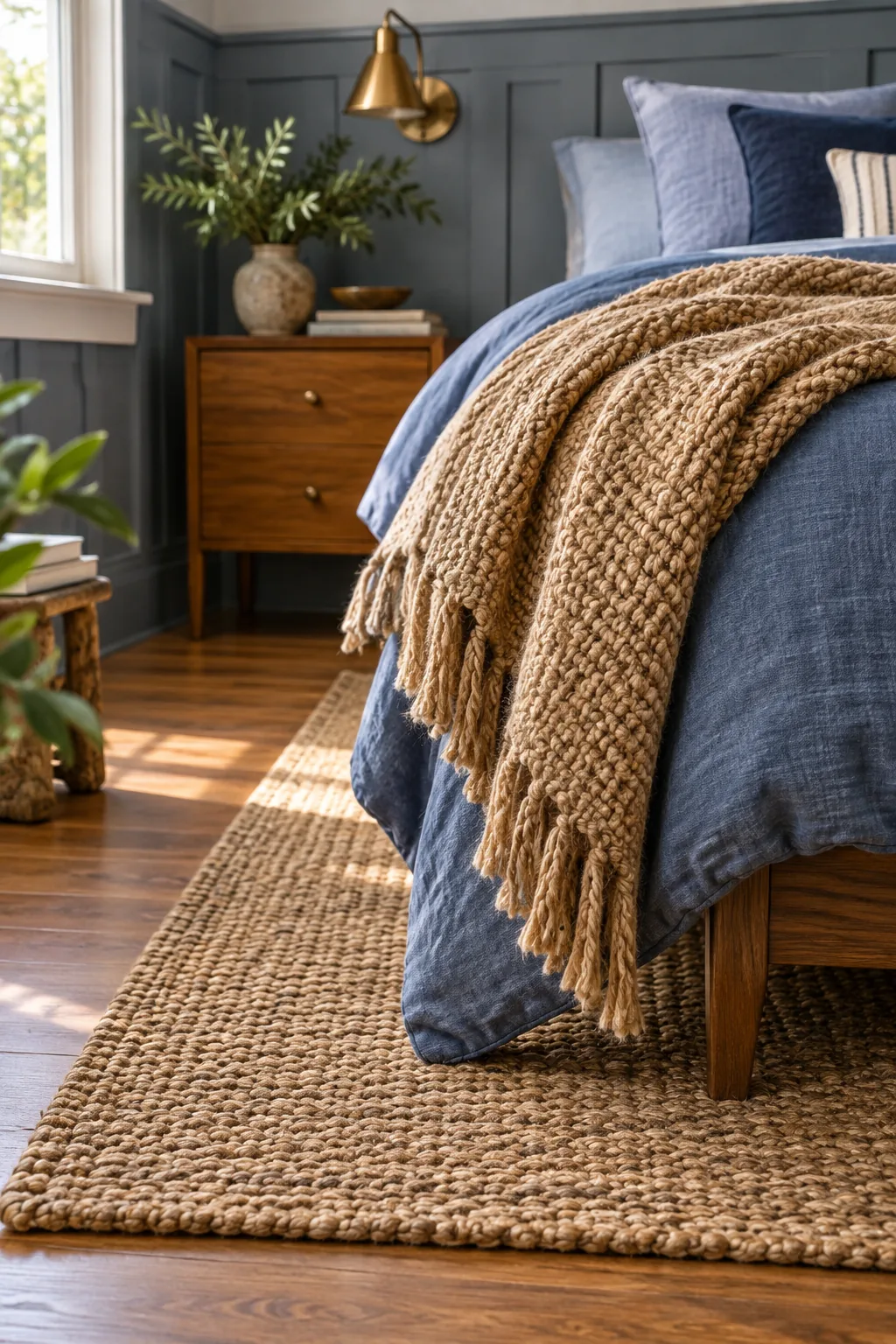
This heavy textile layer successfully breaks up the expansive sea of blue linens. The rich, earthy camel tone immediately draws the eye downward, grounding the bed frame and connecting the soft furnishings to the warm amber wood nightstands nearby.
Selecting the Perfect Throw Size
A throw blanket must be properly scaled to drape elegantly without pooling messily on the hardwood floor. For a standard queen bed, select a textile measuring exactly 50 by 70 inches to achieve that effortless, casually tossed look at the bottom corner.
Softening the Floor with Natural Jute
The flooring foundation ultimately grounds the entire aesthetic of your primary suite. Stepping onto a cold floor on a snowy Denver morning is brutal, which is why I always anchor my bedroom designs with a thick, insulating natural fiber rug.
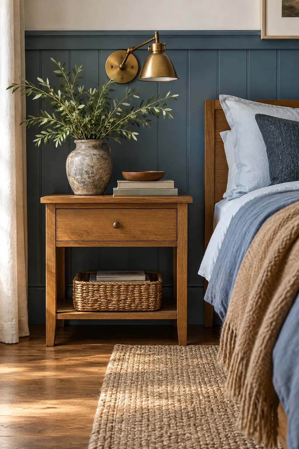
A chunky jute or sisal rug placed securely under the bed continues the warm, earthy tones of the wood and camel wool. This organic layer provides a remarkably soft landing spot that simultaneously absorbs unwanted echoes in the space.
Layering a Vintage Rug Over Jute
If you crave even more texture underfoot, consider layering a smaller vintage wool rug directly over your foundational jute piece. This advanced styling technique adds a localized pop of beautifully faded color right at the foot of the bed where it matters most.
Bringing in Organic Life and Greens
The final styling touch requires a completely natural, unstructured element to soften the room. Placing a rustic ceramic vase filled with fresh, leafy greens on the nightstand beautifully breaks up the rigid, predictable horizontal lines of the architectural wainscoting.
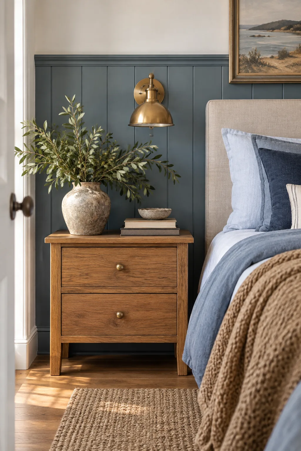
Selecting the right vessel for your bedside greenery presents a subtle but vital opportunity to reinforce the room’s earthy foundation. An overly polished vase will clash with the relaxed, layered textures you have carefully introduced through the linens.
Choosing the Right Window Treatments
Window treatments offer another critical opportunity to soften the hard architectural lines of your wainscoting. Hanging floor-to-ceiling linen drapes in a warm oatmeal shade perfectly bridges the visual gap between your crisp white upper walls and the earthy camel throw resting on the bed.
More Ways to Balance a Blue Bedroom
Discover how different shades of blue and wood tones can completely change the mood of your space.
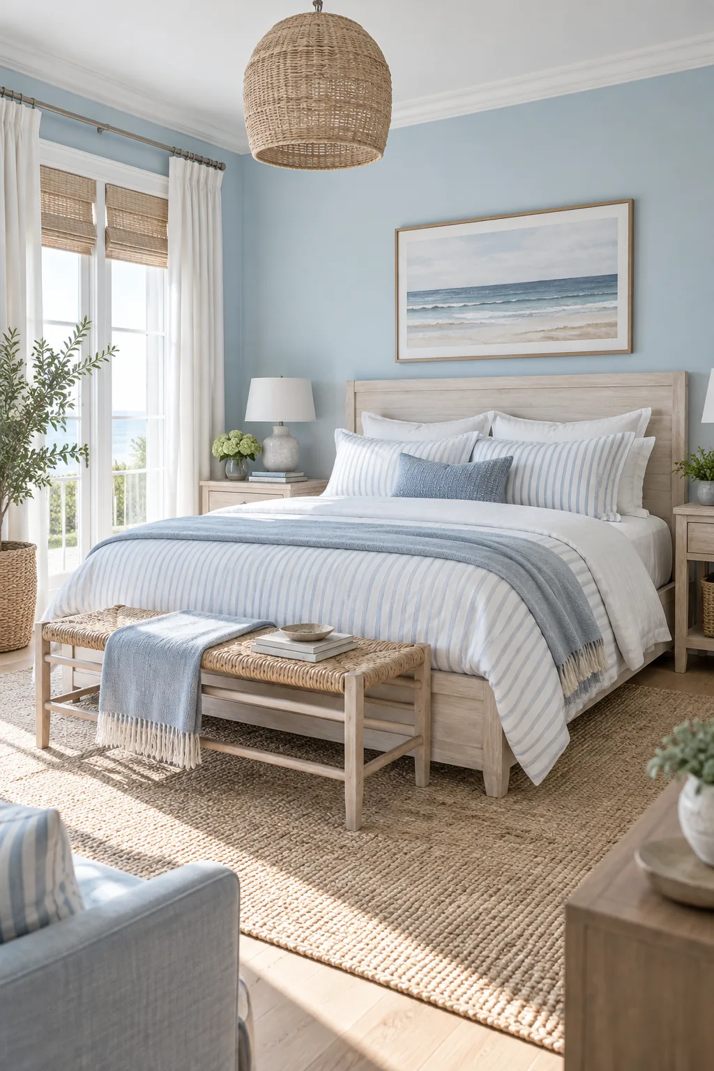
Coastal Light Blue: Pale blue walls paired with whitewashed woods create a breezy, coastal retreat that feels instantly relaxing.
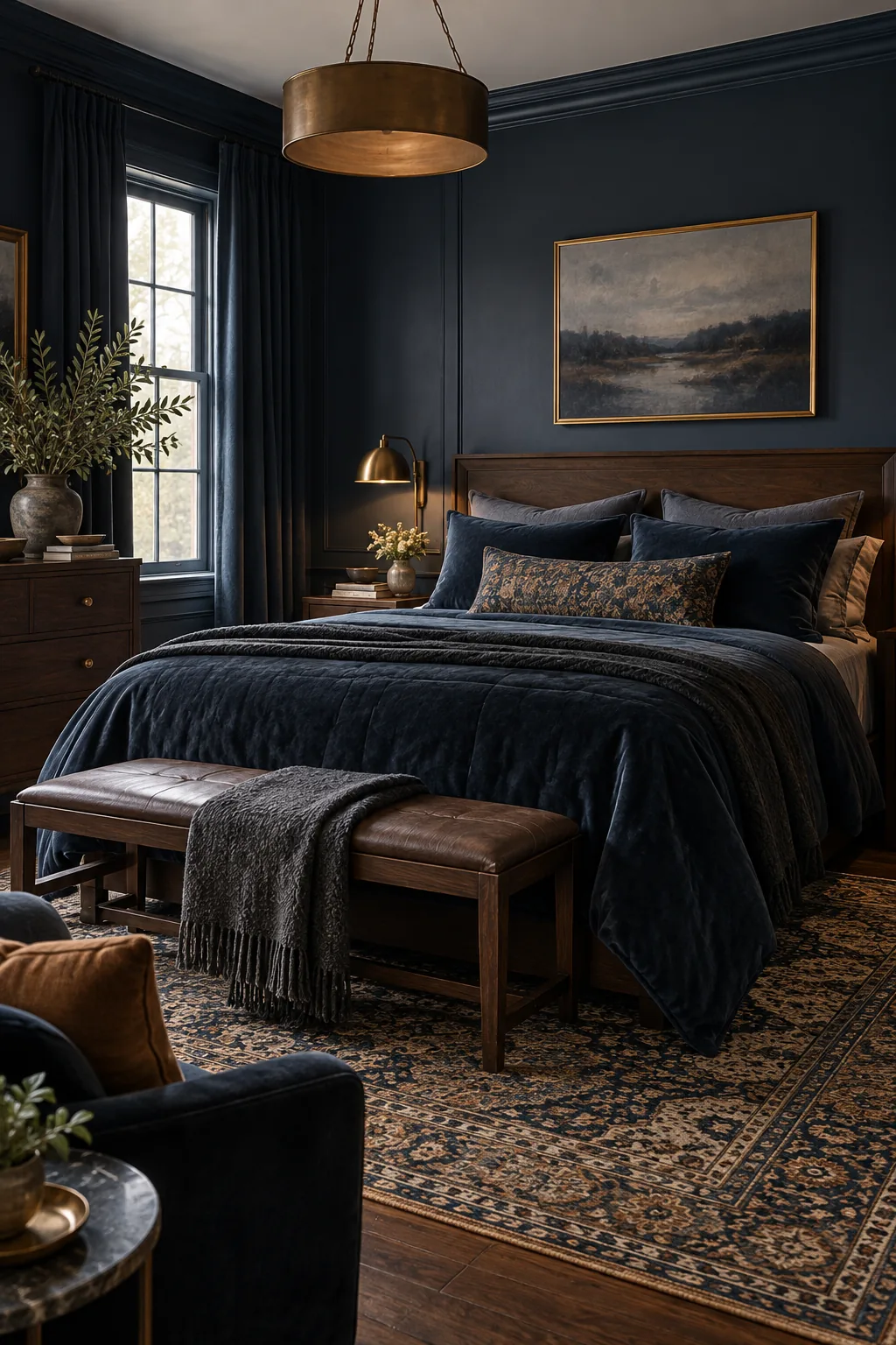
Moody Navy & Walnut: Deep navy paint combined with dark walnut nightstands offers a sophisticated, intimate atmosphere perfect for evening unwinding.
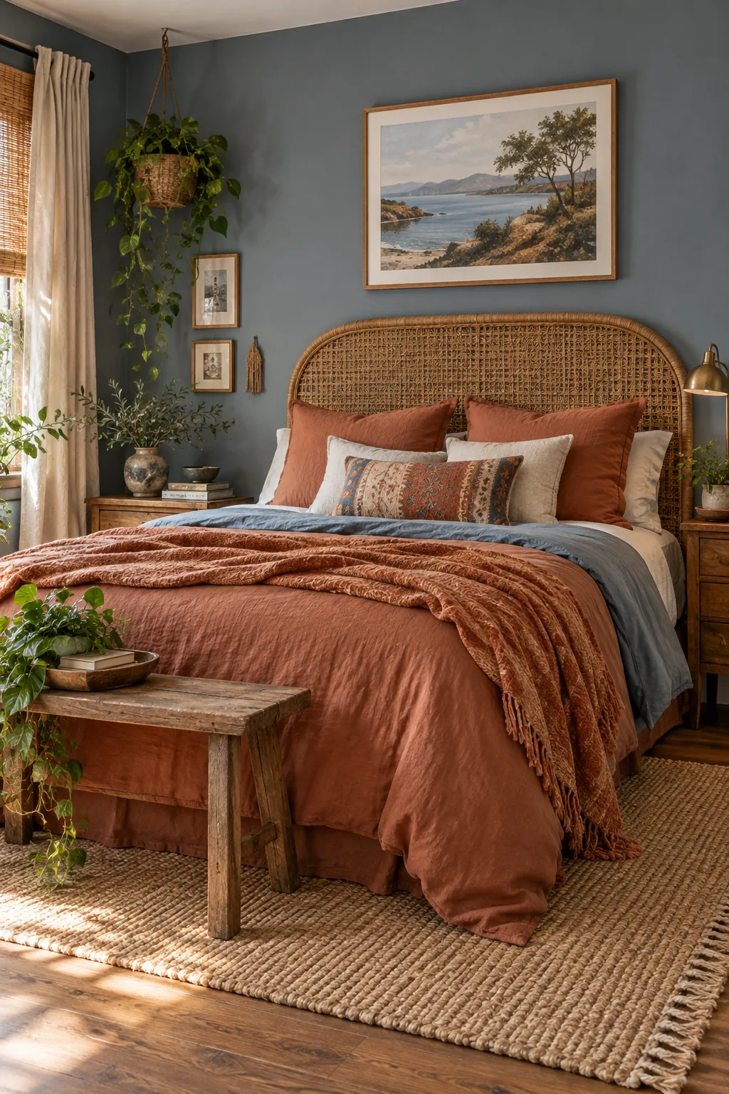
Slate Blue & Rattan: A gray-leaning slate blue provides the perfect subtle backdrop for heavily textured rattan and warm rust linens.
Your Blue Bedroom Tone & Texture Cheat Sheet
This exact styling formula transformed my own primary bedroom from a sterile box into a deeply comforting retreat. You now have the complete blueprint to perfectly balance muddy blue paint, amber wood, raw brass, layered linen, and camel wool.
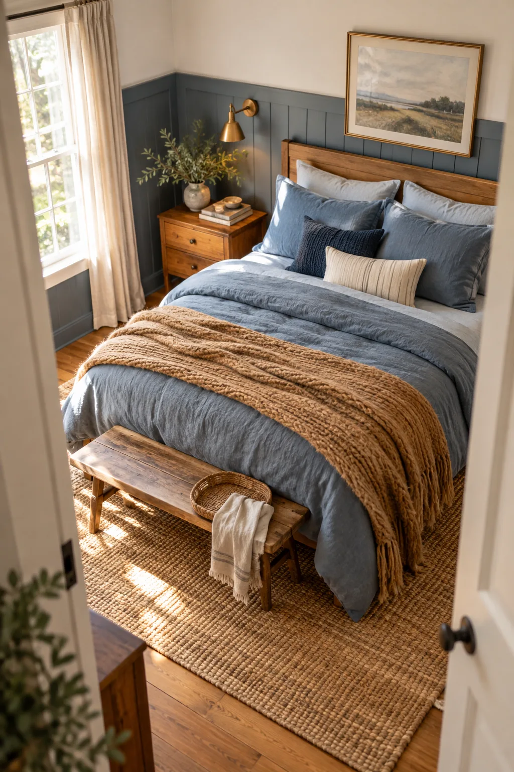
To effortlessly adapt this signature look for any room size, rely on the classic 60-30-10 ratio. Dedicate 60 percent of the space to your muddy blue foundation, 30 percent to warm amber and camel tones, and 10 percent to metallic brass accents.