
15+ Gorgeous Nursery Paint Colors for Your Home
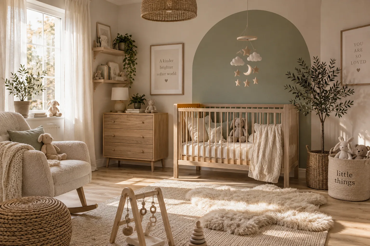
Picking the right paint color for a nursery is the single most impactful design choice you will make for the room. I gathered these solid, tested shades to help you skip the endless swatching and get straight to painting.
1. Sage Green
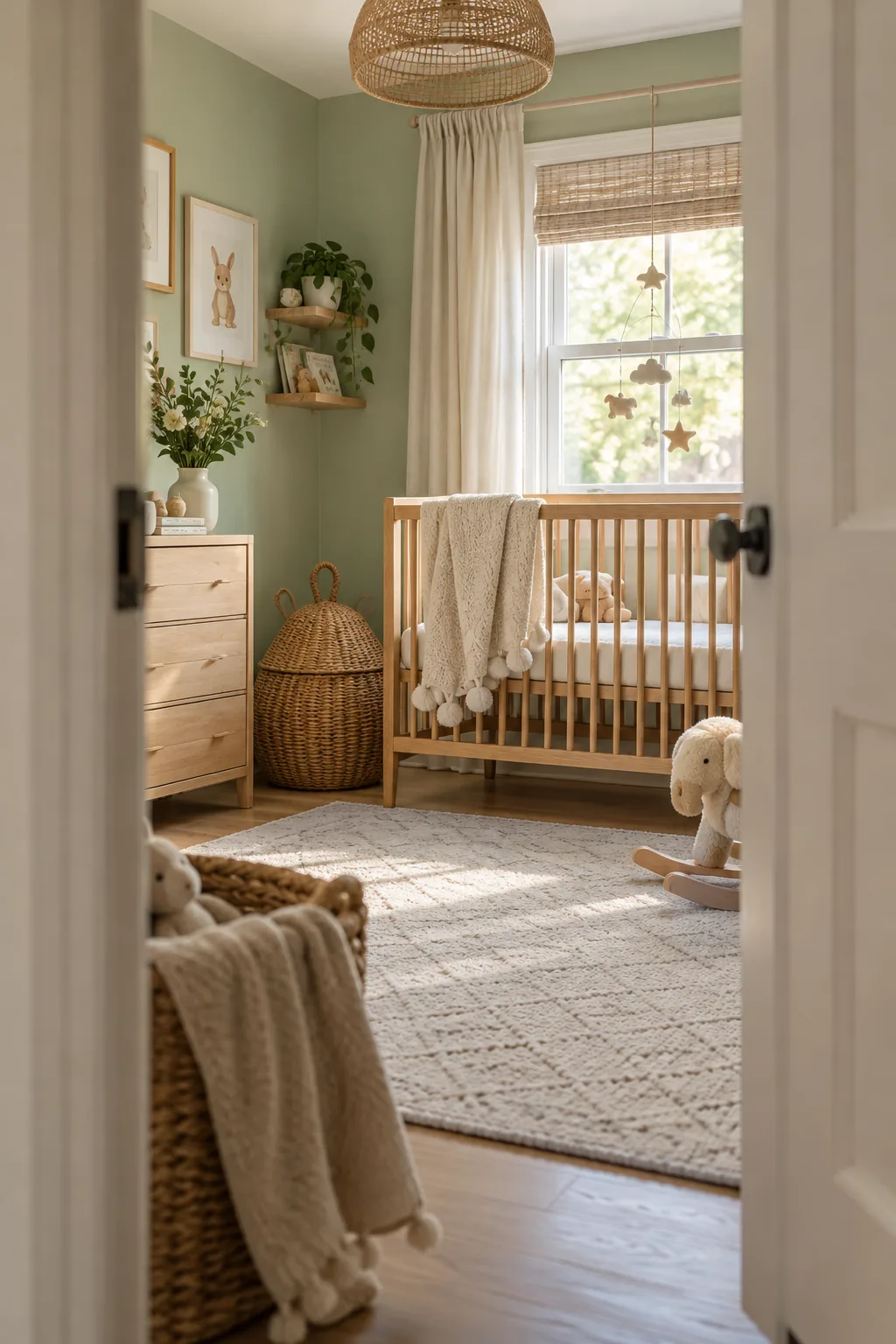
Grounding a room with an earthy tone instantly makes the space feel calm and collected. Sage green acts as a true neutral that pairs beautifully with natural wood cribs and woven baskets. I always use a flat finish for this shade to absorb light and soften the walls. It creates a cozy environment for late-night feedings and midday naps.
Why it works: The muted undertones prevent the green from feeling too loud or energetic in a sleep space.
2. Warm Terracotta
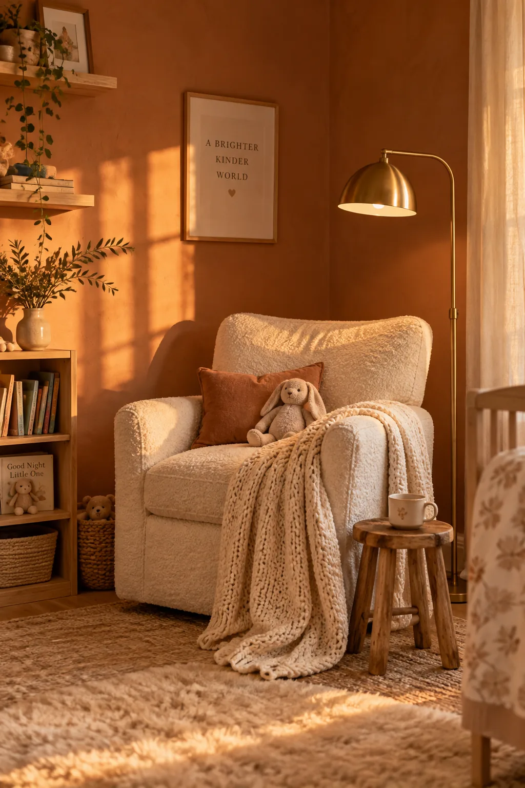
Rooms facing north often feel cold and shadowy during the day.
Brushing a warm terracotta across the walls completely changes that temperature. The rich, baked clay tones reflect a sunset glow around the room. You can layer in brass accents and cream textiles to balance the depth of the paint.
3. Soft Greige
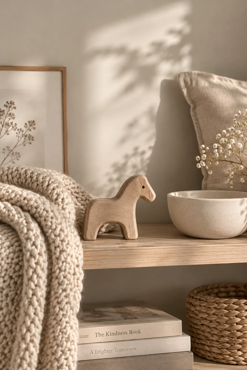
Blending gray and beige creates an adaptable backdrop that shifts beautifully as the sun moves across the sky. Soft greige allows you to easily swap out decor as your baby grows, especially when paired with these accents:
- crisp white trim
- linen blackout curtains
- warm oak flooring
4. Moody Navy Blue
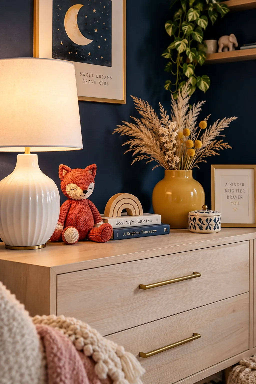
I painted my own son's room this dark shade and never regretted it. A moody navy blue wraps the room in a comforting, cave-like atmosphere that encourages deep sleep. It looks incredibly sharp against lighter furniture and metallic hardware. To keep it from feeling heavy, bring in:
- a large pale rug
- mirrored wall sconces
- light-toned wood floating shelves
5. Muted Mustard Yellow
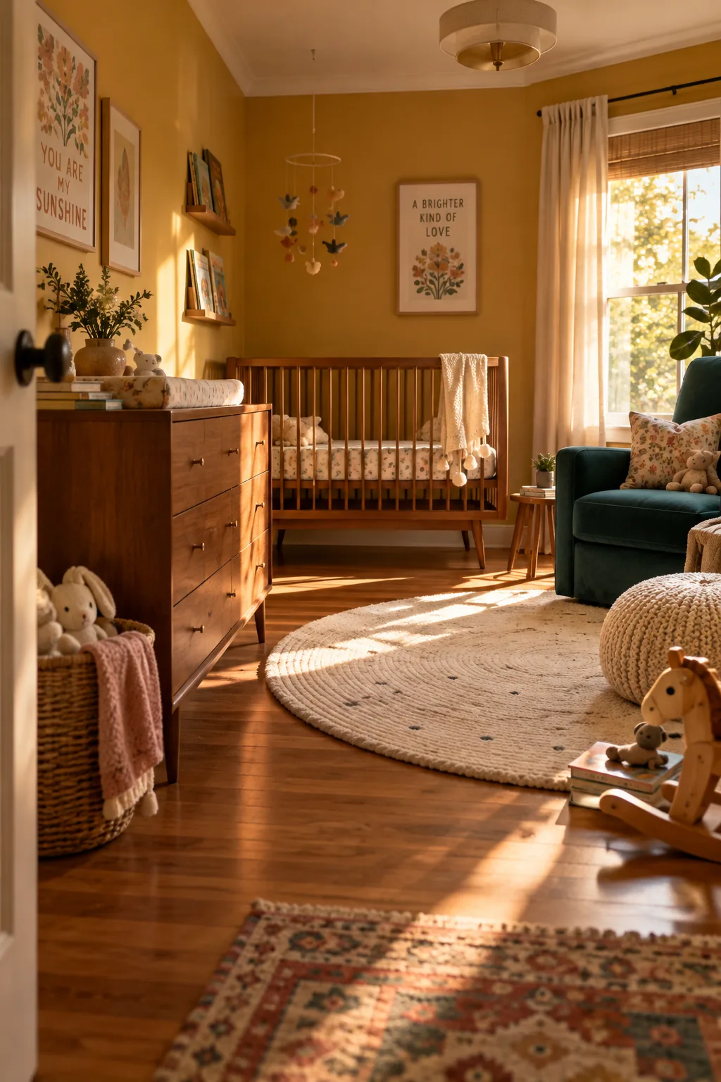
Standard primary yellow is often too stimulating for a baby's eyes. A muted mustard yellow tones down that brightness while keeping a cheerful, vintage vibe. It pairs perfectly with mid-century modern furniture and deep teal accents. The room will feel happy but grounded enough for quiet time.
6. Dusty Rose
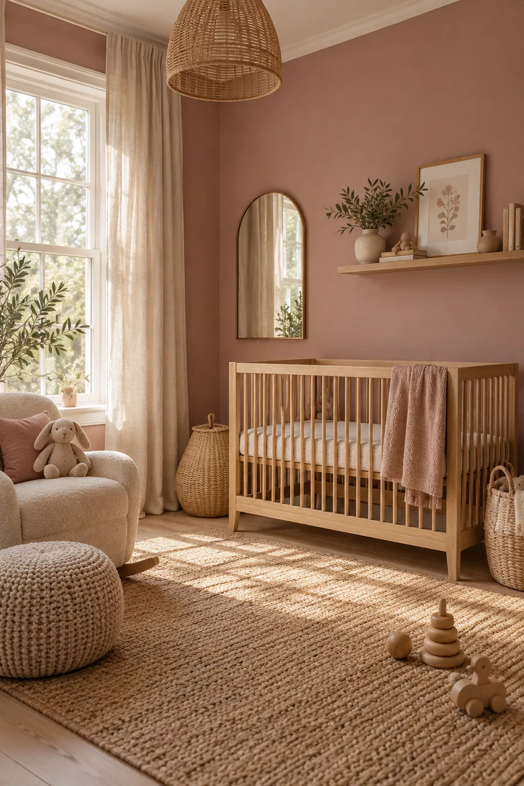
Traditional pink paints often contain harsh blue undertones that look neon in artificial light.
Opting for a dusty rose introduces a hint of brown to the mix. This creates a sophisticated, muddy pink that feels grown-up.
It is the perfect feminine shade that avoids looking like a bubblegum wrapper.
7. Creamy Off-White
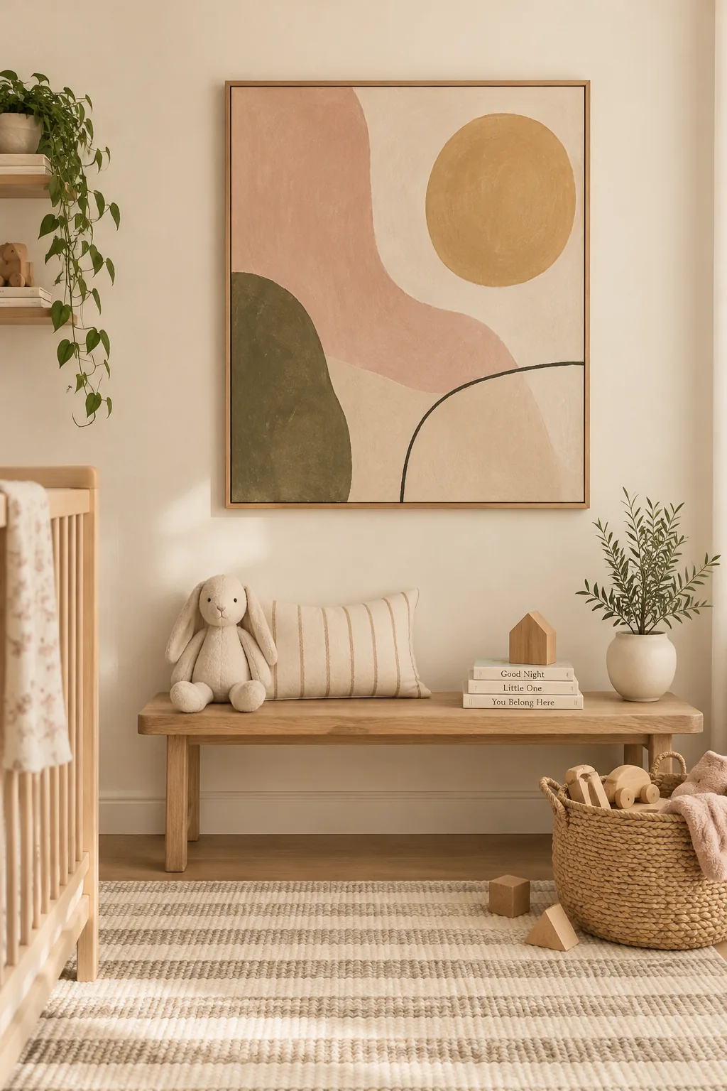
Skip the stark gallery white and reach for a shade with warm yellow undertones instead. A creamy off-white bounces soft, flattering light around the nursery without feeling sterile. It gives you a blank canvas to go wild with colorful rugs, art, and toys. The walls fade into the background while letting your decor shine.
8. Deep Forest Green
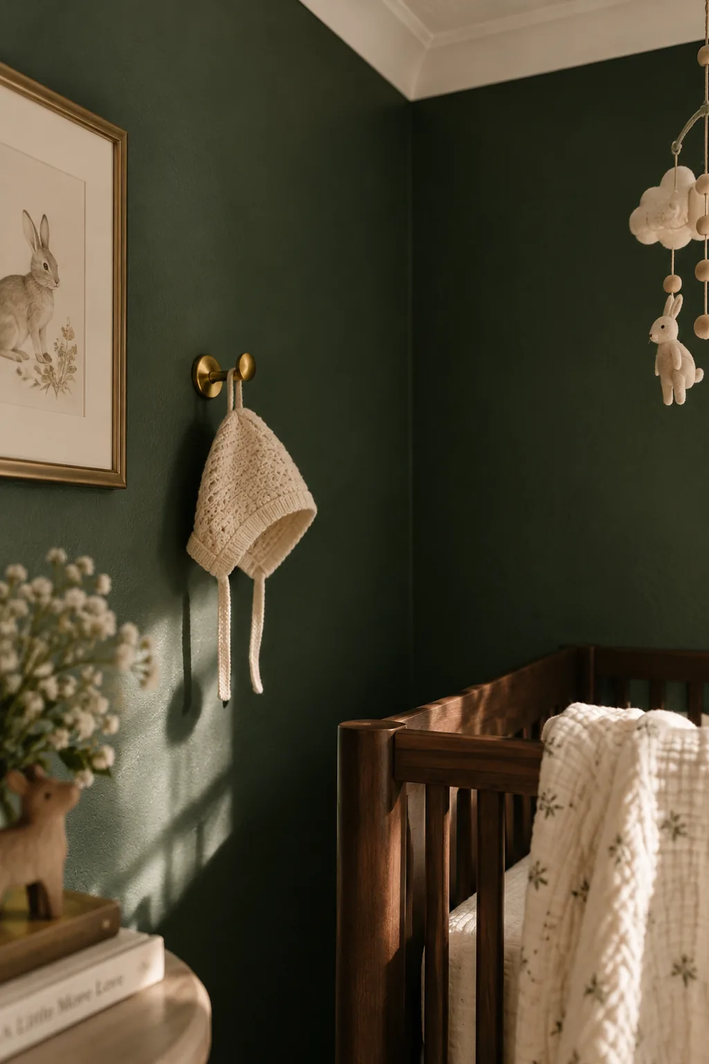
Dark paint colors can actually make a small ten-by-ten room feel larger by blurring the corners. A deep forest green brings the outdoors inside and creates a stunning contrast with crisp white ceilings. I love using this color on all four walls rather than just an accent wall. It envelopes the space in a rich, velvety texture that looks high-end.
Why it works: The lack of distinct shadows on dark walls tricks the eye into perceiving more depth.
9. Pale Lavender
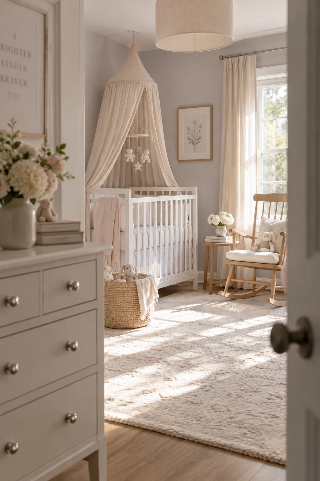
Adding a touch of gray to purple elevates it from a playroom color to a serene nursery shade. A pale lavender offers a subtle wash of color that feels incredibly calming. It looks beautiful alongside polished nickel hardware and plush cream rugs.
Just make sure to test it on your walls first to check the undertones.
10. Charcoal Gray
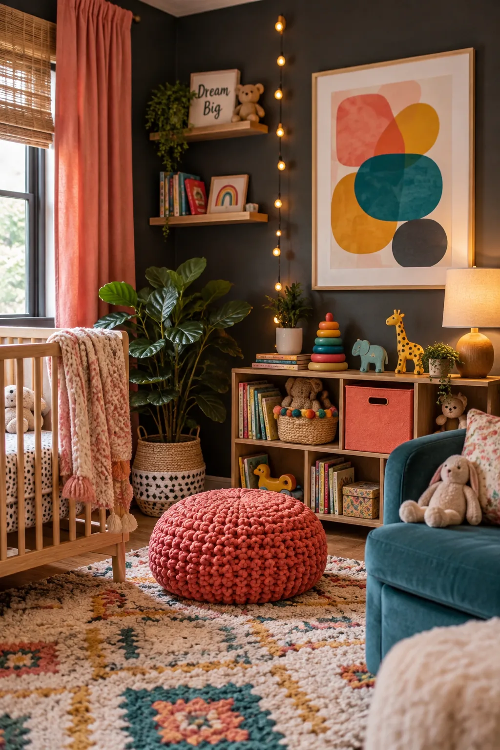
Pastel nurseries are beautiful, but they are not the only option for a new baby.
A bold charcoal gray provides a dramatic backdrop that makes colorful toys and art pop. It hides scuff marks effortlessly as your child transitions into the toddler years.
You can soften the dark walls with layered lighting and plenty of textured fabrics.
11. Warm Peach
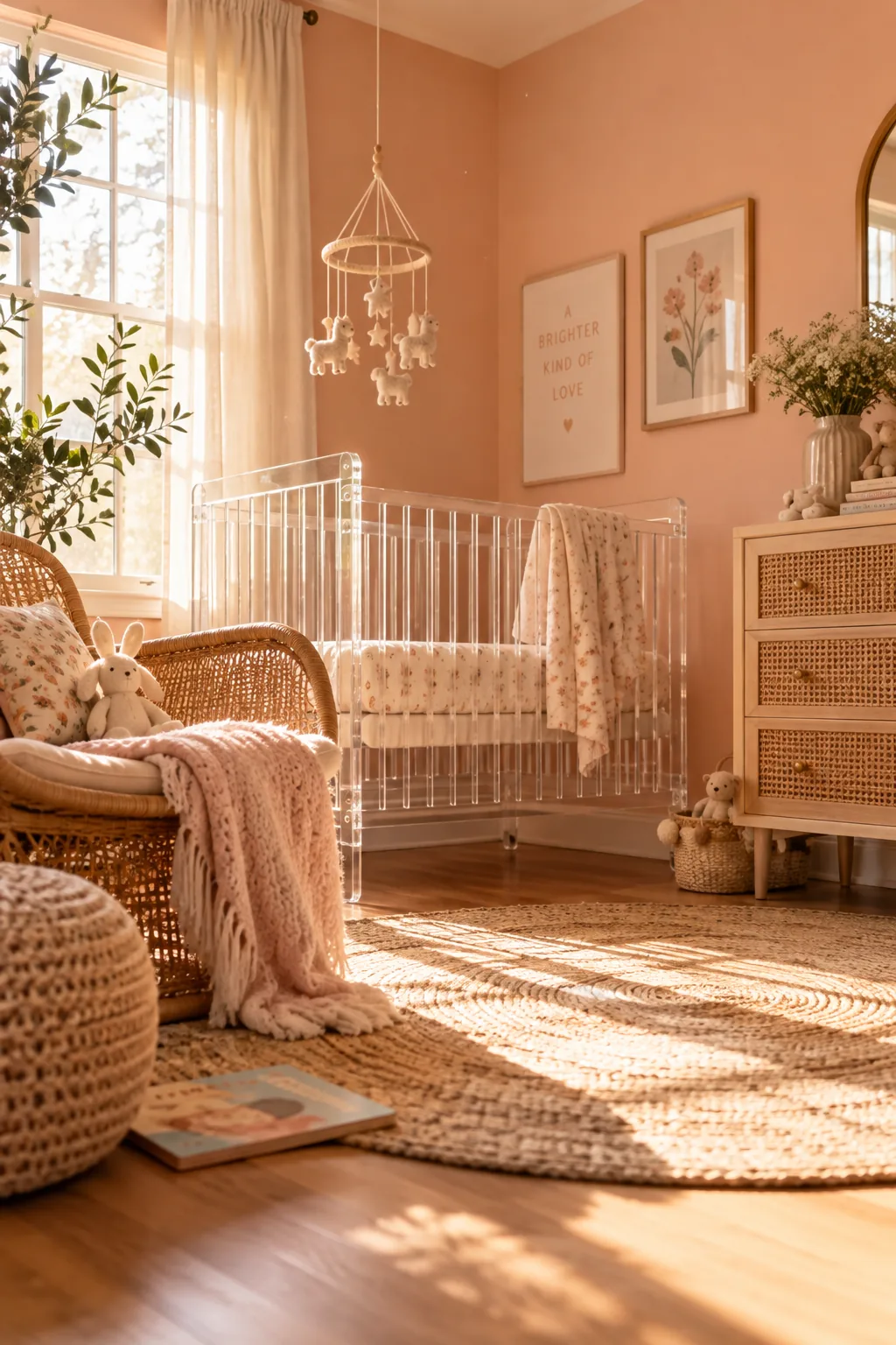
Wrapping a room in a soft, fruity hue instantly warms up the incoming light.
A warm peach feels fresh and inviting without leaning too pink or too orange. It is a highly versatile shade that plays well with both rattan furniture and modern acrylic cribs.
This color shines brightest in rooms that get plenty of morning sun.
12. Soft Slate Blue
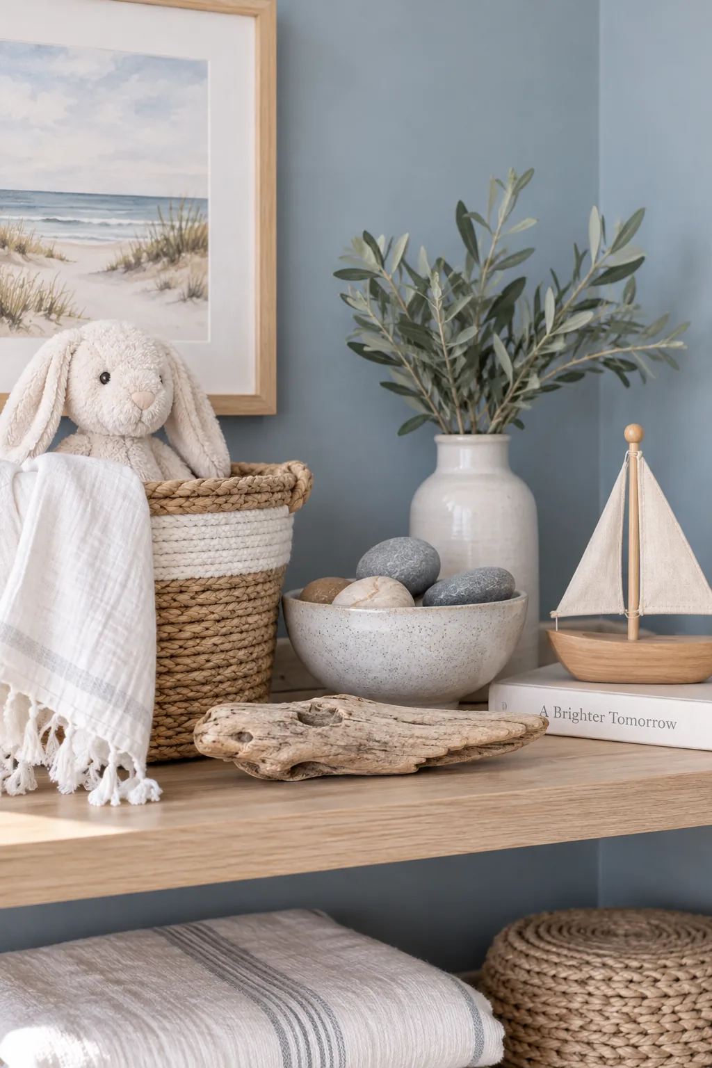
Creating a coastal, airy vibe is easy when you start with the right foundation. A soft slate blue brings in the soothing tones of the ocean while maintaining a neutral edge. Incorporate these pieces to complete the look:
The gray undertones keep the blue from looking too babyish.
- woven jute rugs
- bleached oak dressers
- simple linen shades
13. Earthy Brown
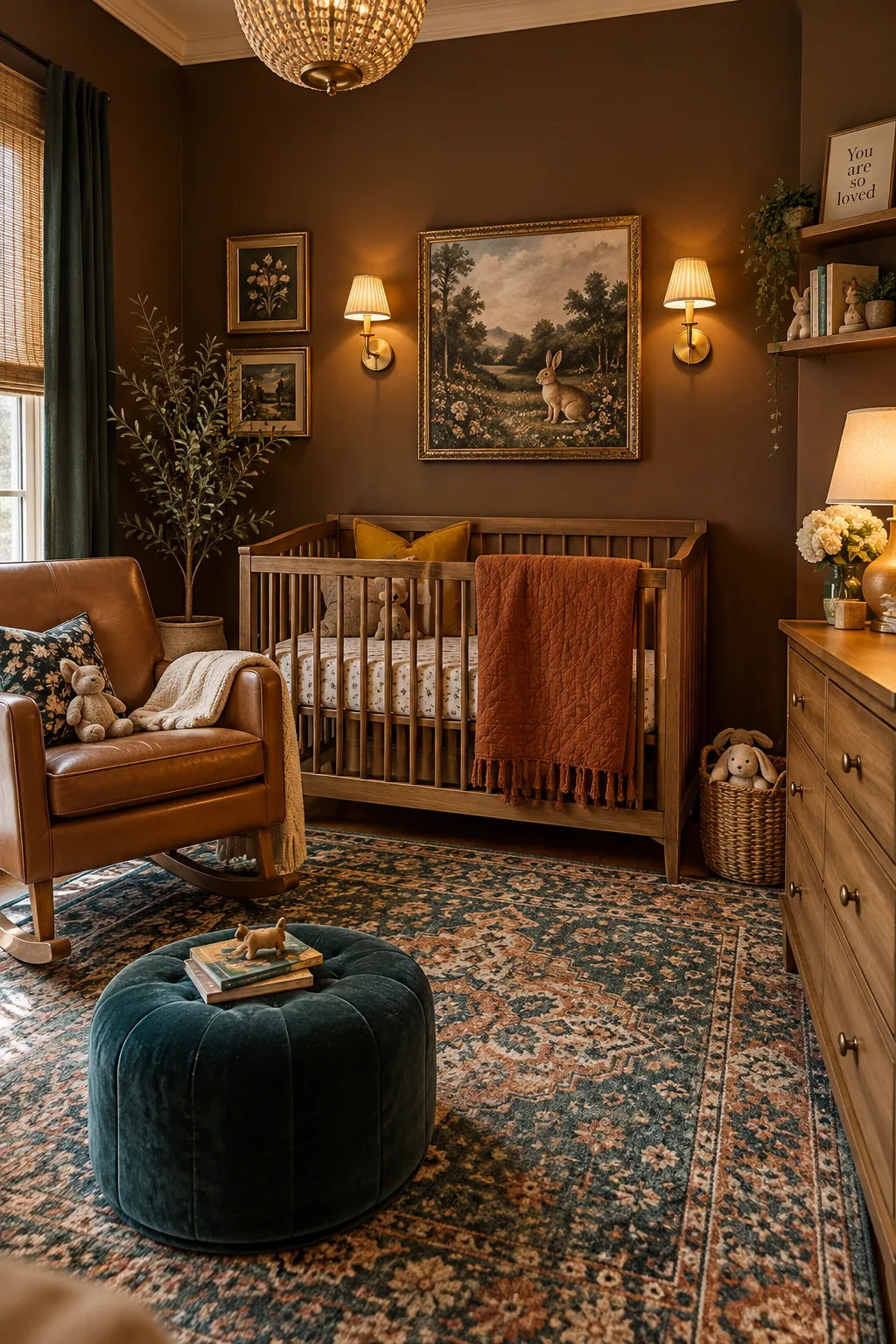
Embracing rich, natural tones brings an immediate sense of warmth to an empty room. An earthy brown is an unexpected nursery choice that feels incredibly cozy and grounded. It serves as a beautiful backdrop for vintage art and brass wall sconces.
You will be surprised by how much this color grows on you.
14. Mint Green
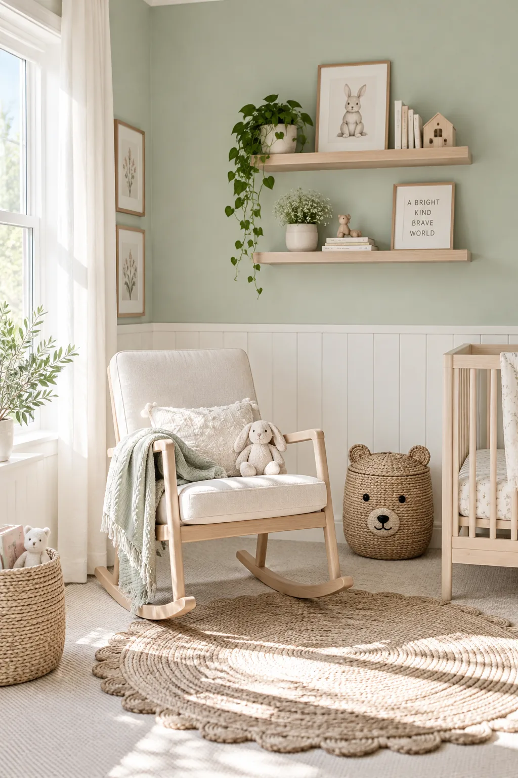
Nearly eighty percent of a paint's impact comes from the natural light hitting it. A crisp mint green wakes up a dim room and makes the walls feel energized. It looks crisp and clean next to bright white wainscoting.
Keep the finish matte to avoid a shiny, hospital-like glare.
Why it works: The cool undertones visually push the walls back, making a tight space feel much more expansive.
15. Putty Gray
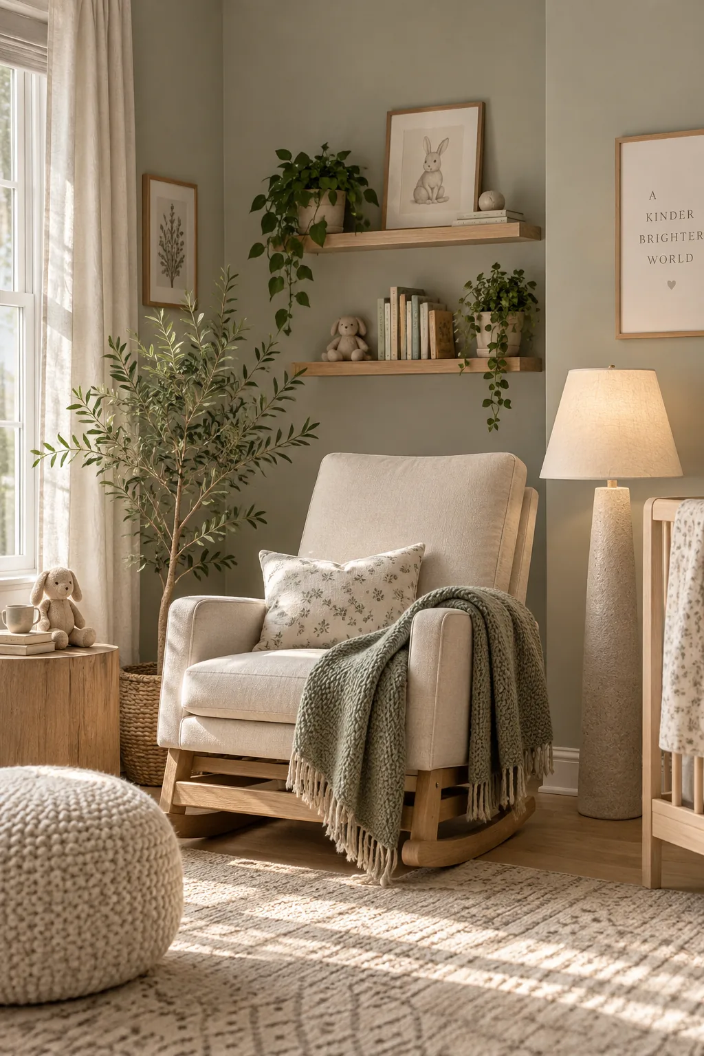
Standard grays can sometimes feel too industrial for a baby's room. Choosing a putty gray with subtle green undertones adds life to the walls while remaining entirely neutral.
16. Matte Black Accent Wall
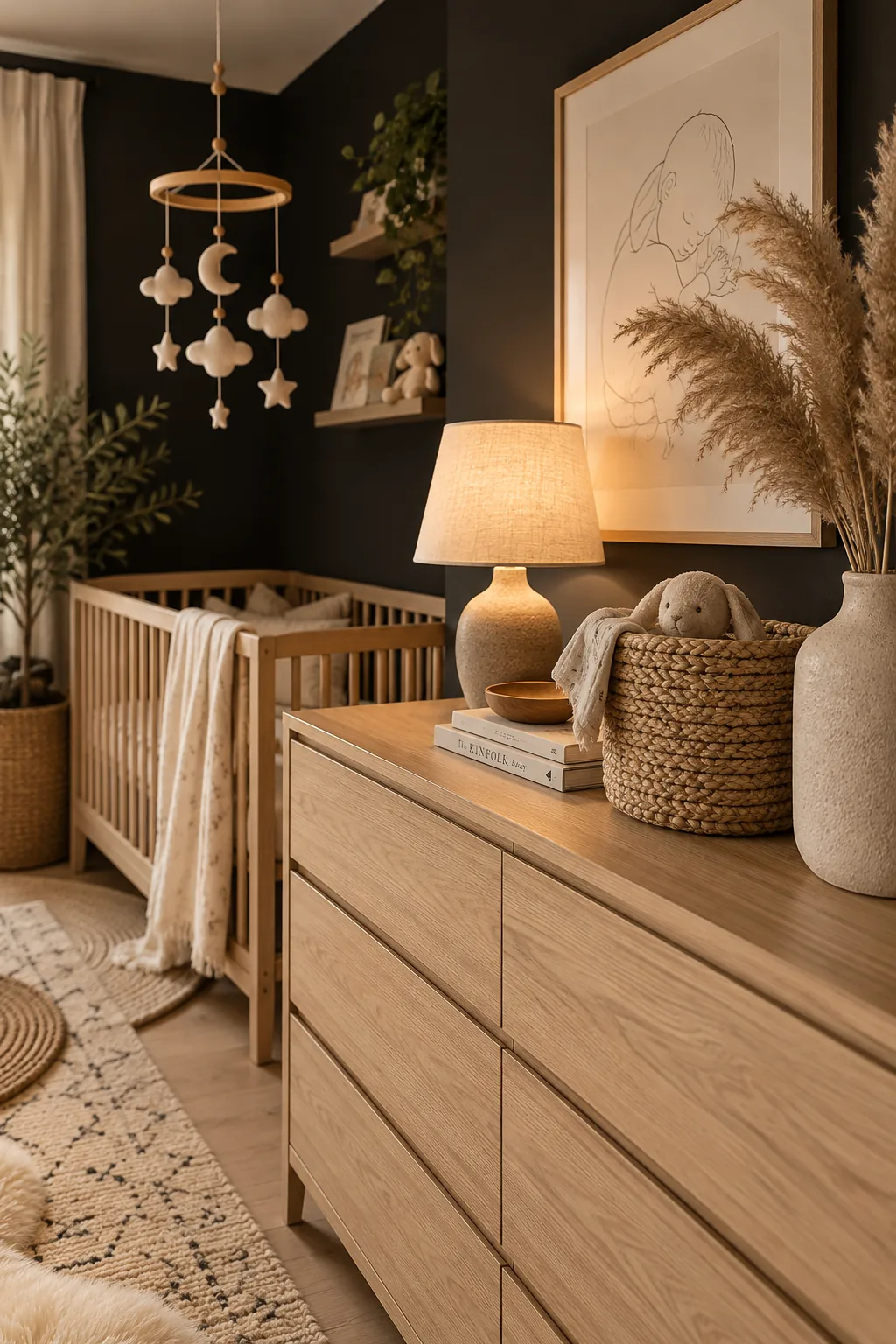
Do not be afraid to use true black in a nursery setting.
A matte black accent wall behind the crib anchors the entire room. It provides a striking contrast for light-colored mobiles and framed artwork.
Balance the dark wall with light oak floors and plenty of natural textures.
Why it works: High contrast environments are actually beneficial for a newborn's developing eyesight.