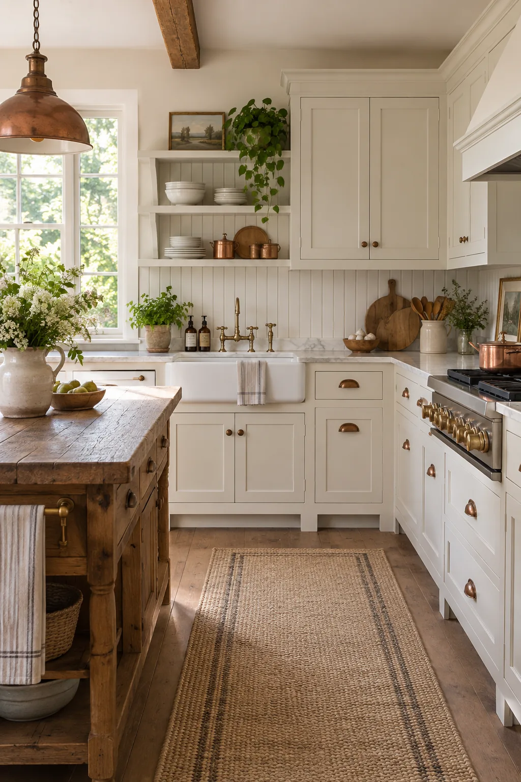
White Kitchen Cabinets: The Designer Paint & Hardware Guide
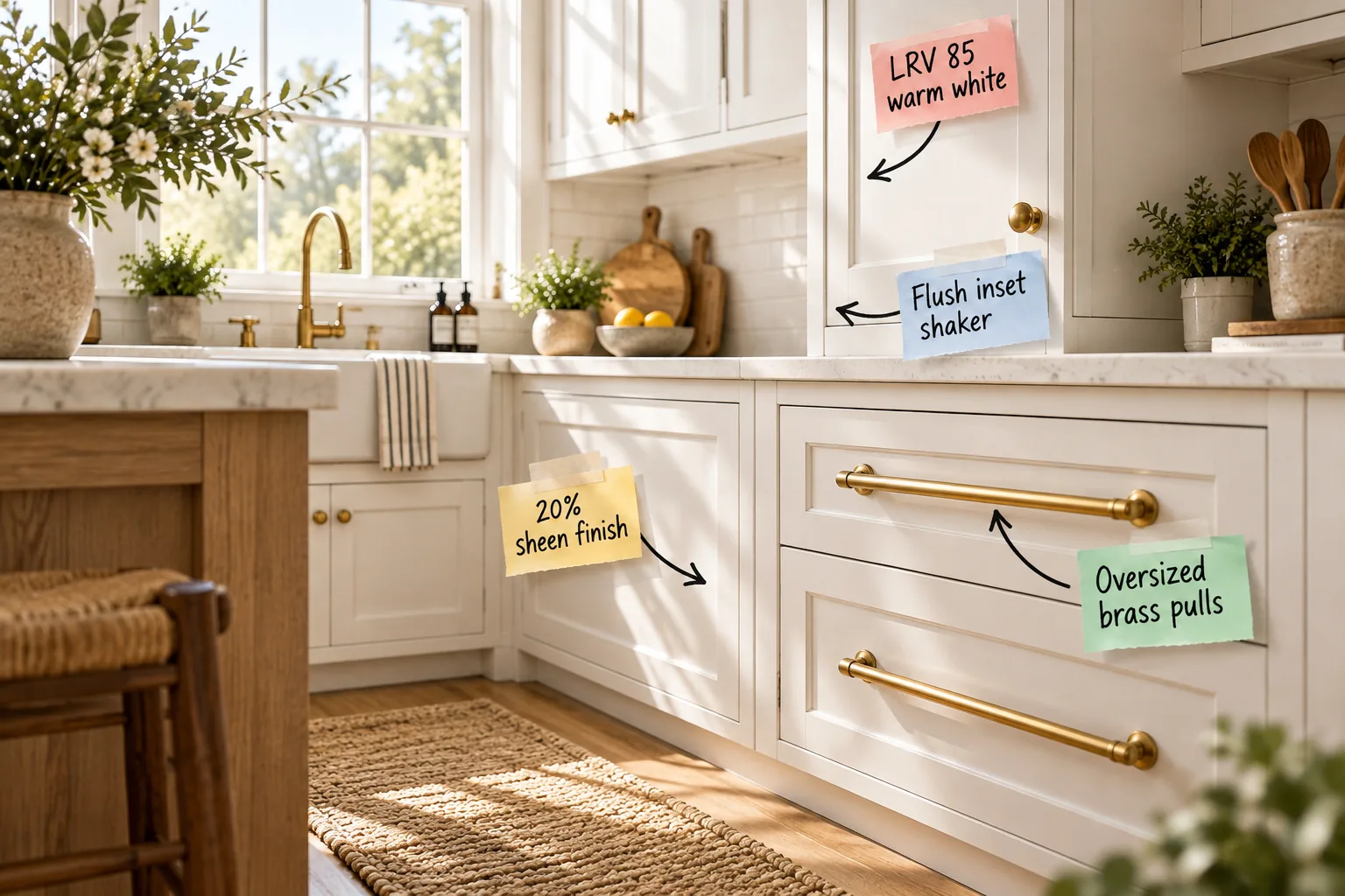
If you are planning a custom white kitchen, this designer paint and hardware pairing guide will give you the exact paint metrics, door styles, and proportions you need. We are going to lock in your sheen levels and brass pairings for a flawless, high-end look.
Finding the sweet spot: LRV 85 warm white
Light Reflectance Value dictates brightness, and I always specify an LRV of 85 to reflect abundant light without feeling clinical. In my own Denver home, this exact metric kept the kitchen feeling incredibly airy while retaining enough pigment to stay wonderfully warm.
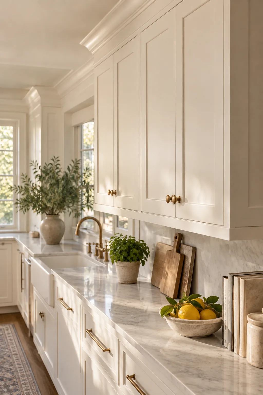
Before committing to a specific shade of white, carefully watch out for these incredibly common color selection errors that can make a custom space feel stark, cold, and uninviting.
Balancing undertones in your white paint
Every white paint carries a subtle undertone. To ensure perfect harmony, always compare your chosen paint swatch against a pure white sheet of paper. This simple trick reveals hidden pigments, allowing you to match the paint directly to your fixed architectural elements.
Selecting the right primer for white paint
Achieving a flawless finish requires a high-build, stain-blocking primer to prevent wood grain from telegraphing through. A premium shellac-based primer seals the raw wood completely, ensuring your final coats of white paint look perfectly opaque and brilliantly smooth for decades.
Specifying a 20% sheen finish
For lower cabinets, a 20 percent sheen acts as the absolute perfect satin-eggshell hybrid finish. This specific gloss level offers the necessary wipeability for inevitable daily spills while expertly avoiding the cheap, plastic reflection of high-gloss enamels.
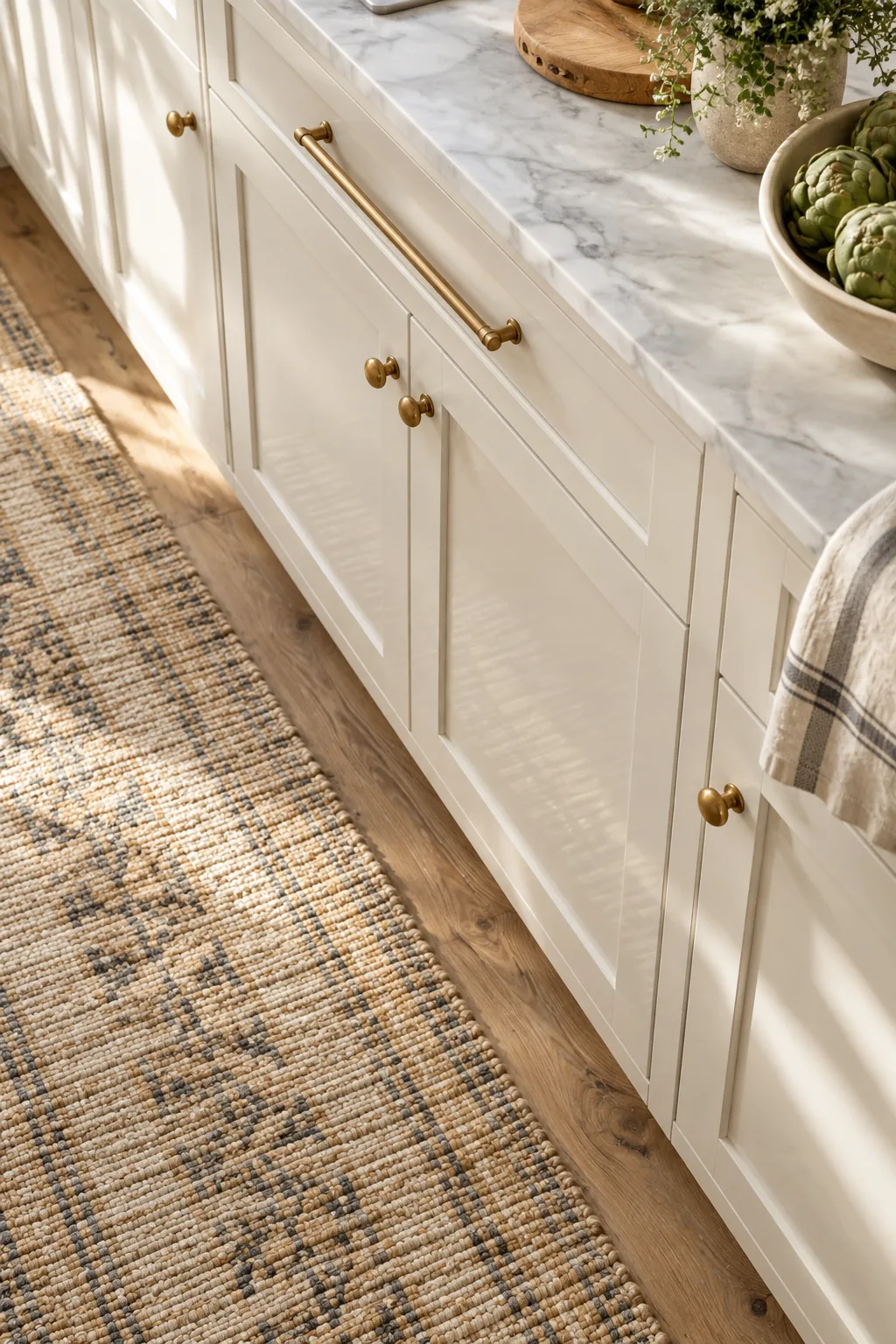
This subtle, carefully calibrated sheen level ensures your newly painted cabinetry feels highly sophisticated and velvety to the touch, rather than feeling sticky or overly reflective under your recessed lighting.
Why we avoid high-gloss enamel
While high-gloss finishes are durable, they reflect light so sharply that they highlight every single imperfection. Opting for a carefully calibrated lower sheen masks these minor structural flaws while still providing a highly protective, washable barrier against daily kitchen wear.
Protecting high-traffic cabinet zones
The areas immediately surrounding your sink and trash pull-out suffer the most daily wear. Applying a clear, non-yellowing topcoat to these specific high-traffic zones adds an invisible shield against water damage without altering the delicate sheen level of your beautiful paint.
Selecting the right cabinet box material
While your exterior doors are painted wood, the interior cabinet boxes should be constructed from pre-finished maple plywood. This material is incredibly durable, exceptionally easy to wipe clean, and provides a bright interior that makes finding your stored items much easier.
The craftsmanship of flush inset shaker doors
Authentic traditional design relies heavily on the flush inset shaker style, where the door sits perfectly level inside the cabinet frame. Achieving this historic look requires a precise 3/32-inch reveal gap around the perimeter to allow for seasonal wood expansion.
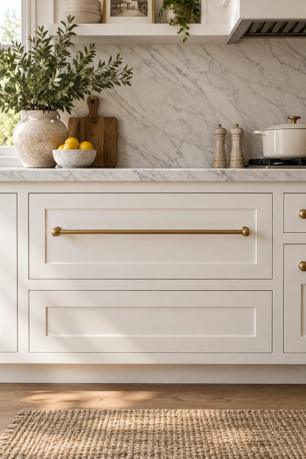
Taking the extra time to engineer this precise 3/32-inch gap ensures your custom doors will operate smoothly and quietly through every humid summer and incredibly dry winter without ever binding.
Concealing hinges for a seamless look
When specifying flush inset doors, hidden barrel hinges offer a brilliantly clean, uninterrupted perimeter. By tucking the mechanical hardware completely out of sight, you allow the crisp, architectural lines of the shaker frame to stand out and feel highly intentional.
Upgrading to soft-close drawer glides
Heavy lower drawers filled with pots and pans require robust, under-mount soft-close glides. Specifying hardware rated for at least one hundred pounds ensures your oversized drawers will close silently and smoothly, perfectly complementing the high-end feel of your custom flush inset doors.
Scaling up to oversized brass pulls
Wide lower drawers carry significant visual weight, which means they require proportionally longer hardware to maintain proper balance. I recently used the one-third width rule in a client project, selecting pulls that measured exactly one-third the width of the drawer face.
To get the proportions exactly right on your oversized lower drawers, thoroughly run through these crucial measurements before drilling any permanent holes into your beautiful brand new doors.
Calculating clearance for hardware projection
Before finalizing your oversized pulls, you must measure their projection depth to ensure they do not interfere with adjacent doors. Always map out the swing radius of your corner cabinets and heavy appliances before drilling your hardware holes to prevent damage.
Mixing knobs and pulls logically
A well-designed kitchen rarely relies on just one single type of hardware. Using classic round knobs on upper cabinet doors and elongated pulls on lower drawers establishes a clear, highly intuitive functional rhythm while keeping the brass finish identical for cohesion.
Matching appliance pulls to cabinet hardware
Integrating paneled appliances into your white kitchen requires specialized, heavy-duty hardware. Keep the brass finish identical to your standard pulls, but step up the thickness and overall scale of the handle to match the refrigerator’s substantial visual weight.
Selecting unlacquered vs. lacquered brass
When pairing hardware with warm white paint, unlacquered brass is heavily preferred for its highly historic, organic feel. Unlike lacquered brass that stays permanently shiny and rigid, an unlacquered finish develops a gorgeous living patina over time.
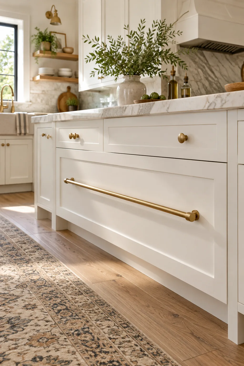
Embracing this natural aging process gives your entire kitchen an incredibly authentic, collected-over-time atmosphere that standard, perfectly uniform factory finishes simply cannot ever hope to replicate.
Maintaining living brass finishes
If your unlacquered brass begins to tarnish slightly more than you prefer, a simple polishing compound will quickly restore its original gleam. You have complete, total control over exactly how aged or pristine the hardware looks at any given time.
The designer white paint and hardware pairing guide
Taking the guesswork out of your finishes means relying on rigorously tested combinations that perfectly balance undertones. These three foolproof designer pairings match specific warm white paints with their ideal brass tones for guaranteed, flawless harmony.
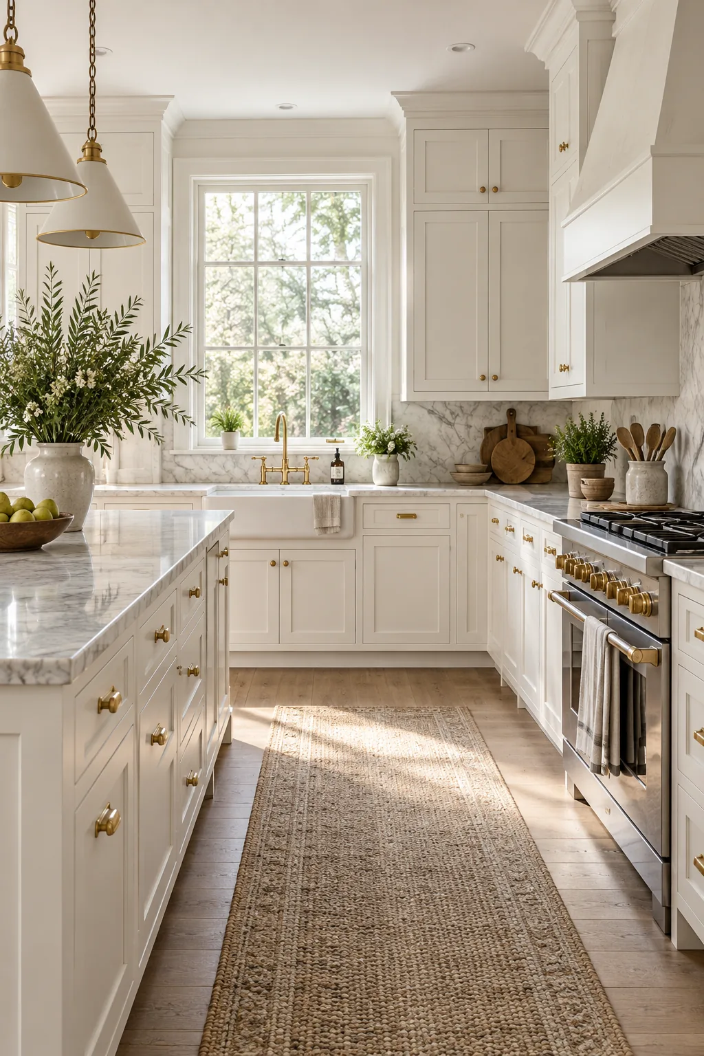
Keep this essential, heavily tested reference chart handy when ordering your custom cabinet paint and brass hardware samples to ensure an absolutely perfect, harmonious match every single time.
| Paint Color | LRV | Hardware Finish |
|---|---|---|
| Benjamin Moore White Dove | 85 | Antique Brass |
| Sherwin Williams Alabaster | 82 | Unlacquered Brass |
| Farrow & Ball Pointing | 89 | Burnished Brass |
Factoring in your countertop colors
Your newly painted cabinetry must speak directly to your stone surfaces. Always view your painted swatches directly against your countertop slabs before making a final, expensive commitment to prevent costly color clashes that are nearly impossible to fix later.
Selecting the perfect grout color for your backsplash
When pairing a white tile backsplash with your warm white cabinets, always select a slightly contrasting grout. A soft silver or warm greige grout highlights the tile pattern beautifully and prevents the entire wall from visually bleeding into your newly painted cabinetry.
Warming the palette with natural wood accents
To prevent an all-white kitchen from feeling overly sterile, you must introduce natural wood tones. In my own kitchen, I incorporated white oak floating shelves and walnut cutting boards to break up the expansive blocks of white paint and ground the palette.
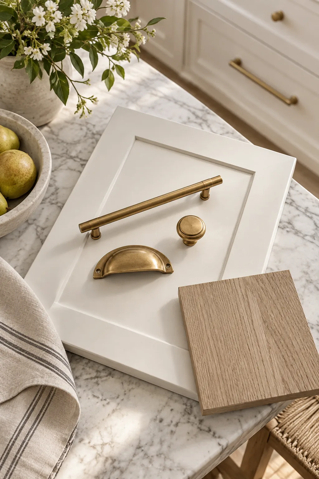
Evaluating floor tones against white cabinets
Your kitchen flooring heavily influences how your cabinet color reads in the space. Dark walnut floors will make white cabinets pop brilliantly, while a very light white oak floor requires a slightly warmer cabinet paint to prevent the room from feeling washed out.
Layering textures for visual depth
Beyond wood, introducing woven materials like rattan counter stools or heavy linen Roman shades adds another crucial layer of tactile interest. By varying the distinct materials in the room, you create a highly dynamic environment that feels rich and thoughtfully curated.
Integrating task lighting under upper cabinets
Proper illumination is critical for highlighting the beautiful 20 percent sheen of your lower cabinets. Installing continuous LED tape light under your upper cabinets provides essential task lighting while casting a warm, even glow that brings out the rich undertones of your paint.
Testing your cabinet color in natural light
Always paint large sample boards and test them vertically against existing architectural elements in your space. I learned early in my career that an LRV 85 white shifts dramatically, moving from a crisp, cool tone in the morning to a rich warmth by afternoon.
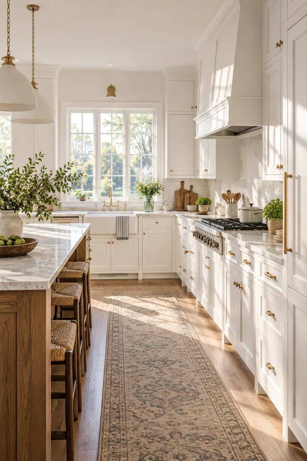
Observing these beautiful natural shifts over a full weekend before finalizing your paint order guarantees you will absolutely love your cabinet color at every single hour of the day.
5 ways to style white kitchen cabinets
Explore how different hardware and architectural details can completely change the mood of a white kitchen.
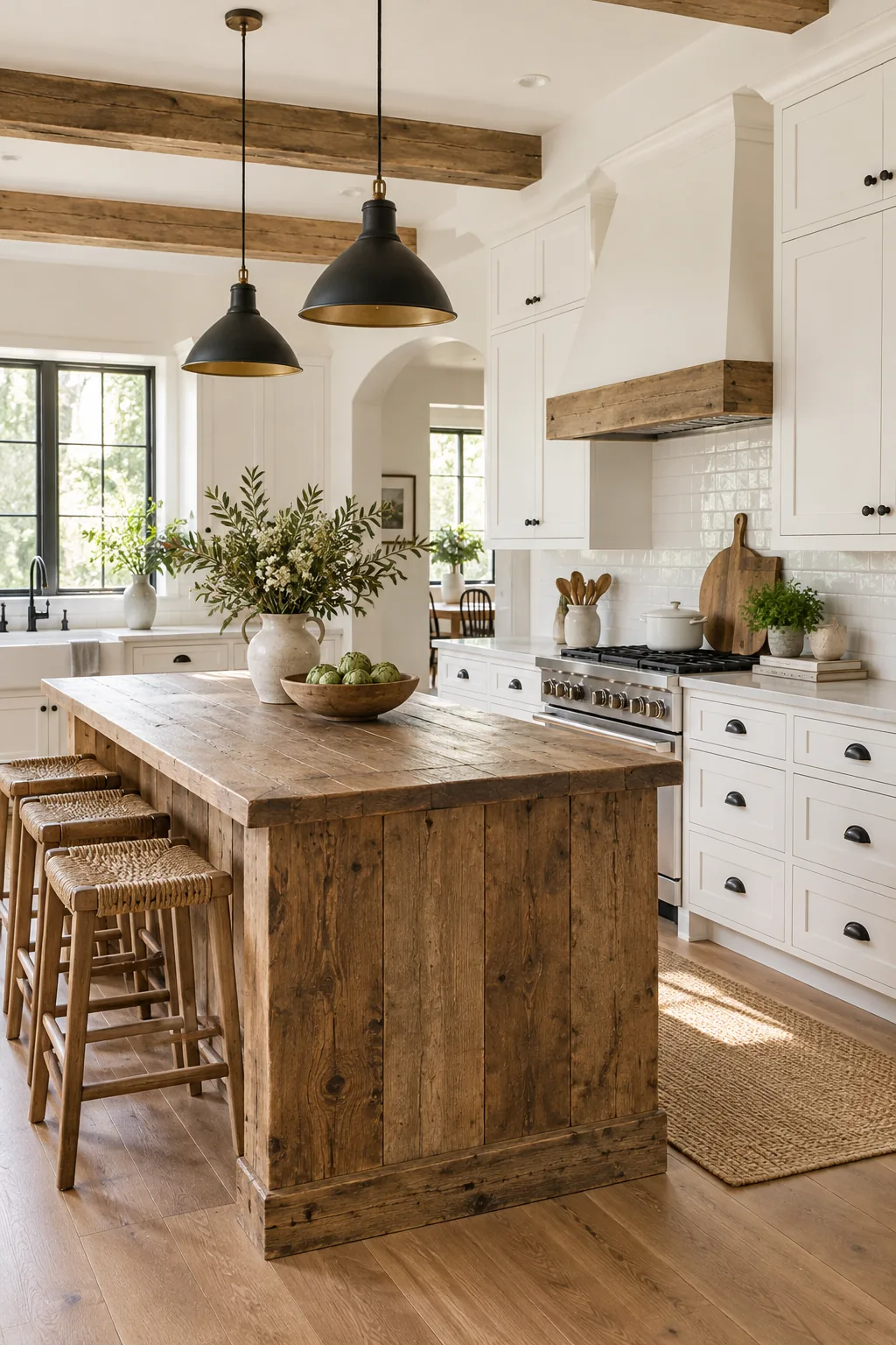
Modern farmhouse high contrast: Matte black hardware pops against crisp white cabinets for a graphic, modern farmhouse aesthetic.
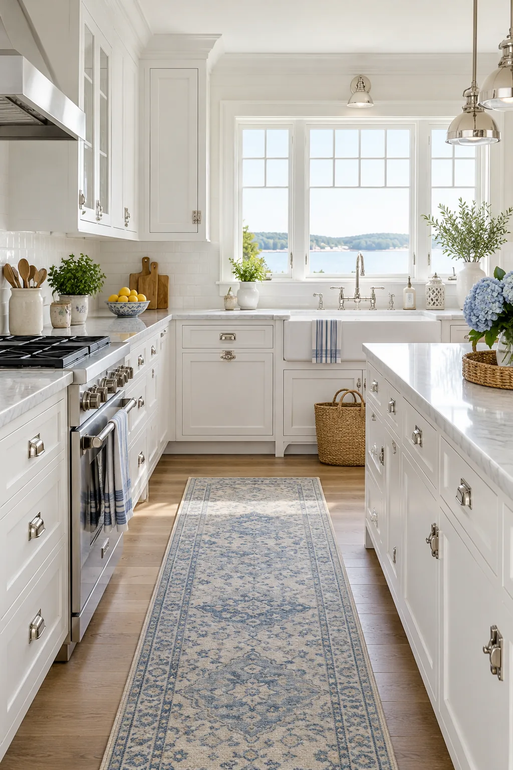
Coastal transitional with nickel: Polished nickel latches reflect light beautifully, adding a subtle nautical nod to bright white cabinetry.
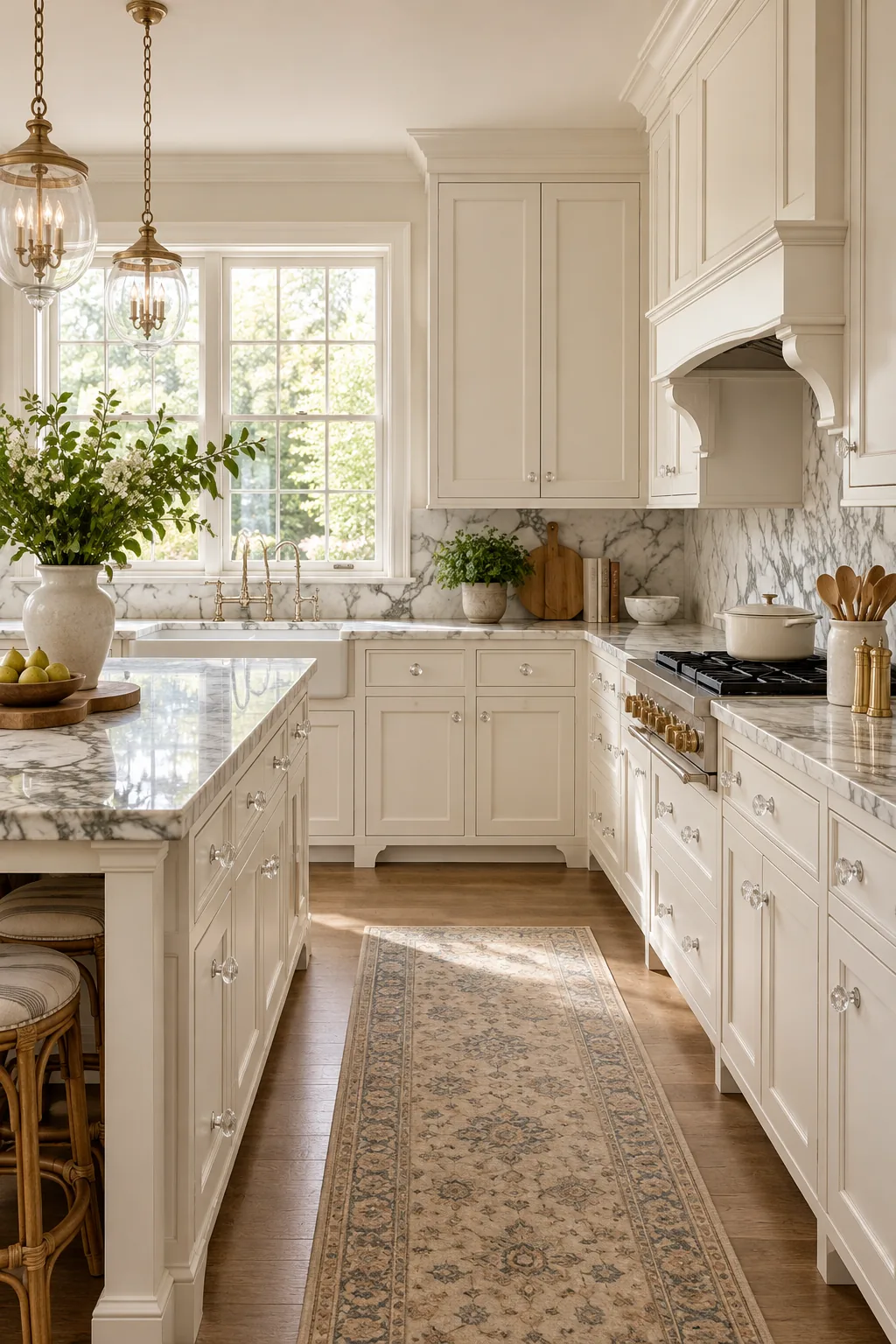
Classic traditional marble pairings: Crystal knobs and creamy off-white paint create an elegant, timeless foundation for dramatic marble countertops.
Minimalist Scandinavian flat panel: Sleek flat-panel doors with hidden finger pulls keep the visual noise minimal in this serene space.
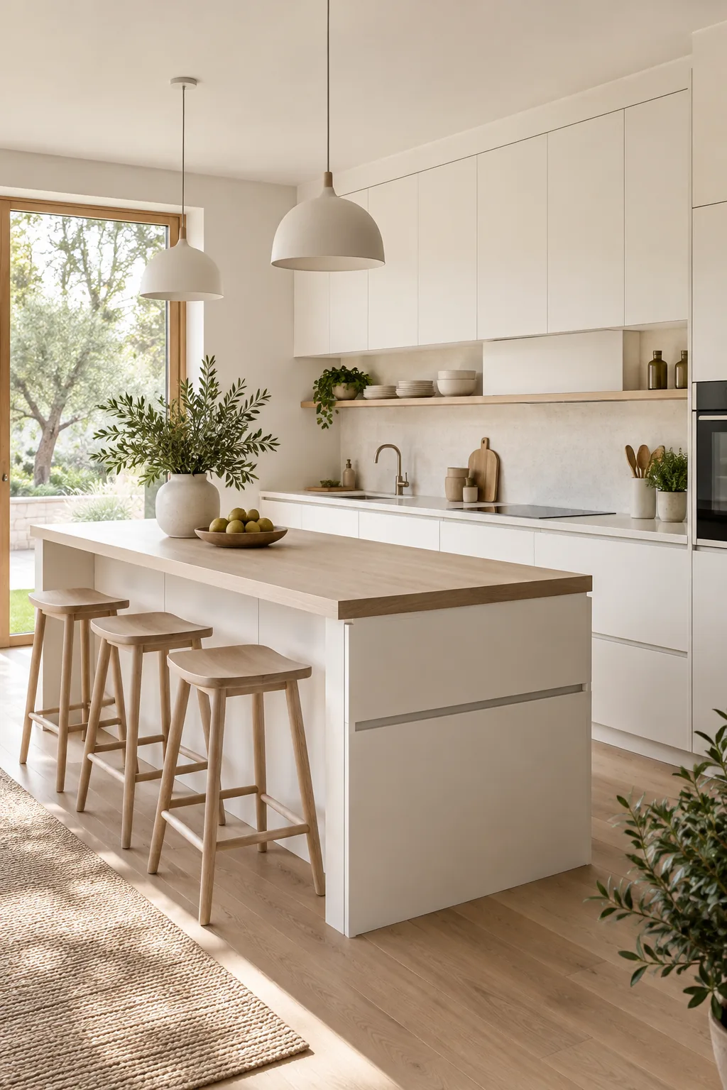
English cottage with copper: Aged copper hardware brings incredible warmth and rustic charm to soft, off-white shaker doors.