
Open layouts give us a feeling of spaciousness and adaptability, which is a designer’s dream come true. How can we use paint to bring definition and flair to these expansive, interconnected spaces?
1. With Monochrome, Embrace Minimalism

For a minimalist, cohesive aesthetic, use a monochrome palette. I frequently advise using variations of a single color to give depth without adding clutter. You can explore more ways to style this look in our black and white apartment decor ideas.
2. Use Shocking Color Bursts

In open spaces, surprise with unexpected color bursts. I enjoy using vibrant colors in hidden spaces, like behind bookshelves, to provide an element of surprise. For more inspiration, explore these unique paint tips for open floor plans.
3. Match Décor and Furnishings

For a unified style, match your décor and furnishings to the paint colors you choose. I’ve discovered that matching cushions and rugs to wall colors in my designs can give a place a sense of cohesion. You can explore stylish wall colors to perfectly complement your dark brown flooring.
4. Play with Touch

To add dimension and interest, try texture. I once combined matte and glossy finishes to experiment with light and shadow, which improved the room’s dynamic vibe.
5. Define Zones with Lighting

In an open layout, varying lighting can subtly define spaces. I frequently hang pendant lights over dining areas to create a more intimate atmosphere in a large space. These techniques are essential when you are designing long open-plan layouts.
6. Emphasize Design Elements

Subtly breaking up space can be achieved by emphasizing design elements like beams or moldings. I frequently paint ceiling beams a contrasting color to give depth and intrigue.
7. Use Geometric Shapes

To draw attention and add interest, use geometric shapes. I once applied a subtle chevron pattern to a feature wall to promote flow and draw attention.
8. Connect Spaces with Shared Tones

To achieve a seamless link, use shared colors in varying intensities. I frequently choose a palette of colors that flow smoothly from one space to another. If you are working with a shared bedroom, explore these ideas for arranging two adult beds to maintain that cohesive look.
9. Use Layers to Create Visual Depth

By layering colors inside the same family, you can add visual depth. I’ve found that using a light to dark gradient effect can give a room a larger, more vibrant vibe.
10. Mix Strong with Soft

To keep things interesting without being overwhelming, strike a balance between strong and soft tones. I’ve had great success using striking colors on one wall and offsetting them with soft neutrals elsewhere. You can see how this works in our one wall kitchen with island ideas.
11. Contrast with Dark Floors

To contrast and ground lighter walls, use dark floors. I’ve discovered that this method adds sophistication and grounds the open space’s overall design. You can explore more stylish kitchens with dark floors for further inspiration.
12. Make Zones with Standout Walls

In an open layout, a standout wall may effectively define a space without breaking the flow. I once made a warm reading corner stand out by using a deep green, which acted as a visual anchor. You can explore sophisticated two-tone wall ideas to add even more depth to your zones.
13. Use Neutral Colors for a Natural Flow

If you want a relaxing and seamless environment, neutral tones are your best option. I think soft grays are great for tying spaces together while letting the décor stand out.
14. Add Natural Touches

Adding natural touches like wood tones and plants makes a place feel warmer. A client’s space was transformed into an inviting haven by the addition of light wood floors and rich plants. You can explore more light wood floor living room ideas to achieve this look.
15. Utilize Matching Hues

To make a smooth flow between spaces, matching colors work wonders. I like to use light blues and cozy yellows together to create a sense of balance and unity in my designs. These color schemes are also perfect for dorm organization projects.
16. Frame Views with Tone

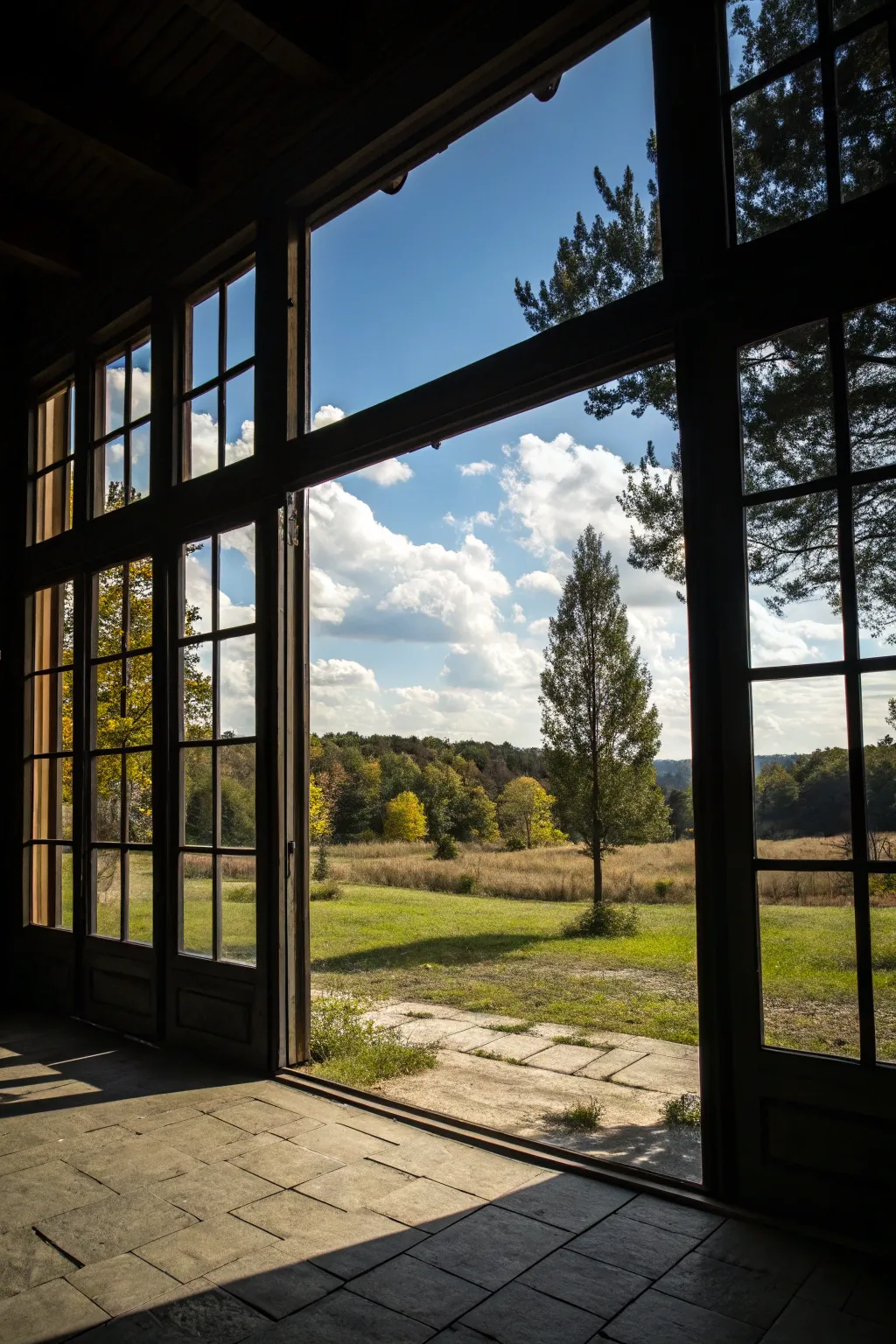
To highlight various areas within an open layout, frame views with tone. I prefer to use darker colors around windows to frame the view and draw attention outside.